On the left are images that Robert took, and on the right are one I had taken. I’m using some of his images to compare to mine, with similar aspects to them.
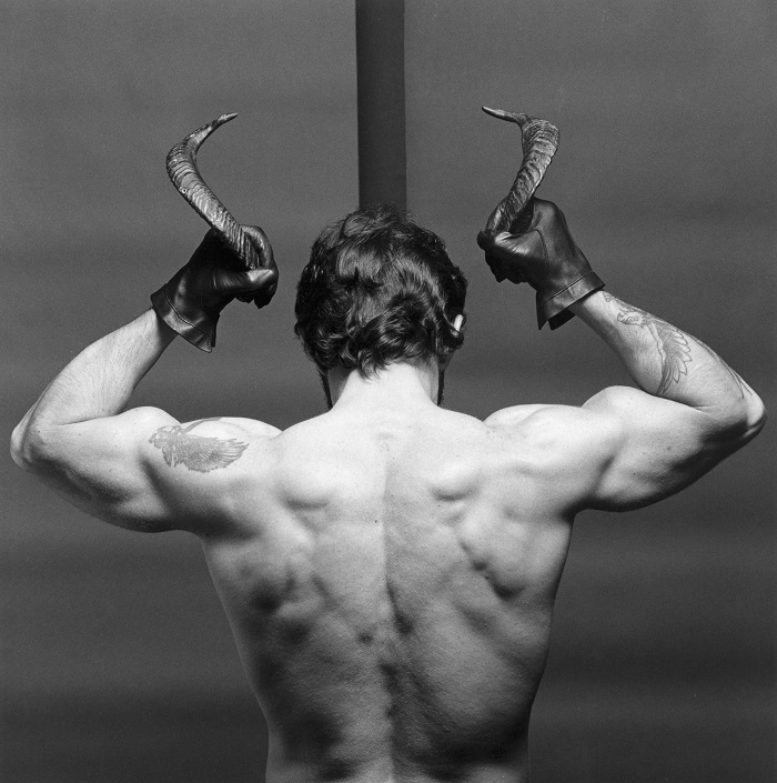

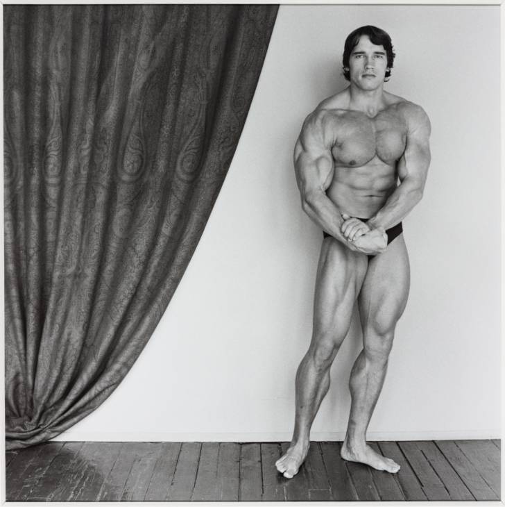
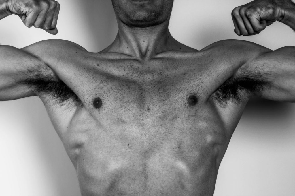
Robert in all of his images used good lighting and positioning, this allowed him to show good definition in specific places he wanted to pop out and show more of. It would also be a good control for how he wanted the image to appear and what he would convey in the images. I used similar techniques by positioning myself in a way where the lighting would work on a specific part of the body id want to appear better, or even as a whole.
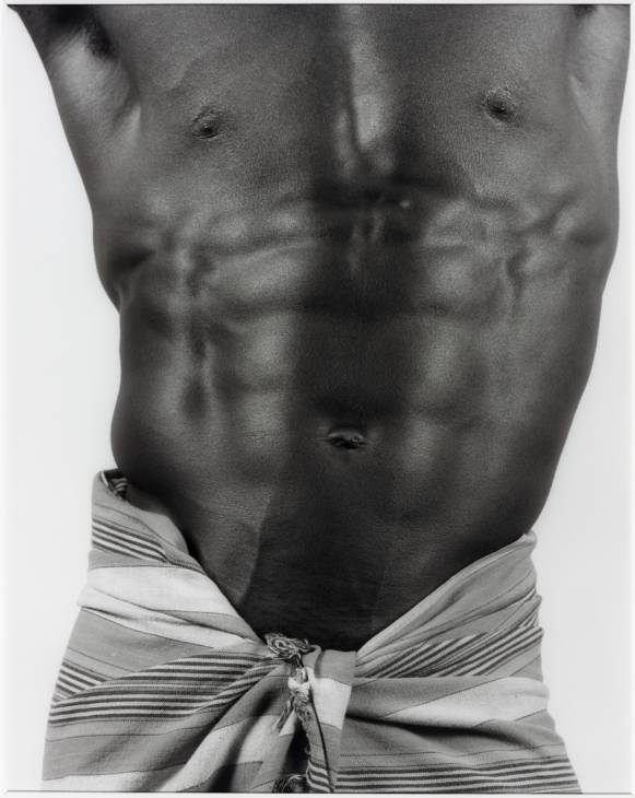
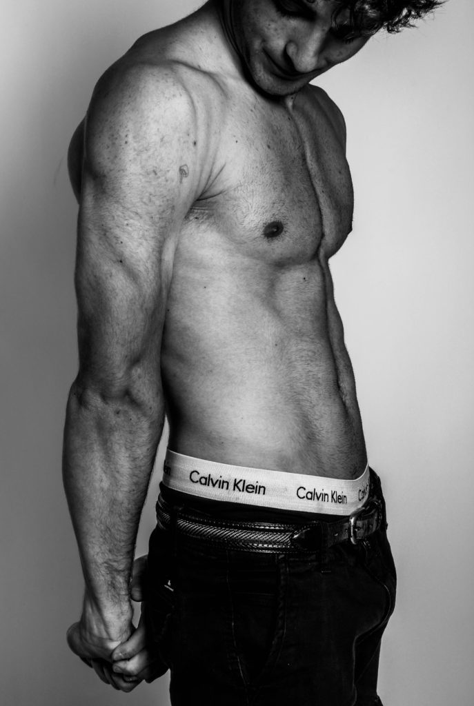

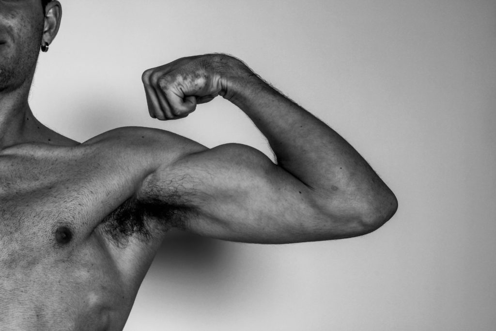
Robert also uses a lot of shape in his images, because his images are a majority of the human body, it uses a lot of shape and lines. In this last image comparison we both use shape to convey meaning.
Both our images are used in the context of masculinity, where it shows the male body. However Robert used his images to show people the violence towards homosexuality during this era, and how it should be acceptable to be discriminatory towards them, which does still link to masculinity and choice. Whereas my images are used to convey staying healthy physically and mentally, and how masculinity links into a lot of that now, to stay strong and better than yesterday. Yet both show the beauty of identity.
Evaluation
I should have taken more images in the studio to choose from as I had not done as much as I could have which would allow better outcomes. In that process I should have played around with the lighting more, to determine which would be better for specific parts of the muscles.
Overall they came out good with a bit of editing, I like the use of black and white, as it gives the image good contrast. I used lighting and editing to create good images which related to identity and masculinity.
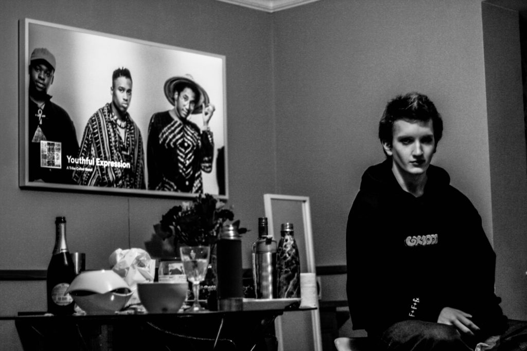
This image was an environmental portrait image that I had taken after a party, where you could say it was the environment of a teenager, in a home, with alcohol left over and food. I like this image because it uses a good contrast between the blacks and whites and is a good balance. I also like the use of shapes and lines, like the TV, the things on the table and everything else, it allows people to easily understand the environment and what is going on. Lastly I like the positioning of the image, how the person is on the right side of the image, and how everything else is on the left. It gives a good balance to the picture.
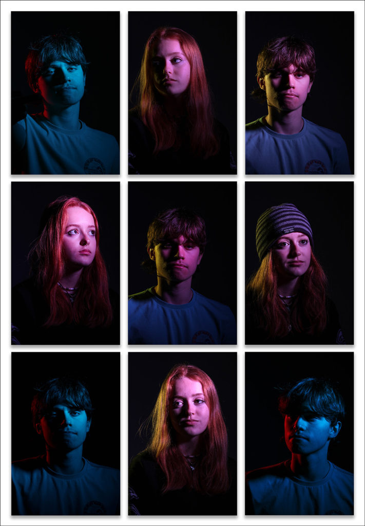
This image was taken for headshots, and I had used 2 people for it. I had done this to create a patterned effect and make it look more eye-catching. I had used a good range of lighting using different colours on different sides of the face and different positionings of their face with different expressions. I had also used some lighting effects like the butterfly effect to give a different look to the person.
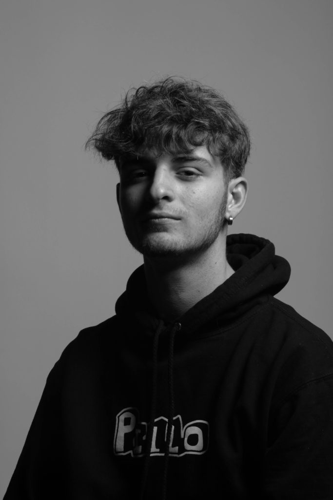
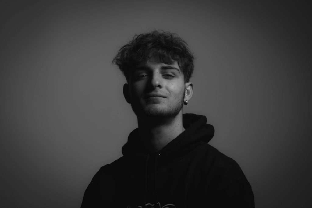
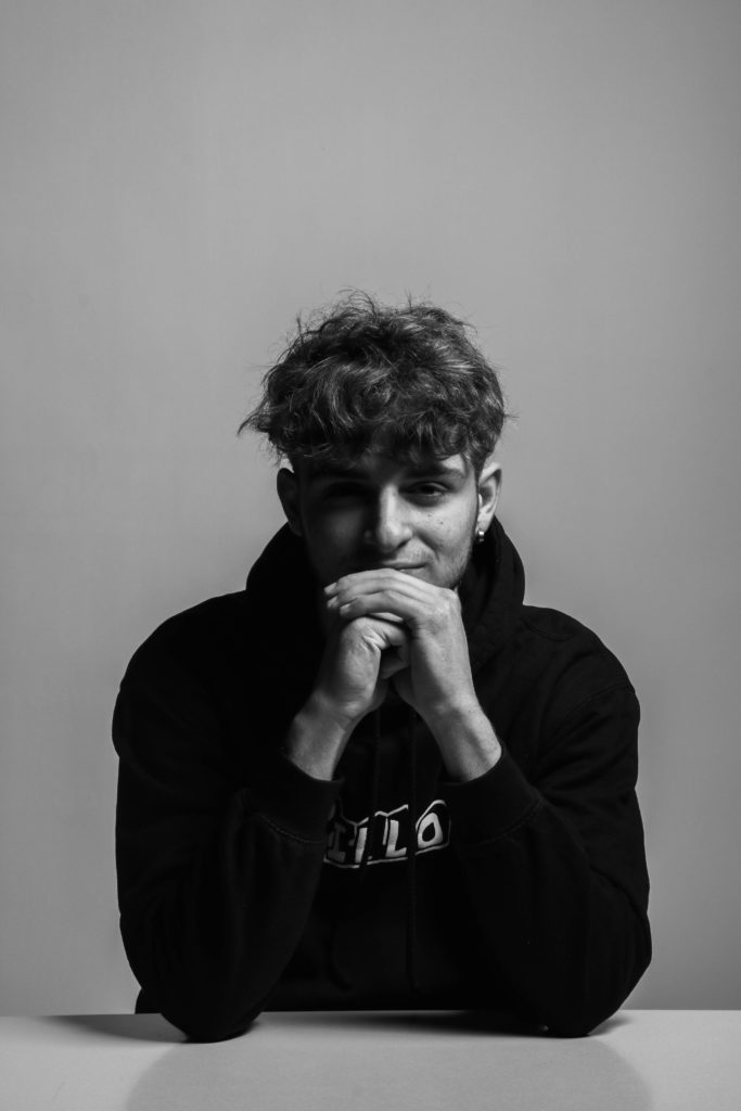
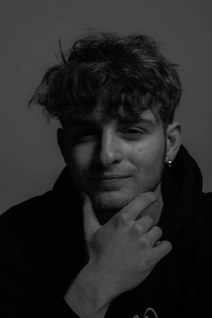
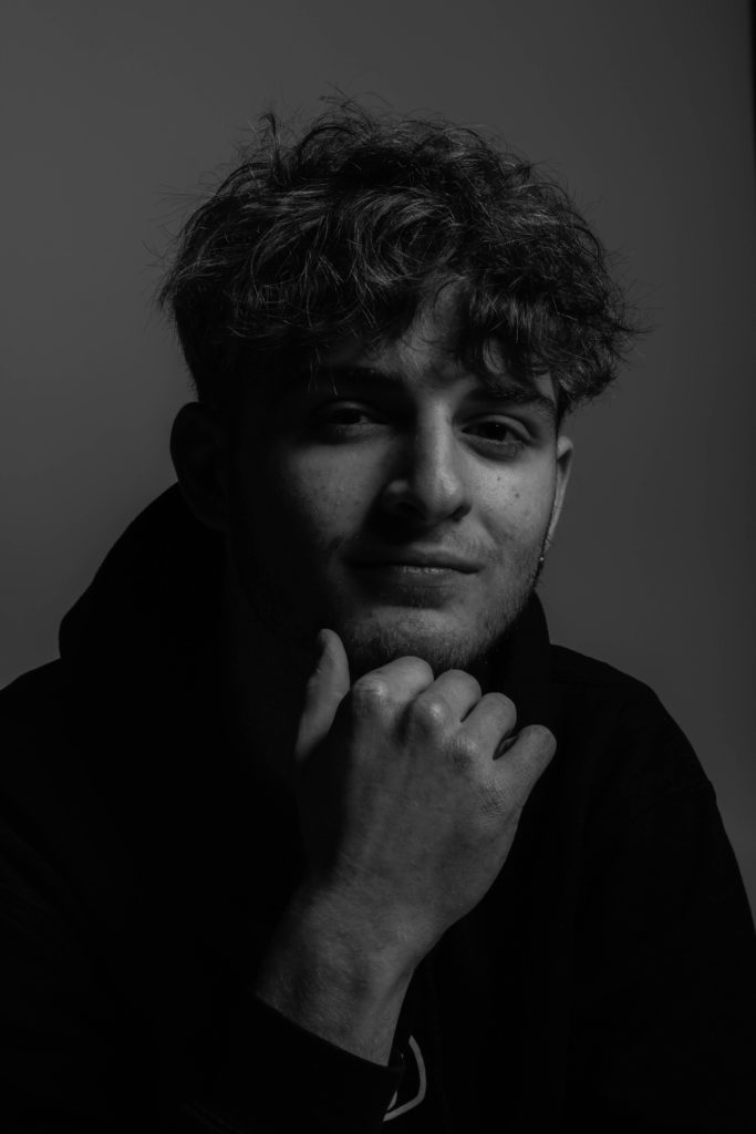
Lastly I used some of my self portraits, experimenting with different lighting effects, and using small adjustments like where to place my hand and what expression I wanted to convey. I liked the use of black and white because it created a better look for the image, and gave a good balance between the blacks and the whites. The use of a black and white filter allowed for different shapes to be formed on the face, like a diamond shape under a eye, whist the rest of the face was brightly shown, creates an ominous effect.
