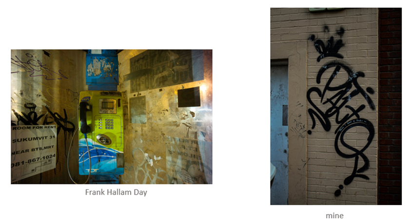
I photographed the wall with the black graffiti in the middle because on Frank Hallam Days picture he has black graffiti placed on the left side of the photo and other small writing/ graffiti around it. There is a similarity between the two photos because of the colour scheme for e.g. yellow in the background and between the gaps, black in the graffiti and shadows and then blue and white for details, these colours are really good as they compliment each other well. There is a similarity in the lighting as both look like they have been taken during late afternoon/early evening as both photos are dark but you can still see some light coming from either the street lights or sky. Another similarity is that both photos are taken from eye level instead of bird view or low angle view, however the difference is that Frank Hallam Days photo is of a phone box and mine is a photo of graffiti on the wall. Frank Hallam Days photo is more colourful and vibrant whereas mine is more dull and darker however I can change this is lightroom by bringing the saturation up.

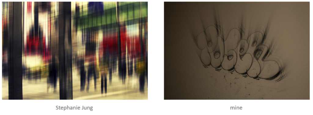
I photographed the wall with black graffiti and edited it on photoshop to make it look like its blurred because Stephanie Jungs photo has been edited to also look like its blurred However Stephanie Jungs photo is taken of people on the streets and mine is of graffiti, Stephanie Jung photo is more dramatic as u cant really see the what she has taken a picture of and mine is more subtle and you can see what I have taken a photo of. The colours used in Stephanie’s picture are yellow, red, green, white, black, blue with hints purple, cream, silver however I only have cream and black.
