Michael Wolf is known for capturing the hyper-density of cities, such as Hong Kong, Tokyo and Chicago in his large-scale photographs of high-rise architecture and intimate studies of the lives of city dwellers. However he has also created a set of portraits which I am interested in, called Tokyo Compression, Michael Wolf’s work on life in cities was always driven by a profound concern for the people living in these environments and for the consequences of massive urbanization on contemporary civilization.

In the series Tokyo Compression, Michael Wolf centred on the subsurface crush of the Tokyo subway, in which thousands of commuters make their daily journeys between work and home. Wolf’s images of individuals pressed against the windows of the crowded trains during the morning rush hour are a disquieting metaphor for the conditions of city-dwellers in today’s dense urban centres.


The images for Tokyo Compression were photographed at Shimo-Kitazawa station in Tokyo over a four-year period. Over time, Wolf engaged with the evocative potential of abstraction, cropping and reframing his images to focus more closely on his subjects. With skin pressed against the windows, the faces of the commuters are often partially obscured, blurred from view by condensation on the glass, or shielded intentionally from others by surgical masks. On occasion, Wolf’s subjects met his gaze, as in the example of Tokyo Compression #18 where one closed eye creates the mirror-image of the artist, training his vision through the viewfinder. On March 25, 2013, the Odakyu subway line was relocated, thus bringing this series to a conclusion.
What I like most about portraits from Tokyo Compression is the abstractness of them, and the creativity and initiative behind them, I love how he was able to create interesting images out of an ordinary landscape that everyone sees everyday. By doing this he encourages people to appreciate their surrounding more as it isn’t the surrounding, or a specific person that makes the photograph good, it is how the photographer engages with both the environment, person and meaning behind the images to put their vison out so another person can see it.


Photographs from Tokyo Compression not only are excellent photographs because of the good quality and editing behind them, but also how people in the photographs relate to what Michael Wolf is interested in. Although it is mainly shown in landscape form, he manages to show overpopulation, and society through a different take on these photographs, by moving from landscape to portraiture. Even in portraiture you can see the strong relationship that he has with the landscape, as he always includes it, even capturing close up portraits he manages to show this environment, in this case by a window on a train/metro.

What I like about the images is this separation the window, especially the droplets on it, create between the photographer and the person. It shows how calm the other side of the train is compared to the other. Not only it shows a crowded space, and an overpopulated area, but how that is compressed and gathered to a tiny area. this might be an extended metaphor to overpopulation everywhere. how no matter how many people the will be alive, we will always be limited to a specialised area, no matter if it is a bus, plane, house or even the world. we are limited, and most of his photographs show that.
Response Plan
What I loved the most about Michael Wolf’s work is that separation between the photographer and the subject, in this case this was shown by a window in the train. I want to respond to this in the same way by using a window or a glass of some sort, so that it is transparent. to show it’s transparency i may do a similar thing shown in his photographs, the raindrops.
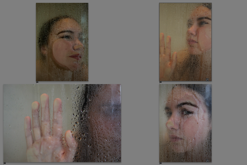
what i decide to do is instead of the train or a metro, is to use a shower as this separation between the person being photographed and me. this is a artist response photoshoot , therefore I’m not planing on producing many different outcomes, but just to explore the artists project.
I found out the better looking photographs were ones where the person is closer to the glass, in further away ones, we had to clear the droplets off the glass so that it was more see through and less blurred.

I have picked my favourite photographs, which i also think are very similar to Michael’s ones, when it comes to the frame, and posing.

When it came to editing the photographs i wanted to be as close to the effect achieved by Michel, as possible. I’ve noticed he uses a lot of cool tones, therefore what i mainly focused on changing were the tones and increasing contrast to make the images darker.


Final Images


