With the bellow photoshoot it was quite tricky to achieve the effect I wanted to. but how i made it work, for the photographs to turn out exactly how i imagined them, was to get the persons taking them to pose in front of the camera in the area I would want to pose, then showing the basic framing skills and said to not move the camera. I envisioned how the photograph would look with me in it and once it was all set up for me to be in the image I simply posed how I wished to, while the framing stayed the same. this took us a while as i had to regularly see how the images actually looked like. this is why bellow some images are not of me as i had to show different types of framing, and had to communicate all the way through.
Sub-Selection
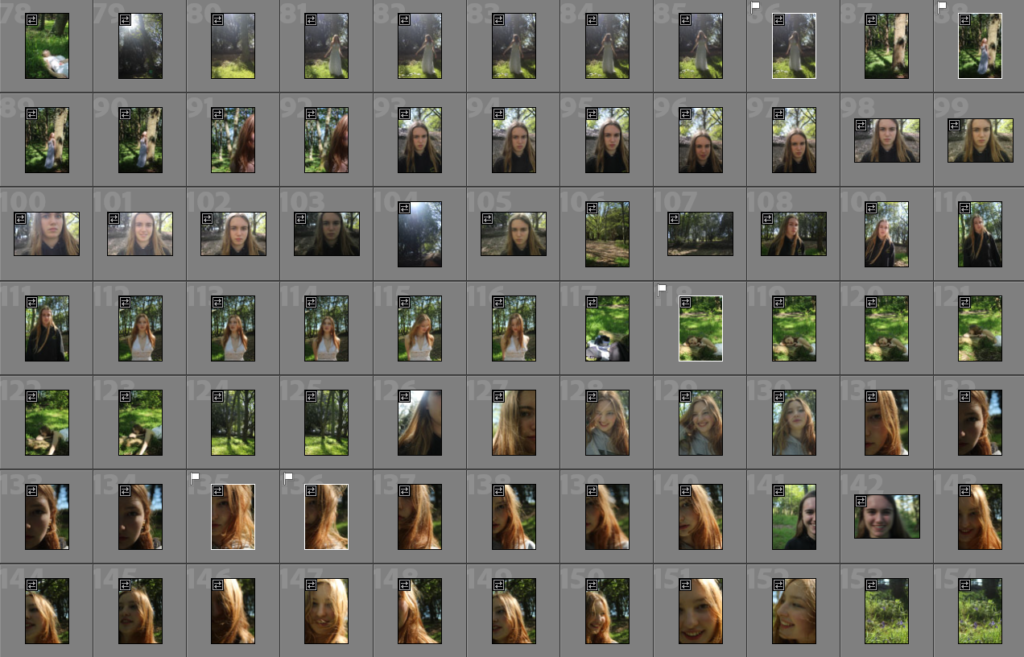
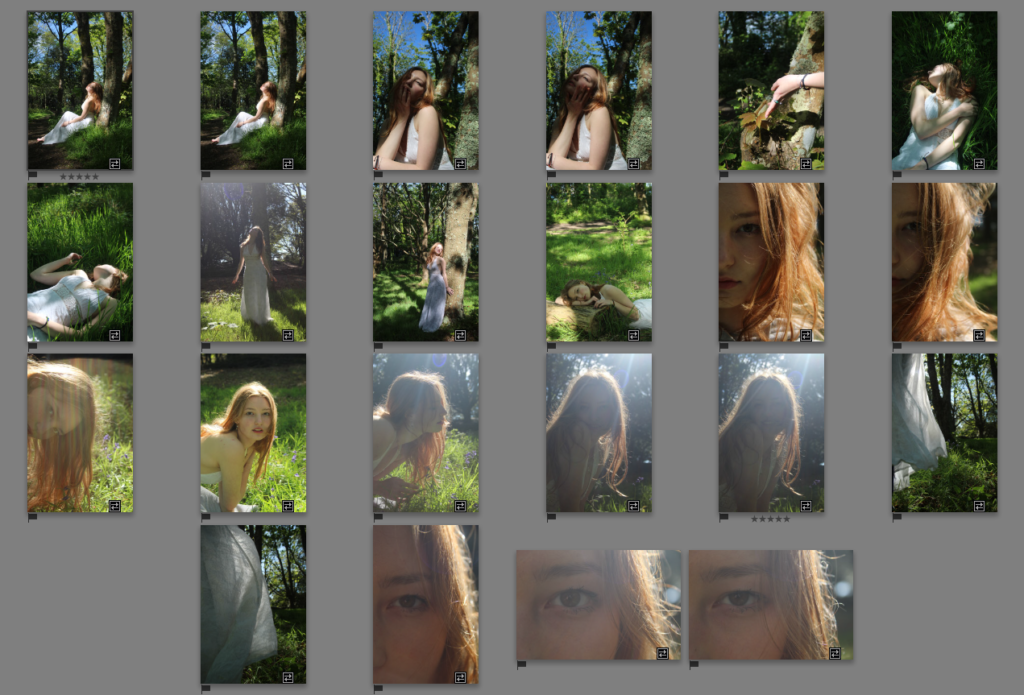
as many images looked quite similar and there were many fails or photographs not of me , i had to narrow it down. even when i narrowed down my options i still found that would be too much, so had to repeat the sub-selection process once again. i was looking for images that presented femininity the best and were gentle and quiet.
Editing
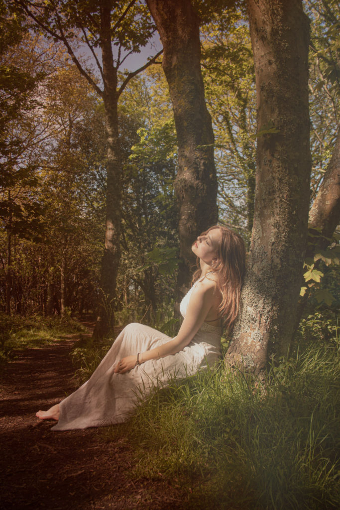
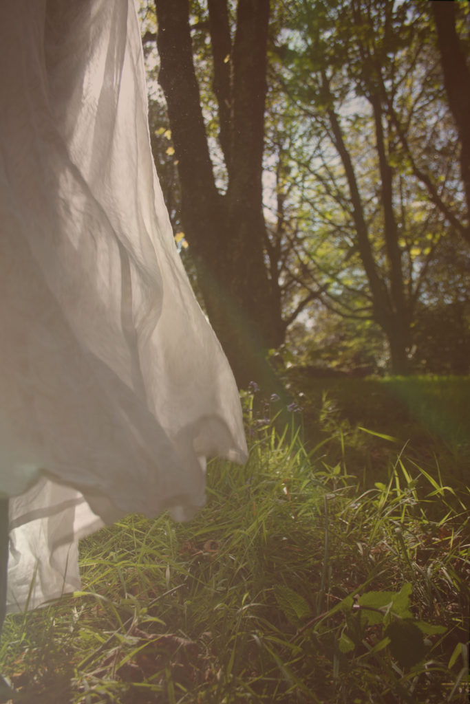
the main thing i was looking to create out of the selected images, were to increase the warth of them, so they have more of a conforting feel, i ocasionally decresed clarity to make them smoother and dream-like. warth colours are usually accosiated as feminine colours so i tried to increase the picks/reds in the images or yealloe tones.
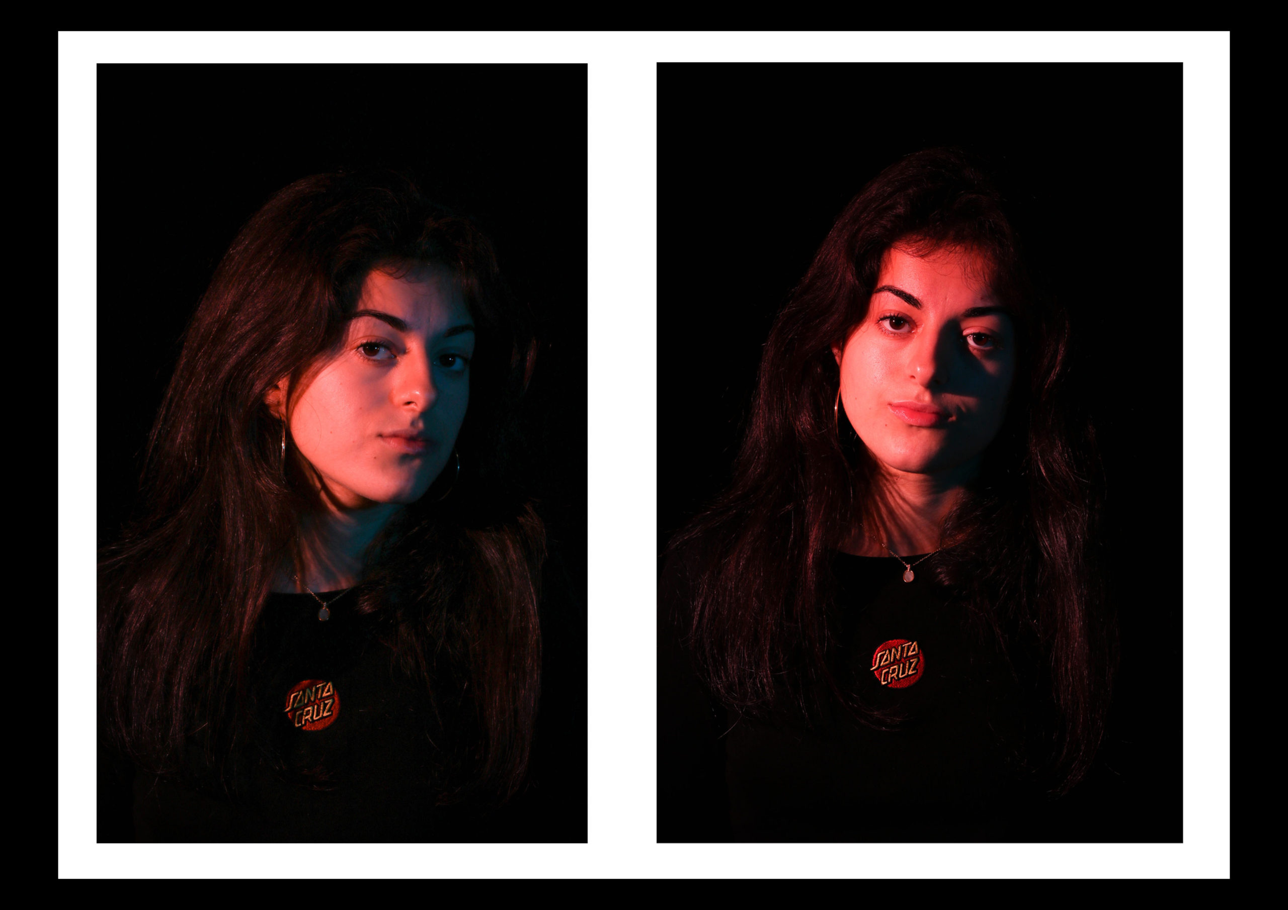
i did a contrast edit of the same image above, this is to show the importance of those soft, warm tones on the image. as cooler ones don’t achieve the effect i was looking for, however they still make the photograph feel more mysterious.
with the bellow images i liked the original version, therefore not too many adjustments were made.
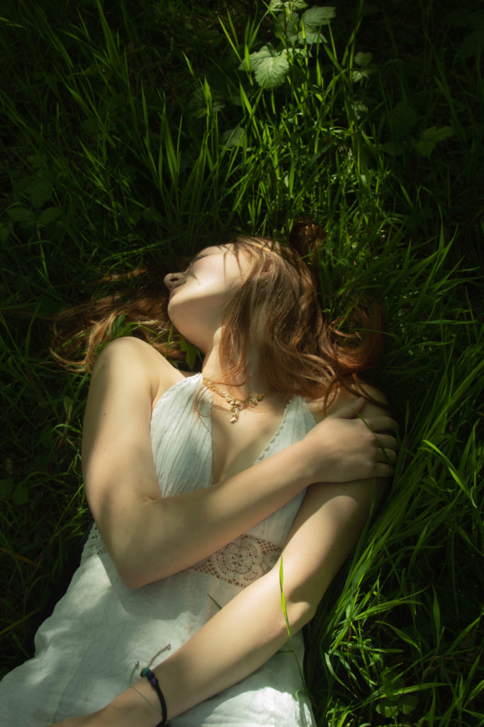
Looking at the pose and situation of the photograph, where i look it looks like I’m dreaming, i tried editing the photograph to mach that scenario, increasing picks to make it feel feminine and dreamy.
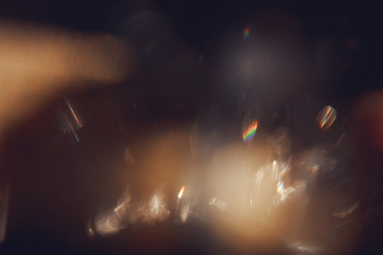
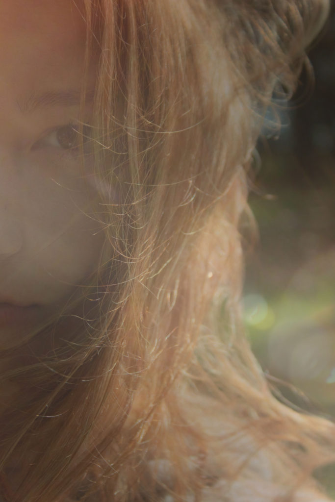
What i wanted to try is well is layering different filters on photographs, especially at the photographs taken against the sun. this i thought would increase the blurriness of them, add a tint, and effects.
what i did is saved many filter like effects and opened them in Photoshop, as well as the photographs i wanted to layer them on top. then i have pasted the colourful filter onto the image, turned the background to layer, which was on the right of the screen. then reduced the opacity of the added filter. on some images the opacity differs. I had flatten the final image and saved it.
These are the different effects i have used.
Those were the final effects after adding the filters. Not all photographs turned out good, but the ones that did , i decided to use in my final piece.
Final Images
The first images i decided to keep a similar effect on them as then i can display them as a group of 3 images. then others are images that i think are not only good quality but respond well to what i wanted to achieve.
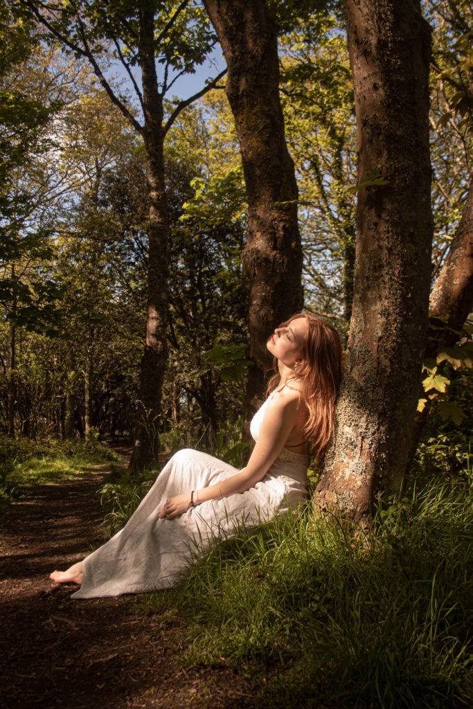
to respond to topic of femininity, i have done research, looking into femininity to understand stereotypical values in women, as well as how women are usually portrayed in art and in photographs. having done this research, as well as gaining knowledge from my personal experience, creating a mood board etc. i have came to a conclusion i would like to portray this stereotypical view on women that society has. meaning the effect i would like to achieve is almost an exaggerated look onto femininity. as i came across the fact women are very closely linked to nature, i would preferably chose an outdoor location.
I have looked at photographs of women in nature, but once i was researching different locations the most popular locations that came up were the sea, flower fields and forest. looking into each specific location i have came across an article of the significance of the forest and it’s deeper meaning in books, history and art. what i found interesting is how forests are often mentioned as a ferry-like locations, where even in novels or children’s books they are a representation of magic and wonder. in many plays and other forms of arts, forests or woods are a sense of mystery and secret, however also a symbol of romance. this idea of romance in forests interested me, as women tend to be taken as more romantic then men, more in touch with their emotions, and ore sensitive, therefore this idea of a magical, romantic location relates to femininity so well. once i decided i would like for the location of my photoshoot to be in the woods, i circled above different woods in jersey that i am most likely to pick. these are: St Catherine’s Woods, St peters Woods, and woods in Noirmont.
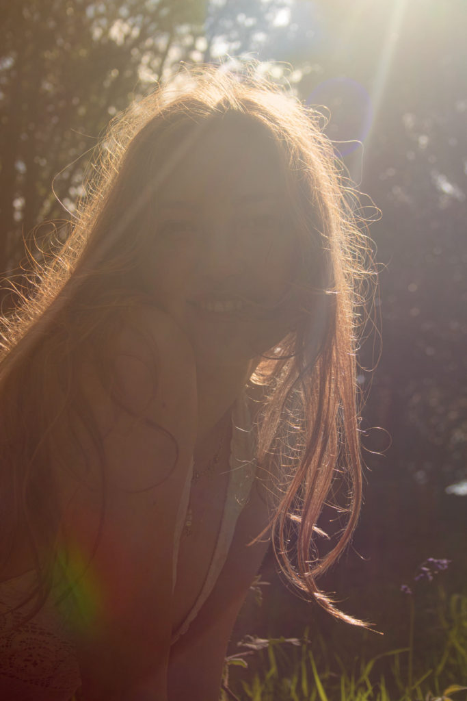
Above i have created a mood board showering example effects i would like to achieve from this photoshoot. these pictures mainly inspire me because of how well they link with representing the place through the definition i have said before, the magical,romantic secretive place. i wish to portray that too with my final outcomes. what i like is how when the camera is positioned against the light , it creates this dream like feel, almost like a ferry-tale. the photographs, place and women in these photographs are all linked together in harmony and work well together to show femininity thorough the location.
Who- As forests and nature are very personal to me, i will photograph myself, through a different person, this is so i can link femininity with myself, show it’s meaning through me , and make the photographs more personal to me. i would like to represent femininity, and my take on it through me as no one else could project my vison on not only femininity but identity and importance of both of these, that are my own personal opinion.
What- I will include nature and use the environment to my full advantage, not only focusing of capturing portraits, but also close ups of leafs, flowers, sticks, and environment.
Where- In forests i have listed above, i think i will pick Noirmont woods, as transport to there is easier for me, however i also know there is a bit more open areas where sun can shine through the trees, meaning i will be able to get more light in.
When- Preferably when the sun is slightly angled, as then i can create a blurred, overexposed images. Regarding the time of year, this should be between hours of 3pm-6pm, this means this could be done after school, but i need to keep in mind the weather forecast and plan my photoshoot to a specific day where the sun will be out for most of the day.
How- As i will not be the one taking the photographs because i would need to model in them, it may be tricky to get the desired photographs. i could use a tripod, but because what i want to achieve will require different angles and approaches i will have to ask someone else to work with the camera. but i need to ensure the photographs are turning out how i imagined them to look like, meaning i will have to carry out regular checks with the person taking photographs.
Why- This photoshoot will be to demonstrate the meaning of femininity and its personal meaning it has to me. to show my identity through femininity and importance of it in my life. this is also to produce a set of images that represent a typical view on femininity and my thoughts on it. i would like from this to gain a deeper understanding of the importance in me exploring femininity, and what effect too much or too little of it would have on me.
Michael Wolf is known for capturing the hyper-density of cities, such as Hong Kong, Tokyo and Chicago in his large-scale photographs of high-rise architecture and intimate studies of the lives of city dwellers. However he has also created a set of portraits which I am interested in, called Tokyo Compression, Michael Wolf’s work on life in cities was always driven by a profound concern for the people living in these environments and for the consequences of massive urbanization on contemporary civilization.
Tokyo Compression 9, 2009.
In the series Tokyo Compression, Michael Wolf centred on the subsurface crush of the Tokyo subway, in which thousands of commuters make their daily journeys between work and home. Wolf’s images of individuals pressed against the windows of the crowded trains during the morning rush hour are a disquieting metaphor for the conditions of city-dwellers in today’s dense urban centres.
The images for Tokyo Compression were photographed at Shimo-Kitazawa station in Tokyo over a four-year period. Over time, Wolf engaged with the evocative potential of abstraction, cropping and reframing his images to focus more closely on his subjects. With skin pressed against the windows, the faces of the commuters are often partially obscured, blurred from view by condensation on the glass, or shielded intentionally from others by surgical masks. On occasion, Wolf’s subjects met his gaze, as in the example of Tokyo Compression #18 where one closed eye creates the mirror-image of the artist, training his vision through the viewfinder. On March 25, 2013, the Odakyu subway line was relocated, thus bringing this series to a conclusion.
What I like most about portraits from Tokyo Compression is the abstractness of them, and the creativity and initiative behind them, I love how he was able to create interesting images out of an ordinary landscape that everyone sees everyday. By doing this he encourages people to appreciate their surrounding more as it isn’t the surrounding, or a specific person that makes the photograph good, it is how the photographer engages with both the environment, person and meaning behind the images to put their vison out so another person can see it.
Photographs from Tokyo Compression not only are excellent photographs because of the good quality and editing behind them, but also how people in the photographs relate to what Michael Wolf is interested in. Although it is mainly shown in landscape form, he manages to show overpopulation, and society through a different take on these photographs, by moving from landscape to portraiture. Even in portraiture you can see the strong relationship that he has with the landscape, as he always includes it, even capturing close up portraits he manages to show this environment, in this case by a window on a train/metro.
What I like about the images is this separation the window, especially the droplets on it, create between the photographer and the person. It shows how calm the other side of the train is compared to the other. Not only it shows a crowded space, and an overpopulated area, but how that is compressed and gathered to a tiny area. this might be an extended metaphor to overpopulation everywhere. how no matter how many people the will be alive, we will always be limited to a specialised area, no matter if it is a bus, plane, house or even the world. we are limited, and most of his photographs show that.
Response Plan
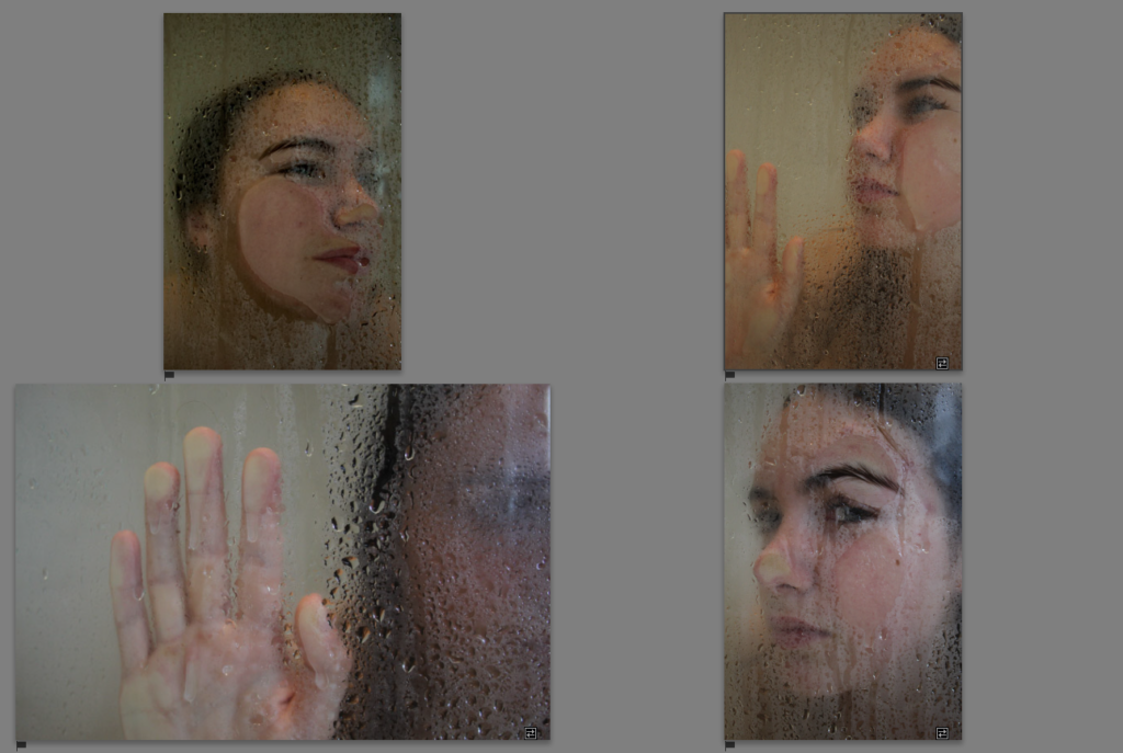
What I loved the most about Michael Wolf’s work is that separation between the photographer and the subject, in this case this was shown by a window in the train. I want to respond to this in the same way by using a window or a glass of some sort, so that it is transparent. to show it’s transparency i may do a similar thing shown in his photographs, the raindrops.
what i decide to do is instead of the train or a metro, is to use a shower as this separation between the person being photographed and me. this is a artist response photoshoot , therefore I’m not planing on producing many different outcomes, but just to explore the artists project.
I found out the better looking photographs were ones where the person is closer to the glass, in further away ones, we had to clear the droplets off the glass so that it was more see through and less blurred.
I have picked my favourite photographs, which i also think are very similar to Michael’s ones, when it comes to the frame, and posing.
When it came to editing the photographs i wanted to be as close to the effect achieved by Michel, as possible. I’ve noticed he uses a lot of cool tones, therefore what i mainly focused on changing were the tones and increasing contrast to make the images darker.
Kayla Varley is an American advertising photographer/director, she is a popular photographer working in many popular LA, London, and NYC. developed her photographical skills at a very young age( being 13 years old). She had the support of her father, who bought her the camera at 13, she stated she used it a as a documentative way, to document her teenage life. “but it allowed me to express my emotions in a healthy way. The way I used to shoot was more about taking note of my own life, or documenting my surroundings. When I was younger I just saw things and wanted to capture what was happening.” which later she said “Now I set up circumstances that allow for an intentional creative space and energy.”, showing how her style changed and developed over the years.
Regarding the work she is producing now, she focuses on different kinds of portraits, both showing her aesthetics and having elements of her in them, one consist of mostly advertising photography, including makeup brands, clothing brands etc. and the other are portraits are more for her photographic, more artistic and more hobby work. these photographs would be without the intention of advertisement , rather more created for aesthetic purposes. i am more interested in the 2nd portraiture she creates, rather than advertisement. this is because i feel the models are ore created to the photographer and photograph, it seems more personal.
I have been inspired my Varley’s work when i was researching photographers that are moved by feminisim and show it in their work. on this website https://www.lomography.com/magazine/327804-8-women-photographers-on-feminism-confidence-photography i have came across her work and what stood out to me the most is what she had said “I don’t think women should be afraid of showing their true selves. When we have the space to be who we really are, and we are not afraid, we flourish. I hope that someday we can shape our society so that women don’t ever think twice about their appearance or behavior – we have the right to act however we please.” after reading this, i have researched her website https://www.kaylavarley.com/portrait . from then on i have selected images which i preferred the most, so i can show which images inspire me the most and of which ones i like the appearance of the most. however she she has a much bigger variety of photographs then i could include in this blog post.
reading a couple interviews she has done in order to understand the motivation and context behind her work, some of the answers to certain questions are quite inspiring and especially as a learning photographer, very helpful. For example the answer she replied to a question about what makes a good image to her: “A good image is an image with soul, impact, emotion, and good composition. I believe a photographer should always put a little bit of himself into an image. Without an emotional connection I think an image is that and you forget it once you’ve stopped looking at it.” i completely agree with this, and this is why in most of my future work i would truly put purpose for my images but also attempt to show it, while photographing items or producing photographs that show me, and the connection with what i would be photographing. I plan to produce images based on visions and plans made before, always considering impact, good composition and emotional connection.
on https://www.c-heads.com/2014/01/05/a-talk-with-kayla-varley/ she has said “Women are beautiful to me all of the time. My idea of beauty is a warm energy and a loving heart. Beauty comes from within- when a woman walks in a room and she has confidence, there’s nothing else like it.”
why I am so interested to what she has to say about finding inspiration from women and her work in general, is because I would potentially produce images that may differ aesthetically to hers, however they will be produced based on the advise I have gathered from the research.
I love how diverse her work is, showing haw great of a photographer she is, as she can work with many different environments and situations that sometimes might be tricky to shoot in, however she still manages to make unique photographs. you can see the confidence put out in the photographs, this empowerment she spoke about earlier, all her images do exactly what she wishes, which is to embrace these feminine traits and empower others through the connection shown in the photographs. i like how cinematic the images look, like they were taken from a movie or straight from someones life as they we happening, even though most are staged for an organized photoshoot. her work is meant to reel you into a spontaneous, but intentional space, where each image has a sense of movement, which brings the individual photographs more alive. Each image is meant to bring to life the human emotion, and capture a fleeting, magical environment.
what i also like is how broad her work is, that although she does have a significant style, she manipulates it to the person she is photographing and valuing showing these feminine qualities. for example the softness and delicate feel each image has, while most are exiting and spontaneous they have a sense of peace and balance.
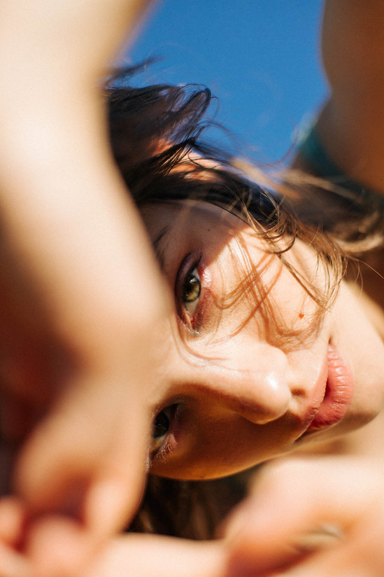
What inspires me the most about her work is this playfulness she shows in women, she adapts each photograph to show a persons nature and how they feel to her, this could mean the photograph its self is so personal and filled with connection between the subject and the photographer. i have decided to analyse one of her images above, out of many other outstanding photographs she has produced, because I think this respond so well to what i wish to capture. I really like the composition of tones seen in the photograph, not only with this image but with many other photographs of her’s, the tones and colours always make sense, always have a theme and are never too overwhelming. this photograph shows femininity in it’s best way, showing the gentle side of women. the creamy colours link to the gentle nature women tend to be. i wish to embrace the softer side of women in my final photographs, i want to display movement and softness, to show, like the picture above, the fun that women have in them. this photograph shows this, the picture captures the movement of the women, her hair being messy and frozen in time. i think her hair is a vital part to the photograph, because it’s movement can suggest so much, the direction and how it flows shows how she was moving. even centuries ago when people would create painting of women they payed attention to women’s hair, it is symbolic and gives different meanings depending on the hair type/texture. Hair is one of the most feminizing elements of a woman’s body,and is traditionally seen as a sign of womanhood. this picture shows how confident the woman is in her femininity, but the movement also may suggest freedom. there are many factors to why i link this image with freedom but also reaching freedom and peace through embracing femininity. for example the direction of her looking into the light, and the use of light it”s self. the light which looks like sunlight, falls gently onto her face, the use of light also narrows the viewers focuses on her face. as you pay more attention to her face, and her expression, it shows joy, and happiness, which to me has a close link to confidence and freedom, as she has been put in the spotlight. almost like reveling her true self, the spotlight can have many connotations of revealing. to many this revealing can be of many forms, like femininity, freedom, true self etc. however whatever it is it all has a link to identity, this will be more personal to person being photographed or the photographer, but the meaning this image is trying to tell is do do with ones identity, which will be taken apart in different forms by different people.
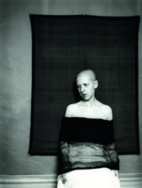
Claude Cahun was actually born under the name Lucy Renee Mathilde Schwob. Schwob adopted the pseudonym Claude Cahun in 1914,she also said that her actual gender was fluid. Cahun is best known as a writer and self-portraitist, who assumed a variety of performative personae. Cahun is considered to be a ground-breaking artist who fully embraced her gender fluidity long before the term came into use. For example, in Disavowals, Cahun writes: “Masculine? Feminine? It depends on the situation. Neuter is the only gender that always suits me, hiowever In her writing she consistently referred to herself as “elle” (she). Cahun is most well known for her androgynous appearance, which challenged the strict gender roles of her time. During the early 1920s, she settled in Paris with lifelong partner Suzanne Malherbe, who adopted the pseudonym Marcel Moore. The two became step-sisters in 1917 after Cahun’s divorced father and Moore’s widowed mother married, eight years after Cahun and Moore’s artistic and romantic partnership began. For the rest of their lives together, Cahun and Moore collaborated on various written works, sculptures, photomontages and collages. Some of Cahun’s portraits feature the artist looking directly at the viewer, head shaven, often revealing only head and shoulders (eliminating body from the view), and a blurring of gender indicators and behaviors which serve to undermine the patriarchal gaze.
In 1937 Cahun and Moore settled in Jersey. Following the fall of France and the German occupation of Jersey and the other Channel Islands, they became active as resistance workers and propagandists. strongly against war, the two worked extensively in producing anti-German fliers. Many were snippets from English-to-German translations of BBC reports on the Nazis’ crimes and insolence, which were pasted together to create rhythmic poems and harsh criticism. The couple then dressed up and attended many German military events in Jersey, placing their pamphlets in soldier’s pockets, on their chairs, and in cigarette boxes for soldiers to find. Additionally, they inconspicuously crumpled up and threw their fliers into cars and windows. On one occasion, they hung a banner in a local church which read “Jesus is great, but Hitler is greater – because Jesus died for people, but people die for Hitler.” As with much of Cahun and Moore’s artistic work in Paris, many of their notes also used this same style of dark humor. In many ways, Cahun and Moore’s resistance efforts were not only political but artistic actions, using their creative talents to manipulate and undermine the authority which they despised. In 1944, Cahun and Moore were arrested and sentenced to death, but the sentence was never carried out, as the island was liberated from German occupation in 1945.
Claude Cahun was a Surrealist photographer whose work explored gender identity and the subconscious mind. The artist’s self-portrait from 1928 epitomizes her attitude and style, as she stares defiantly at the camera in an outfit that looks neither conventionally masculine nor feminine. “Under this mask, another mask,” the artist famously said. “I will never be finished removing all these faces.”
Most Surrealist artists were men, whose primary images of women depicted them as isolated symbols of eroticism rather than as the chameleonic, gender non-conforming figure that Cahun presented. Cahun’s photographs, writings, and general life as an artistic and political revolutionary continues to influence artists.
In 2007, David Bowie created a multi-media exhibition of Cahun’s work in the gardens of the General Theological Seminary in New York. It was part of a venue called the Highline Festival, which also included offerings by Air, Laurie Anderson, and Mike Garson. Bowie said of Cahun:
“You could call her transgressive or you could call her a cross-dressing Man Ray with surrealist tendencies. I find this work really quite mad, in the nicest way. Outside of France and now the UK she has not had the kind of recognition that, as a founding follower, friend and worker of the original Surrealist movement, she surely deserves.”
I created a mood boards representing stereotypical view of femininity and masculinity, I searched for these specific images to create a general view of how i could start looking into femininity or masculinity. i could use the theme of these mood boards as a starting point in exploring this identity topic.
as i searched for the most common images on google, many of them included very soft colours, as well as the images, they were very ferry-tale-like, and had a dreamy effect to them. many also included movement and free-like spirit, where women would be doing something rather than posing. i found there are much more variety in images of women rather than men. this could be because women were taken as muses for centuries and carried the “beauty” in the definition of women. hence to why the photographs appear gentle and beautiful, they are of many colours and show the definition of femininity. there are many hints in some photographs that make the photograph more “feminine” like many including flowers, which is also a symbol of beauty, or dresses, which were taken as the most feminine clothing for centuries. what i noticed after the mood board was made that nature is very important when producing a feminine base photograph, this is because nature was taken as a sign of beauty for centuries and people have showed this even in historic paintings and art.
once i had 2 different mood boards to compare, i have noticed a drastic change. the theme was contrasting with the previous one, and almost every idea in the previous one was reversed and opposed. The main thing displayed in all the images , images that are taken as masculine, was strength and toughness in men. where women were more associated with nature, men are more associated with innovations, and man-made objects. this relates to the idea of men being stronger then women. this is the main value taken from masculinity, toughness, and is displayed clearly in the above images, where most men in the photographs have a bigger built and are also doing what are seen as more man dominated jobs, like war, mechanic or a kind of sport, these fields are man based because a greater strength is required. regarding how the photographs have been structured, there are the opposite of feminine photographs. they are much darker, and have less colour variety, i tried to include a bigger range of different photographs representing masculinity, however most of the pictures i came across were in black and white and of close ups of a muscled bodies of men. this related to the idea of strength once again, however it is shown in a less creative way, than feminine images.
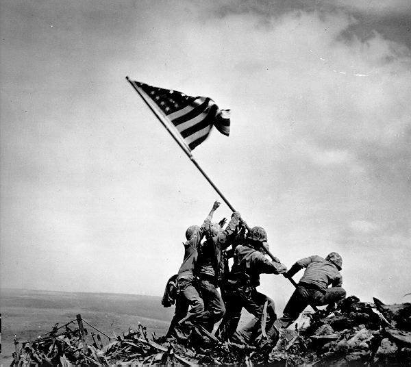
Joe Rosenthal, Raising the Flag on Iwo Jima, February 23, 1945
A photograph is a certain delivery of facts?
Jeff Wall, Mimic, 1982
Claims of truth that most people take for granted?
Tom Hunter, Woman Reading a Possession Order, 1997, after Johannes Vermeer (1632-1675) A Girl Reading a Letter by an Open Window, 1647-49
You often hear a photographer saying: ‘the camera was there and recorded what I saw’.
A common phrase is to ‘shed light on a situation’ meaning to find out the truth.
‘A picture tells a 1000 words‘, is another aphorism that imply images are more reliable.
Picasso famously said: ‘We all know that art is not truth. Art is a lie that makes us realise truth.’
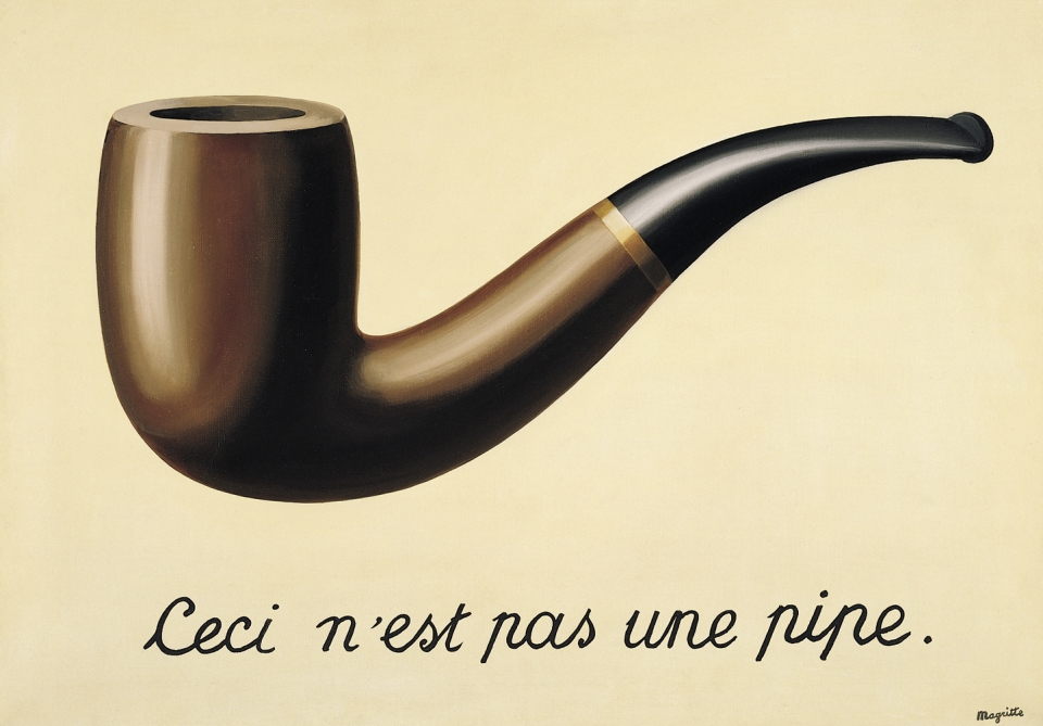
Magritte’s painting La Trahison des Images in which he painted a picture of a pipe with the words ‘Ceci n’est pas une pipe’ (This is not a pipe) goes some way towards an explanation.
Documentary photography’s central aesthetic, political and moral associations are:
depicting truth
recording life as it is
camera as a witness.
TASKS: Produce a number of blog posts that show evidence of the following
DEADLINE: Mon 3 July
1. ANALYSIS: Choose one image from case studies listed below that questions the notion of truth regarding the photographic image and its relationship with reality and explain why.
Follow this method of analysis: TECHNICAL > VISUAL > CONTEXTUAL > CONCEPTUAL. Read more here on PhotoPedagogy
2. PHOTO-ASSIGNMENT: make one image which is documenting reality and one which is staging reality. Evaluate and describe differences and similarities.
The rationale behind this task is for you to consider the nature of the photograph to be a true representation of reality. In order to complete the tasks successfully, you must read and look through supporting material and consider the bullit points too that may prompt you in your answers . It is important that you do thorough research and use direct quotes and reference from sources included below
For a contemporary perspective on documentary practice read photographer, Max Pincher’s Interview: On Speculative Documentary To read this interview you must access it online from home as it is blocked the internet filter in school.
Documentary photography is based on assumptions that the photograph represents a one-to-one correspondence with reality, which is nearly accurate and adequate, and that the photographic image is capable of conveying information objectively.
Consider these points when you analyse your image
Traditional documentary believes the viewer to be a receptive subject taking in the objective information of the world through the photograph
Can we rely on its ability to capture a moment in time accurately as historical evidence or as a witness to the world?
Postmodernism points out that all forms of representation is subjective? How? Why?
Digital photography has made manipulation much easier?
READING: Background and context of the historical, conceptual and aesthetic approaches and differences between documentary practice and tableaux photography.
David Bate (2016), Art Photography. Tate Publishing
CASE STUDY 1: In the terrorist attacks in Brussels in 2016 Fox News was reporting from the Place de la Borse. Video footage shows a young photographer posing a woman in front of a makeshift memorial: is it bad journalism ethics, or just the way it’s done?
Read the Guardian newspaper article here and make a blog post that expresses your own thoughts and views.
Following the second explosion, Kardava (the woman who took the image on her phone) fought her urge to run to a safe place. “I also wanted to take pictures. As a journalist, it was my duty to take these photos and show the world what was going on. I knew I was the only one at this spot.”
In this photo provided by Georgian Public Broadcaster and photographed by Ketevan Kardava two women wounded in Brussels Airport in Brussels, Belgium, after explosions were heard Tuesday, March 22, 2016. A developing situation left at least one person and possibly more dead in explosions that ripped through the departure hall at Brussels airport Tuesday, police said. All flights were canceled, arriving planes were being diverted and Belgium’s terror alert level was raised to maximum, officials said. (Ketevan Kardava/ Georgian Public Broadcaster via AP)
Is there a moral dilemma in photographing people injured or dying? As photojournalist should you take the image?
What is your view? How has this image become iconic of the terrorist attacks in Brussels airport?
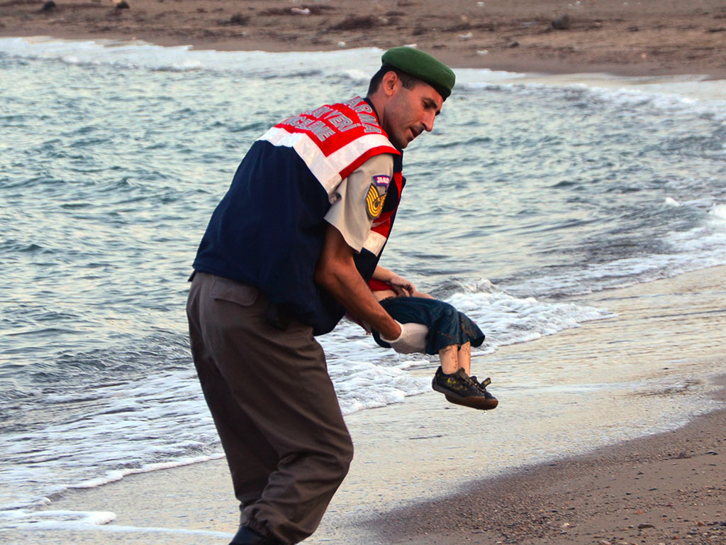
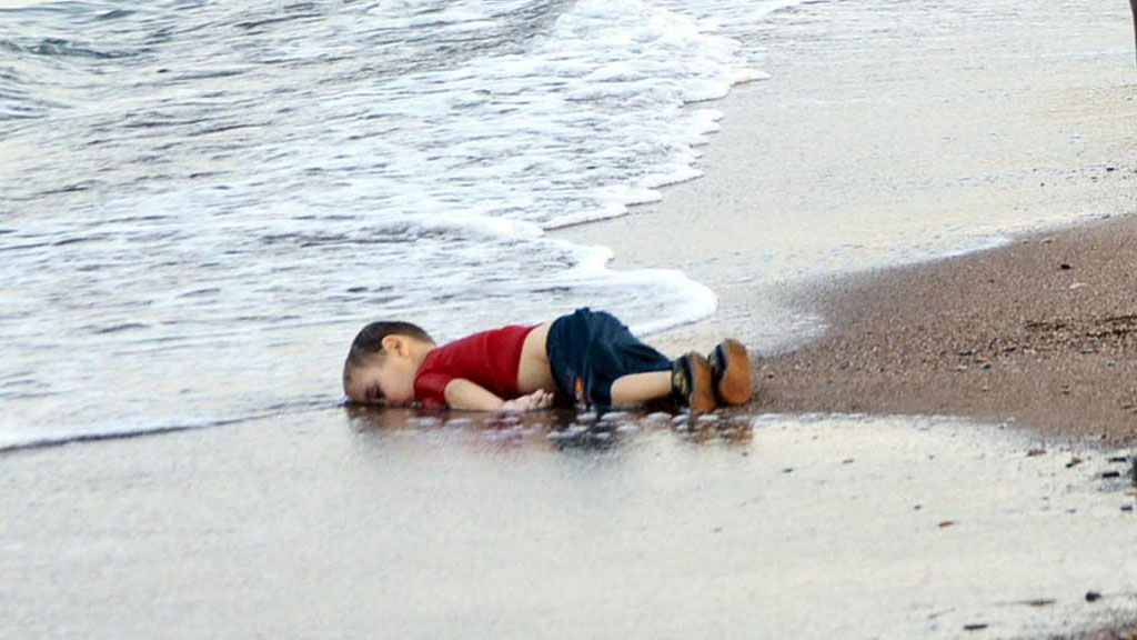
CASE STUDY 3: Using another news images as an example, such as the drowned Syrian boy (read article here), consider if photographs can change the world or change people’s perception?
Here is a link to another article about the photographer who took the photos of the dead Syrian boy where she speaks about why she took them.
For a different point of view read this blog post by photographer and lecturer, Lewis Bush where he discuss the above in light of recent images of dead Syrian refugees in Europe. Incorporate his views and include quotes, for or against your own analysis and point of view.
CASE STUDY 4: Jeff Wall, Canadian artists known for his large scale tableaux image presented in light-boxes
Today, most of his images resemble reportage and, as such, are likely to incense his detractors, who claim he’s not a “true” photographer. His most contentious new work, called Approach, shows a homeless woman standing by a makeshift cardboard shelter in which we spy the foot of what could be a sleeping vagrant. Wall tells me it was shot under an actual freeway where the homeless congregate and that “it took a month to make, working hands-on” – but he won’t divulge just how staged it is. Is this an actual homeless woman, or an actor? Is the shelter real, or was it built by Wall’s team of assistants to resemble one?
Re-creating images from memory is crucial to Wall’s practice – perhaps because it flies in the face of the tradition of photography as an act of instant witnessing.
“Something lingers in me until I have to remake it from memory to capture why it fascinates me,” he says. “Not photographing gives me imaginative freedom that is crucial to the making of art. That, in fact, is what art is about – the freedom to do what we want.”
In terms of truth or communicating an idea that make references to a real social problem such as homelessness, does it matter if the image is staged or not? Where does authenticity come into the picture?
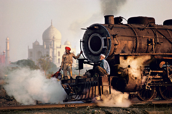
CASE STUDY 5. The images of renowned photographer Steve McCurry, who made the famous and iconic image of an Afghan girl for a front cover of National Geography has recently been criticized for making ‘too perfect pictures’ which not only are boring but reinforces a particular idea or stereotype of the exotic other.
Read this article by Teju Cole in the New York Times Magazine which compares McCurry’s representation of India with a native photographer, Raghubir Singh who worked from the late ’60s until his untimely death in 1999, traveling all over India to create a series of powerful books about his homeland.
Taj Mahal and train in Agra, 1983. Credit Steve McCurrySubhas Chandra Bose statue, Kolkata, 1987. Raghubir Singh
Reference to Coldplay’s new video also highlight the idea of cultural appropriation that harks back to Britain’s colonial rule and exploitation of the Orient.
Read this artcicle on Petapixel in In defense of Steve McCurry’s images
What is your view? Back it up with references to article read and include quotes for or against.
CASE STUDY 6:
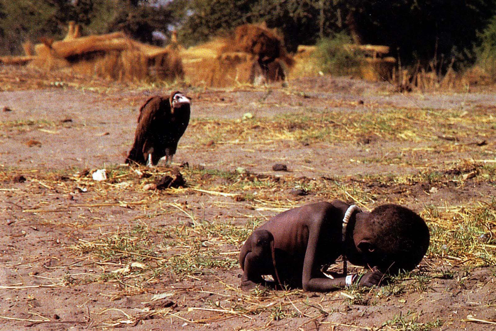
Kevin Carter and The Bang Bang Club
Starving Child and Vulture
Kevin Carter knew the stench of death. As a member of the Bang-Bang Club, a quartet of brave photographers who chronicled apartheid-era South Africa, he had seen more than his share of heartbreak. In 1993 he flew to Sudan to photograph the famine racking that land. Exhausted after a day of taking pictures in the village of Ayod, he headed out into the open bush. There he heard whimpering and came across an emaciated toddler who had collapsed on the way to a feeding center. As he took the child’s picture, a plump vulture landed nearby. Carter had reportedly been advised not to touch the victims because of disease, so instead of helping, he spent 20 minutes waiting in the hope that the stalking bird would open its wings. It did not. Carter scared the creature away and watched as the child continued toward the center. He then lit a cigarette, talked to God and wept. The New York Times ran the photo, and readers were eager to find out what happened to the child—and to criticize Carter for not coming to his subject’s aid. His image quickly became a wrenching case study in the debate over when photographers should intervene. Subsequent research seemed to reveal that the child did survive yet died 14 years later from malarial fever. Carter won a Pulitzer for his image, but the darkness of that bright day never lifted from him. In July 1994 he took his own life, writing, “I am haunted by the vivid memories of killings & corpses & anger & pain.” Read more here: http://100photos.time.com/photos/kevin-carter-starving-child-vulture
Photographer Clare Rae is an artist working in Melbourne, Australia. Her photographic practice often explores ideas of performance and gesture to interrogate and subvert dominant modes of representation. Her work is heavily influenced by femininity, and presents an alternate, and often awkward, experience of subjectivity and the female body, typically using her own.
Known for her engagement with domestic and institutional spaces, recently Rae’s work has been captured and exhibited in locations such as the Australian Centre for Contemporary Art (ACCA), the National Gallery of Victoria, Monash University, the Abbotsford Convent, Sutton Project Space and the Substation, Melbourne. In Rae’s recent projects, she has engaged with site specificity, involving works that are captured and displayed within the same environment.
Photo analysis
In this image, we can see Clare balancing herself on top of two plain rectangular boxes. I think this image is incredibly powerful and produces a message to the viewer. The message links to femininity and potentially what it’s like for women at the workplace due to the file cabernet beside her. The words fragile are littered all over the boxes potentially hinting that women have to be especially careful within the work environment, since they are not viewed the same as men, meaning that even the slightest mistake could have an explosive impact. This point also links back to Rae balancing herself on the boxes, trying not to fall.
This image also links to femininity, but shows us how women are represented in a court room, rather than the work place. In the image we can see Rae laying on the table, in front of where the judge would sit. She is below where the other members of court would be, perhaps signalling that she has no control. This connects to what its like for some women in the world, who have had their fates controlled by those in a higher power to them. The idea that can also be signified through colour green, since it is only on Rae’s skirt and the carpet on the floor. This again signifies that women are considered lower.
I might put my three images on foamboard in a strip. I like having the two darker images on the outside of the lighter one as it creates a contrast and looks good presented together.
For these A4 images I might put them on white foam board, then back that onto black card to bring out the colour and add to the darkness.
As its A3 I will either do the same for this image by mounting it onto white, then black board, or I will window mount it.