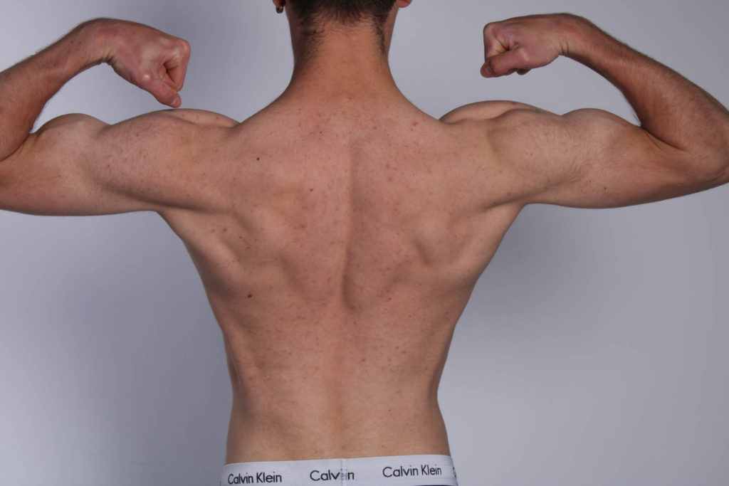


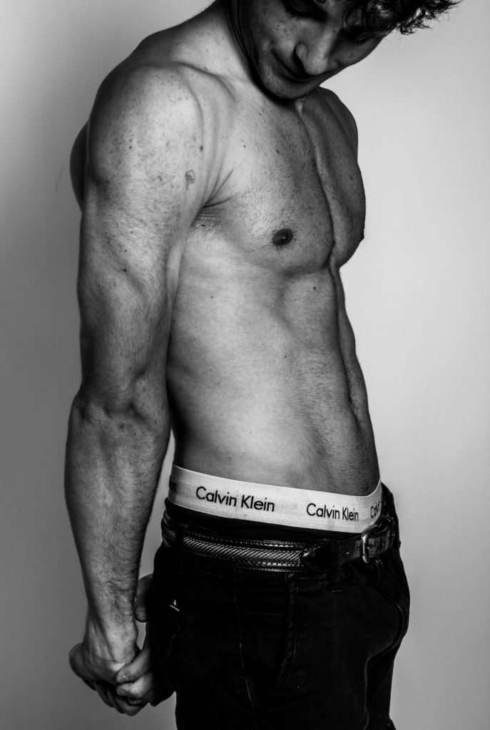

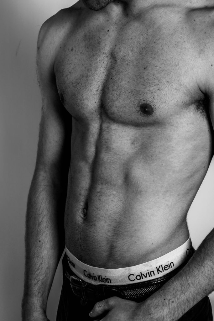
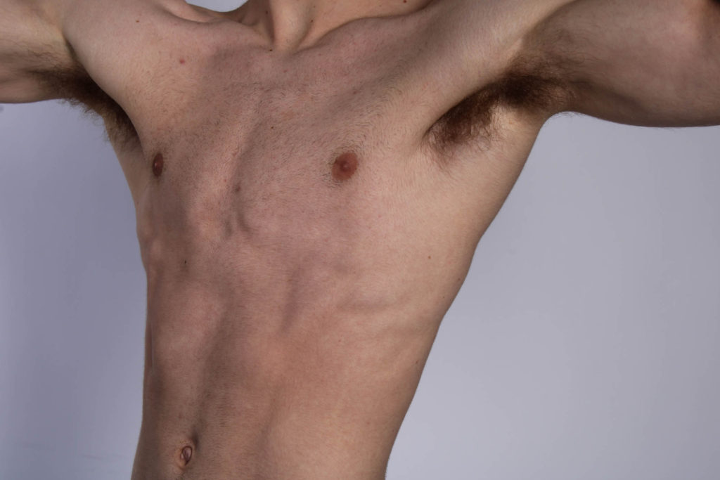
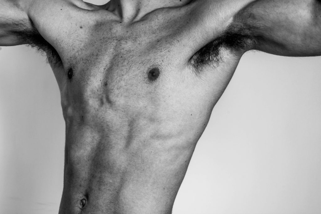


Here are the comparisons of non edited to edited versions of the images I took in the studio. (relating to masculinity).
I used a black and white punch filter on these images to create a more defined affect for the muscle parts of the body. With more shadows and a black and white affect, it shows more of an outline and tones to specific parts of the muscles and in photography terms it shows more shapes and lines in the images. I had also like the use of black and white because of Robert Mapplethorpe, and how his images where in black and white as well.
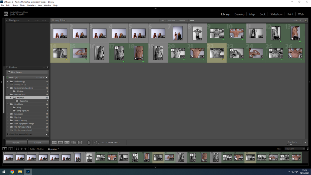
I used Lightroom Classic to edit my images but used colour selection to minimise the images I took to the ones liked best. With my best ones I used “black and white punch” which showed high contrast between the whites and blacks of the image.

Then I had my best one’s printed as a test to decide how I would compose the images.
