KURLAND INSPIRED IMAGES:
EDIT ONE:


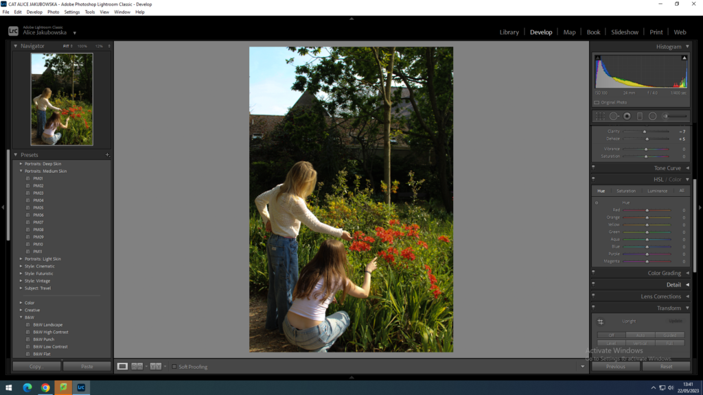
In this image I decreased the exposure so The lines would become more defined and more sharper to the eye, however due to decreasing the exposure it caused my image to get slightly darker. In order to adjust this I increased the highlights and decreased the shadows so I could have a brighter image while also having detail seen in the image. Increasing the highlights created brighter spots in the image so that when you look at the image you are able to see that they are lighter and darker areas which creates more levels. To create a brighter and colourful image I increased the colours red and green, so the image is presented more colourful and feminine instead of dull, and muted.
EDIT TWO:


The first editing to this image was minimal. Not much was changed in this image due to the lighting and the scenery being perfect in the style of Kurland, however some changes were made. For example I decreased the exposure so the trees in the background could create more depth to the image. I increased the highlights, as the clothes that the girls were wearing are light colours which would make them seem brighter.
EDIT THREE:


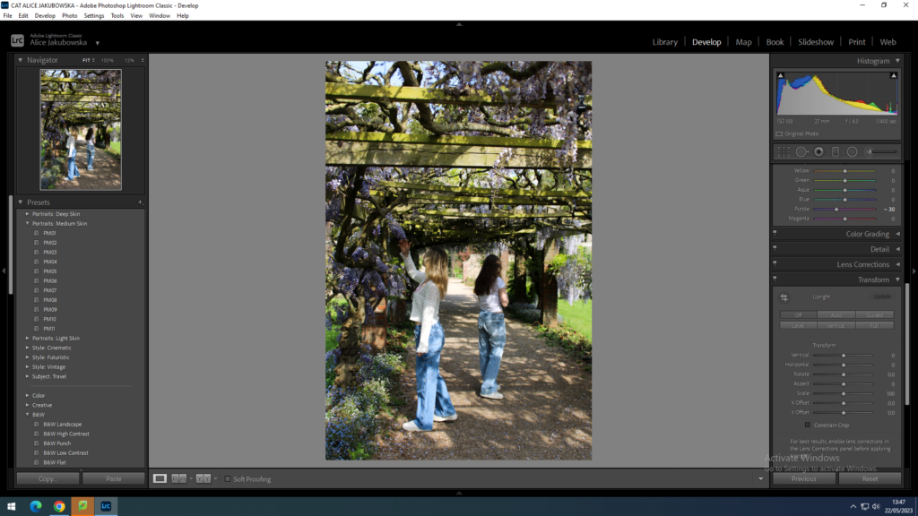
During this edit I added the filter PM04 which created a cool tone within the image. Furthermore to this I decreased the exposure to enhance the flowers that intertwine in the walk through. I increased the whites in the image to highlight the white seen in the image, in contrast I decreased the blacks and shadows so create a lighter image. Due to the bright colours seen in the image I adjusted the purple hue to enhance the colour.
EDIT FOUR:


In this image I lowered the exposure and heightened the contrast, this is so you are able to see the more defined lines in the clothing (top), and facial features. I increased the green hue considering majority of the background in green. Increasing the hue meant that the colour would appear more distinctive. I slightly decreased the highlights, and white in order to further show the fine points within the linen top.
RAE INSPIRED IMAGES:
EDIT ONE:


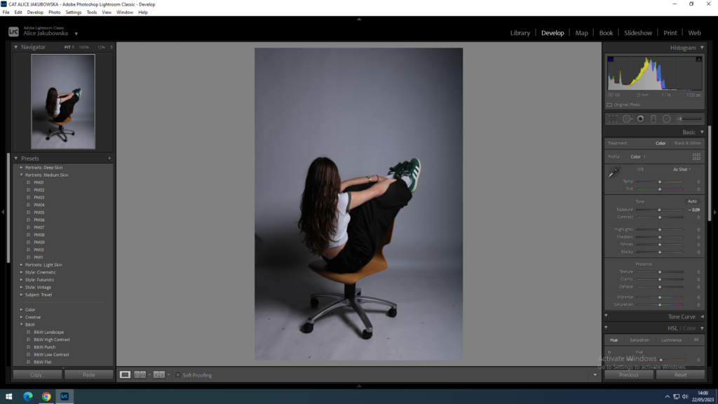
In this image I increased the exposure in order to try and bleach out the black spot in the middle, left third (rule of thirds). I decreased the highlight trying to restore some of the darkness in Phoebe hair, from the heightened exposure, also decreasing the blacks was able to return some of the colour within the clothes and hair. However as a result of trying to recover some of the darker colours in darkened the black spot. To try and minimise the black spot I added a dark vignette around the image to create the focal point of Phoebe.
EDIT TWO:


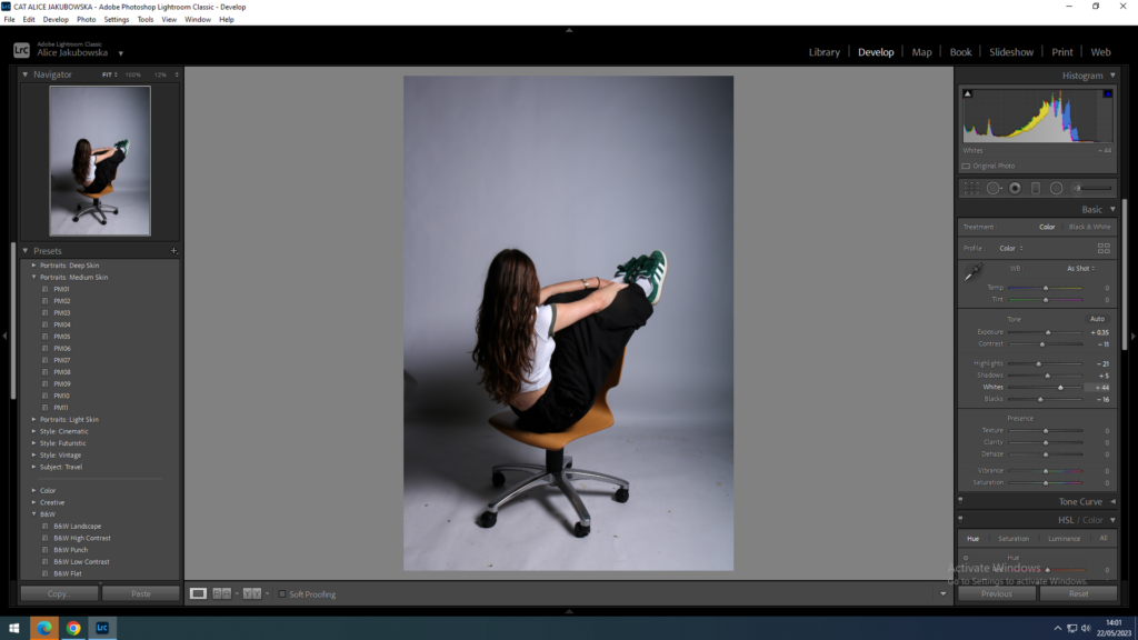
In this image I elevated the exposure to lighten the image from its dark tone. This was able to bring some life into the image however even by elevating the exposure and reducing some of the darkness the spot in the image was still very visible. In order to try and minimalize the dark spot I increased the blacks and shadows to try and bleach out the black in the image. In order to try and make the images in a similar style I also added a dark vignette, while also trying to minimalize the black edge in the image.
EDIT THREE:


Overall in these Rae inspired images I could have improved the lighting in the studio. Due to the shadow in the left corner it has caused the editing process difficult and has created this series of images less valued then what it could have been. Even thought during the editing process of this I have tried to improve the quality and bleach out the shadow it has not necessarily worked. However this dark vignette has significantly improved these images.
