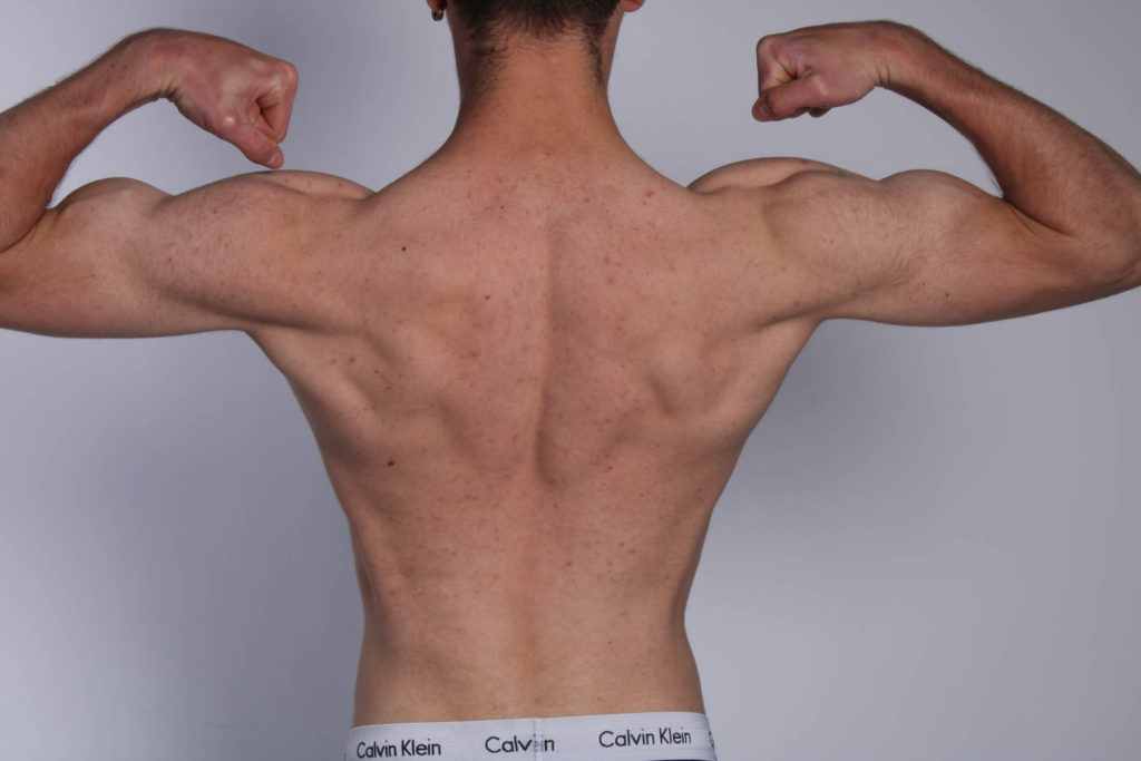
I have decided to put these two portraits together as they are both outcomes from my photoshoot where I explored lighting techniques. These show evidence of Rembrandt lighting and I had edited them both in black and white. I did this to make them appear more dramatic and to emphasise the Rembrandt elements in the lighting. I will be printing them both in A4.
Environmental portraiture
I have selected these portraits from an environmental portraiture photoshoot I did of my friend in their house. I think these reflect their interests and personality as well as being some of my strongest photographs from the project. I will be mounting these as two A5 portraits on either size of the landscape A4.
Identity
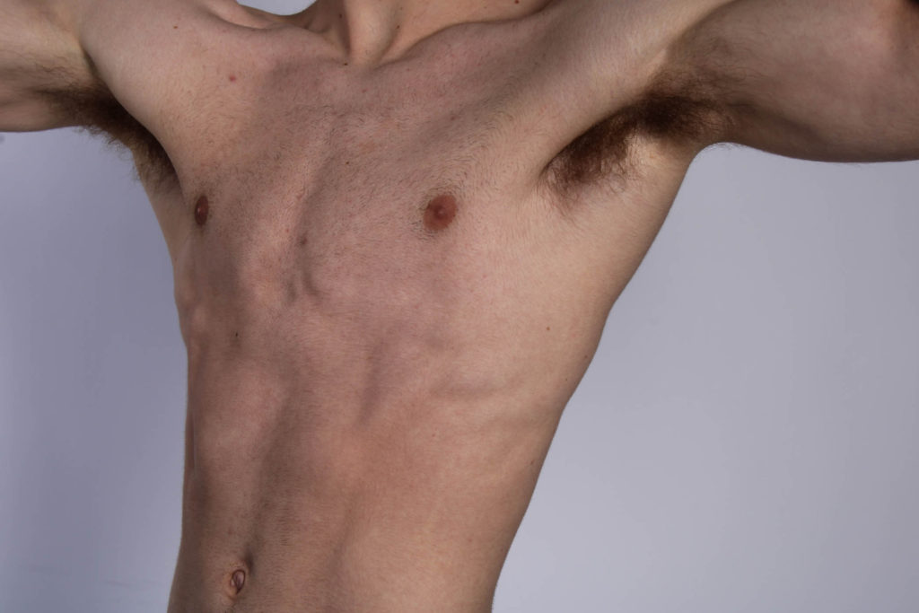
These are photographs from a photoshoot I did for evidence of the identity project to do with the masculinity vs femininity theme. I have included a self-portrait to also link into this. I will be mounting them in a grid of A5 photographs.
Multi-exposure
I have selected this image to be printed as A3 to show evidence of my multi-exposure experimentation.
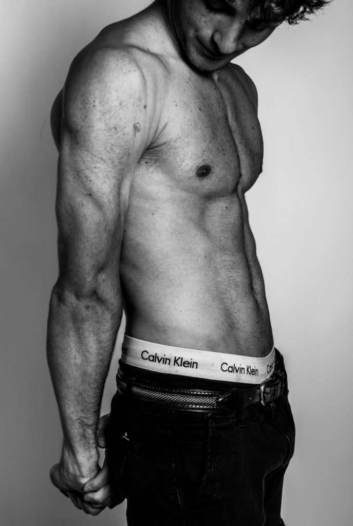
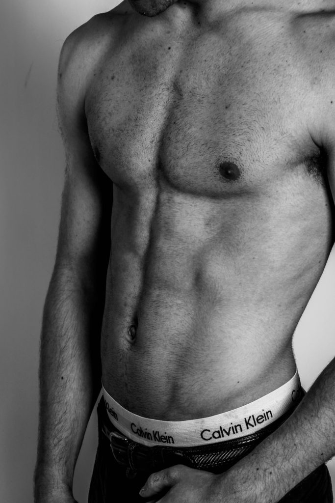
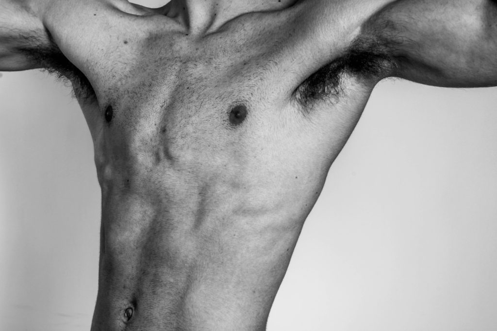
Here are the comparisons of non edited to edited versions of the images I took in the studio. (relating to masculinity).
I used a black and white punch filter on these images to create a more defined affect for the muscle parts of the body. With more shadows and a black and white affect, it shows more of an outline and tones to specific parts of the muscles and in photography terms it shows more shapes and lines in the images. I had also like the use of black and white because of Robert Mapplethorpe, and how his images where in black and white as well.
I used Lightroom Classic to edit my images but used colour selection to minimise the images I took to the ones liked best. With my best ones I used “black and white punch” which showed high contrast between the whites and blacks of the image.
Then I had my best one’s printed as a test to decide how I would compose the images.
I attempted to create a distinct contrast between the whites and blacks in these edits. I did this by upping the exposure and highlights and lowering the blacks and shadows. I also added vignette and dehaze.
I struggled to create a strong focus on my subject in these images as there is distraction from the shadows.
These photos were easier to edit as the background was less complicated, so she was more defined.
I really like the backdrop from the sun in these photos. I specifically used it to light up her hair and create this effect.
Claude Cahun, or also known as Lucy Schwob, was born October 25, 1894, in Nantes, France. She died December 8, 1954, in St. Helier, Jersey. Cahun was a French writer, photographer, Surrealist, and performance artist who was largely written out of art history until the late 1980s due to her being an activist during the second world war.
It is thought that Cahun took her first self-portrait at around 1913, a year later publishing her first collaboration with Malherbe under the pseudonyms Claude Corlis and Marcel Moore (the name Malherbe assumed permanently). They contributed a piece titled “Vues et visions” (“Views and Visions”) to the literary journal Mercure de France, the writing by Cahun and the illustration by Moore. Although she had tried out other names, by 1917 she had adopted the pen name Claude Cahun. Moore’s mother and Cahun’s father married in 1917, and the two young women moved in together later becoming lovers.
She is known for her self-portraits that portray her as ambiguously gendered. In taking the gender-neutral forename Claude and by shaving her head, Cahun actively and outwardly rejected social constructions of gender and sexual identity. To Cahun, identity was changeable, or unstable as shown in her self-portraits as she presented herself as a man, a woman and majority of the time androgynously. By fusing several gender stereotypes into a single character, she obfuscated her identity. It is not entirely clear whether Moore was the photographer of Cahun’s “self-portraits” or had some other role in their production. Moore did, in fact, photograph Cahun later on, and those pictures are attributed to her.
photo analysis
This picture showcases Cahun in a wrestlers outfit while holding a weight in her lap, signifying the masculine aspects to the image. The more feminine parts to this image are the hearts on her face and tights as well as the position she’s sitting in. The words on her shirt, ‘don’t kiss me I’m training’, also hint more towards femininity. The whole photograph seems to combine stereotypical aspects of both genders, resulting in a meaningful outcome.
This image leans more towards the concept of masculinity due to the stance she’s taken as well as the suits. Typically, during Cahun’s time suits were often only worn by men thus resulting in a more boxy appearance. The image as a whole is quite powerful, mainly due to the confident stance Cahun takes.
In this image I decreased the exposure so The lines would become more defined and more sharper to the eye, however due to decreasing the exposure it caused my image to get slightly darker. In order to adjust this I increased the highlights and decreased the shadows so I could have a brighter image while also having detail seen in the image. Increasing the highlights created brighter spots in the image so that when you look at the image you are able to see that they are lighter and darker areas which creates more levels. To create a brighter and colourful image I increased the colours red and green, so the image is presented more colourful and feminine instead of dull, and muted.
EDIT TWO:
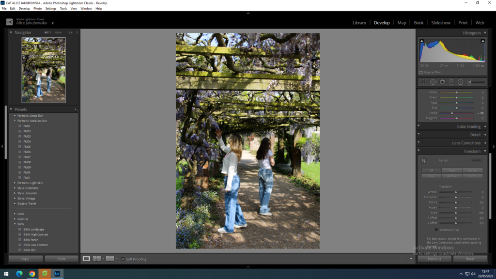
The first editing to this image was minimal. Not much was changed in this image due to the lighting and the scenery being perfect in the style of Kurland, however some changes were made. For example I decreased the exposure so the trees in the background could create more depth to the image. I increased the highlights, as the clothes that the girls were wearing are light colours which would make them seem brighter.
EDIT THREE:
During this edit I added the filter PM04 which created a cool tone within the image. Furthermore to this I decreased the exposure to enhance the flowers that intertwine in the walk through. I increased the whites in the image to highlight the white seen in the image, in contrast I decreased the blacks and shadows so create a lighter image. Due to the bright colours seen in the image I adjusted the purple hue to enhance the colour.
EDIT FOUR:
In this image I lowered the exposure and heightened the contrast, this is so you are able to see the more defined lines in the clothing (top), and facial features. I increased the green hue considering majority of the background in green. Increasing the hue meant that the colour would appear more distinctive. I slightly decreased the highlights, and white in order to further show the fine points within the linen top.
RAE INSPIRED IMAGES:
EDIT ONE:
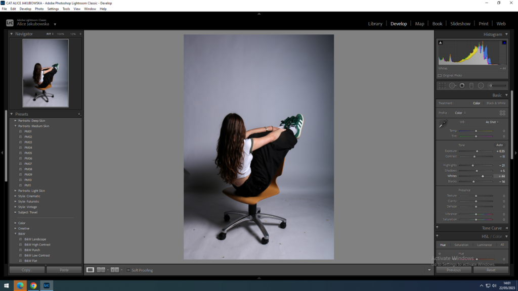
In this image I increased the exposure in order to try and bleach out the black spot in the middle, left third (rule of thirds). I decreased the highlight trying to restore some of the darkness in Phoebe hair, from the heightened exposure, also decreasing the blacks was able to return some of the colour within the clothes and hair. However as a result of trying to recover some of the darker colours in darkened the black spot. To try and minimise the black spot I added a dark vignette around the image to create the focal point of Phoebe.
EDIT TWO:
In this image I elevated the exposure to lighten the image from its dark tone. This was able to bring some life into the image however even by elevating the exposure and reducing some of the darkness the spot in the image was still very visible. In order to try and minimalize the dark spot I increased the blacks and shadows to try and bleach out the black in the image. In order to try and make the images in a similar style I also added a dark vignette, while also trying to minimalize the black edge in the image.
EDIT THREE:
Overall in these Rae inspired images I could have improved the lighting in the studio. Due to the shadow in the left corner it has caused the editing process difficult and has created this series of images less valued then what it could have been. Even thought during the editing process of this I have tried to improve the quality and bleach out the shadow it has not necessarily worked. However this dark vignette has significantly improved these images.
This is roughly how i want to present my photos when i get them printed and frame them i have made this collage by using photoshop and arranging them into how i would like to present them, i have done this so i can visually see how it is going to look before i finalise it and i am able to experiment different ways and see what looks the best.
these images are meant to portray the stereotype of men and boys not being effected by negativity and that we are expected to just overlook anything negative and not show emotion.
The first images shows the model with his head in his hands and seems worried or affected by something and as the images go on you can see his body language changes to show that he is not meant to show emotion by hiding his feelings with a smile and the third shows him trying to be un aware of any feeling he may want to display.
For this shoot I used my friend to try and capture images of the average masculine stereotype,
masculine stereotypes can be very harmful to men. Society often expects men to be strong, tough, and unemotional. This can lead to men feeling like they can’t express their emotions or seek help when they need it. It can also lead to men feeling like they need to be aggressive or violent in order to be seen as “manly.” These stereotypes can also be harmful to women, as they can lead to men feeling like they need to dominate or control women in order to be seen as “manly.”
It’s important to recognize that everyone is different, and there’s no one “right” way to be a man. Men should be allowed to express their emotions and seek help when they need it, just like anyone else. It’s also important to recognize that masculinity can mean different things to different people, and that’s okay.
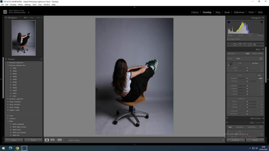
Clare Rae is a photographer which explores feminism through women’s bodies. In her photography she represents women how society views them, and creates art through shapes and shadows that are created.
‘In her photographic practice Clare explores ideas of performance and gesture to interrogate and subvert dominant modes of representation. Her work is informed by feminist theory, and presents an alternate and often awkward experience of subjectivity and the female body, usually the artists’ own.’
Rae uses the female body to create messages and art through the way these women present themselves. In this image the women is seen in the centre third, the rule of thirds is defined as a composition guideline that places your subject in the left or right third of an image, leaving the other two thirds more open, however is also slightly leaning to the right due to her balancing on the chair.
Emotional Response:
This image is a creative way to explore the views of femininity and uses all the objects in the frame in order to creates this distorted images. In this image you are able to see a woman is a slightly distorted position, yet she still looks delicate and careful, which reinforces the female stereotype that women are weaker then men.
Visual – what we can see in the image
This image shows that women can be careless and reckless, this is connoted by the threatening position on the chair and how se is using the wall to help balance herself and avoid injury. The natural lighting is shining on the women through the window, which gives a direct light onto her which makes her the focal point of the image, furthermore the dark colours contrast against the white background which lead your eyes through the stance of her body.
Contextual – who, when, where etc…the story, background, impact:
Climbing the Walls and Other Actions is a photographic series primarily concerned with visually representing my experience of femininity, whilst also exploring aspects of representation that relate to feminism. This project by Rae was a way to explore the relationship between body and space and how to use every element within the photograph she is taking. She promotes and takes awkward pictures, in order to create discomfort to obstruct the traditional view of feminisms; this could be a connotation in which how Rae feels about the dominant ideology of feminism and expresses this through her photography.
According to Butler, gender is by no means tied to material bodily facts but is solely and completely a social construction. Judith Butler is an American philosopher and gender studies writer, she is also the author of Gender Trouble.
‘Butler critiques the notion that gender – whatever it is – is stored within the body as if it were something akin to the soul’. Rae supports this idea by showing women defying their stereotypes, and showing them in dangerous and reckless positions. In her project ‘never standing on two feet’ shows that women are adventurous and can do reckless activities, and have qualities are stereotypically found in men.
‘Our genders are not stable but are constructed through repeated actions. Rituals and performative actions constantly reinforce our identities’. Rae shows this through photography that women and men should not have a definite way they should act. However due to change in gender identity, society may feel uncomfortable with this due to the fact that the certain ideas that were put in place are being replaced, and the more people defying the stereotypes the more society will feel the dominant ideology is being challenged.