Justine Kurland inspired photoshoot
My selected images:
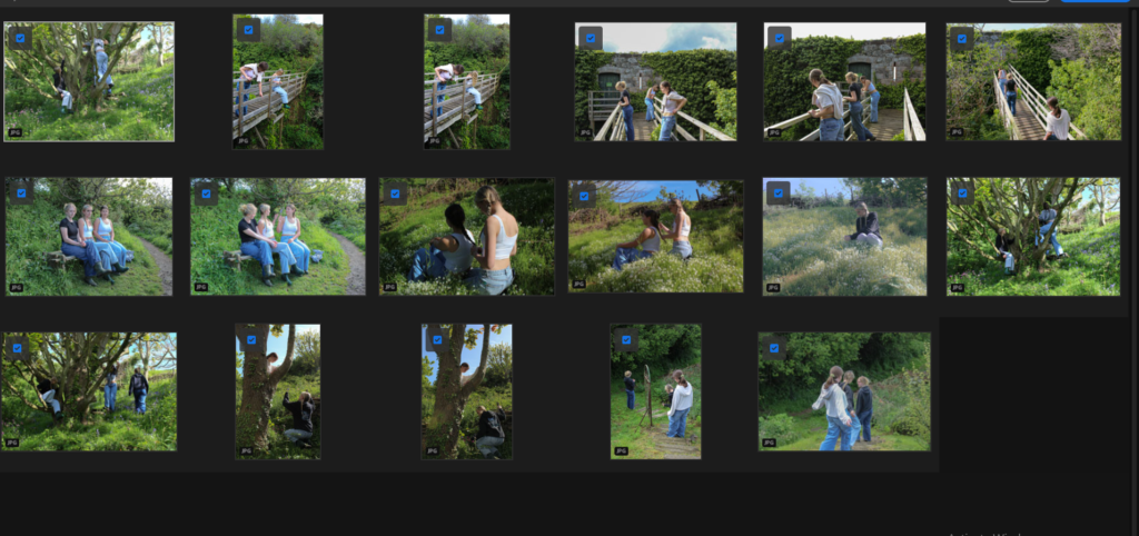
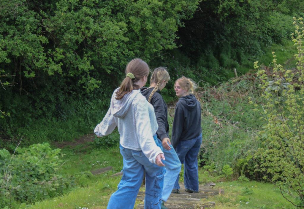
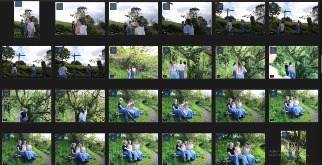
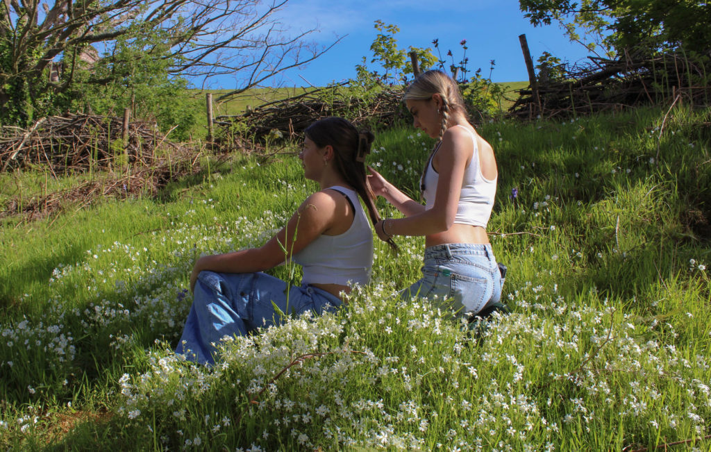
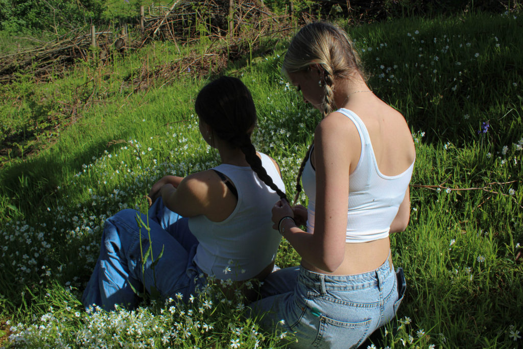
I chose this image as one of my final images as I like the composition of it. This image wasn’t staged but we are positioned well, in line, naturally.
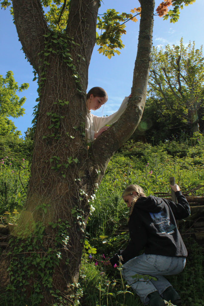
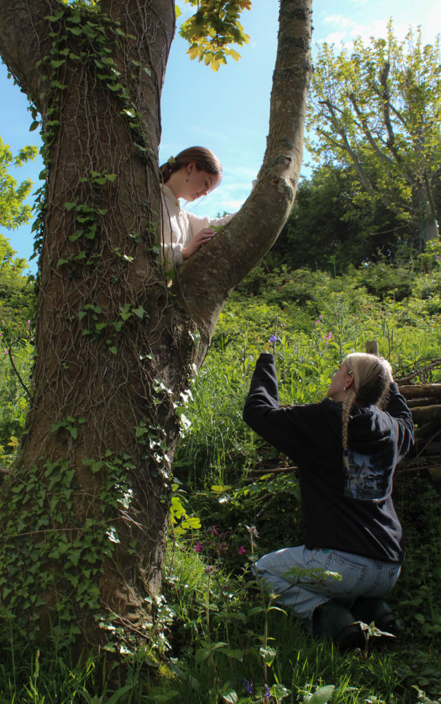
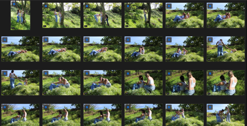
These images were staged, we thought the tree would work well as the centre of interest in this image, which it does, the tree is the first thing the viewer would see when looking at this image, fitting with our nature, countryside theme. I’m happy with this image as the outcome came out exactly what we planned and aimed for, using Justine Kurland as inspiration.
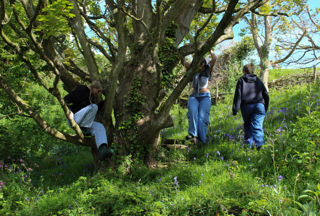
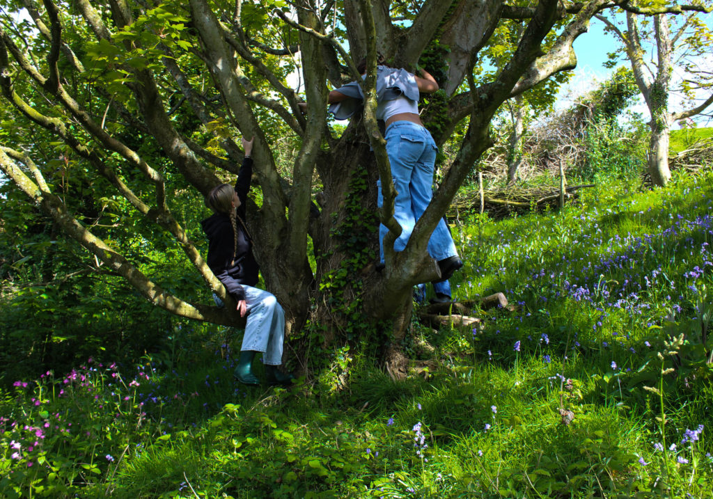
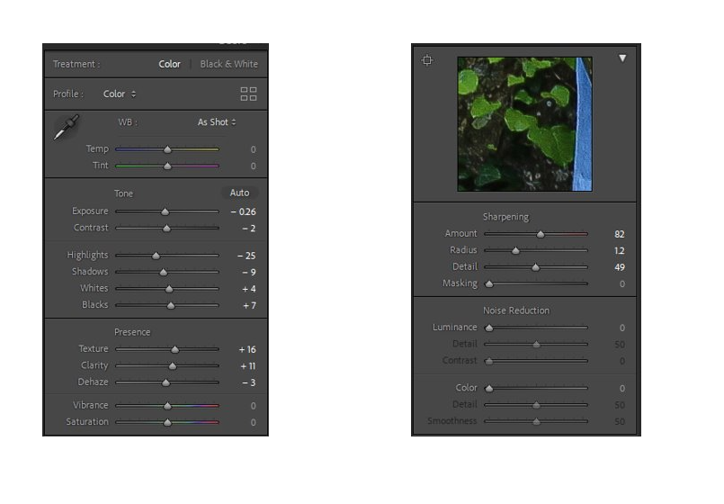
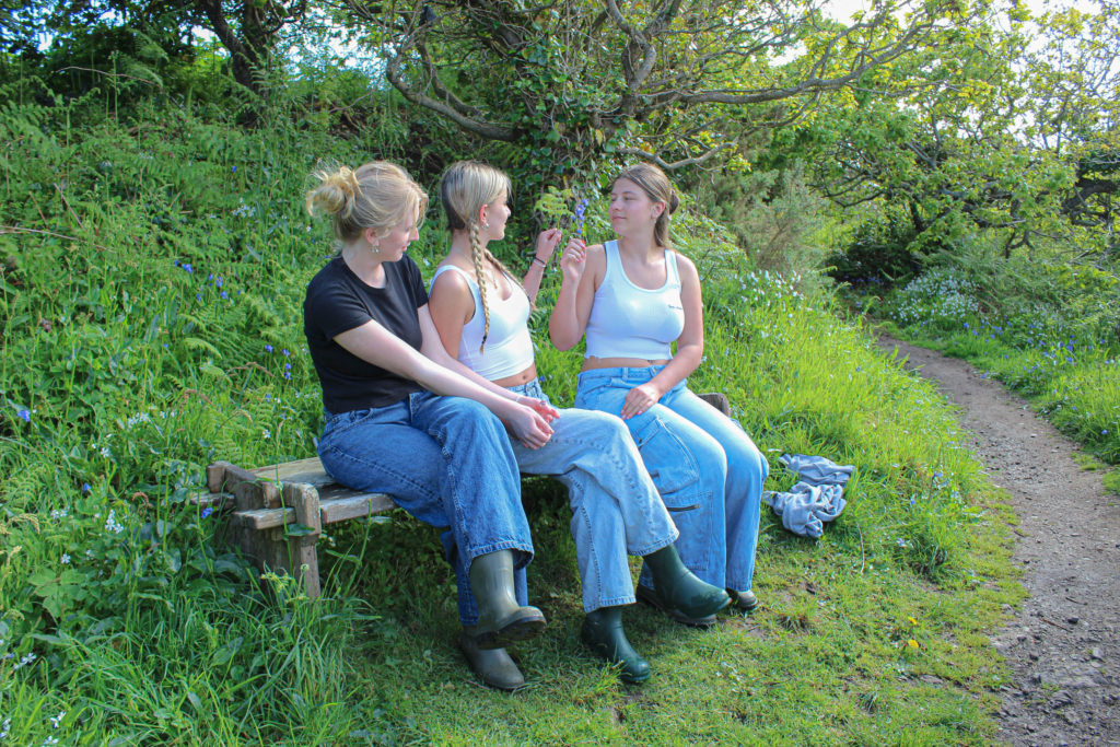
I edited these images to appear brighter and exaggerated the colours by changing the highlights, increasing the saturation and decreasing the exposure. I also tempered with the texture of the images by using the sharpening tool (shown below).
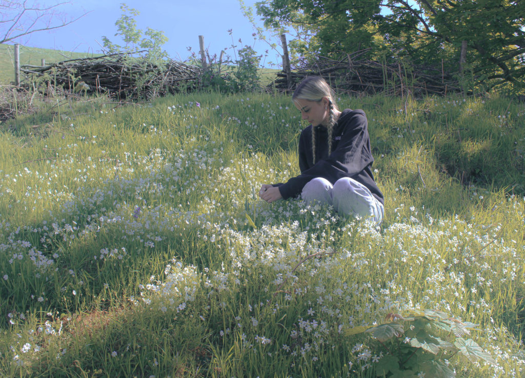
I increased the haze, decreased the highlights and made it slightly over exposed, to give the effect that it was taken on a film camera. I like this effect, i think it reflects the theme of stereotypical femininity.
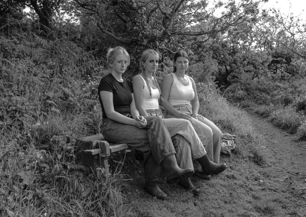
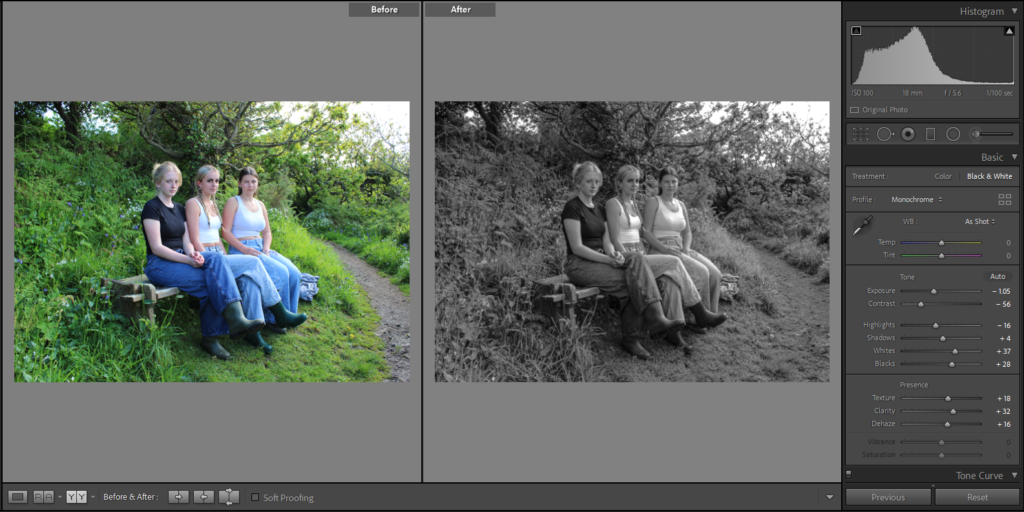
I decided to make this image black and white as if feel it makes the image stronger. There’s a lot of clutter and distractions in the image like the plants, tree and footpath; the black and white calms down the image and emphasises the focal point of the three girls. Also, the highlights of the image become more obvious ( for example, the white t-shirts) with the contrast of the shadows in the background of the image.
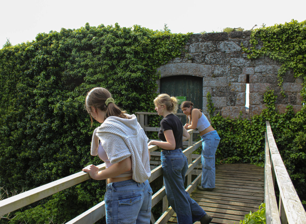
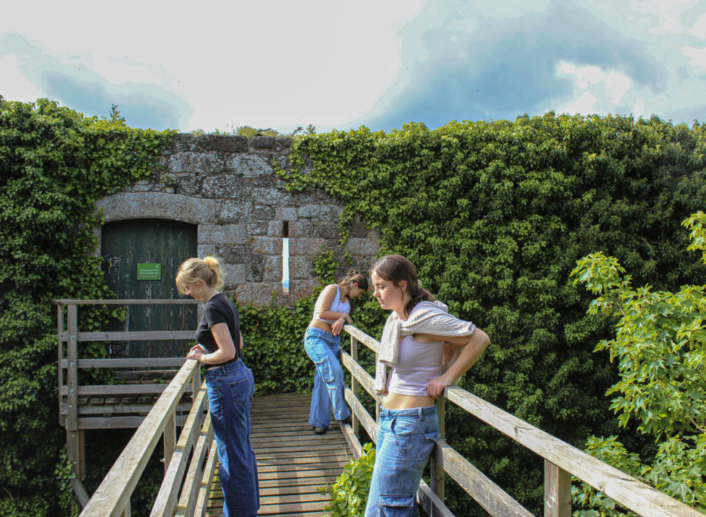
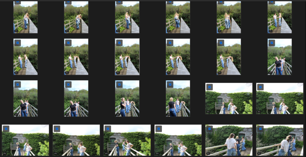
These images were half staged. I have chosen them as part of my final images as I really like the layout of them. The brick wall creates a strong background, it also demonstrates humanity taking over nature and the nature reclaiming its home. The green vines across the wall juxtapose the idea of us three girls in the foreground of the images. I like the perspective of these images, and how the fence of the bridge lead into the corners of the image.
During the process of taking these photos, we had Sian Daveys photoshoot of “Martha” in mind. Our photoshoot, these images in particular, reflect Daveys’ work as she photographs her daughter doing everyday things, especially in country side settings, our photoshoot is like this.
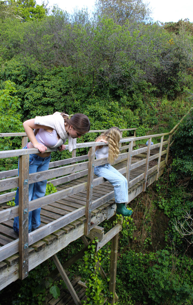
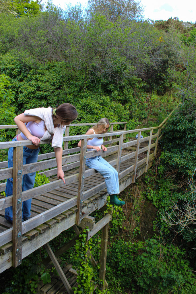
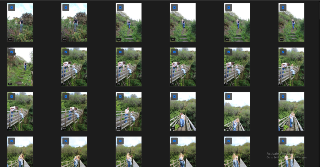
These images work well with the bridge being the centre of interest, I like the contrast of the different shades of green in the background against the beige coloured bridge. Me and anna are the focal point.
