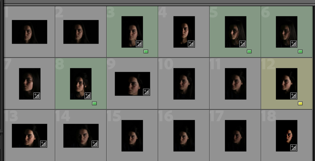
Butterfly Lighting

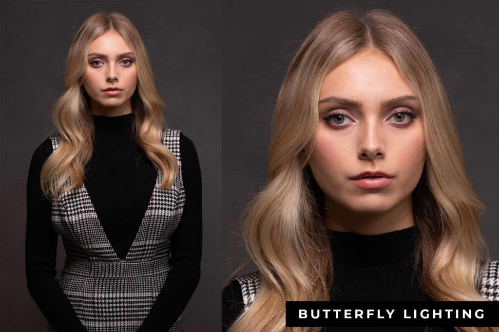
Butterfly lighting is a type of portrait lighting technique used primarily in a studio setting. Its name comes from the butterfly-shaped shadow that forms under the nose because the light comes from above the camera. You may also hear it called ‘paramount lighting’ or ‘glamour lighting’.

It forms a butterfly-shaped shadow under the subject’s nose, which is the source of the name. It is ideal for portraits as it highlights the subject’s main features, like the nose and cheekbones.

Butterfly lighting is a portrait lighting pattern where the key light is placed above and directly centered with a subject’s face. . It’s also known as ‘Paramount lighting,’ named for classic Hollywood glamour photography.

Setting Up Butterfly Lighting

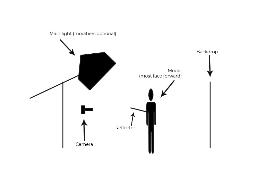
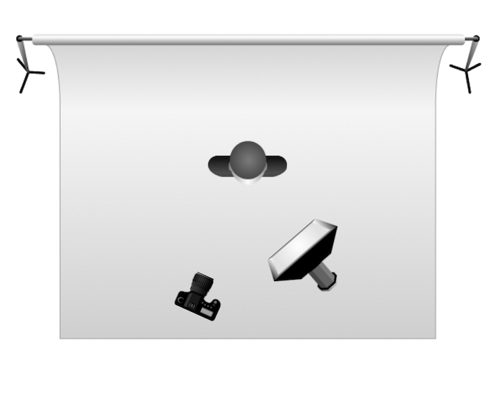
To achieve butterfly lighting, you will need a light source light source is placed directly above and slightly in front of the subject’s face, such as a studio light or natural light source. You can use a three-point lighting system, consisting of a key light, fill light, and hair light, to achieve butterfly lighting. The key light is positioned directly above and slightly in front of the subject’s face, while the fill light is placed on the opposite side to fill in any shadows. The hair light is placed behind the subject to separate them from the background.

CHIARASCURO LIGHTING

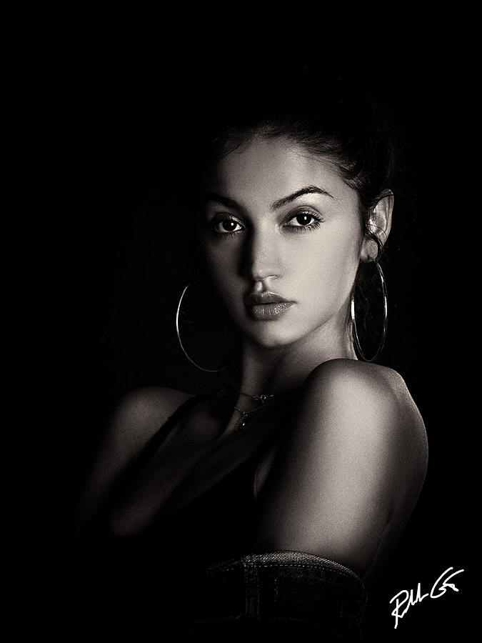
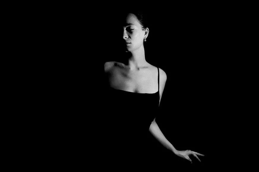
Chiaroscuro is a high-contrast lighting technique that uses a key light to achieve dark backgrounds with starkly lit subjects

A visual element in art, chiaroscuro (Italian for lightdark) is defined as a bold contrast between light and dark). A certain amount of chiaroscuro is the effect of light modelling in painting where 3-dimensional volume is suggested by highlights and shadows. It first appeared in 15th century painting in Italy and Flanders (Holland), but true chiaroscuro
developed during the 16th century, in Mannerism and in Baroque art.

Dark subjects were dramatically lighted by a shaft of light from a single constricted and often unseen source was a compositional device seen in the paintings of old masters such as Caravaggio and Rembrandt.

Chiaroscuro in Photography
Chiaroscuro lighting tutorial - use dark backdrops.

CHIARASCURO lighting

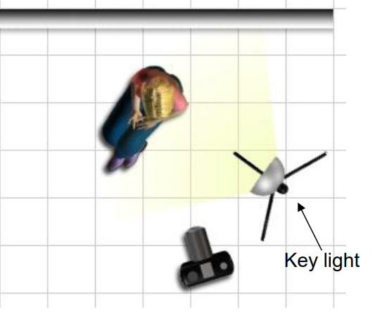
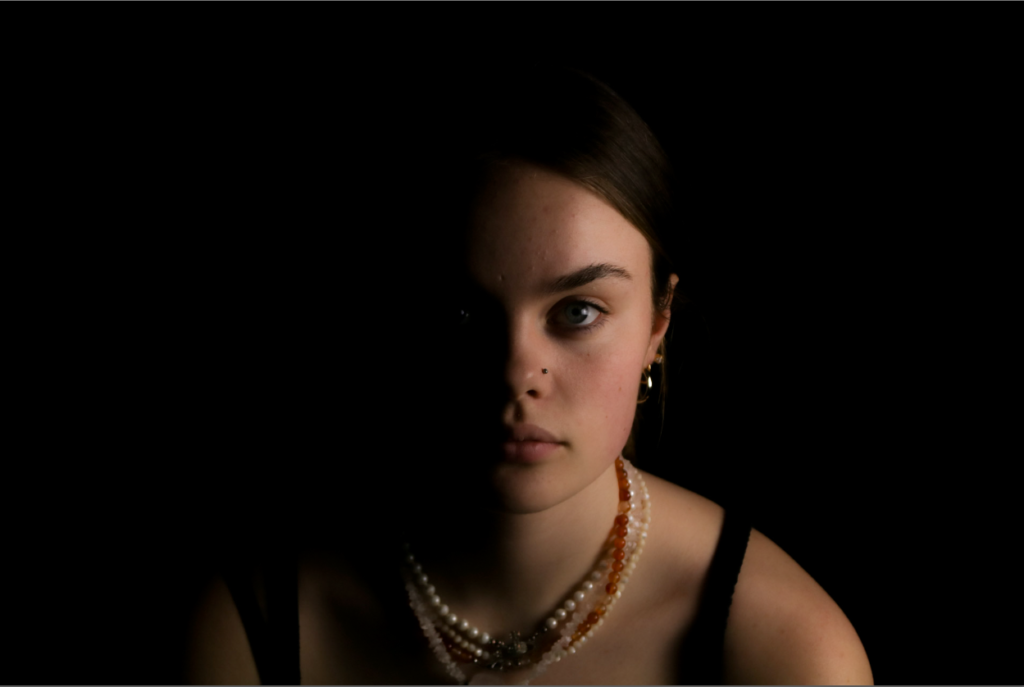
Chiaroscuro is a high-contrast lighting technique. Chiaroscuro uses a low key lighting setup, where a key light is used as the sole light source to achieve dark backgrounds with starkly lit subjects.

7 Chiaroscuro Lighting Tips

  • Spot Meter for Accurate Exposure
  • Use an Artificial Lighting Setup to Create a Chiaroscuro Effect
  • Use Available Light for a Simple Chiaroscuro Image
  • Use Multiple Light Sources to Vary Your Lighting Effects
  • Take Self-Portraits for Practice
  • Use Rembrandt Lighting to Take Striking Portraits
  • Shoot in RAW to Make the Most of Your Highlights

How will you describe chiaroscuro techniques?

This is an Italian term which literally means ‘light-dark’. In paintings the description refers to clear tonal contrasts which are often used to suggest the volume and modelling of the subjects depicted. Artists who are famed for the use of chiaroscuro include Leonardo da Vinci and Caravaggio.

Butterfly lighting

Butterfly lighting is a lighting pattern used in portrait photography where the key light is placed above and pointing down on the subject’s face. This creates a dramatic shadow under the nose and chin that looks like a butterfly.

Whys is called butterfly lighting?

Butterfly lighting is a simple lighting pattern used in portrait photography. It’s named for the shadows that’s formed underneath the nose. Not seeing the butterfly? Picture a butterfly flying toward you, wings spread out…that’s the shadows it creates!

Butterfly lighting is a technique where the light source is placed directly above and slightly in front of the subject’s face, creating a small butterfly-shaped shadow under the nose. The technique is achieved by placing a light source at a 45-degree angle to the subject, slightly above eye level. The result is a soft and flattering effect that adds depth and dimension to the subject’s face.

To achieve butterfly lighting, you will need a light source, such as a studio light or natural light source. You can use a three-point lighting system, consisting of a key light, fill light, and hair light, to achieve butterfly lighting. The key light is positioned directly above and slightly in front of the subject’s face, while the fill light is placed on the opposite side to fill in any shadows. The hair light is placed behind the subject to separate them from the background.

Butterfly lighting is a popular lighting technique that can create soft and flattering portraits. Understanding the key elements and techniques involved in achieving butterfly lighting can help you create stunning portraits that stand out. With the right equipment and techniques, you can master butterfly lighting and create portraits that capture the mood and emotion of your subject. Experiment with butterfly lighting to create soft, flattering, and memorable portraits.

Portrait lighting

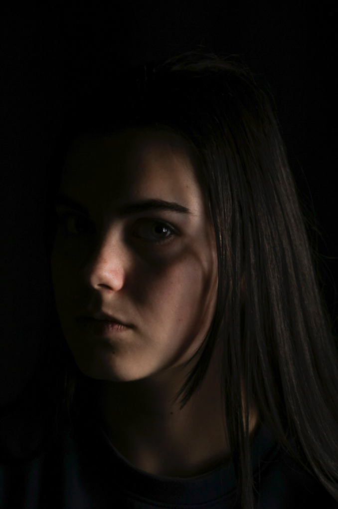
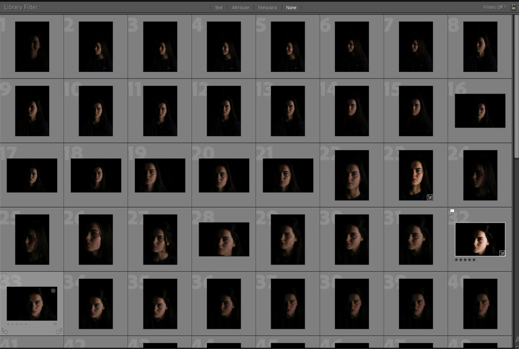
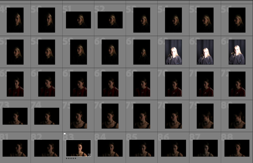
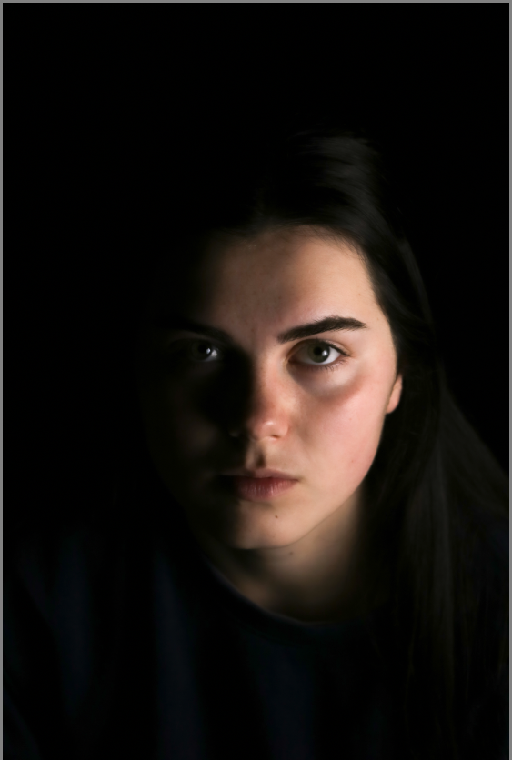
This photoshoot was taken in the studio i used one light place on the side of the models face and a black backdrop to show only one side of the face which gives an aspect of mystery and eeriness to the photographs.

Rembrandt Lighting

The lighting system we used was continuous lighting, there for the lighting was constant so we could see where the lighting was highlighting the face.

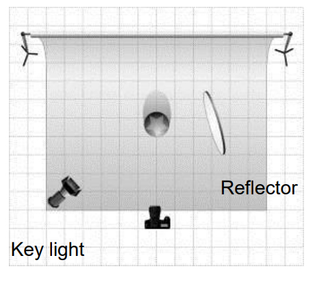
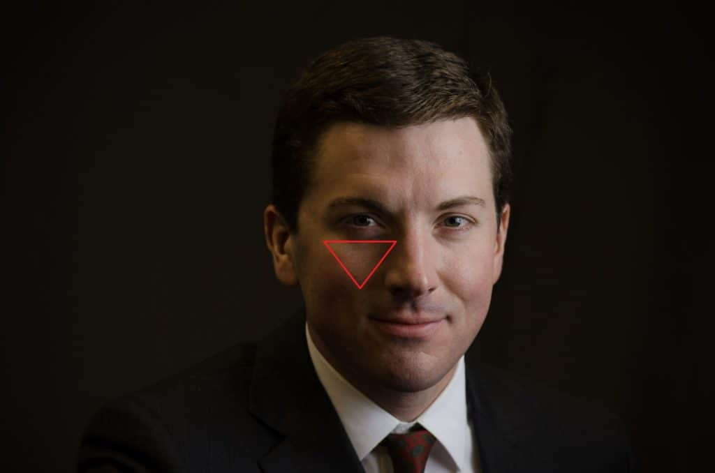
Rembrandt lightings a standard lighting technique that is used in studio portrait photography and cinematography; it is also used in contrast with butterfly lighting It can be achieved using one light and a reflector, or two lights, and is popular because it is capable of producing images which appear both natural and compelling with a minimum of equipment. Rembrandt lighting is characterized by an illuminated triangle (also called “Rembrandt patch”) under the eye of the subject on the less illuminated side of the face. It is named for the Dutch painter Rembrandt, who occasionally used this type of lighting.

By using Rembrandt lighting you instantly create shadows and contrast – and of course, the characteristic ‘triangle of light’ beneath the subject’s eye

Lighting set up
Rembrandt lighting using hard light
Rembrandt lighting using soft light

Rembrandt lighting

Rembrandt lighting is characterized by an illuminated triangle (also called “Rembrandt patch”) under the eye of the subject on the less illuminated side of the face. It is named for the Dutch painter Rembrandt, who occasionally used this type of lighting.

Rembrandt lighting takes its name after Rembrandt Harmenszoon van Rijn, a 17th-century Dutch painter who was known for using earthy tones and golden highlights to frame the faces of his portraiture subjects.

Set-up for Rembrandt lighting

What is the effect of Rembrandt lighting?

Rembrandt lighting will draw the viewer’s attention where the light triangle is from. This is because of the contrast between the dark and the light. It also adds a mysterious feel to the image. On top of this, it’s a simple setup to master.

Why use Rembrandt lighting?

Rembrandt lighting technique is considered one of the go-to photography lighting setups because it produces a dramatic visual effect without requiring a lot of setup. A more sophisticated version of this setup includes a reflector, which brings detail back into the shadows on the subject’s face, but even this setup requires minimal tools and associated costs. In this way, all renditions of the Rembrandt method are considered low-effort while producing high-impact photographs.

Chiaroscuro effect linking with Rembrandt lighting

Secondly, one of the reasons professional photographers go with Rembrandt lighting is to achieve a dramatic visual effect called the chiaroscuro effect. Favored in types of still life, street, and landscape photography, the chiaroscuro effect is one with the presence of shadows on parts of the subject matter with sharp contracts of lighting in others. For portraiture, this often means that the shape of the sitter’s face defines light, and the dark side of the face is defined in silhouette against a lighter background.

When they come together, light and dark can create tension. One of the things that make the chiaroscuro effect—and in turn, Rembrandt lighting—sought after is its ability to create an atmosphere and single out the individual and their character in a captivating way.

Response to Rembrandt lighting

studio lighting shoot

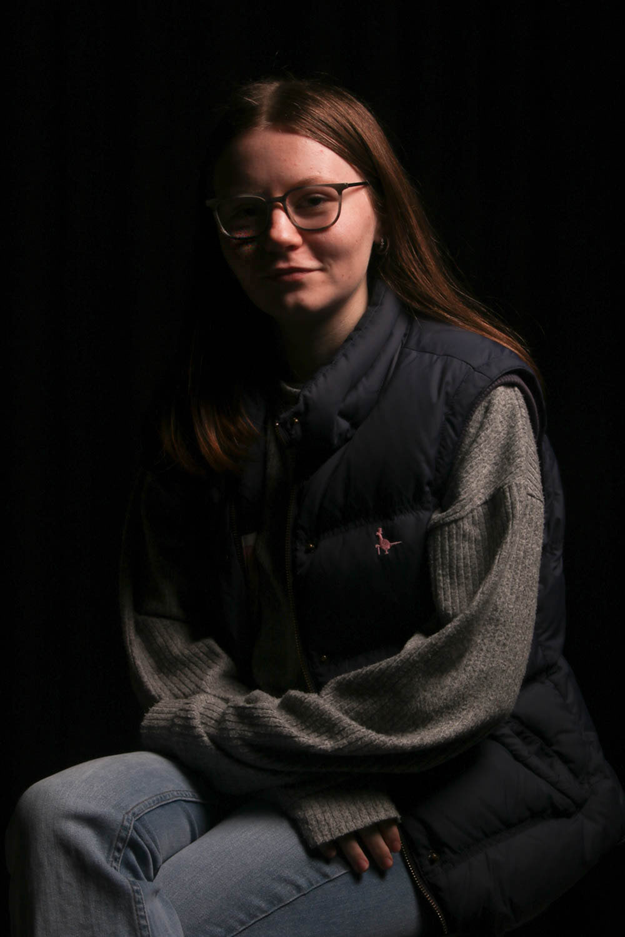
rembrandt lighting

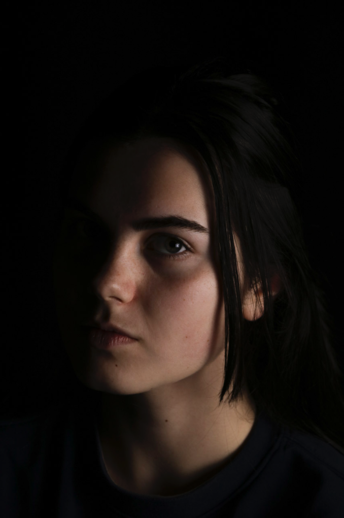
I like how this image turned out as you can slightly see the triangle underneath the models left eye, I also think that it is effective as the opposite side of her face is lit up more. If I were to take more of these images I would change the aperture to make the image brighter and less of a dark background. I also think that because my model is wearing glasses it makes it harder to achieve the triangle below her eye and make it clearly visible. Because of this I am happy that you can slightly see it, however I think that the background also doesn’t help with the triangle.

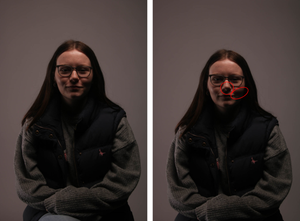
butterfly lighting

For my butterfly images I used a studio light with the diffuser box on it to spread the light. I placed the light centrally above the model to create the shadows underneath her features. I also too the image head on, sitting directly in front of her. I am happy with how these images turned out as I think that they are very effective with the shadows making her face appear slimmer and add some detail to the image. I prefer the colour of the background on these image compared to the rembrandt lighting as it is softer and make the image less dramatic.

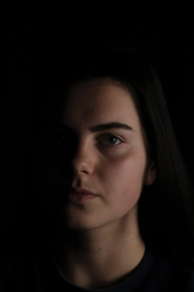
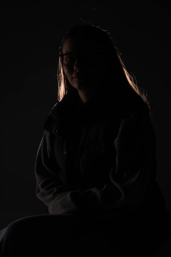
chiaroscuro lighting

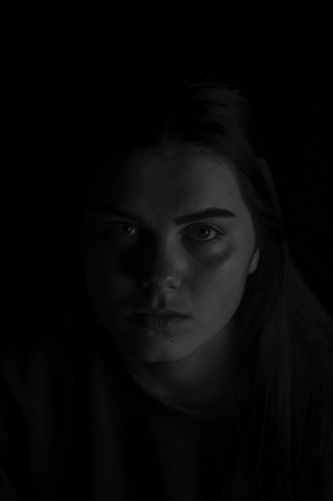
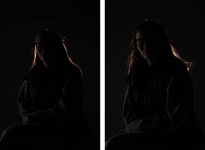
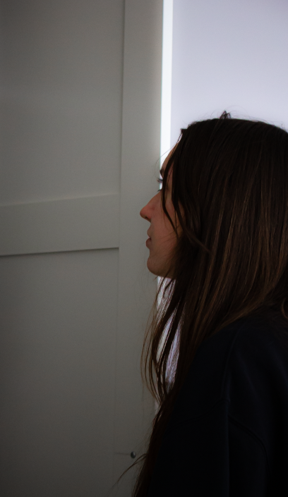
Lastly, I tried to re create Chiaroscuro lighting. To achieve this effect I used a studio light with no attachment on it and placed it behind the model so that when the flash went off it created a little highlight behind her. I like how these images turned out as they are quite eerie and dramatic how you can only see the line around her and the left side of her face slightly. I think this makes the images effective as she is almost hidden.

Environmental Edits

Edits

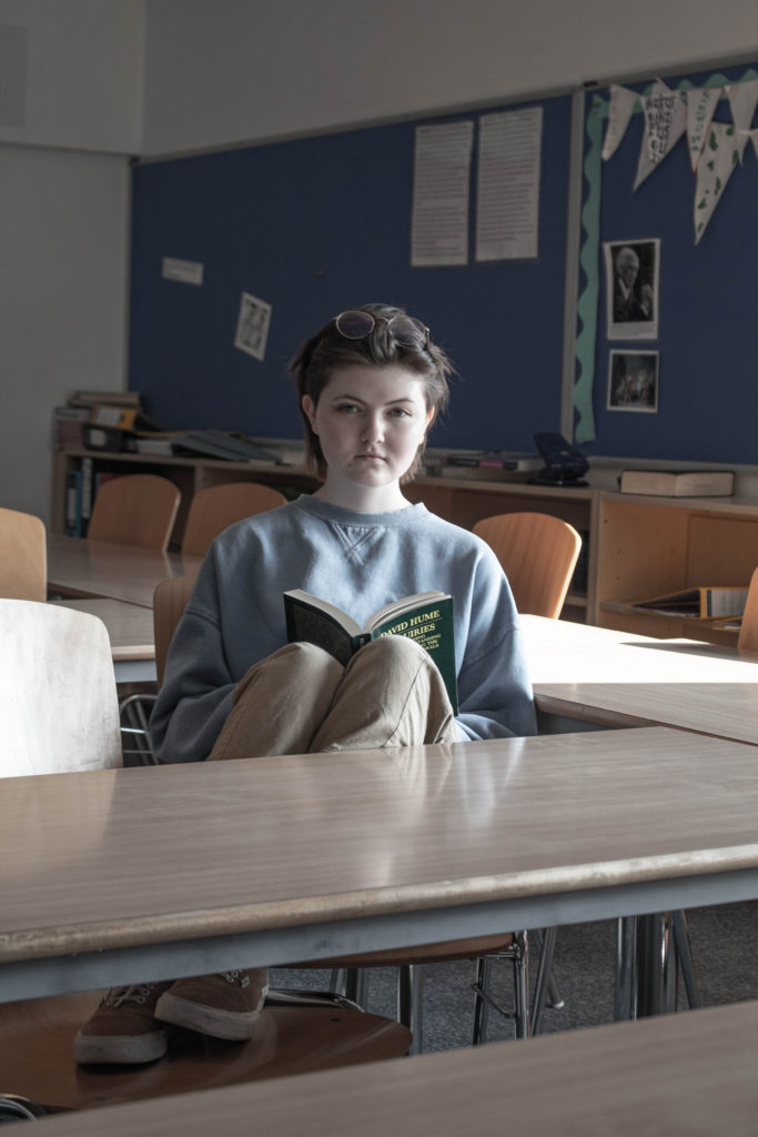
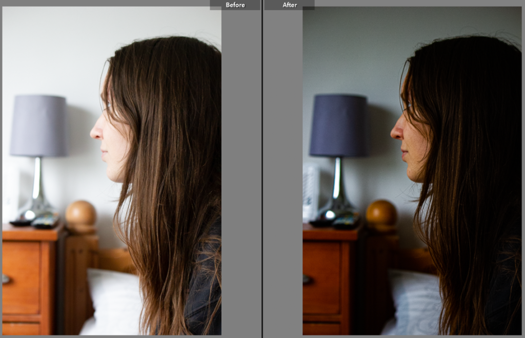
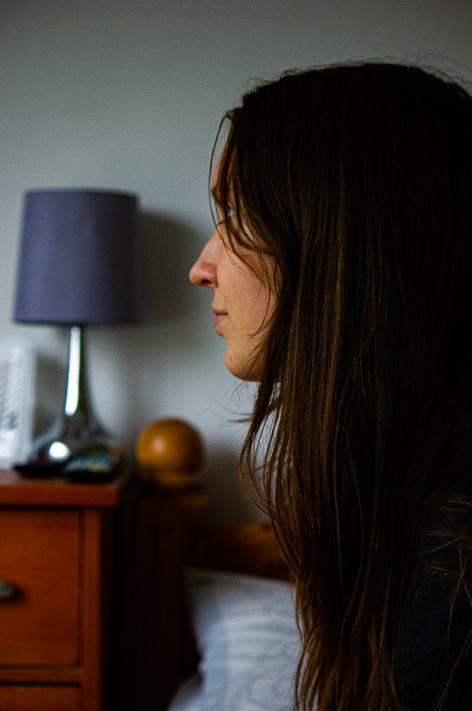
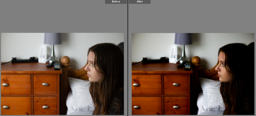
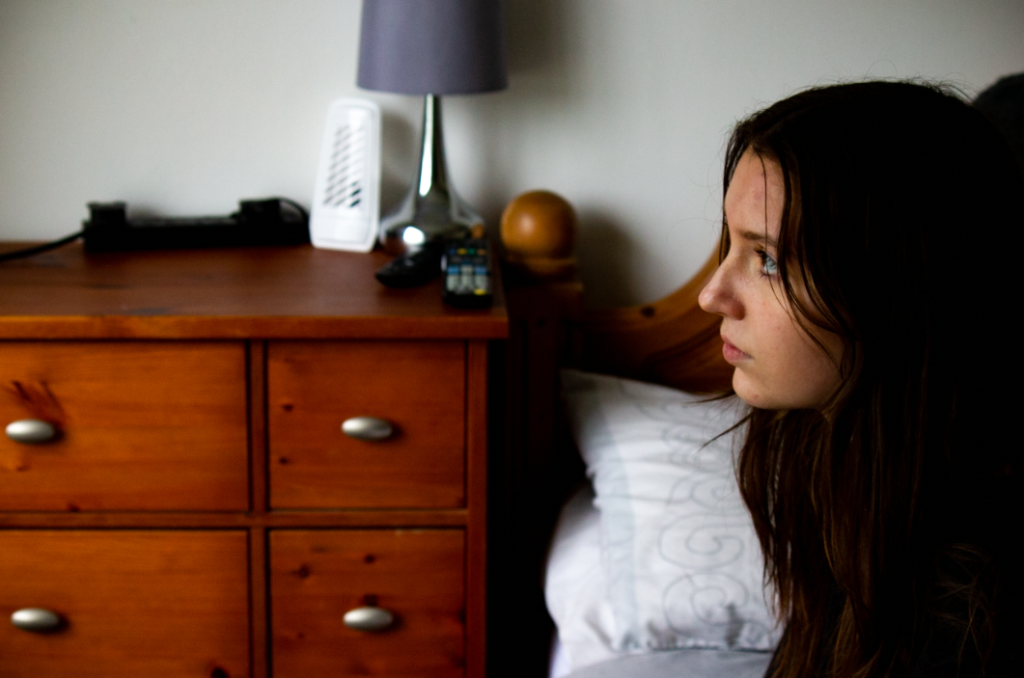
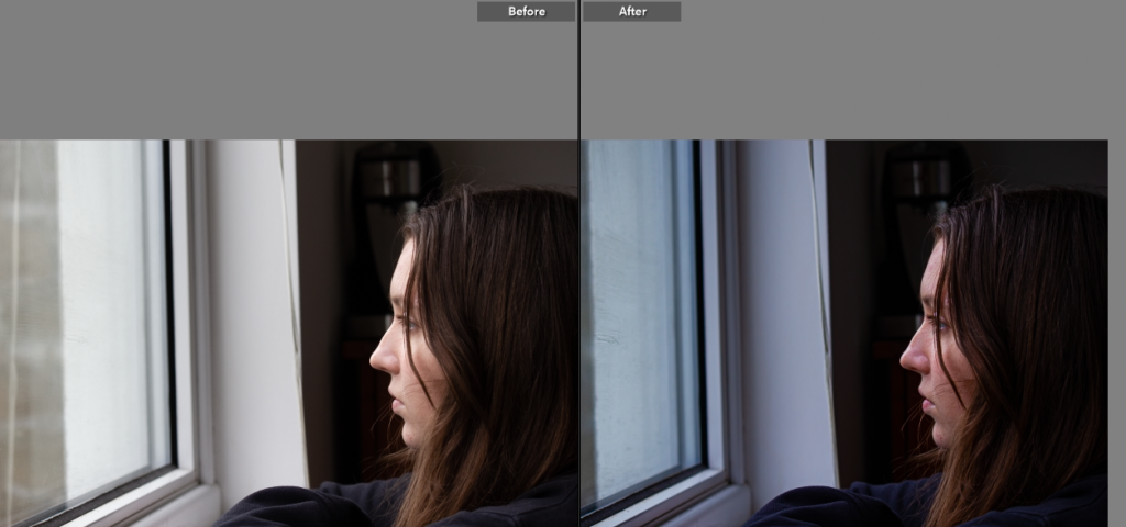
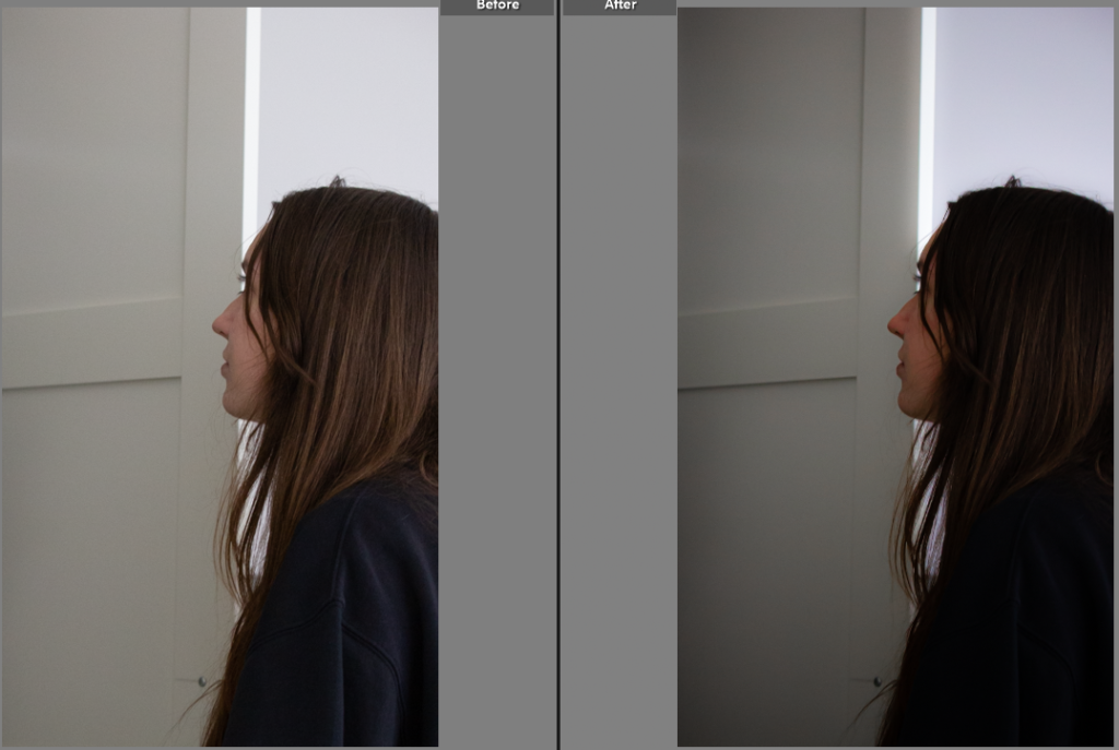
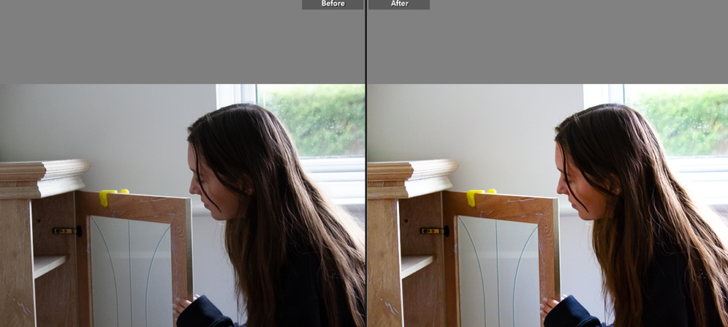
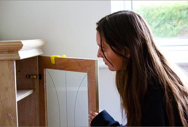
In this image, changed the exposure in order to darken the image in order to make the subject to main focus. I also increased the vibrancy and saturation to allow to photo to feel more natural. Lastly, I added vignette around the side to make the focus point the model.

In this photo, I wanted to increase the colour and texture of the image in order to make the subject appear more in focus. By increasing the saturation I was able to make the image appear more eye catching and entertaining to view.

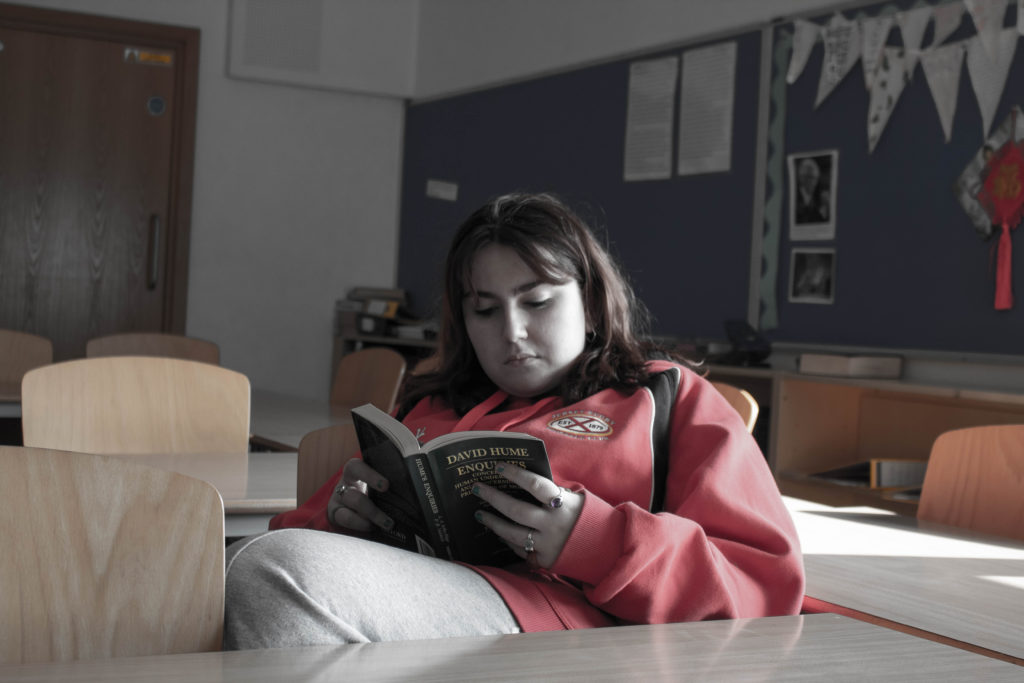
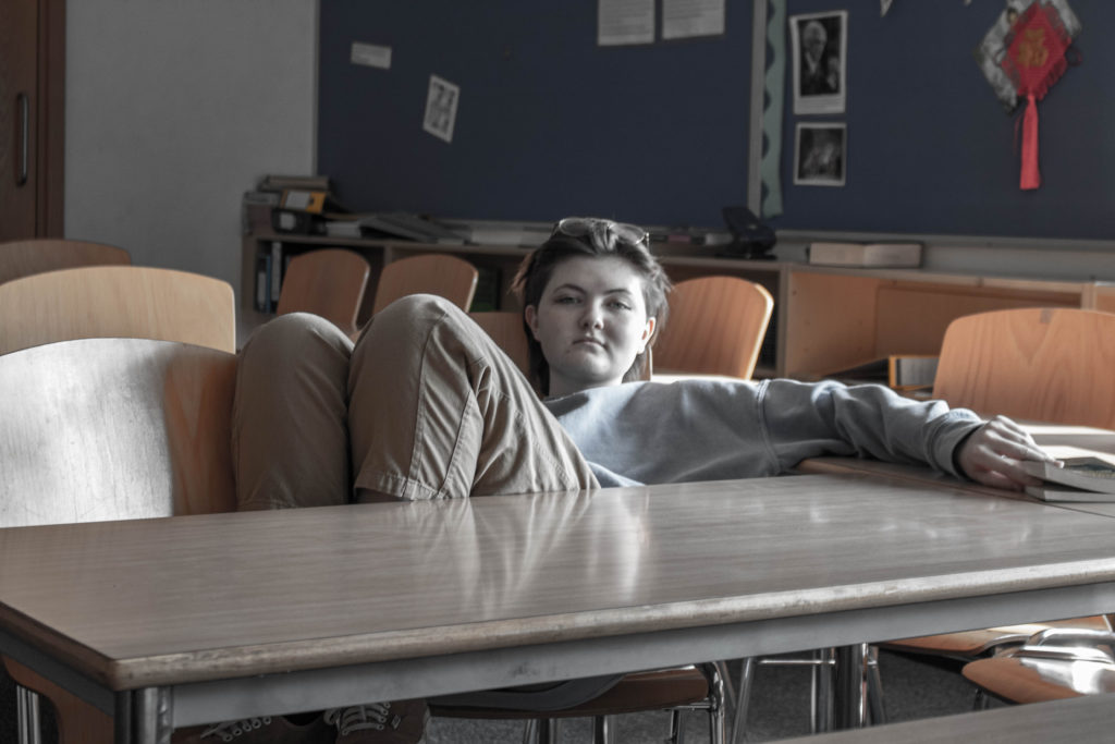
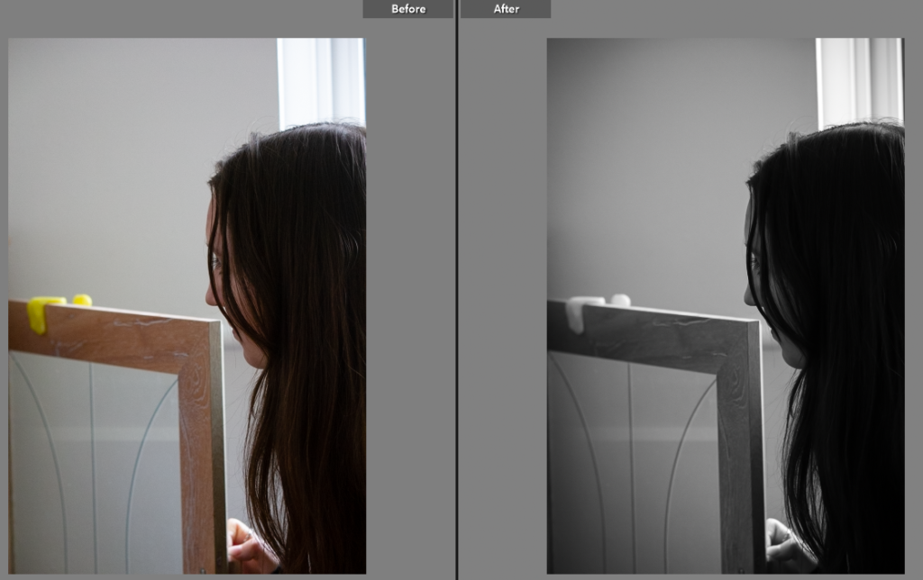
For this picture, I felt that the model was not the main focus. To change that I changed the background to black and white by lowering the saturation and then increased the brightness of the model as well as the vibrancy. This makes the model stand out more against the blank background.

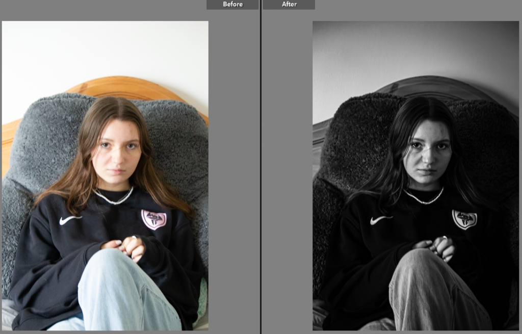
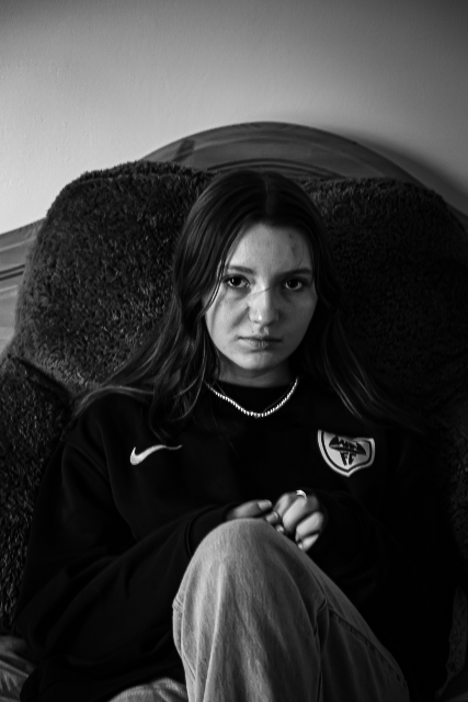
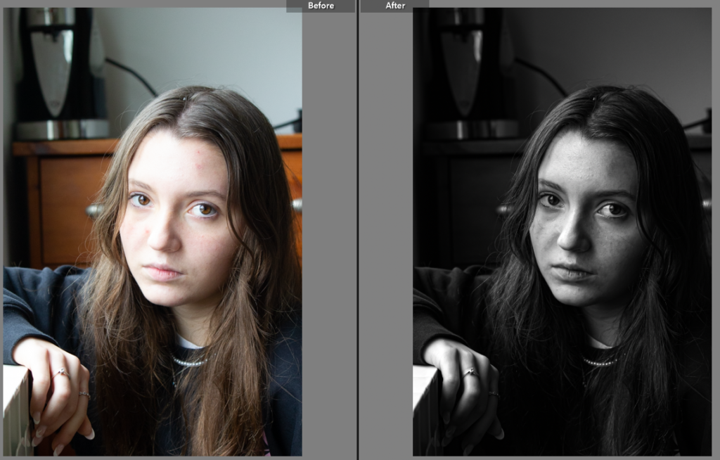
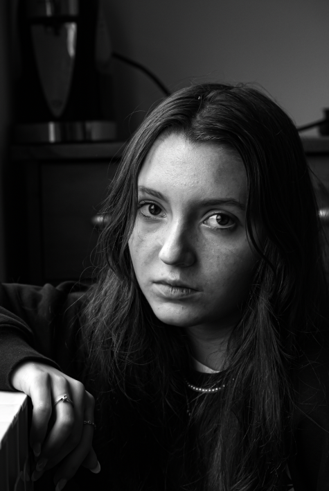
With this image, my aim was to make the model’s features stand out. By having the image in black and white, the brighter appearances are more likely to be noticed. I lightened the models eyes by changing the white tones in them as well as making the necklace stand out more in order to create a link between the two.

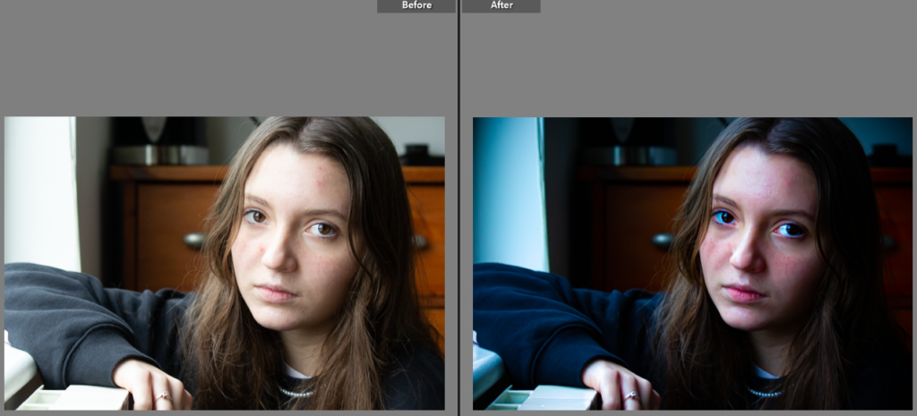
For this photograph, I wanted to add more colour to the image while adding a more shaper focus. I did this by increasing the saturation and vibrancy as well as sharpening the image by increasing the texture.

For this picture, I changed the image to black and white as well as increasing the contrast to create a more dramatic look. I liked how well focused the image is on the subjects face as well as the placement of her hands.

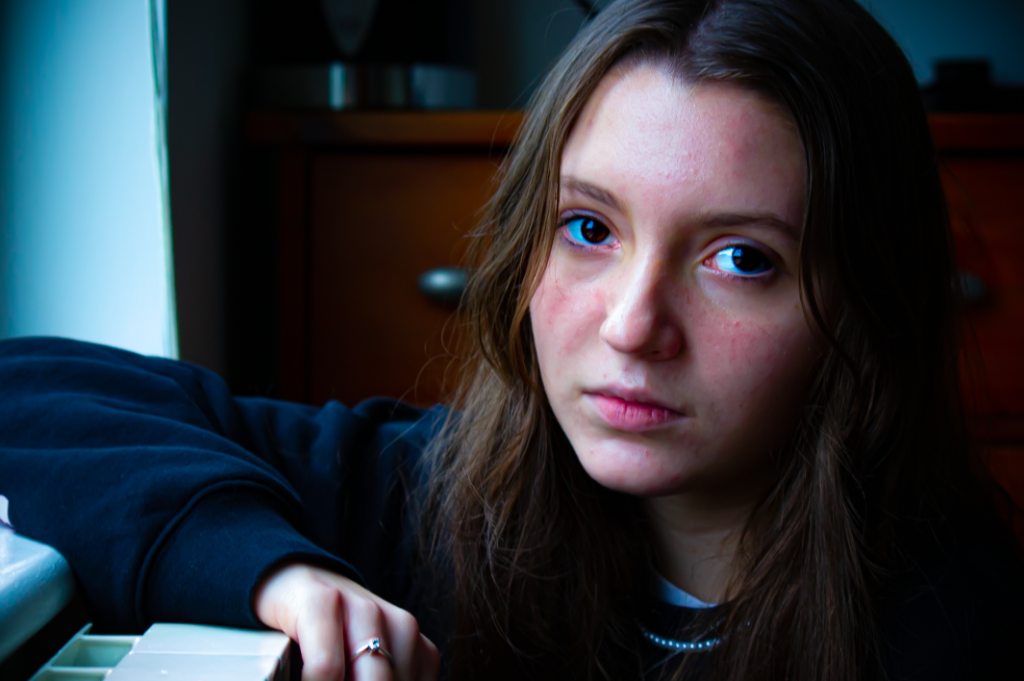
I decided to make this picture brighter and more colourful by increasing the brightness and tones of the image. I decided to also make the subjects eyes and the gem on her ring stand out more by increasing the brightness on them significantly.

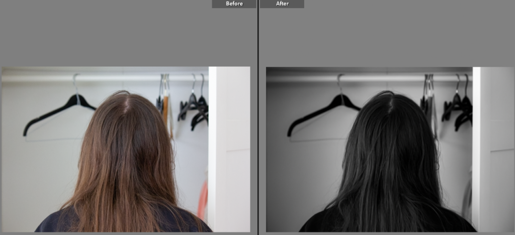
I turned this image to black and white, then lowered the exposure in order to minimise some of the harsh lighting in the photo.

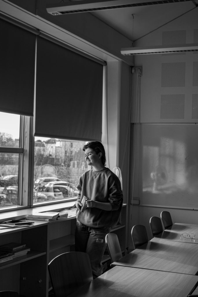
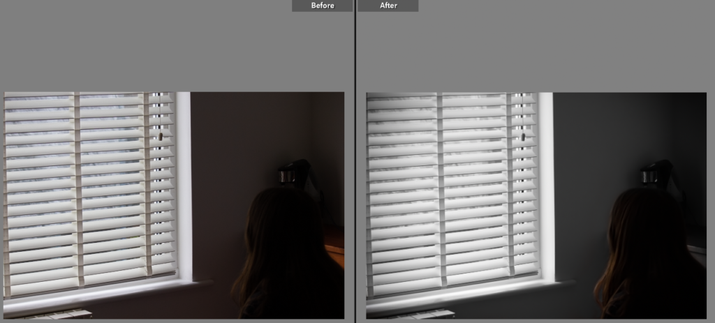
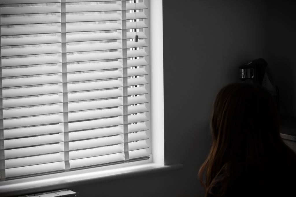
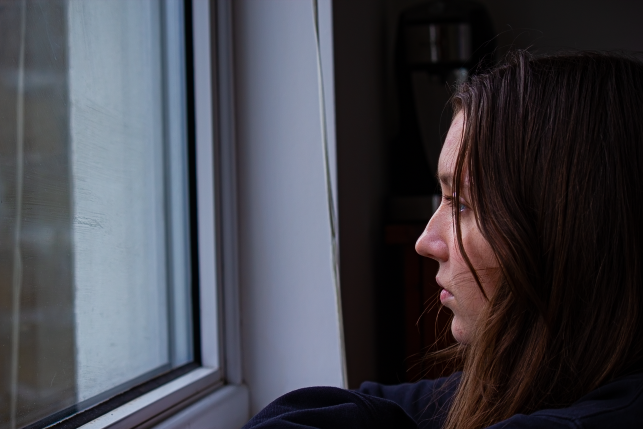
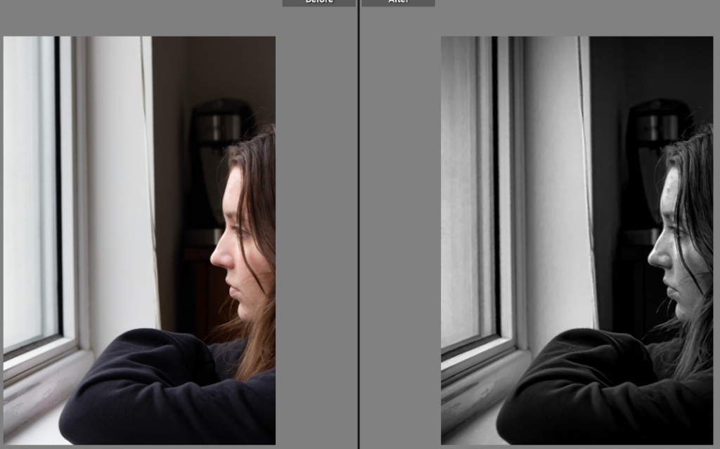
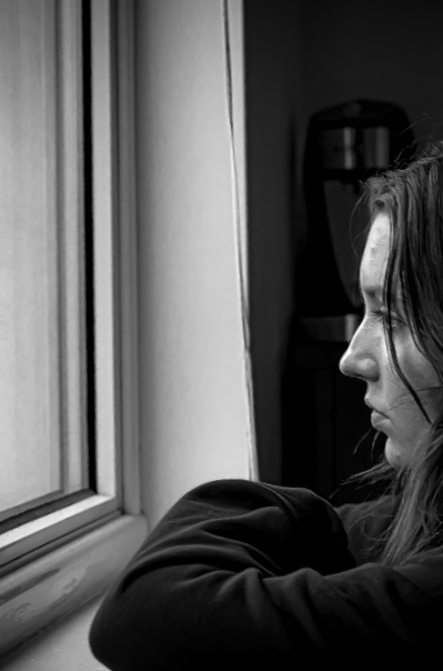
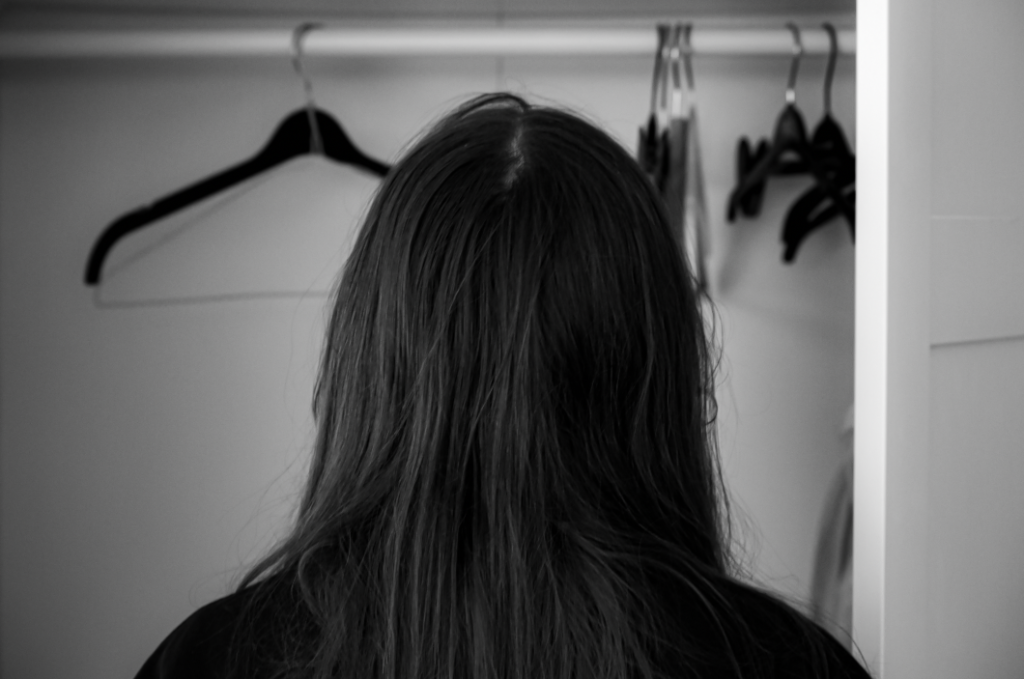
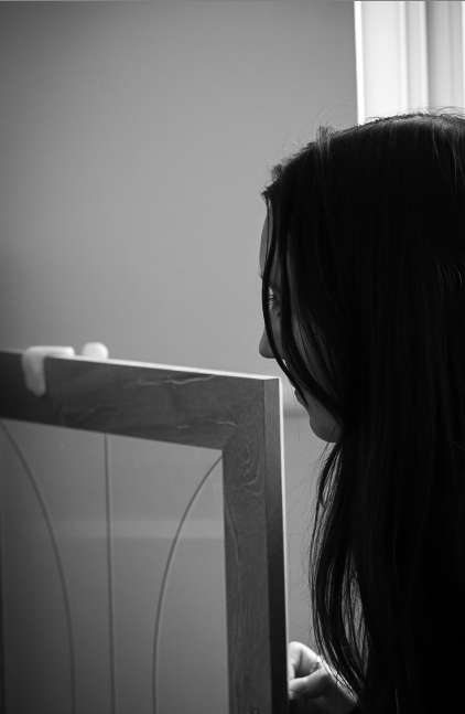
While you can’t see the subjects expression in the image, we are able to imply certain things from the image, such as her potential location. I edited this by making it in black and white while increasing the contrast.
In this picture, I increased the vibrancy and saturation in order to brighten the image. I also added vignette around the edges to bring the focus onto the model.

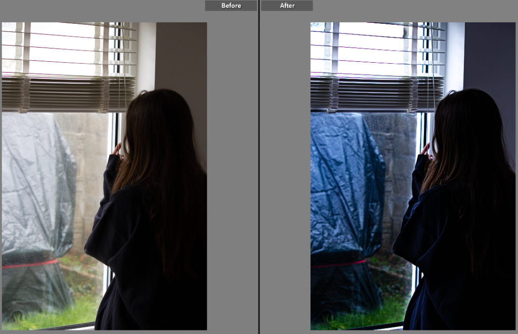
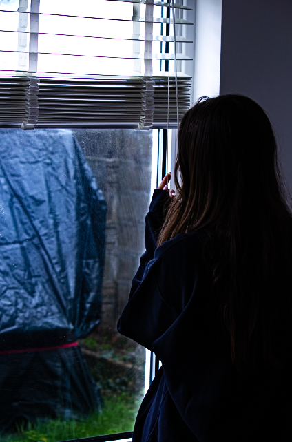
In this picture, I was originally going to blur the view from the window, however I thought that it was important to show the environment outside. I increased the vibrancy and saturation as well as lowering the exposure.

My main goal when editing this image was to make it brighter and more lively. I did this by increasing the brightness, saturation and vibrancy.

I made this image into black and white in order to create a more dramatic look. I did this by completely lowering the saturation and increasing the contrast.
Best Images

I would say that these three images are my best. This is because They are all focused on the subject and show some kind of body language or emotion. They are also the more appealing to look at in terms of colours and contrast.