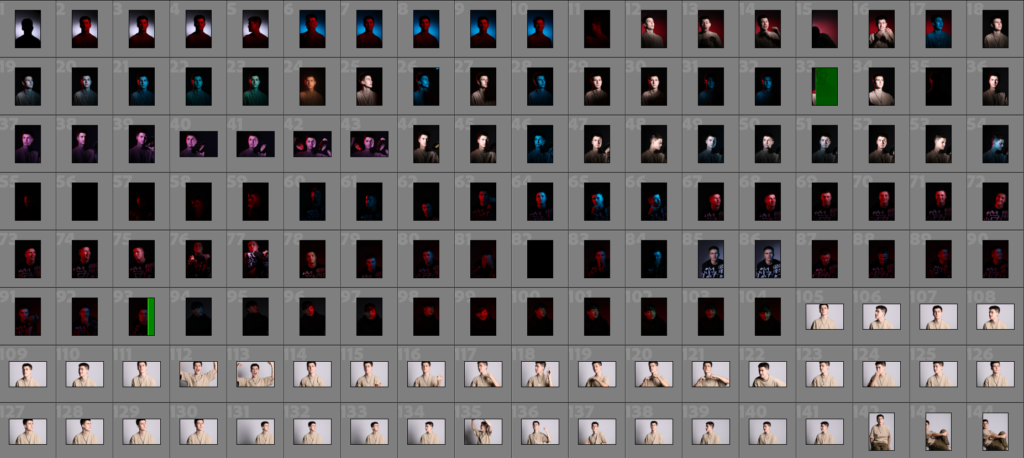
We had another photoshoot down in the studio, where we experimented with gel filters to add colours to the different lights. We used flash lighting and didn’t use very exciting camera settings, using f/16, an ISO of 100, shutter speed at 1/125, and a focal length of 105mm.

I sorted through the images we took and found some very interesting compositions, keeping the ones in good focus and lighting, and discarding the rest, which ended up being a large chunk of the last part of the shoot.

I colour-coded and gave each photograph a star rating, based on how good I thought they’d be as a final product or to be edited. As the shoot itself was in a low-light setting, it was difficult to be able to get a good final image from a lot of the darker ones, as they are more of a struggle to edit.
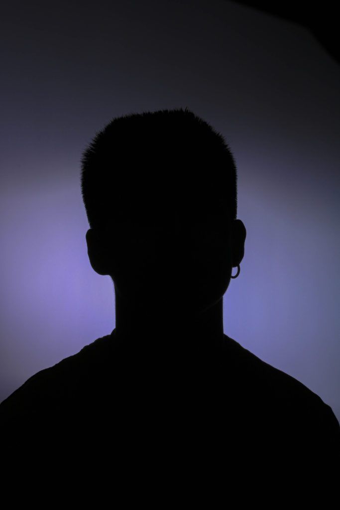
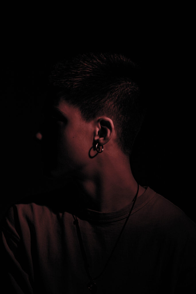
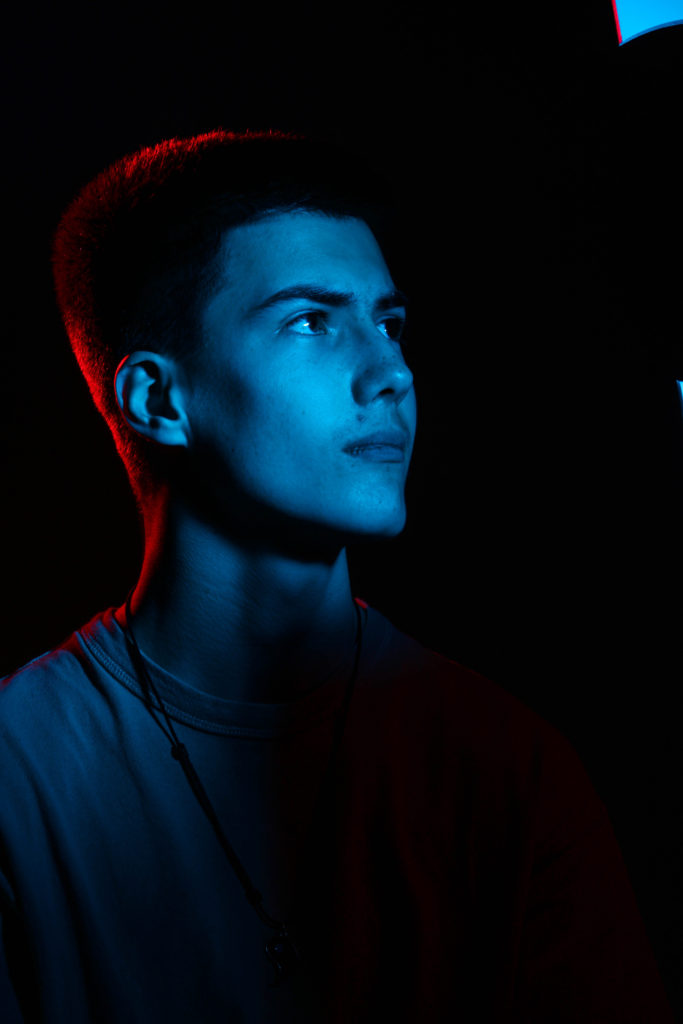
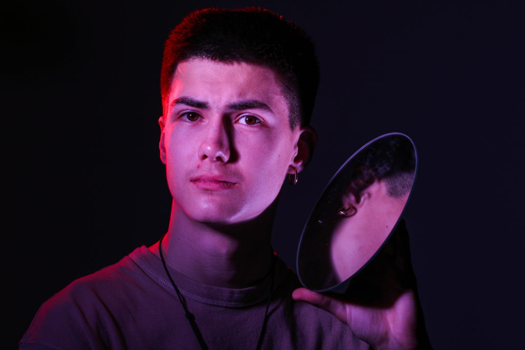
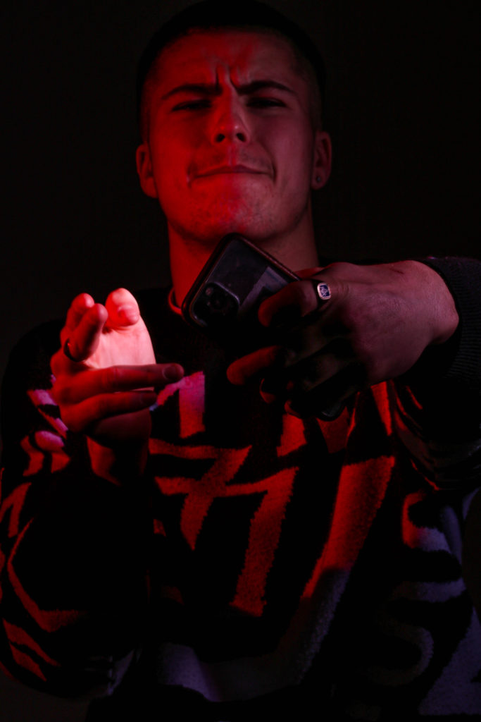
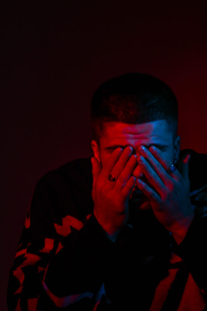
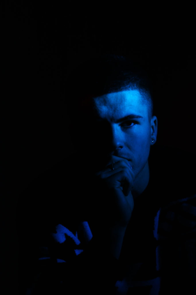
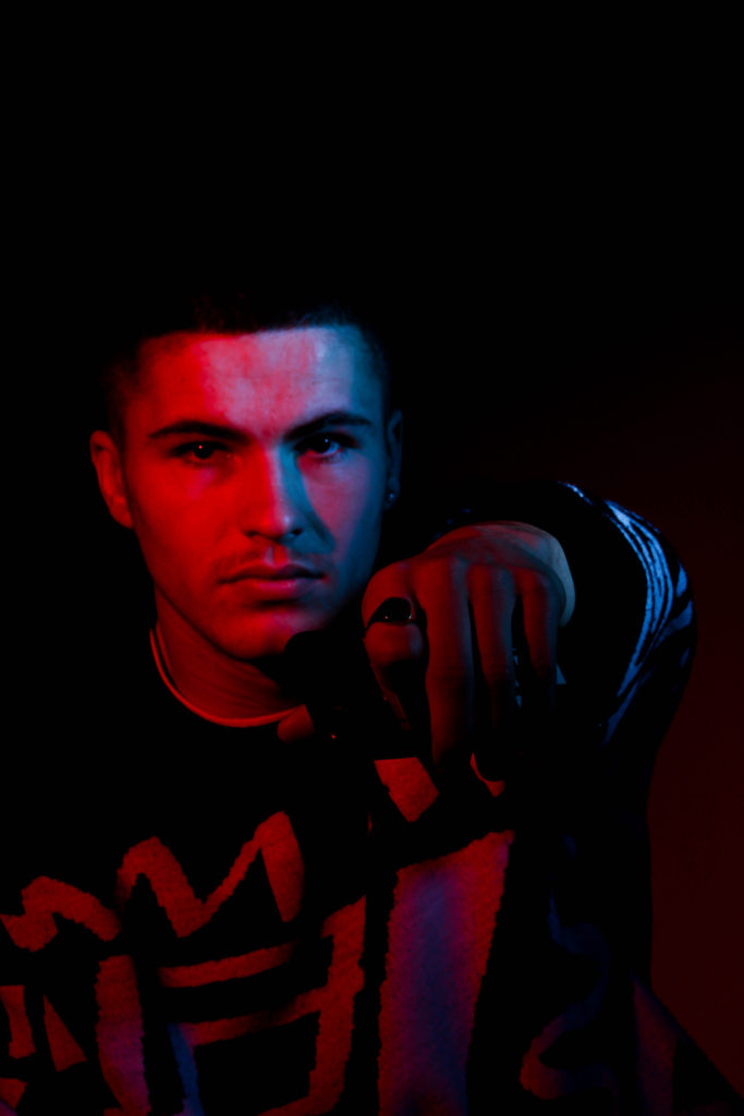
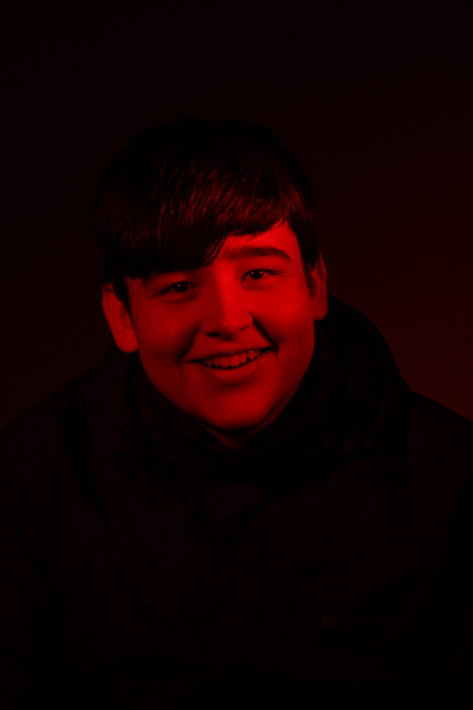
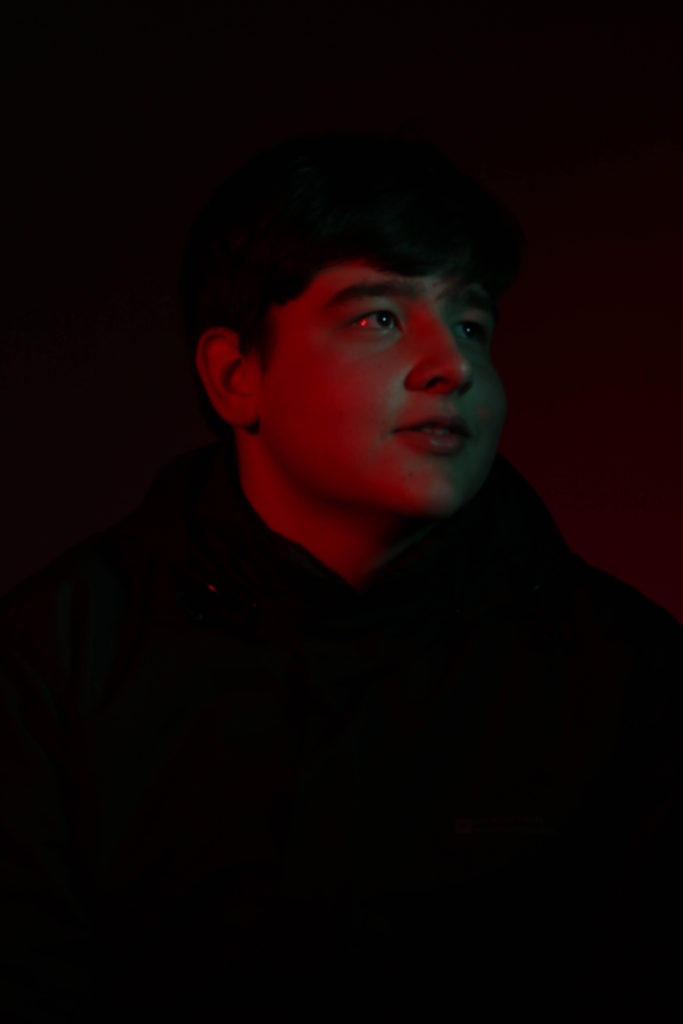
I think these photographs are all quite dramatic and unique, and express various tones in darkness and emotion. The use of coloured lighting creates personality within the subjects, and alludes to what kind of people they might be.


These two images of myself both show very little detail of my face, only showing explicit details such as my earring and my silhouette. It exudes a feeling of mystery as to who the person in the image is, and could also stir a sense of anxiety in the viewer because of this.


These two images both have a primarily blue colour palette, creating a melancholy atmosphere for the viewer, amplified by the use of these colder colours. On the photo to the left, some red light shines onto the back of my head, creating a contrast to the palette.


These three images all share very similar colour palettes, reds and blacks, mostly mixed with blues (excl. centre), and make great use of pose. The combination of the blues and reds as key and filler lights create links to police siren lights, which adds more personality to the photograph, creating interest. I think these three images could work well as a triptych, and could be used in a final piece later down the line.


These two photos contrast greatly in brightness, the one on the left using brighter reds and more separated (from the reds) blacks, whereas the one on the right uses softer tones of red and greens at a lower exposure. I don’t think these images are the best from the shoot, as the one on the right doesn’t have the strongest focus, but I still think they’re interesting enough to be looked at.
