Portraiture – Studio Photoshoot

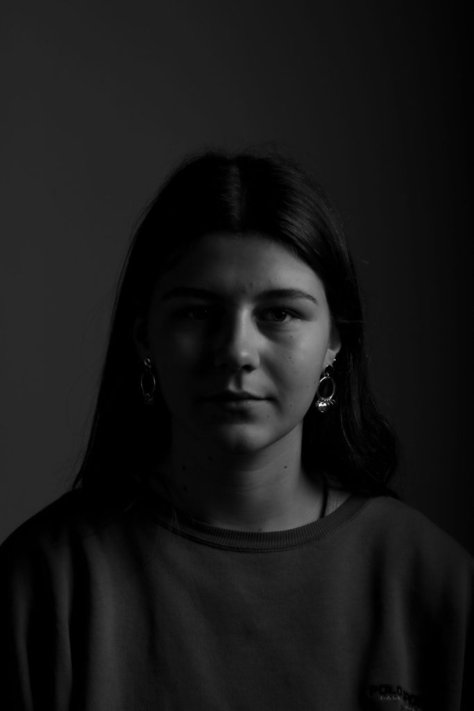
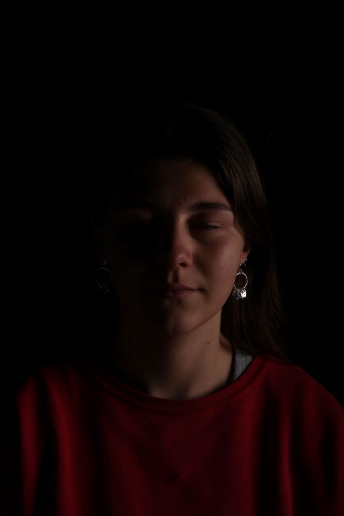
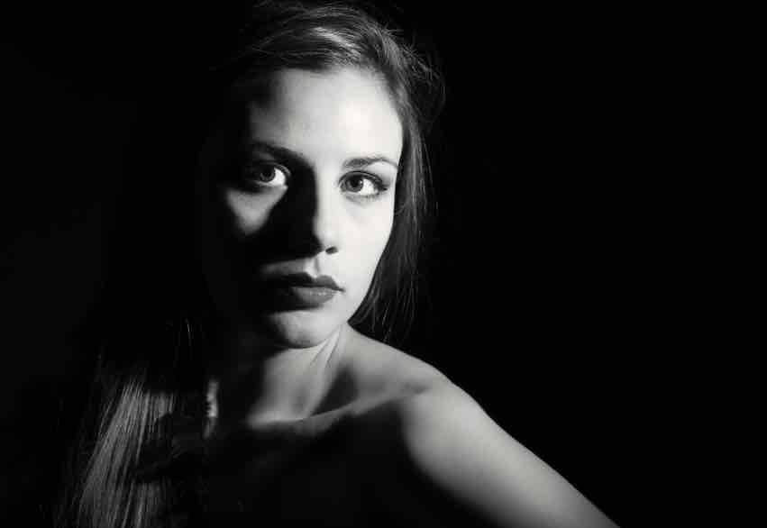
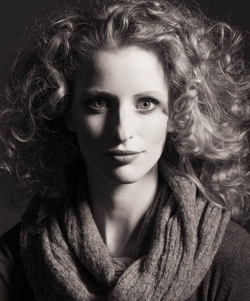
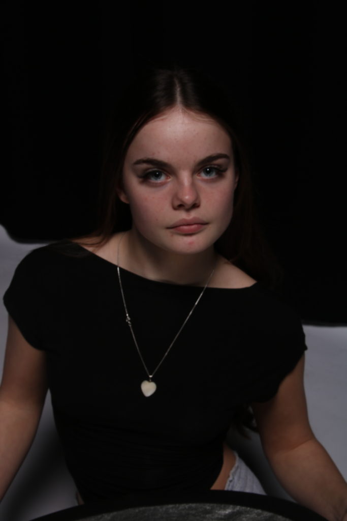
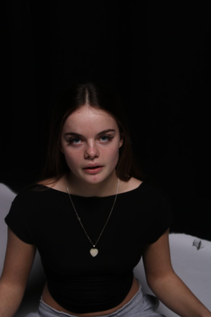
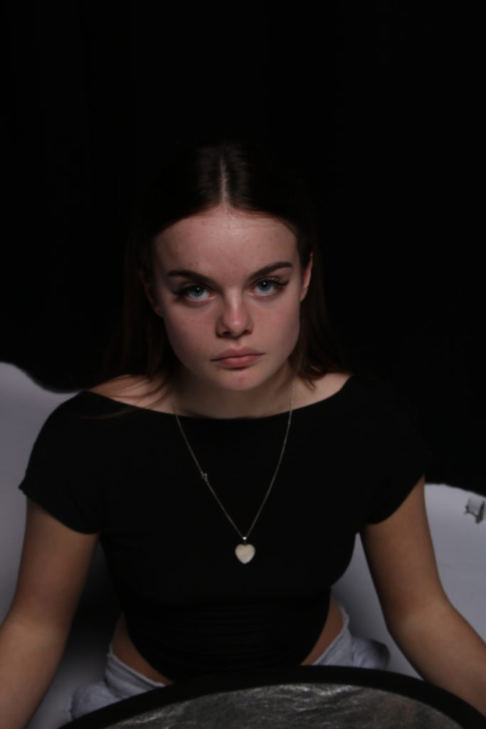
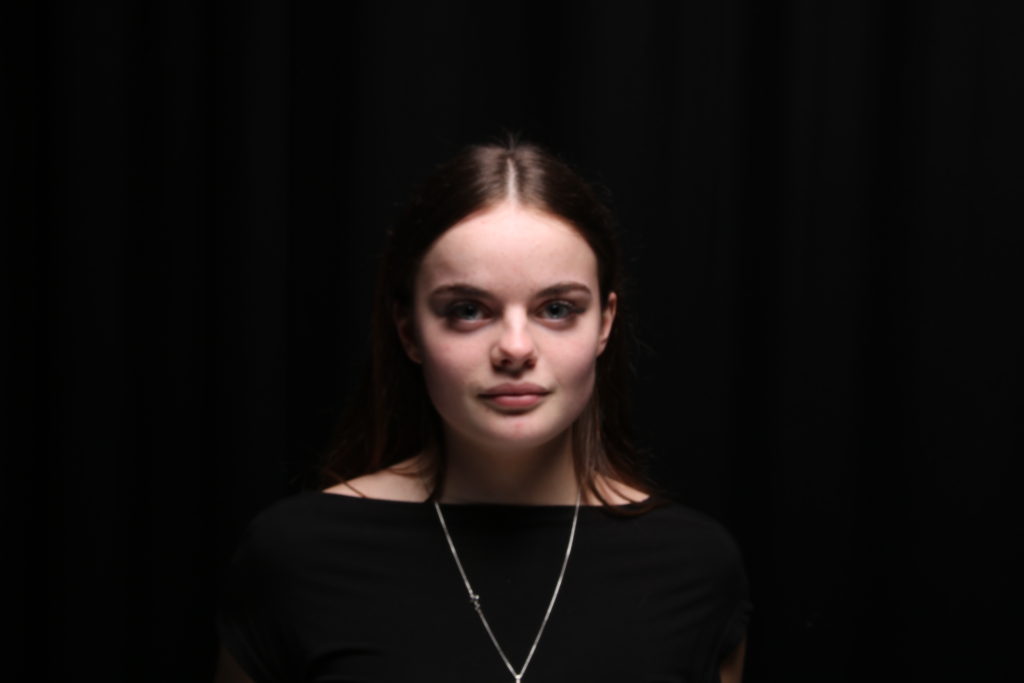
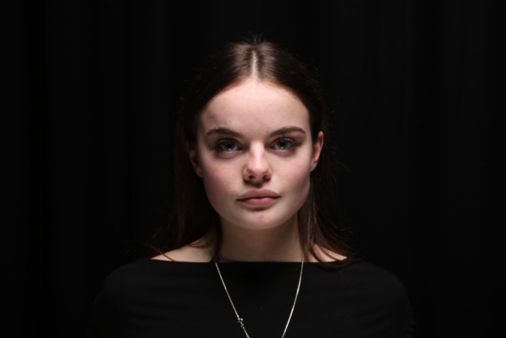
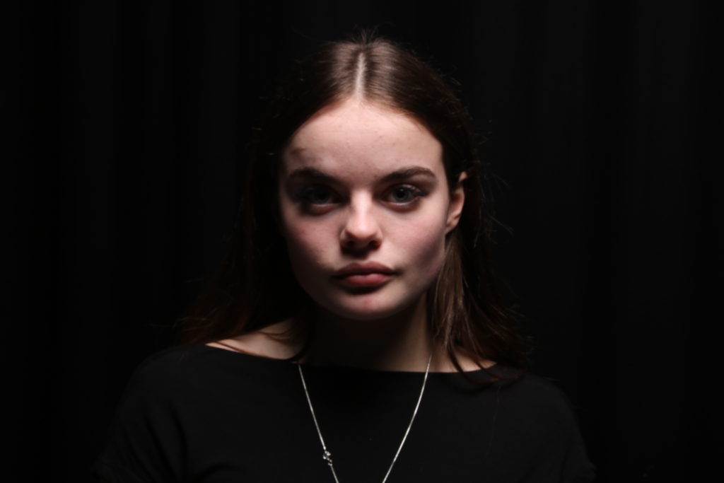
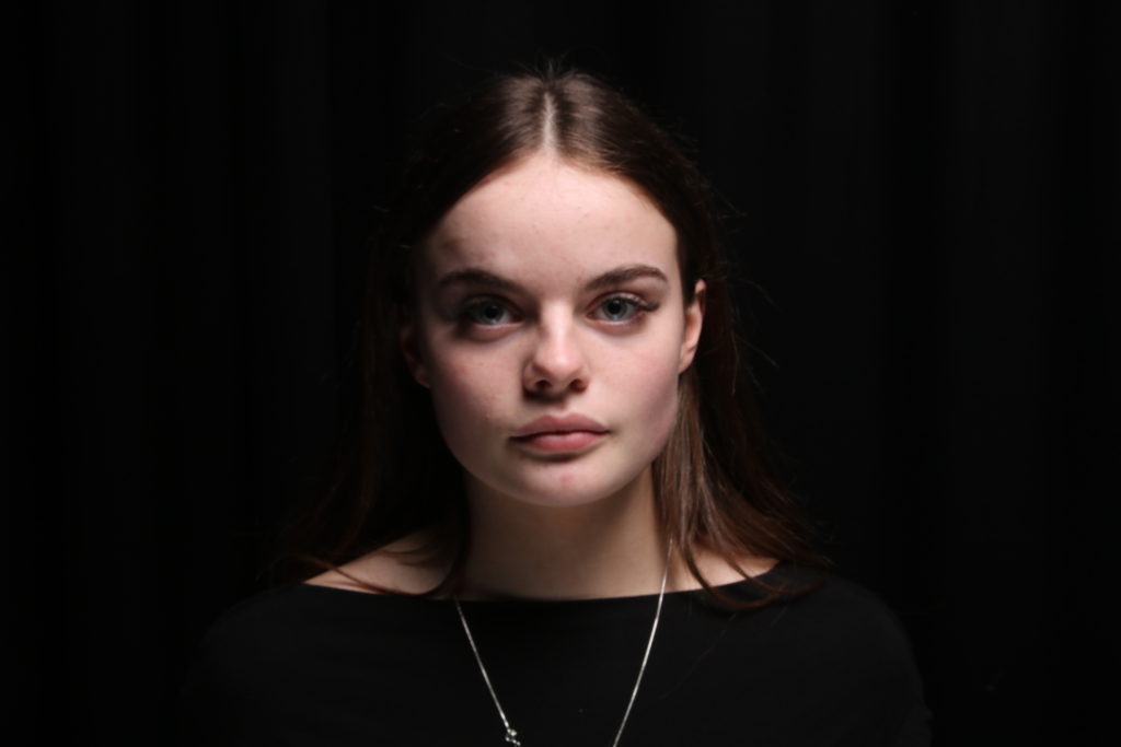
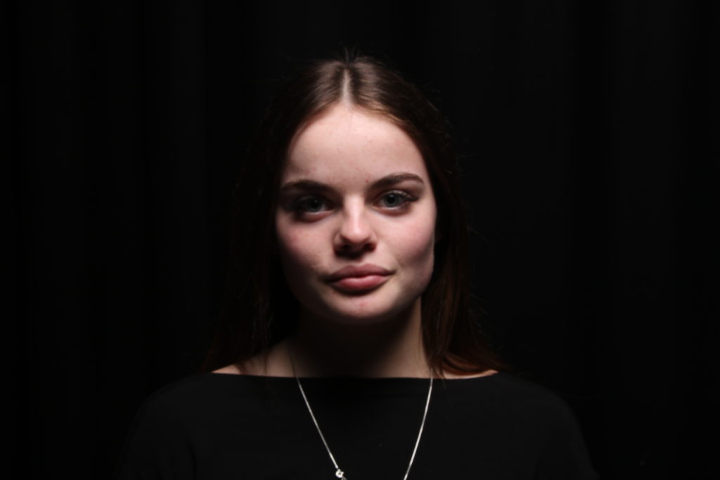
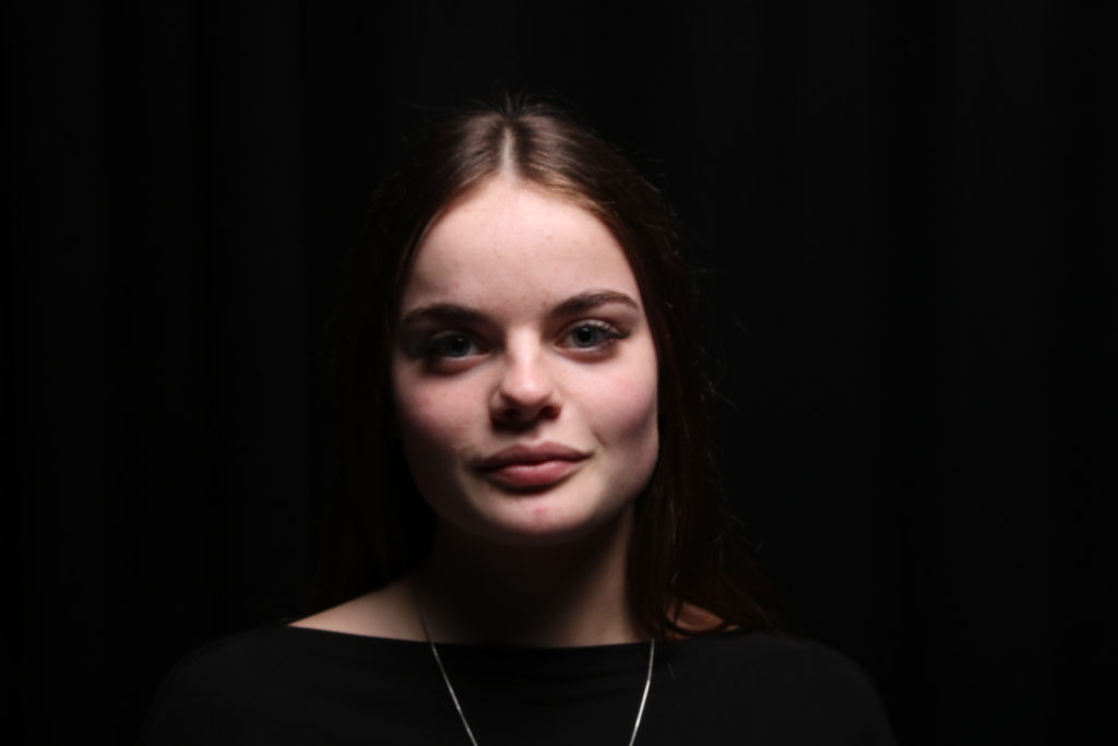
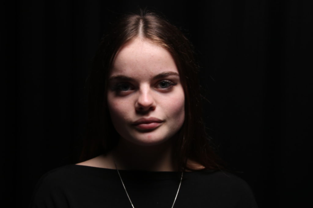
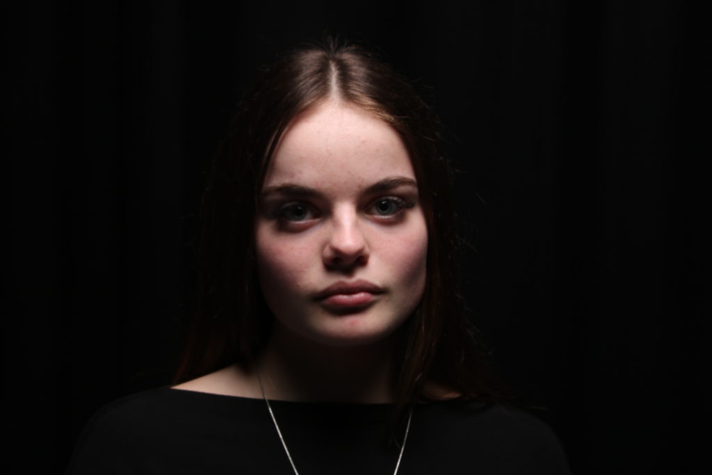
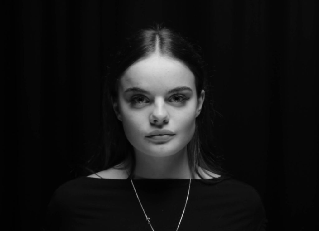
We did a shoot in the studio, experimenting with different lighting and backdrops, and came up with some pretty good portrait compositions.
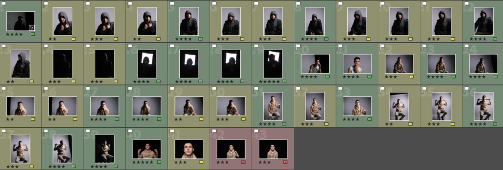
I sorted through each image, giving each one that I decided to keep a star rating and colour rating based on whether or not it would be good as a final composition for editing.
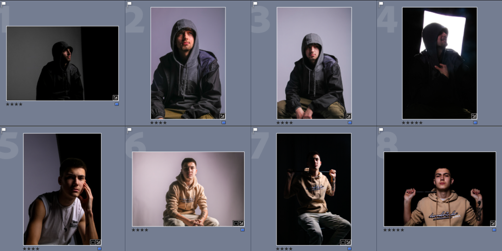
I then edited 8 of the photographs by increasing contrasts and focusing on the shadows in particular.
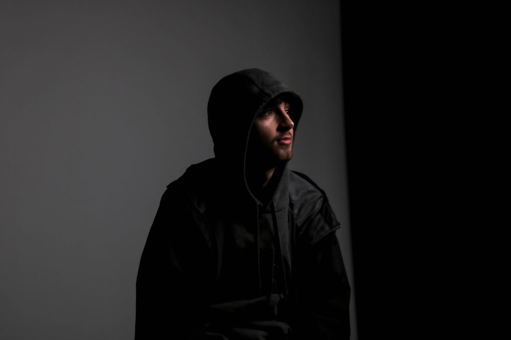
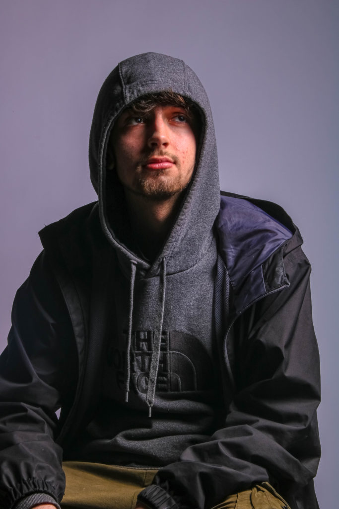
I was left with 8 very strong pieces, that all, in my opinion, look very good. I tried experimenting with different contrasts and lighting, and I think it paid off.

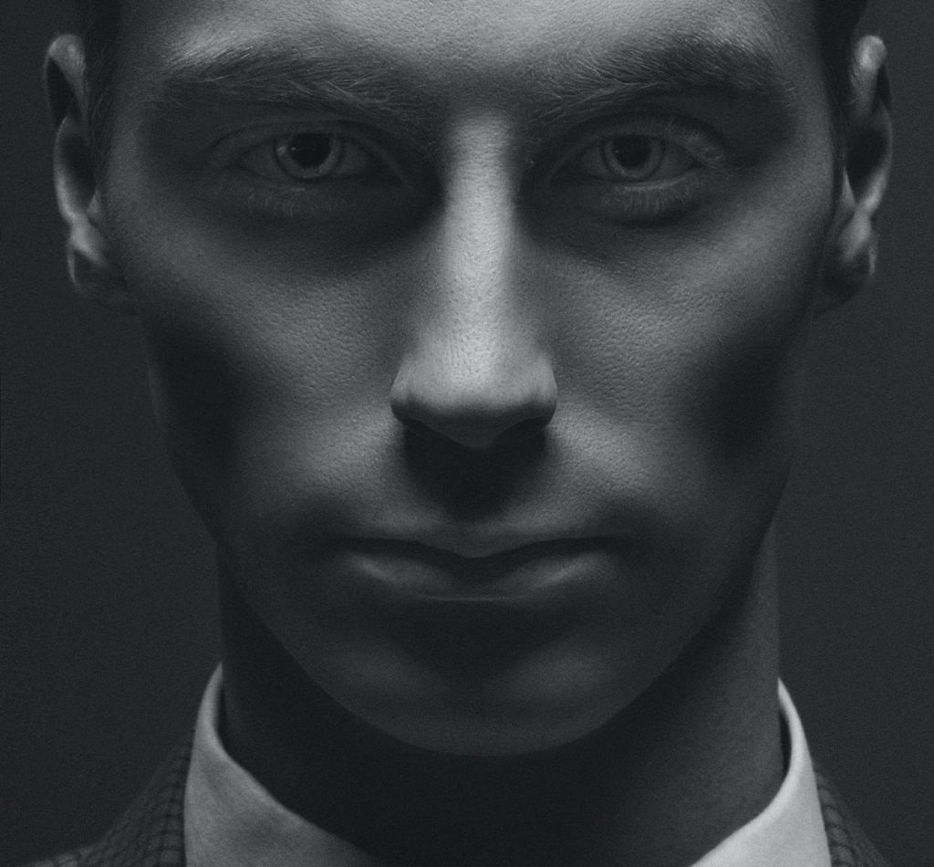
We took this image of Tom with the studio lights on a lower setting to achieve a darker image. I increased the highlights and the exposure slightly to bring out his facial features and kept the surrounding area as dark as I could. I like the way his dark clothing creates a sense of mystery in the image, as not all of him is on display properly.

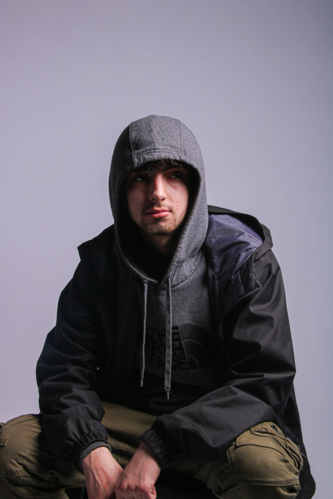
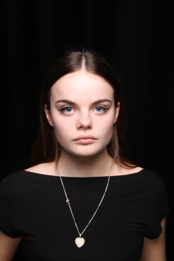
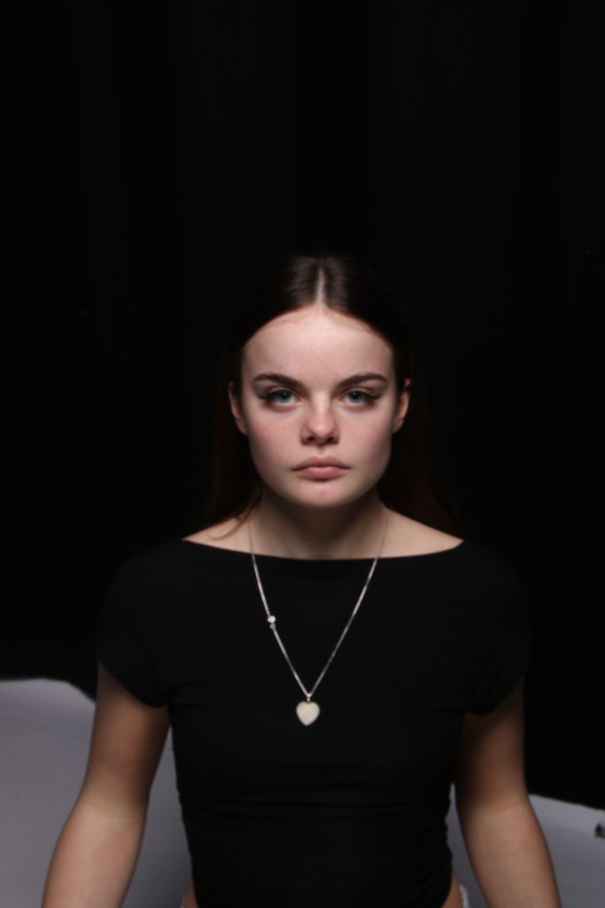
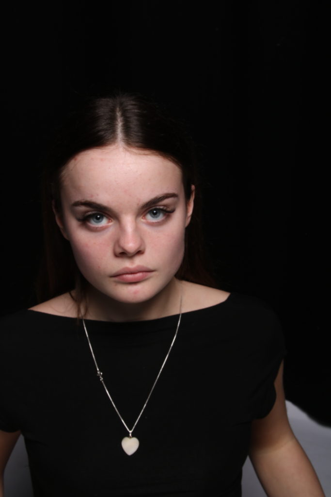
These two images were taken at the same time, a few seconds apart maybe. I believe the one on the left has been cropped, to focus more on Tom. Again, these two compositions work very well with the levels of contrasts and shadows and evoke the same sense of mystery as the first image.
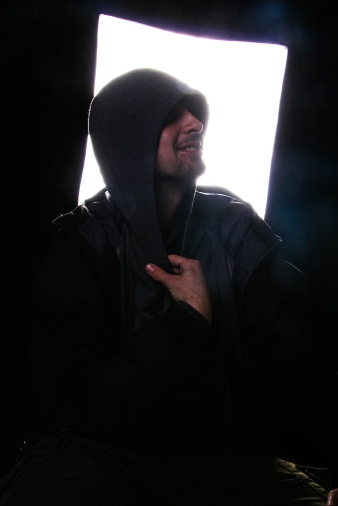
I would classify this photograph as probably my best from this whole shoot. I love the way small pieces of colour appear throughout the image, like on his leg to the bottom right, or on his hands. I also find it quite interesting how the studio light affects the image, creating a silhouette and creating a foggy effect on the smudged areas on the camera lens. It captures the same essence the last three photos of Tom caught but does it more strangely and uniquely.
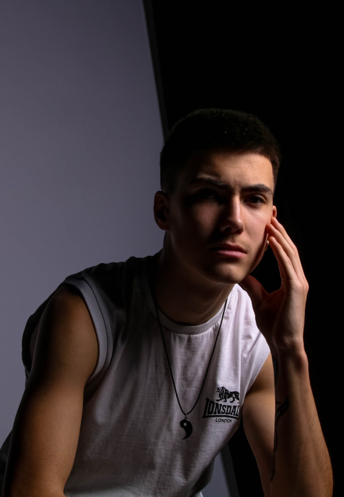
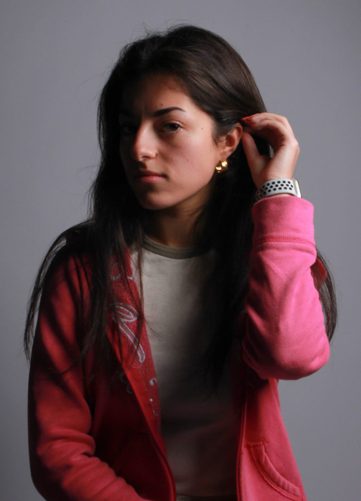
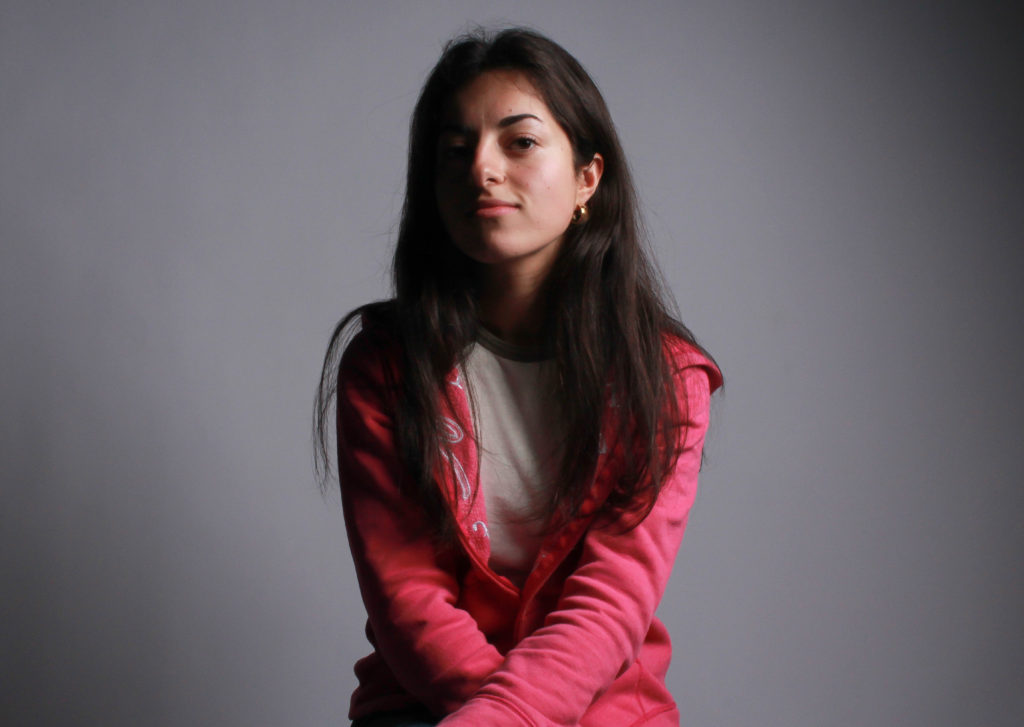
This photograph uses Rembrandt and chiaroscuro lighting, creating a dramatic piece that defines different areas of my face and body. I decided to keep this image even though the background has a substantial change from black to white, as I believed it could work well as the line the change followed was almost completely in line with my arm. When I edited this, I was aiming for a more dramatic use of shadows and lighting and was left with something I very much liked.
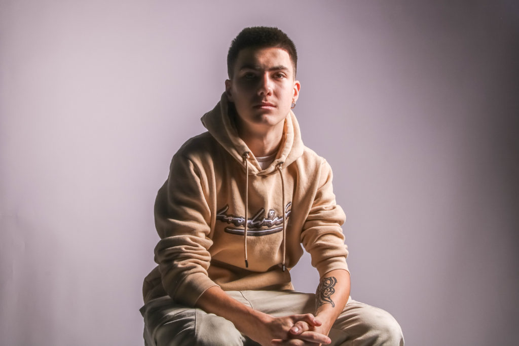
With this photo, I wanted to create a lighter tone when it came to the actual final composition in the editing stage. I use the de-haze tool on the image to lighten my skin tone and to bring out the more neutral hues. I like the way it works with the shadows, creating instances of both soft and harder light.
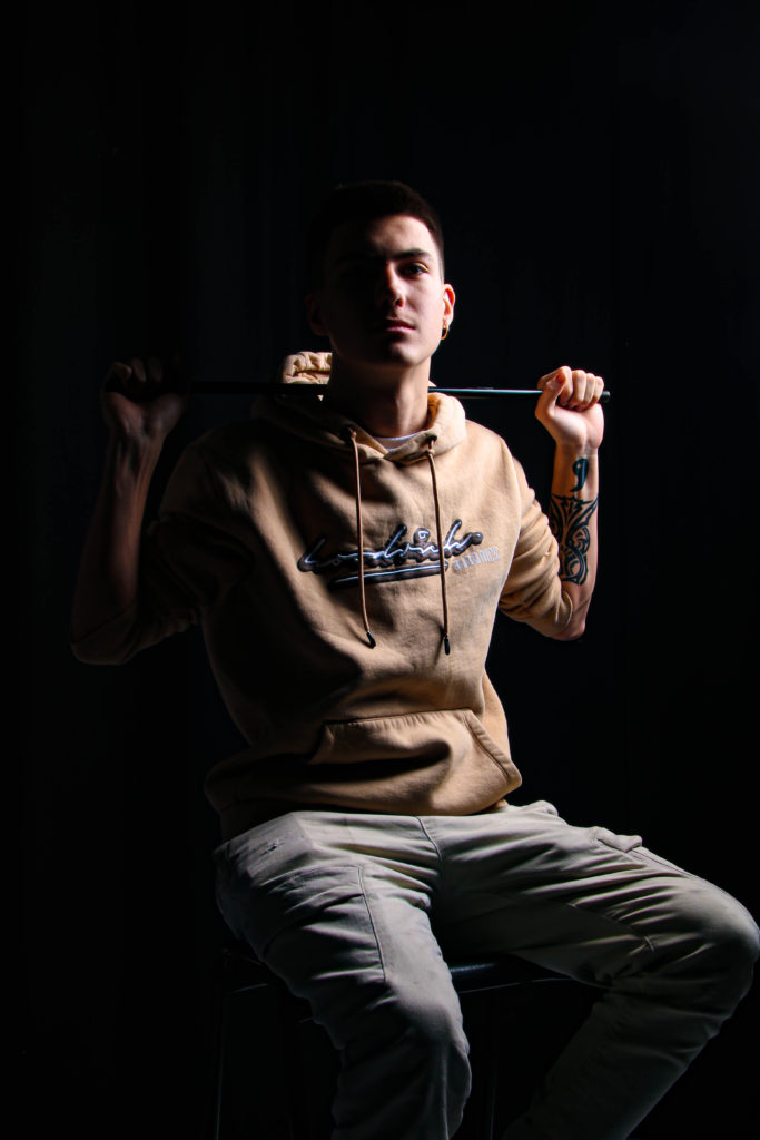
In this photograph, I wanted to create a sort of intimidating presence, making use of the pipe I was holding as a prop and a mixture of my hoodie and tattoos, I felt that it fit the typical conventions of someone quite thuggish and wanted to bring that out in this piece. I increased the levels of contrast and strengthened the darker tones, which I feel improved the final look of it.
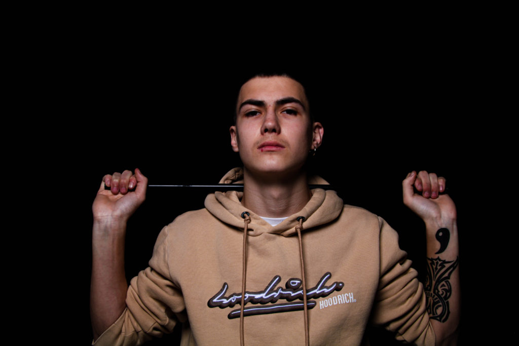
I wanted to do a similar thing with this photo too, which worked well as my busted lip is considerably visible, and combined with the other elements previously mentioned, I think I managed to achieve this effect pretty well.

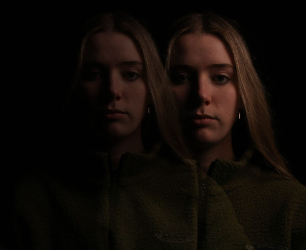
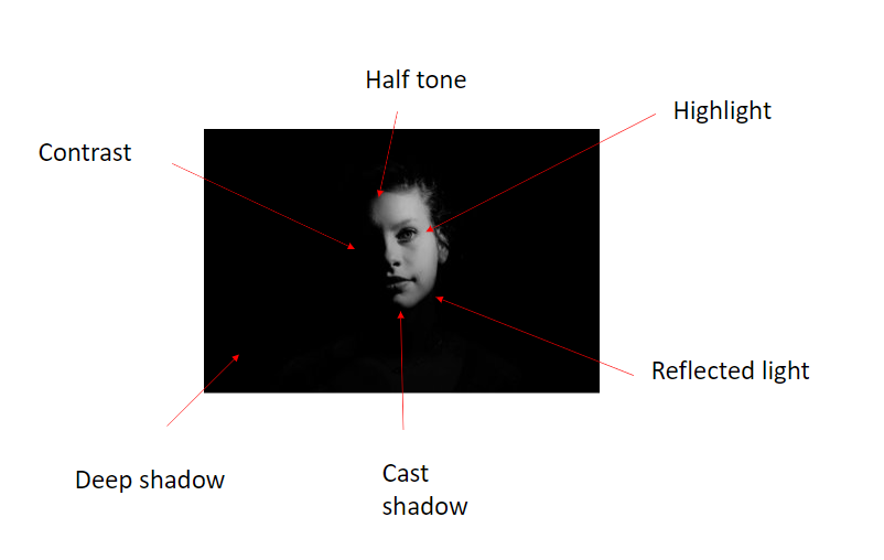
Chiarascuro lighting

Chiaroscuro is the use of contrast between light and dark to emphasize and illuminate important figures in a painting or drawing. It was first introduced during the Renaissance. It was originally used while drawing on colored paper though it is now used in paintings and even cinema.

Chiaroscuro uses a low key lighting setup, where a key light is used as the sole light source to achieve dark backgrounds with starkly lit subjects.

Chiaroscuro is a technique that filmmakers use to create contrast between light and dark areas on screen. It’s often used as a storytelling device where there is an extreme difference in tone or mood from one scene to the next.

5 areas of chiarascuro

1.highlight

2.halftone

3.deep shadow

4.reflected light

5.cast shadow.

Chiarascuro is the juxtaposition between light and dark

My take on chiarascuro lighting:

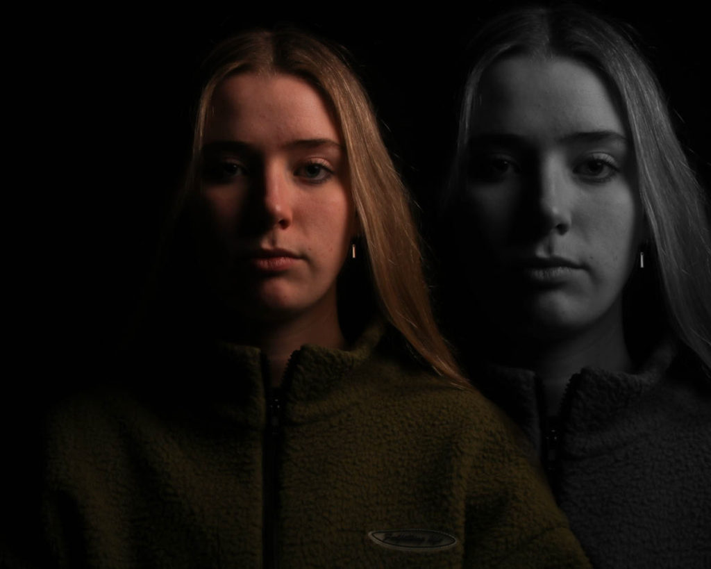
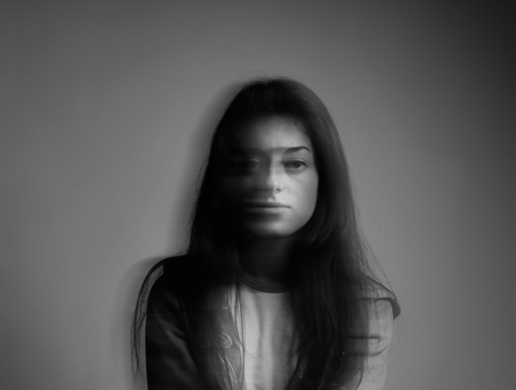
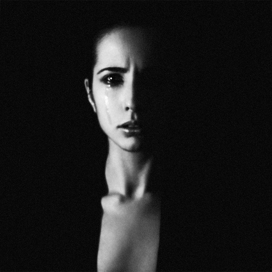
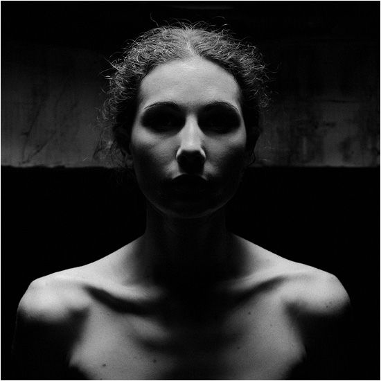
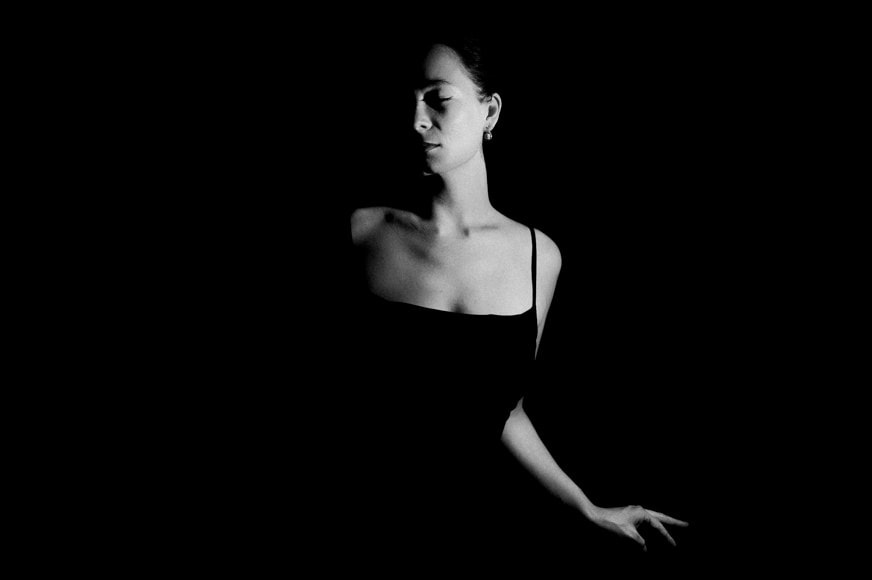
These were the images that came out the best, in terms of getting the lighting correct; the juxtaposition between highlight and shadow.

After editing them, these are the final outcomes:

Rembrandt lighting

Rembrandt lighting consists of a single light source placed on a 45 degree offset from the subject, about 5 feet away. Positioned roughly two feet higher than eye level, the light source is angled slightly downward and hits the side of the face that is farthest away from the camera.

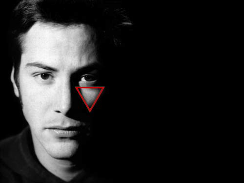
Rembrandt lighting is characterized by an illuminated triangle (also called “Rembrandt patch”) under the eye of the subject on the less illuminated side of the face. It is named for the Dutch painter Rembrandt, who occasionally used this type of lighting.

REMBRANDT

He was a master of the chiaroscuro technique. And he often used this kind of light in his paintings, particularly in his self portraits.

Looking at his paintings, you’ll notice a single-light portrait lighting. How the short lighting hits the subject’s face is interesting.

As you can see from the image above, this lighting setup is a split light setup. It creates a triangle of light under the model’s eye on the shadowed side.

Rembrandt lighting is a dramatic light. It is one of those moody setups that plays with chiaroscuro. This technique from paintings uses the sharp contrasts between light and dark.

My take on Rembrandt lighting

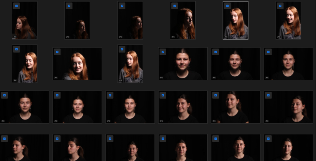
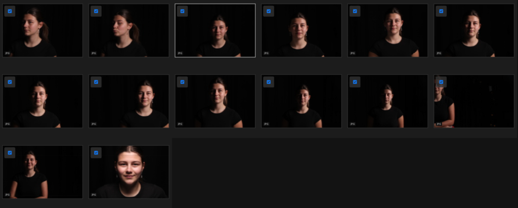
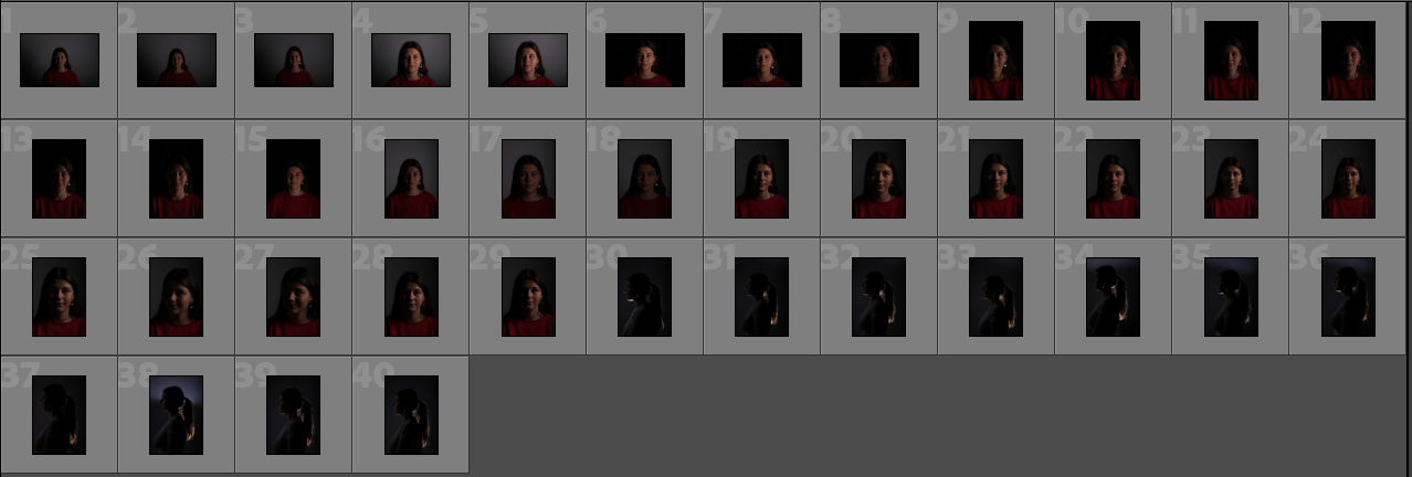
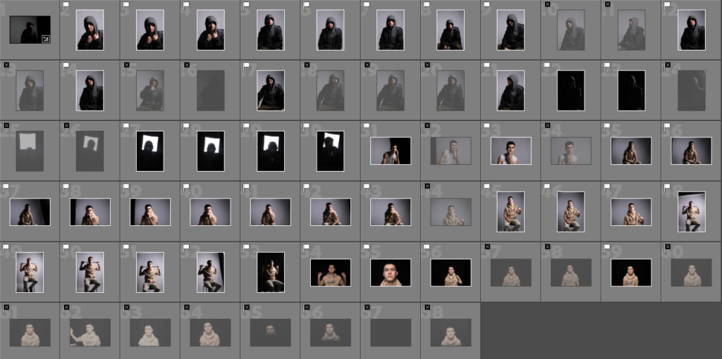
Contact sheet:

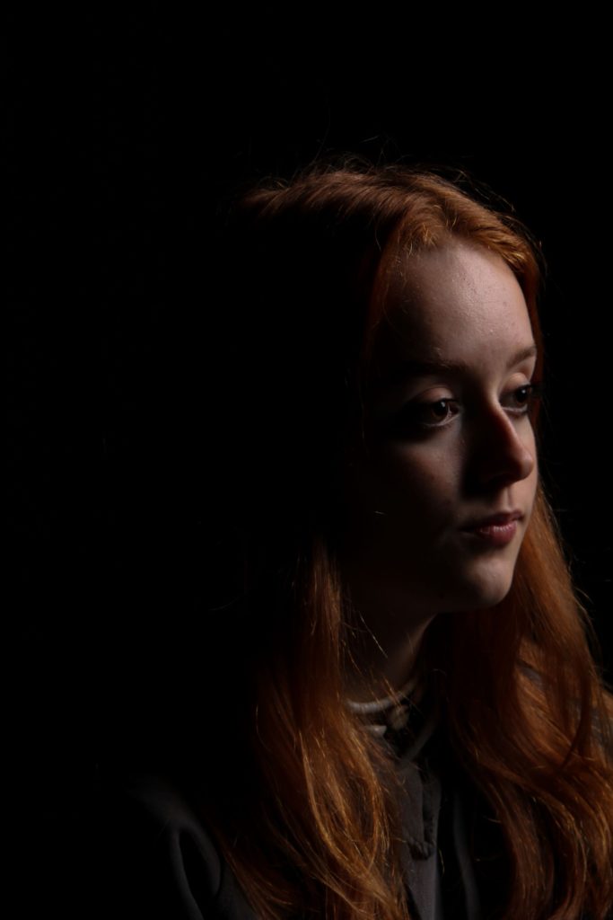
Edited Images:

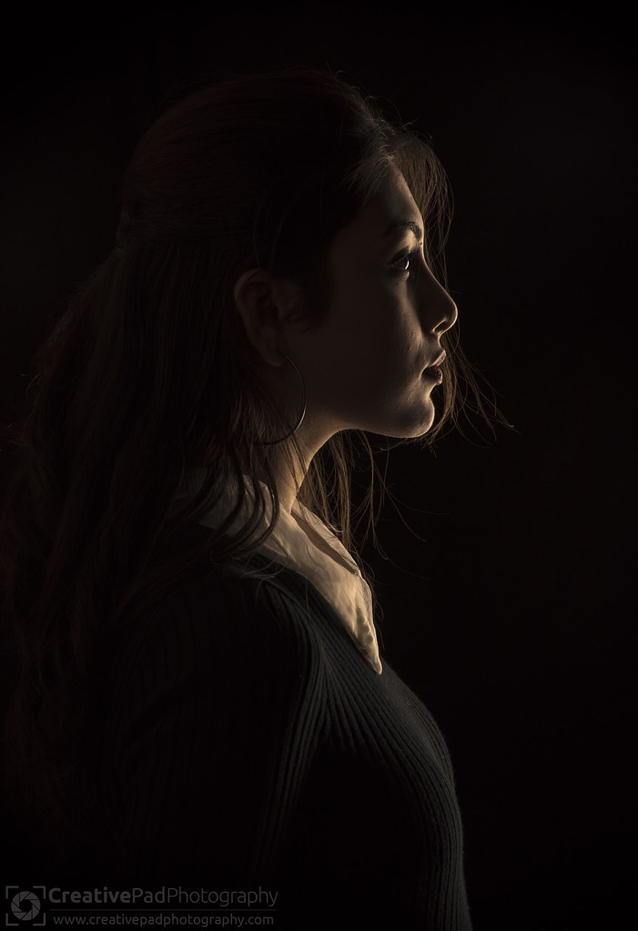
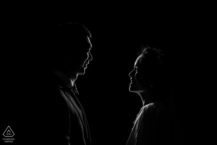
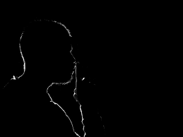
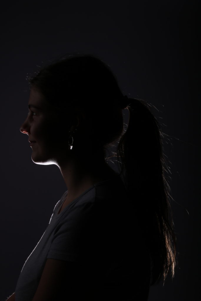
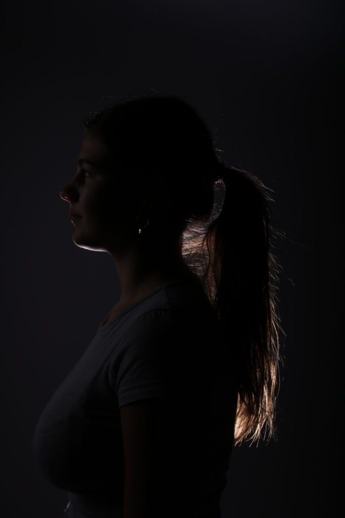
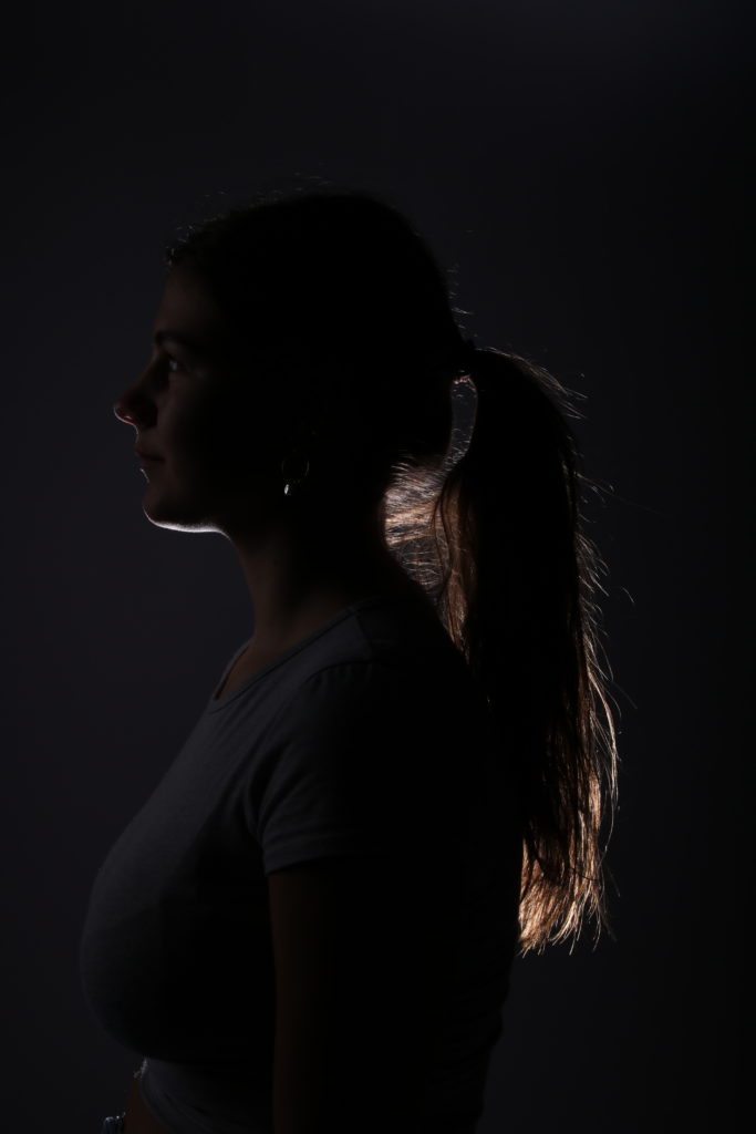
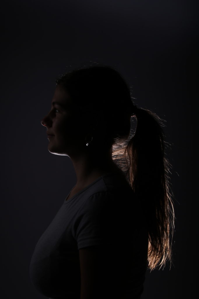
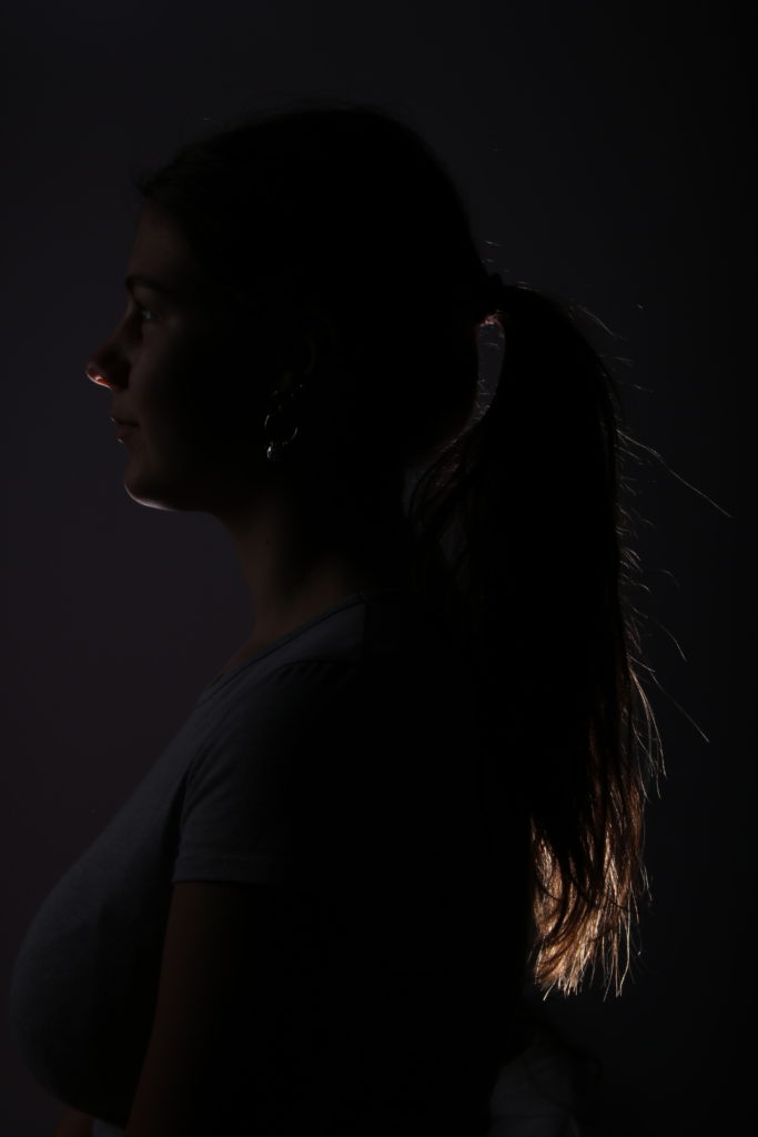
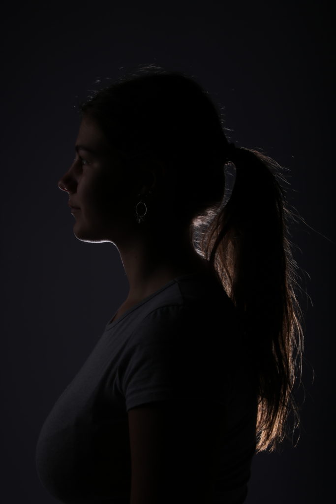
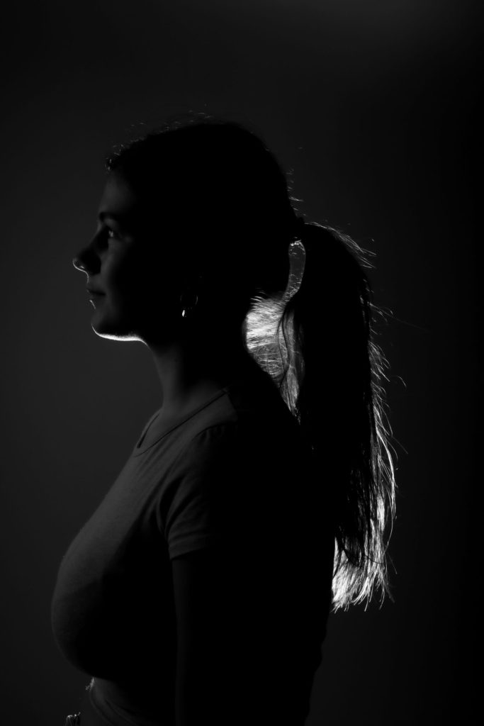
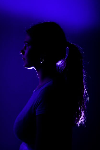
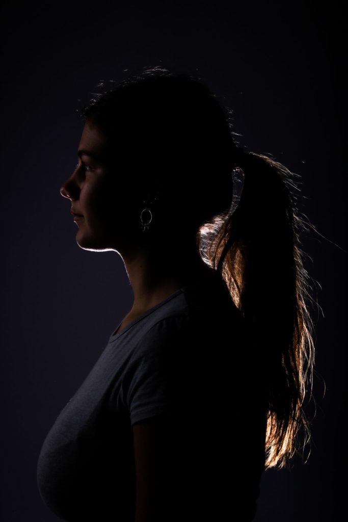
Rim Lighting

Rim lighting, also known as edge lighting, is a method of lighting a subject by using off-camera flash. The technique is used to separate a subject from the background by using a rim or strip of light around the edges of the subject.

How is it done?

A rim light is placed behind a subject that exposes the outline or rim of the subject with light. This lighting highlights the contours of a subject and creates a dramatic and mysterious effect. Rim lights can be used in a variety of ways.

My images:

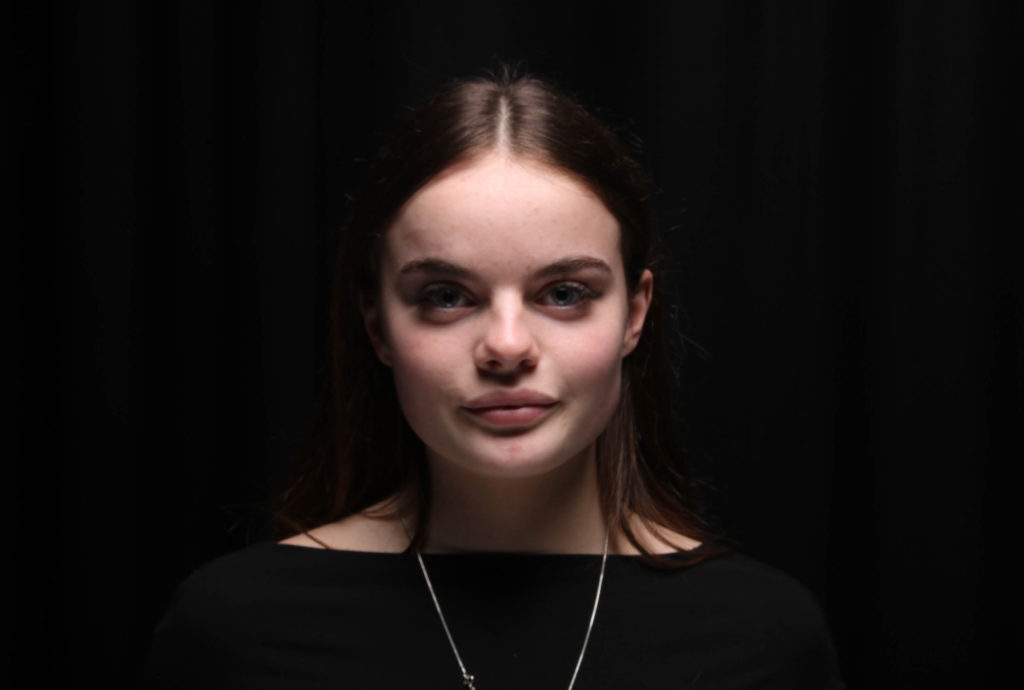
Below are the photos I took of Poppy, these are the ones that worked with the light. It took many tries to get the lighting correct but we got it in the end to outline her side profile, hair, chin and slightly her body.

Edited image outcomes:

Portraits- contact sheet

Photoshoot 2- experimenting with rembrandt, chiarascuro and black/ rim light lighting

Selecting best images

  • I selected all the images from the shoot and went to develop
  • from here, I flagged the images as pick (images I want) and reject (images I didn’t want)

environmental portrait photoshoot 2

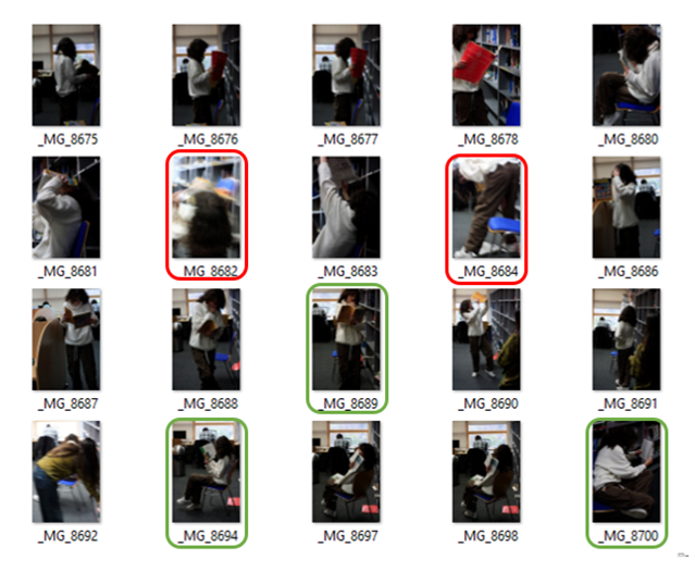
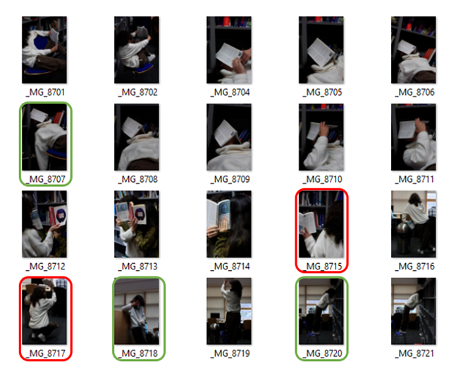
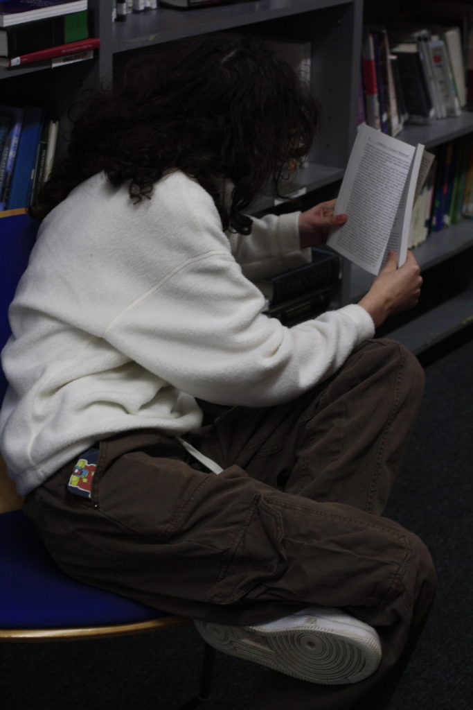
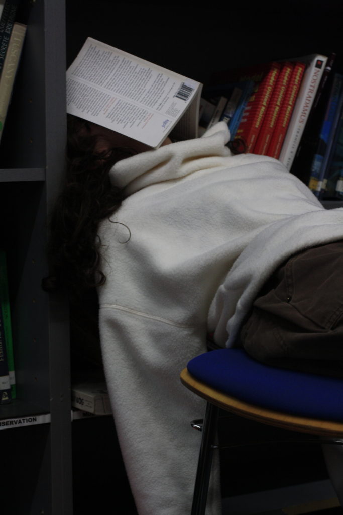
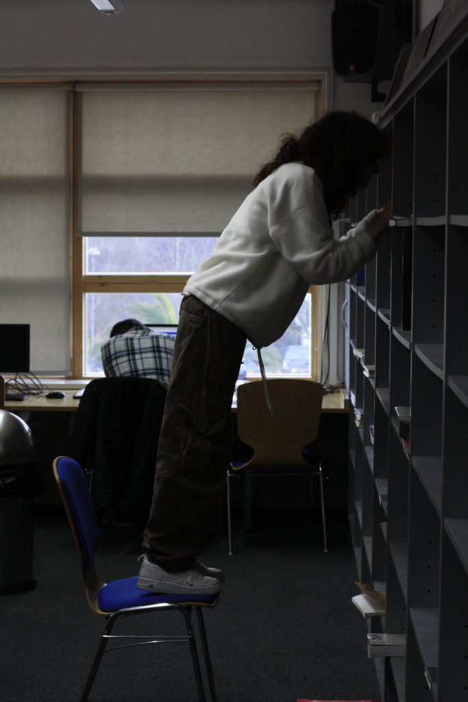
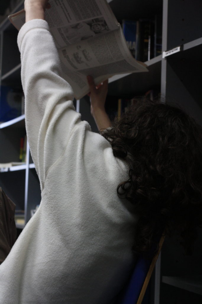
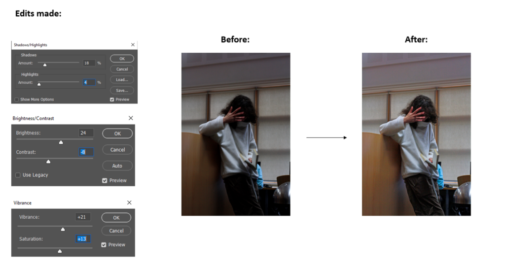
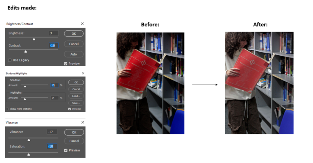
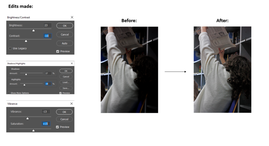
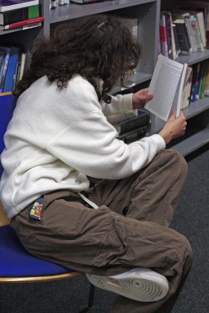
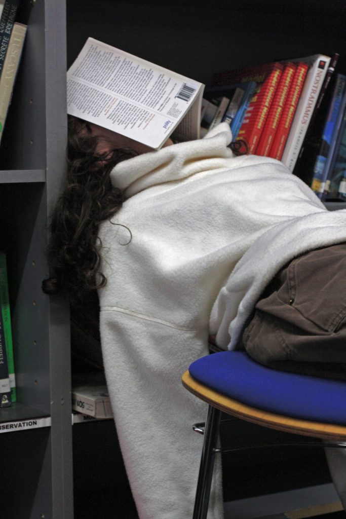
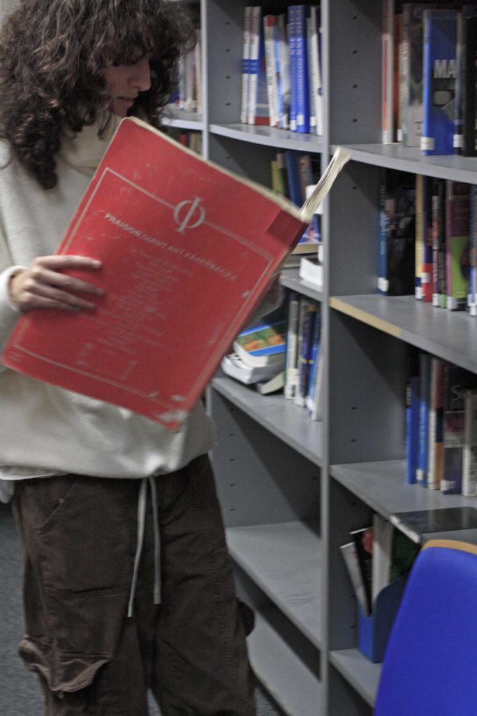
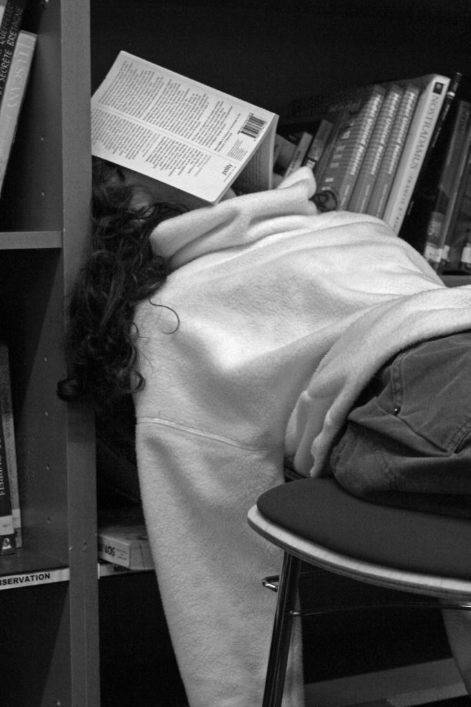
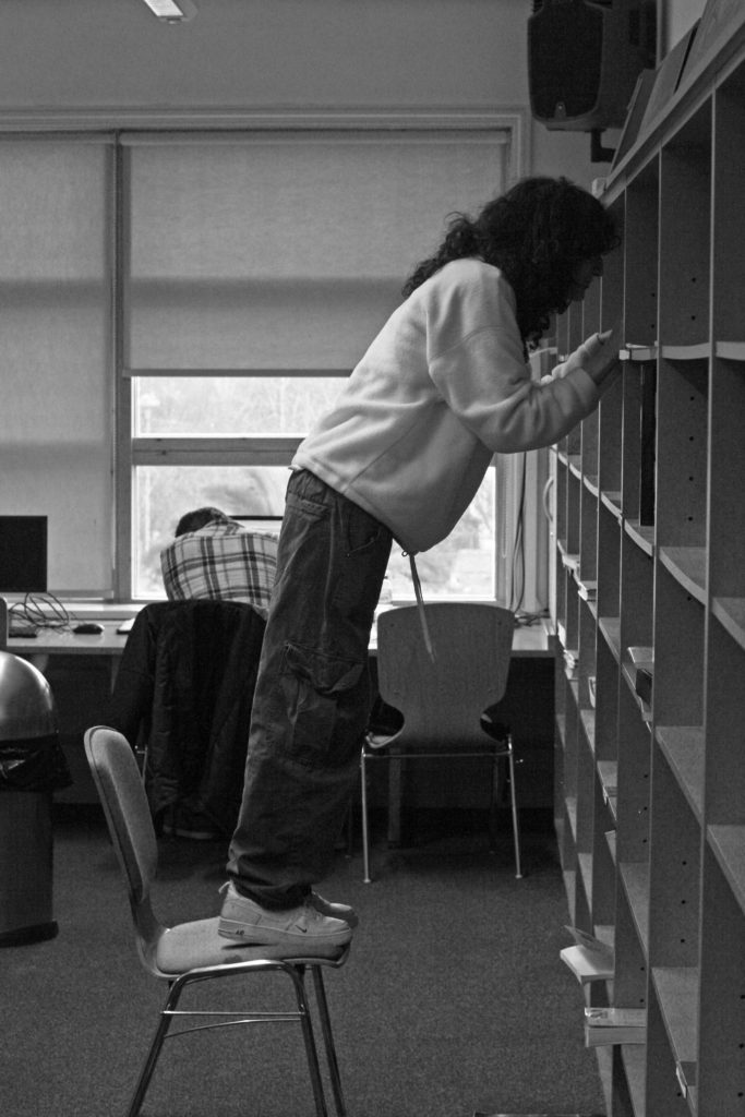
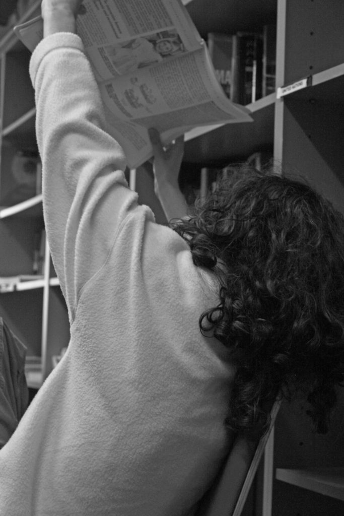
Here I have selected what I believe to be my best and worst photographs from our photoshoot in school. I had my friend pose in our library as this is where she spends a lot of time. I got her to pose in multiple different places and positions
BEST SHOTS

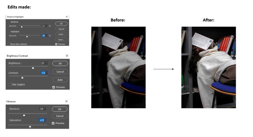
EDITING BEST SHOTS

EDITED BEST SHOTS

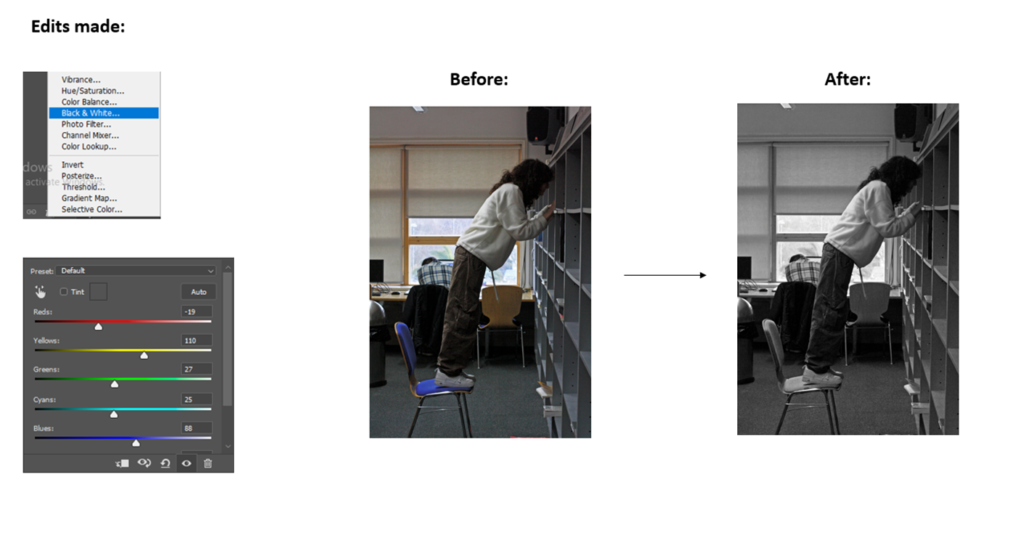
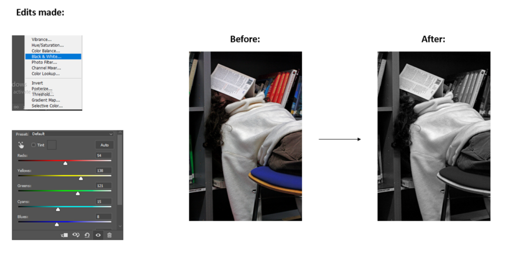
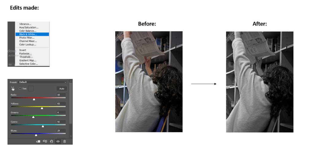
EDITING INTO BLACK & WHITE

FINAL IMAGES IN BLACK & WHITE

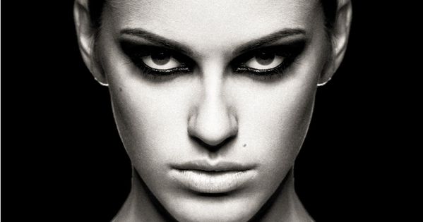
Butterfly lighting

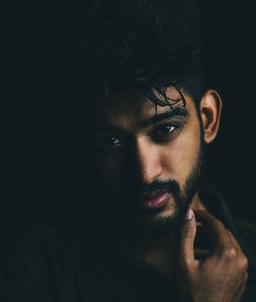
Butterfly lighting is a lighting pattern used in portrait photography where the key light is placed above and pointing down on the subject’s face. This creates a dramatic shadow under the nose and chin that looks like a butterfly.
Whys is called butterfly lighting?

Butterfly lighting is a simple lighting pattern used in portrait photography. It’s named for the shadows that’s formed underneath the nose. Not seeing the butterfly? Picture a butterfly flying toward you, wings spread out…that’s the shadows it creates.

What is butterfly lighting used for?

Butterfly lighting is a lighting pattern used in portrait photography where the key light is placed above and pointing down on the subject’s face.

What mood does butterfly lighting create?

It is ideal for portraits as it highlights the subject’s main features, like the nose and cheekbones. It creates a shadow under the subject’s nose and chin. These shadows make the subject look slimmer. The soft lighting pattern casts a feminine effect on the subject’s face.

My take on butterfly lighting:

Final Outcomes:

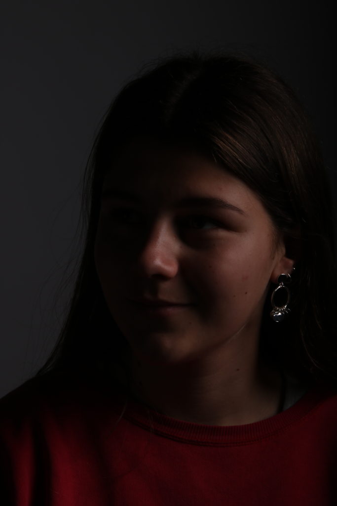
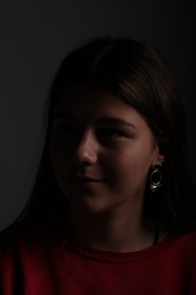
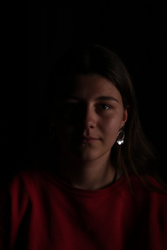
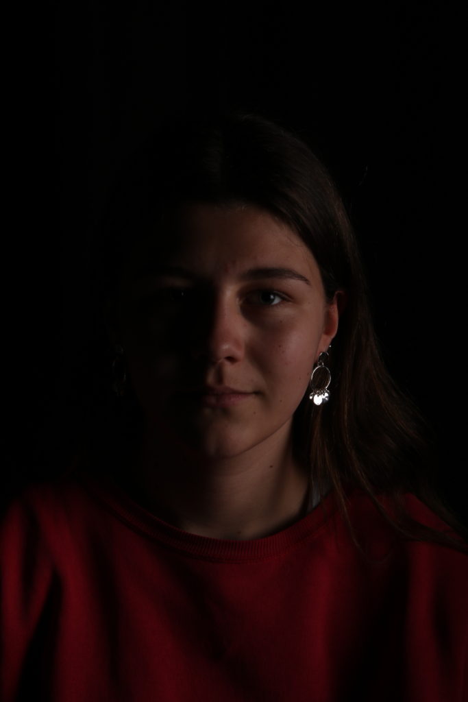
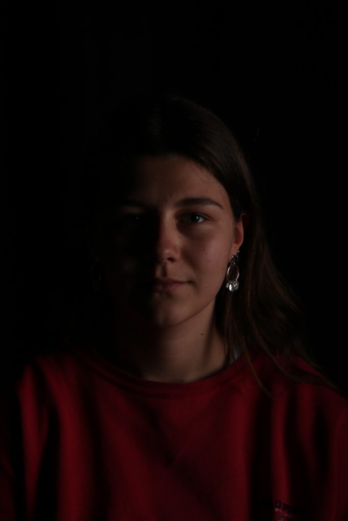
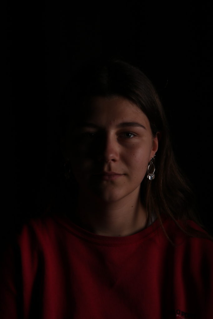
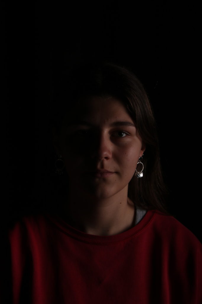
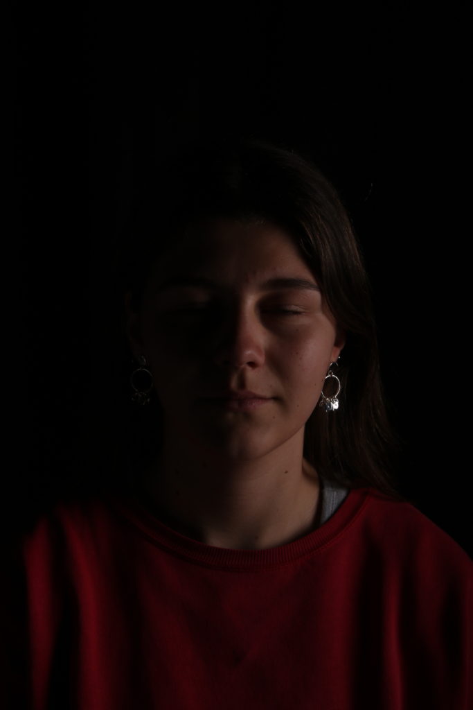
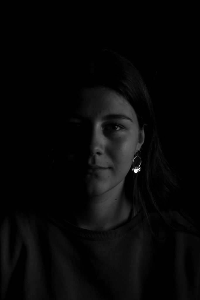
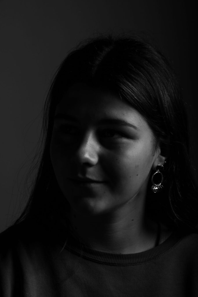
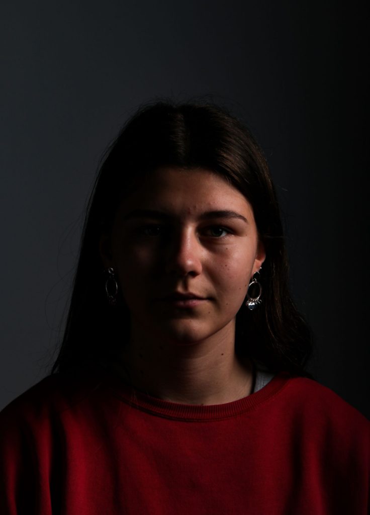
Rembrandt lighting

Rembrandt lighting is a lighting technique which was named after Rembrandt Harmenszoon van Rijn. It is used in photography and cinematography and can be achieved by using one key light and a reflector. It creates a triangle shape from the light on the side of the face which it is not directly hitting whilst leaving the rest of the face dark.

Movie director Cecil B. DeMille is credited for the first use of the term. While shooting his 1915 film DeMille borrowed some portable spotlights from the Mason Opera House in downtown LA and began to make shadows on his subjects. DeMille’s partner first thought that people would only pay half for these images he had taken as only half of the face was captured. But then DeMille told him that is was Rembrandt lighting and they would pay double.

How is Rembrandt lighting useful?

This lighting technique is useful as it creates a dramatic but also natural look on the person. It is considered one of the go-to lighting effects as it creates a dramatic effect but is fairly simple to set up.

Rembrandt lighting set up.

The one key light is placed diagonally to the subject to highlight one half of the face and the camera either centre or at an opposite angle to the light. A reflector should be used to get more light onto the underneath of the subjects face.

Rembrandt lighting own images