When creating my zine I must always keep this idea in the back of my head:
The story I want to express through my zine is spending a day relaxed in the town of St Malo. By crossing the English Channel from the island of Jersey on a short boat trip, you are able to explore the artistic and historic aspects of the town from graffiti on the walls to designated art galleries embedded in little bunkers built by the Germans or on cannon batteries built to defend against the British Navy. St Malo having such a rich historic background presents itself as a high profile tourist attraction where the towns footfall could reach up to 500,000 per annum, meaning the tranquil town can easily become very hectic and busy within a matter of minutes. I want to express the idea of exploring the town, finding something new around every corner.
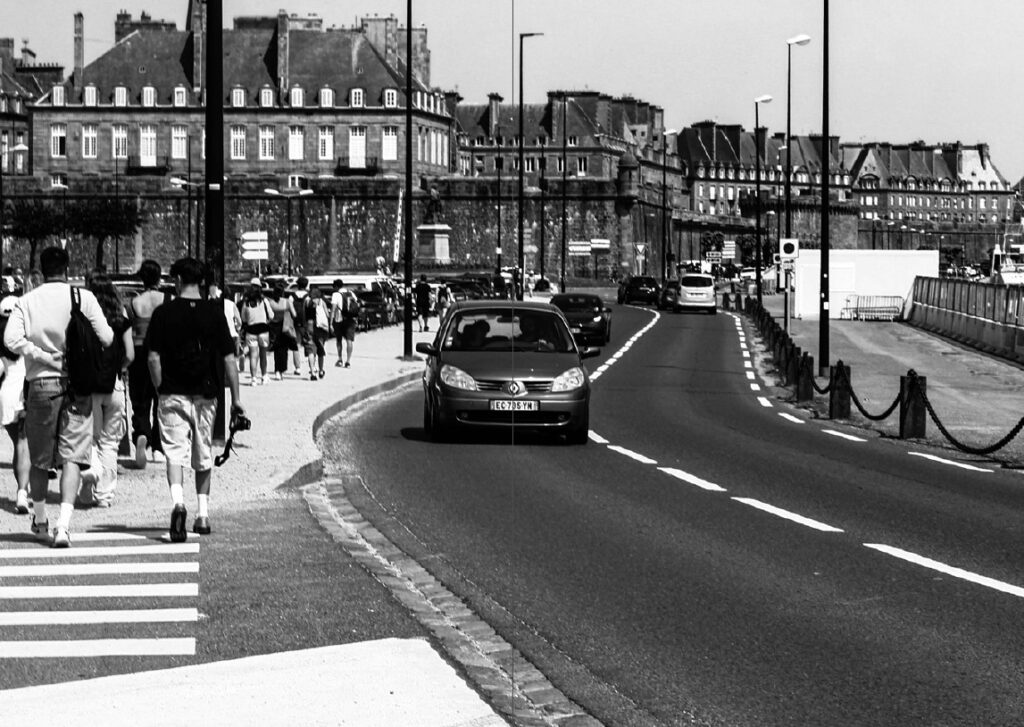
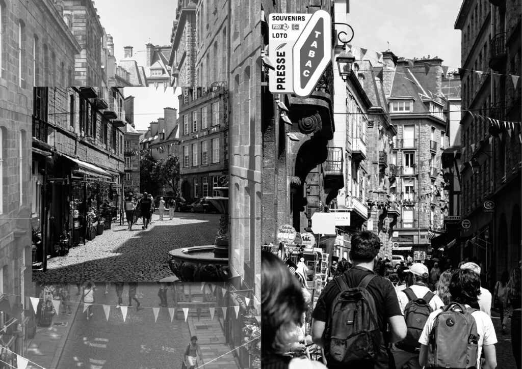
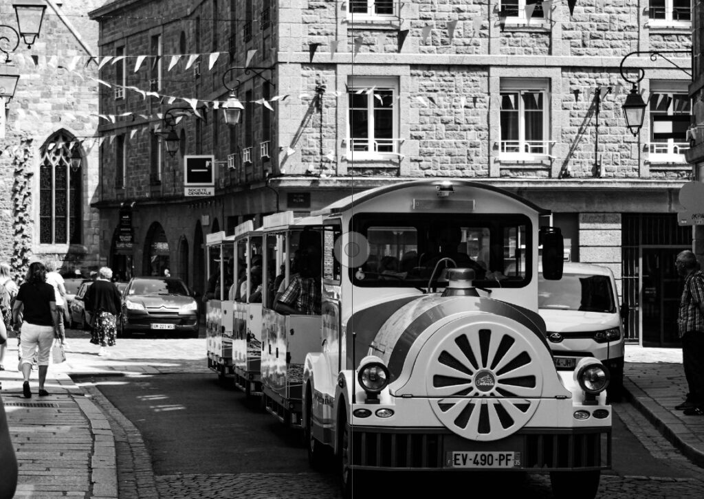
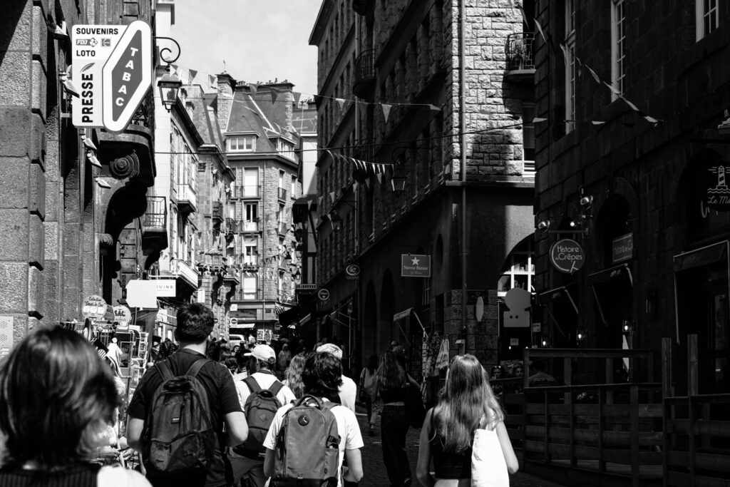
By using a range of images taken on a day trip to the town (shown below), most show exactly what was seen and some were enhanced by using AI software when editing.


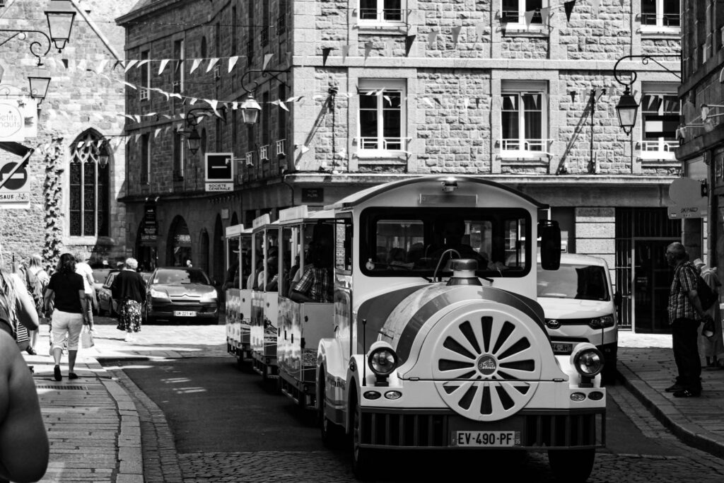
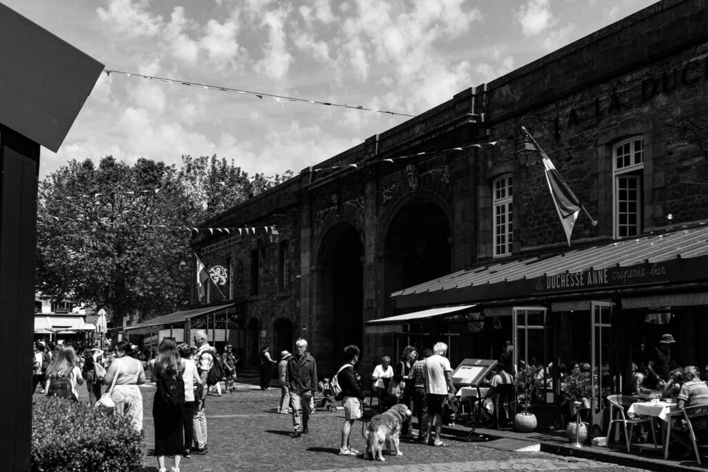


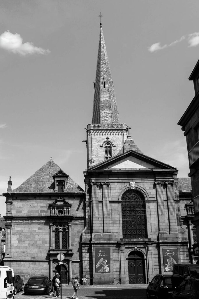


The Title: ‘A DAY OF PIRACY’
I didn’t want to simply title the zine as ‘A Day in St Malo’ as it seems very boring and basic. Therefore I decided to think about the towns history and incorporating that into a title that still expresses that the images were taken in a single day. As a safe haven for pirates throughout the 17th and 18th Centuries and this being the largest point of the towns history I would believe this era to be the best option to weave into a title. The stereotypical swashbuckling sailors that made their livelihoods trading and partying in the town would be exciting. The adrenaline that they must feel when running from the likes of the Royal Navy and the East India Trading Company, attacking and raiding seaside towns and merchant shipping. It was a life of freedom and exploration. And this is exactly the story that I want to tell. A daytrip exploring the pirate town; ‘A Day of Piracy’
Designing the Layout
When looking at my images I notice initial groupings on the pages whereas some images simply don’t coincide with one another. But by maintaining this idea of an exploration, I feel that the more disjointed that the images seem, this idea would across more easily. Of course not everything would be randomly placed together because even an exploration has aspects of uniformity be it a certain type of flower in one area or a single street lined with crêperies.
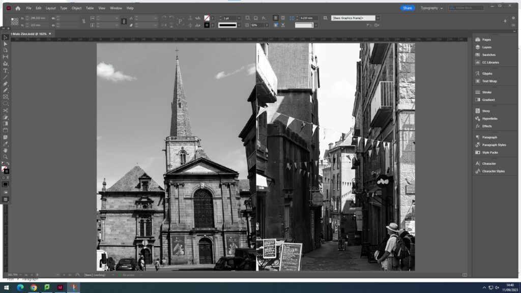
These two images have nothing in common visually but are both sights to see in St Malo. Therefore, I would put them simply together in a very basic format to show that yes they are from the same place, but they have nothing in common except for being a different sight for tourists to see and explore.

With image like the one above that can easily fit across a double page spread on its own but have little or no relation with others, I believe could create a effective background for a group of images that can relate. The image looks very empty with the most prominent aspect being the lone seagull walking on the ground. I believe that by using this photo as a background but maintaining the seagull’s prominence within the spread the towns story could come across very clearly. A possible layout is shown below with a single portrait and two landscape images.


I also wanted to change the final look of my zine, as it all seemed very flat. (Page-spread below)

I experimented with both borders for the images and using drop shadows.


I decided to use the drop shadow effect as it creates a softer look around the images instead of the solid black border.
Below is the final layout for my zine across 16 pages starting with the front cover.

