While at a place called Ikeys, I was taking images of the person who owned the establishment, for an environmental image, until a man outside asked if I would like to take a picture of him outside. There was a use of natural and artificial lighting, which was a bit much so I edited the image to reduce the intensity of the lighting. The guy was good because he gave instant eye contact, in a very content position.
Another Portrait I had taken was of my friend Conor, where he was in a perfect setting for the environment a lot of people would like to be in, which was a party except this picture taken was at the end of the chaos. It shows the Tv in the background with songs playing and the aftermath on the table. I had asked him to position comfortably and look “normal ish”. I had used artificial lighting which was the lights inside, and positioned myself in a way which would suit the setting. Although I have no idea what settings my camera was in as it was a joke at first, the end result was good, so I decided to play around which filters and editing to create some outcomes.
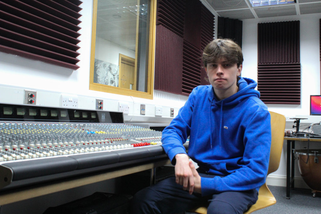
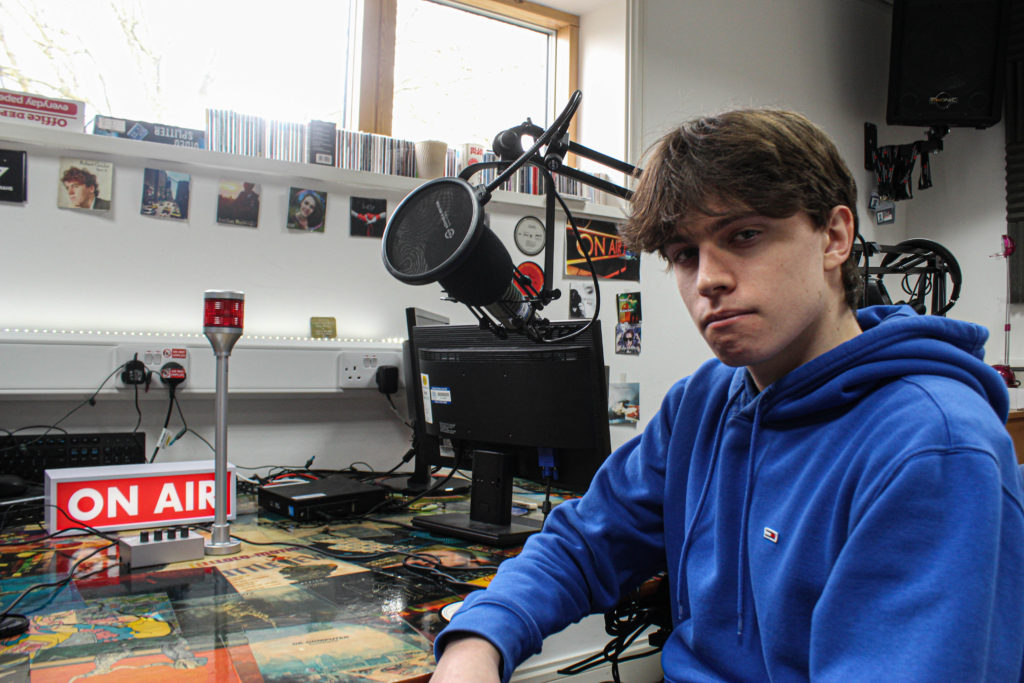
These where some images I had taken during and inside of school with Angus, doing our best to create an environmental portrait, scavenging round school to find a good spot for a picture, was fun for a photography lesson. We attempted with different positions, lighting and angles of the camera. And the results where these, including some adjusting in lightroom.
David Goldblatt was popular in taking images in South Africa, mainly portraying the period of apartheid. Which was where he was taking portraits of people during this period of political war pretty much.
His history goes back to when his father gave him a camera which was found after WWII as a teenager. After that his love for photography grew, attempting to be one of those wedding photographers working for someone else at this time because he wasn’t yet ready. Eventually he sold a clothing shop that his dad gave to him after he passed, and he became a full time photographer, at first documenting South Africa’s apartheid period.
David took an image of a sales assistant in his work environment, this could be intriguing to some because it captures where this person is working and the facial expressions show the seriousness of what might be happening, you don’t see any smiles.
David Goldblatt wasn’t only famous for his environmental portraiture, he was well known for his photography skills in general by also showing his landscaping abilities, and photography of buildings, which he says that the buildings and how they look and are designed tell a lot about the person who built them.
When creating my zine I must always keep this idea in the back of my head:
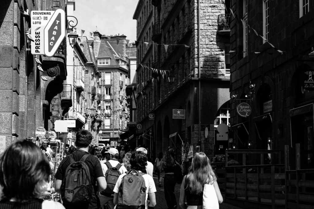
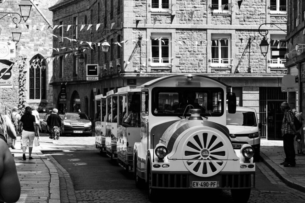
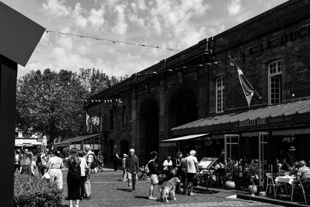
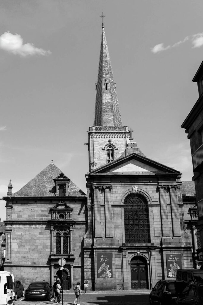
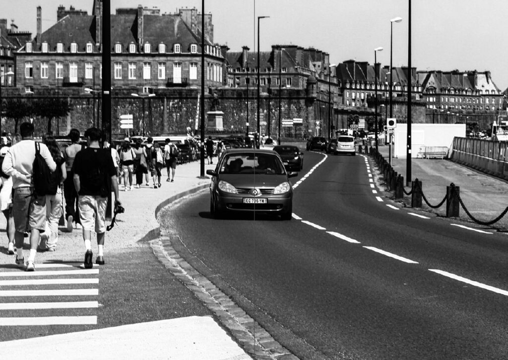
The story I want to express through my zine is spending a day relaxed in the town of St Malo. By crossing the English Channel from the island of Jersey on a short boat trip, you are able to explore the artistic and historic aspects of the town from graffiti on the walls to designated art galleries embedded in little bunkers built by the Germans or on cannon batteries built to defend against the British Navy. St Malo having such a rich historic background presents itself as a high profile tourist attraction where the towns footfall could reach up to 500,000 per annum, meaning the tranquil town can easily become very hectic and busy within a matter of minutes. I want to express the idea of exploring the town, finding something new around every corner.
By using a range of images taken on a day trip to the town (shown below), most show exactly what was seen and some were enhanced by using AI software when editing.
The Title: ‘A DAY OF PIRACY’
I didn’t want to simply title the zine as ‘A Day in St Malo’ as it seems very boring and basic. Therefore I decided to think about the towns history and incorporating that into a title that still expresses that the images were taken in a single day. As a safe haven for pirates throughout the 17th and 18th Centuries and this being the largest point of the towns history I would believe this era to be the best option to weave into a title. The stereotypical swashbuckling sailors that made their livelihoods trading and partying in the town would be exciting. The adrenaline that they must feel when running from the likes of the Royal Navy and the East India Trading Company, attacking and raiding seaside towns and merchant shipping. It was a life of freedom and exploration. And this is exactly the story that I want to tell. A daytrip exploring the pirate town; ‘A Day of Piracy’
Designing the Layout
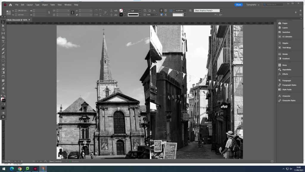
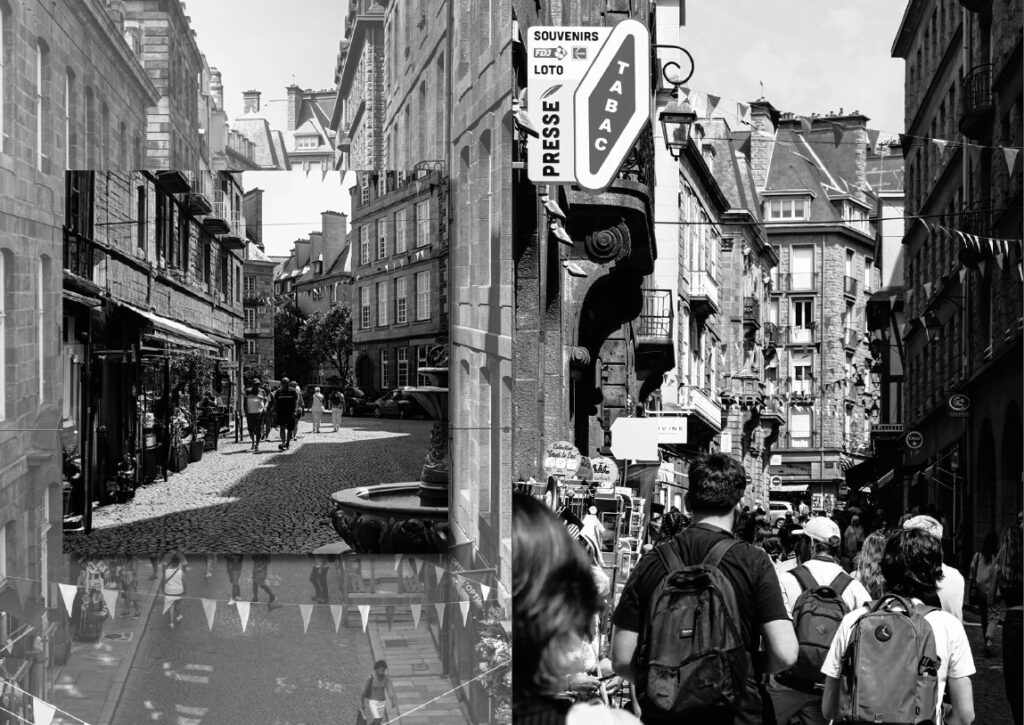
When looking at my images I notice initial groupings on the pages whereas some images simply don’t coincide with one another. But by maintaining this idea of an exploration, I feel that the more disjointed that the images seem, this idea would across more easily. Of course not everything would be randomly placed together because even an exploration has aspects of uniformity be it a certain type of flower in one area or a single street lined with crêperies.
These two images have nothing in common visually but are both sights to see in St Malo. Therefore, I would put them simply together in a very basic format to show that yes they are from the same place, but they have nothing in common except for being a different sight for tourists to see and explore.
With image like the one above that can easily fit across a double page spread on its own but have little or no relation with others, I believe could create a effective background for a group of images that can relate. The image looks very empty with the most prominent aspect being the lone seagull walking on the ground. I believe that by using this photo as a background but maintaining the seagull’s prominence within the spread the towns story could come across very clearly. A possible layout is shown below with a single portrait and two landscape images.
Possible layout for the page spreadImage 1 addedImage 2 addedImage 3 addedFinal outcome for the page spread
I also wanted to change the final look of my zine, as it all seemed very flat. (Page-spread below)
Very flat initial page-spread
I experimented with both borders for the images and using drop shadows.
Page-spread with BordersPage-spread with drop shadows
I decided to use the drop shadow effect as it creates a softer look around the images instead of the solid black border.
Below is the final layout for my zine across 16 pages starting with the front cover.
A zine is a self-published, non-commercial print-work that is typically produced in small, limited batches. Zines are created and bound in many DIY ways, but traditionally editions are easily reproduced—often by crafting an original “master flat,” and then photocopying, folding, and stapling the pages into simple pamphlets. Zines may also be sewn, taped, glued—or even exist in unbound and other non-folio formats.
“Zines provide a safe, independent platform of expression for underrepresented and marginalized voices: Black, Indigenous & People of Color, young people, people with disabilities, the LGBTQ(+) community, persecuted religious groups, and people with limited economic resources.”
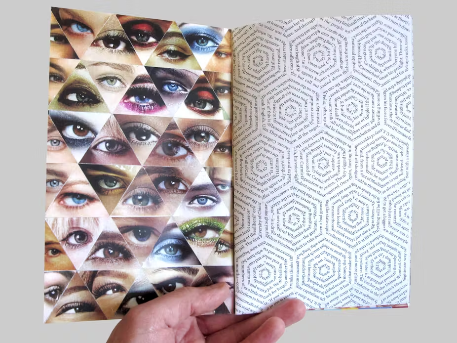
This zine (above) shows a typology of eyes compressed into one single page alongside lines from a book positioned on the adjacent page in a series of hexagons. Looking across two pages, this is an effective technique of separating typical photographic presentations with a page of text, while simultaneously showing a mix of colour and monochrome imagery. However, the overall page spread shares a motif through how each image is presented. Both typologies are arranged in intertwining triangles, the eyes creating a linear, uniform spread and the text forming hexagonal formations. The only critique that I would have for this approach is that it is unclear whether the designer wanted the text to be read as I have no idea if what is written in the text links to the ‘eye’ typology or not. However, if they didn’t want the text to be read then it is an extremely clever and creative approach that has an intriguing effect on the viewer. For me personally, the interlocking hexagonal formations remind of honeycomb and how natural patterns seem the most beautiful and most mesmerising to the human eye.
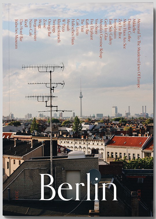
When looking through examples of zines that are focused around tourism, they all seemed to be have the same common approach – a single image of the are that they want to tell a viewer about. For instance the front cover above shows a typical landscape image of a high-rise that is very obviously of Berlin. It has a simple title so everyone knows exactly what this zine will be about. That is the typical front cover for any tourism based zine. However this differs from the status quo by having somewhat of a contents page of what there is to see in the city going across the top of the page, forcing the viewer to take a closer look in order to read it. This is a clever trick to grab someone’s interest, but for me personally I wouldn’t bother attempting to shift my head just to read a little bit of extra information. I also find the simple title of ‘Berlin’ quite boring as a viewer and therefore when designing my own zine would think of a clever way to present what is enclosed in a clever and submerged way that a viewer would have to look through the zine to get an understanding of what it is about.
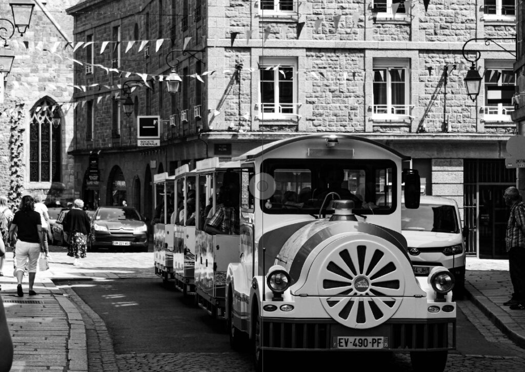
The two page spreads above both show techniques that I would like to incorporate into my design. The image on the left shows on photograph spanning across a double page as an establishing shot for the section of the zine about ‘Mitte’. I believe that this is a good way to show off more important images of the St Malo that I have taken (i.e. the petit train that tours the town or a view of the walls from outside of the town as you approach from the ferry terminal). The spread on the right if you look closely shows an image of food and coffee layered on top of an establishing shot of a café. I want to use this technique as it is a stylised way to not only use more of my images but to also create an unusual background for that specific page spread.
When creating a zine or photo book, you need to have story for your images to flow and make sense within it. A good and easy way to come up with your story line is to describe in 3 WORDS:
Relaxed, Artistic, Busy
A SENTENCE
In my zine, I want to tell the story of a relaxed, artistic and busy little town on the coast of France.
A PARAGRAPH
The story I want to express through my zine is spending a day relaxed in the town of St Malo. By crossing the English Channel from the island of Jersey on a short boat trip, you are able to explore the artistic and historic aspects of the town from graffiti on the walls to designated art galleries embedded in little bunkers built by the Germans or on cannon batteries built to defend against the British Navy. St Malo having such a rich historic background presents itself as a high profile tourist attraction where the towns footfall could reach up to 500,000 per annum, meaning the tranquil town can easily become very hectic and busy within a matter of minutes.
NARRATIVE: How will I tell my story?
I want to take the simple approach to my zine by telling the story through images with the main text being the title. In my opinion the zine should be more visual rather than textually based. The title should be enough text for someone to have some kind of understanding of the overall narrative in order to form their own opinions of the town.
The images should be grouped either by what they show or by where or how they were taken. For example the images below all show the towns most loved aspect, its food and creperies.