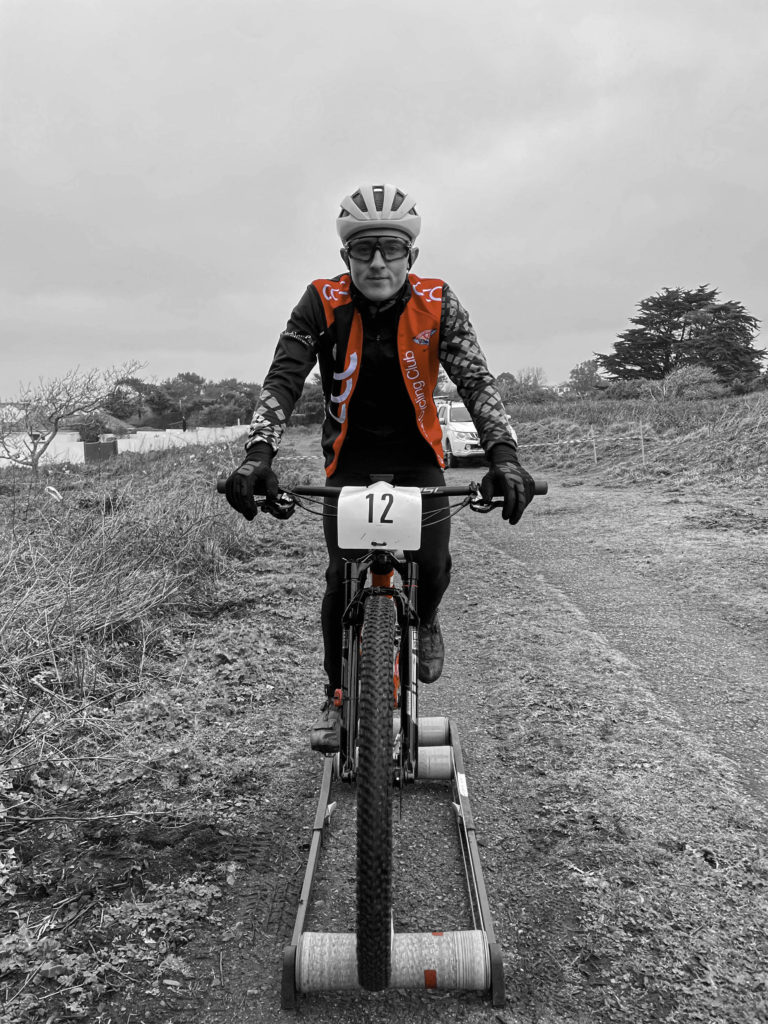
For the first part of this shoot I chose to photography a cyclist who was warming up before a race. I think that I have framed him quite well in the camera as his is very central and almost sits on the bottom of the image. I like the colours that contrast in the image like the red and bright blue as well as the white and green standing out to the viewers. I think that the fire track in the image adds a focal point as after you have seen the model your eyes get drawn down the path as well as into the background. The grey sky doesn’t add much to the image however, I think that it allows you to focus on the rider rather than what else the image holds. I have also shown one of my images in black and white as well which I think is a very effective image. I like how it has brought out all the detail with the darker and lighter tones as well as enhance the models facial expressions. If I were to make this image again I would add a bit more space to the bottom of the image to put the model in the very centre of the frame. As you can see in the image with the red grid over it with the rule of three, my model is a bit more in the bottom image rather than in the centre with a bit in the top and bottom.


I also tried some different edits with this image as you can see bellow.

In this image I left all of the image black and white but made the part of his jacket the was red show.

In this image I did the same however I made the red parts of his bike and the tape on the rollers show as well as his jacket.

For the second part I photographed three dancers, I had them all in different costumes and positions so that I had a variety or images. I kept the background plain so that the viewer would be able to focus on the model rather than looking for other detail. I like how these images turned out and think that they capture the dancers nicely. I also think that they all stand out with the colours of their costumes which contrast with the background wall. Similarly to my images above of the rider, I like how I have framed the models as they are very central, with some space above and below them. I have also edited the image to black and white white I think it more effective that the original colour image. I think that it make the model look more defined and exenterates her costume, hair and glasses. If I were to take these images again I would add some more colour to the image as they are very dull other than the costumes, and are quite plain. I think that to improve this I could have edited them more to give them a better contrast in tones and add more definition to them.


