Anthropocene refers to the earths latest geological time period which is that of the affect of humans on the environment and earths ecosystem. Humanity has had drastic effects on the earths climate such as animal extinctions – The Anthropocene was a project started where artists- photographers, filmmakers ect could make responses to climate change and Anthropocene. For my project I decided to focus on plastics and how we are so reliant and so used to using and seeing plastic everywhere.
initial ideas
-post covid
-population density buildings-apartments offices- night photography
– plastic waste – plastic bottle colidescope??
My initial plan for the Anthropocene project was to look at the after math of Covid – masks and signs left over. I found a lot of that in Edinburgh and other cities ( old vaccination centre signs left in shopping enters) but jersey didn’t have anything as extreme because of the smaller population. I decided to focus on plastics and how used we are the seeing them in our daily lives.
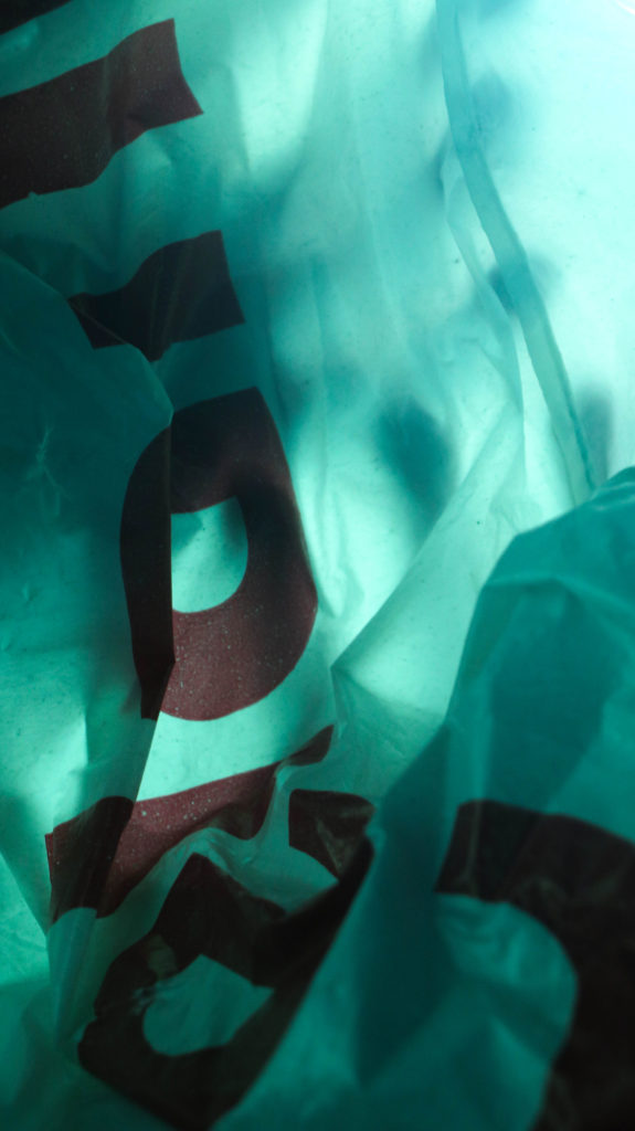
My initial plan for the Anthropocene project was to look at the after math of Covid – masks and signs left over. I found a lot of that in Edinburgh and other cities (old vaccination centre signs left in shopping enters) but jersey didn’t have anything as extreme because of the smaller population. At this point I was also very inspired by Stephen Gills work and felt that it wouldn’t hand itself as well to that so I decided to focus on plastics and how used we are the seeing them in our daily lives – hence inspired by Stephen Gill I put plastics over the lens so you were literally seeing through it. The final photos inspired by Stephen Gill in themselves were interesting but didn’t end up being my favourite.
I had struggles getting to camera to focus how I wanted through the clear plastic screen and a lot of photos ended up being blurry if I were to do it again I think I would find another way to suspend the plastics in front of the lens but I think it was an interesting experimentation and something I would try again in the future.
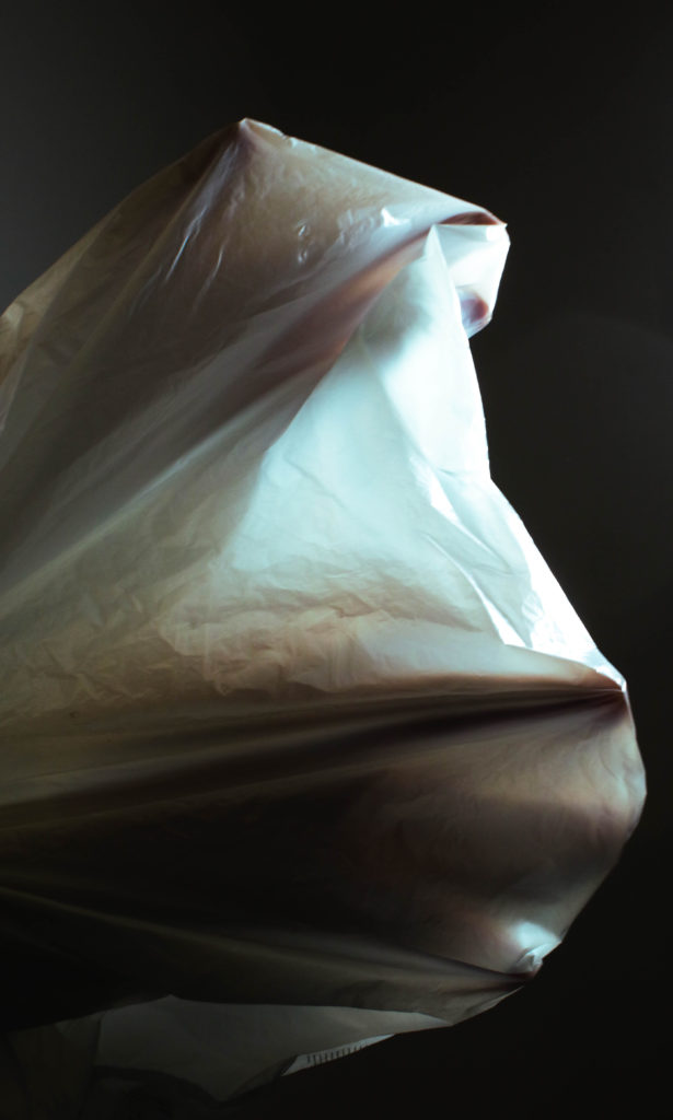
For the second photoshoot I collected plastic bags inspired by Vilde Rolfsen but instead I wanted to focus on human form mixed in with the plastic, the idea being ‘drowning in plastic’. I also took inspiration from René Magritte’s The Lovers painting as I wanted to create something ‘haunting’, so I focused on trying to make shapes and silhouettes inside the plastic bags using backlighting.
—
For these two images I used filters over the studio lights – Alone they aren’t successful images however together they compliment each other well.
The initial attempts looked a bit horror movie poster esc so I leaned more towards scrunching the bags to make interesting shapes.
The middle image of the three was kind of and afterthought as it was suggested to me that there should be a third to create balance finding an image was quite difficult and it is not my favourite however i think it works well to break up the other two.
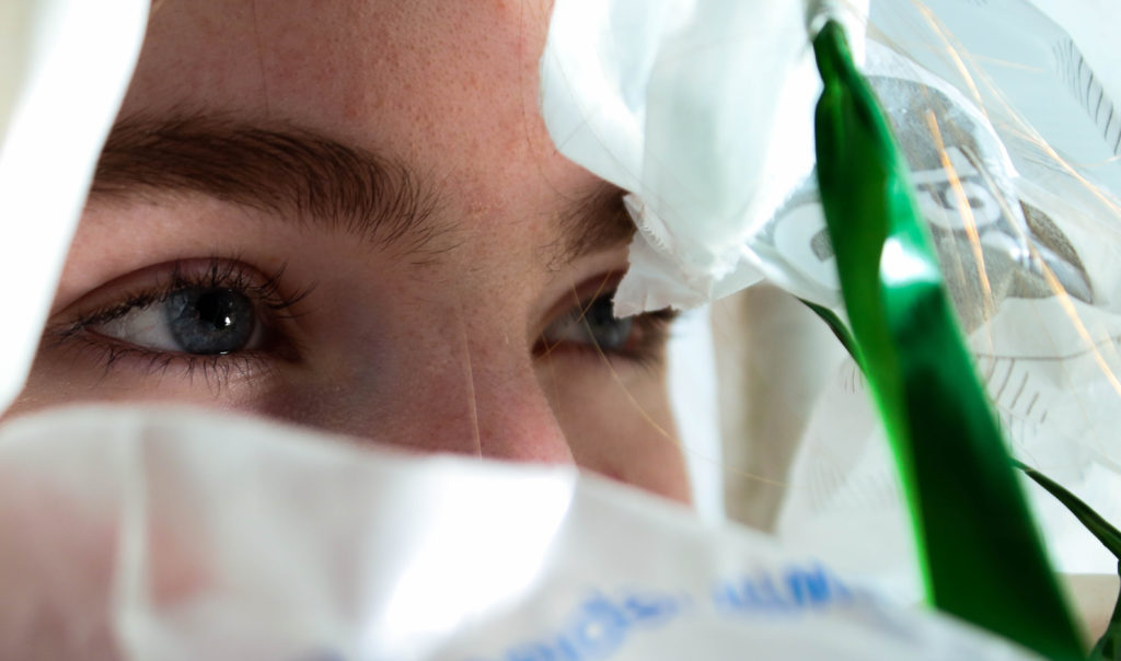
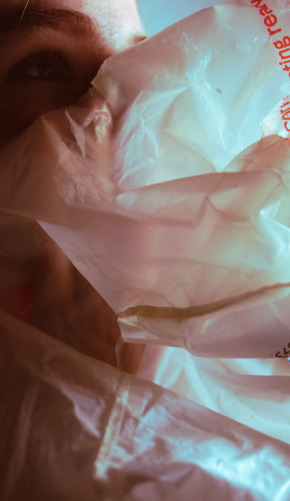
I then tried using portraiture along with the plastic bag and whilst I liked these two but I found the portraiture was overbearing with others and took away from what I was trying to achieve.
The black and white whilst giving it a more dramatic look took away from the unnatural colours I was trying to achieve.
With this image I was attempting to imitate the pastel colour gradients that Vilde Rolfsen uses in her work – whilst being whilst achieving what I wanted I felt that for this product it wasn’t what I was looking
Over all I am pleased with the project and the final images I think they articulate what I was going for well. however there’s a lot if given the chance I would change and improve.
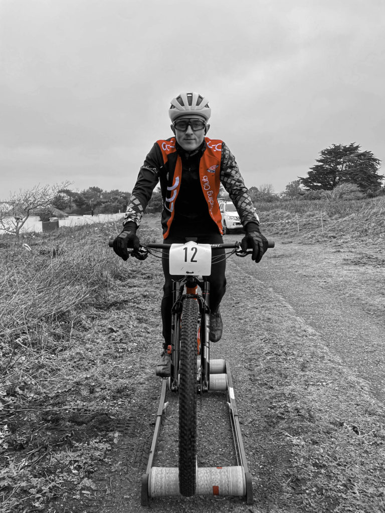
For the first part of this shoot I chose to photography a cyclist who was warming up before a race. I think that I have framed him quite well in the camera as his is very central and almost sits on the bottom of the image. I like the colours that contrast in the image like the red and bright blue as well as the white and green standing out to the viewers. I think that the fire track in the image adds a focal point as after you have seen the model your eyes get drawn down the path as well as into the background. The grey sky doesn’t add much to the image however, I think that it allows you to focus on the rider rather than what else the image holds. I have also shown one of my images in black and white as well which I think is a very effective image. I like how it has brought out all the detail with the darker and lighter tones as well as enhance the models facial expressions. If I were to make this image again I would add a bit more space to the bottom of the image to put the model in the very centre of the frame. As you can see in the image with the red grid over it with the rule of three, my model is a bit more in the bottom image rather than in the centre with a bit in the top and bottom.
I also tried some different edits with this image as you can see bellow.
In this image I left all of the image black and white but made the part of his jacket the was red show.
In this image I did the same however I made the red parts of his bike and the tape on the rollers show as well as his jacket.
For the second part I photographed three dancers, I had them all in different costumes and positions so that I had a variety or images. I kept the background plain so that the viewer would be able to focus on the model rather than looking for other detail. I like how these images turned out and think that they capture the dancers nicely. I also think that they all stand out with the colours of their costumes which contrast with the background wall. Similarly to my images above of the rider, I like how I have framed the models as they are very central, with some space above and below them. I have also edited the image to black and white white I think it more effective that the original colour image. I think that it make the model look more defined and exenterates her costume, hair and glasses. If I were to take these images again I would add some more colour to the image as they are very dull other than the costumes, and are quite plain. I think that to improve this I could have edited them more to give them a better contrast in tones and add more definition to them.