Image Analysis

When first looking at this photo there is a clear power dynamic the man in the centre at the forefront of the image staring straight into the camera with a blank expression and clasped hands it gives him a sense of confidence and almost makes him intimidating to look at.

The two pillars either side create symmetry framing him and the industrial looking workshop behind him implying that he owns it. His body creates a triangle in the centre mimicking how his hands are clasped also in a pyramid shape this furthers his sense of power. The ceiling has beams that lead backward creating depth but also drawing the eye back to looking at him. There are skylights on the ceiling that whilst letting light in also create a pattern leading to the back of the workshop helping create depth this is used to create a visually interesting image with harsher lines but also creates a sense of scale within the environment. with The use of backlighting in the image casts the mans face is in shadow obscuring his face whilst also giving him highlighting his silhouette giving him more shape and sharpening his features makes his gaze more severe. A shallow aperture is used to have the foreground focused whilst unfocusing the background keeping the eyes on the man as the focal point of the image.

The man in the photo was Alfried Krupp a German industrialist in charge of making trains in world war 2 many of which were used to transport Jews to concentration camps. The photographer Arnold Newman initially refused the commission the photograph Alfried Kruppbut later accepted seeing it as an opportunity to ‘expose’.

Photographer Case Study

Michelle Sank

Michelle Sank is a South African photographer born in Cape Town, however, she’s lived in England since 1987. Her images represent her interest in the human condition and because of this, her work can be seen as a social documentary. She quite often targets social and cultural issues with her work.

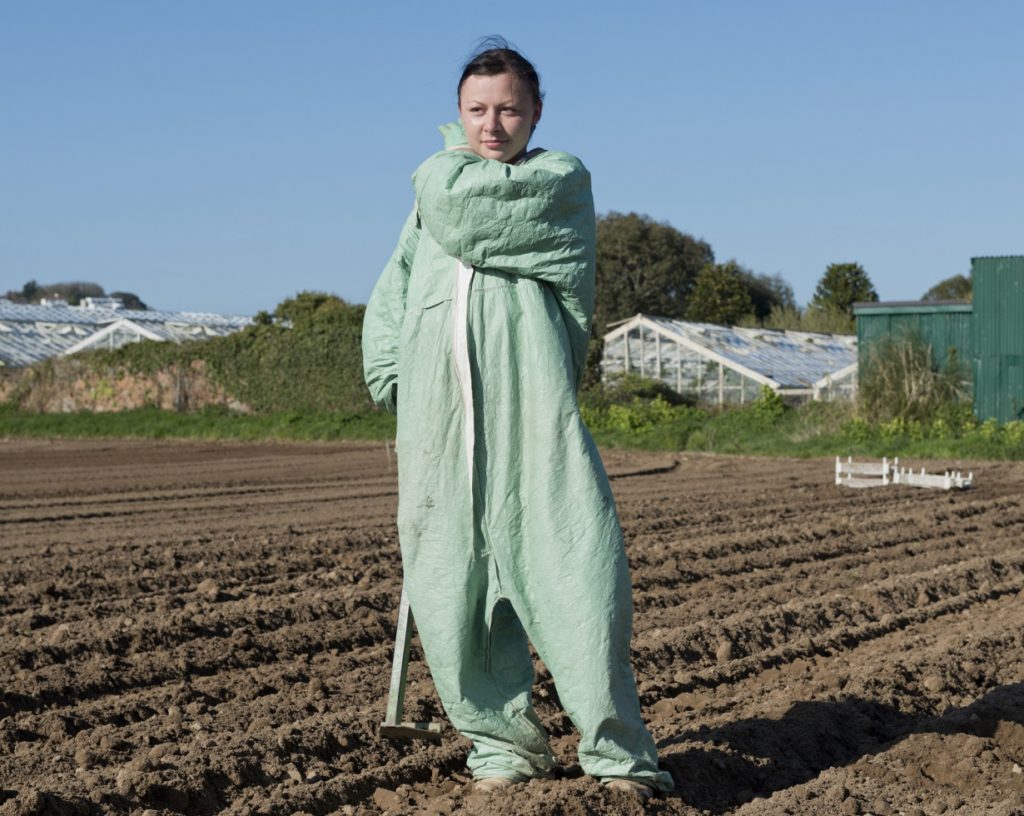
This is a series of images that she made in Jersey called Insula. Using locals in their homes, places of work, or even somewhere they enjoy being, she made images to develop a lyrical vision within which the defining influences are place and cultural geography.

Another collection of images she has made is “Breathe” was made during the Covid-19 pandemic. First, she documented the social isolation and then the lockdown in this collection of images. As she says on the portfolio of this collection, she felt drawn to how people of all ages were “negotiating” the new way of living and how their relationship to each other changed.

Alongside this, house facades and accompanying objects discovered in the area have taken on a heightened sense of relevance serving as a way of showing that the people were in isolation.

Michelle Sank hasn’t actually finished this project and is continuing as the Covid-19 situation continues on. She is due to release more images in the near future.

Image Analysis

First I’m going to start with how the image came about, Michelle Sank was asked to make a collection about what being a young person in today’s society is like. Michelle did this using people from all different ethnic background and using the cultural divide. She also took the images in the subject’s room, so the objects and decoration could tell us about the person.

In terms of the actual image analysis, the image has a lot of natural light coming in and there are a lot of squares e.g. the mirrors, the window etc. The subject is in the middle of the image sat on their bed, looking straight into the camera. Based on the bedroom, it doesn’t look like she spends a lot of time in her bedroom, there aren’t clothes thrown around the place or there isn’t even that much decoration apart from the mirrors. The girl herself doesn’t look very comfortable, if that’s because of the way she is sat or whether it’s because she’s not that comfortable in her room.

PHOTOSHOOT PLAN; ENVIRONMENTAL PORTRAIT

PHOTOSHOOT PLAN:

MOODBOARD:

WHAT?

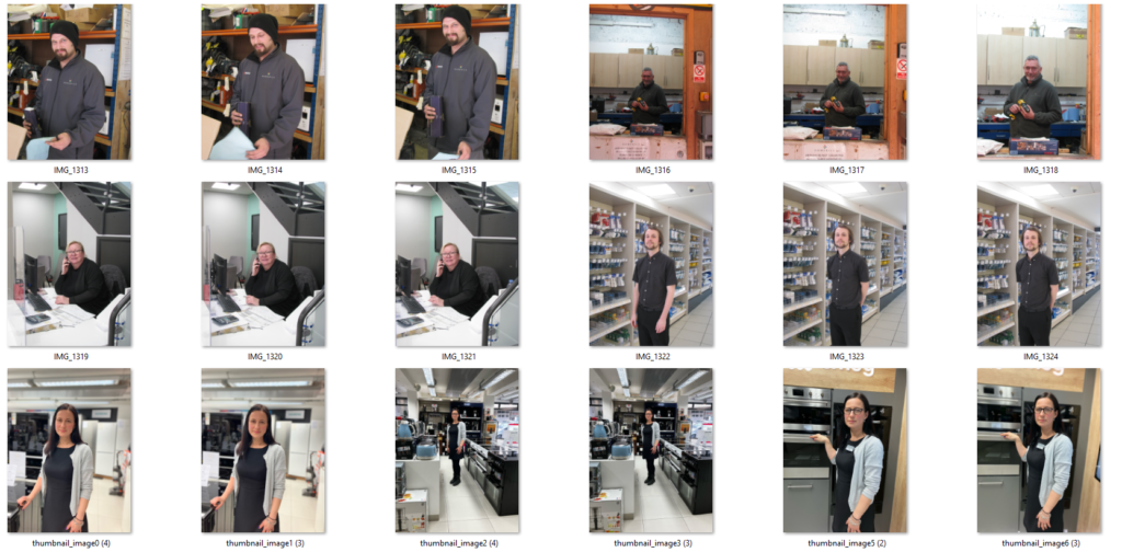
I will be taking environmental portraits of people in their work place. Furthermore I will take images of people in public places living their lives, personal or professional.

WHERE?

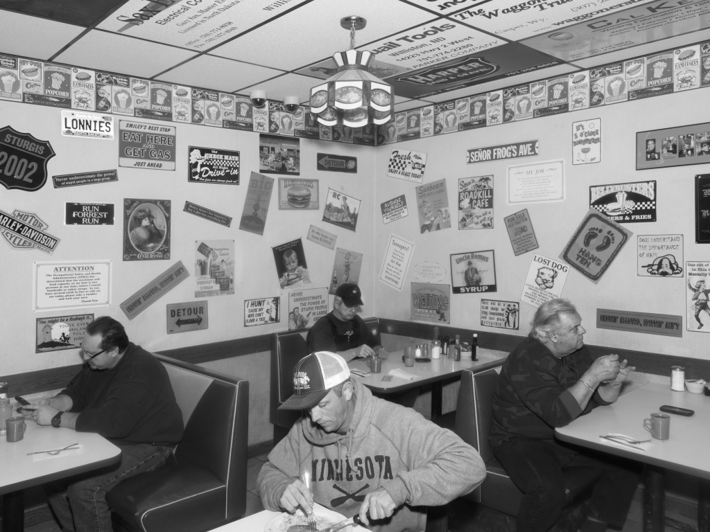
Locations where I may try to take this images will be various places in town; the market, restaurants, small local business’ and perhaps small spots where young people decide to meet up.

WHEN?

These images will be taken on the date; Wednesday 1 March, regarding whether the weather will be dry and have some soft natural light. Higher in the market and fish market there is natural lighting while also having some artificial light on the walls and ceiling so perhaps I can take my images there. This will also give me enough time to upload and basic edit the photos I will take.

HOW?

I will be uses my personal camera which I have at home, while also taking some on my phone so I can take subtle and natural images, to create an authentic image of how people really are.

WHY?

This shoot is to illuminate the subject of environmental portraiture which discovers the behaviours and decisions of people.

Environmental artist research

Michelle Sank

Michelle Sank is a South African photographer. She left South Africa in 1978 and has lived in Exeter, in the South West England, since 1987. Her work is included in the collection of the Museum of Fine Arts Houston, the Centre for Photography at Woodstock and the Royal Albert Memorial Museum. She was born in 1953 and prides herself on the diversity of young people in her images.

Her images often depict the youth and usually have vibrant tones. The models in her photographs are often styled with 2000’s clothing.

– Michelle Sank “Quincenera Girl, San Francisco”

Sank created this image by taking a face on full body shot. She had her model wear a bright orange ballgown dress to contrast the nature setting behind her making her really stand out. This allows the model to be the main focus of the image.

We are also able to see more modern aspects such as the car’s and electrical wiring in the background again contrasting with the nature we can also see in the image.

Laura Pannack

Laura Pannack is a British social documentary and portrait photographer, based in London. Pannack’s work is often of children and teenagers. Her work has been shown in three solo exhibitions and contributed to a couple of publications. She was born on June 12, 1985 in London.

Her images are usually of young people in some sort of emotional state. Body language and scenery often play a big role in her images with lots of cool tones.

-Laura Pennock, Hannah Farquhar Visit

In this image, Pannack focuses the image solely on the model making her the centre point of the image. She took this from a forward facing, eye view angle as well as keeping cool tones in the image. There are also links such as the blue from the girl’s eyes matching against the blue of her jeans or her hair matching the wheat field in the background.

We are also able to see the body language of the girl, her hands are placed awkwardly at the side of her legs and she is looking directly towards the camera with a concerned look on her face indicating she’s nervous.

EDIT; PHOTOSHOOT ONE

EDIT ONE:

FURTHER EXPERIMENTATION EDIT ONE

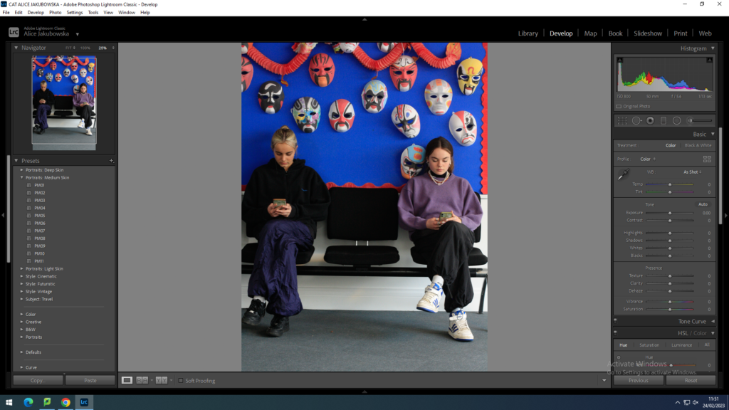
PRESETS IN LIGHTROOM CLASSIC

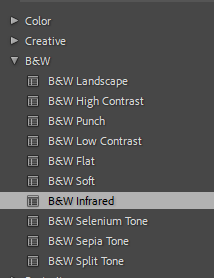
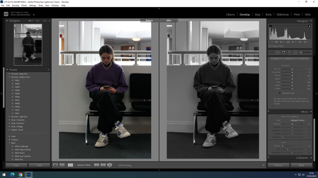
I tried using different black and white presents to experiment with my portrait. The black and white Infrared created a textured and grainy image while also giving more definition to the masks in the background.

EDIT TWO:

EDIT THREE:

PHOTOSHOOT ONE

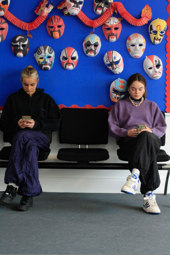
This photoshoot was experimenting with the camera and creating environmental portraits. We had taken the images around Hautlieu school. My best image was taken on the languages wing where both Anna and Phoebe, were sitting on the stairs with the masks behind them. Most of my images have a low resolution and are out of focus, when taking my environmental portraits I need to check my camera setting before I go out.

BEST IMAGES:

IMAGE COMPARRISON:

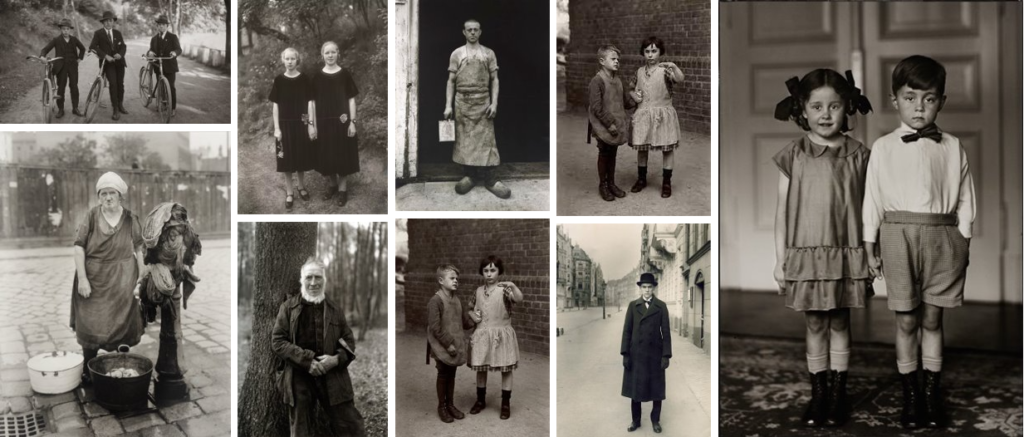
Within the two images they both include two people within them, there are some similarities between the images however there are also some differences. Both images are in black and white however Sanders image has more of a grainy texture due to the technology at the time, as well as him trying to reduce using new technology. Both images have two people within the frame however they have different connotations. Due to the close proximity of the subjects in Sanders image it could suggest they are related or relatively close friends. Both kids are looking directly at the camera, giving a direct mode of address, suggesting that they have been instructed what to do, this could be because they are children however in observing their clothing it suggests they are part of the upper class so they have to maintain a certain image. In my image both girls are looking at their phones with a space between them, this is to show how society has evolved while showing the effects of new technology and how it has consumed young minds. With the distance between the images it is reinforce the idea of the distance that technology create social interactions.

ARTIST REFERENCE; AUGUST SANDER

August Sander Moodboard/Environmental Portraits

WHO IS AUGUST SANDER?

August Sander was a German portrait and documentary photographer.

ABOUT AUGUST SANDER:

Sander’s photography career began when he was a teenager. Sander worked on his project through a period of tumultuous social and political change that spanned the Weimar Republic and the Nazi regime, and one of his early book projects, Face of Our Time. Sander’s work continues to be a source of inspiration for generations of photographers, including Walker EvansDiane ArbusBernd and Hilla Becher, and Rineke Dijkstra.

5 THINGS ABOUT AUGUST SANDER:

  • August Sander didn’t come from an artistic background
  • One of his projects lasted his whole career
  • He captured a key moment in German History
  • August Sander avoided new technology
  • His influences cannot be overestimated

IMAGE ANALYSIS:

August Sander – Master Mason – 1926

Visual –

In this image you can see a man standing against bricks. This is an example of an environmental portrait taking it perhaps at his place of work. His full body stance suggest power and strength, he is showing his whole body which suggests he is revealing himself and has nothing to hide. He is wearing a white jumpsuit, suggesting he is in work uniform, however you can see some dirt suggests he work hard labour. Furthermore due to the place this image is taken in suggests that he is a builder which shows he is hard working. The background is plain yet the positioning of the brick creates a frame around his body trapping him between the two towers, creating a slight frame in frame photograph. The tone of this image is muted and subtle, the black and white in this image does not creates a feeling of no emotion yet has a slight ominous undertone within it.

Technical –

Sander did not use the newly invented Leica camera. Instead he remained devoted to an old-fashioned large-format camera, glass negatives and long exposure times. This allowed him to capture minute details of individual faces.

Contextual –

“Man of the Twentieth Century” was Sander’s monumental, lifelong photographic project to document the people of his native Westerwald, near Cologne. Sander was trying to document people and how they evolve and what they do for work showing the difference throughout the years. This image was taken in around 1926.

Environmental Portraits – Alec Soth

Alec Soth, born in 1969, is an American photographer based in the state of Minnesota, with over 25 published photobooks. Soth seems to focus on both landscape photography and portraiture, often combining them into personalised environmental portraits.

This image is a full-length body shot of a man Soth was curious about on his road trip. The man in the image, Charles, stands in quite a regular position, wearing his lightly paint-splattered overalls, almost dressed like a pilot, which creates connotations to the model planes in his hands. The colour palette in the photograph is very high-key, the biggest contrasts being from the darkest shadows underneath the materials on Charles’ roof and under the gutter on the wall of his house, to the ice-white snowfall on his roof. The exposure in the image is quite high, evident in the lack of detail in the bright grey sky and the snow, which complements the airy colours throughout the rest of the piece. Charles makes a direct mode of address to the viewer with both his body language and his eyeline, looking straight into the camera lens, although the reflection in his glasses makes it rather difficult to see. He bears a neutral expression on his face, which forces a viewer’s opinion to be purely based off of the rest of the environment and his other features. Soth intends to present Charles in a documentary-style image, not reinforcing any sort of authority, gender roles or authority, displaying Charles in as raw a form as he can.

Soth came across Charles during a road trip, when noticing his home and its peculiar glass-domed roof. Soth knocked on his door and requested to speak to the occupants, to learn about these strangers, and took the photograph a few hours later. He learned that Charles was a very aspirational person who’d built the dome to look at the stars, and considered himself a ‘dreamer’.
Officer Earl Running by CandyElgatoMagico on DeviantArt