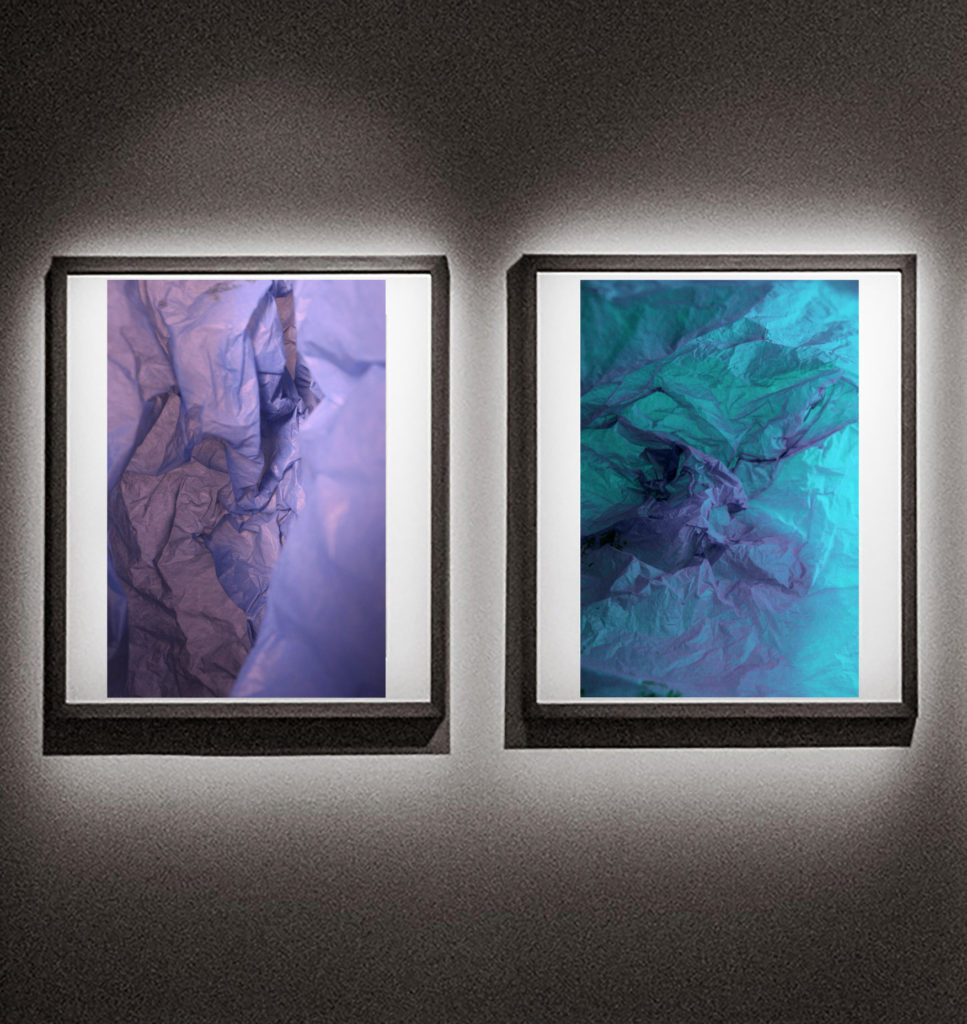
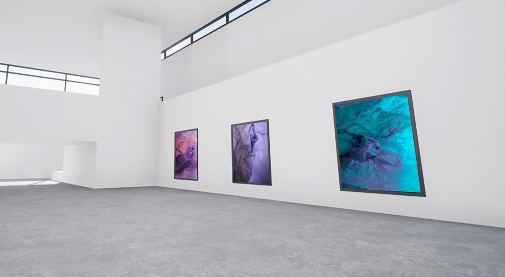
These are my most successful outcomes from this project:
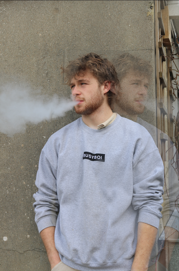

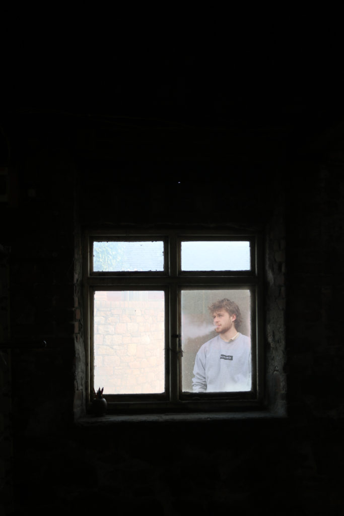


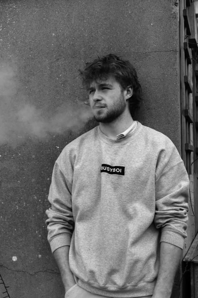


These are my most successful outcomes from this project:


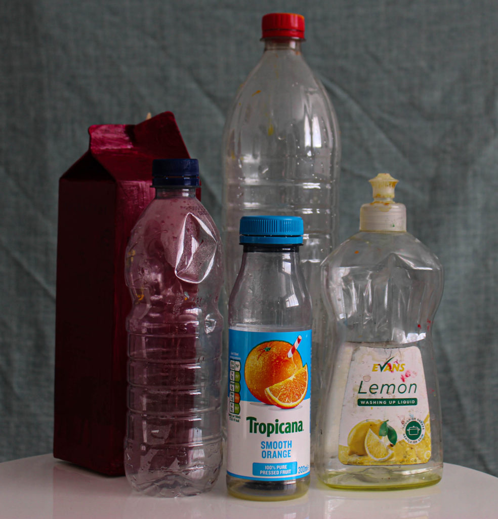


Thirza Schaap’s ‘plastic ocean’ project combines sculpture with photography and examines our changing relationship with plastics and the increasing and overwhelming presence they have in our lives.
At a first glance, the debris do not disgust us. On the contrary. Their dainty look almost seems to gloss over the ugliness of all the plastic pollution on our beaches. But only for an instant. Our initial attraction, soon fades.
Thirza Schaap:
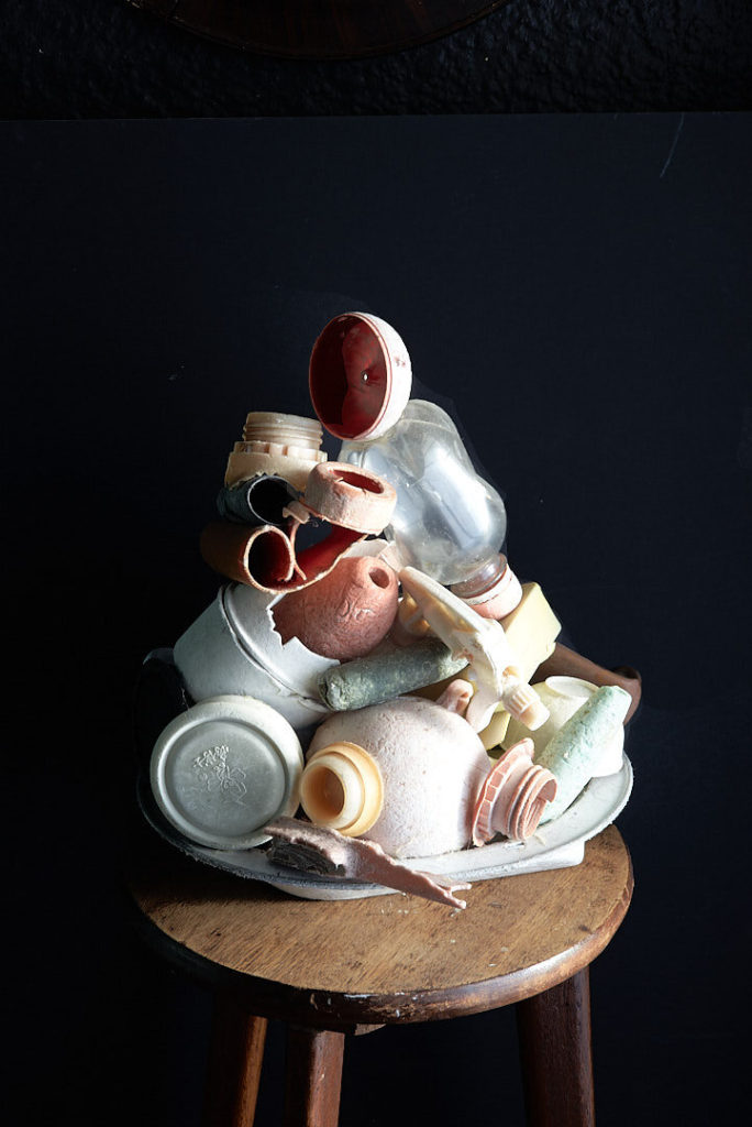
This image shows a clash between worlds, offering minimal and aesthetically pleasing compositions which, on closer inspection, in-still a sense of ecological grief. Plastic Ocean questions consumption, idolatry and what it is we value in our lives today. The effect is a quirky, playful and pop art paradox.
Plastic Ocean provides a kind of Vanitas for the 21st century. Traditional icons of mortality, ephemerality and wealth have been traded out for bottles, baskets and bowls: single-use items which are used and discarded, now only existing as empty vessels of destruction.
My image:
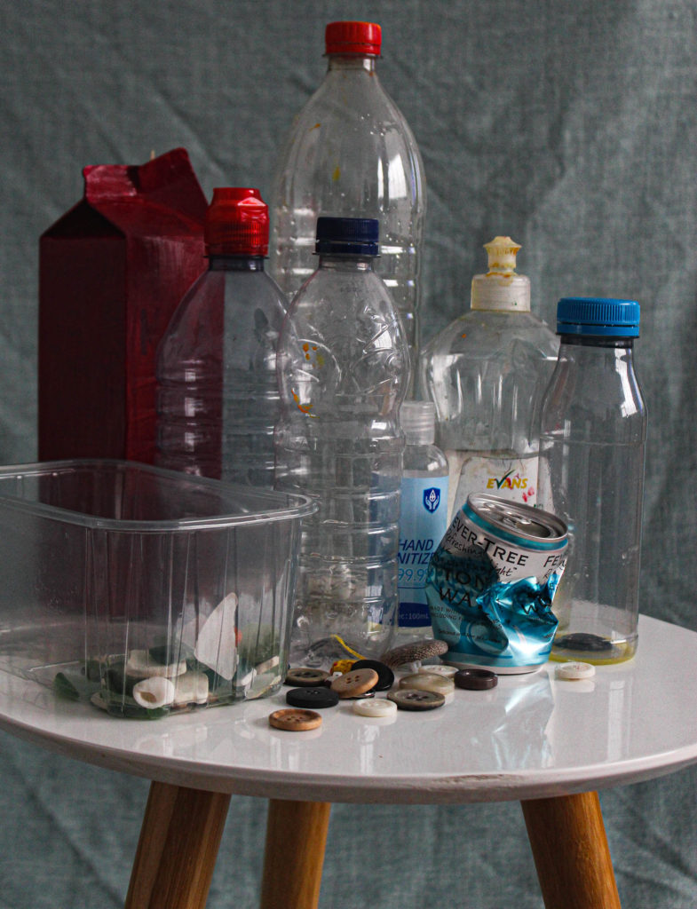
I liked Thirza Schaap’s style of work, relating to the Anthropocene project, as she took rubbish and plastic debris which is usually seen as disgusting, and made art out of it by creating these images.
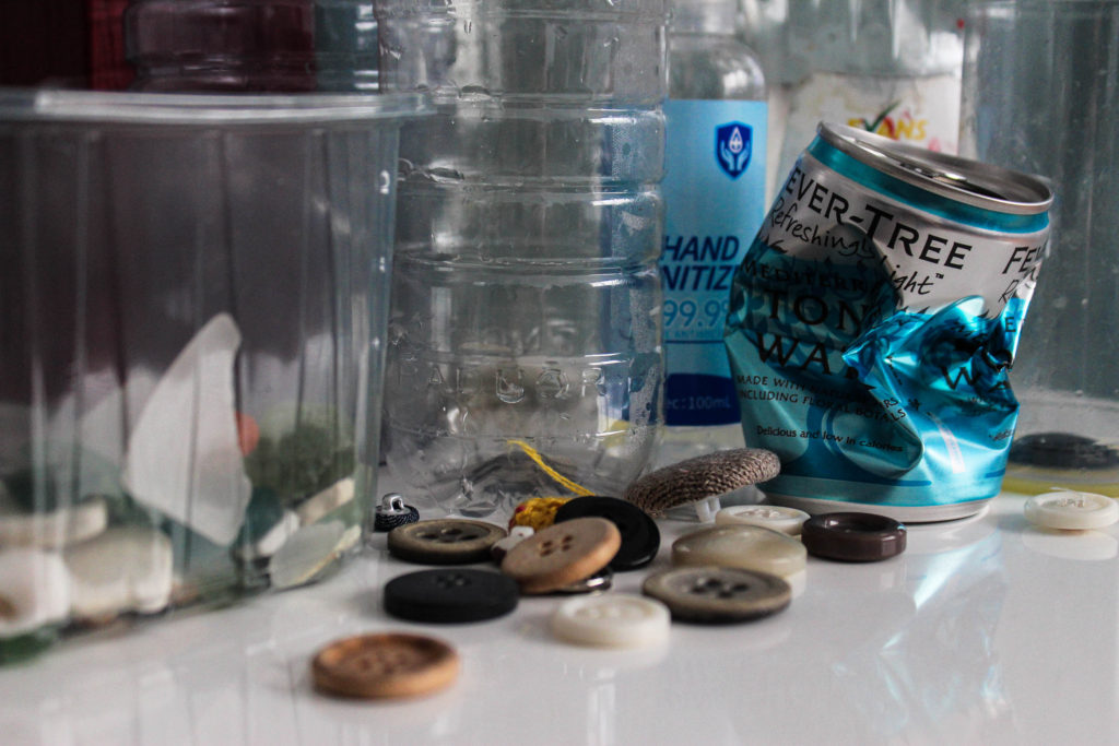
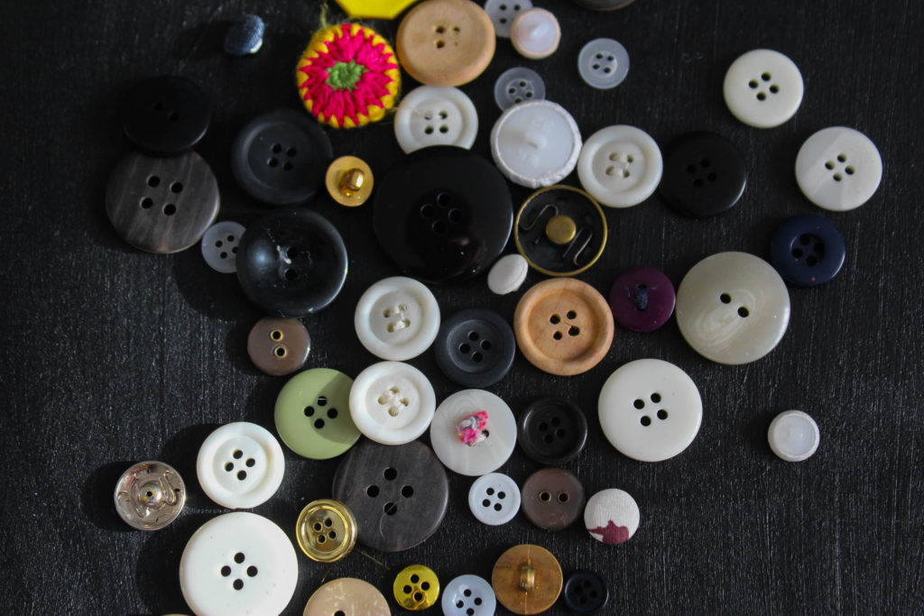
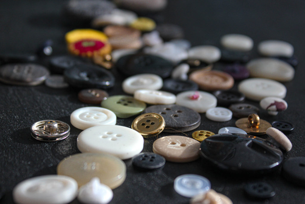
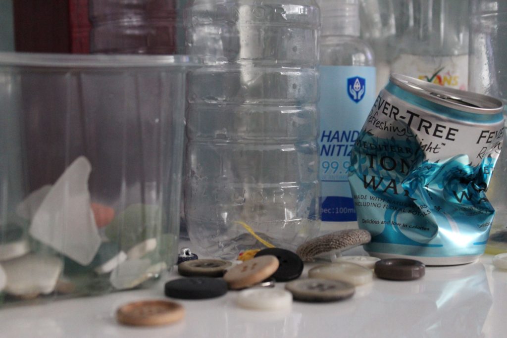
I did my own photo shoot, inspired by Schaap’s work. I used plastic bottles, containers and cans. For some contrast i decided to add plastic buttons and sea glass, this added some depth to the image as well as fitting in with the Anthropocene/ plastic pollution theme.
unedited:
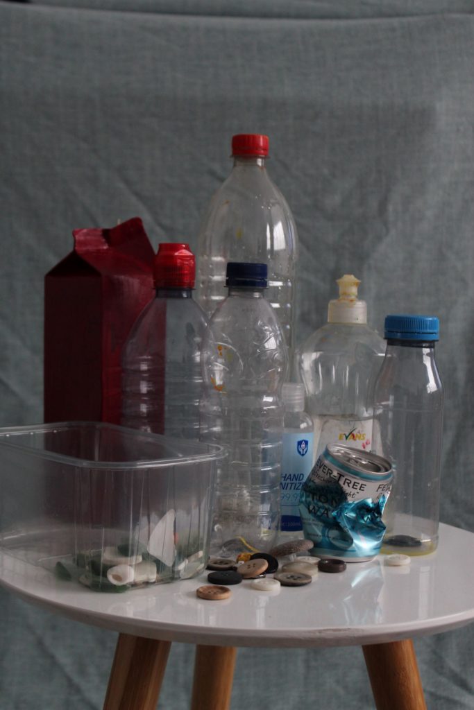
editing:
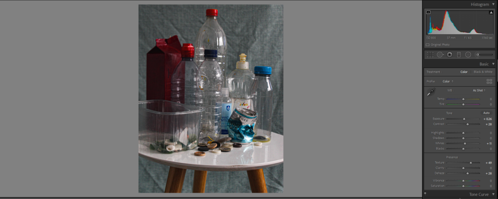
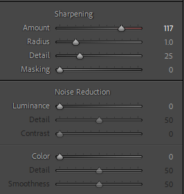
I sharpened the image, added texture. Also, i increased the saturation and contrast but decreased the exposure. This resulted in a simple image, although more defined, clear and colourful than the original.
outcome:

unedited:
In the original image I took, the image above, I used the ‘close up’ setting on the camera. The image is good quality however, quite boring.
editing:
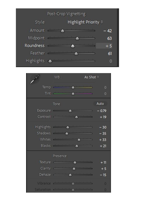
I made this image black and white. I increased the highlights and ‘whites’ to emphasise the effect of using the flash when taking this image.
outcome:

PLASTICS
studio shoot of plastics and rubbish
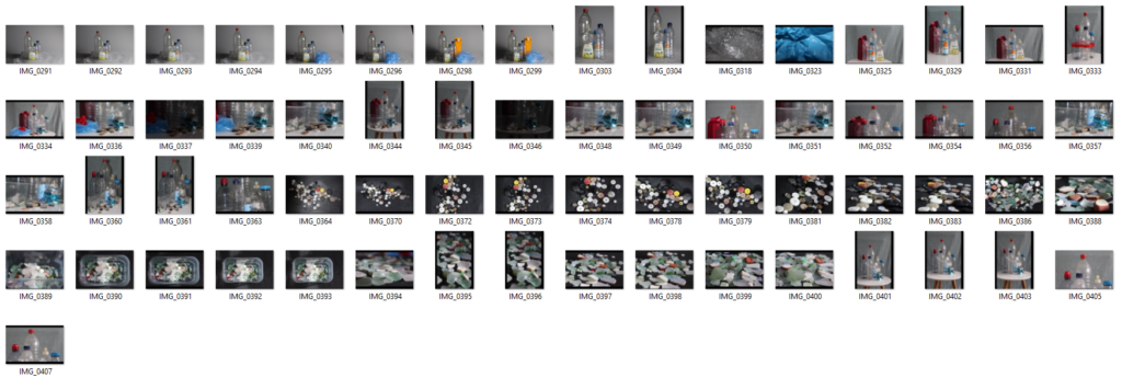
Although I took around 80 images for this photoshoot, some of them turned out as not what I wanted, too blurry or dark, so i ended up with around 60. Some I took in the school studio; using the infinity board and experimenting with different lighting. Others were taken at home. I created my own photoshoot at home, improvising with backgrounds. I used a small stool as a surface to put the objects on, however, this is very relevant to vanitas style paintings and photographs as stools and wooden stools were used in the majority of them.
Contact Sheet:
The outcome of the images I chose to edit in Lightroom:


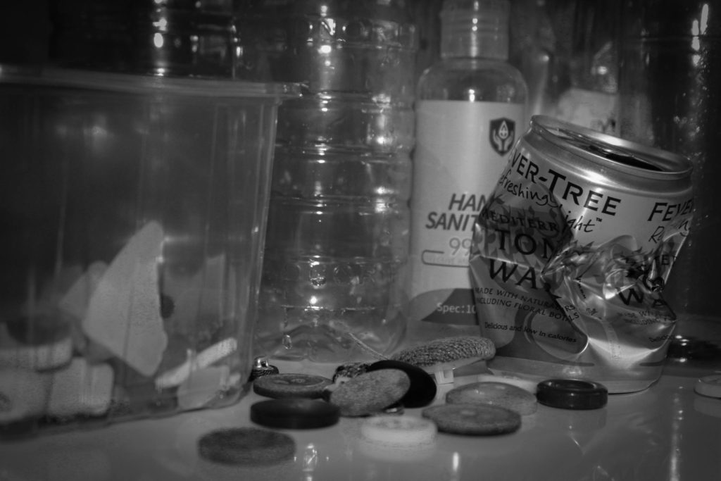


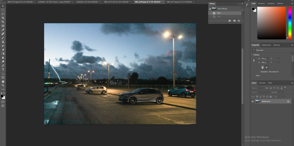
This photo is bland but I like the tones to the image.
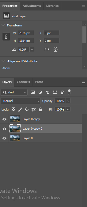
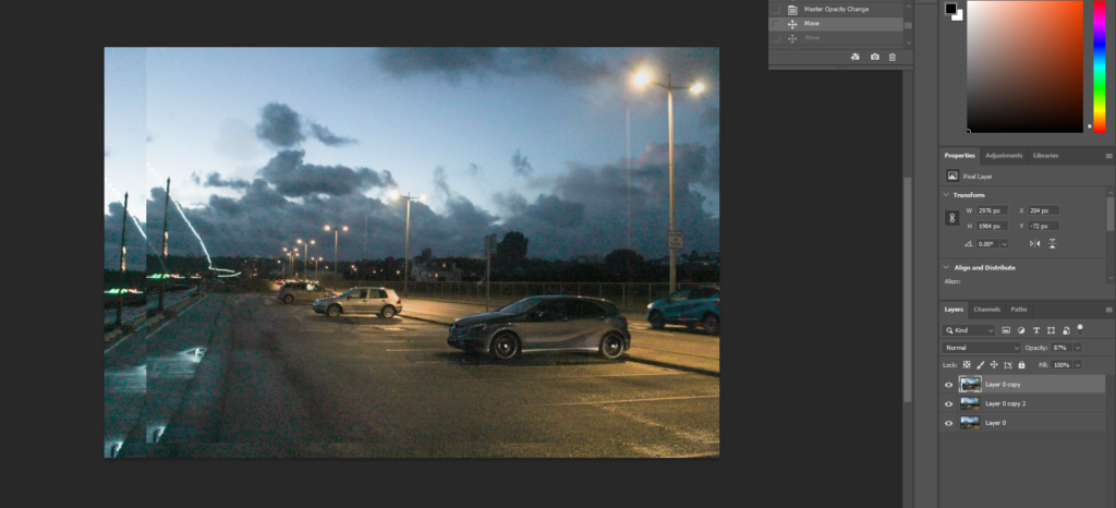
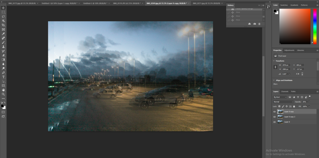
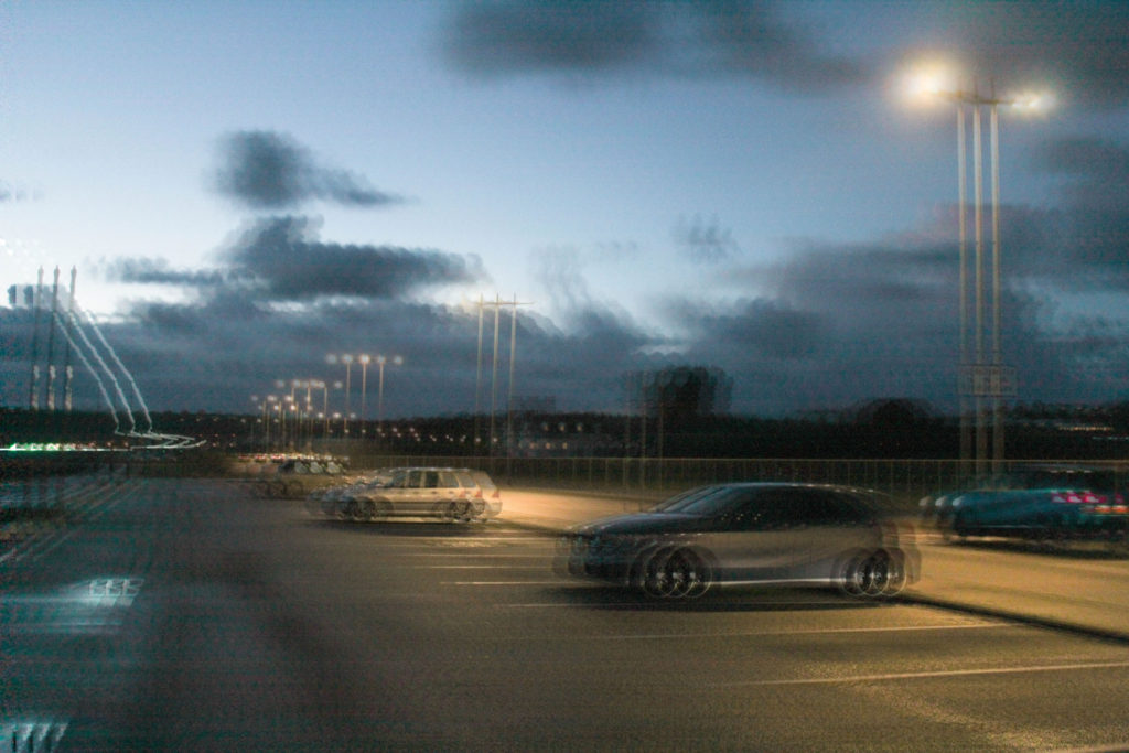
I wanted to give the image a blurred look. I achieved this by duplicating 3 layers of the same image and then editing the opacity of each later. After I got them to the opacity I wanted them at, I moved each layer around to this chosen position.
outcome:
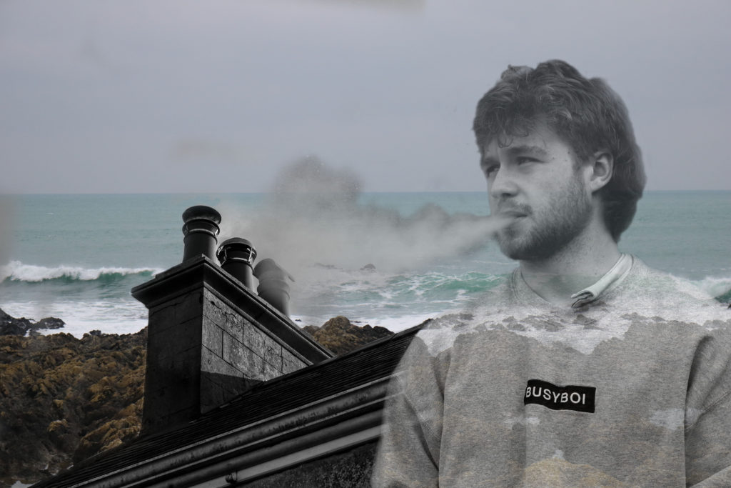
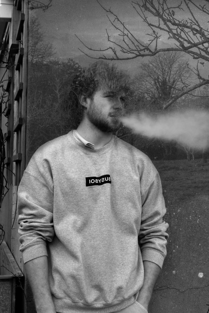
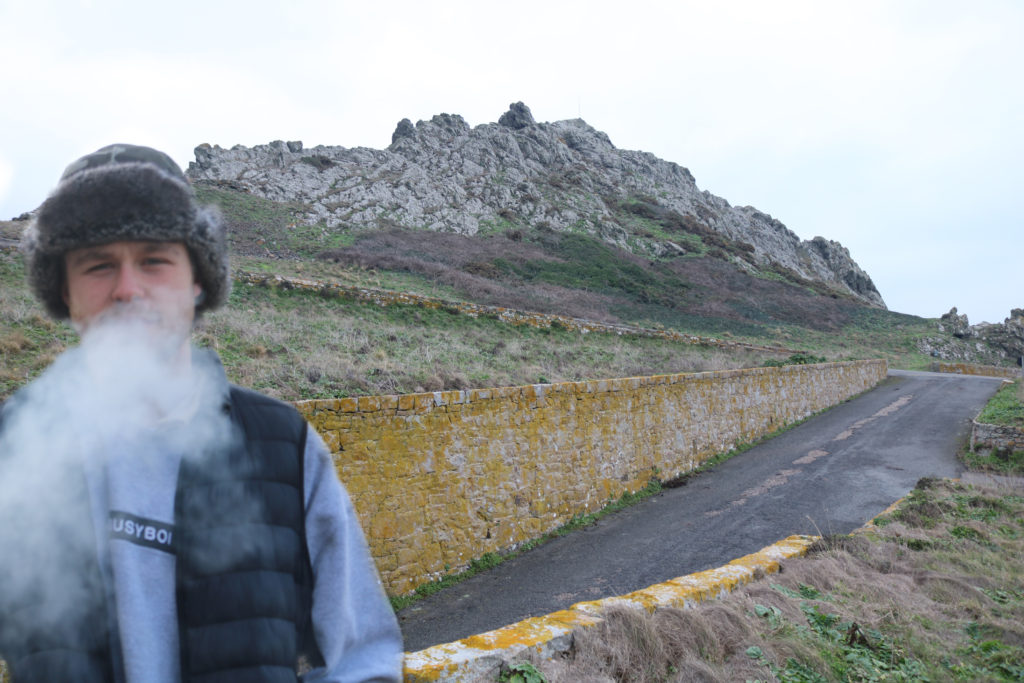
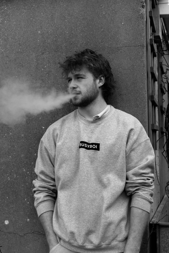

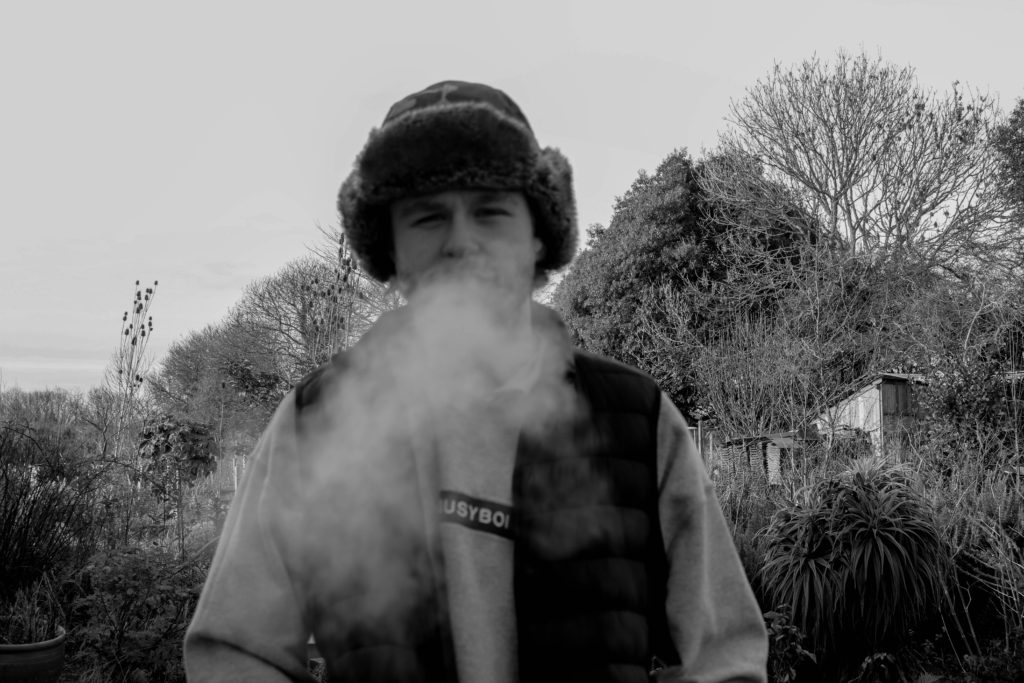
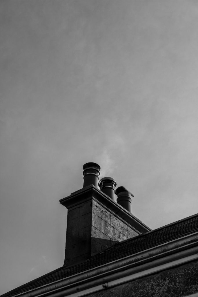
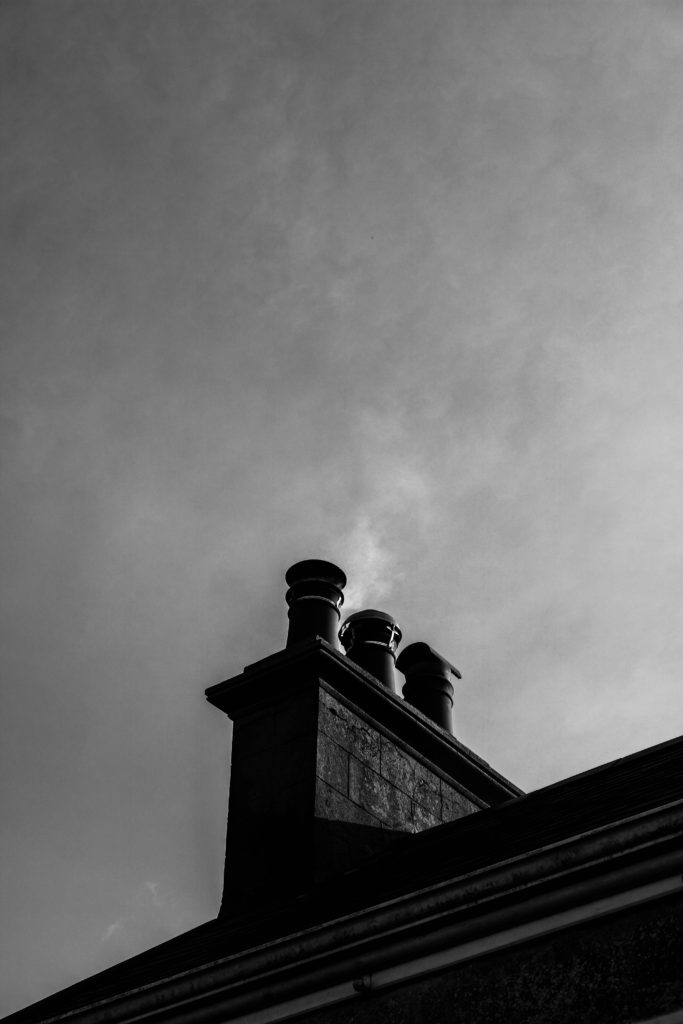
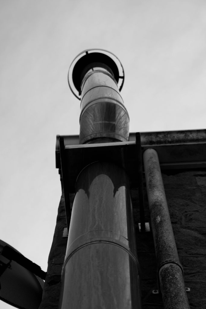
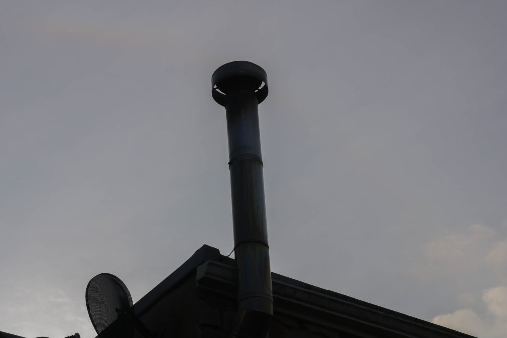

In the next few images I used a mixture of my own images and photos I found of factories and pollution on the internet and made some montages:
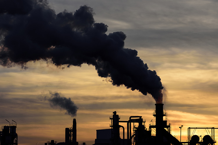
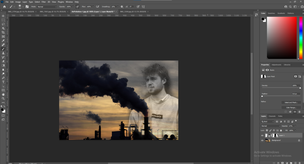
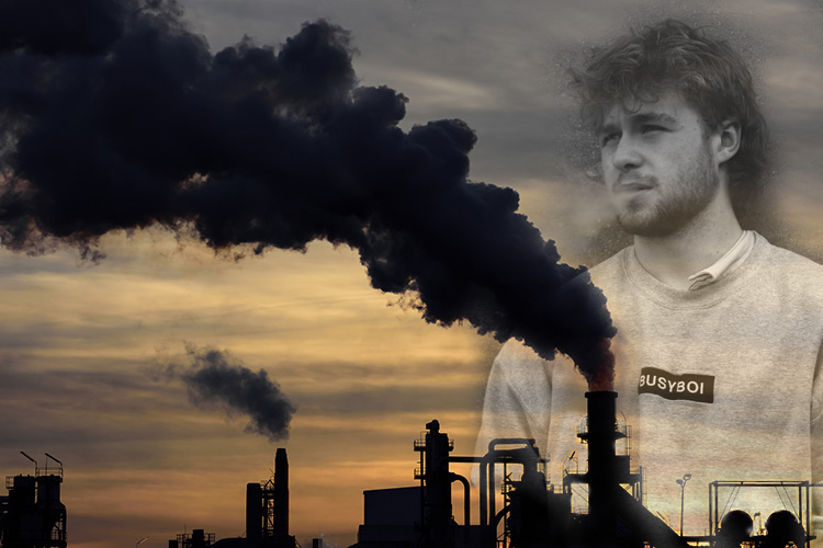
Using photoshop I montaged my own image with the one from the internet and changing the opacity to make sure the factory was visible through the second image however I felt like it was missing something and I wanted to add an aspect of nature to show what this pollution was damaging.
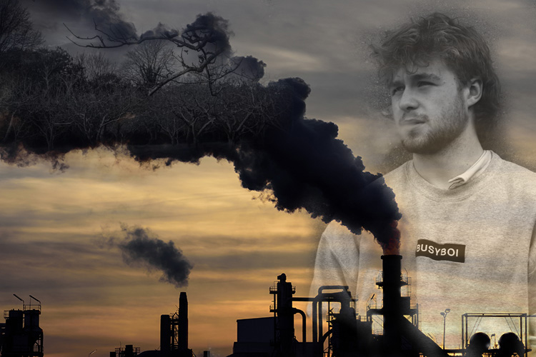
I added my image of apple trees to the smoke/emissions from the factory to represent what the air pollution is damaging and kept the image in black and white to represent the issue in a way that portrays air pollution in a negative light.
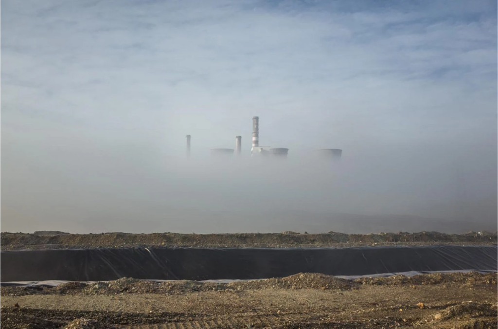
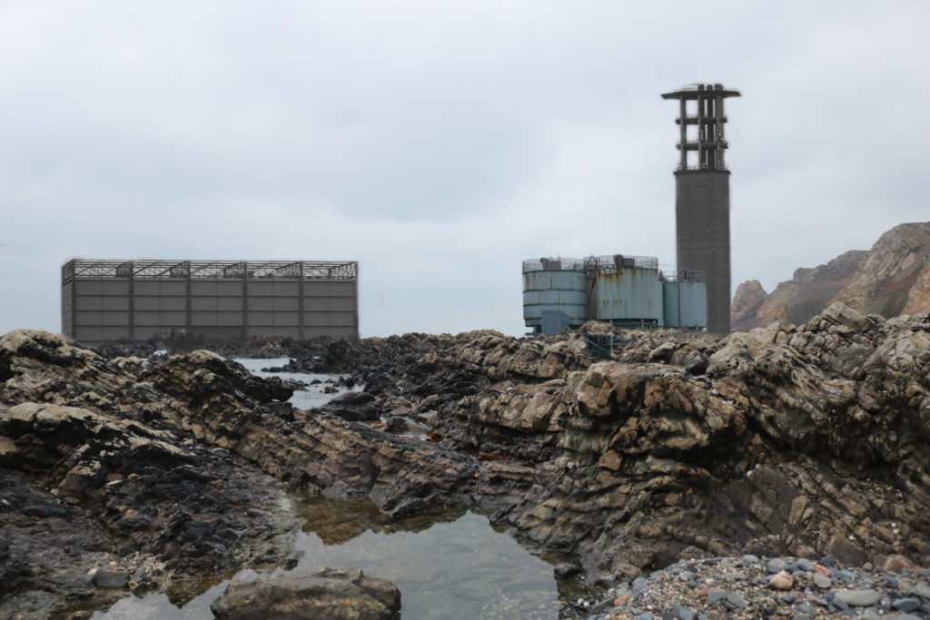
Similar to George Marazakis’ image I laid out my image in a similar format with similar spacing. For example we both have a rocky foreground and man made buildings/factories further back with the cloudy sky as the background. However in George Marazakis’ image he has fog in front of the factory whereas in my image in front of the factory is rocks giving the similar effect of the factory being far away and behind something.
Both images have similar lighting due to them both being taken using natural lighting during the day and they both have the same focal point being on the industrial buildings. The buildings are similar shapes allowing them to look similar such as the tall towers and ‘factory like’ look.
In my opinion I didn’t grasp the same feeling in my image as in the one created by George Marazakis as his image is foreboding and mysterious whereas mine is very straight to the point. However I think this is down to the fact that his image was taken on a foggy day whereas mine was captured on a moderately clear day.