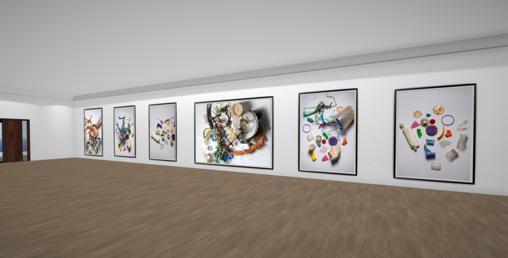


I wanted to experiment and create an image that looked more like Mandy’s because in my shoot I used a white background and I didn’t have enough micro plastics.
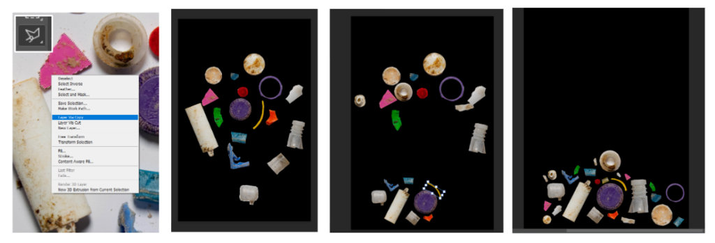
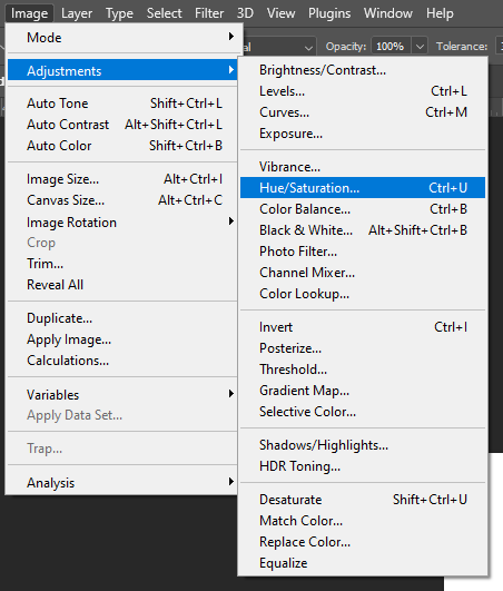
I used the Polygonal Lasso Tool in Photoshop to cut out each piece. After I had selected one, I Feathered them by 2-5 depending on the shape. Next I created a blank black canvas and dragged all the layers across. I worked out where to place them, and duplicated the layers to fill in gaps. I didn’t want the duplicates to be obvious so I changed the Hue/Saturation of some.
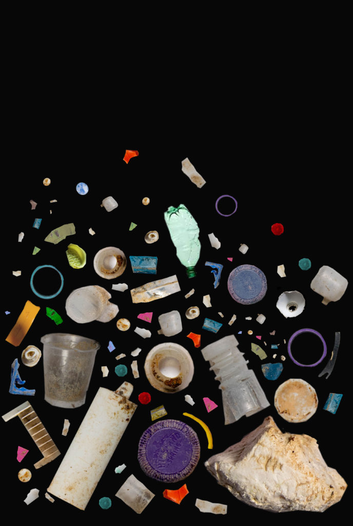
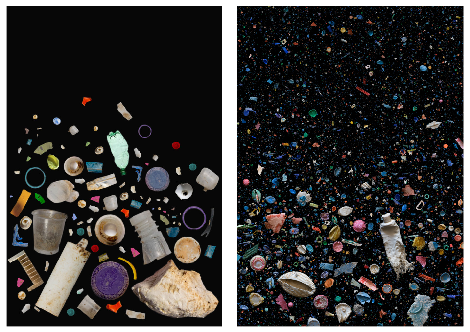
Overall I like how this turned out, I think it looks like Barker’s work even though I used photoshop to create it. I think I used the same variety of colours and shapes as her, using large and small pieces. The only difference is that her work is more compact. I could change this by photographing more different pieces of plastic, or duplicating more (however I didn’t want to use too many duplicates).
Further Experimentation on Photoshop:
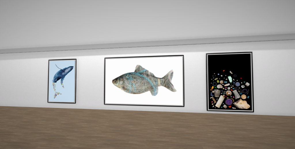
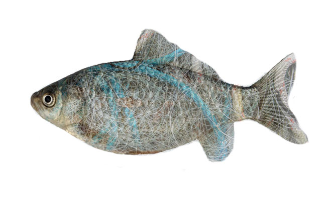
I wanted to edit my images further to create photos that clearly show pollution and waste affecting the marine life and oceans.
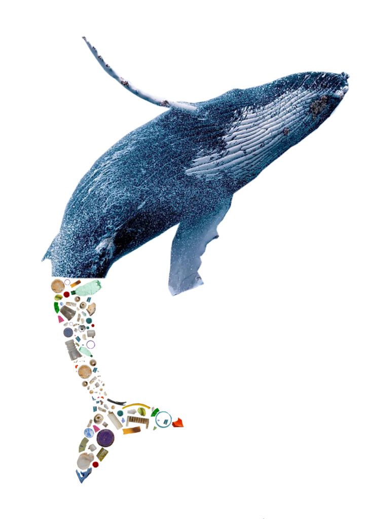
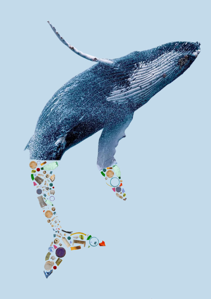
For this image I took my cut outs from my Barker edit, and organised them to look like the whales tail.
CONTACT SHEET
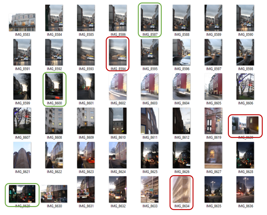
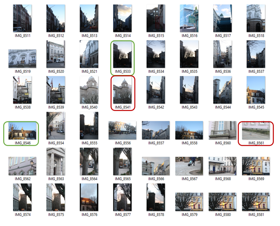
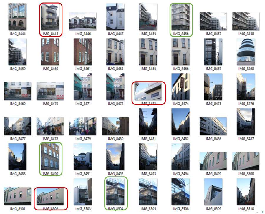

BEST SHOTS
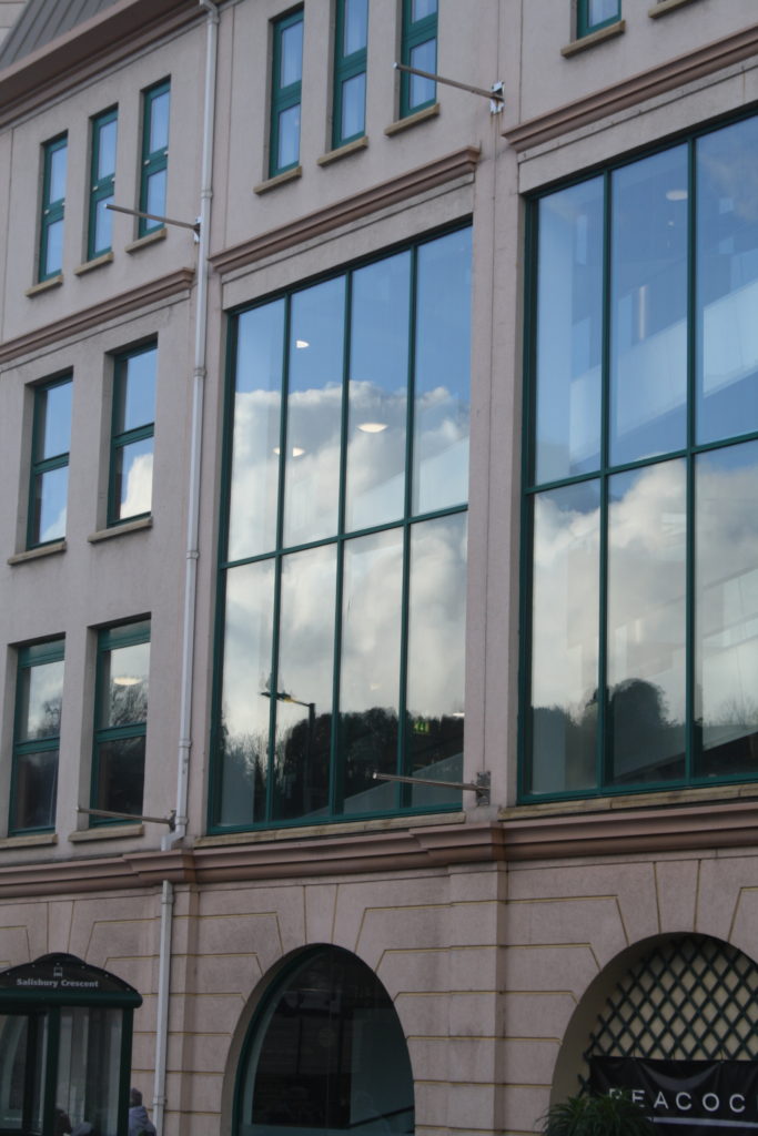
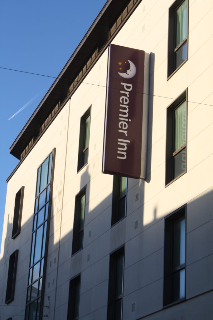
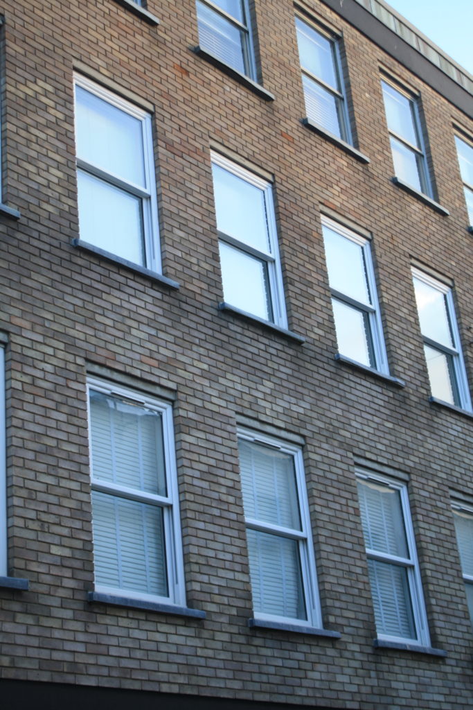
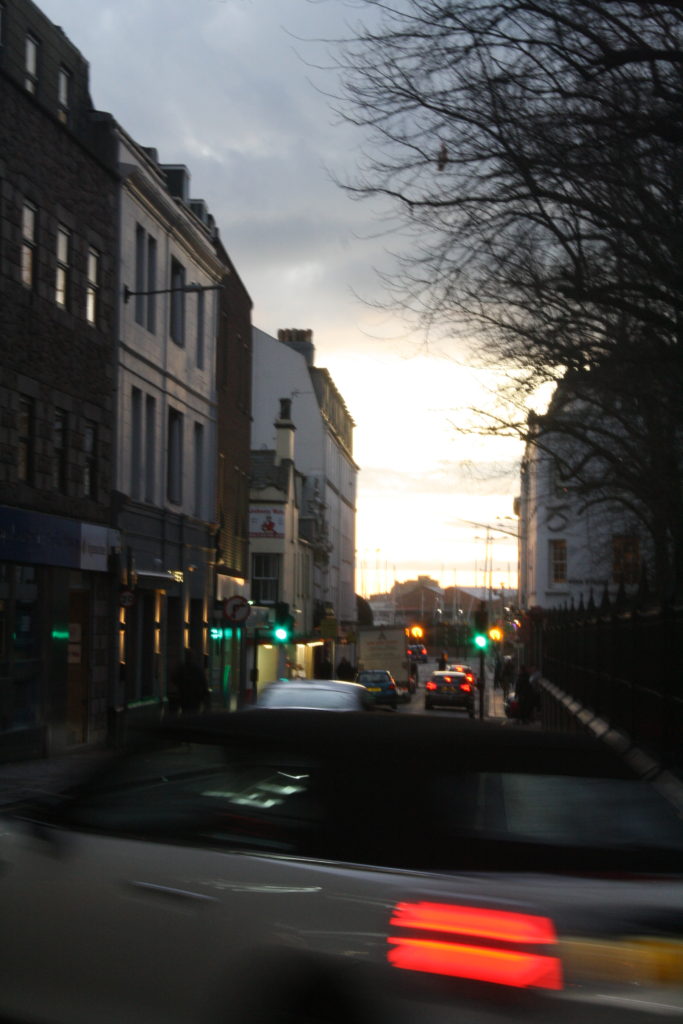
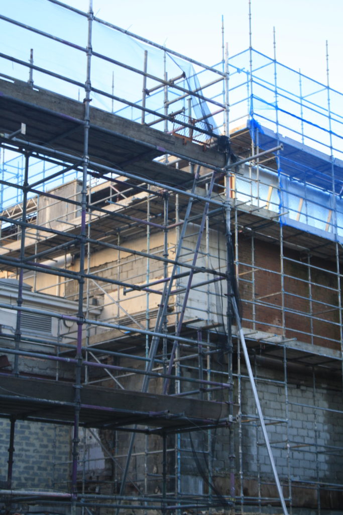
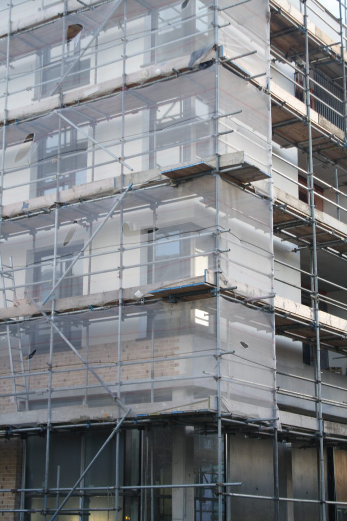
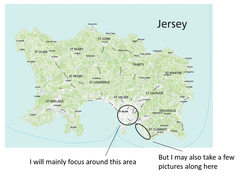
I will mainly focus around town and other built up areas like St. Helier that have a range of different buildings and crowds that I can photograph. I will mainly focus around 4-5pm as this is when most people finish work so there will be bigger crowds. As I am taking inspiration from Stephanie Jung, I will try to photograph the busiest areas and take multiple shots of the same area from different angles/exposures so that I can later layer them on top of each other. I will also focus on taking close up shots of different buildings as I am also responding to Michael Wolfs work. I will photograph a variety of architecture from small to large, old to new, colourful to dull. Through my photoshoot, I hope to display the effects of overpopulation and how it is effecting on the planet and our Island.
I started with using images of single objects, in this case cigarette buds:
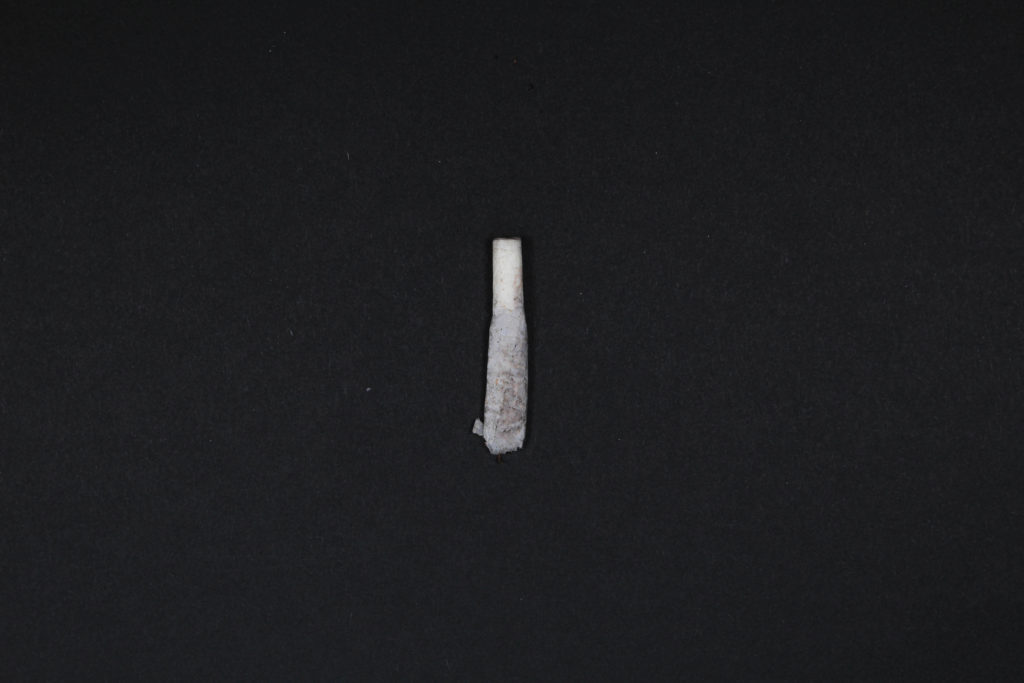
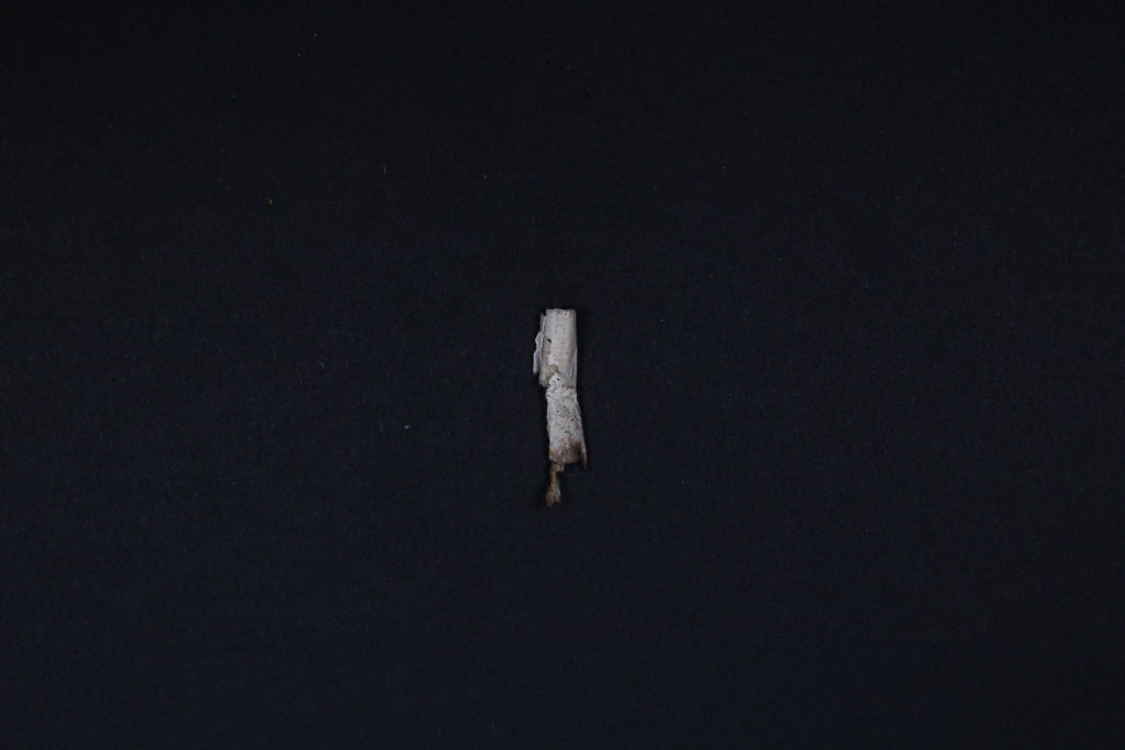
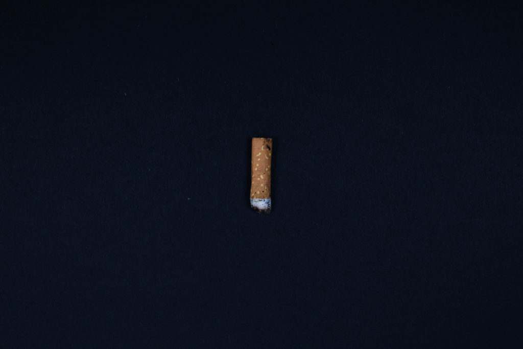
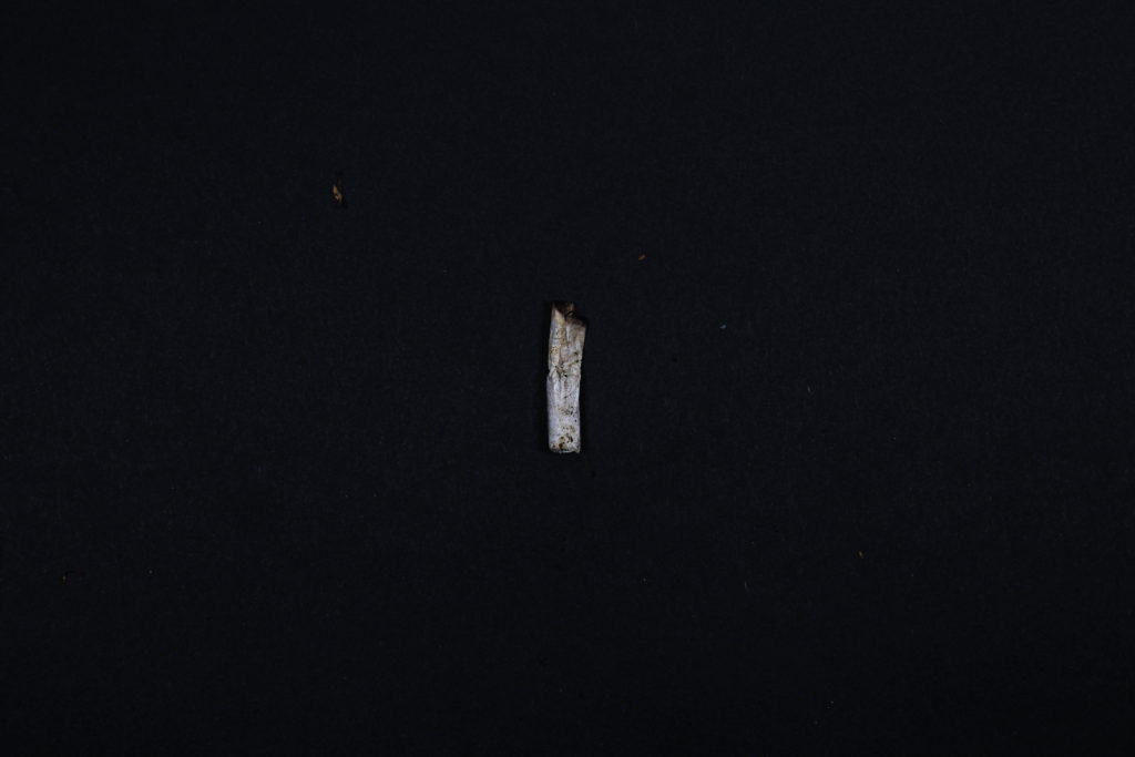
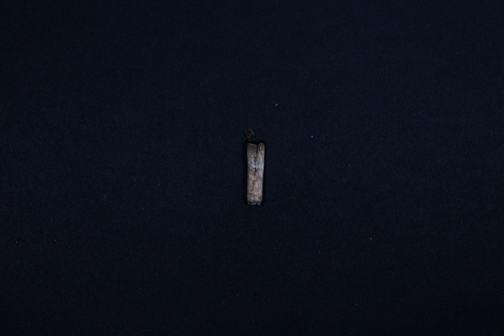
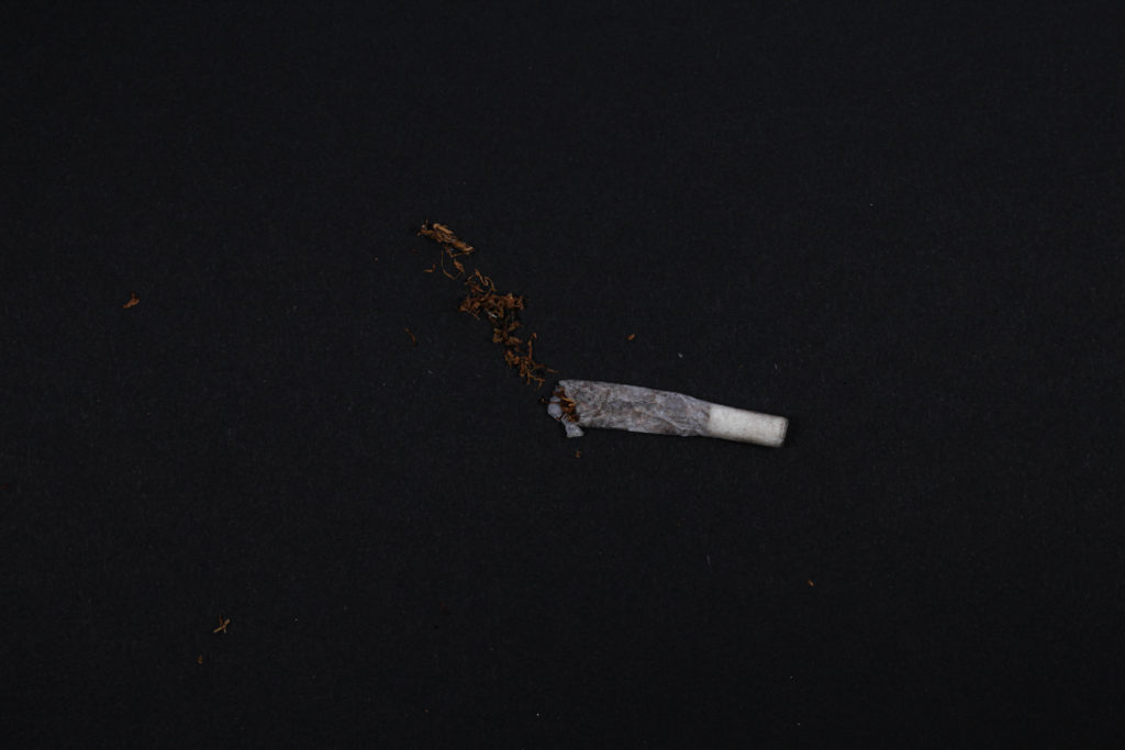
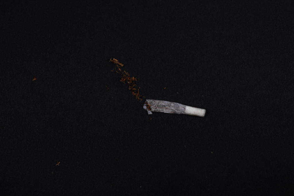
This was my way of showing what you could find almost anywhere in the world because of the volume of smokers. Not only does this show the litter of cigarette buds, but it also shows the amount of smoke let off into the air compared to everyone who smokes in the world.
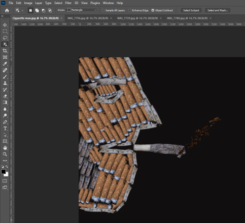
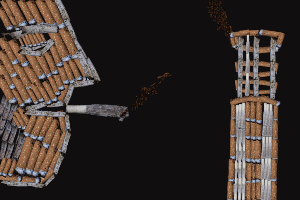
I then had an idea of using the cigarettes that I had imaged and to create them into a person into who was smoking from a side view angle, this alone on photoshop took a long time sizing and moving, and even copying from the simple ones I had imaged. I had this idea from Irvin Penn who had taken images of individual cigarette buds, and editing them in a way which suited him and even the topographic world.
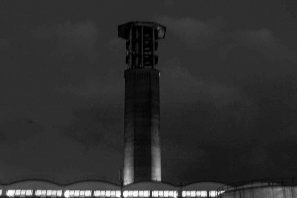
I had also had an edited image of the chimney tower down at the dump which would let off smoke when burning plastics. and thought I would do the same thing I did for the “cigarette man” (as I called it). I had used the ideas of Mandy Barker by taking images of single objects and then creating something out of it which linked to the object and what affect it has or does. This allowed me to create this:
SHOOT ONE:
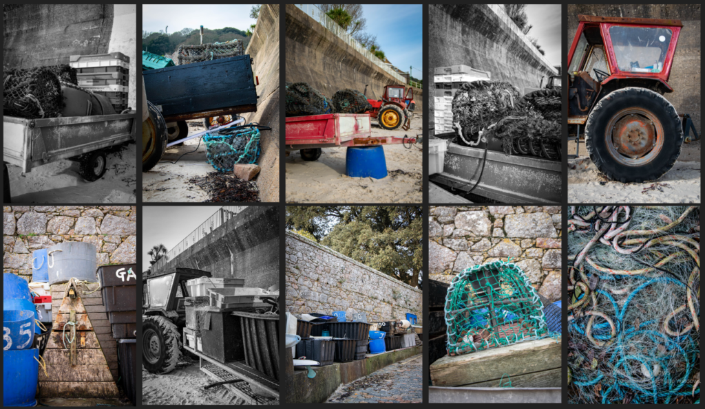
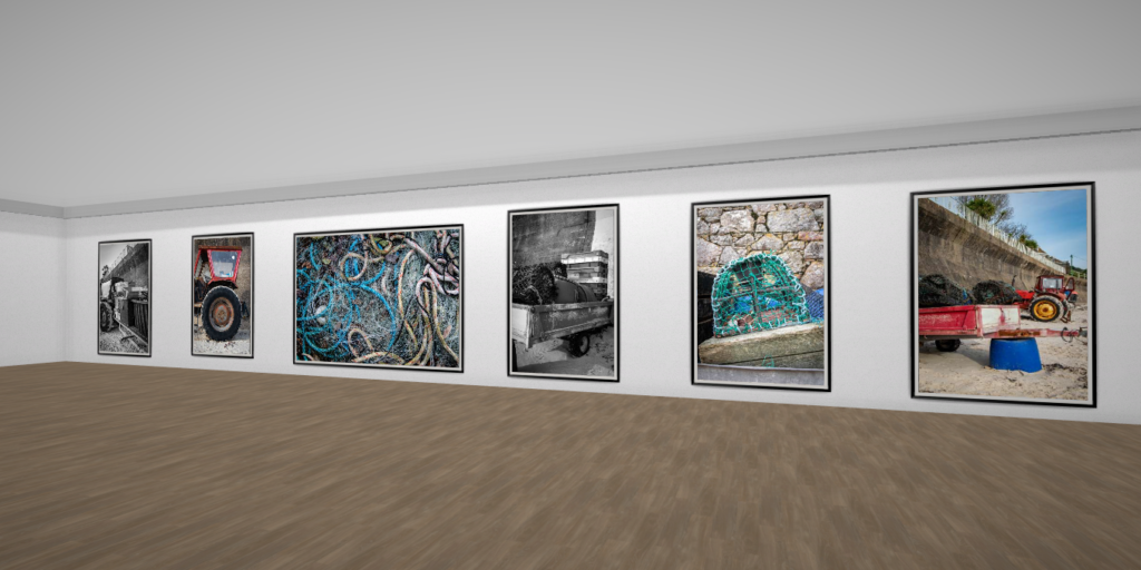
I decided to shoot fishing waste on St Brelade bay to show the impact the fishing industry has on the environment. 20% of the Great Pacific Garbage Patch is offshore debris oil rigs, pacific cargo ships, and boaters dumping trash into the water. 705,000 tons of this is fishing nets, making up the majority of the waste. I wanted to focus on the pollution in the Jersey waters and on beaches for this shoot.
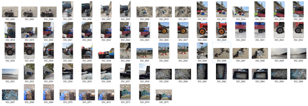
Selecting: I imported the image into LrC and flagged the photos I wanted to edit.
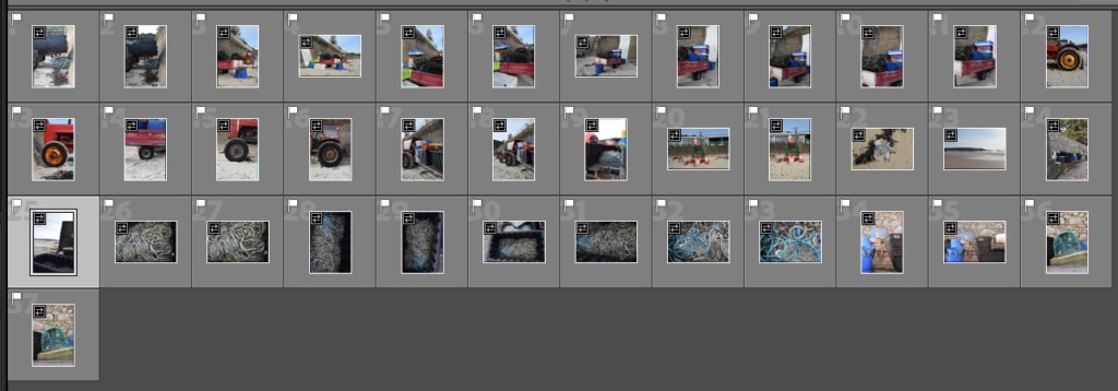
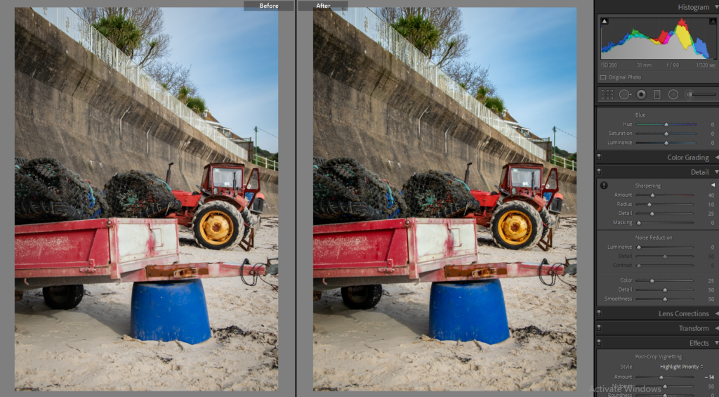
Editing
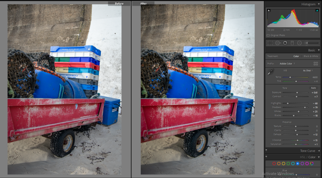
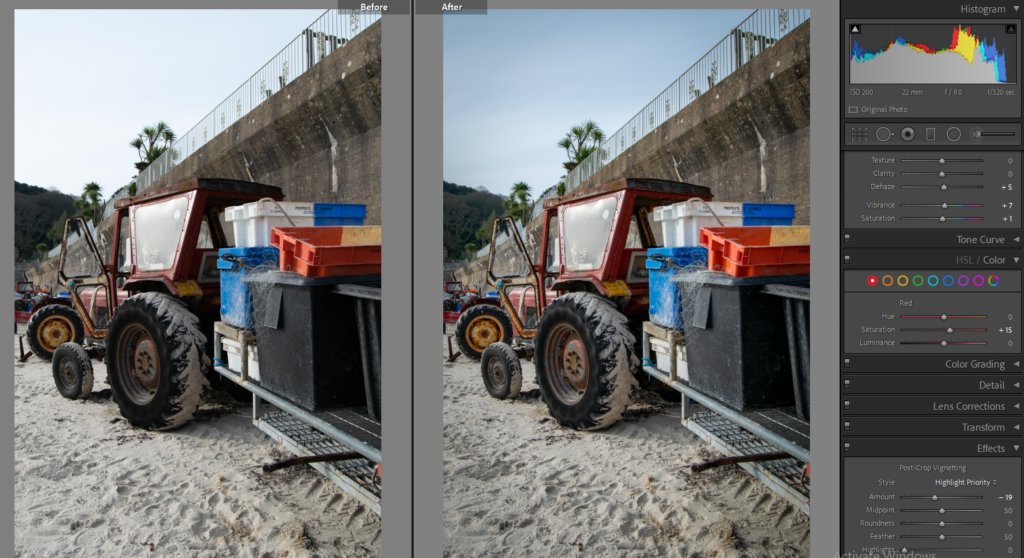
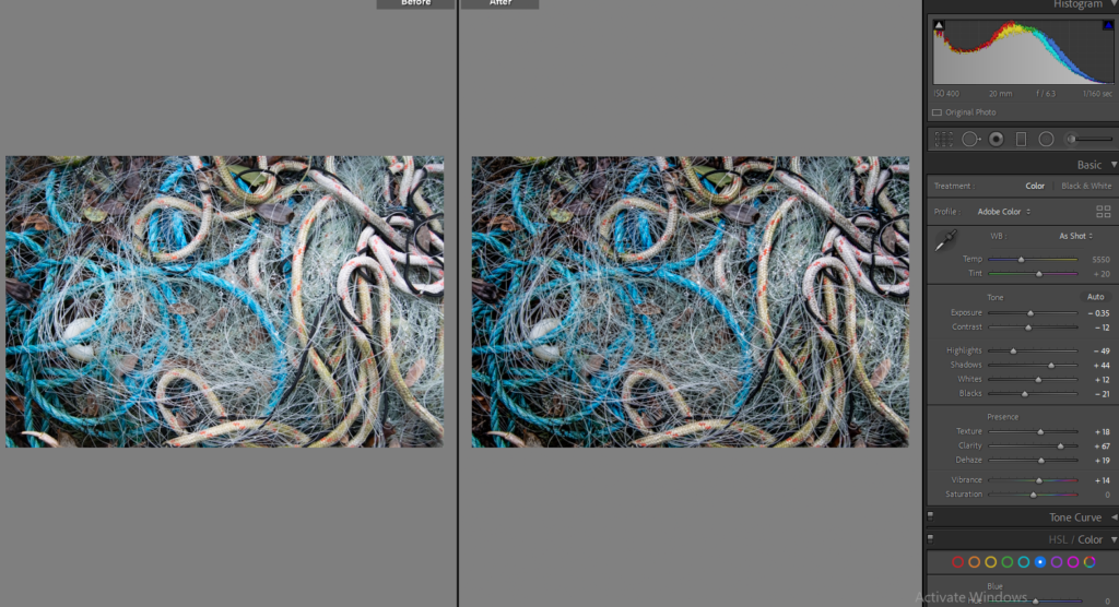
Final Images
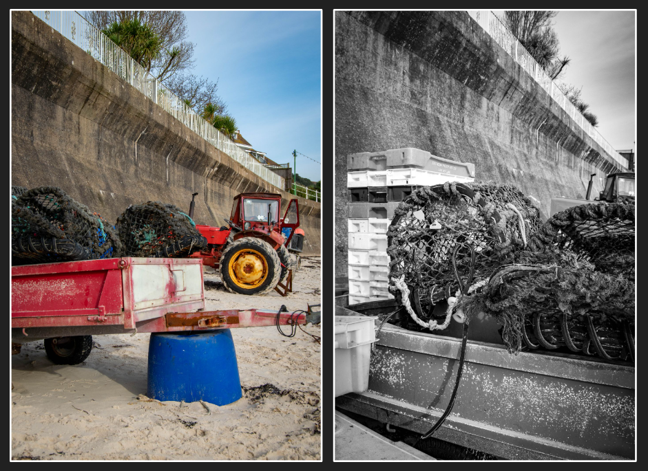
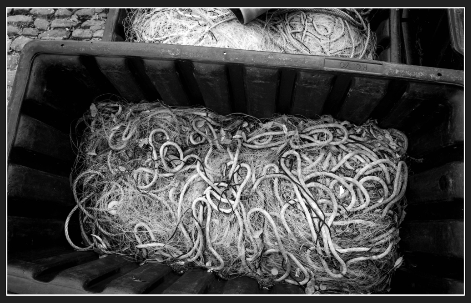
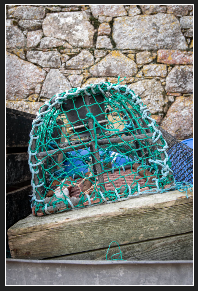
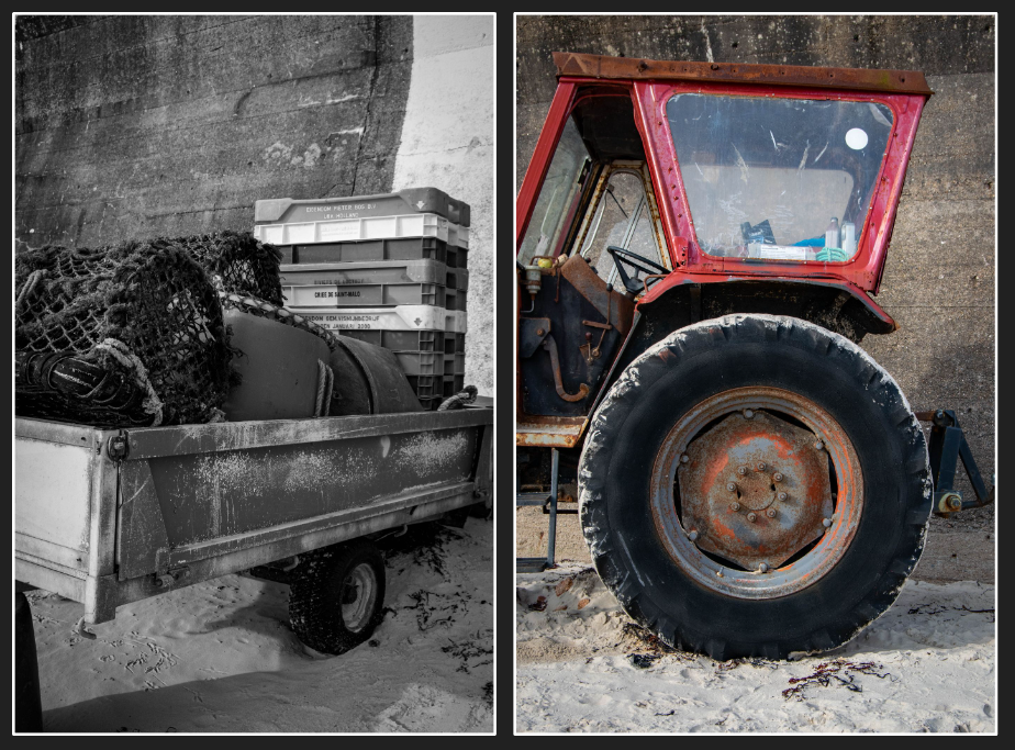
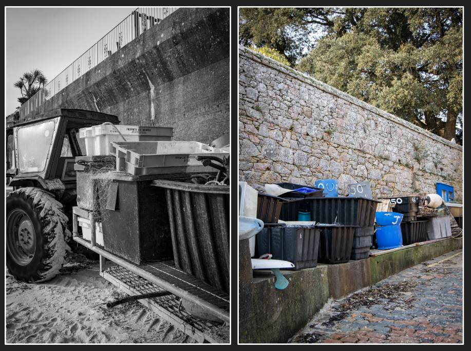
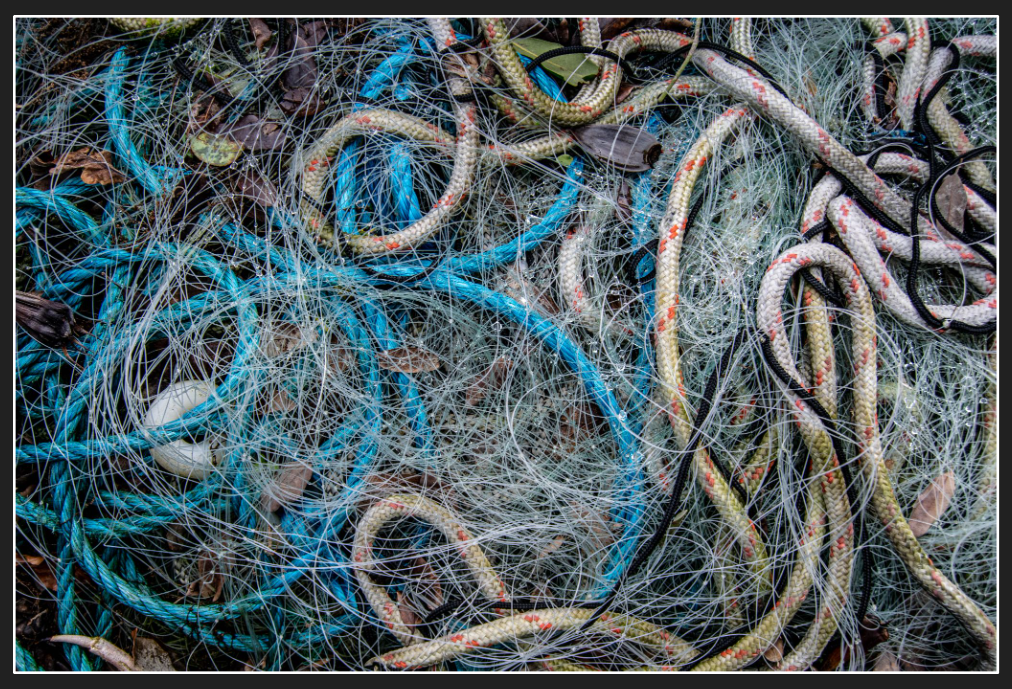
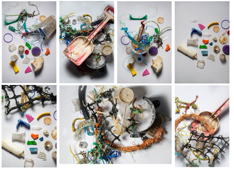
Although this shoot doesn’t connect to Mandy Barker’s images, I think the message behind them is the same. However in my next shoot, I collected plastic and fishing waste on the beach and shot it in the studio to replicate her work.
SHOOT TWO:
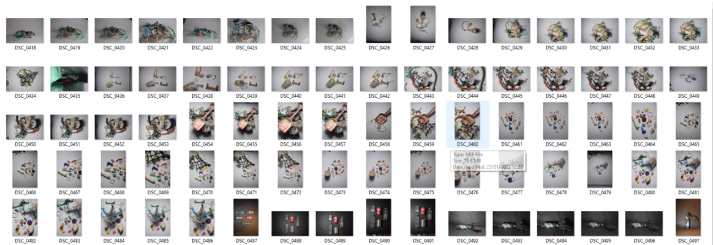
Selecting

Editing
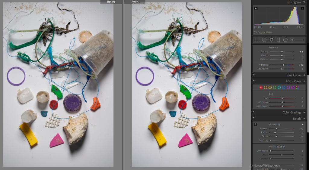
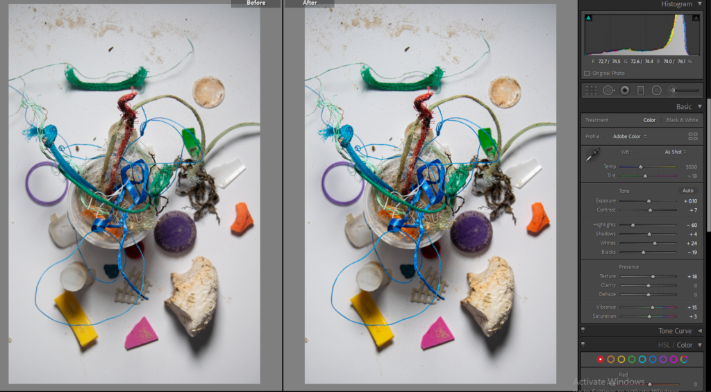
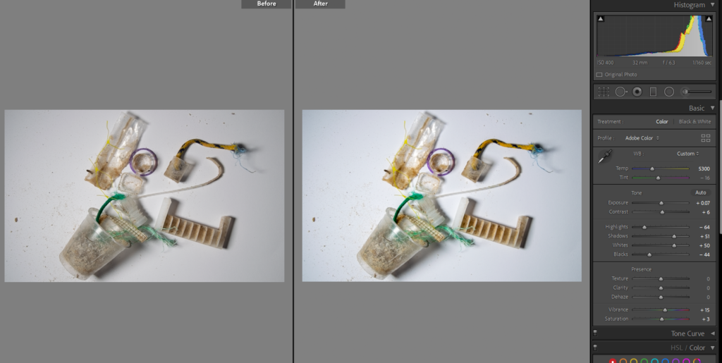
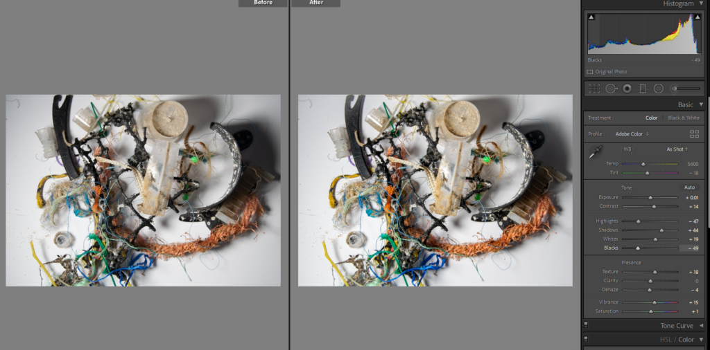
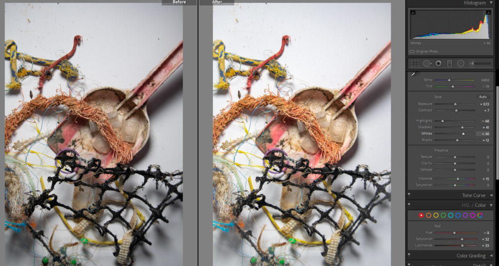
PHOTOSHOP – I used the Rectangular Marquee Tool to select areas where there was a lot of sand, then deleted them because I found the sand made the images look dirty and it distracted from the main focus. I also went over the white areas with the paint brush in white, with a low opacity (e.g. 20%/30%) to lighten up the areas and shadows.
FINAL IMAGES: BASIC EDITS
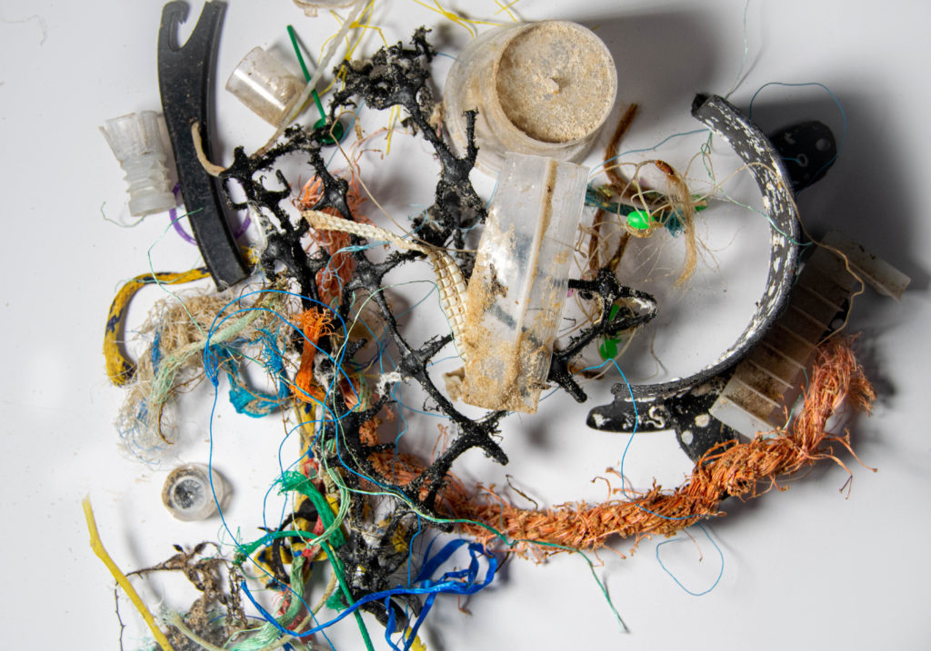
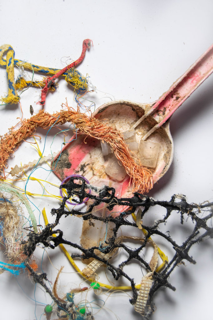
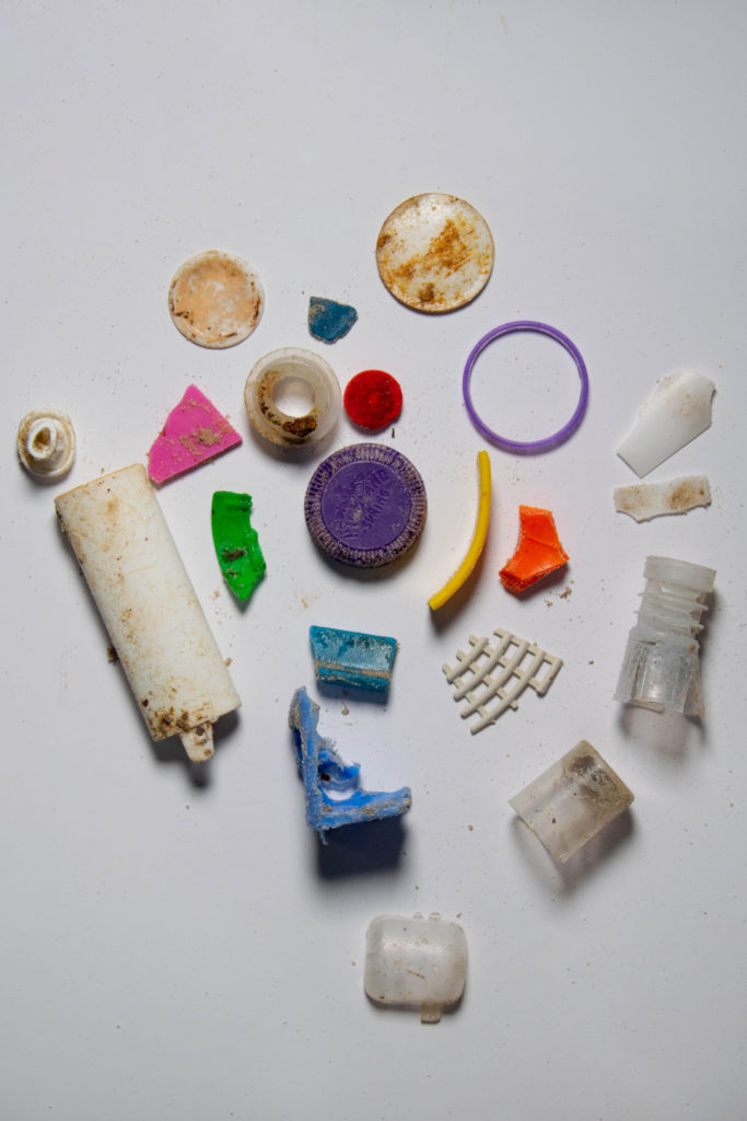
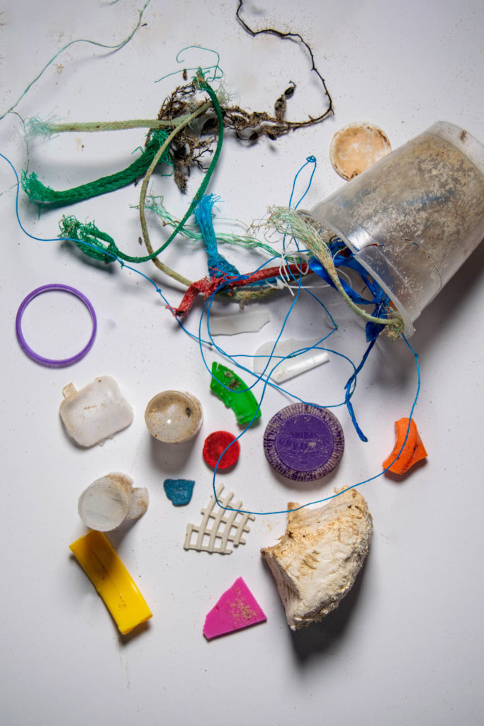
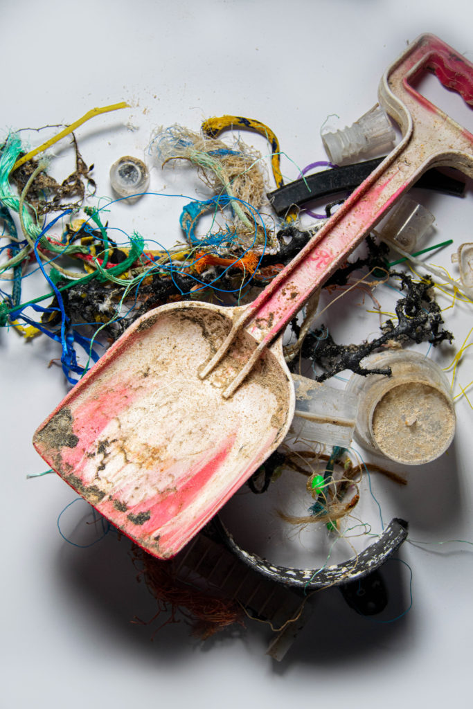
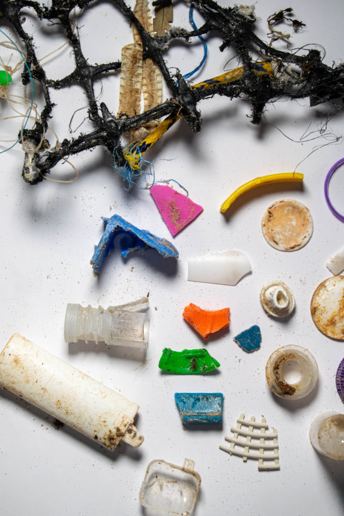

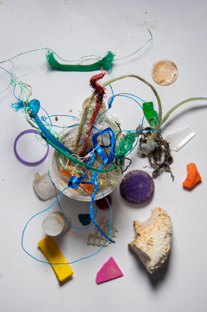
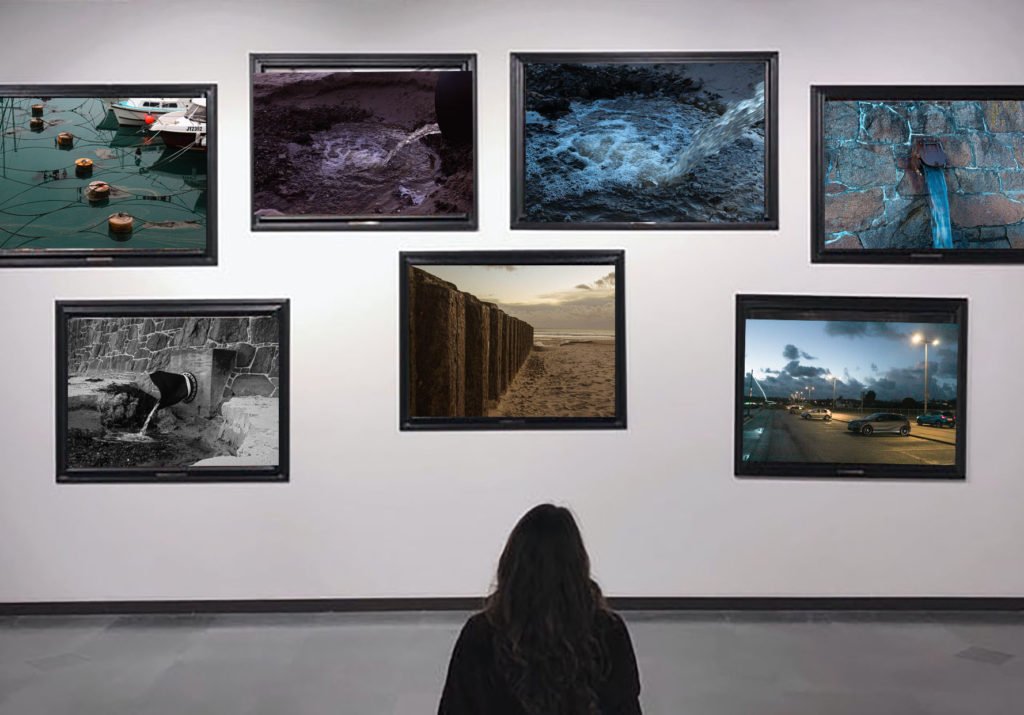
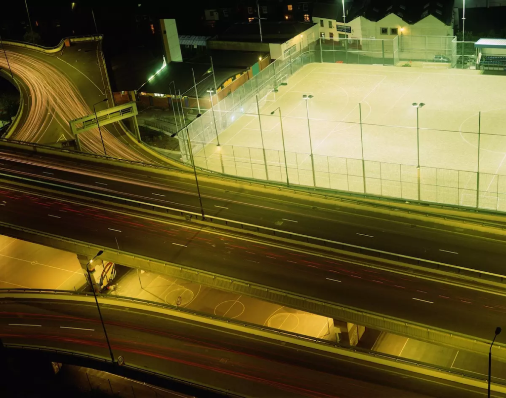
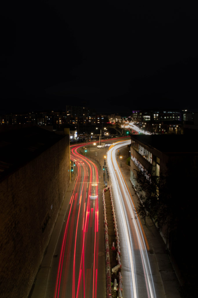
Image comparison/analysis
Both images similarly present a busy road at night, shot in shutter priority mode with a long exposure producing an image overloaded with artificial lighting. The foreground of both images show a road masked in light whereas in the background its seen to be deserted almost as if the lighting has taken over the city. Luxemburg’s image was taken alongside a number of photographs in London in 1996, whereas my image was recently taken in Jersey’s town centre above a popular tunnel. The two images consist of a similar composition and structure, although Luxembergs lighting has a more sulphruric orange tint to it affecting the mood of the photograph in comparison. The pair of images have been captured from a vantage point allowing viewers to see a unique angle of the area, the harsh red and white lighting differs to the softer lines of light seen in Luxemberg’s image. The dark surroundings of my image almost act as a frame to the bold lighting in the centre, placing a stress on the unnatural presence of the light. Leading lines can be seen on the roads of both images continuing until visibility is lost. Possibly making viewers question what’s beyond the photograph. The use of the S-curve technique in my image can also aid the viewer’s eye to explore the scene captured by taking them on a visual journey, giving the image a sense of overall rhythm.
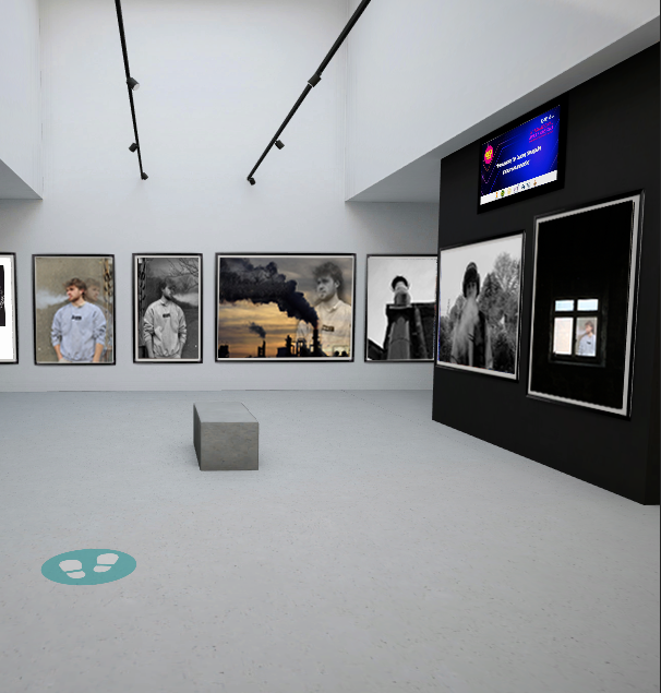
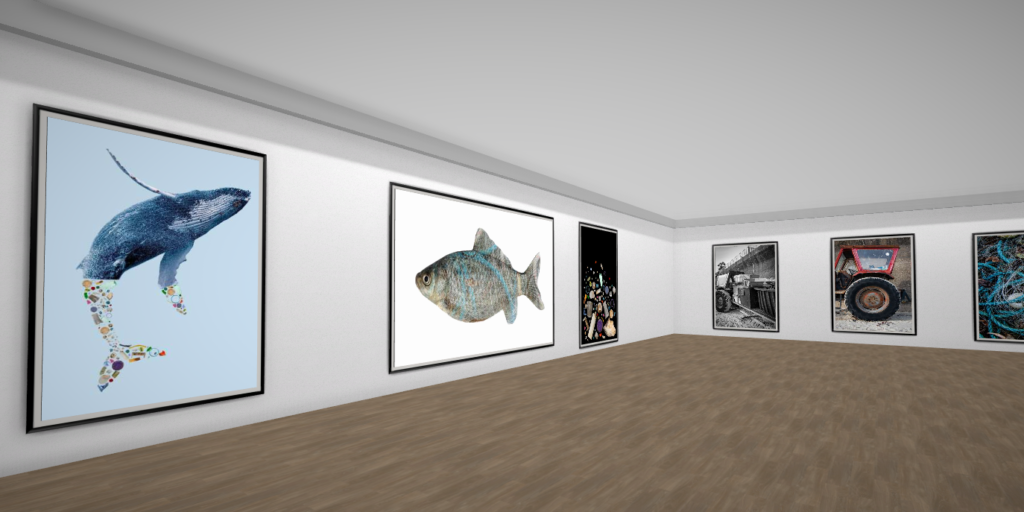
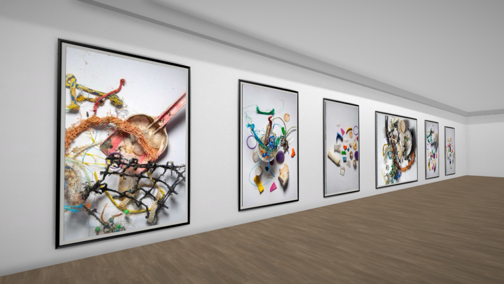
This is a virtual gallery I made to display some of my best outcomes.