Anthropocene evaluation

My process:

At the start of this project I decided to focus on plastics and un-used items as well as the industrial side of Anthropocene. I think these two things play a big part in how we are damaging our planet and think it is important to make sure people are aware of it. I went to various locations such as Bellozane and power stations and took images of the industrial structures which I thought fit in with the theme. I also went to some beaches and mainly collected different old bottle caps before taking them back home and photographing them laid out on a sheet of black card. I also used some old pencil colours and played them out on the black card as well. For the bottle caps and pencils I was specifically inspired by one artist in reticular. Barry Rosenthal used collected plastics from beaches and photographer them to show viewers his discoveries, I think he is a powerful photographer and uses his work as a way of connecting to people about Anthropocene.

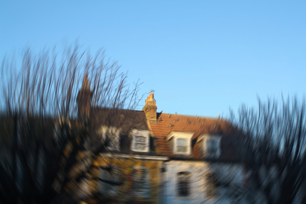
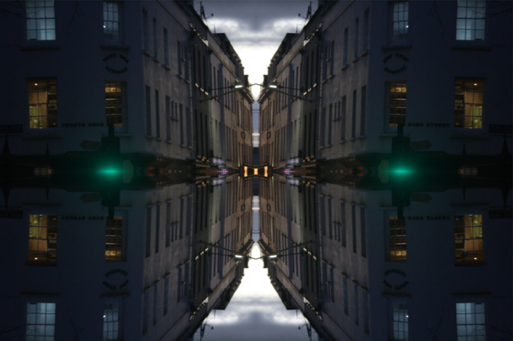
Once I had all of my images I then used Lightroom classic and photoshop to adjust and edit them. Firstly, I used Lightroom to adjust the lighting and exposure making sure that the images were clear. On photoshop, for the inspired images I then filled the background in with black to make the objects stand out more and engage the viewers with my images, as well as crop the images to make sure that the objects were in the centre of the frame to make them as similar to Rosenthal’s as I could. I then used the industrial images for create some edits holding value about Anthropocene. I used a few different ideas, techniques, and tools as can be seen on a previous blog below. I tried to link my edits to Anthropocene as well as my images hoping they carry a meaningful message behind them.

What went well:

Within my project I think there were a few main things that went well for me Firstly, I think that my inspired image connecting to Barry Rosenthal’s came out well. I like how they are very simple and give things that people don’t usually think of such as bottle caps a new purpose as well as it being easy for others to recreate.I think my images look very similar to Rosenthal’s but still have a different showing that they are mine. Secondly, I think that my edits were effective as they each had a different style, whilst still linking to Anthropocene. I like how they are effective and engage the viewer allowing them to see the detail and depth in the images.
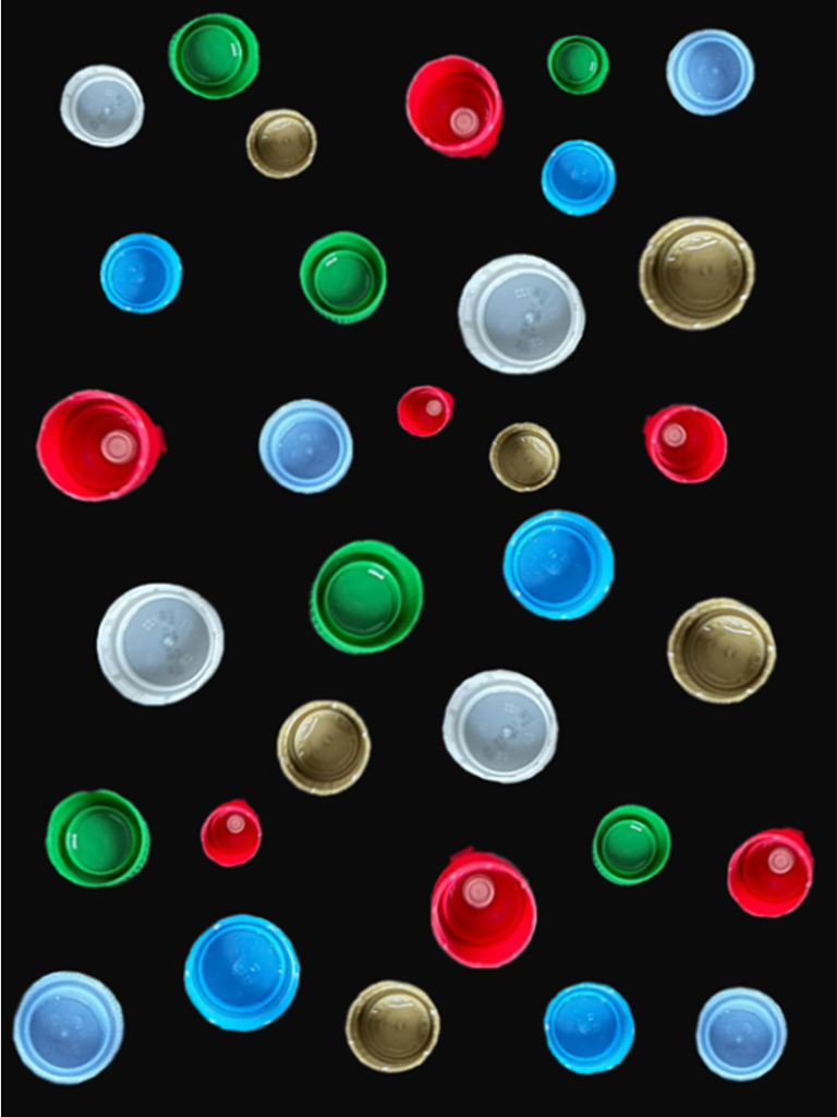
one of my inspired images

Possible improvements:

As a whole I am please with my project however, there is always things that could be improved. Mainly I think that I could have produced more images as I was very limited with what I had came up with. I think that I could have tried to recreate a few more of Rosenthal’s images as the one I did came out effective, as well as more industrial images. I think that I could have visited a few more different locations from my mind map, on a previous blog, to give myself a wider range of images to work with. I also think that an improvement could have been made with my edits Whilst I had a range of techniques with different meanings behind them I think I could have made some with more detail in them that more obviously relate to the theme of Anthropocene.
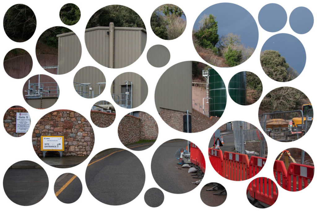
one of my edits

evaluation

FINAL IMAGES

WHY DID I CHOSE THIS IDEA?

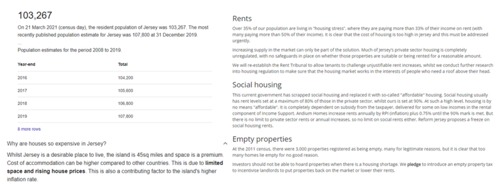
The reason I want to focus on this area (overpopulation/overcrowding) is because I believe it is a real problem for Jersey. Not only is this negatively affecting the environment but the limited space and housing crisis is detrimental for the people living on the Island.

I think these style of photographs shows just how Anthropocene is effecting us without it being obvious or boring. I love the use of repition in Michael Wolfes work, it suggests that humans are only repeating what they are already doing instead of fixing the problem they have caused. Whereas Stephanie Jung’s work how the busy lives of the city and crowded areas while it still being creative and effective.

WHAT DID I DO?

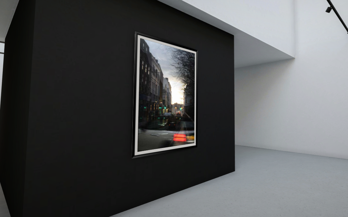
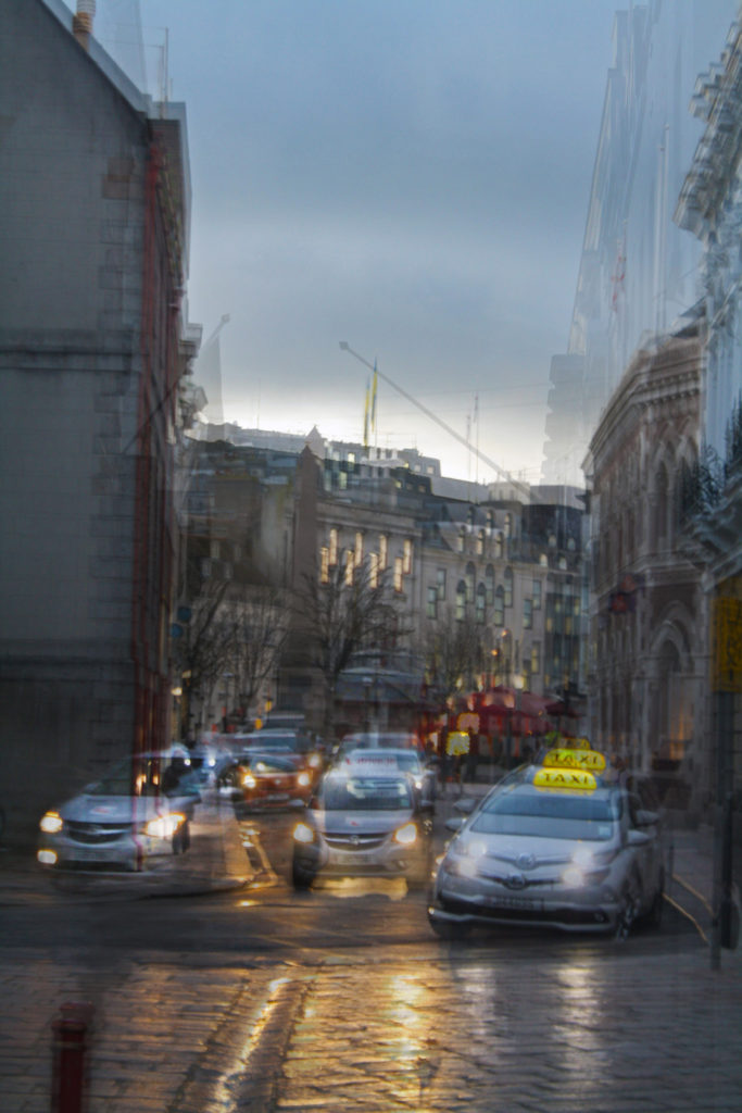
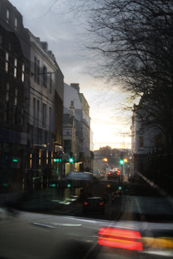
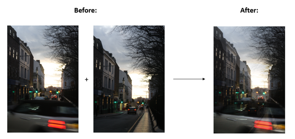
I started by walking around the busiest areas of St. Helier to try photograph big crowds after work hours before then focusing on buildings and architecture. I wanted a variety of different types of buildings in various places, time, angles, etc. as I think this was a great way of showing off exactly what Jersey has to offer while still linking it to Anthropocene and my area of overcrowding/overpopulation. To link back to Stephanie Jung for some of my photos, I messed around and lowered the f/ stop to create movement which I think adds to the depth and the message of the images. This works best with cars moving as the lights create a path to follow.

WHAT COULD’VE BEEN BETTER?

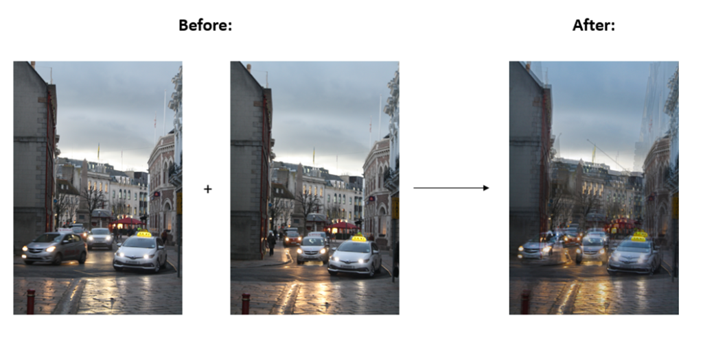
To make my work better, I could’ve done another photoshoot to create better images and spent more time on making a series of images to layer on top of each other – inspired by Stephanie Jung. In the extra photoshoot I could’ve also focused more on apartment blocks and offices as this would link to Michael Wolf and his repition of buildings. I think having more images to work from would elevate my work even more and not limit to quite similar pictures like I have.

OVERALL ANALYSIS OF PROJECT

Overall, I am really proud of how this project came out but I do think I could’ve made it a lot better if I had spent more time on them. I think I was able to find a mix between Stephanie Jung and Michael Wolfs work while it still being original and different.

Analysis

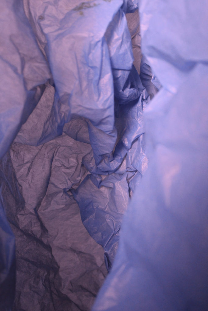
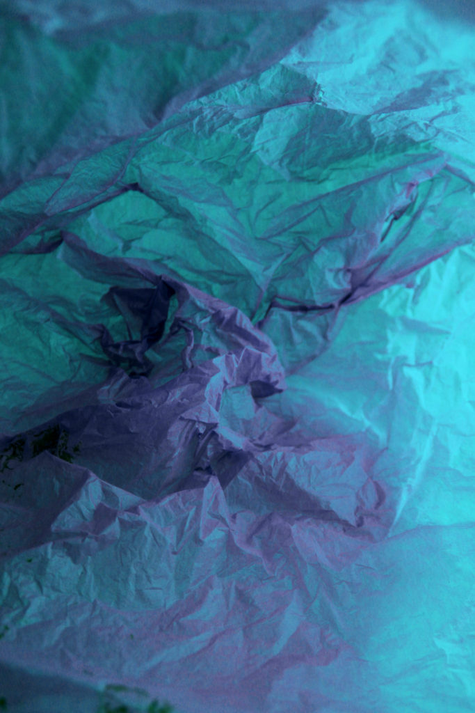
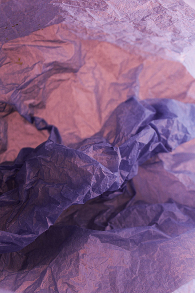
The type of lighting used in the image is artificial lighting from studio lights, coming from straight above the image. The light creates a contrast of colours and lights in the dark areas of the photograph. By using the colour tools in photoshop I changed the colours of the bags to create a more interesting response to her work. The visual elements of the image such as colour creates leading lines and for your eyes to flow around the image. The material of the bag makes the image feel like a jelly fish under the sea which represents the project of Rolsfen, she explored collecting single use plastic bags and re using them to create art work. The form is created by the positioning the bag in a certain way making it look like its 3D. The repetition of the creases and folds in the bag helps to create this 3D effect.

Why did I choose Abstract for my Anthropocene?

I chose to have an abstract response to this project as the images can have many meanings and interpreted in different ways. After doing research on abstract artists such as Mandy Barker I learnt more about the problems with single use plastic and how it effects the environment. This helped me to explore my ideas with plastic and experiment with different aspects of it.

How did I plan?

I started by exploring abstract artists and gathering ideas. I really like the idea of plastics, not just the composition of it but the meanings behind it. For example, how it is affecting our Earth every day and every minute. I decided to collected plastic bags, bottle lids and other single use plastic which are thrown out. I used the studio at school and also shoots at my home. After viewing my images I wanted to then develop them further by changing colours in photoshop and Lightroom.

Overall Evaluation

Overall, i am happy with how my final outcomes turned out. The three images work very well together as a trip ticks. I really like the colours of the images together how the purple flows through the images.

Anthropocene Evaluation

Why did I choose Ronez quarry?

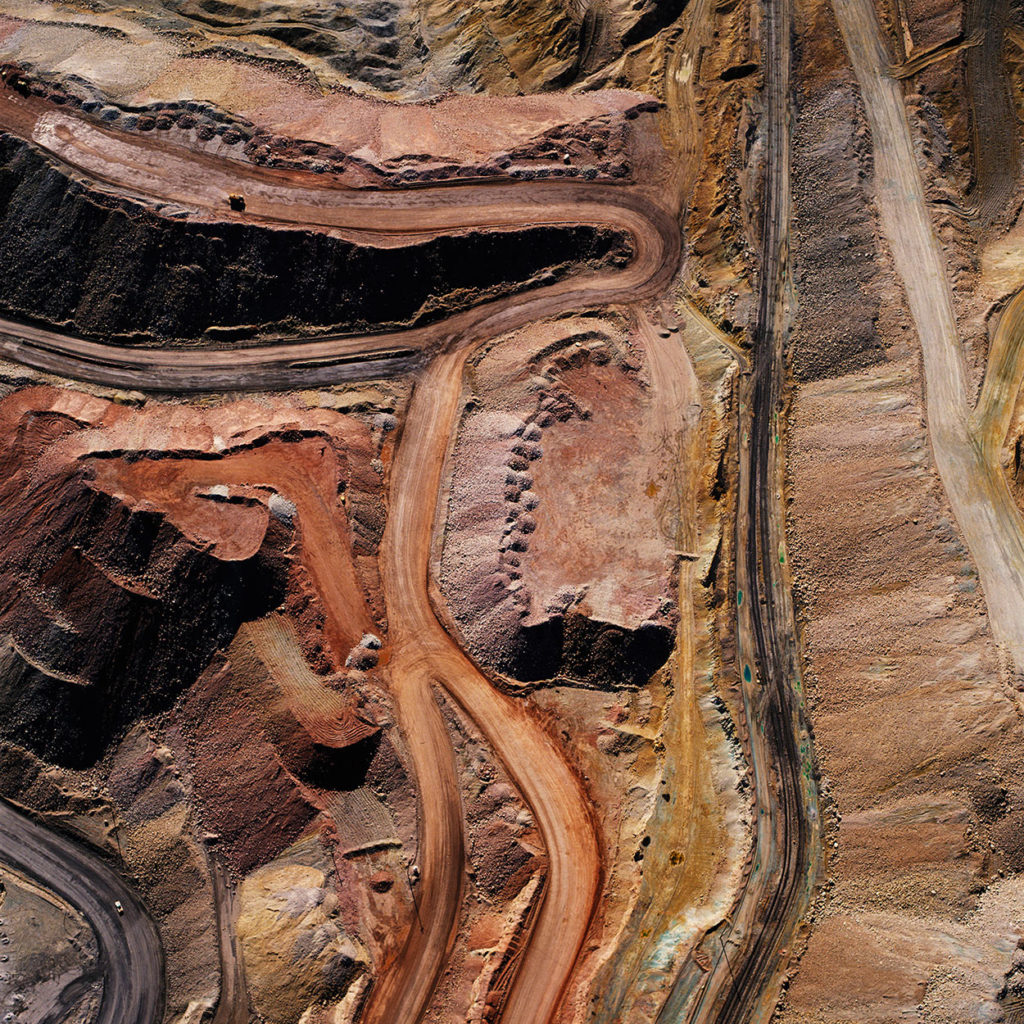
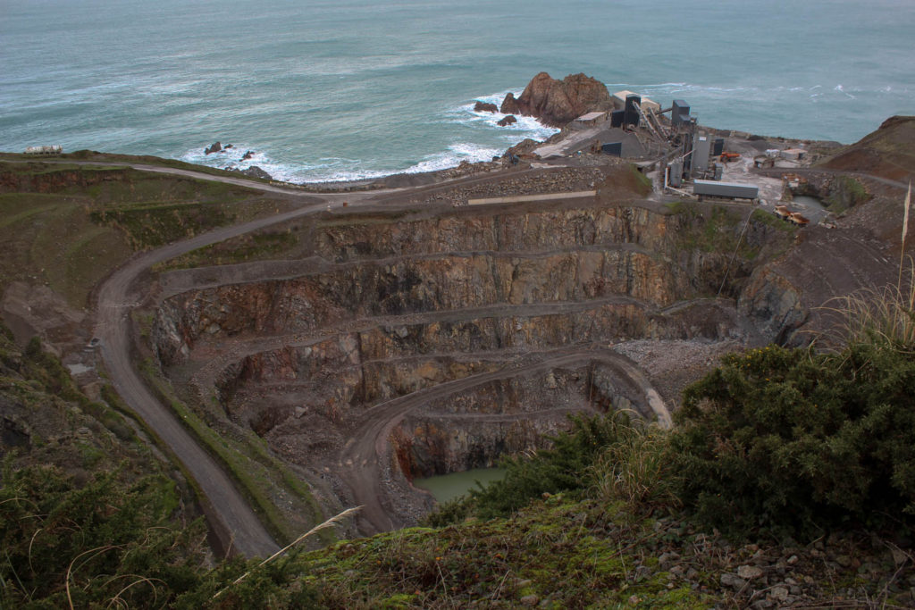
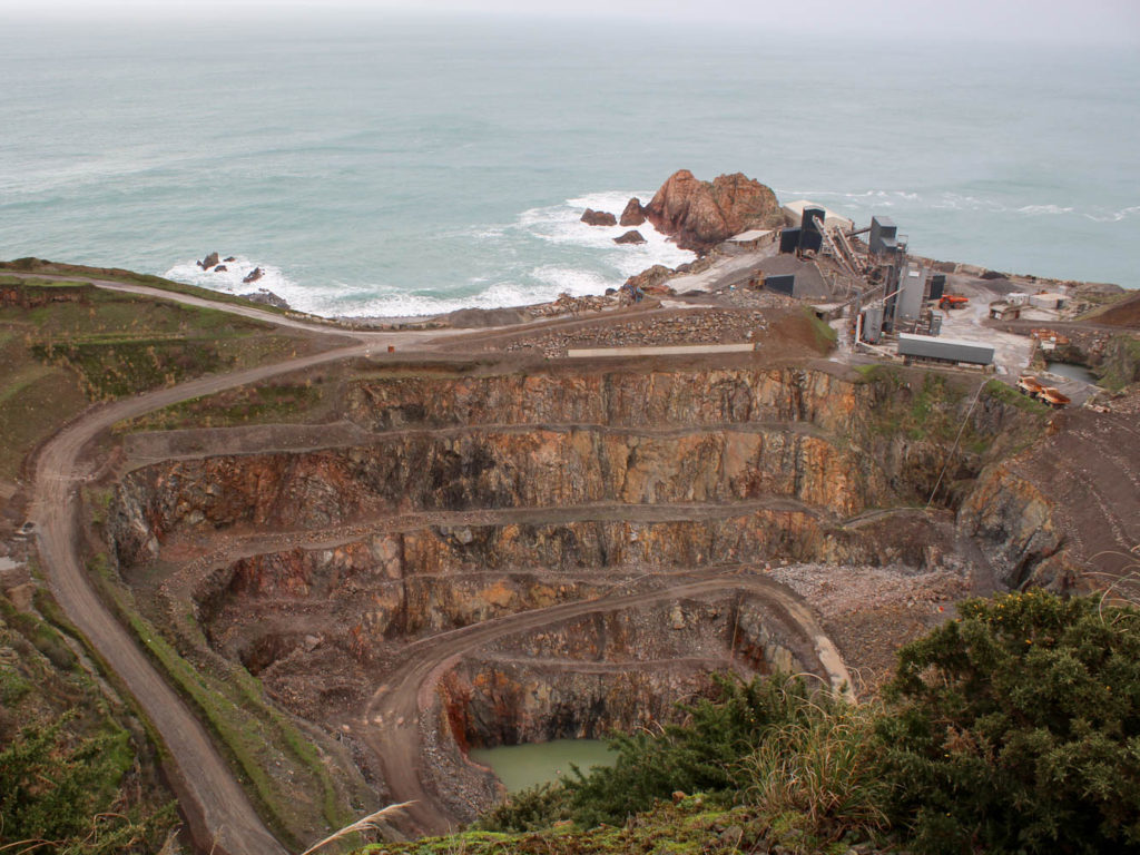
I chose to focus on Ronez quarry because out of the ideas I had, I felt that it linked strongest to the theme of Anthropocene. I was attracted further to the idea once I had seen David Maisel’s images from his mining project, which captivated me, as they had a sense of awe about them. Ronez quarry linked strongly to Anthropocene as the landscape has been drastically changed because of human activity and the demand for raw materials.
How did I plan?

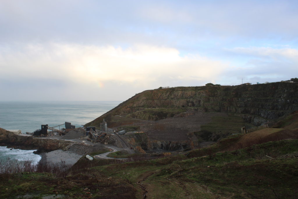
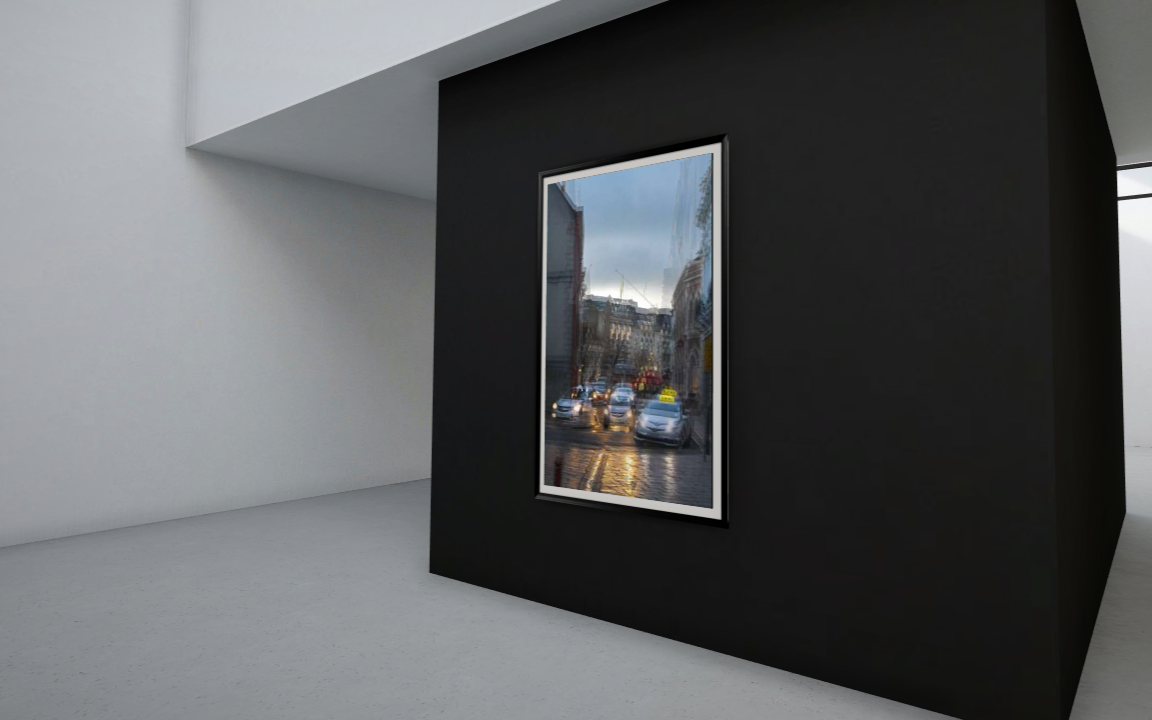
I wanted to show how vast Ronez quarry actually was and how much the landscape around the area is being affected. I went to Ronez and took images from above to replicate the work of David Maisel, who inspired me to take photos of the quarry. I also, wanted to show the depth and width of the quarry. However, I was restricted to the angles and shots I could get because there was a fence, preventing me getting the angle I wanted. I took further images of the quarry from Sorel Point to get a different view. The only limitation when taking the images, at Sorel Point is that I couldn’t get an aerial view of the quarry so the images didn’t really link back to David Maisel’s work.

Overall evaluation on the project:

In my opinion the images I took at Ronez, from above, are stronger and came out better, than the ones I took at Sorel Point. This is mainly because the view of the quarry wasn’t what I was looking for however, the images at Ronez weren’t perfect because you can’t see the whole quarry due to restrictions and overgrown bushes blocking the view of the water pool.

It was quite frustrating not being able to get the view of the quarry I wanted to demonstrate what the quarry looks like as not many people will know how vast it is and the effect it is having on the landscape surrounding it.

I feel like I could have portrayed David Maisel’s work better if I had a drone to get a proper aerial view, like his images, which would of given my images more depth and a better composition..

In conclusion, I enjoyed this project and exploring the theme of Anthropocene and how the environment is being drastically changed by humanity. I am happy with my outcomes as I have some strong images even though there were factors, out of my control, restricting me to take the images I wanted.

Evaluation

Inspiration

My focus for this project on the topic of Anthropocene was to create a series of long exposure images highlighting the excessive use of artificial lighting and its effect on the environment. Rut Blees Luxemburg’s work similarly explores the urban, metropolitan landscape and its effect on the human condition. Luxemburg’s photographs are made with long exposure times using the ambient light sources provided by the various forms of neon and other night-time illumination in the city inspiring my chosen images. Luxemburg first captured modernist structures such as tower blocks, 1960s council estates, car parks, empty sports grounds, urban motorways and building sites, Luxemburg’s images have seen characteristic synthetic lime green, fluorescent yellow and sulphuric orange tones. The interesting approach of her images present normal everyday structures in a unique and powerful way, exploring the effects caused to the environment.

Environmental issue

Light pollution was my chosen topic for Anthropocene. Light pollution is a global issue. This became glaringly obvious when the World Atlas of Night Sky Brightness, a computer-generated map based on thousands of satellite photos, was published in 2016. The atlas shows vast amount of light surrounding our planet at night. Sky glow is the brightening of the night sky, mostly over urban areas, due to the electric lights of cars, streetlamps, offices, factories, outdoor advertising, and buildings.
Outcome

Overall, i’m pleased with how my images turned out. I believe they visually represent the effect of light pollution on the environment, similar to the objectives of the The Anthropocene Project. Although, i was not able to capture as many images as i would have liked due some difficulties with the positioning of my tripod on a slanted wall, blurring some potential final outcomes.

my final edits

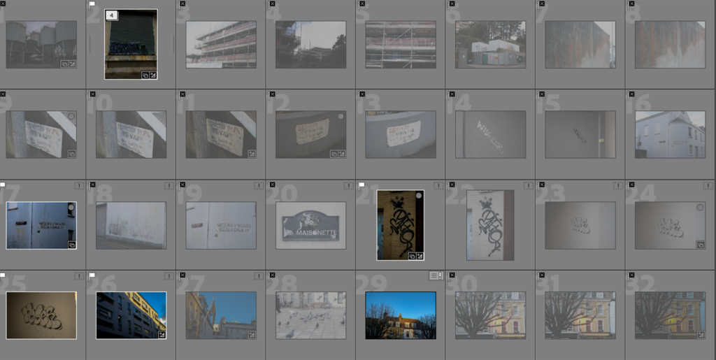
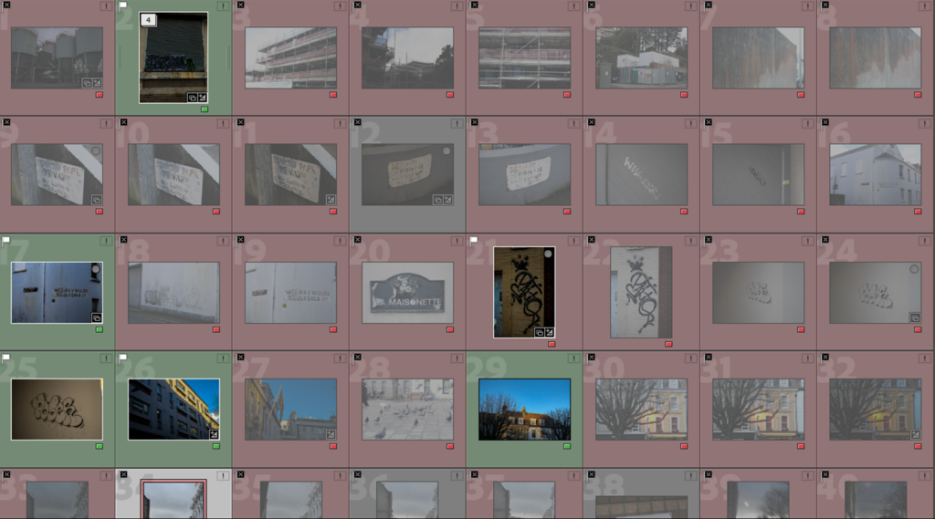
selecting my final images:

firstly I flagged the imagines I liked the most

I then coloured the pictures red or green that I was going to use as my final images. green= final images/ red= wasn’t good enough

first image

original:

after:

final outcome:

second image

original:

final outcome:

third image

original:

final outcome:

fourth image

original:

final outcome:

editing and experimenting

EDITING MY BEST SHOTS

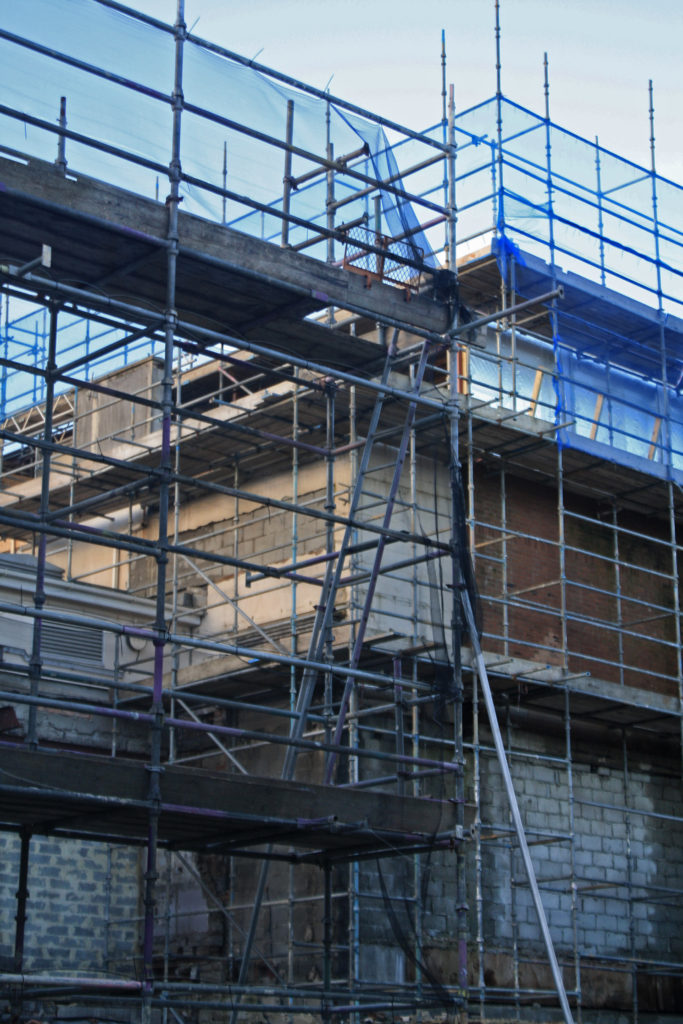
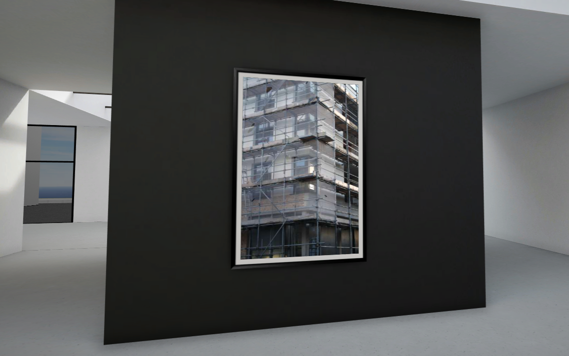
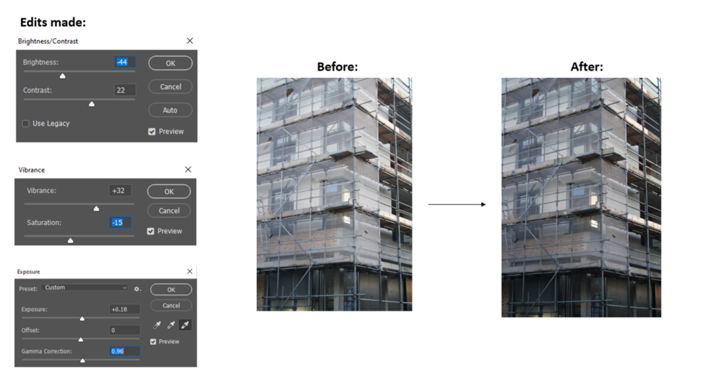
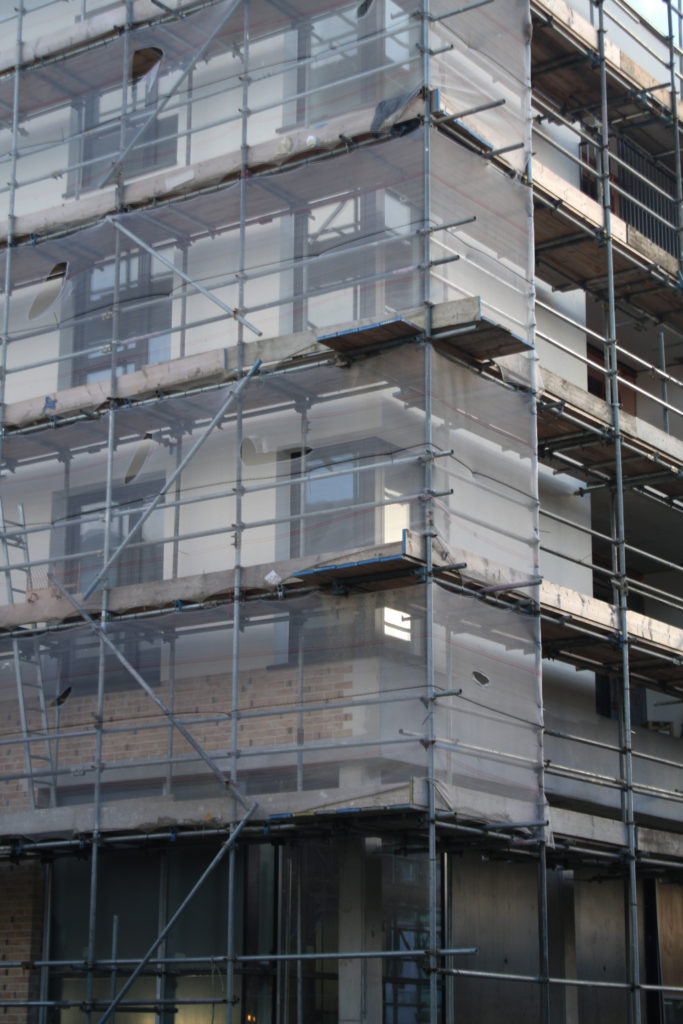
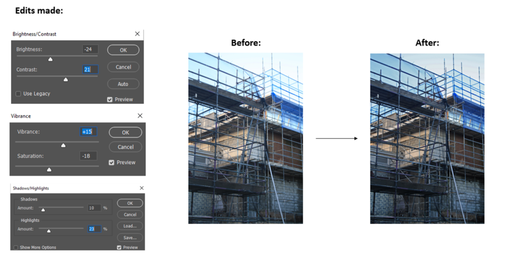
For this image, I wanted to create depth but also focusing on the repition of the scaffolding and linear objects. This links to Anthropocene as construction work is connected to not only more buildings but also fossil fuels, a lot has to be burnt to create it all.

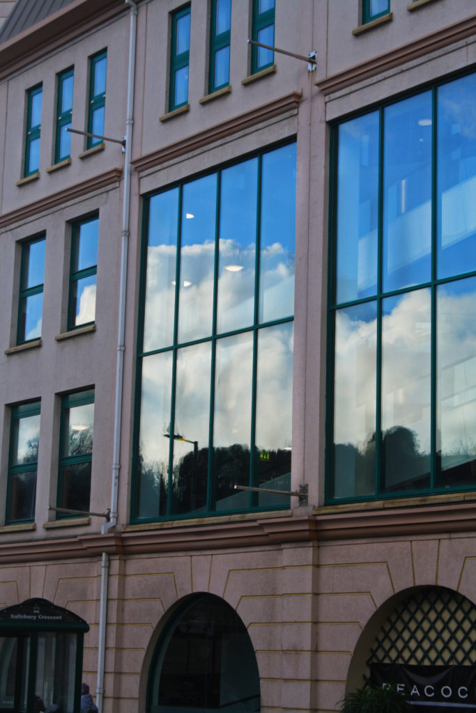
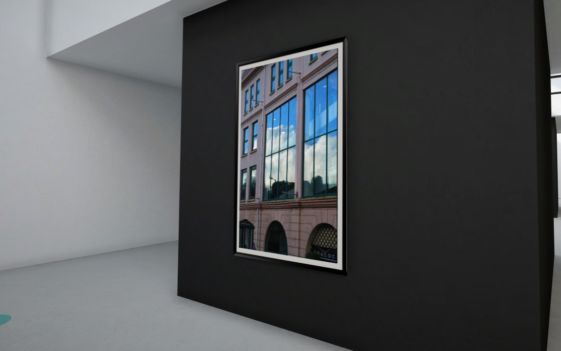
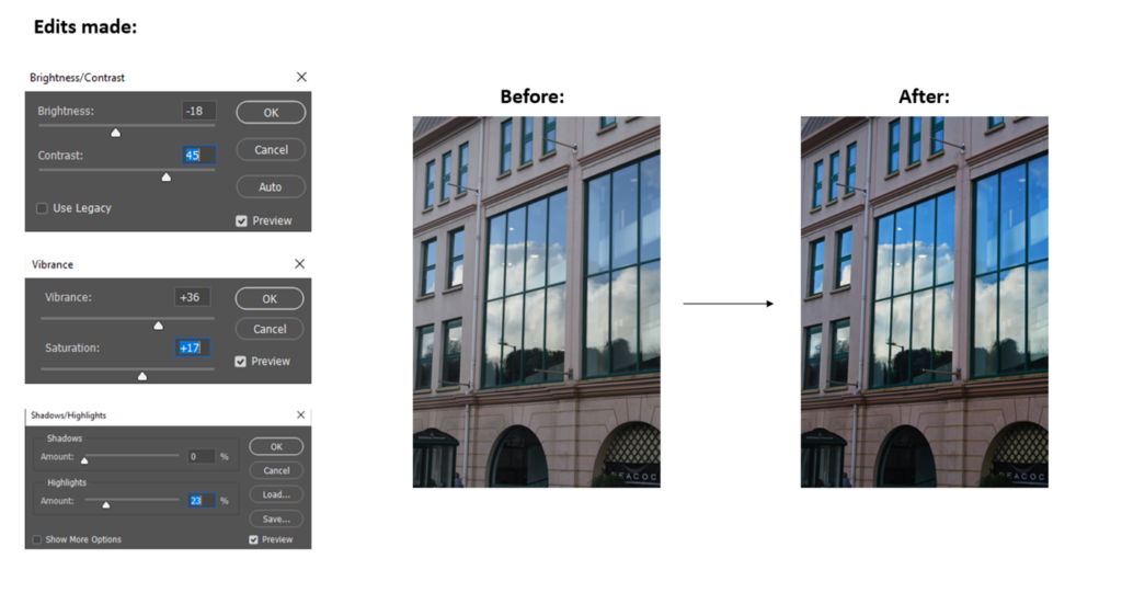
For this image, I really wanted the focus to be on the sunlight reflecting off the window and how the window acts as a mirror. I think this could link to Anthropocene as it could look like a split between the two world (natural and industrial).

For this image, I really want to create a sense of depth and shape within the multiple layers of scaffolding and use the light to my advantage.

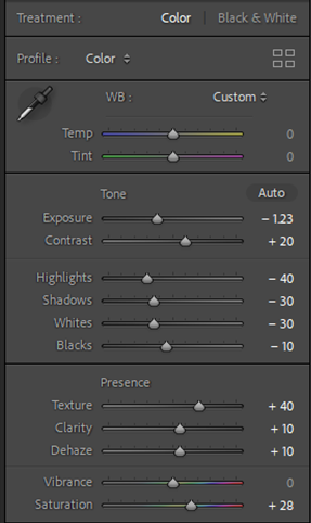
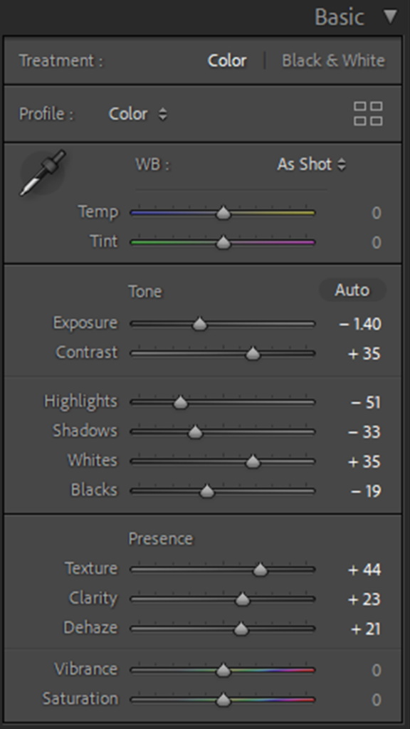
After editing all my photos, I then went in and adjusted them even more using the dodge and burn tool to lighten/darken certain areas.

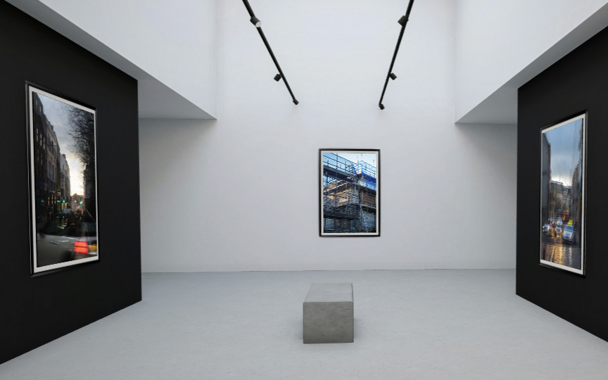
FINAL IMAGES

EXPERIMENTS

For these experiments, I was inspired by Stephanie Jung and her work. What I really like about these images is how easily they fit within each other while still giving off the affect I wanted them to. I used photoshop to layer the images on top of each other and then played around with the opacity until I was happy with how the images blended together. I then went in and adjusted some of the areas, either with the dodge/burn tool or with the brightness/contrast.

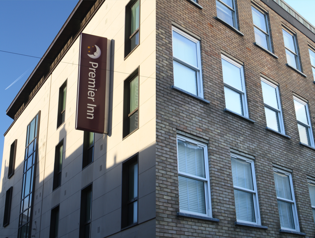
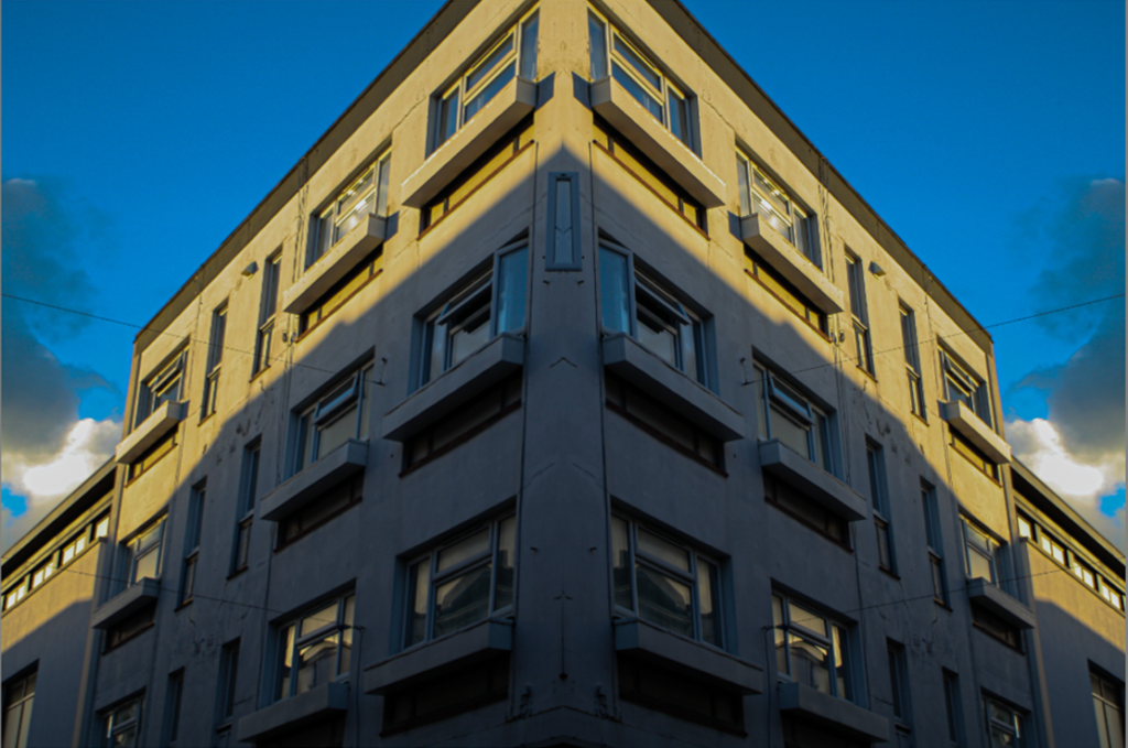
To make this montage I started by flipping one of the images so that they were both the right way to make the illusion of a new building before then cropping and layering them together until I was happy with how it looked. I really like the idea of a building made up of two separate buildings while also having the two different light directions and intensities, the image on the left is during the beginning of a sunset whereas the image on the right looks more like it is light and sunny.

Evaluation

Where I went

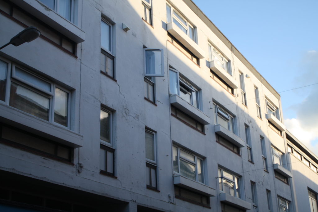
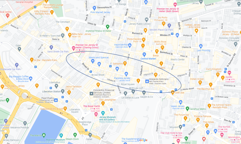
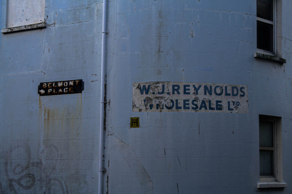
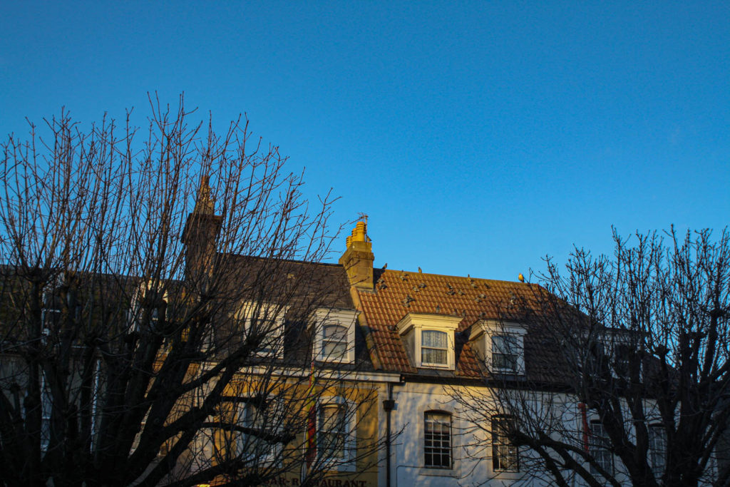
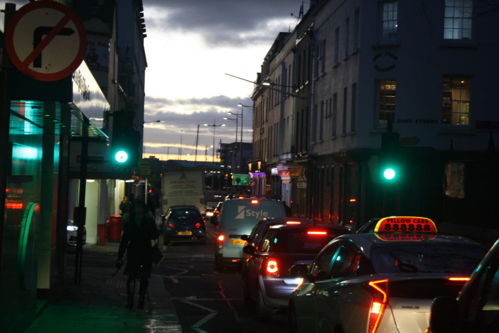
To take my photos I walked through town after school when the sun was starting to set, I went to the royal square, millennium, snow hill and a few alleys in town as these places tend to have graffiti, rust and cracks on the buildings. I also went to crowded places but also places with not a lot of people.

here I have circled where I went

What I took pictures of

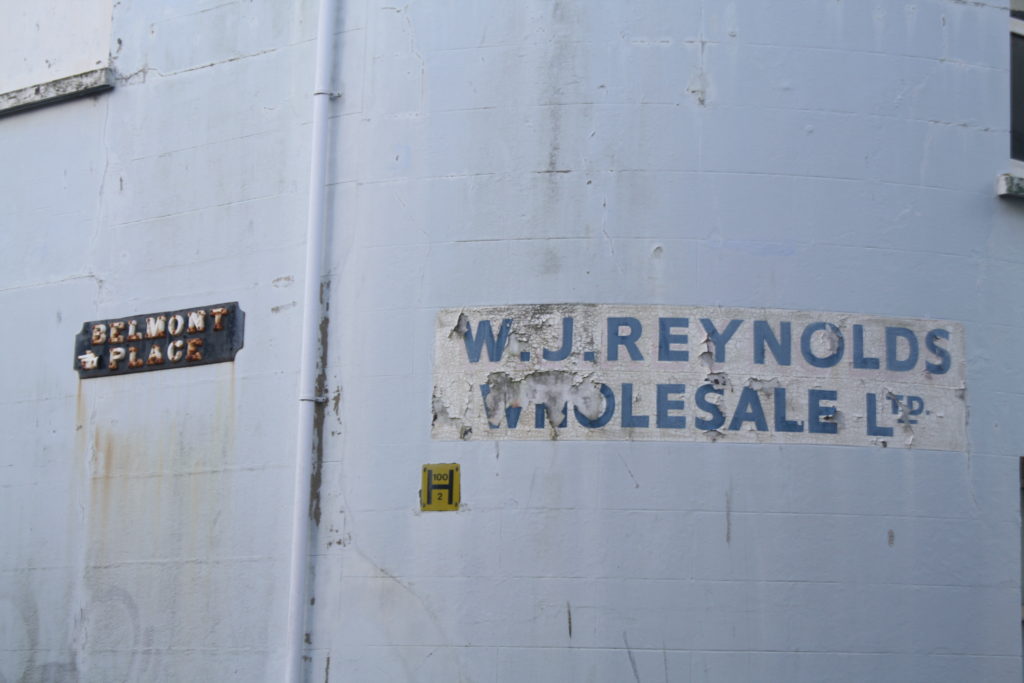
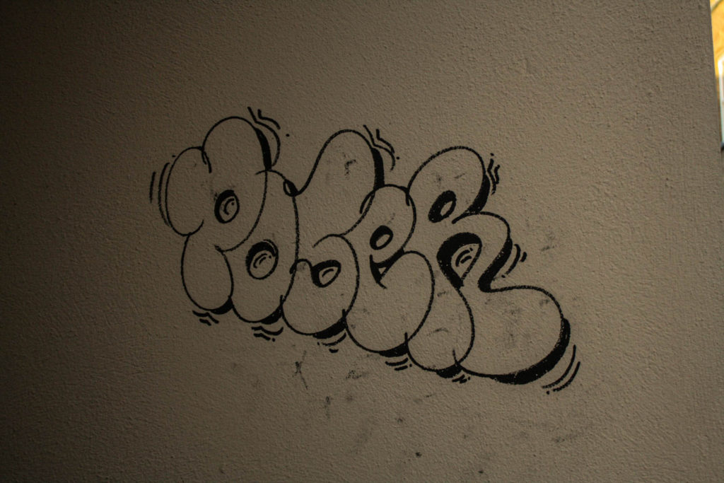
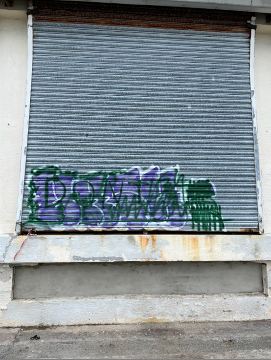
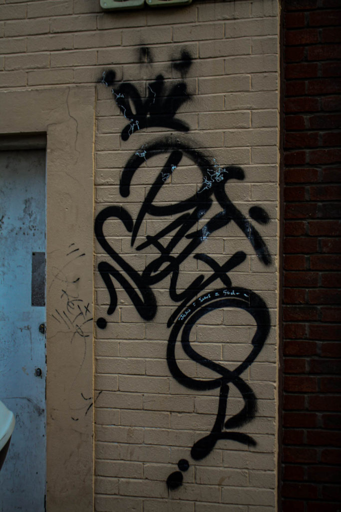
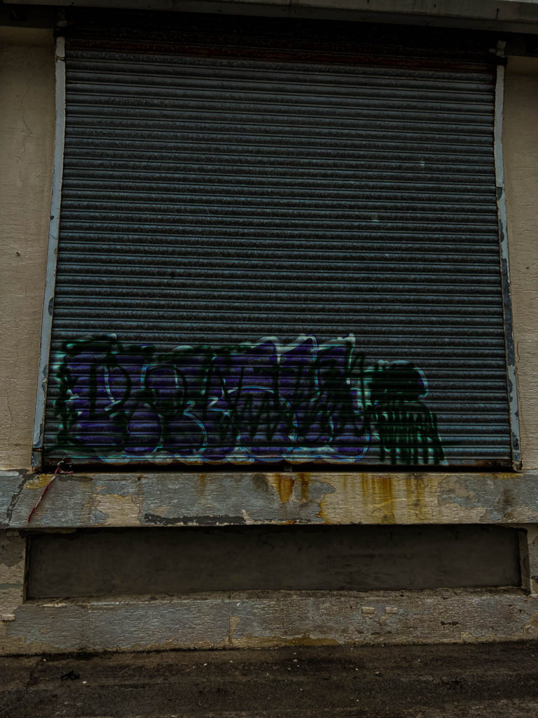
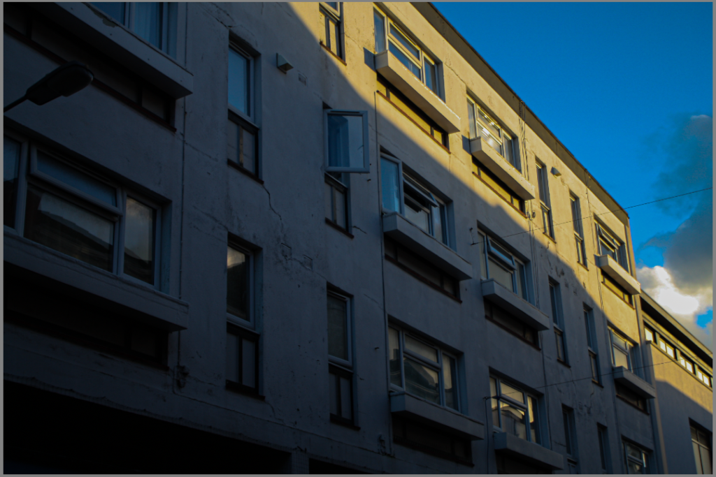
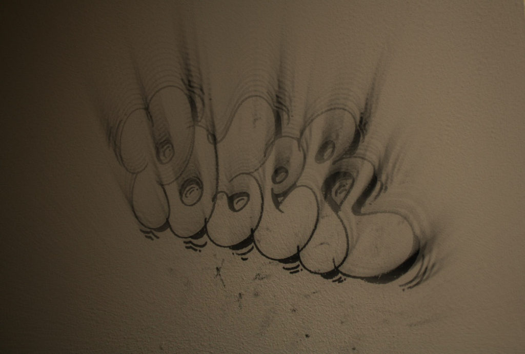
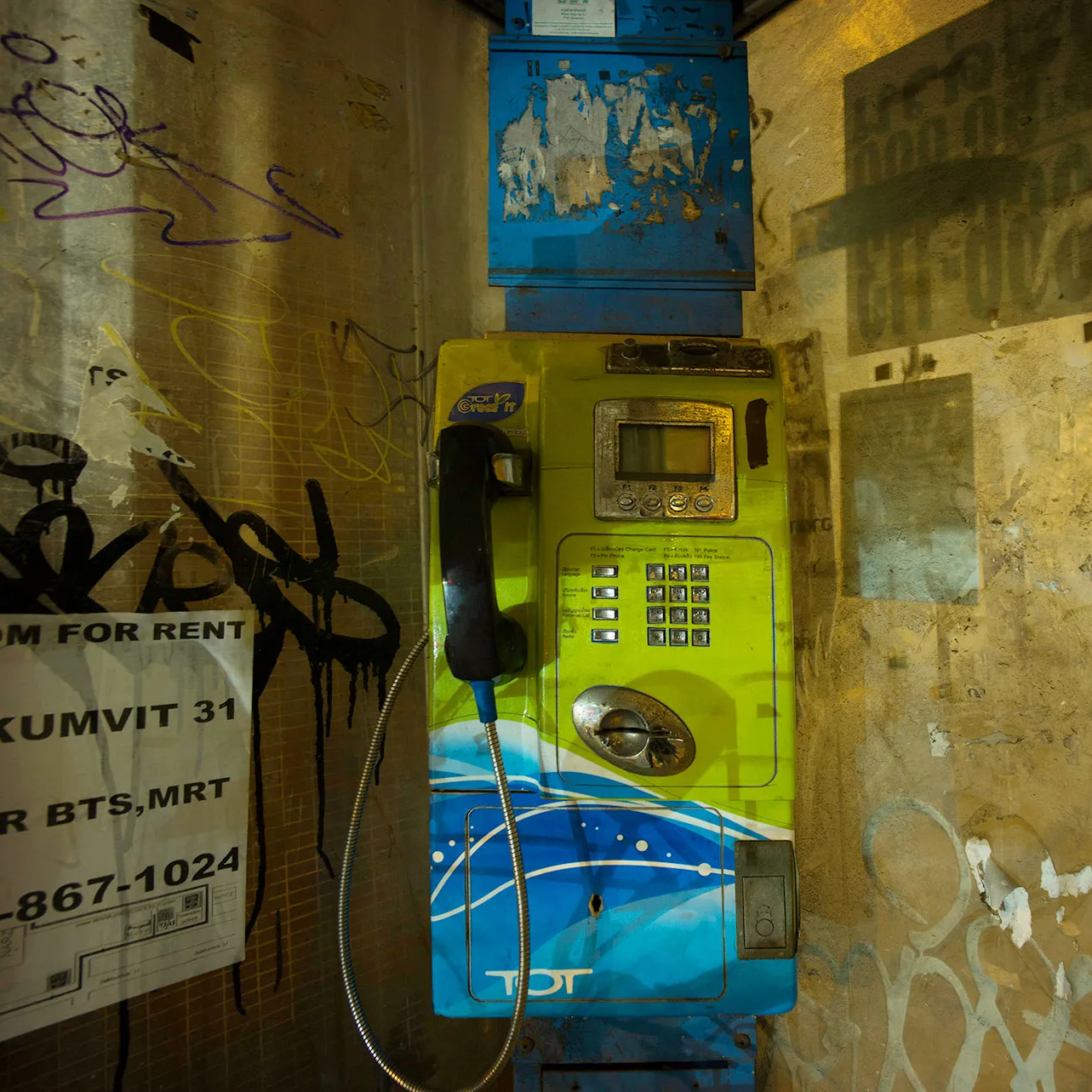
I took pictures of buildings that was worn down with cracks on it and graffiti on the side of buildings, I took pictures of road signs, streets, cars anything that rusts and doesn’t look that clean.

the photos I took

why I took those pictures

I took these pictures because I think they present what the world actually looks like and how we have had a huge impact on the world.

What I could do better and what went well

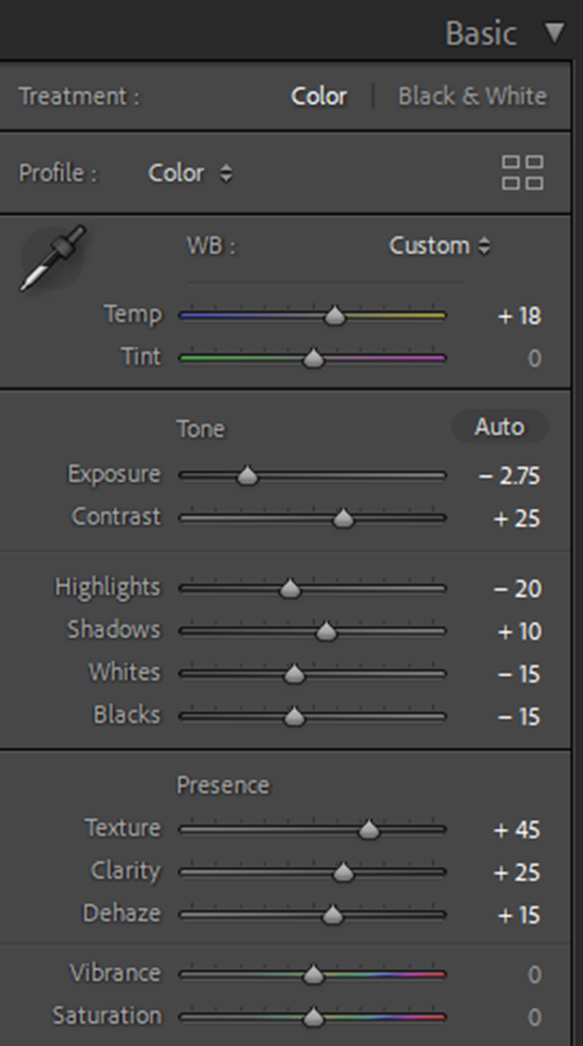
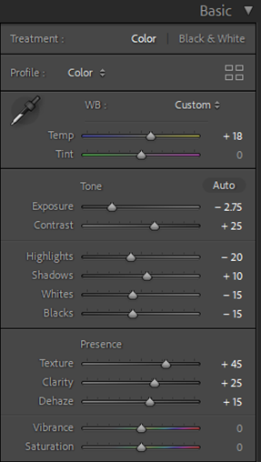
With my pictures I feel like I could edit the photos better and go to more places out of town as I feel like I haven’t properly looked into what I was photographing. However I managed to go to the places that consist of graffiti and buildings with rust and cracks on them as this was my goal at the start.

Before

After

photoshoot plan

For my photoshoot that I’m doing I will be going to run down places and the harbour as these places will have stuff decaying and rusting. I will be using these two photos as inspiration and what I will be trying to aim for. The photos I’m going to take will be of buildings, boats, cars or anything that’s rusting, rotting, breaking or has graffiti on it as this is the theme that Frank Hallam Day was doing. I will then be wondering around town to see if I can find places that’s been abandoned or looks a bit torn down.