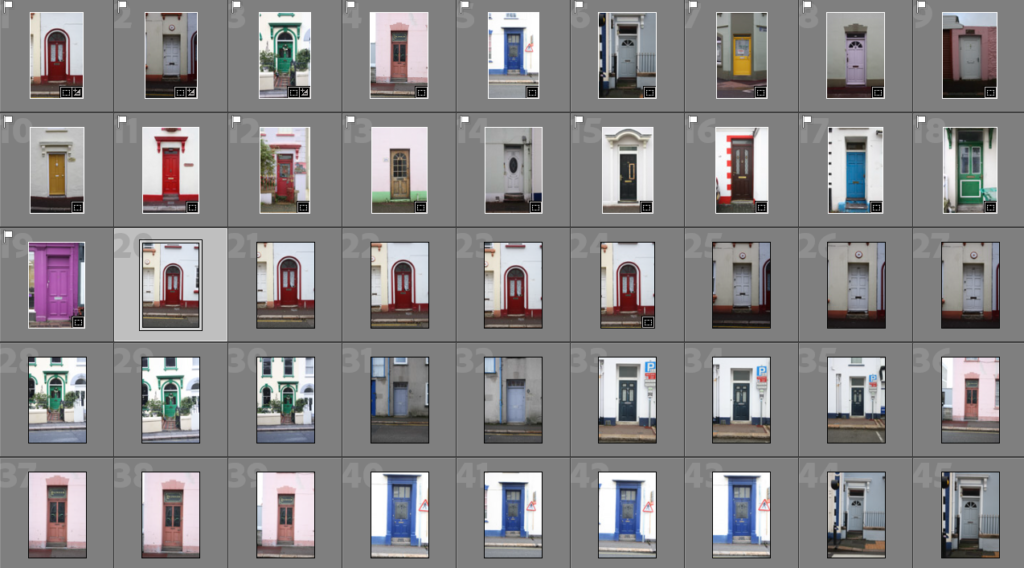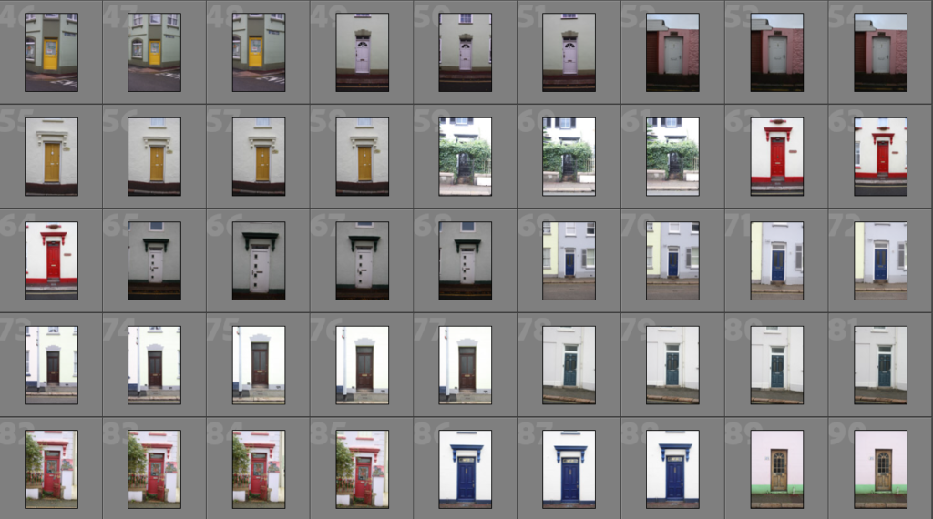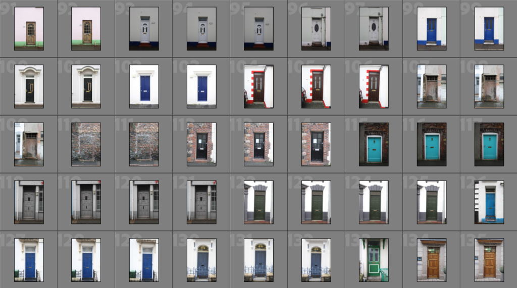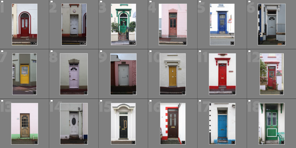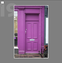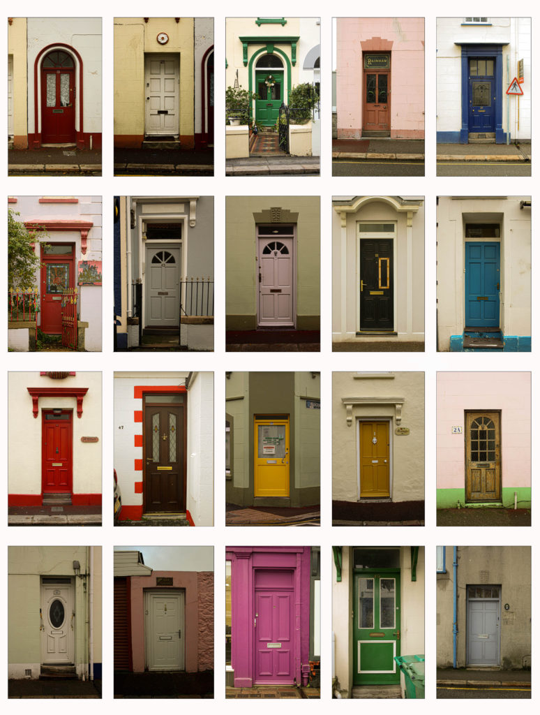
Typology final results

When the colours of the images where altered and similar to each other, I had a theme where they looked similar to each other. However some doors were still slightly not straight because of the angle I originally took them at. I had to align them and comparing one to another so that they were proportional to each other. This was done in Lightroom using crop tool where I changed the angle of some photographs and also cropped them to match the others.

A thing I wish to improve on or which didn’t go exactly to plan was that the sizes of the doors are not exactly the same on the photographs when compared next to each other. This is because some photographs are more zoomed in then others. sometimes it was because I couldn’t have the same distance from the camera to the door each time, but to improve that whenever I do a typology next time would be to get much more photographs or the object with more different length points.

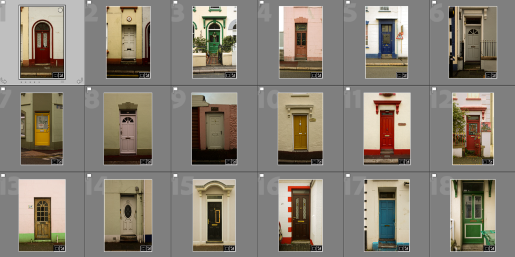
once the images were ready I simply created my own grid in Photoshop by using the rectangle tool to create long white rectangles which were as lines between the photographs. I have then spaced them out evenly, both horizontally and vertically between the pictures. This ensured all images were of the same size.

Creating a GIF

With a couple of the images I decided to have a go at creating a GIF. To do that I firstly in Photoshop selected File-Scripts-Load Filed Into Stock.
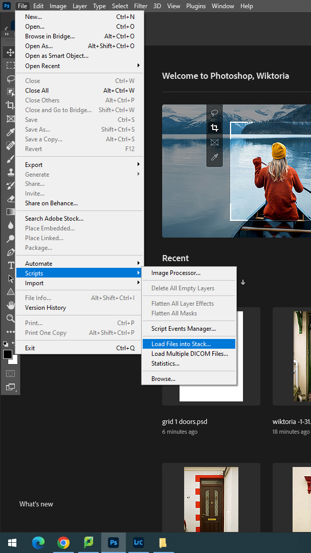
After I was able to select which images I wanted to include, this could of been done with more or less images but i have decide to pick 5.
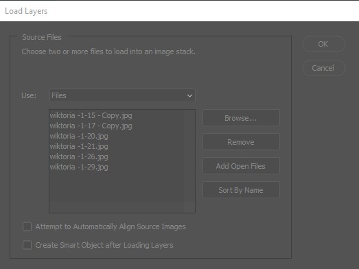
Once the images are uploaded, on the bottom of the screen there an option with an arrow pointing down, this out of all options was selected to Create Frame Animation, in the timeline box what can be edited about the GIF is how fast the images move, this could be very quick or slow, I decided to go with a close to the middle option which made them move fast but still visible to notice what each picture is.

What I had to do next is by clicking the lined box under the X, I made fames from layers.

Then I have changed the time of how quick the images move from one to another. This was because of the arrow below each image. originally it was to 0sec and I changed it to 0.2.
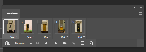

Due to the blog not being able to have larger files uploaded I had to shorten the image size which meant the loop playback was deleted. tTis is what I could upload:

Joiners

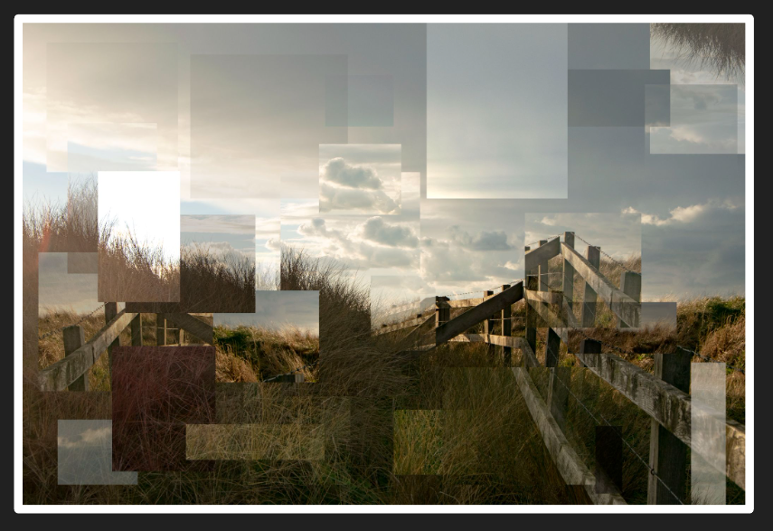
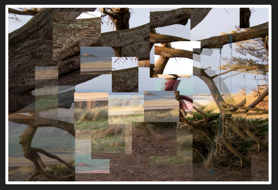
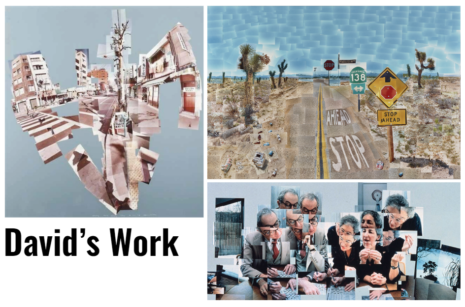
Joiners is typically created by taking multiple photos of one view, and joining them together to give a wider view of the scene. David Hockney did this with his work in the early 1980s.

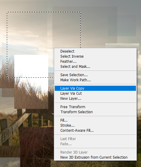
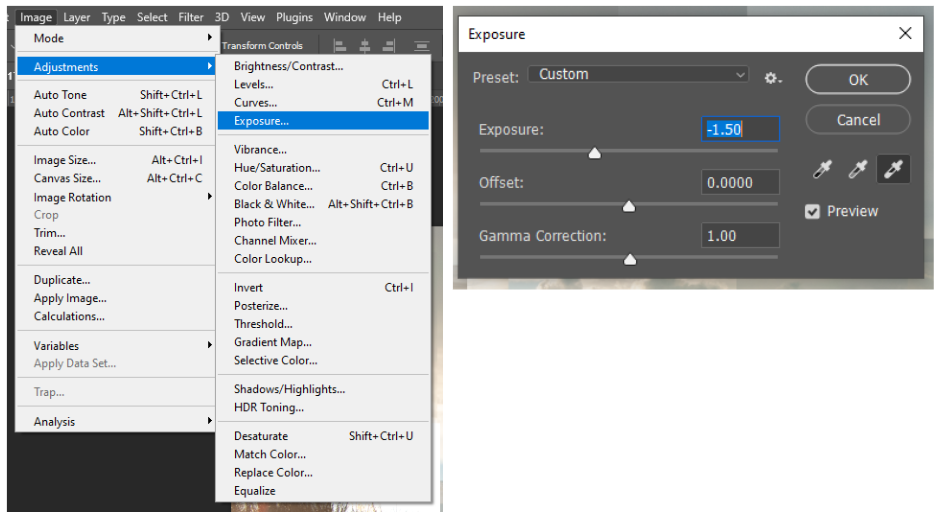
I took a photo from one of my shoots on Romanticism, and edited it to look like a joiner on photoshop. I selected an area and created a copy. Then I would change the opacity, exposure, or hue to make it stand out. I also moved the copies around the image to show a clear difference between them and the original photo.

TYPOLOGIES PHOTOSHOOT

As I knew the selected topic for me to create a typology on were doors, I have gone out with a camera to town where after wondering for a while I found an estate which wasn’t busy and had interesting looking doors.

The doors were interesting to me because most were colourful and unusual, unusual because of their shape, colours, . These doors were not modernised which what made me drawn to photographing them more as then they are a part of history and can even tell a story through the way they look.

The main challenges of this photoshoot was to get every door photographed at the same angle and size. this is the reason I ended up with multiple pictures of the same doors. These picture were often in different distances from the camera.

SUB SELECTION

I have selected and narrowed down the options from the photoshoot by picking the best quality photograph based on the angle it was taken at. The selected images had to not repeat so if I liked look of a certain door, I would have to look through the pictures taken of that door and select the best one.

EDITING

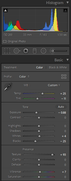
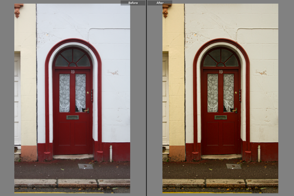
To make all the pictures relatively the same I have used only one editing setting. This means I have edited one photograph, enhancing the texture, temperature, and played with other setting like exposure and tint, until I achieved a result I was satisfied with

Then copied all the adjustments in photoshop and pasted them onto all the other images. This means all the photographs had the same adjustments done to them.

Before and After image to show the changes made.
All the selected photographs , with the same editing settings, next to each other.

TYPOLOGIES PHOTO SHOOT PLAN

What I am interested in photographing are a series of doors. This is because this also links very well to the topic of “home” and I find it it interesting how an ordinary subject, like a door is used regularly everyday and is so good at it’s function however not many will look at one for more then a couple seconds to think much more about it, like it’s beauty, the way it was made, by who it was made, how old it is and many more questions that would come after these, maybe how many people massed through this door, how many times it was painted over , or haw many people lived in the house of that door.

with this idea I created a mind map of how to photograph the subject and how I may want the layout of a typology to look like.

Who-this photoshoot shouldn’t include any people in it, since I will be photo shooting in a busy area, some strangers may get in the frame , but I should not use these pictures.

What- My main focus is going to be house doors, however I will look out for doors that are unique, are different and show history behind them, doors that aren’t new or modern but rather old , colourful maybe even worn out.

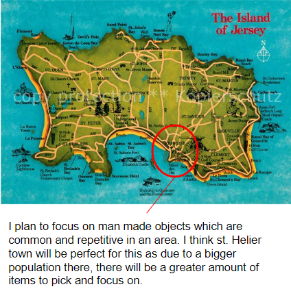
Where- In St. Helier Town I plan to wonder outside the main street and find estates that may have a similar pattern to the doors the houses have. some estates may even be hidden and I could be unaware about them, this is why I do not have an exact location for the photoshoot location.

When- Since the subject is quite personal as it is someone’s home I need to be aware that people are more likely to come from and out of their homes during times like early in the morning or around 4-6pm as most people start/finish work at these times. The best times to go is during the day at noon, during the week, as on weekends people are likely to be home.

How- Since the photographs I will be making are supposed to be grouped into a typology, displayed one next to the other, they should be taken at the same angle and style. I should make them as similar as I can. However because i am not going to be using a tripod, and I might stand in different distances from the door, I am awa

Why- To respond to the topic of typologies, but also to get an understanding of how a typology is made, including the challenges and advantages of the making process. This could include how to take the pictures and make them relatively similar.

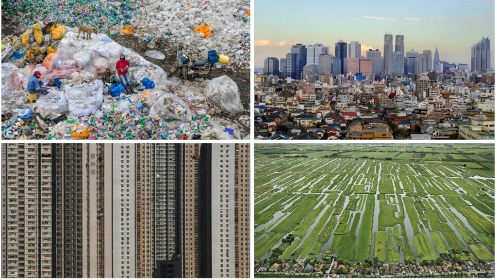
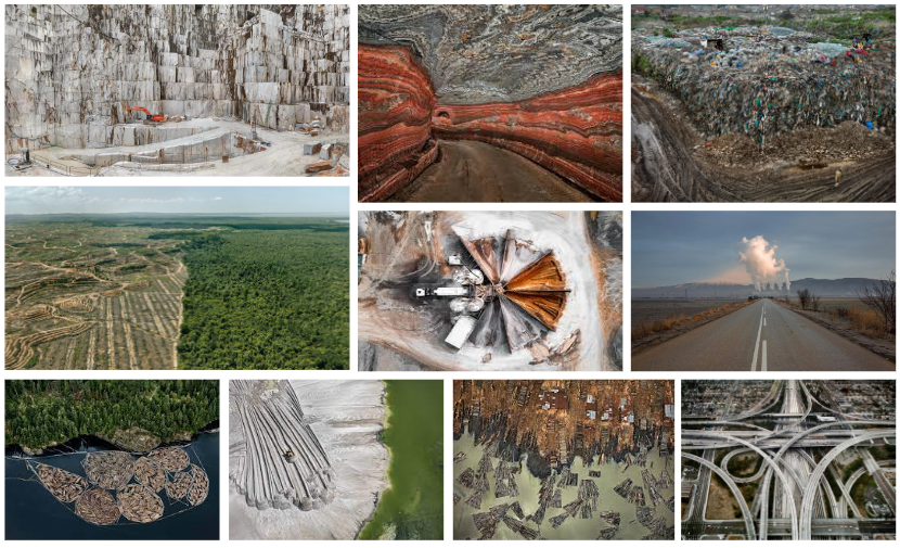
Anthropocene

The Anthropocene is a proposed geological epoch dating from the commencement of significant human impact on Earth’s geology and ecosystems, including, but not limited to, anthropogenic climate change. As of April 2022, neither the international commission on stratigraphy nor the international union of geological sciences has officially approved the term as a recognised subdivision of geologic time, although the Anthropocene working group of the Sub commission on Quaternary Stratigraphy of the ICS voted in April 2016 to proceed towards a formal golden spike proposal to define the Anthropocene epoch in the geologic time scale and presented the recommendation to the international Geological congress in August 2016. In May 2019, the AWG voted in favour of submitting a formal proposal to the ICS by 2021, locating potential stratigraphic markers to the mid-twentieth century of the common era.

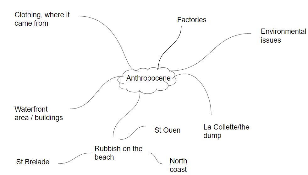
Mind map

Daniel Beltra

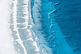
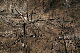
Daniel Beltrá captures the profound beauty and vulnerability of the natural world in his photographs of natural landscapes and wildlife. Primarily a landscape photographer, Beltrá combines painterly abstraction with the haunting details of an earthly paradise in peril. His sweeping aerial images invite us to soar over majestic fields of ice, water and earth, to experience the natural wonders of our planet, and to bear witness to the scars, and shocking scale, of environmental degradation.

Beltras oil spill work

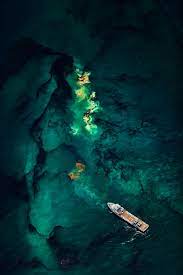
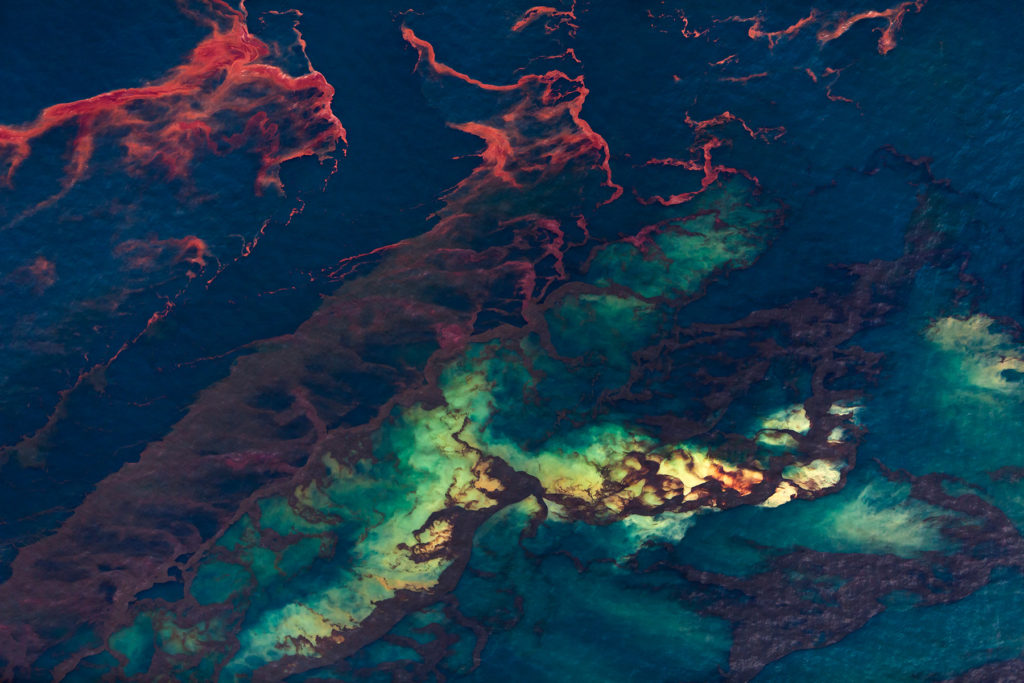
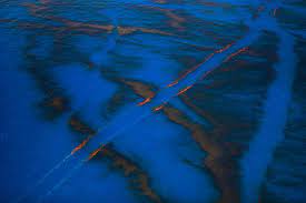
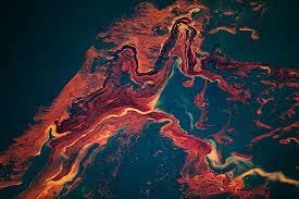
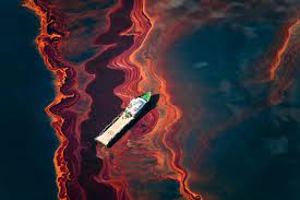
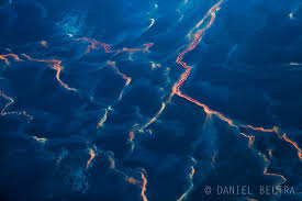
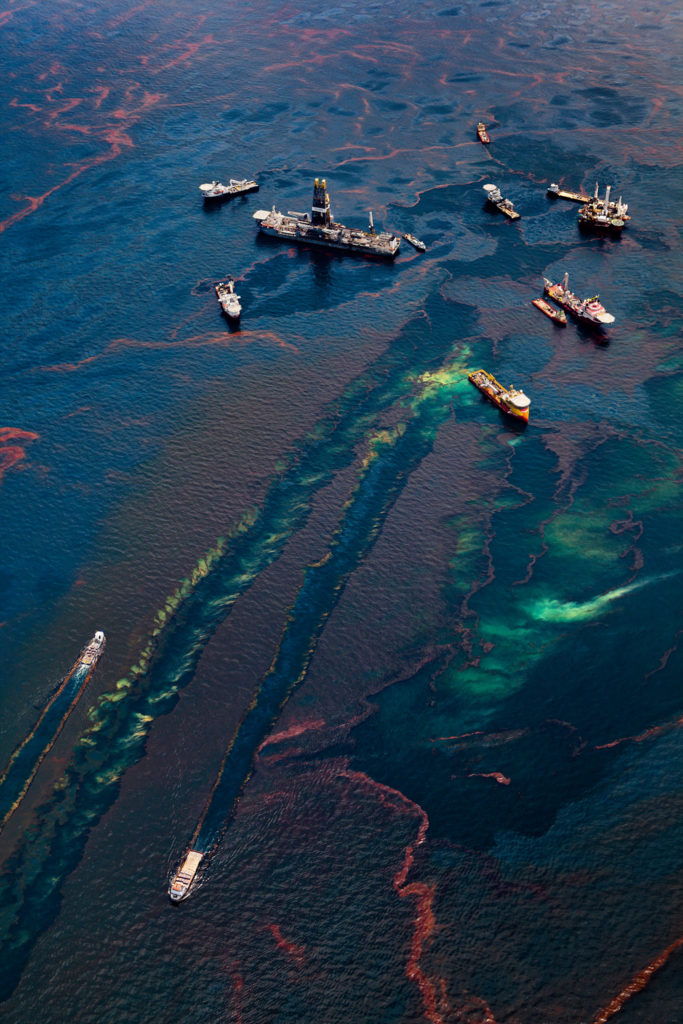
Daniel Beltra takes an abstract approach when photographing the oil spills from a high up POV. The bright colors of the oil massively contrasts against the deep dark tones of the ocean; this catches the viewers eye.

His images always have lots of texture due to the swirling of the oil, he makes these natural disasters look pretty.

Spill- Daniel Beltra (2011)

It was the world’s worst offshore oil spill: 5m barrels spewing from the BP-run Deepwater Horizon rig into the Gulf of Mexico, killing 11 people, marine life and devastating hundreds of miles of coastline. From a Cessna float plane 3000 foot above the Louisiana coastline, photographer Daniel Beltrá captured the carnage. It was only from this height, he said, that the magnitude of the spill – and the futility of the clean-up operation – became apparent. “It was like trying to clean an Olympic pool full of oil while sitting on the side using Q-tips.”
My respone:

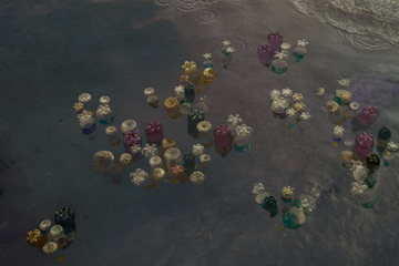
I aim to photograph signs of oil in our seas, inspired by the work of Beltra. i want to take an abstract approach to my work by photographing the multi-colors of the oil in the sea. I will find this mainly in the harbors, as oil spills from the boats. To compliment this, i might also take photos of boats in the harbor as they are the cause of the oil spills.

Juha Tanhua

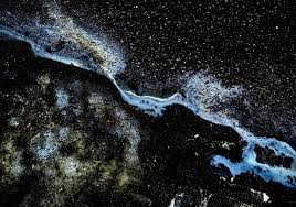
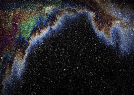
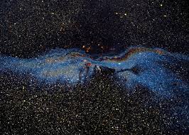
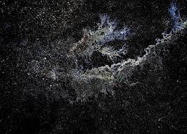
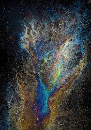
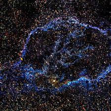
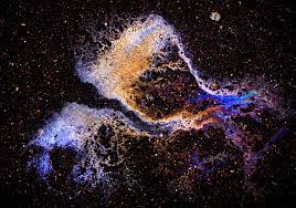
In this collection of cosmic photographs, comets, nebulas, and galaxies stretch before the human eye, showering the sky in glittering scenes that ought to be from a telescope. But instead of looking upward into the night, Finnish photographer Juha Tanhua points his camera to the ground. He documents his “oil paintings” in broad daylight, shooting gasoline and oil spills usually found in car parks. “I don’t look up, but down,” he tells Colossal. “It’s not space above us; it’s space under our feet. You can find subjects to photograph even in dull places like parking lots. Expect nothing, get everything.”

The photographer first got his idea for the gasoline puddles when noticing an oil spill next to his car. “It looked a little bit like the northern lights,” he says.

My response:

As well as capturing the oil spills in the sea, i can also focus on where oil also spills from, cars. Using this idea, i aim to approach it in the same abstract way as the oil spills in the sea, capturing the colors of the oil on the ground. Inspired by Juha Tanhua.

Thirza schaap

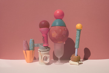
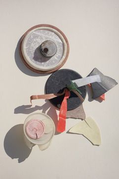
Thirza Schaap is a photographer exploring new art forms through her Plastic Ocean project. She lives and works in Amsterdam and Cape Town, South Africa.

  • “Plastic Ocean is an art project, which I started to create awareness around pollution to try and prevent (or at least reduce) the use of plastic.”

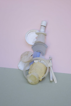
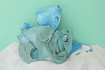
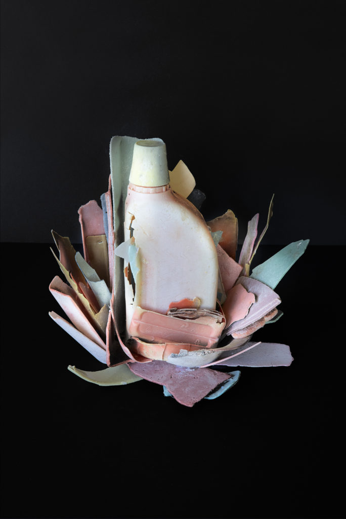
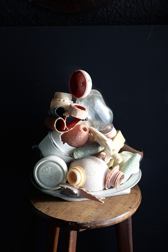
The images show a clash between worlds, offering minimal and aesthetically pleasing compositions which, on closer inspection, in-still a sense of ecological grief.  Plastic Ocean questions consumption, idolatry and what it is we value in our lives today. The effect is a quirky, playful and pop art paradox. 

At a first glance, the debris do not disgust us. On the contrary. Their dainty look almost seems to gloss over the ugliness of all the plastic pollution on our beaches. But only for an instant. Our initial attraction, soon fades.

Plastic Ocean provides a kind of Vanitas for the 21st century. Traditional icons of mortality, ephemerality and wealth have been traded out for bottles, baskets and bowls: single-use items which are used and discarded, now only existing as empty vessels of destruction.

Our beaches are covered in plastic confetti and there really is nothing to celebrate.

In my response:

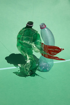
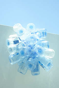
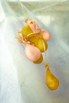
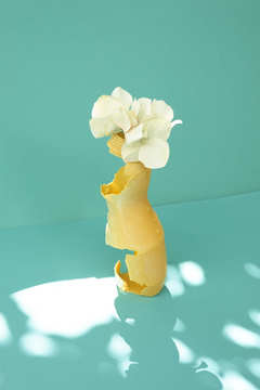
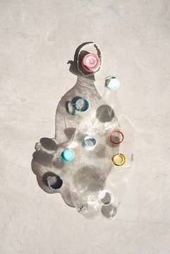
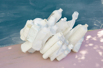
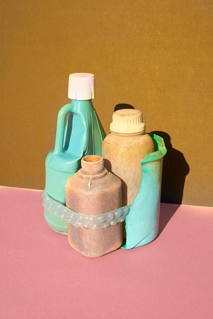
In one of my photo shoots, i aim to create a still- life, vanitas inspired shoot. Using objects such a plastic, nets, bottles, bottle lids, wrappers and anything that pollutes our oceans. I set up a photo shoot at home, and use the studio at school; i aim to experiment with different background, lighting, and angles.

Anthropocene Mock Exam- Ideas

Mind Map 1

LOCATIONS:

st aubins long beach

SUBJECTS:

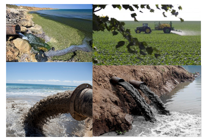
big drains on the beach, water and other substances off the fields, small drains on the wall

Mood Board 1

Mind Map 2

LOCATIONS:

Home photoshoots, school photography studio

SUBJECTS:

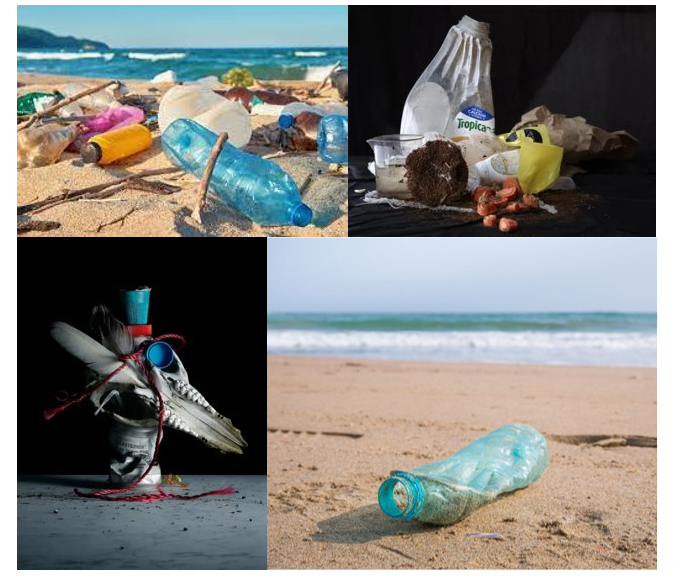
plastic bottles, wrappers, net from the sea, sea glass, any rubbish from beach/ found on beach.

Mood Board 2

Case Study: Vilde Rolfsen

Plastic Bags Landscape:

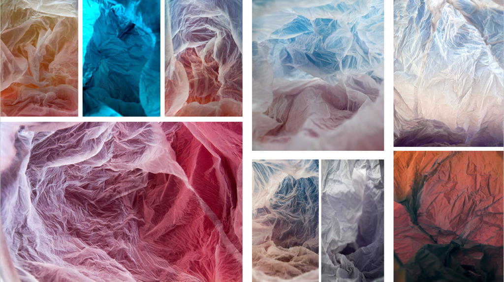
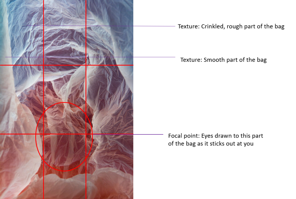
Vilde Rolfsen is a photographer from Norway, Oslo who studied in Kensington University. While living in London she realised the impact we were having on the environment especially the use of plastic bags. In her project ‘Plastic Bags Landscape’ she addresses the detrimental effects of using plastic bags as they pollute our land and oceans. Rolfsen didn’t want her project to be too in-your-face so, she decided by doing a more abstract project as it will have a more aesthetically pleasing feel and look and won’t scare the audience away. Vilde Rolfsen took inspiration from where she grew up, in Oslo, as she wanted the bags too give a look of the mountains and glaciers from back home.

Analysis:

This is a digital image of a plastic bag, the mis-en-scene presents a clear plastic bag that has lights around it to create the different colours seen in the image. There are different tones within the image with the darker tones being around the centre of the image, being the focal point, with the lighter tones on the outskirts of the image. The use of light is artificial to create the different colours, most of the image is in focus suggesting the image was taken with a f/8. Rolfsen has clearly used the rule of thirds, with each third having a different colour wave/tone.

Photoshoot Plan:

constructed seascape

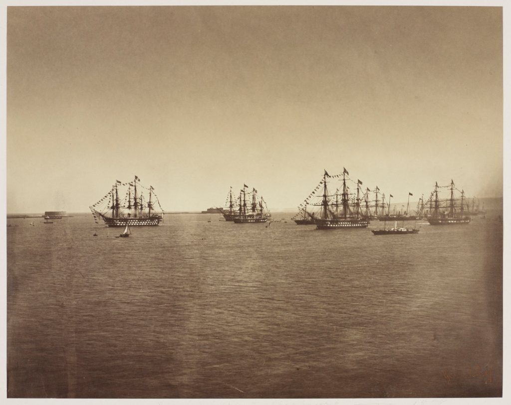
Gustave Le Gray

Gustave Le Gray was the central figure in French photography of the 1850s—an artist of the first order, a teacher, and the author of several widely distributed instructional manuals. He is known as the most important French photographer of the nineteenth century because of his technical innovations in the still new medium of photography, his role as the teacher of other noted photographers, and the extraordinary imagination he brought to picture making.

His real contributions—artistically and technically—however, came in the realm of paper photography, in which he first experimented in 1848. The first of his four treatises, published in 1850, boldly—and correctly—asserted that “the entire future of photography is on paper.” 

Image analysis:

Dafna Talmor

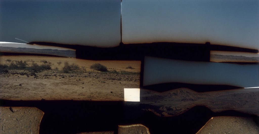
In Constructed Landscapes, Dafna Talmor conjures imaginary places through a process of collaging and montaging colour negatives.

comparison

Both could be described as landscape pictures. What kinds of landscapes do they describe?

‘The Great Wave’ describes an idyllic and romanticised landscape. Gustave describes a stormy day. The thick and dark clouds creates an intense environment, and the choppy waves on the bottom half compliment this.

Talmor’s image describes a more abstract image. Her original images were most likely the same as Gustave Le Grayes in the sense of being a romanticized straight up seascape. However, her technique of collaging different images together allows the viewer to see all the different angles of the landscape.

What similarities do you notice about these two pictures?

The content in both images is similar, they are both the sea. Both images have dark tonal colours. Both images have a burnt feature to them; the image on the left has rustic colours within the black and white, undertones of yellow. The image on the right is a collage, its been made by cutting up images and putting them together, however, on the edges of where it looks like its been cut up, there’s colours of orange a slightly red, again looking burnt.

What differences do you notice?

The image on the right is a collage, its abstract and not just a straightforward landscape of the sea. The image on the left is black and white with very yellow undertones, it seems more old and vintage. Also, in the image on the left, the sea is choppy and rough, smashing up against the rocks and the sea on the right is more calm and flat.

What words/phrases best describe each of these landscapes?

Gustave le gray- grainy, dark, gloomy, tonal, vintage, vivid

Dafna Talmor- abstract, Delineated, sectioned, cubic in a way

In which of these landscapes would you prefer to live? 

The image on the right. It appears more peaceful; yet very interesting as there’s different parts to the image, its still dark and tonal but has a less gloomy and threatening feel to it.