Constructed Landscapes

Constructed Landscapes are ones that are created with the imagery that the artist has in their mind with existing items/landscapes etc. This could be done by slicing or splitting two images which were taken of the same landscape but with different negatives. This method could also be used for 2 or more completely different landscapes that were combined together in order to make a new photograph.

A Constructed Landscape is a reflection of the artist mind therefore its negotiable to if the landscape is ‘real’ as it is of an existing landscape however it isn’t taken in a single photograph but by having adjustments done to it.

On the other hand in photography sometimes what a person sees is not always how a camera captures it. For example the image below is of the same landscape however back then it was hard to achieve what one saw through photography, mainly because of the exposure effecting different elements of the image.
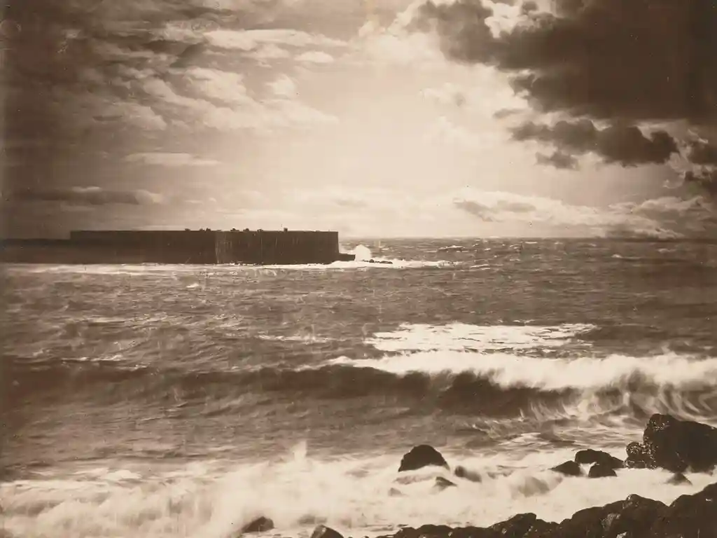
The Great Wave … sunlight breaks through the clouds above the waves at Sète, France, 1856–59
Illustration: Gustave le Gray

What Gustave Le Gray did was take 2 pictures of the landscape but making the exposure correct to the area being photographed, so that he was left with both the sky and the sea to be as detailed and equal to each other. their values regarding brightness and darkness are balanced, this would be impossible to do then with a camera as the exposure when focused on a certain area would make the other overexposed or underexposed. This is why the start of a constructed landscape was revolutionary as then a photographer was able to create an image as close to the one they could see in real life.

This method was later used by many photographers, one of many was Yves Klein who created “leap into the void”, although it wasn’t exactly landscape based it was a very popular image in France. It was the early stage of photo montaging is well.
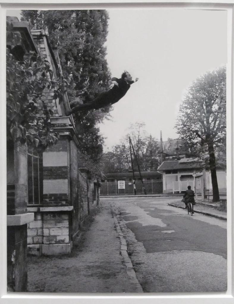
Yves Klein – Leap Into the Void, 1960, gelatin silver print, installation view

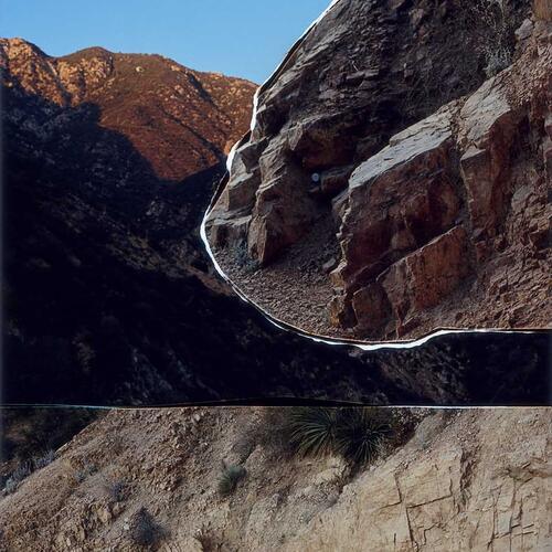
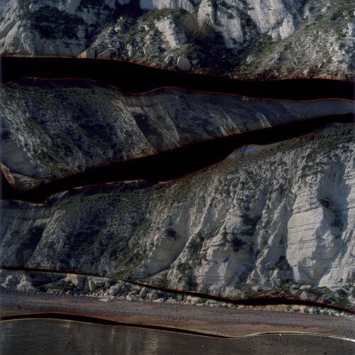
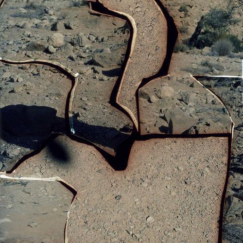
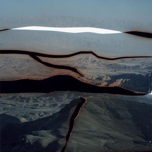
Another Photographer creating constructed landcaped, but in modern period is Dafna Talmor.
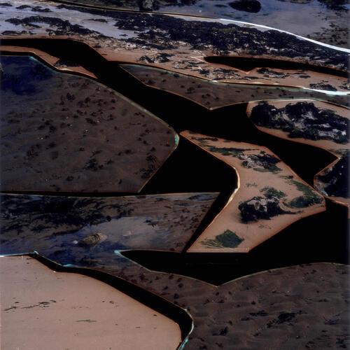
Dafna Talmor’s work is very interesting to me because of the abstract effect it has, she mixed two opposing categories together; realism and abstract, through photography. I find her work fascinating and definitely would like to experiment with her style of  collaging and montaging colour negatives. I will consider to base my final outcomes on her work and study her style and photographs in more depth.

Her work consists of staged landscapes made of collaged and montaged colour negatives shot across different locations, then merged and transformed through the act of slicing and splicing. The resulting photographs are a conflation, ‘real’ yet virtual and imaginary.
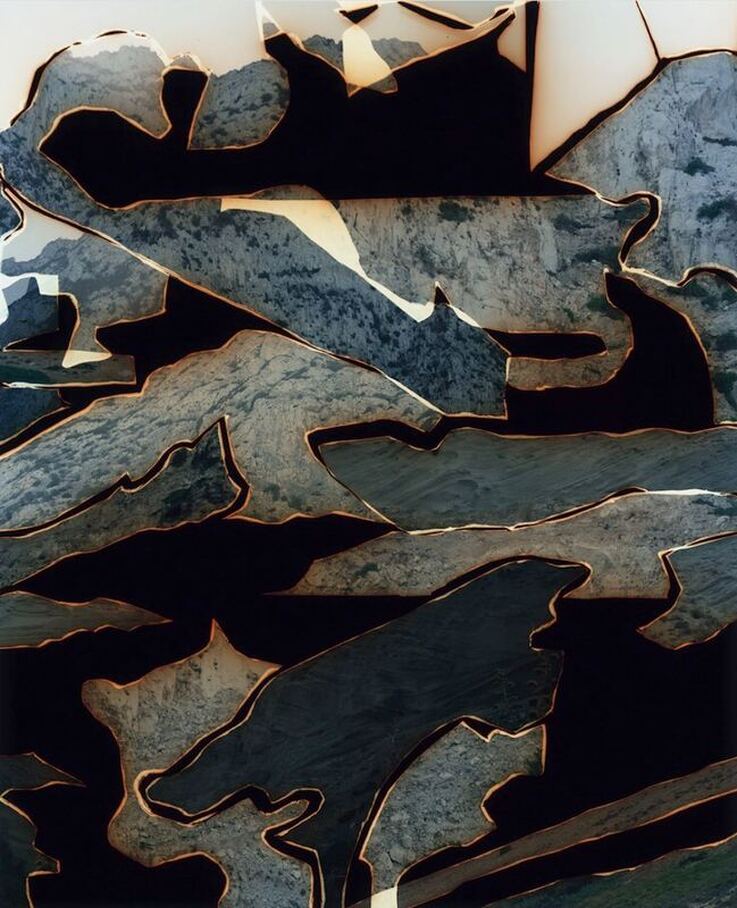
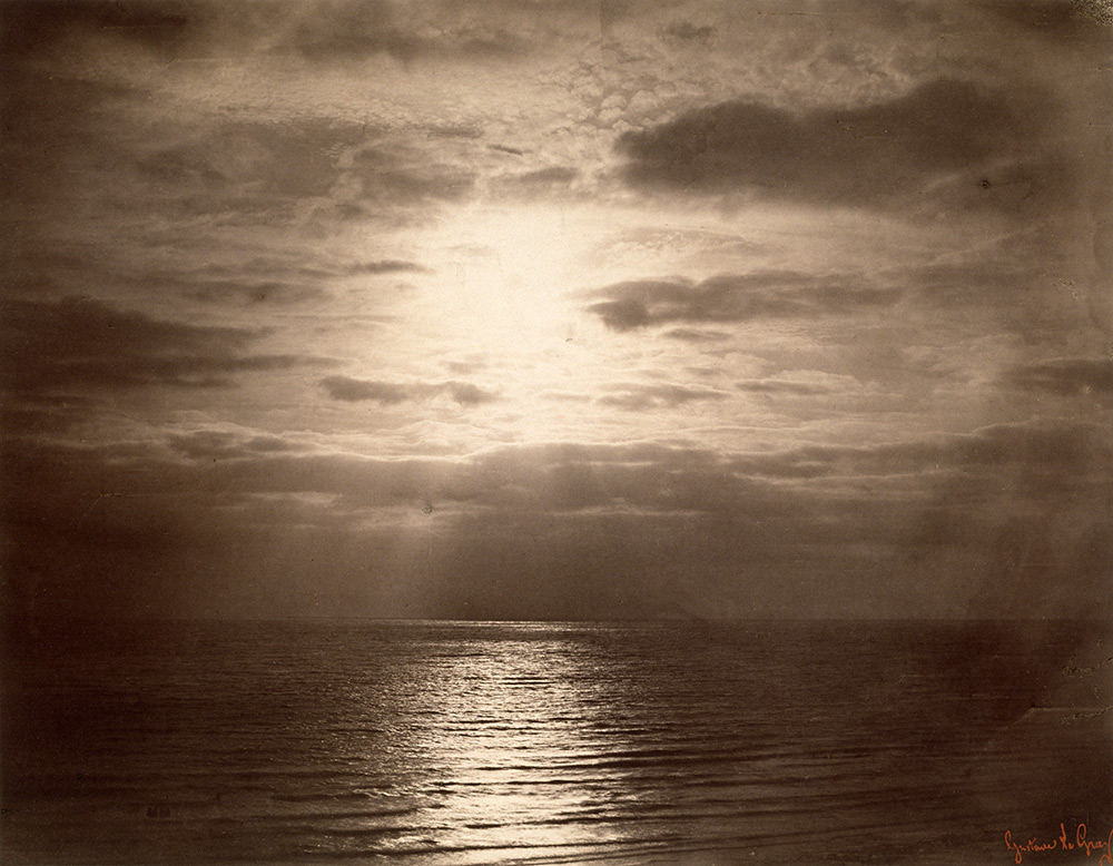
  1. Both could be described as landscape pictures. What kinds of landscapes do they describe? To me both images are landscapes and classify as them. This is because they both include elements of landscapes. they may not be a straight photograph, meaning the photograph is not the same as the one the came took, but has been altered. This however doesn’t impact the category the photograph lands in to be different as the camera was pointed at a landscape and those images are a result of that. because they are altered, especially with Dafna Talmors work they would fall into more abstract landscapes as she uses different mediums to achieve her work.
  2. What similarities do you notice about these two pictures? Both images contain areas of landscapes, where one is a pure landscape where the only thing noticeable is what the camera already captured, “The Great wave”. the pictures both represent seascape in their own way and both are constructed, meaning it isn’t a straight print but a mix of 2 or more, regarding both of the photographs. They also both created their constructed landscapes by manipulated coloured negatives.
  3. What differences do you notice? The main difference is that Dafna’s work is more abstract and gives the intention of it being made up by her but Gustave’s is more realistic and not many would notice it’s an constructed landscape as the image makes sense on it’s own and doesn’t look changed.
  4. What words/phrases best describe each of these landscapes? To describe Defna’s landscapes I wold use the world mythical, as her images look more like how she sees the world, like they live in her head rather than in the real world, the almost feel like a tale or a nightmare, and her photographs encourage the viewer to feel them and intrigue them to look, luring them into the details of each of her photographs. To describe Gustave le Gray’s work is curious, I think this because of the fact his curiosity led him to discovering a new technique, which was quite revolutionary. due to this his landscapes are imposing and a little alarming. this is because of the dramatized tones and contrast between darks and whites.
  5. In which of these landscapes would you prefer to live? I would prefer to live in Dafna’s landscapes simply because they look more fascinating, whereas Gustave’s work is more frightening to me because of the colour enhancement. Dafna’s choice of colour is more calming to me and if I were to live in her landscapes I would feel more adventurous and eager to explore.

Alice Wielinga

Alice Wielinga is a photographer that takes photos in north Korea and edits in painting that is propaganda for north Korea so for example the picture under this shoes a farm with some cows and in the bottom left is the edited in with a strong cow carrying a lot of hay and woman with a rifle the next to this is the real photo where it looks like a small almost kind of weak cow next to man and there no crops and the landscape almost looks like a desert.

Alice wielinga was born in 1981 and lived in Netherlands she finished school as a documentary photographer her most notable work is with north Korea. where she takes photos of north Korean landscape and then adds north Korean propaganda on top of it, its sort of satire its showing what the country promises and then the reality next to it.

Toy Car Photoshoot

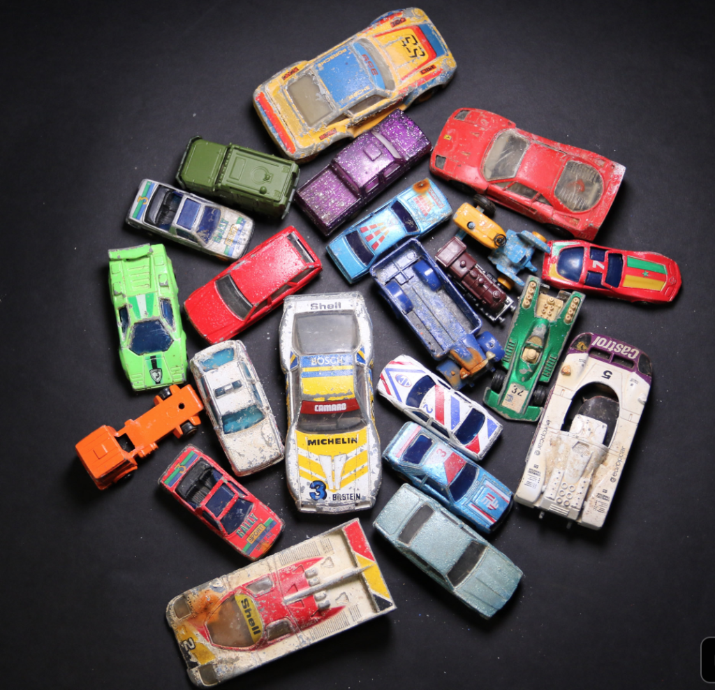
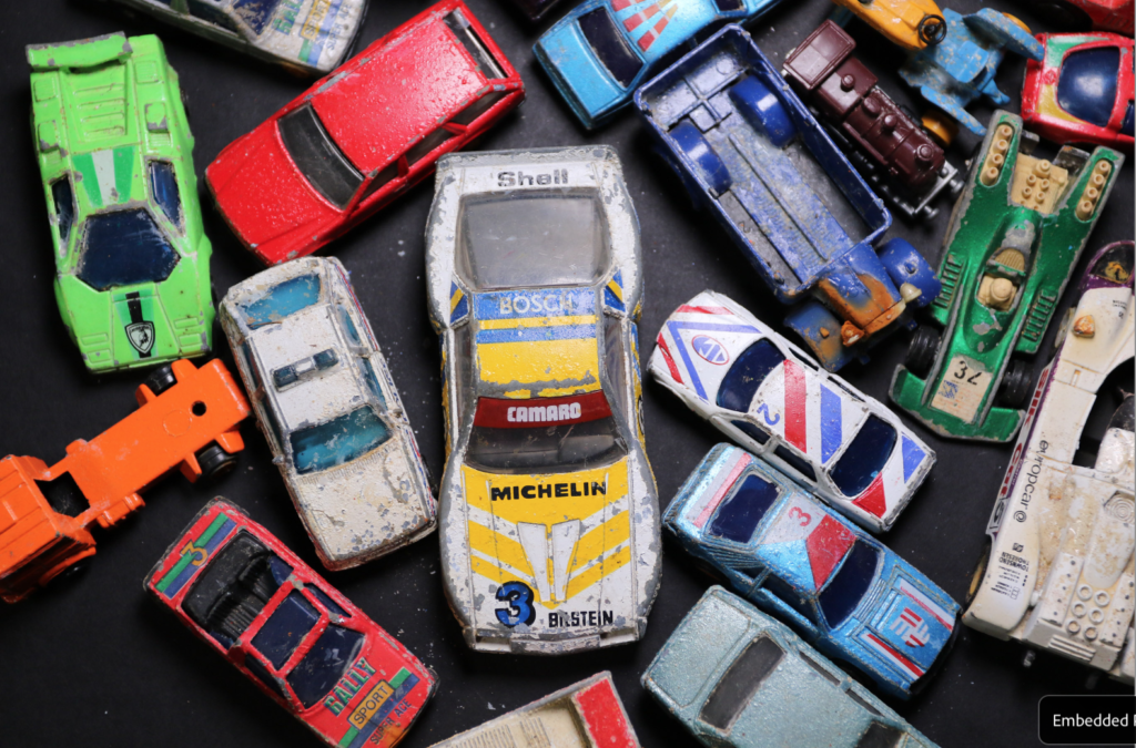
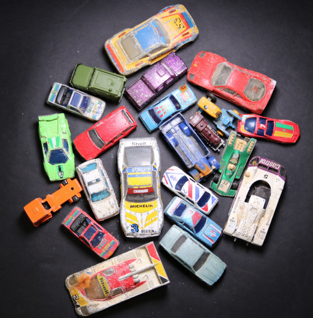
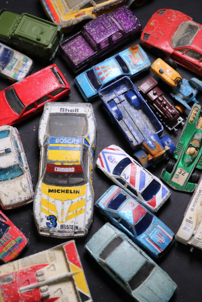
For this photoshoot it was inspired by Mandy Barker and her work with plastic objects which she finds washed up on the beaches, i used toy cars for this shoot and placed them randomly on the backdrop i used a black backdrop as i thought it would bring out the vibrancy of the cars more i am pleased that i did as i really like the outcomes of these photos.

Best Images

Photoshoot Plan

Plan 1

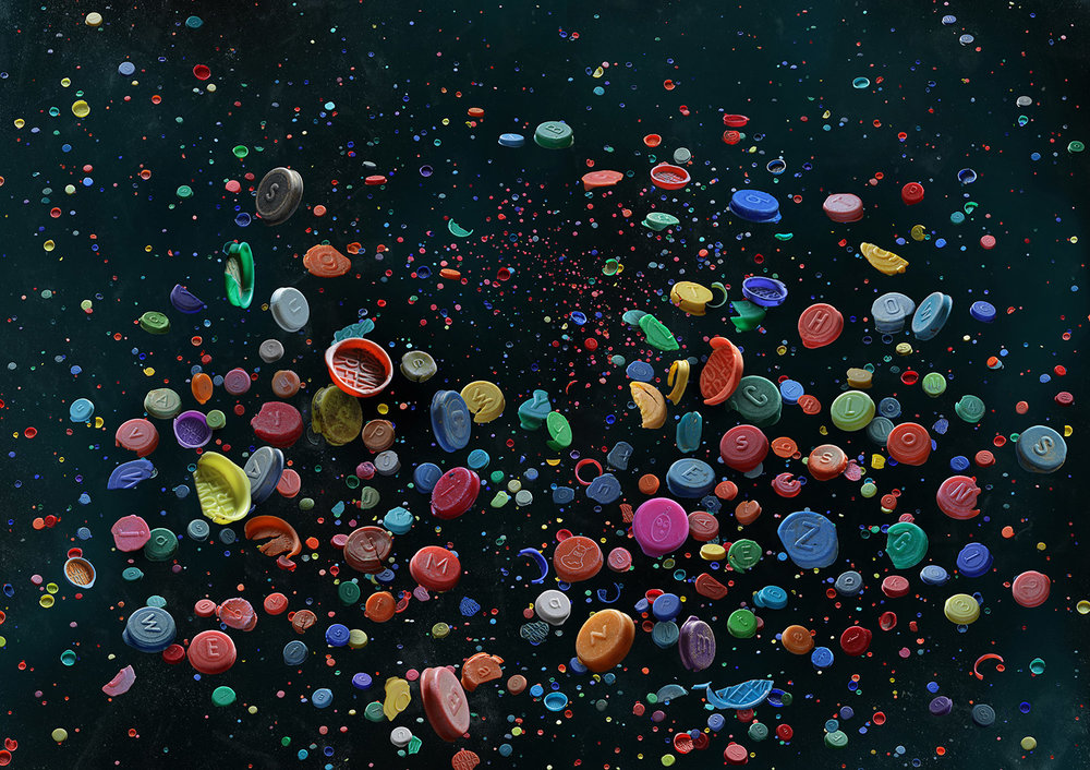
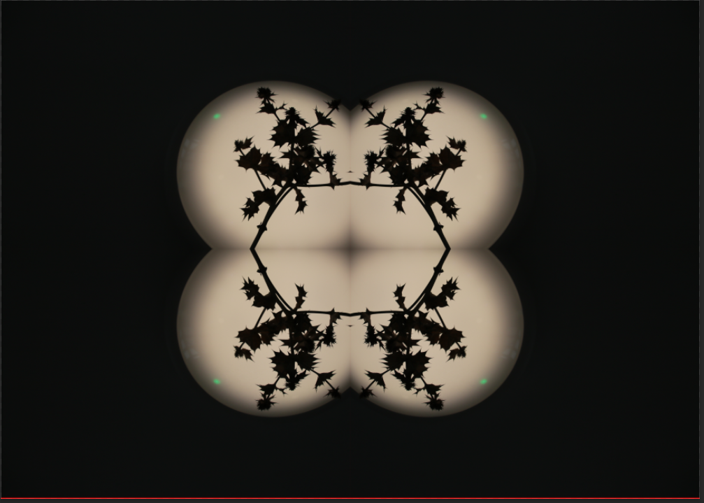
For the photoshoot I would collect bottle caps and place them on a black background and take a picture then I would change the position of the caps and take more picture then layer them onto each other to give the illusion of there being more. This is inspired by Mandy Barker.
Plan 2

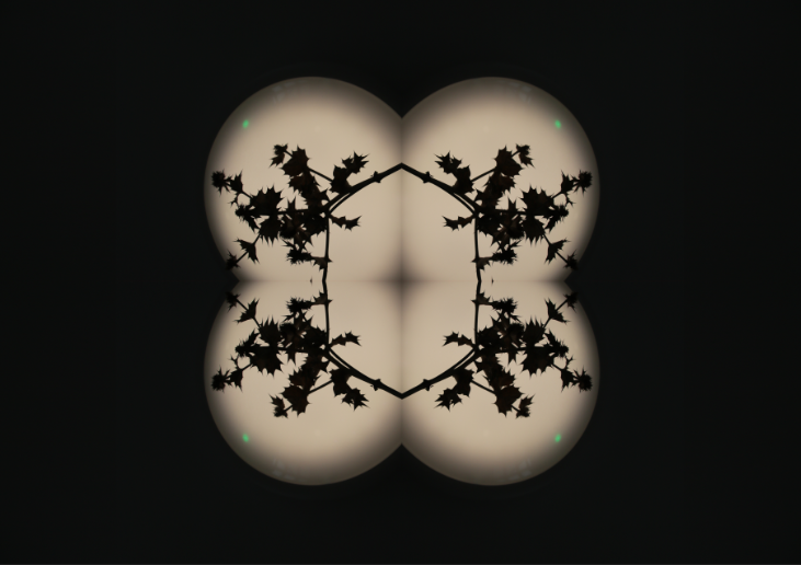
For this photo shoot i plan to get some clear plastic bags and shine some lights on the outside and take pictures of the inside. This is inspired by Vilde Rolfsen
Plan 3

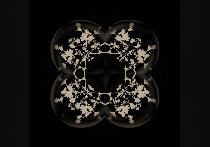
For this photoshoot I plan to go to La Collete and take photos of the factories and incinerator or i would got to construction sites and take photos of the construction work. This is inspired by Edward Burtynsky.
Anthropocene mock photoshoots plan

Where: Multiple locations in Jersey

(on different occasions as there are quite a few locations including Val de la Mare reservoir, Les Mielles nature reserve and L’etacq fields.)

When: Afternoon/evening

(If possible, I want to go out when the weather is stormy, which is quite likely this week, to respond to my plan)

What: For the more human landscapes, focusing on the industrial aspects; for the more natural landscapes, focusing on the beauty of fairly untouched wildlife

How: Using Aperture priority setting and possibly the flash if needed

(to ensure the entire photo/focal points are in focus)

Why: In order to get images responding to the brief of Anthropocene

My Photoshoot

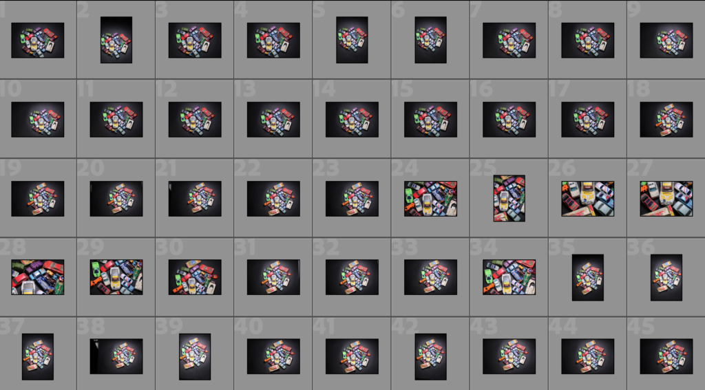
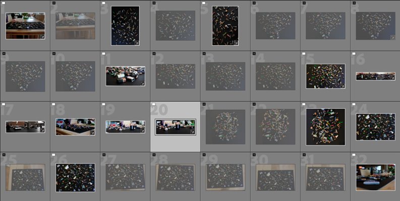
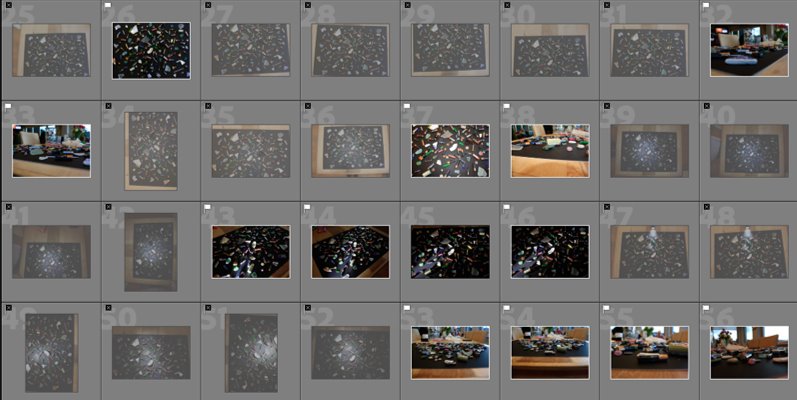
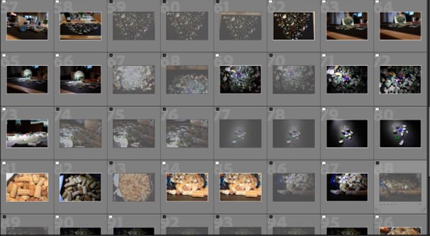
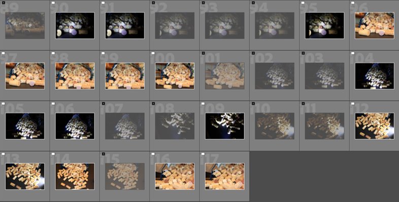
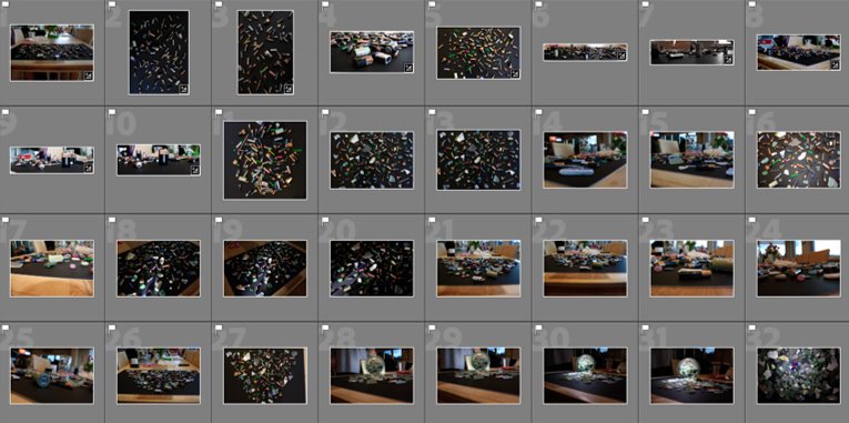
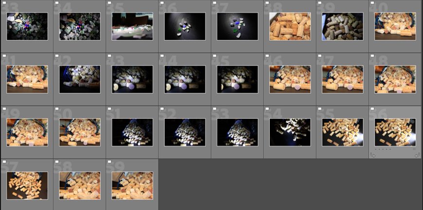
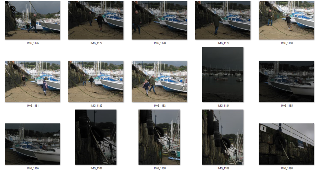
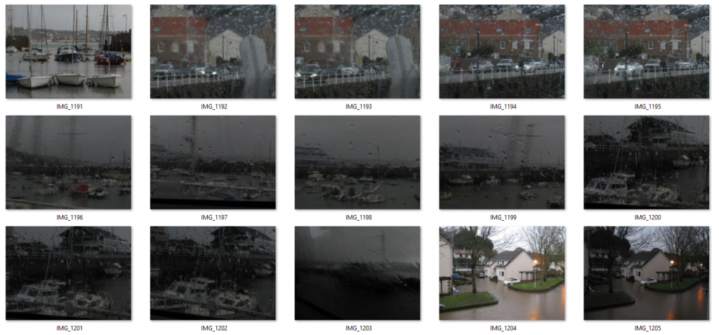
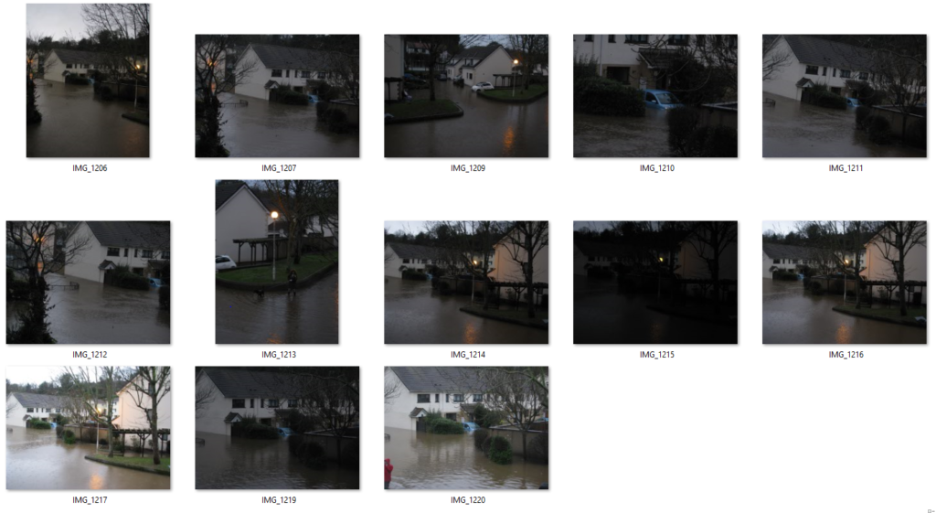
Once my photoshoot was completed, I transferred all the images onto Lightroom.

I finished with 117 images, including the bad images, I then sorted through all of then, flagging all the ones I like. This narrowed it down to 59 images.

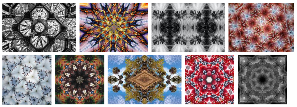
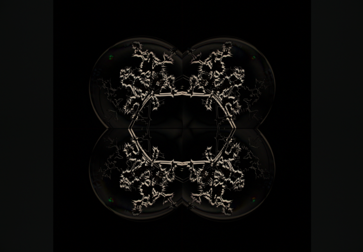
Kaleidoscope

Kaleidoscope Experimentation

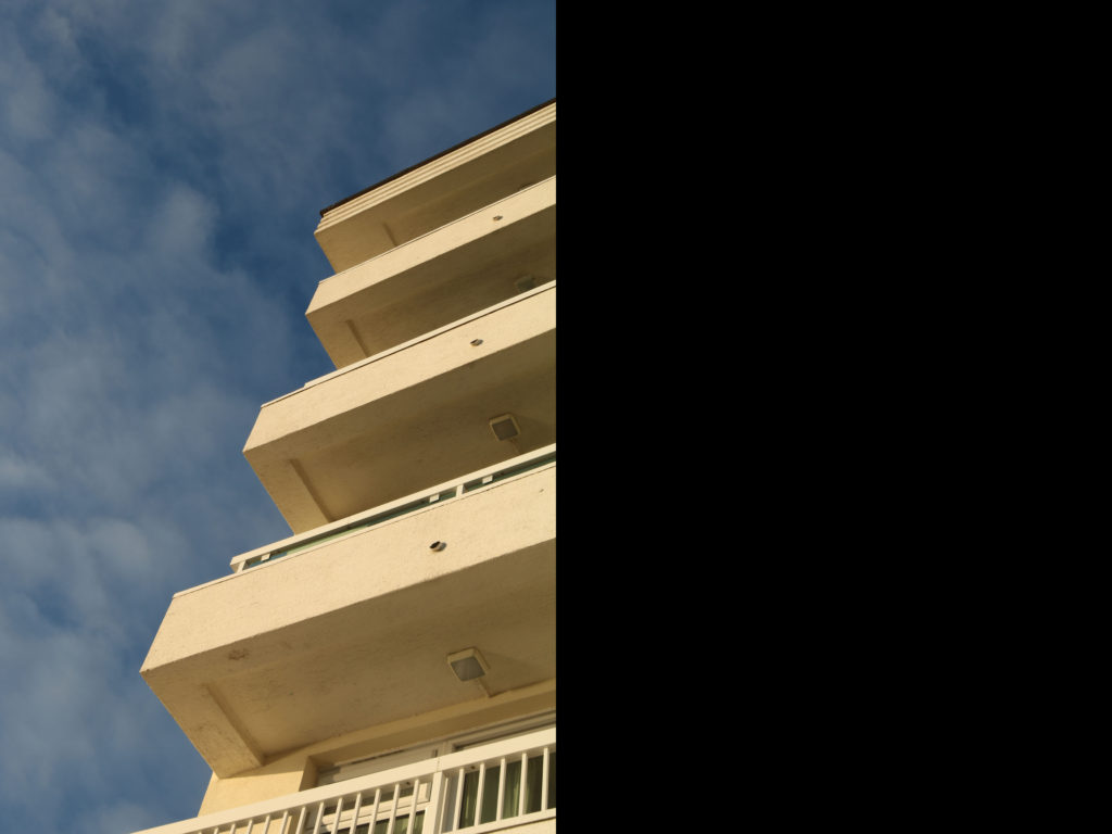
Base Image

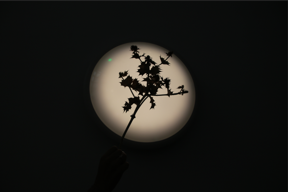
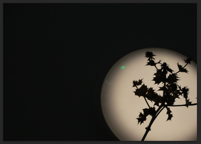
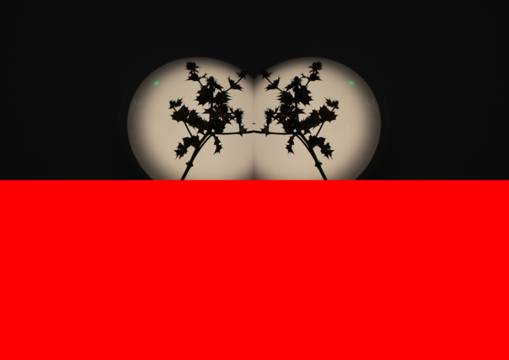
I cropped the image so when I duplicate it it will connect up

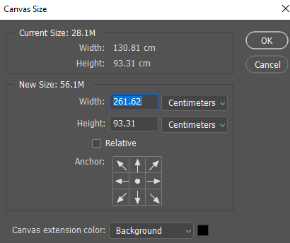
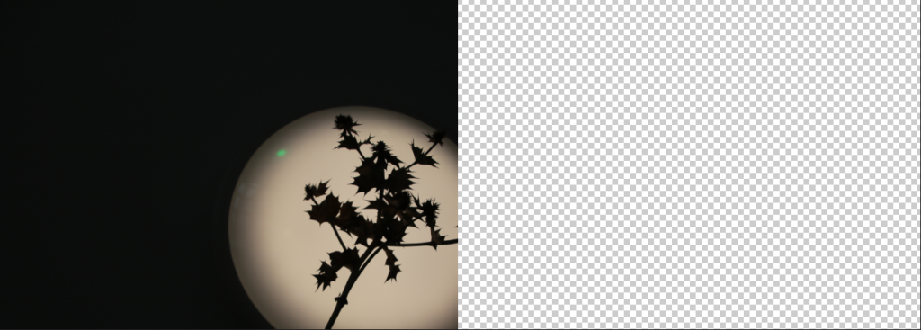
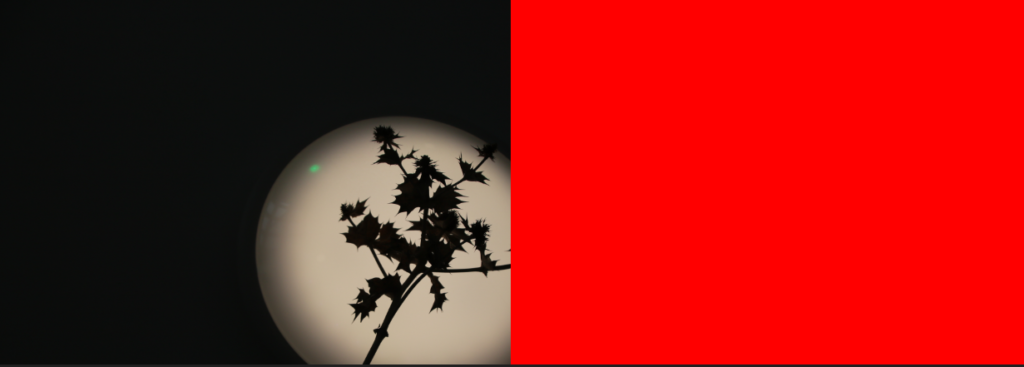
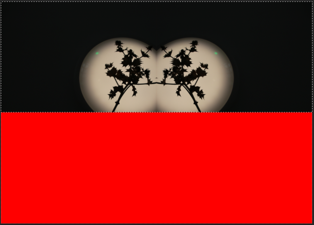
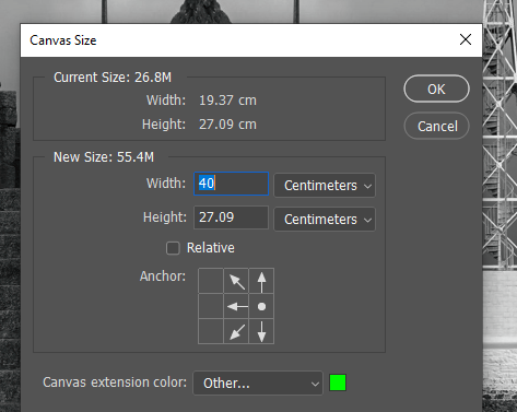
I then changed the canvas sizes’ width to be double

I filled in the blank space with red so I can see later if there is any gaps between the images

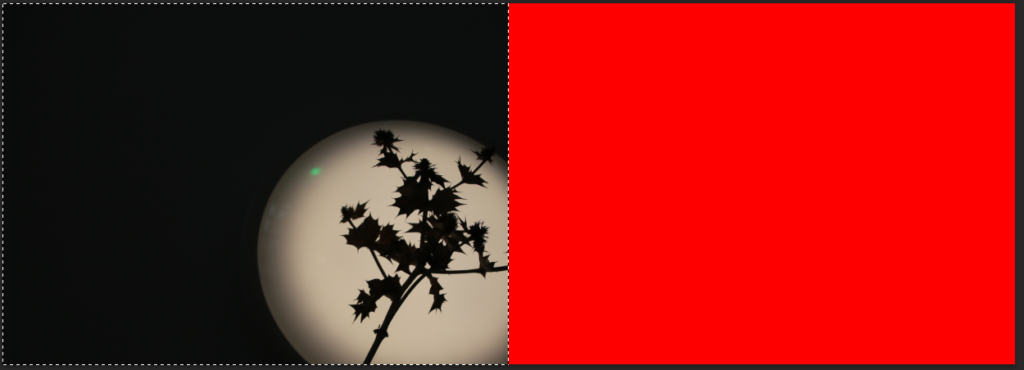
I selected the red area with the magic wand selection tool and did an inverse select so it would select the image instead

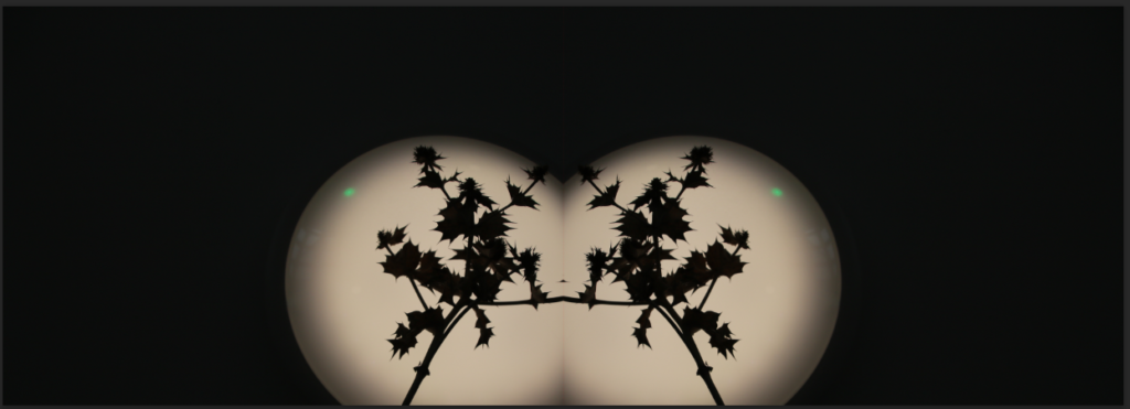
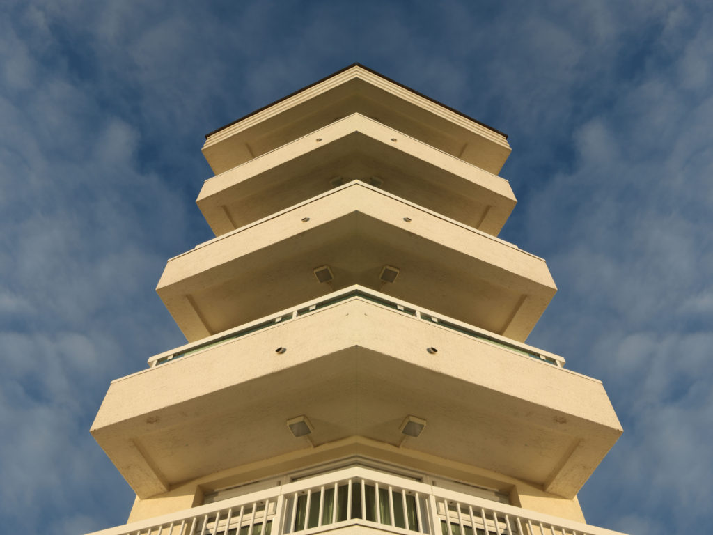
Then I duplicated the layer, moved it over the red space and flipped it horizontally and then flattened the image

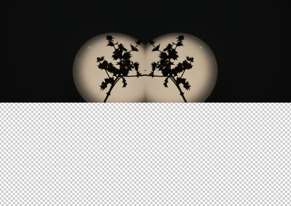
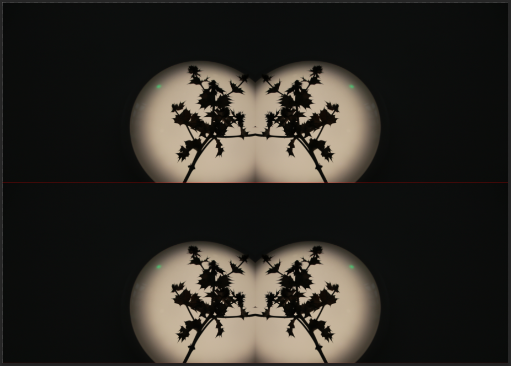
Then I doubled the height of the canvas

There is a gap in the middle of the image because you can see a red line so we have to make the image overlap

Then i cropped the image so there is no more red showing

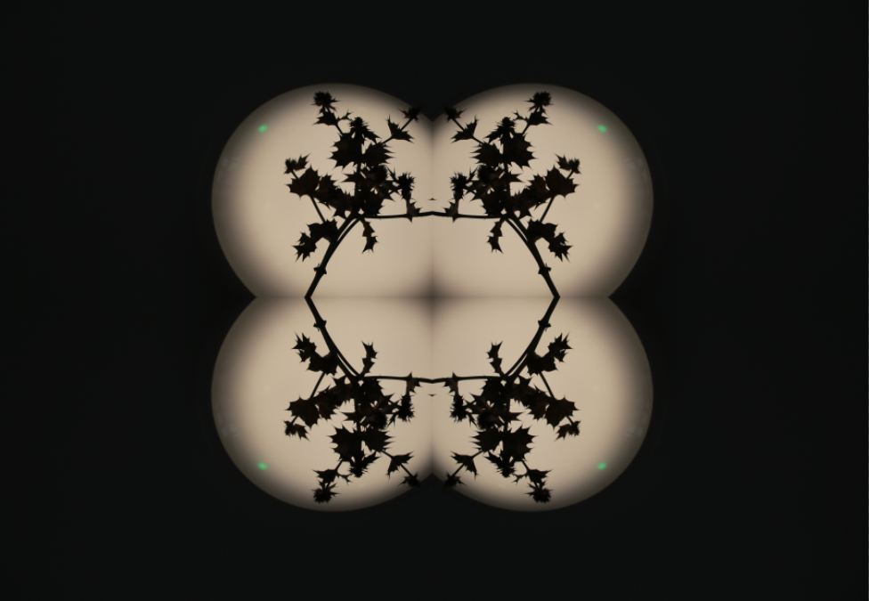
I duplicated the image and flipped it 90 degrees

Then I flicked through the blending mode until i found one that looks good

I repeated this process

Editing – Kaleidoscope

Step 1

First, you pick an image and put it into photoshop.

Step 2

Then, you follow these steps:

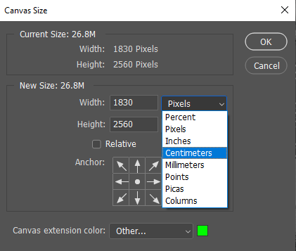
Image – Canvas size – Change size to cm – Double width

Step 3

  1. Use the magic wand tool (4 down) to select the blank colour.
  2. Right click and press select inverse.
  3. Right click your image and press layer via copy, this will create a new layer.
  4. Click Ctrl T (free transform)
  5. Right click and press flip horizontal
  6. Drag this to the other side

Step 4

Now repeat the process but instead of doubling the width in Step 2, double the height.

Then just fiddle around, rotate, blend your images until desired result.

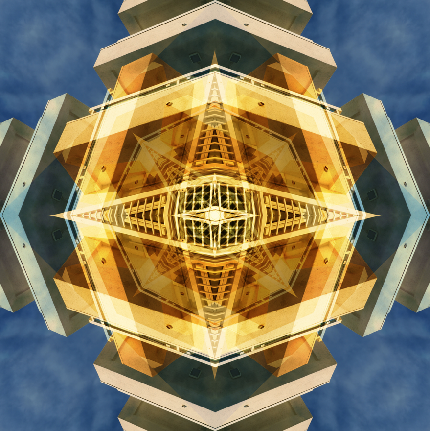
Final result

I quite like how this image turned out, however it isn’t my favourite editing method.

On the other hand, I do like the result of Step 3:

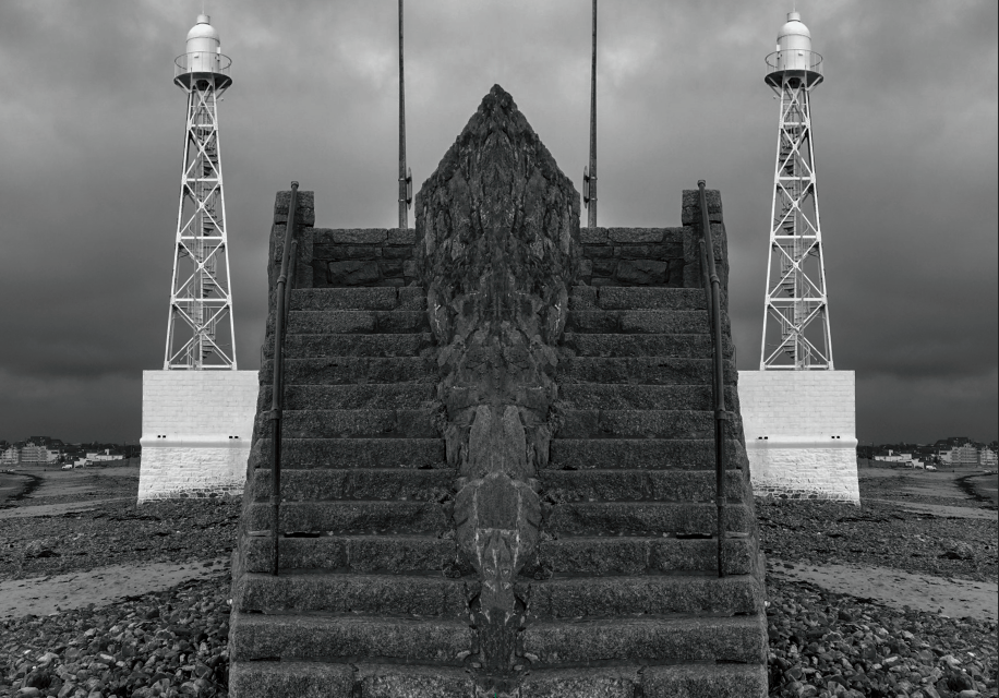
I really like how it turned out, its quite simple but still visually appealing. It looks like arrows pointing up towards the sky. The opposing colours of the building and the sky makes it stand out more, along with the sharp, straight lines.

kaleidoscope

the kaleidoscope effect is where you copy a image and then invert it and put it next to the original image and this is how you do it

first open up photoshop then select a imagine and then go to the image tab and go down to canvas size.
then click on pixels and then select centimetre
then times the original number by 2
then select the original image and copy it and invert the copy
then do the same as you did with the side one rotate the image down and your finished