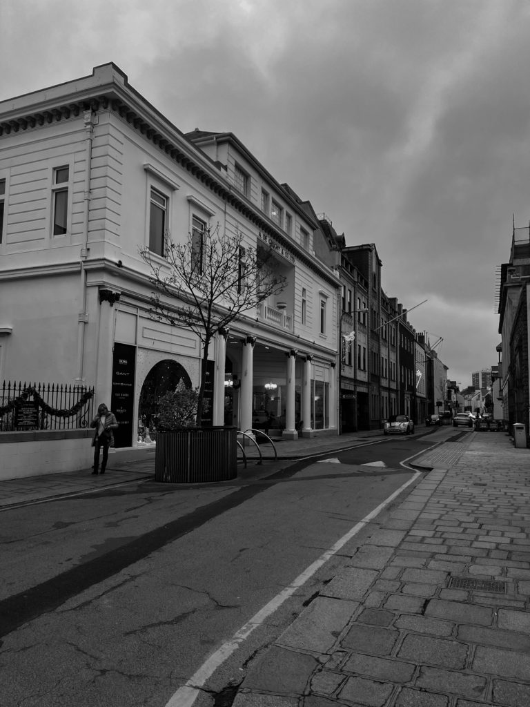
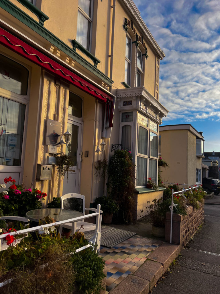
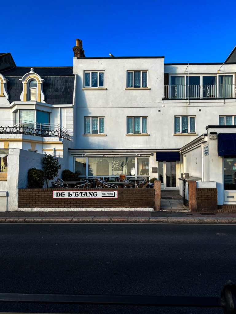
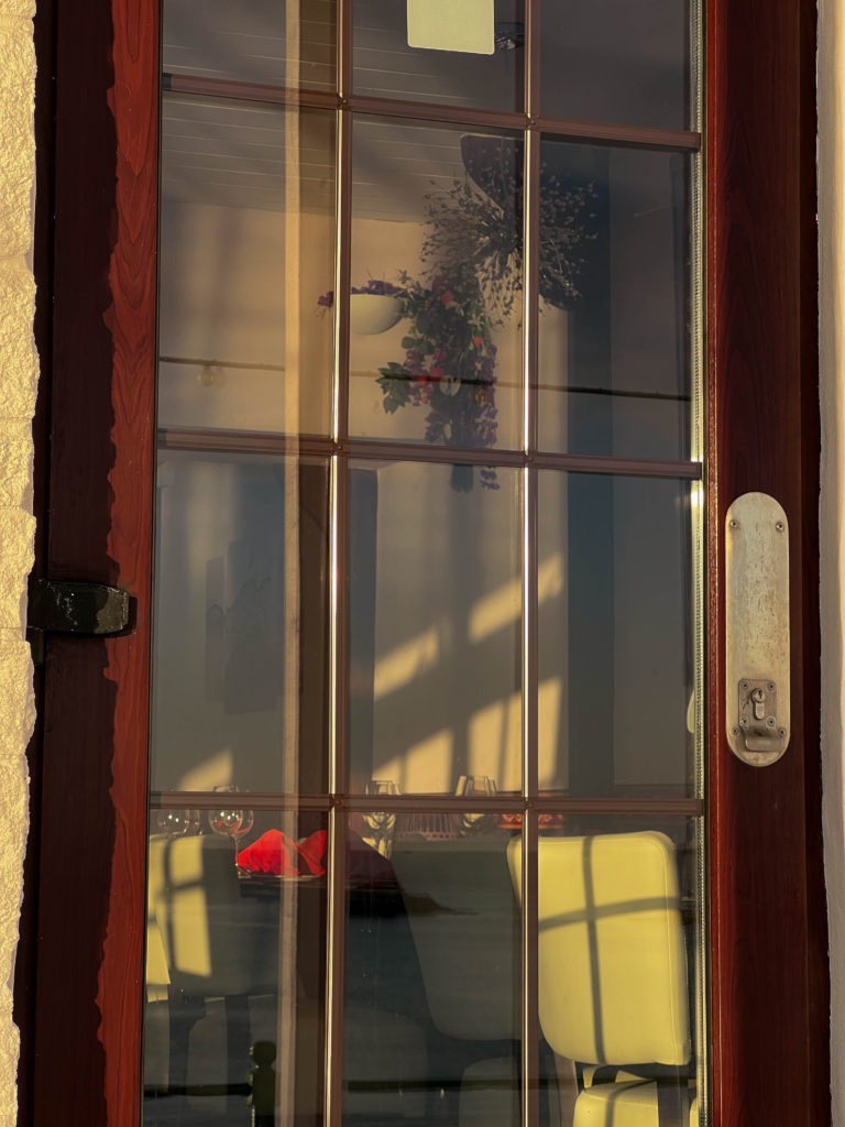
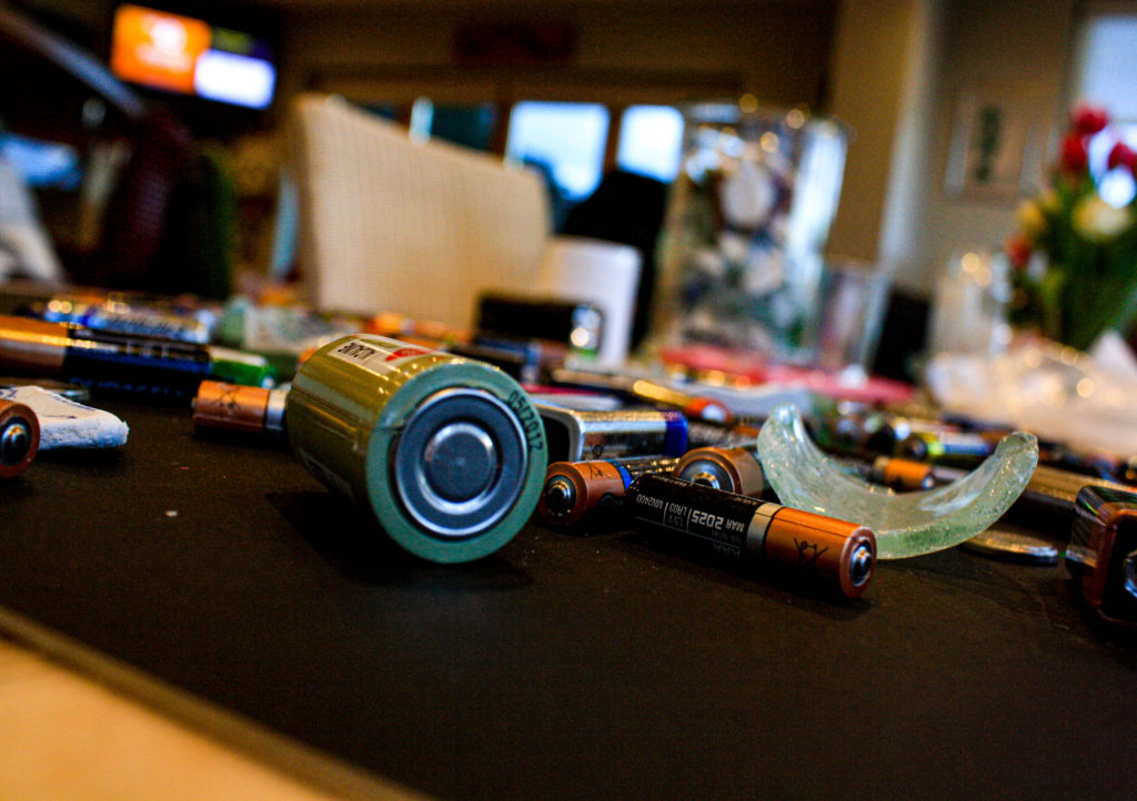
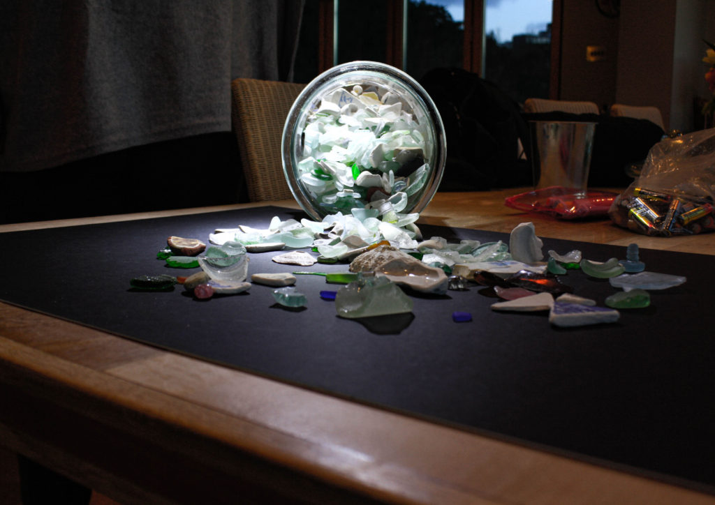
final photos and evaluation

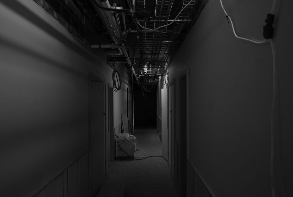
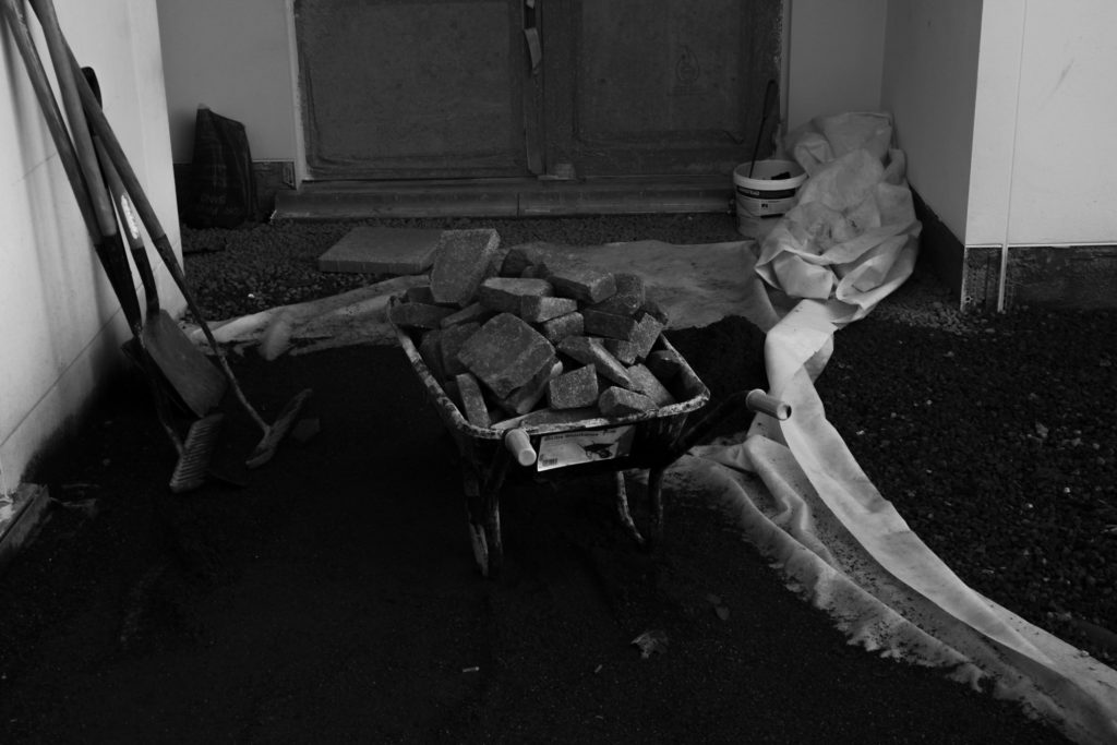
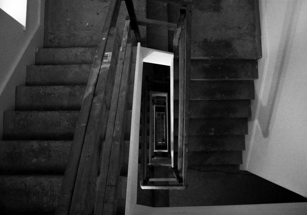
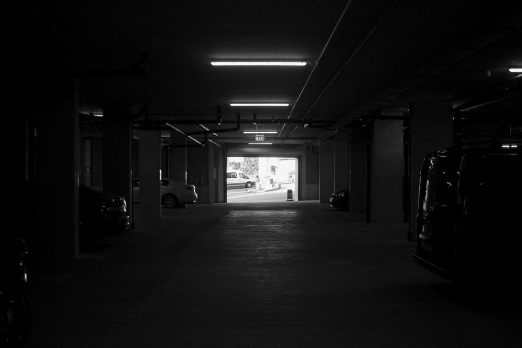
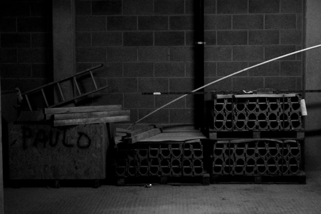
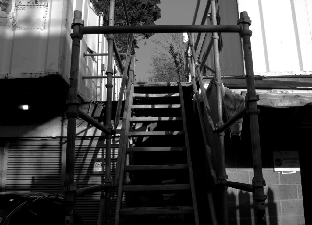
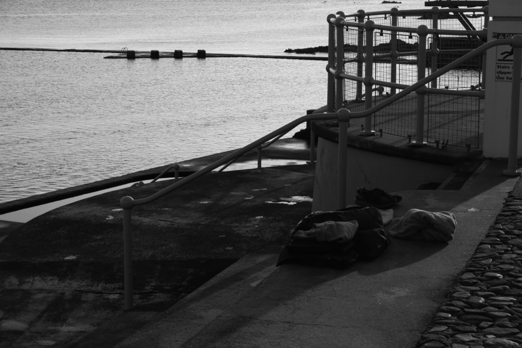
With editing these photos and taking them I had artists in mind Edward Burtynsky, I don’t have drone to take photos on so I to try and get some photos that sort of had the same effect as Edward Burtynsky photos whilst on the ground. I feel like my photos do have the same effect after editing and they make them look even better than the original. for not having a drone to take the photos I believe these are the good photos I could of gotten with the amount of time I had.
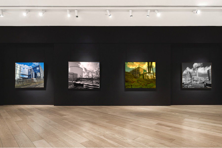
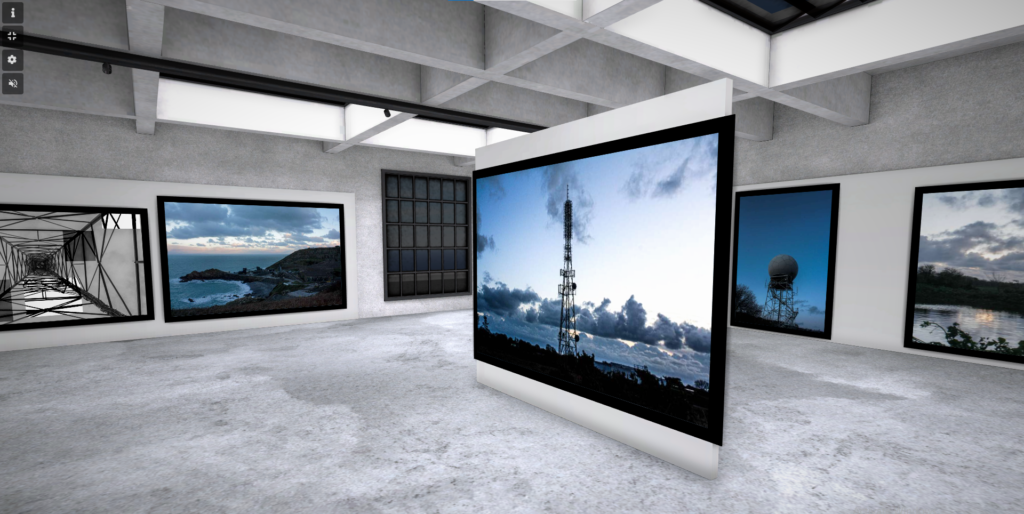
I put my final photos in a picture gallery I explained how I did it on another blog post. but there are 4 images that I have edited and wrote about and there my final pictures. I decided to use these four photo because I think these where the best photo I edited throughout the mock.
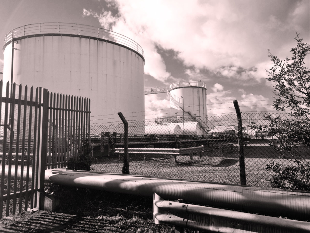
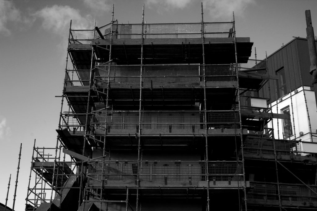
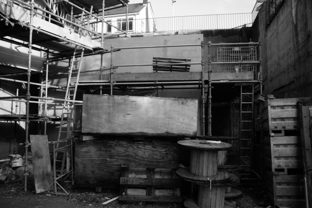
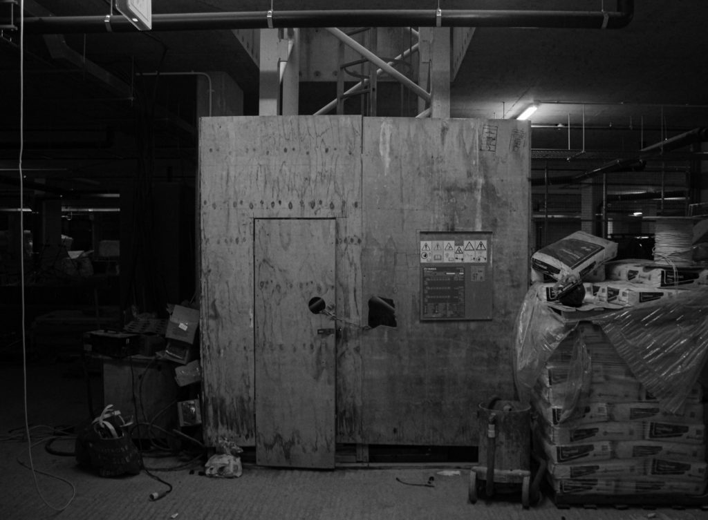
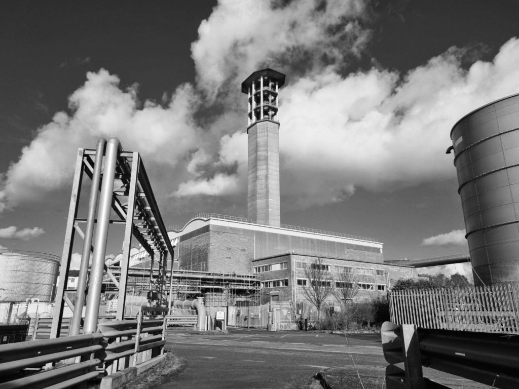
This photo was taken on a landfill site 100 years ago this would of been the sea however today its a important area for jerseys economy. Jersey is known for its stunning views and sights all across the island however where this photo was taken is normally overlooked and ignored by most of the population however in our modern society we need this industrial area for most of the modern day comforts. and that’s why I thought taking a photo of a place where most people over look and try and find beauty in it might be a good challenge. This is known as new topography taking photos of man made landscape instead of natural made landscapes. The reason I went for a black and white edit over this photo is because its doesn’t need any colour in it to make it pop the actual photo has a lot going on in it, I feel if there was colour in the photo it wouldn’t have the same effect. how I took this photo I this photo on my phone and I just used the basic settings I believe it turn out fine maybe next time I should use a proper camera.
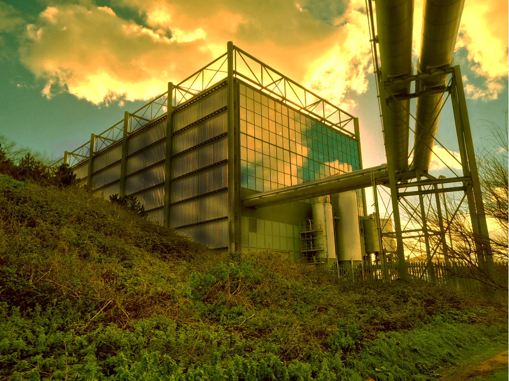
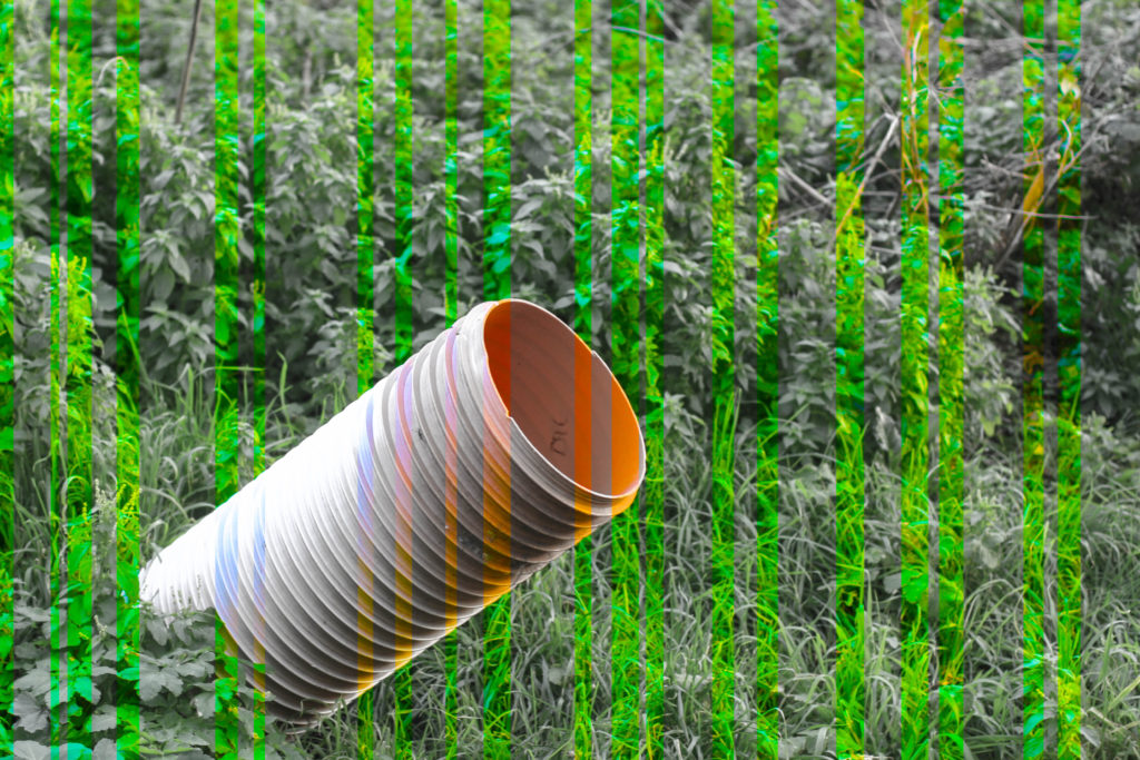
I took this photo on my phone with the basic setting it tuned out alright but next time I will definitely be using a proper camera. Context behind this photo it was taken round back of the incinerator building as I said before where this is built is on landfill so 100 years ago this would of been the sea. I feel like this image is nature and industry living next to each other. however the plants living there are very jagged, overgrown, and has not really been looked after at all. The reason I added a sort of green overlay on this image is to make the air look sort of toxic and kind of post apocalyptic and I went over some of the metal pipes and wall with the burn tool to make it look a bit rusted and warn down. I think it turned out great with the red clouds and the glass reflecting the clouds has really cool effect.
Editing this photo was kind of easy because I already liked the original image with the reflection of the smoke stack so all I really did is add lenses flare to it because I was experimenting around with it and thought it suited this image and going over some of the metal objects with the burn tool to add a worn down effect. this is the same site as before so its a landfill site. What I like about this photo is that there only industrial area, and little bit of grass in the background.
With this photo I tried to make it little bit different because I already have done a black and white photo so with this one its not that noticeable but there’s a slight reddish tint to the photo. I did this because it makes some the details pop a lot more if the reddish tint wasn’t there. I feel like the red adds a hint that this area is not a safe or nice place and that’s the effect I wanted.

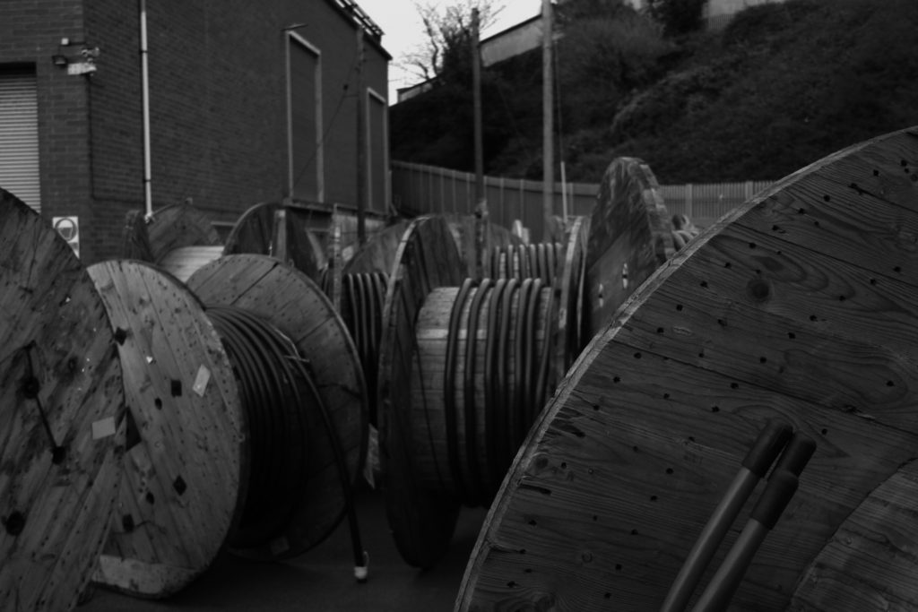
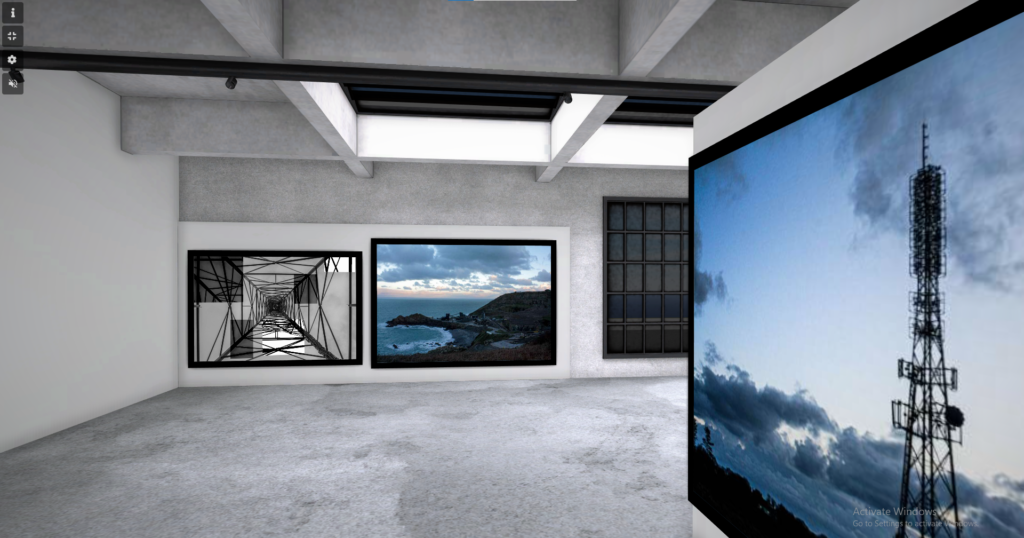
These photos are the same not in a literal sense but in a way where they both have the same tunnel effect. Where there are close up thing on each side of the images and then there leading up to something in the middle of the photo. They are also similar because they are both the out come of heavy industry, my one shows what happens to waste in the western world and Edward Burtynsky one shows what happens to waste in poorer country’s it just left there because in poorer country’s they have other things to worry about other than waste like there safety of there people or crime in there country.

MY VIRTUAL GALLERY

Virtual Gallery – Alice Jakubowska Landscape 2023

CREATING MY VIRTUAL GALLERY

Creating Gallery in Photoshop

When creating my virtual gallery I used Adobe photoshop. I looked on the internet for photography galleries I could use as a template, however the template also had to fit the aesthetic of my images throughout my landscape project. I used images throughout my landscape project; Topographics, New Typologies, and Anthropocene. I inserted my images from my documents that I had previously edited, using the transform tool I changed the sizing so it fits onto the canvas. On the images that are on the side of the wall I used the ‘skew’ and ‘distort’ tool to size the image onto the side.

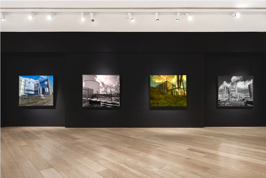
photo gallery

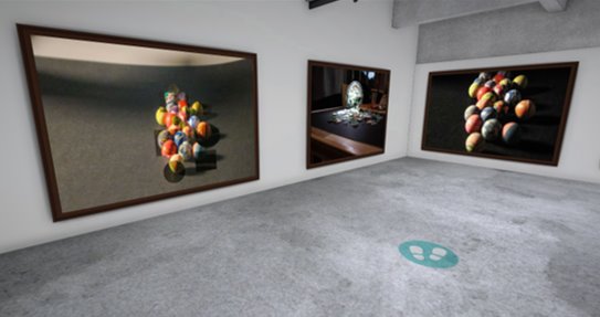
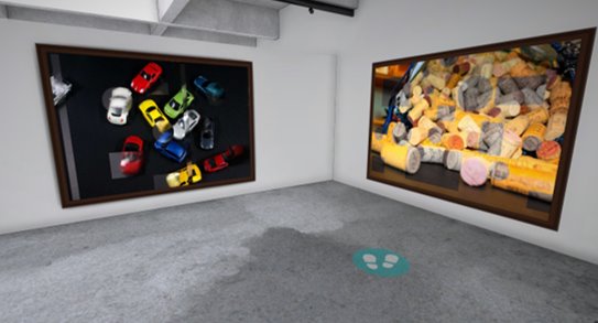
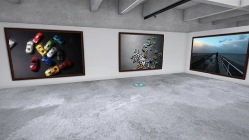
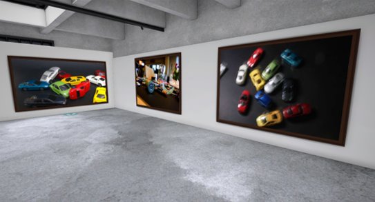
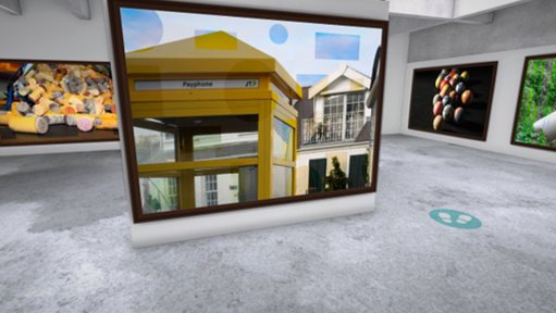
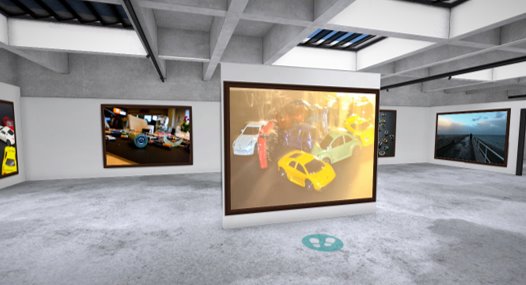
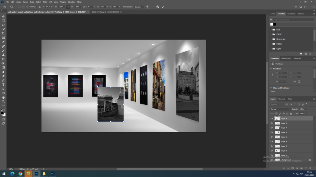
this a photo gallery with my final photo in the picture. I edited them in by shrinking the photo in the picture frame, then I warped it so it fits the actual frame. after doing this I did some finishing touches by getting the lighting right and making sure the pictures are straight

Landscape Final Images

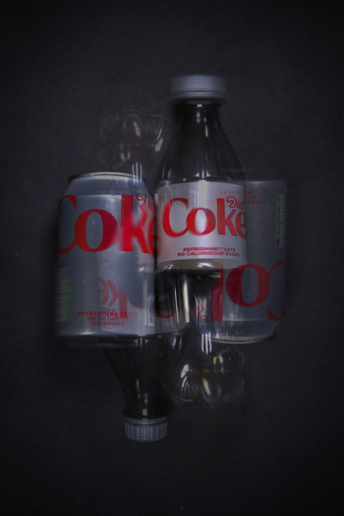
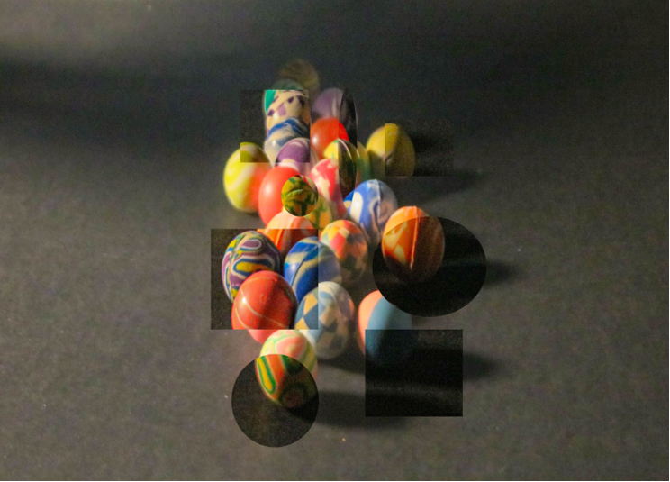
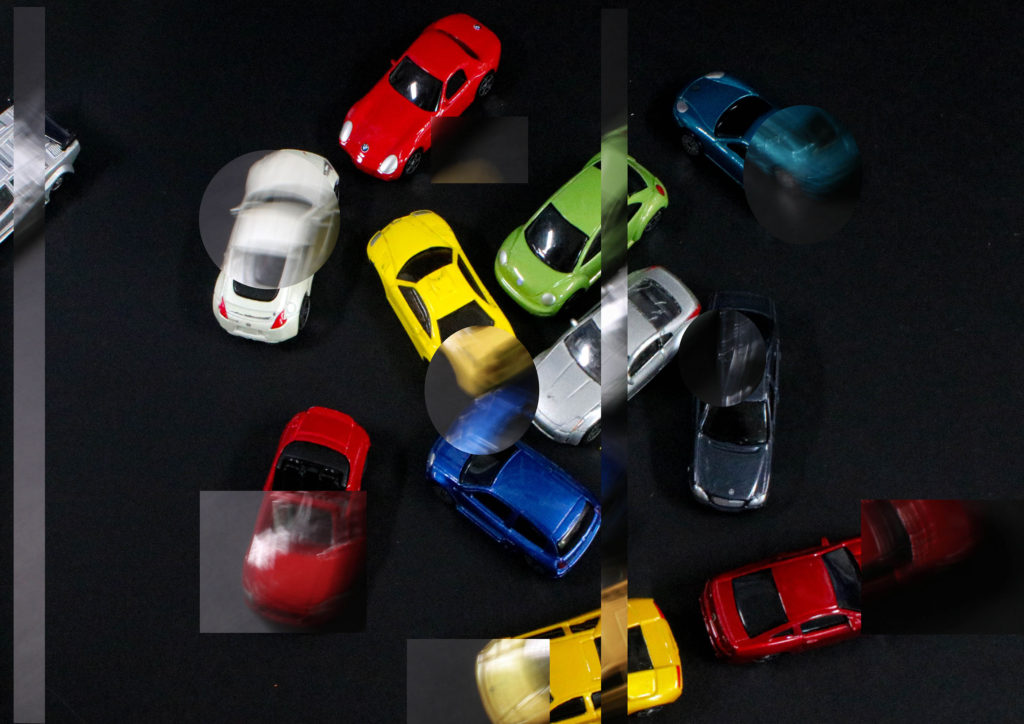
Using photoshop, I cropped out parts of a darker image and put them in the main image.
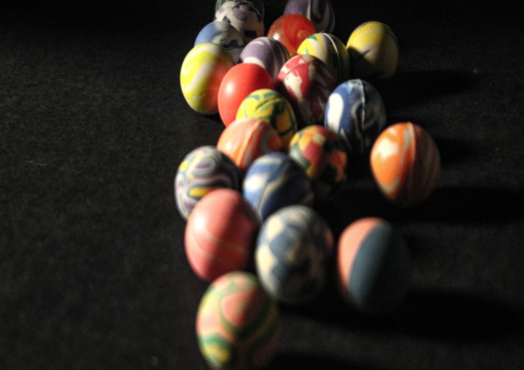
In this image, I used lighting from the front, making shadows.
This image was made unintentionally blurred however I think that it makes the image better.
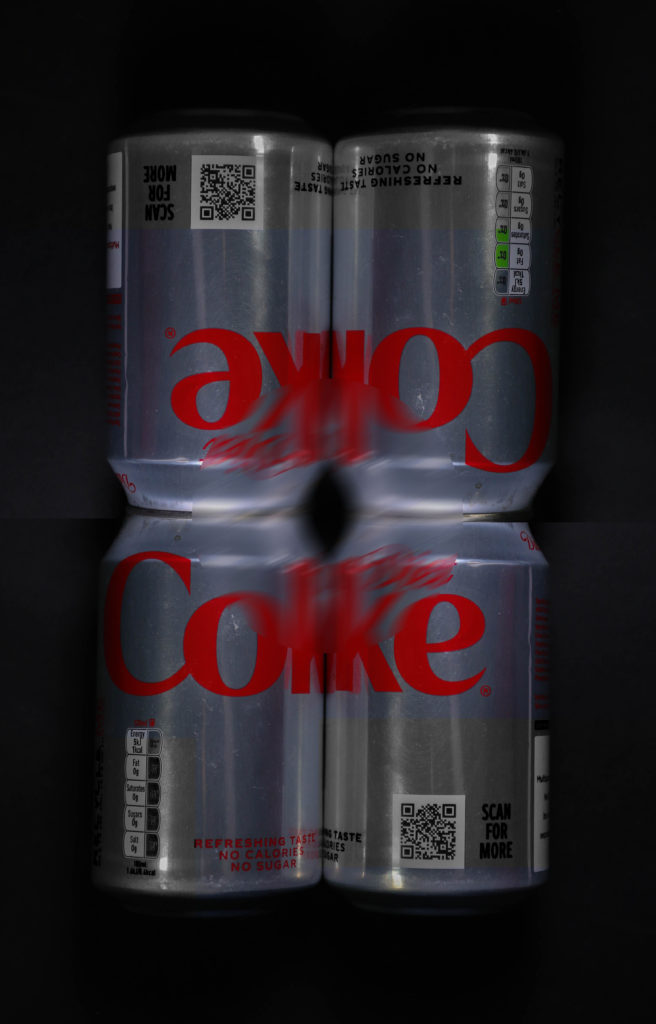
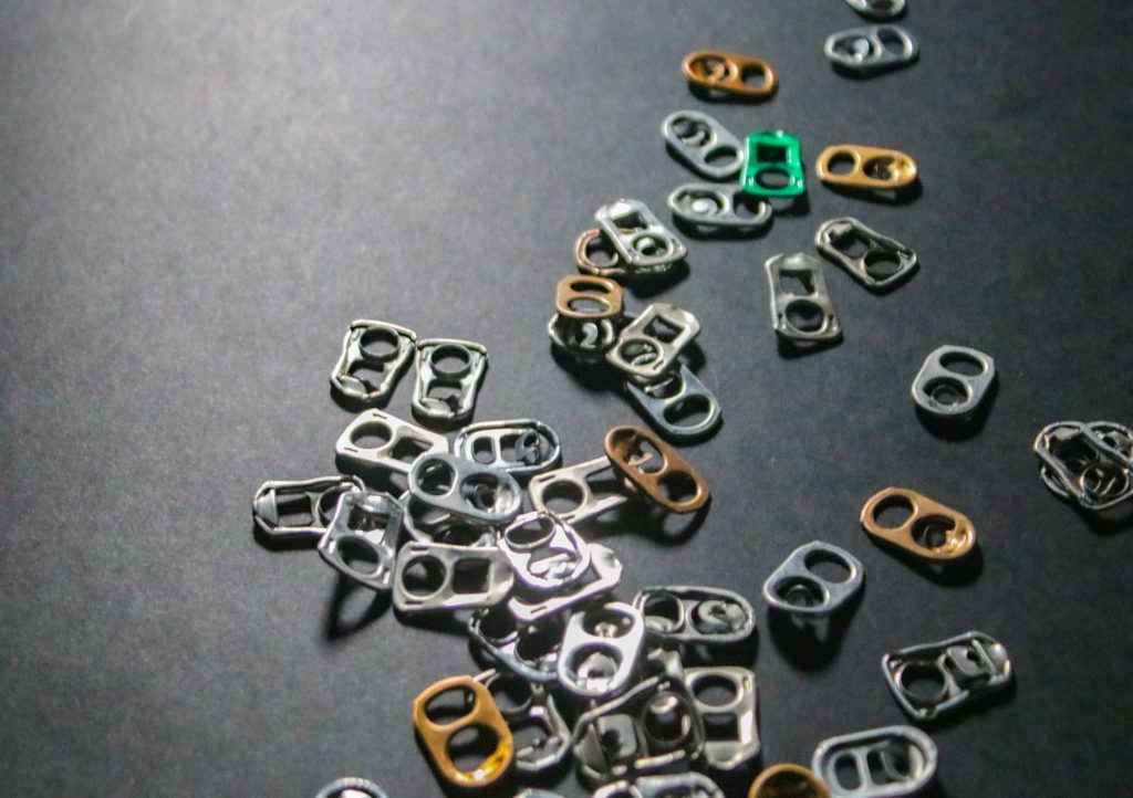
I liked this image because of the individual green can tab.
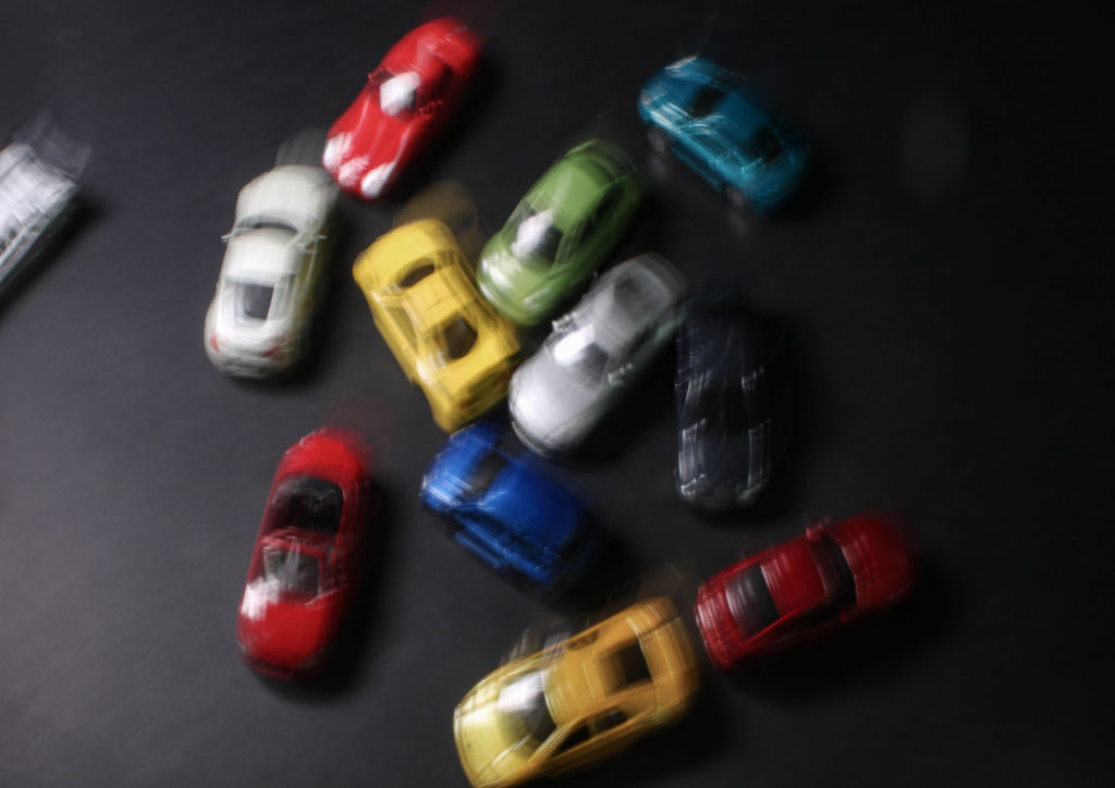
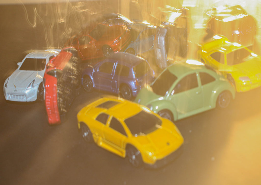
In this image, I used photoshop to edit the image of the blurry cars above onto an image of some regular cars, resulting in this image.
In this image, I really liked how the cars look as though they are radiating heat from them.
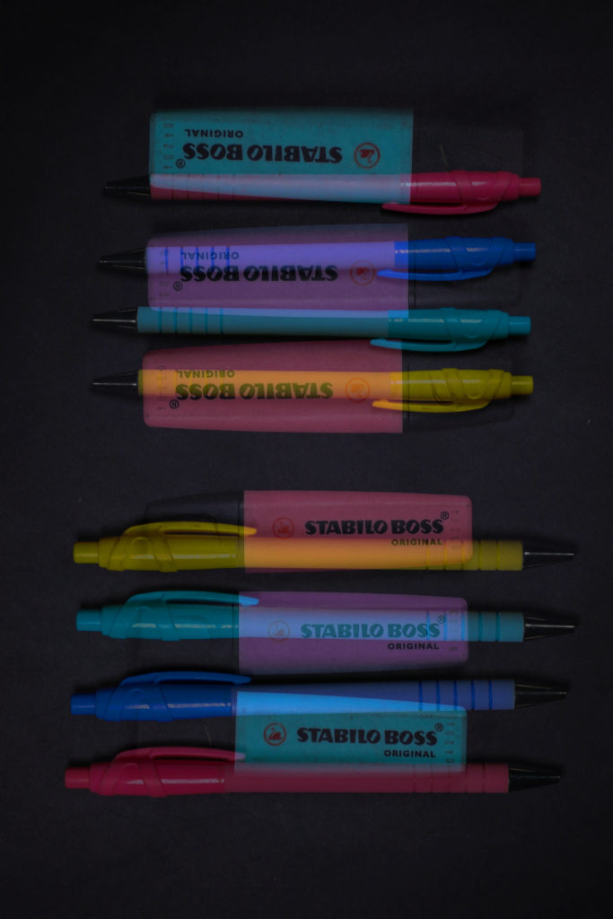
In this image, I, once again, used photoshop to cut out parts of a less vibrant image and put them into my, more vibrant, background image.
I chose this image because of how simple it is.
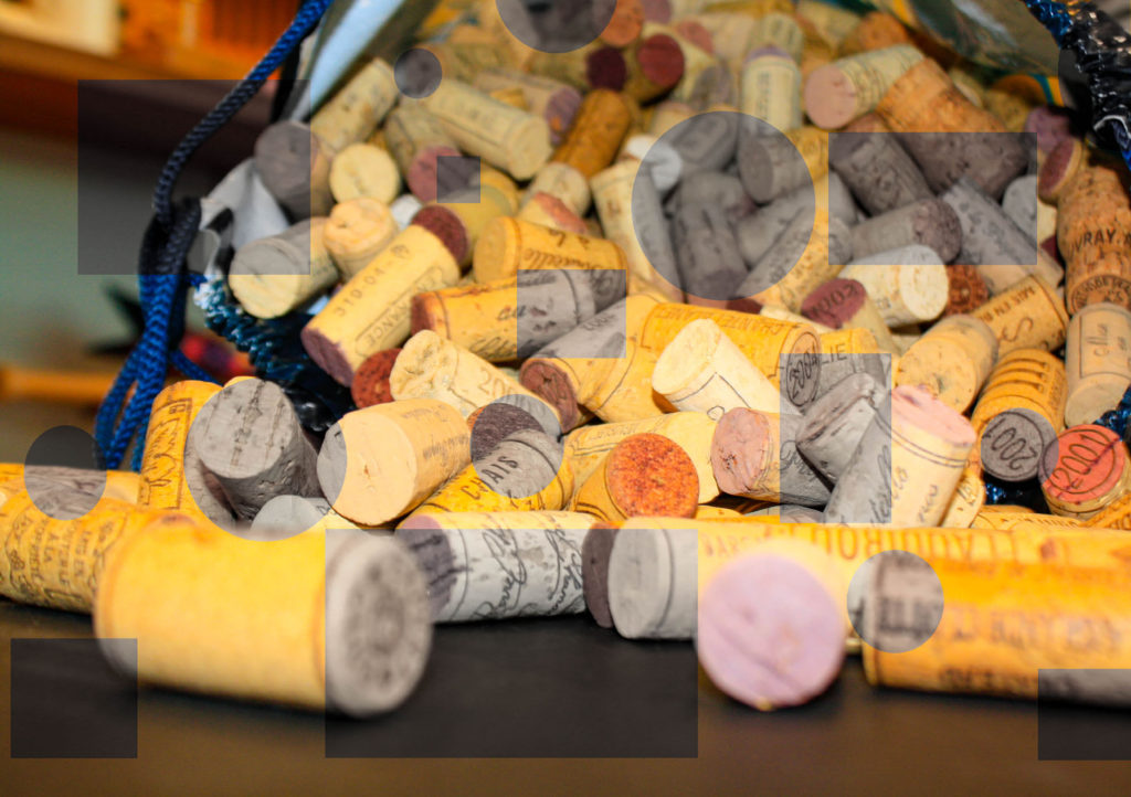
I took this image with a flashlight behind the jar and then in Lightroom, I made the image darker so the objects background aren’t as noticable.
I used photoshop to cut out parts of a more vibrant version of the original image and place them on top of the original.
I thought that this image could signify how “dull” humans have made nature by using a really vibrant image and a really dull image.
This is image is one of my favourites from the romanticism topic, I love how the clouds are moving across the sky and the colouring of the image.

COMPARISON

Alessandro Zanoni
My image

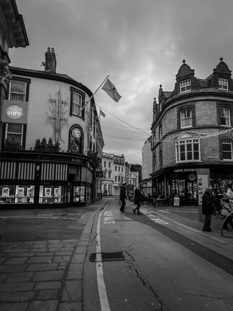
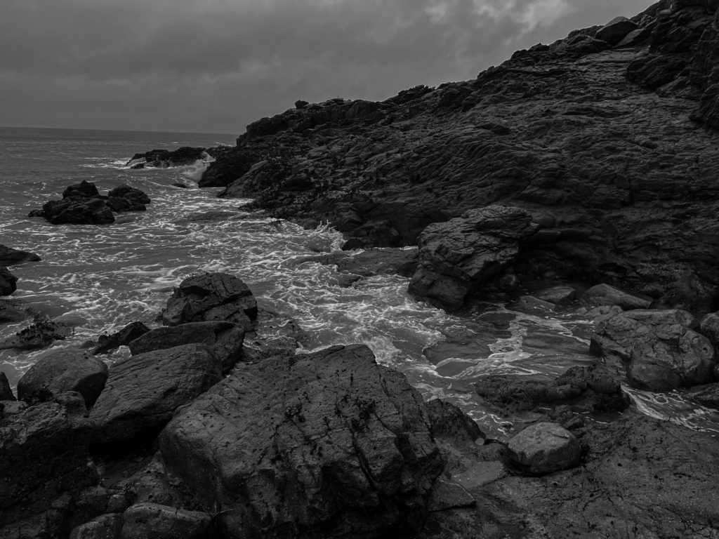
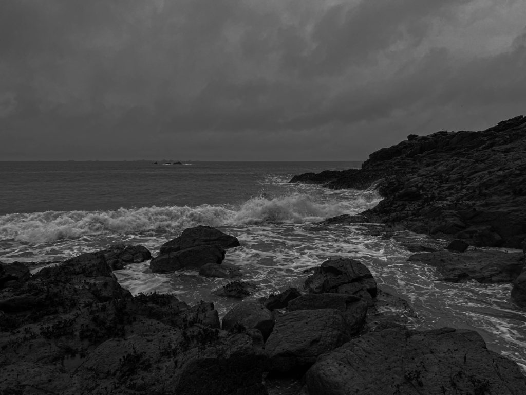
My artist reference was Alessandro Zanoni who i believe has amazing Anthropocene style images such as the one above, he uses excellent style of editing which i took inspiration from when taking and editing my images.

As you can see in the images above i used black and white images since i loved the way his images make you feel which i don’t think would have the same effect if they were in colour which fits well with the theme of Anthropocene since it gives the sense that humanity is slowly de evolving due to greed and the consequences of destroying the planet. I also wanted to try use shadows to add depth to my image, taking inspiration from quite a few of his photos.

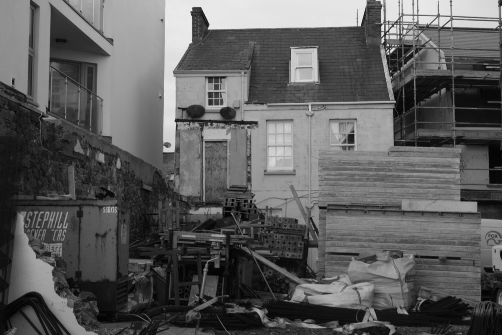
I also liked how he used quite abandoned/half built structures since it shows the waste of construction recourse which is greatly impacting our environment, which is my main point im trying to share with my photos.