
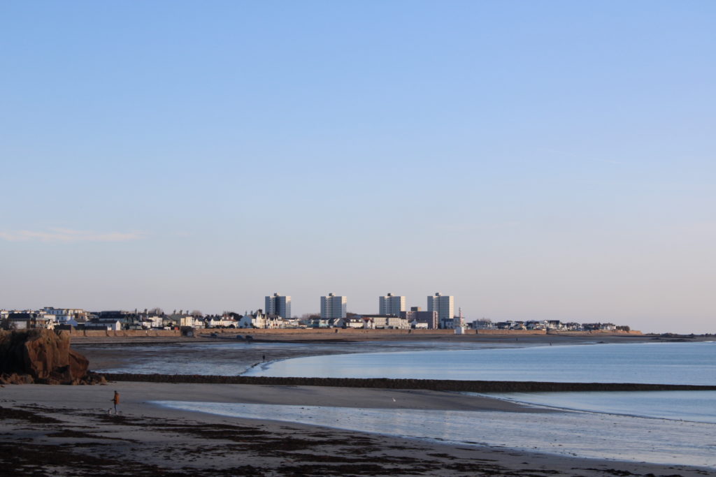


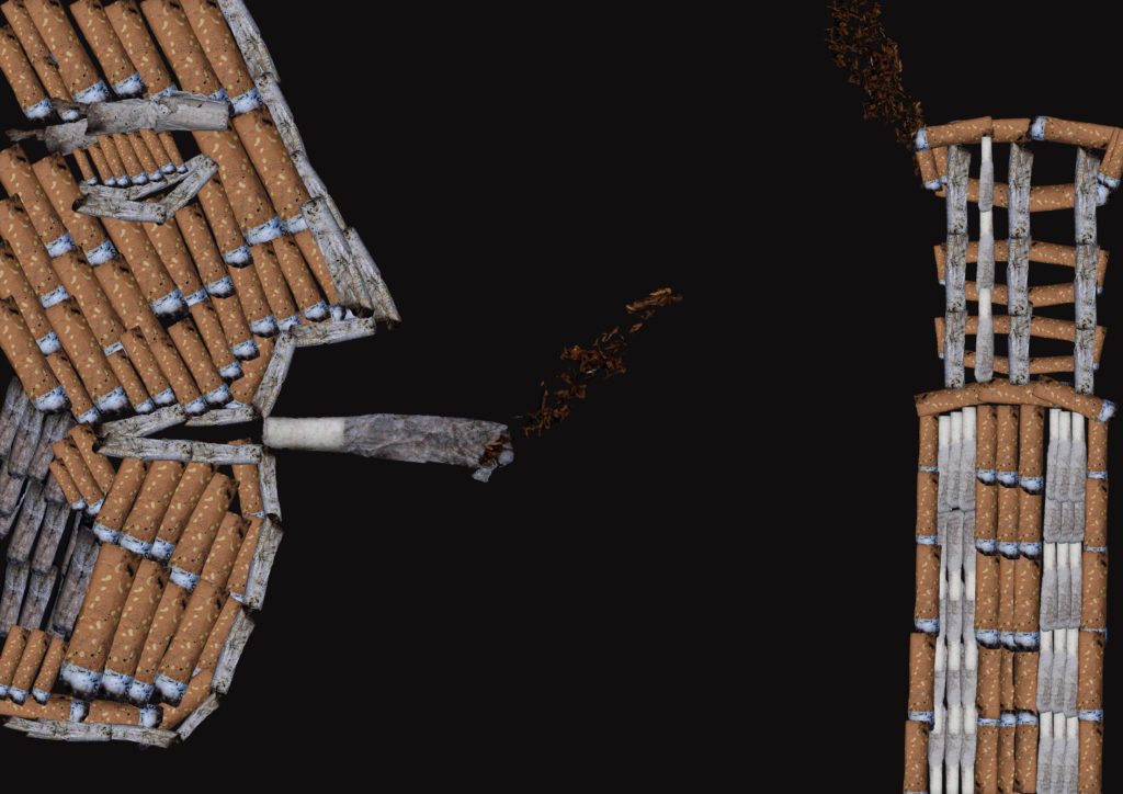
In my opinion starting off with whom I call the “Cigarette Man”, I am happy with a first attempt of what I had created on photoshop. I decided to create an image like this as reference to Mandy barker and thought I would use Cigarette buds as a way of showing this, it links with the context of smoking and is eye-catching in the first place, because who would even do this? The idea behind it is to show people what can even be physically made out of cigarette buds which you would find everywhere, but there is no care for them as they are only a small piece of plastic which does add up. In this image there is a lot of repetition of the buds, but with a variety of different shapes and colours to form something visible, which is what I attempted to do in order to create tone for the 2D image. And I couldn’t leave the right hand side empty so I decided to link it with a huge chimney which is used to let go of excess fumes from burning plastics.
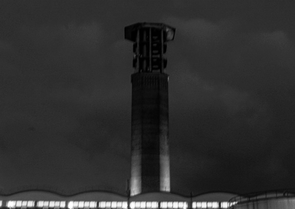
which was inspired by this image, and used as a reference, Its repetition of lines at the top, also on top of one big line. I also tried editing this image to a more older look to view the contrast of the image in order to create some tone of reference when creating it with the cigarette buds.
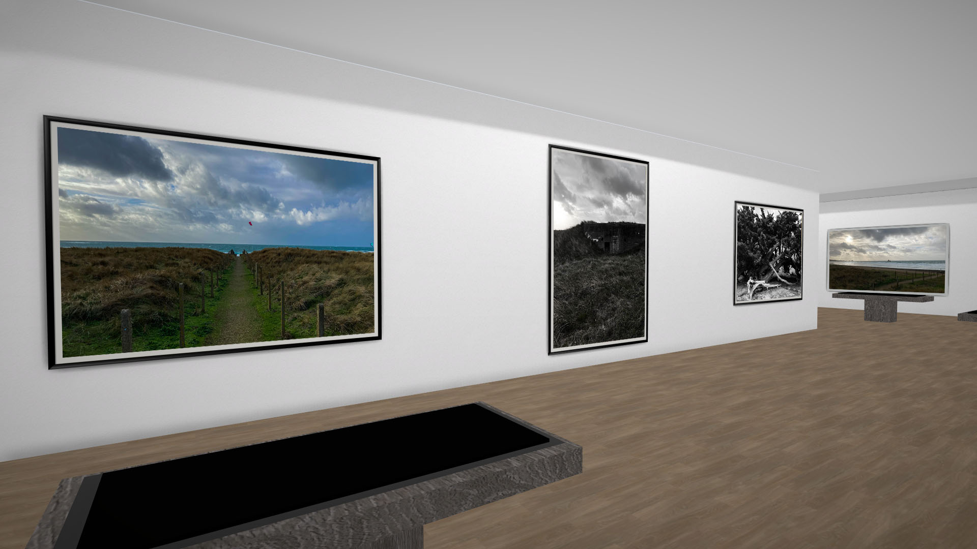
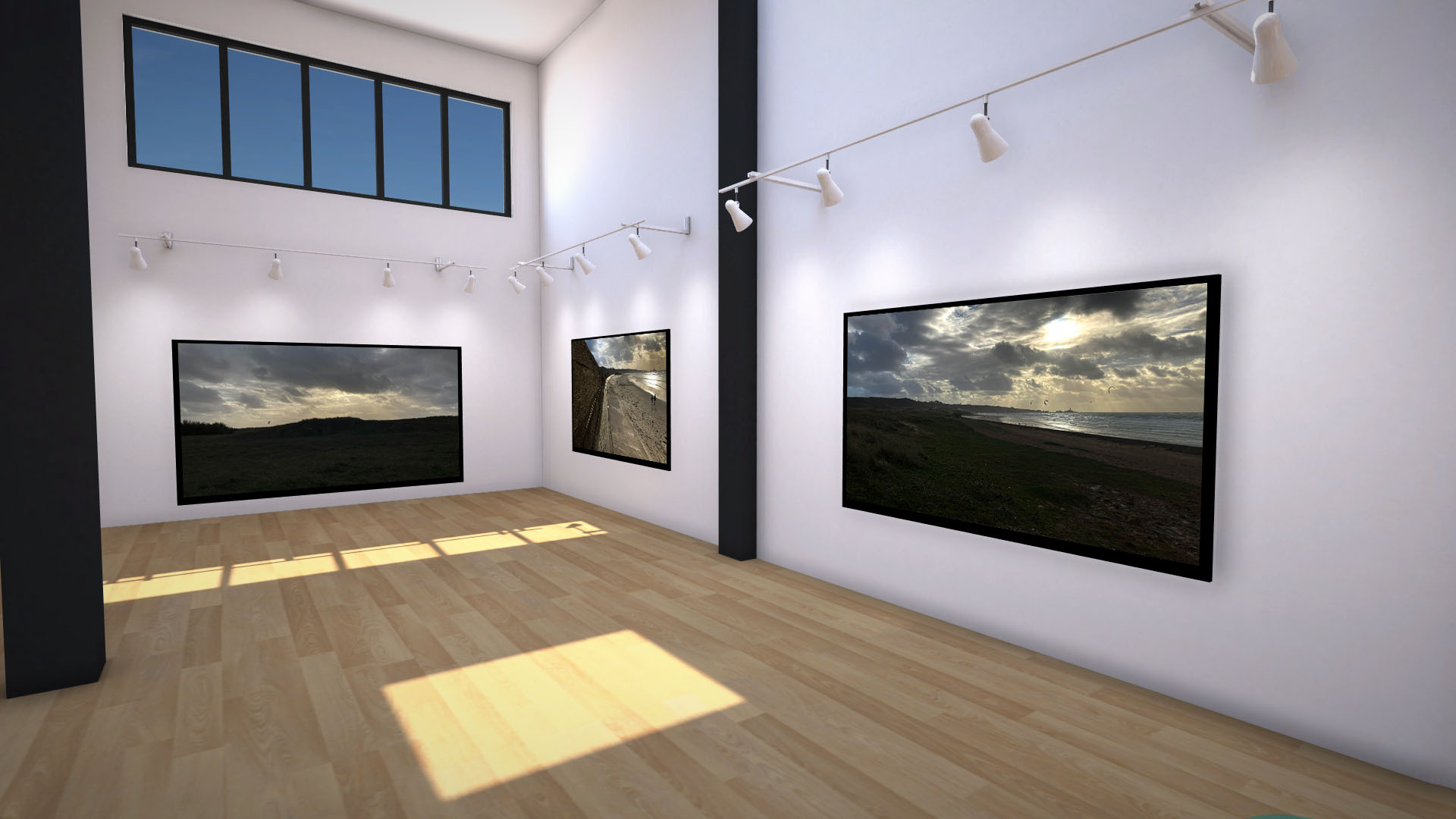
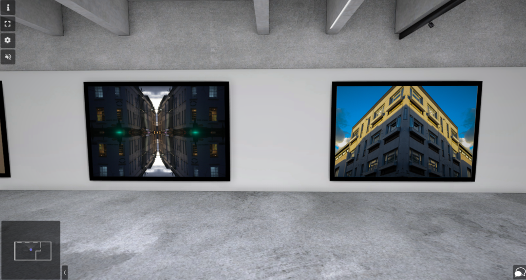
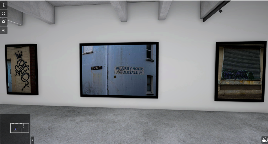
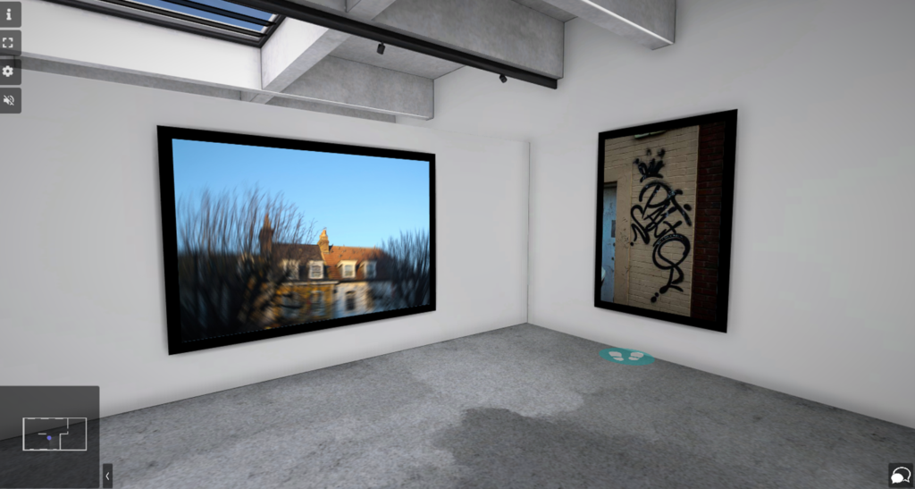
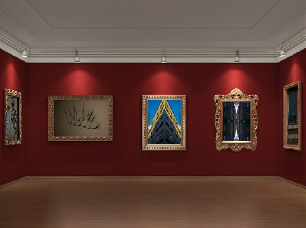
I created a virtual art gallery of the images I composed:


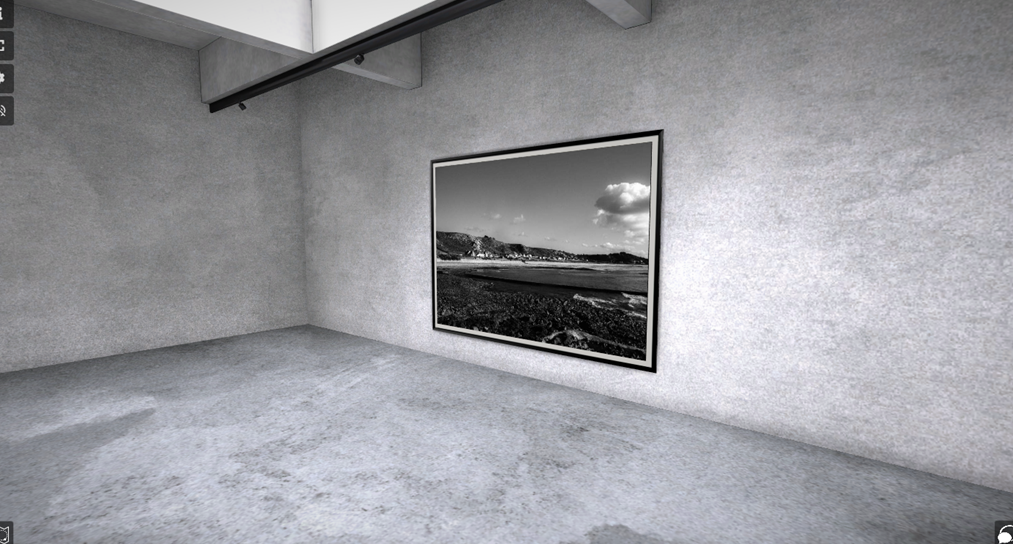
In the first screenshot there are 4 compositions I made. They include my final piece and a chimney edited in a way where it looked more eye catching or relatable to the subject. In the second screenshot, I included the 6 types of cigarette buds I had used to create the “cigarette man” as I like to call it. and even a nice suburban image which I had used because of the aesthetic of it.
In the third image it includes a mix of suburban and landscape images. In one of the images I used the kaleidoscope effect which in my opinion produced a funky acid looking image. While the others create in my opinion an Italian affect.
In the last Screenshot it includes a nice landscape image of St.Ounes, which I like a lot because the day at the time was perfect for creating images, and even the image itself looks very nice.
Anthropocene Gallery:

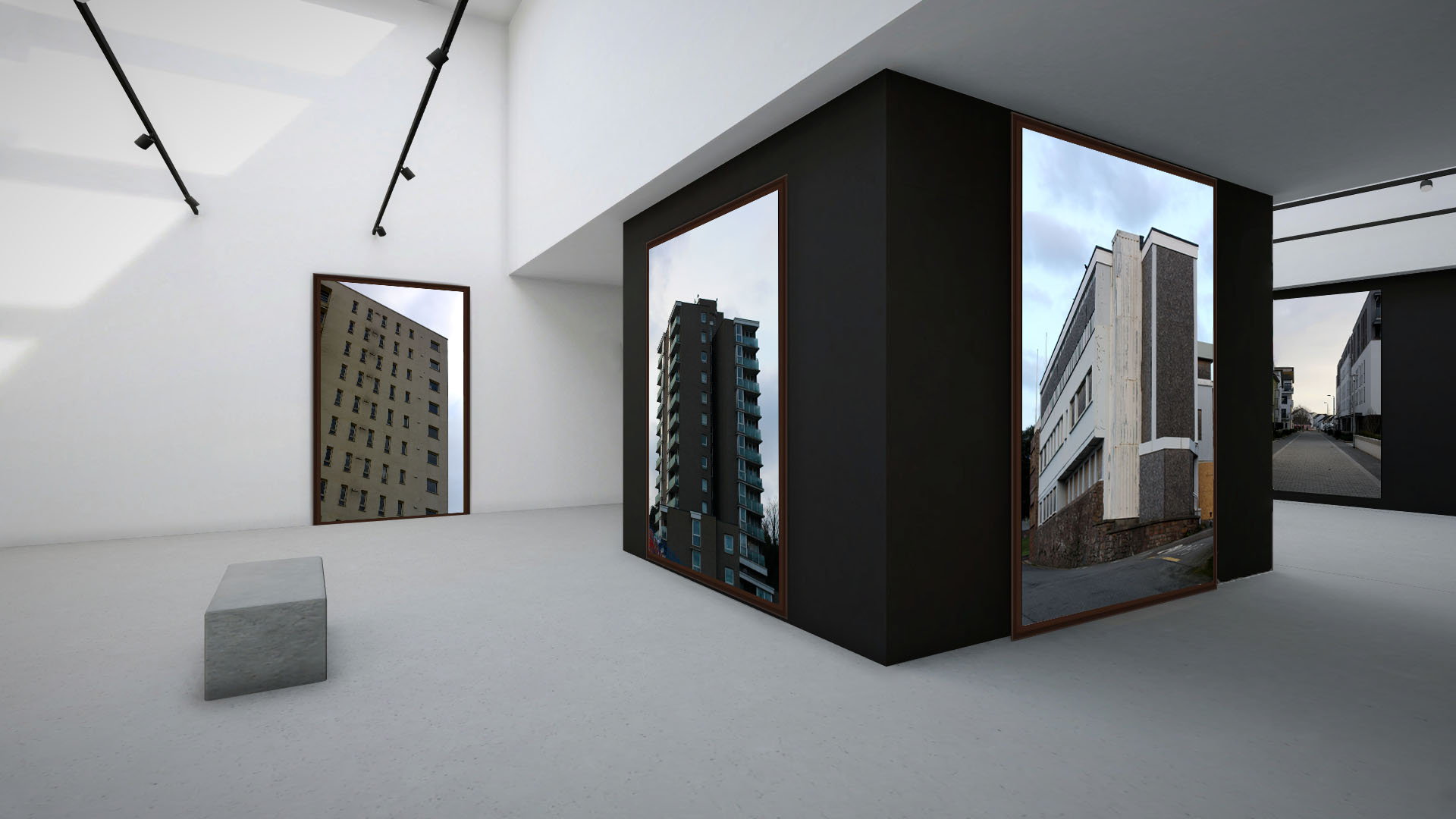
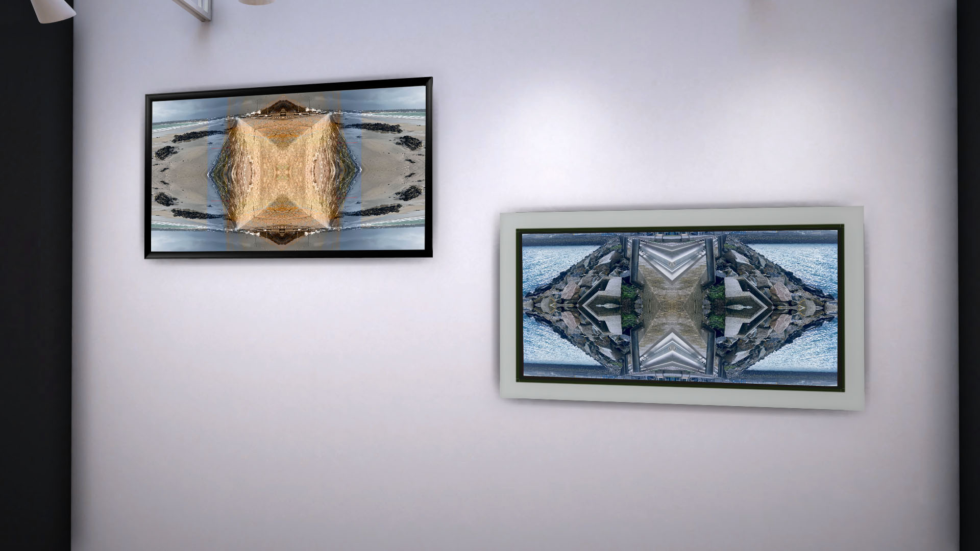
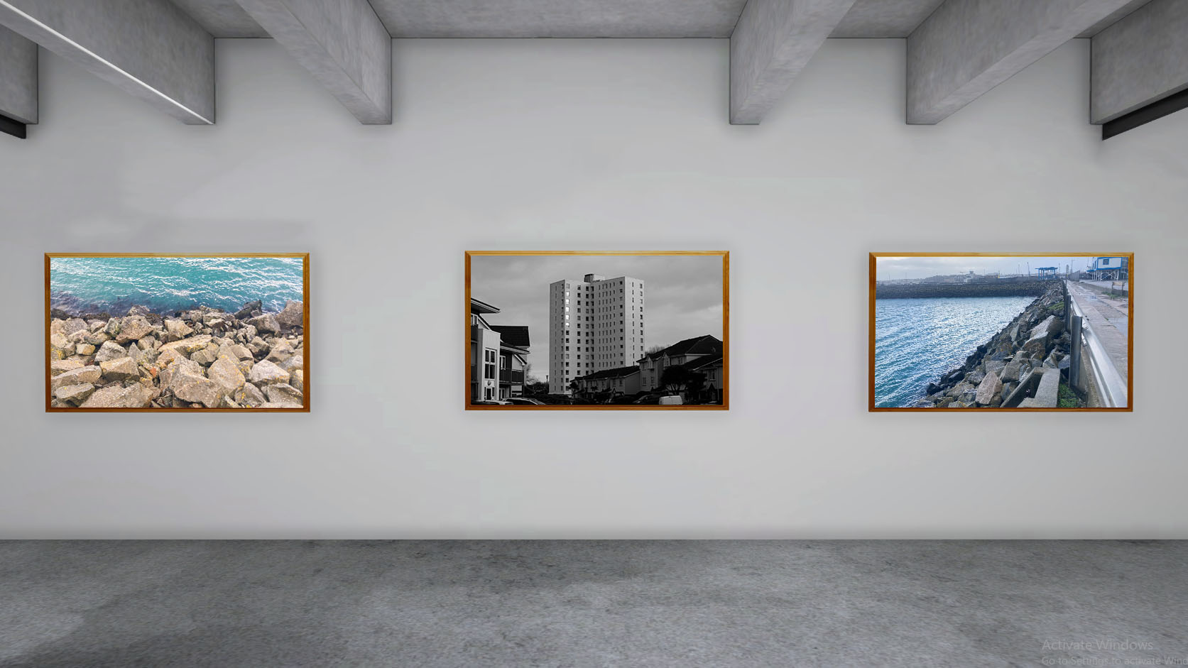
Urban Gallery:
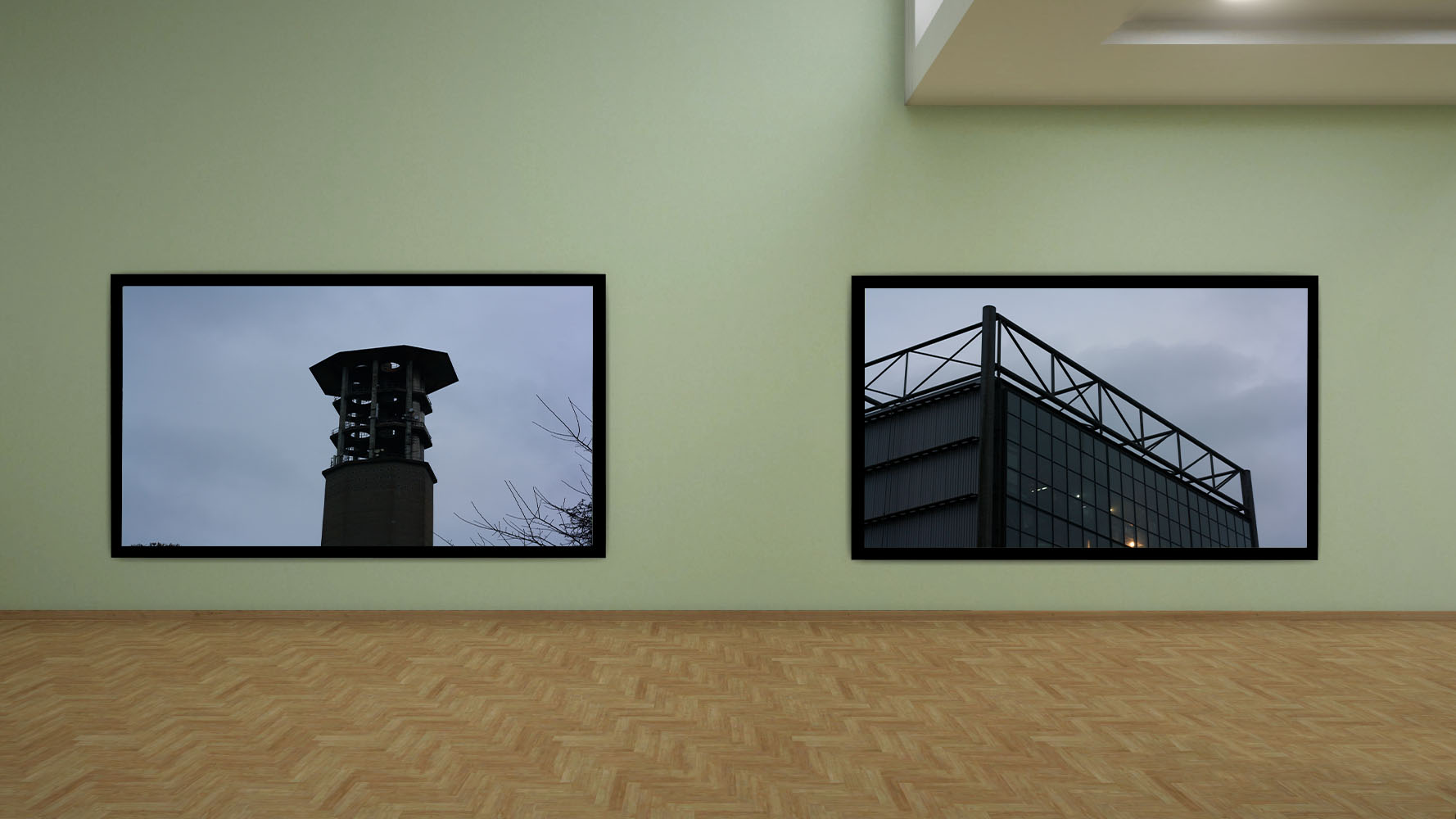


Rural Gallery:


on photoshop:

The below images are from a Photo-shoot I based of the photographer; Matthew Brandt. The process that I went through was very entertaining and experimental. To join together the artist as well as the topic of Anthropocene I had an idea of joining a landscape of a natural form with substances used by humans that destroy these landscapes. on the other hand I was very intrigued by abstract photographs. I have combined all of these to produce the images bellow:

The above image was created with many chemicals and substances. the bluer/purple looking stains are created by bleach that was poured staring onto a printed photograph. I have added a mixture of baking soda and salt onto the photograph and then poured nail polish remover on top of them in certain areas, this came out more as a clearer stain, with some distorted colours, but overall looked clear with more of a visible stain. some other stains were from a combination of the substances I used before. I have left them for a bit in water and then left them to dry. Originally what Matthew would do to his own photograph is soak it in the water collected from the reservoir. He would include the environment in his photographs, taking it as far as creating his own substances. in 2014 he did a project on lakes and reservoirs, this is also one of the locations that I chose to photograph for a response to Anthropocene . the reason why I decided to change Matthews way of working is because I wanted to experiment with something different as well as having a go at manually altering the photographs to know if this is something I am interested in developing.
I am very pleased with the results of this photo shoot, because this was a new medium to explore and due to the uncertainty of the liquids, it was unpredictable how the end result would turn out. I have tried to control them to my best ability however because of this unpredictability, it shows how pollution is getting out of hand. I like how the photographs are very vague and dark, almost only showing the silhouette of the landscape, where not much detail can be seen. this, especially the first image (one with a house in the middle ) gives a ghostly effect and this unwelcoming which can be interpreted differently by many, to me this uncertainty has a link to the uncomfortable landscape that would be the effect of pollution caused by humans. Another thing that I like is how these images are abstract however the landscape photographed is still visible, although the colours are distorted the shadows still show in their place.
What was difficult was to maintain the direction or effect a substance had on an image, but this was also what created this abstract image, which was an effect I was looking for. what I have learned for another time I attempt to alter images manually is to give myself time and especially when using liquids, leaving a designated area and time for them to dry. Another thing that I had to be cautious of was to be safe when using the chemicals, this meant I had to make sure the image was dry if I were to burn them, and to use cloves to not get the chemicals onto me. What I think could of went better and what disappointed me was the lack of colour as I expected the print to come out more colourful, with a wider variety of colour. this might of happened if I let more chemicals and more time react with the image. I had a much more limited time the Matthew gives for his images therefore I knew the effect won’t be exactly the same.
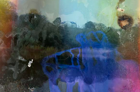
With the above image I have used the same chemicals as discussed earlier, this time I have tried to use fire and heat to see how the image would react with that. this creates a bigger burn onto the right side of the image, but also when using fire onto the middle of the photograph I have realized that the ink cracked and separated from the background print, these are the little white lines in the middle of the image.
As I had another photo shoot planed to respond to Anthropocene. this was more based on the artist which also to me could link to this topic. Dafna Talmor creates a burning effect on her images while altering the landscapes when a print from a film camera is developing, she uses negatives to achieve this effect of ink coming off from the print in different segments. She does this manually, photographing the seascape . I have stuck to capturing the landscapes she was interested in, however what I have changed is to create a similar effect digitally. due to a lack of a film camera I have used Photoshop to experiment with replicating her images with my own.

I liked the freedom editing these images gave me, as in comparison with Matthew response photographs, this time I could manipulate which parts I want to keep, the shapes of them and arrangement. I was able to be very creative with these images and imaginative on how the end result of these would look. Having small experience with Photoshop it took me some time figure out a plan on how I could get started. However because now I have finished it I know for the future which tools I could use and how to use them. I have made a couple mistakes with this, which have made it more difficult to edit the pictures. this for example was not creating each layer for every segment selected, but because of this I am aware for the future.
How I wanted to link this with Anthropocene was through the representation of natural, abstract and physical distraction of the photographs to create a representation of a natural landscape being destroyed by humans. when I saw Dafna Talmor’s work, I immediately thought of the photographs being burned because of how they were distorted. Similarly to Matthews work I wanted to create a link of the physically altered landscapes and Anthropocene, through abstract results. What would be beneficial for me is to try both digital and manual image altering this is why I have picked to alter these images digitally.

Judging all the final outcomes, responding to Dafna’s and Matthews work, I am pleased with the photographs. the outcomes were unpredictable and hard to tell how the end result would turn out, most of the time it was pure experimentation and improvising at the spot. there was a general idea of what I would want to achieve but no guarantee it would look like that. altering the images digitally I had a bigger control over the images and manipulation, however the lack of knowledge when it comes to Photoshop made it harder. I much more enjoyed altering the images by hand in comparison to digital altering as it came naturally to me. I’m happy that out of this project I was able to be creative as well as responding to a topic which bothers all. Anthropocene is a very interesting topic as there are many branches that I could of taken to create responses on it, I am glad I was able to mix abstract with realism and the contrast of natural landscape with the opposite to show the impact pollution has on the world. I like to believe that within my images I have created a surreal, imaginary landscape that makes people question how pollution is taking over the environment.