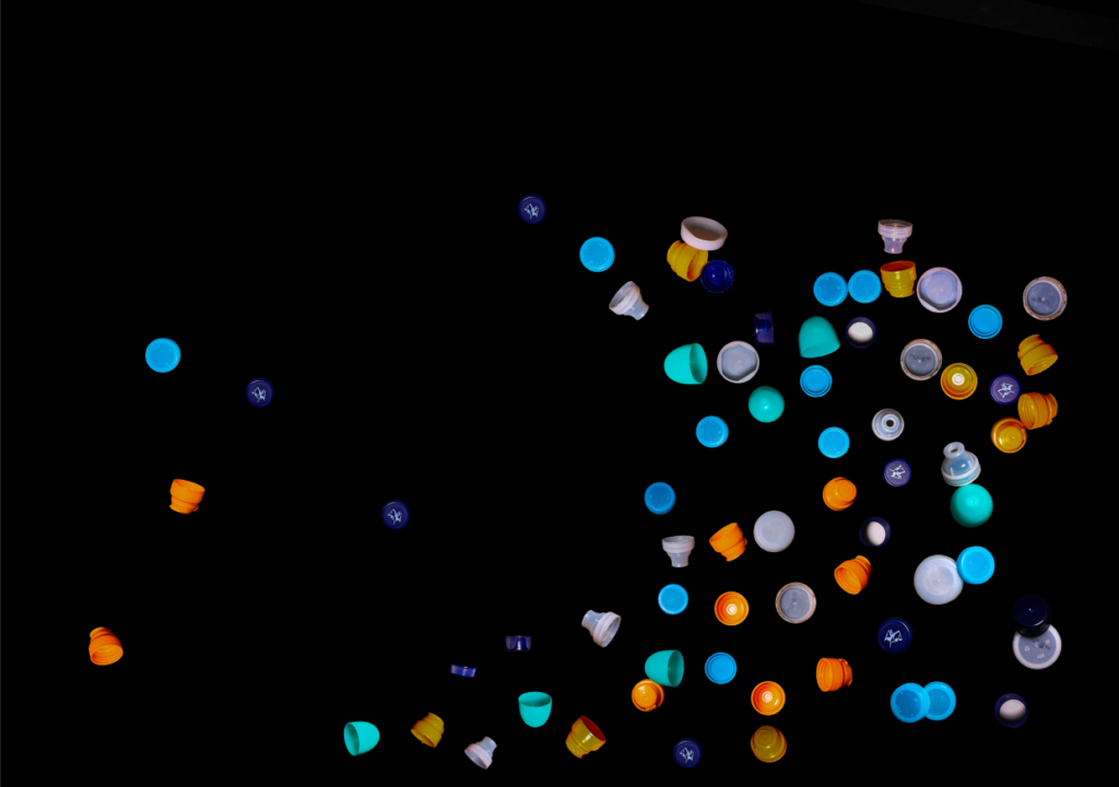
I used the object select tool to select the rough shape of the bottlecaps from the original images from my photoshoot, to help me cut out the background. I did this for each photograph I took from Lightroom and started to put them together.

As I put them together shapes started forming, but I felt that the space behind them was still empty.

I thought that later on I might add on a layer on top of this one with the bottle caps more enlarged, so I added a gradient from black to transparency, and lowered the opacity to get the desired shadow effect.

I then created another layer beneath the original, and downsized the bottlecaps to create more depth in the image when the whole thing is completed.

I started experimenting with adding a gradient and hue blending it with the rest of the image to change the colours of the bottlecaps, as my colour range was quite limited with only 4-5 different coloured caps.

I then created another few layers beneath and decreased the scale of the bottlecaps each time, until it almost resembled litter floating in the ocean.

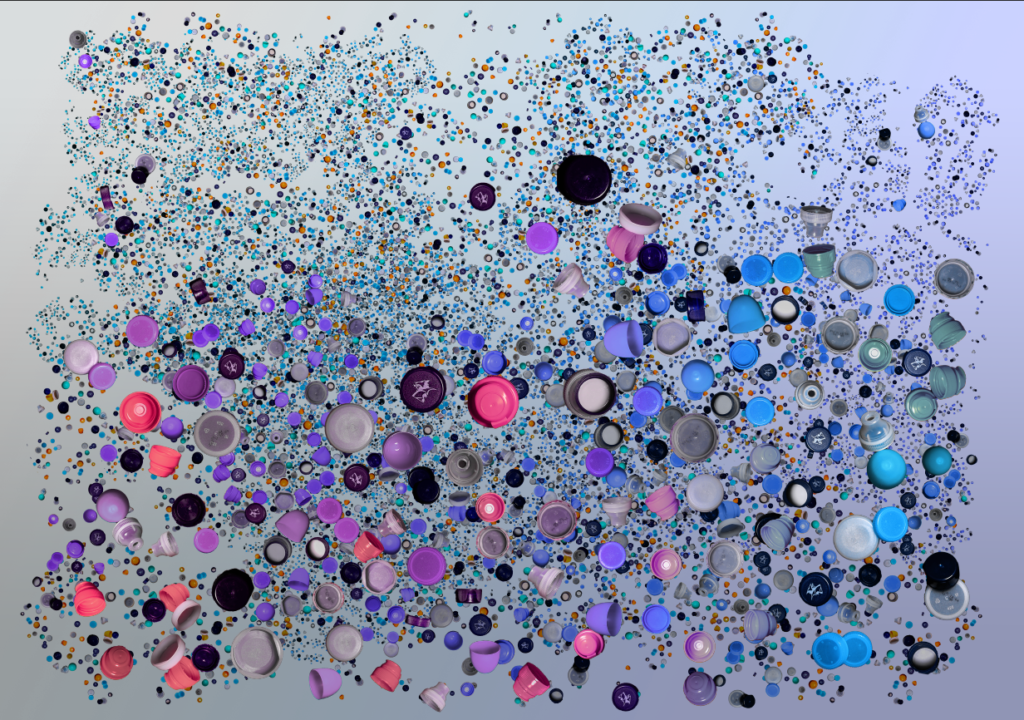
I decided to try a gradient for the background as well, and found this one very visually pleasing, but I’m not too convinced it supports the ideas of Anthropocene or Barker’s work.

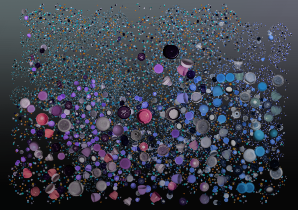
Using the blur tool, I created more of a sense that the bottlecaps were submerged underwater, and changed the background gradient behind to a murky green and dark purple, and then reduced the opacity again to create the effect of polluted water.

I was left with these two pieces that are almost identical composition-wise, but completely opposite in tone. I think I visually prefer the lighter version, however the realism and idea behind the darker image adds more value to it in my opinion.

I wanted to do another piece similar to this, but with a clearer message, and after experimenting with different ideas, I thought that I could position the bottlecaps in the shape of a person.

I built up a lower layer using parts from my first image, and changed the hues of the layer.

I then made a start on an upper layer with larger bottlecaps. I also messed around with the hues slider for each extra layer I put on to add some extra colour.

I was considering adding a background similar to Barker’s, with the dark green/dark blue mist effect, but I couldn’t do it in a way that wouldn’t turn out awful in printing, so I stuck with the plain black background.

To add some more to the rest of the image, I added in some smaller bottlecaps floating around behind the ‘person’ at various smaller sizes.
I’m quite proud of this piece, although I still don’t think it captures the same sort of flow that Barker so effortlessly uses when putting together her work. After some more practice, I could probably create a more accurate version of a Mandy Barker piece. However, I do think that it portrays the message of plastic pollution quite well, as the plastic ‘person’ can easily make you wonder how much plastic we truly use as a whole.

• Some good work here…most notably in the editing / manipulation
• However, your ideas do not seem completely resolved…and need a wow factor / sophisticated edge to them
• A re-development could be the answer
• Check the list below…you have some missing elements!