Evaluation

Why did I choose Agriculture for Anthropocene?

I chose to do agriculture for this project as Jersey struggles with the pollution caused by agriculture that eventually ends up washing into our oceans. I also chose this topic as I thought i could capture some abstract images as well as landscape ones.

How did i plan?

originally, i planned to complete 3 photoshoots: agriculture, plastics and oil pollution in the sea. However, I was only able to complete 2 of the photoshoots, agriculture and plastics. Although i was only able to complete two of the photoshoots, it put me at an advantage as it would of been hard to find oil pollution in the sea in Jersey. This photoshoot was hard as the weather has been very dark, gloomy and rainy, so I chose to do the photoshoot on days where it was not raining. Even when it wasn’t raining the lighting was always very dim so this was hard.

Photoshoot – experimenting with editing

My photoshoots were carried out along the front on St Helier/ St Aubin’s beach. The plan was to photograph the pollution caused by agriculture so I found the different drains spread along the beach to photograph. The lighting was gradually becoming darker throughout the shoot so this was challenging to work with, however, it gave me a variety of different images with different lightings to work with.

What went well and what could have been done better?

on a whole, I feel my mock exam would have turned out a lot better if I had more time to complete the photoshoots. I wasn’t able to complete the photoshoots i initially had planned so i wasn’t happy with this. Also, with the photoshoots i did complete, particularly the beach photoshoot i did, i feel would have went a lot better if i had more time to do the same shoot on different days. This would allow me to photograph in a range of different lights. I was unable to do this as it was difficult to get out when it wasn’t raining or really cloudy, as the weather was bad. On top of all of this, i didn’t give myself as much time as i should of to complete the photoshoots.

Although i feel there was lot’s of negatives to this photoshoot, during this exam and looking at my final outcomes, i am very happy with my images. I was able to edit them on photoshop and Lightroom to a way i wanted them. As a result of not having time to do multiple shoots for this photoshoot, i was left with a range of different photos. From the landscape of the sea, to the photos of the drains, so i am overall very happy with my final outcomes.

With the plastic photoshoot i did, i was able to collect plastic and rubbish, however, i struggled when actually carrying out the photoshoot as it was difficult to get the angles and lighting right.

With this photoshoot, i was able to do a shoot in the school studio and one at home; this allowed me to have a variety of images under the same photoshoot, with different backgrounds, angles and subjects. I was happy with the way this photoshoot came out, in comparison to my artist references. However, i felt my final images from the beach photoshoot were stronger then the plastics photoshoot, so i used those as my final images to put in the print folder.

Overall evaluation on Anthropocene:

I enjoyed doing this project but wish I had more time to complete my photoshoots to my best ability, I am pleased with my final outcomes however I do think they are limited and that i could do much better and more on task outcomes.

TYPOLOGY FINAL RESULTS

These are some of my images from my Topographics shoot as I felt that they all go well together due to all of the old buildings and architecture. I9 also felt like they all had and eary effect to them. I ended up creating my grid on Google slides by lining all the images up and manipulating them into the same size, then i made sure that the white gaps in between the images all had the same length and distance.

Constructed Seascapes

Gustave Le Gray – The Great Wave, 1857

This is Le Gray’s most dramatic of his seascape photos. It combines his technical skills with the incredible seascape and mysterious prison-like building. At the horizon, the clouds are cut off, this points out the join between two negatives.

Many photographer found it difficult to photograph good exposure for the sky and the sea in a photograph as it is often seen as over exposed. Le Gray merged these two photos one of the sea and one of the sky and combined them onto one sheet.

Dafna Talmor – from Constructed Landscapes II

This incredible collage consists of staged landscapes made of colour negatives shot at different locations.

Questions

Both could be described as landscape pictures. What kinds of landscapes do they describe?

The Dafna Talmor one appears to be more serene and beautiful. The collages allude to an imaginary place, which is an idealised view of the sea as there are many dangers and problems there

The Gustave Le Gray one looks like a cloudy and negative seascape. The building in the middle of the sea looks prison-like as it is surrounded by nothing but sea. This enforces negative views of the ocean as it looks violent and dangerous.

What similarities do you notice about these two pictures?

They are similar in the sense that they are both seascapes and show the seas incredible textures. Both images are more than one photo combined.

What differences do you notice?

I notice that the Dafna Talmor is more of a collage, it is obvious that the image she has put together is more than one at different times of day or different area of the sea. However with the other it looks like the same image, the weather seems very over exaggerated it almost looks burnt between images to distinguish between them.

Also, I notice that Le Gray’s photo is monochrome and Dafna Talmors is in vibrant colour.

What words/phrases best describe each of these landscapes?

The Great Wave- dangerous, gloomy, lonely

Constructed Landscapes II- vibrant, serene, enticing

Evaluation

I chose to look at air pollution as it is a topic that effects almost all aspects of our life whether it’s health, environment etc. When looking into causes of air pollution i started to research the effects smoking and vaping have on our environment and decided that it would be one of my focus points for this project.

I looked at well known photographers such as Mandy Barker and Edward Burtinsky for inspiration however my favourite work was made by a photographer called George Marazakis. His work focused a lot on images of factories omitting pollution into our atmosphere and the damage that causes so he became a big inspiration for my work in this project.

For my photoshoots I went on a walk and took pictures of cars and chimneys and then also recruited my brother (who vapes) to be photographed.

By focusing mainly on vaping and smoking it allowed the project to become something very well known to me as it is such a common thing to see and so it was interesting to photograph and delve into the damage that it is actually doing to the air. I used the smoke in my images to represent the air pollution produced by larger scale industrial factories and use it to represent other forms of air pollution which I wasn’t able to photograph due to not having access to them kind of large scale factories in jersey. However in my opinion they still delivered the point I intended them to despite being unable to reach large factories.

Overall I consider this project to have been quite successful as I managed to create some interesting outcomes however next time I think I should get a larger range of very different images so that I have more to work with.

Anthropocene – Experimentation – Mandy Barker

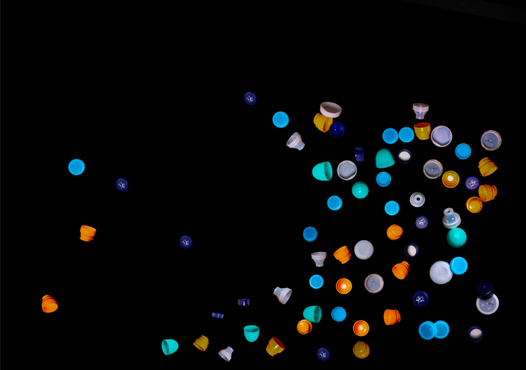
I used the object select tool to select the rough shape of the bottlecaps from the original images from my photoshoot, to help me cut out the background. I did this for each photograph I took from Lightroom and started to put them together.

As I put them together shapes started forming, but I felt that the space behind them was still empty.

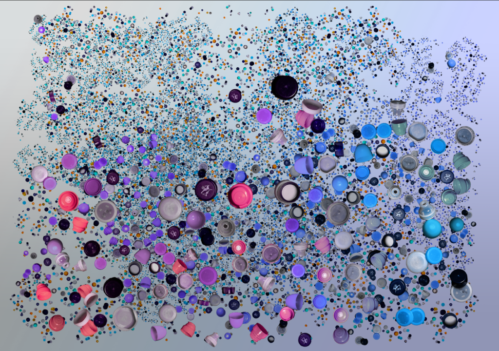
I thought that later on I might add on a layer on top of this one with the bottle caps more enlarged, so I added a gradient from black to transparency, and lowered the opacity to get the desired shadow effect.

I then created another layer beneath the original, and downsized the bottlecaps to create more depth in the image when the whole thing is completed.

I started experimenting with adding a gradient and hue blending it with the rest of the image to change the colours of the bottlecaps, as my colour range was quite limited with only 4-5 different coloured caps.

I then created another few layers beneath and decreased the scale of the bottlecaps each time, until it almost resembled litter floating in the ocean.

I decided to try a gradient for the background as well, and found this one very visually pleasing, but I’m not too convinced it supports the ideas of Anthropocene or Barker’s work.

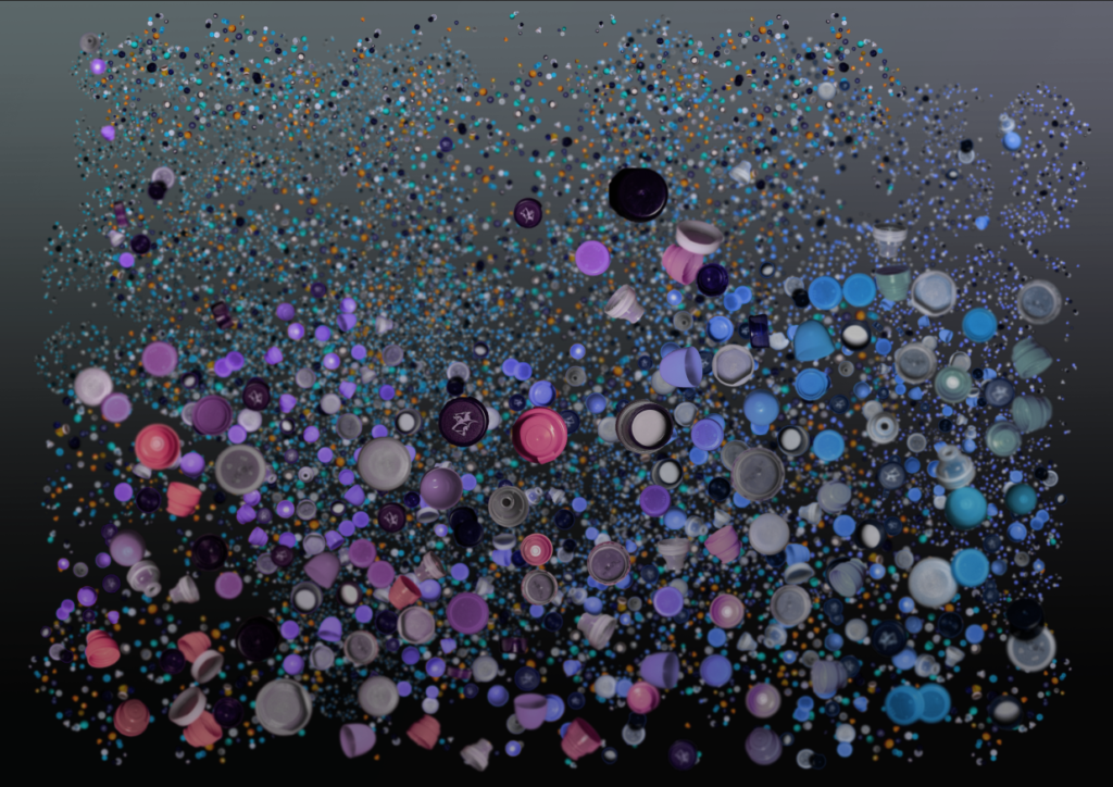
Using the blur tool, I created more of a sense that the bottlecaps were submerged underwater, and changed the background gradient behind to a murky green and dark purple, and then reduced the opacity again to create the effect of polluted water.

I was left with these two pieces that are almost identical composition-wise, but completely opposite in tone. I think I visually prefer the lighter version, however the realism and idea behind the darker image adds more value to it in my opinion.

I wanted to do another piece similar to this, but with a clearer message, and after experimenting with different ideas, I thought that I could position the bottlecaps in the shape of a person.

I built up a lower layer using parts from my first image, and changed the hues of the layer.

I then made a start on an upper layer with larger bottlecaps. I also messed around with the hues slider for each extra layer I put on to add some extra colour.

I was considering adding a background similar to Barker’s, with the dark green/dark blue mist effect, but I couldn’t do it in a way that wouldn’t turn out awful in printing, so I stuck with the plain black background.

To add some more to the rest of the image, I added in some smaller bottlecaps floating around behind the ‘person’ at various smaller sizes.

I’m quite proud of this piece, although I still don’t think it captures the same sort of flow that Barker so effortlessly uses when putting together her work. After some more practice, I could probably create a more accurate version of a Mandy Barker piece. However, I do think that it portrays the message of plastic pollution quite well, as the plastic ‘person’ can easily make you wonder how much plastic we truly use as a whole.

Anthropocene Photoshoot – La Collette

I drove down to La Collette to take more photos for my mock exam, and decided to focus more on the dump and recycling plant instead of the other areas around it. I asked some of the workers for permission to just take some photographs and had a conversation about photography while I shot my images.

I then walked down the road to take some photos of the rest of the site from a distance and of cars passing by.

I then sorted through the images and only selected a small range to edit during the exam.

I experimented with changing the colours in the photos to be duller and seem ‘more dead’ – such as the sky, grass, etc. to remove focus on the more natural areas of the photo.

I like all of these images, especially because, in my opinion the tones create an almost apocalyptic feel with the rubbish and dead-looking plant life everywhere.

I could also try to edit more of these in my spare time, and see what I can come up with.