What do I think went well/wrong?
In my opinion, I personally think that the first two diptychs are far stronger than the third, which I regrettably do not particularly like.
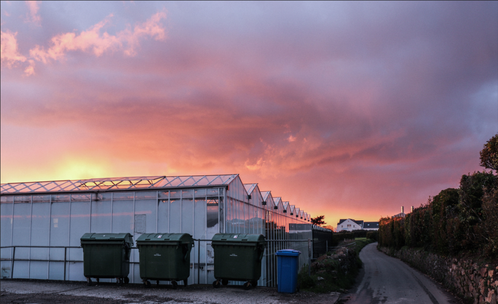
However I don’t think this is because of both images, but just because of this one;

I think the reason that this image does not really compliment my others is because it is just a little more cluttered than them – the composition is just less simplistically successful which has unfortunately resulted in a less professional looking image. I also think that it doesn’t at all relate to any of my artist studies.
This being said, I do think that my other images are all really strong and I am happy with my editing choices. I think that all of the images that I put together do compliment and contrast each other in a productive manner.
It was quite frustrating to not have been able to take as many strong and varied images as I would have liked; and I think maybe a more clear framework in my head would have perhaps made this a little easier. Knowing exactly what I wanted before I went out to take photos might have made this simpler. However, I do still feel that the weather was quite difficult during the week and this did invalidate a lot of my images that I actually took for the project.
I think I did use the camera to the best of my abilities, but there is definitely more I could learn and utilise within the settings to take more interesting images.
Altogether, I would like to have put more thought into creating images that really did resemble the work of my artists, specifically Andreas Gursky. I feel that this was not completely taken into account when I went out to take photos, but more importantly in my planning. By not choosing subjects that would suit his style, I was limiting my chances of replicating his photos. I am happy with my outcomes for Fay Godwin however, and I think this might be due to my personal preference toward her style and her photos over those of Gursky.
Gursky’s digital manipulation of his work is something that I feel I was not educated on enough to fully understand and be able to replicate. I was not fully aware of the amount of manipulation that actually went into his images, and I would most likely have not had time to do this to my own.
In conclusion, I enjoyed this project. Taking the time to research the different aspects of Anthropocene and its effects was really interesting and I feel that I have learnt a lot through doing so. I am proud of my outcomes, despite feeling that my idea was not as strong as it could have been, and I am aware that there is room for improvement in all areas of this kind of task for my future reference.

• Lots of hard work on display here…well done, and keep the pace up!
• You can afford to be more selective with your images…check with JAC / MVT if you are unsure !
• A documentary / narrative approach will suit your way of looking and working, so start looking at some our photo-books and previous students work to help you shape your future projects