not edited:
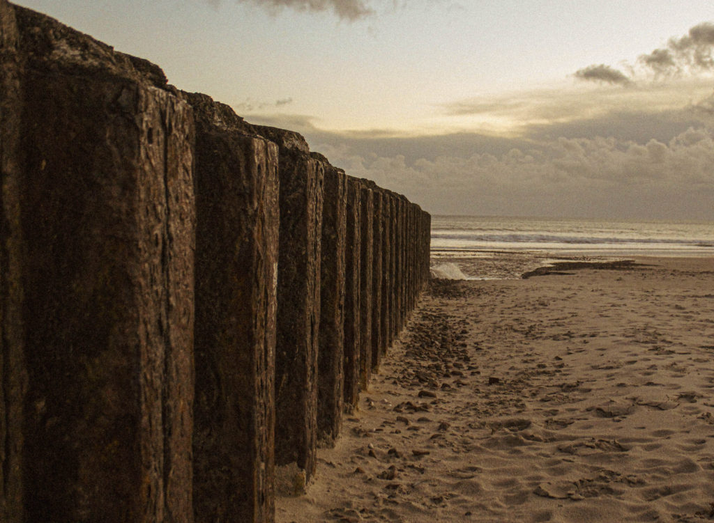
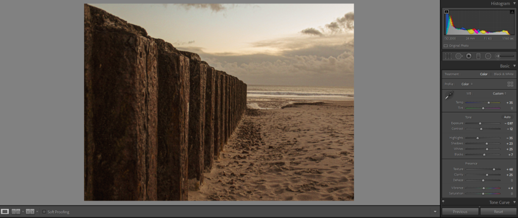
This is the original photo I took. It is very bland and not particularly even. The colours and tones of the image are boring and very dark; nothing stands out.
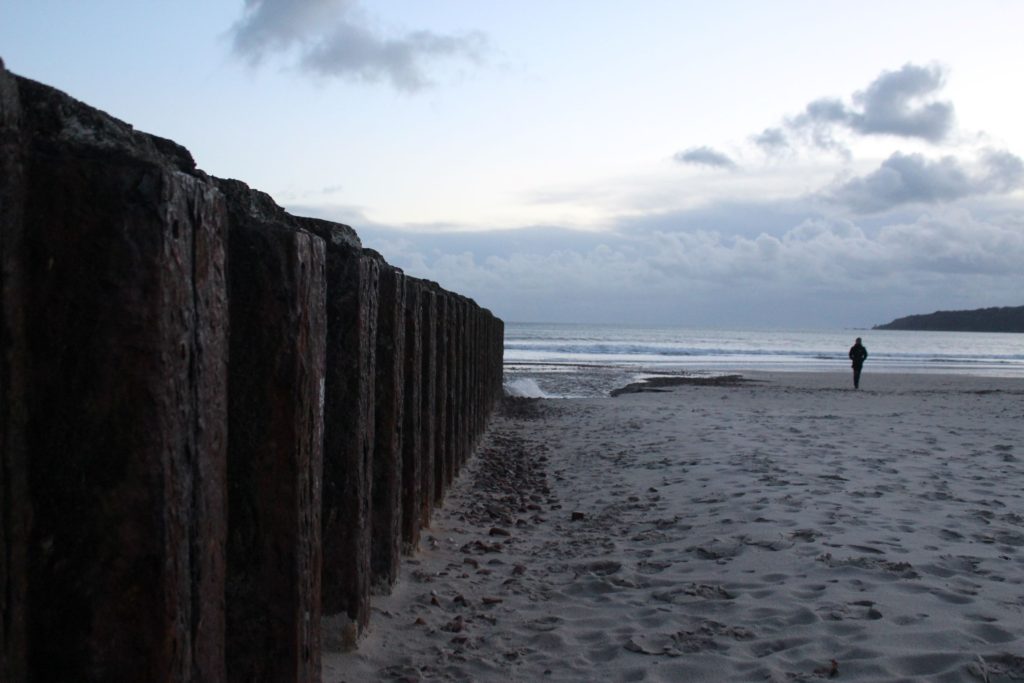
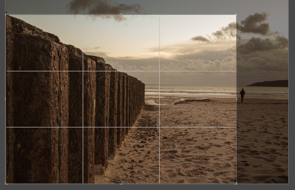
However, I was drawn to the left side of the image as it creates a perspective distortion, so I decided to crop the right side of the image out a lot to move the focus of the image to the wall and ocean in the distance:
editing:
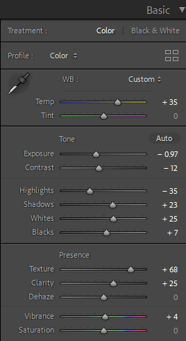
I turned the ‘warmth’ of the image up and increased the saturation of the yellow, orange and red in the image. I like that the image now looks tea-stained. I edited a ‘grain’ effect into the image, this creates the illusion that the image is old, it has a vintage look to it.
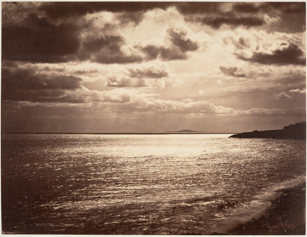
I was inspired by Gustave Le Gray with this image. His images are always very grainy and yellow toned.
outcome: