
Image comparison/analysis
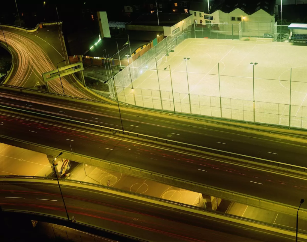
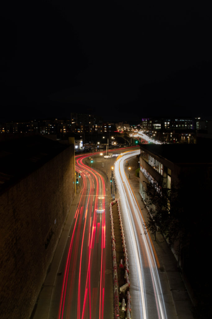
Both images similarly present a busy road at night, shot in shutter priority mode with a long exposure producing an image overloaded with artificial lighting. The foreground of both images show a road masked in light whereas in the background its seen to be deserted almost as if the lighting has taken over the city. Luxemburg’s image was taken alongside a number of photographs in London in 1996, whereas my image was recently taken in Jersey’s town centre above a popular tunnel. The two images consist of a similar composition and structure, although Luxembergs lighting has a more sulphruric orange tint to it affecting the mood of the photograph in comparison. The pair of images have been captured from a vantage point allowing viewers to see a unique angle of the area, the harsh red and white lighting differs to the softer lines of light seen in Luxemberg’s image. The dark surroundings of my image almost act as a frame to the bold lighting in the centre, placing a stress on the unnatural presence of the light. Leading lines can be seen on the roads of both images continuing until visibility is lost. Possibly making viewers question what’s beyond the photograph. The use of the S-curve technique in my image can also aid the viewer’s eye to explore the scene captured by taking them on a visual journey, giving the image a sense of overall rhythm.
