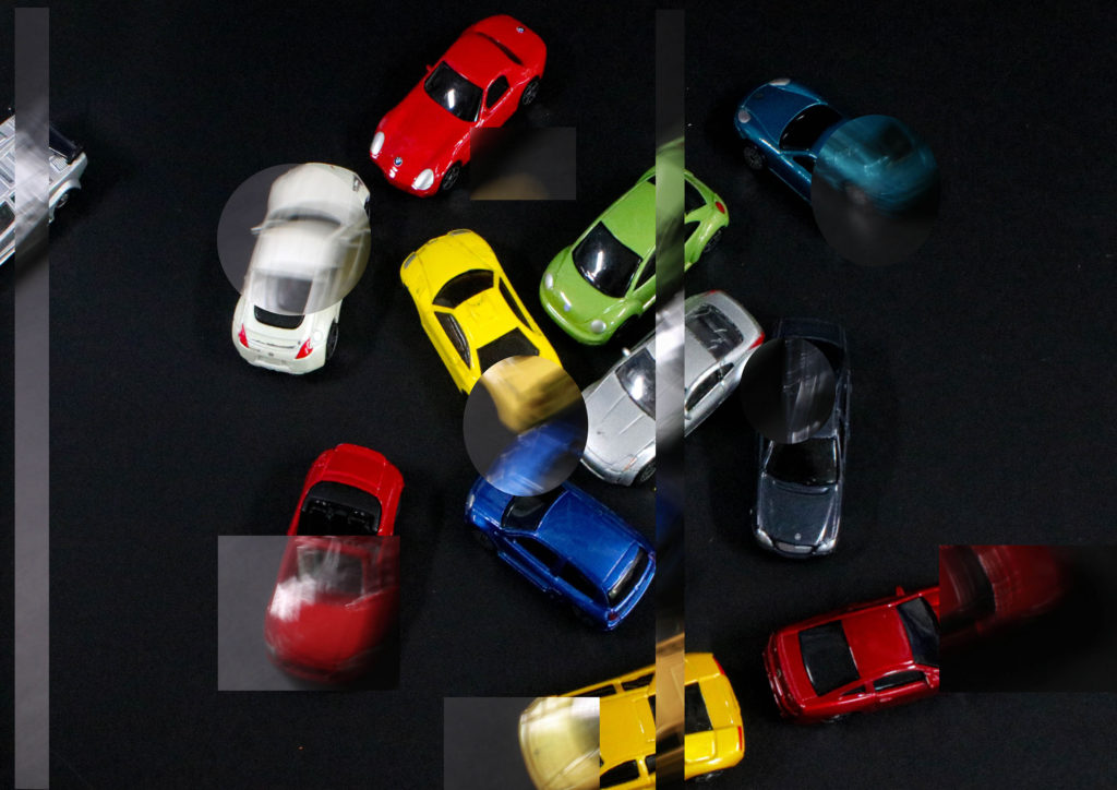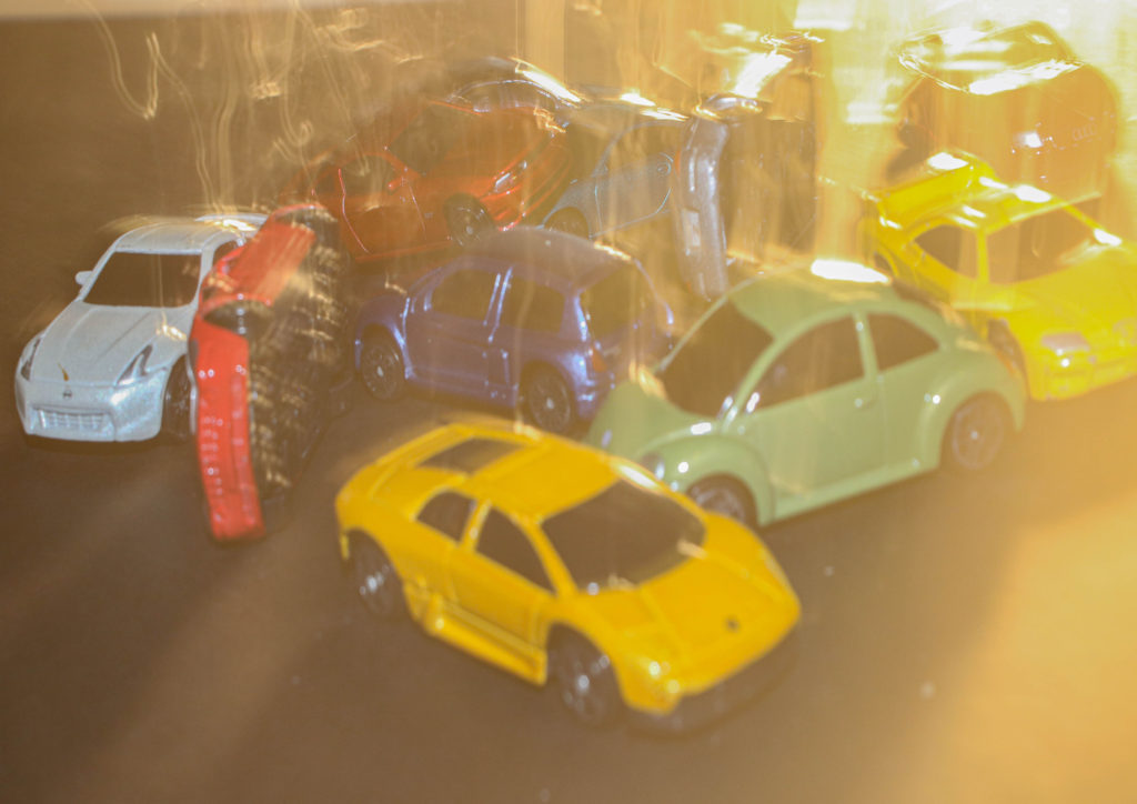
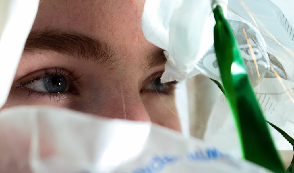

Stephen Gill inspired work-

Stephen Gill inspired work-

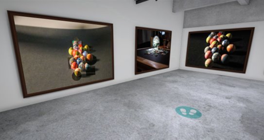
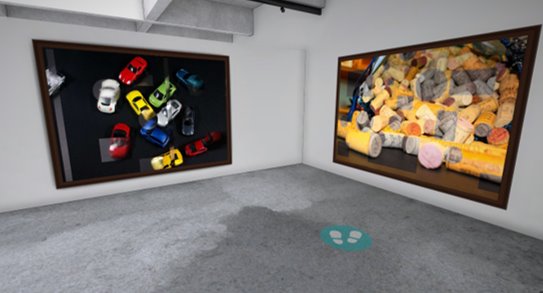
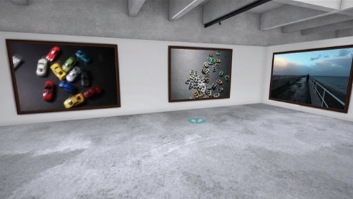
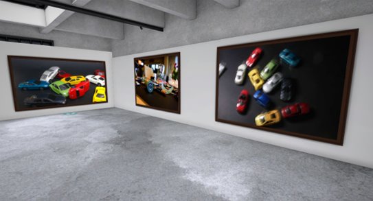
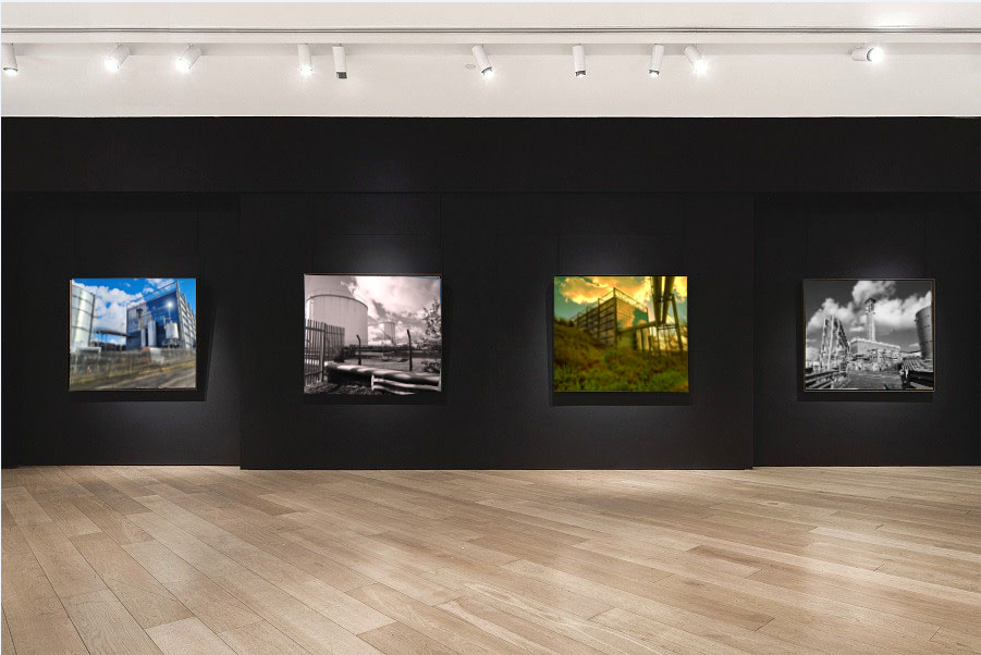
Using artsteps, I made a virtual gallery of my final images.
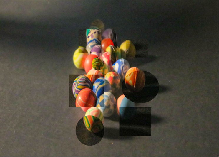
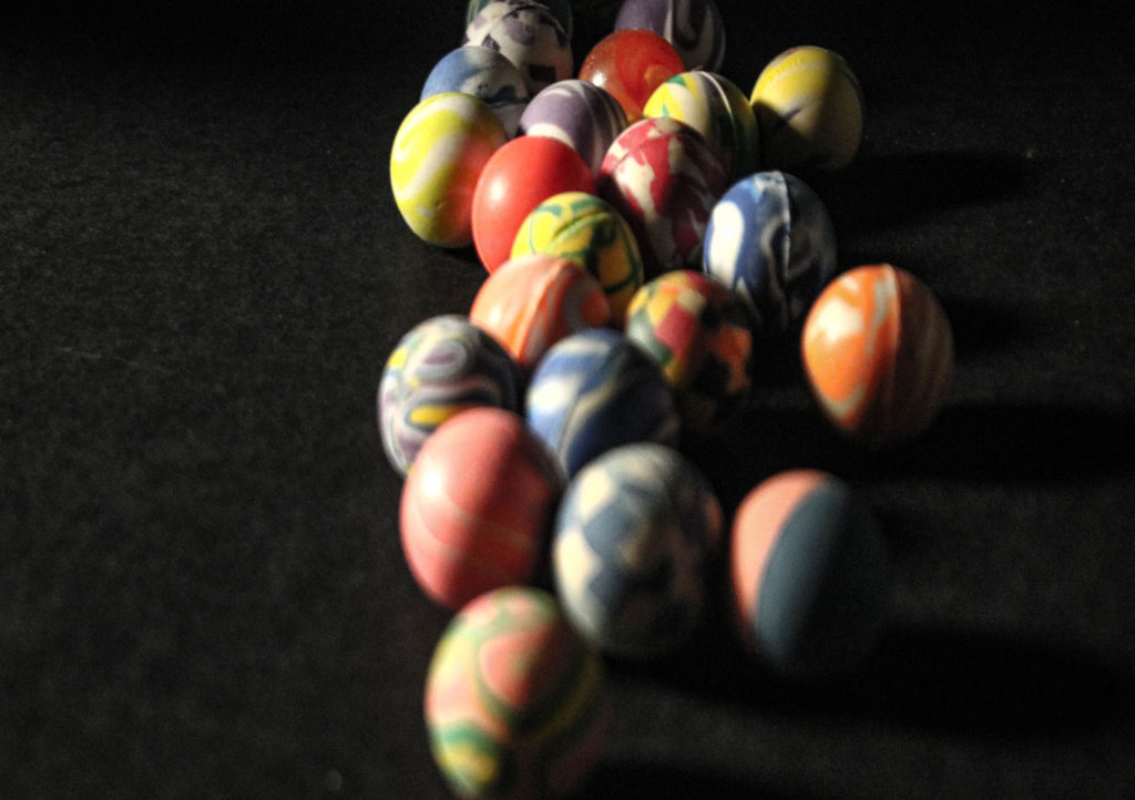
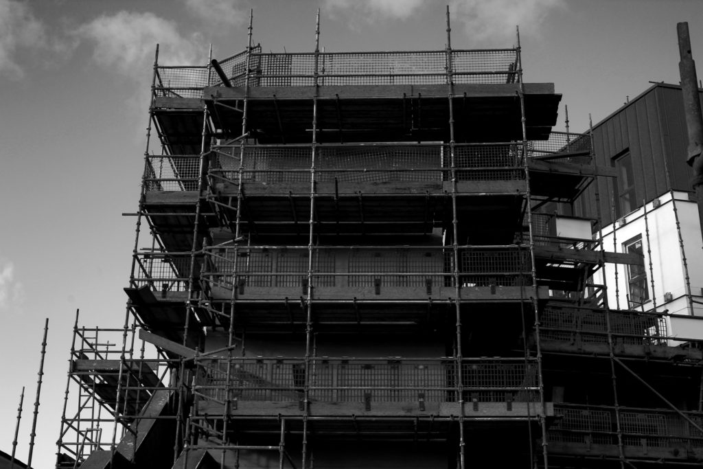
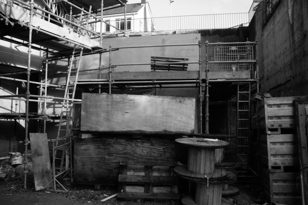
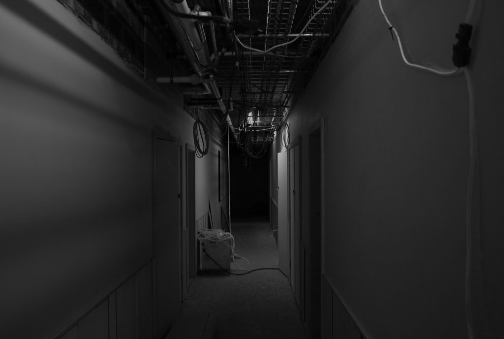
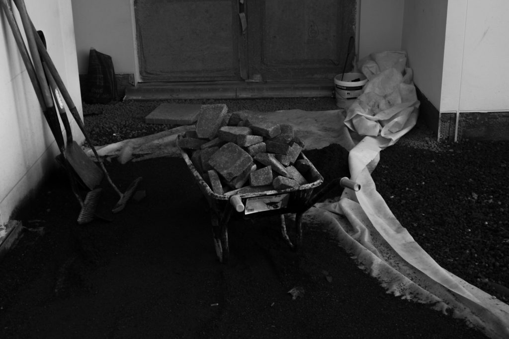
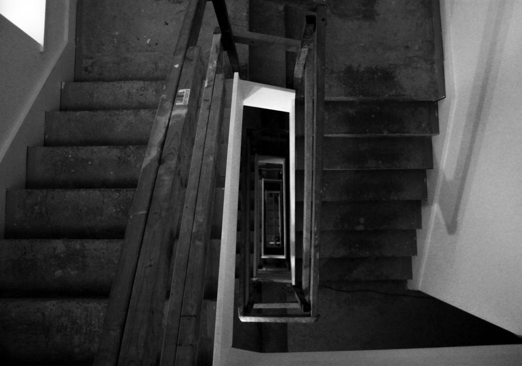
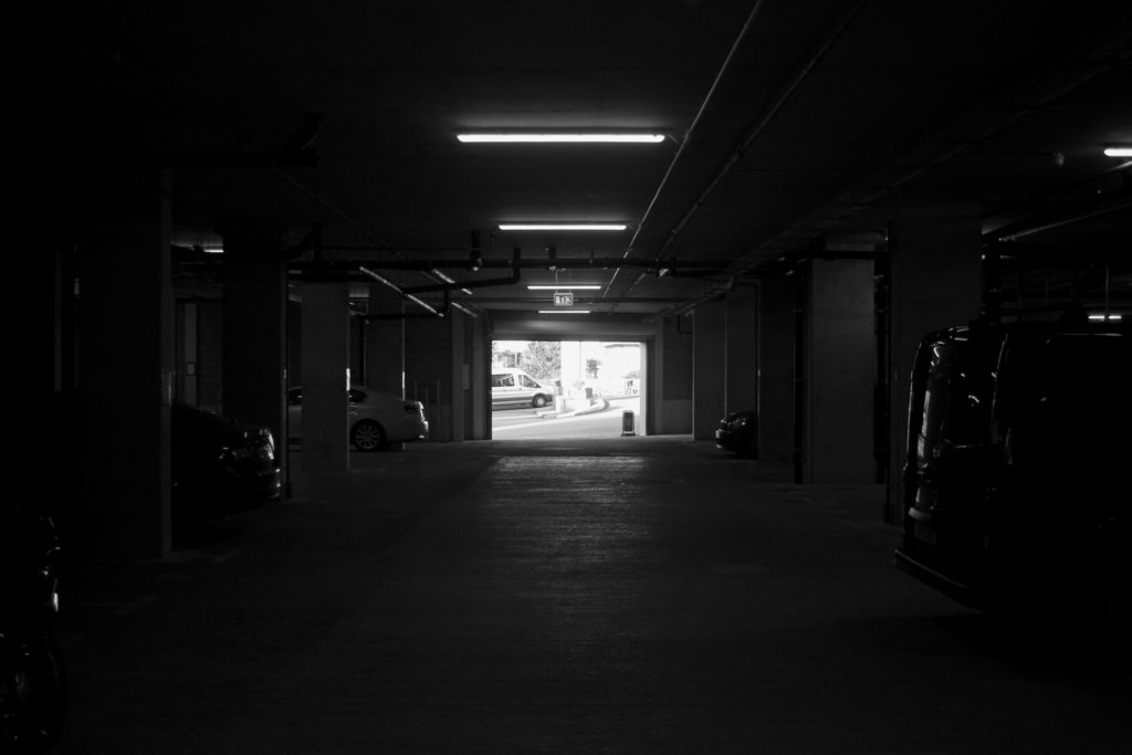
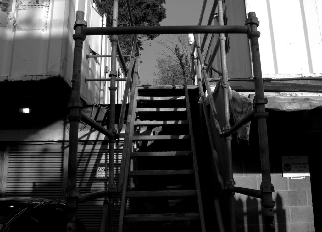
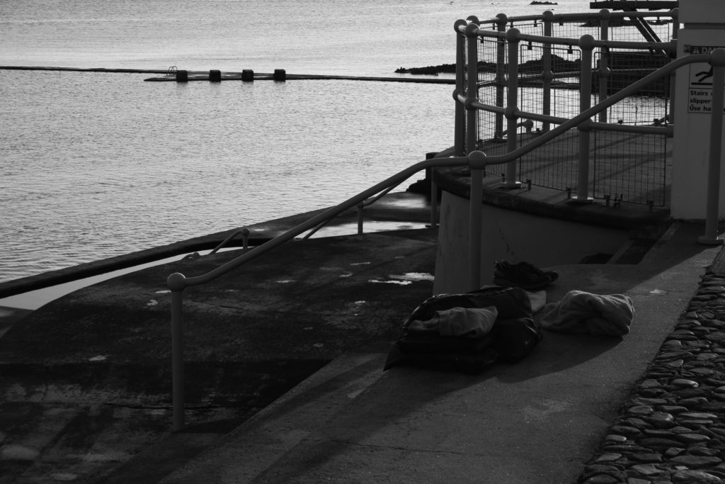
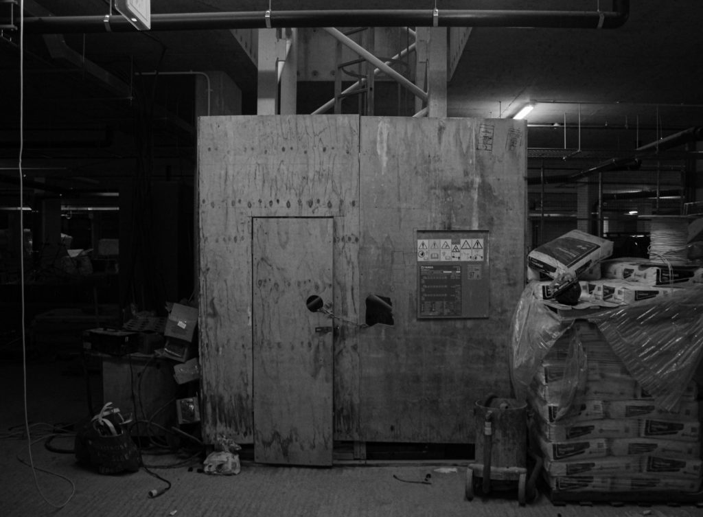
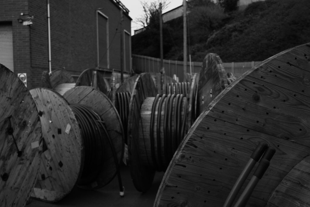
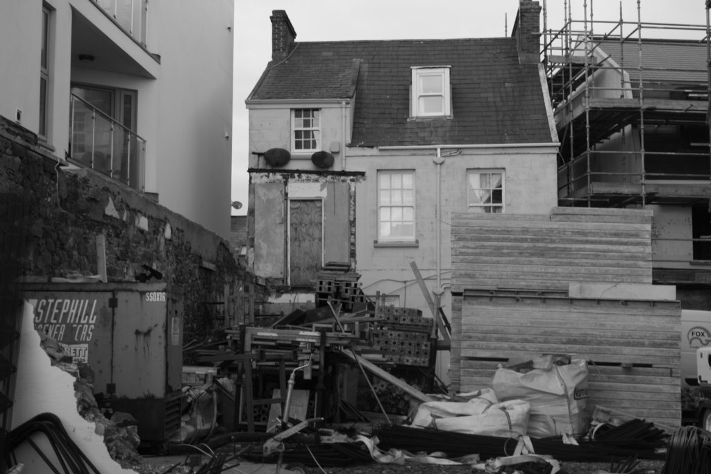
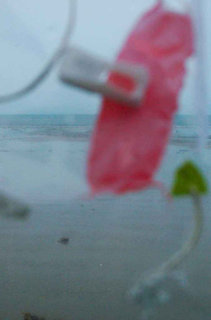
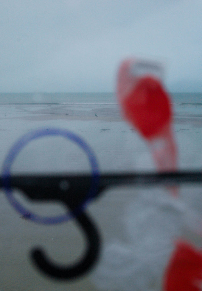
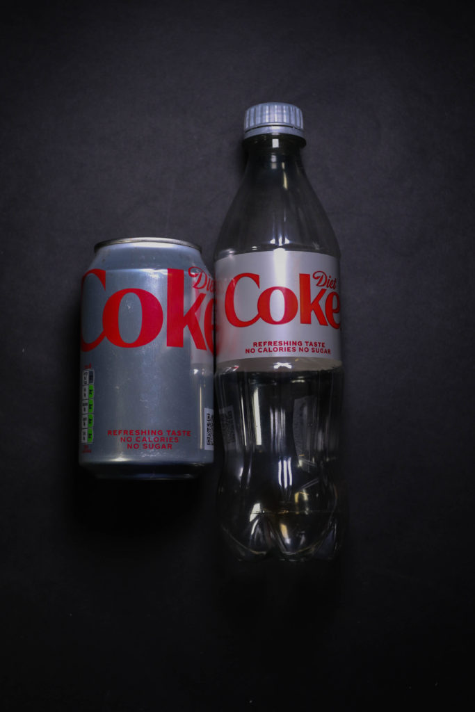
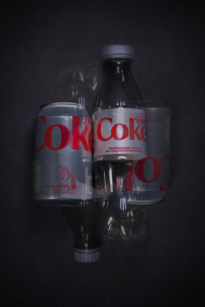
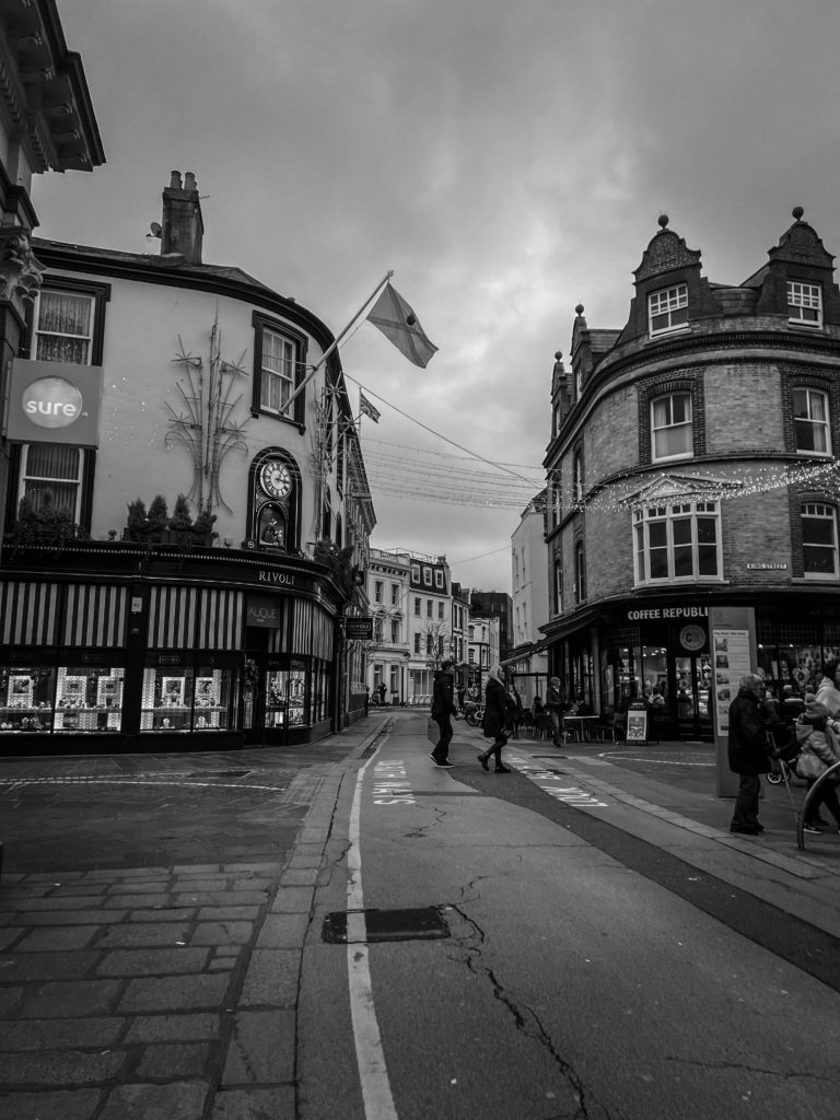
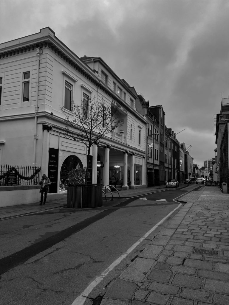
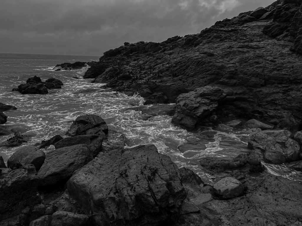
With editing these photos and taking them I had artists in mind Edward Burtynsky, I don’t have drone to take photos on so I to try and get some photos that sort of had the same effect as Edward Burtynsky photos whilst on the ground. I feel like my photos do have the same effect after editing and they make them look even better than the original. for not having a drone to take the photos I believe these are the good photos I could of gotten with the amount of time I had.
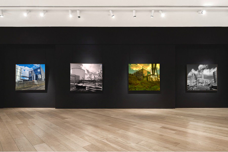
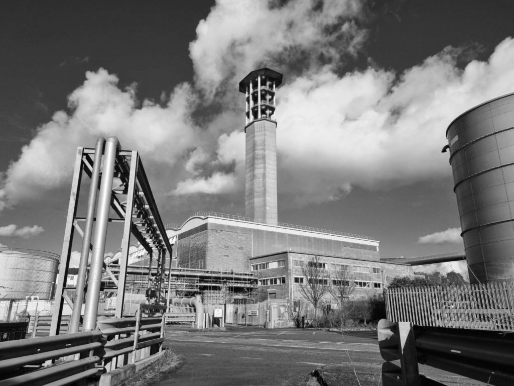
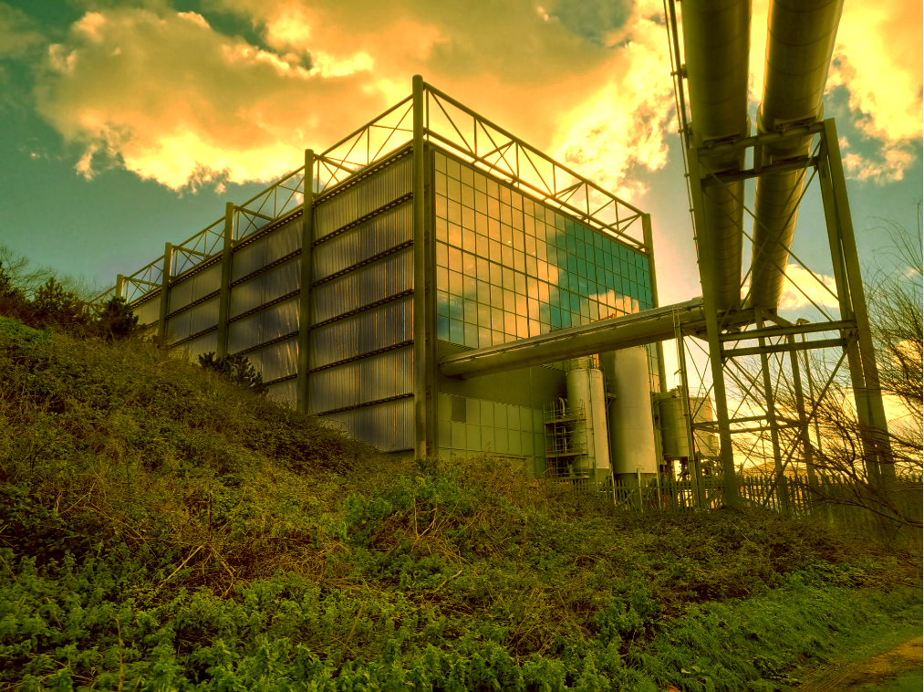

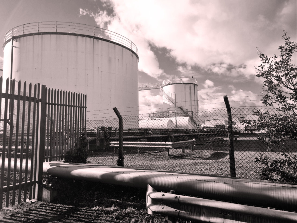

These photos are the same not in a literal sense but in a way where they both have the same tunnel effect. Where there are close up thing on each side of the images and then there leading up to something in the middle of the photo. They are also similar because they are both the out come of heavy industry, my one shows what happens to waste in the western world and Edward Burtynsky one shows what happens to waste in poorer country’s it just left there because in poorer country’s they have other things to worry about other than waste like there safety of there people or crime in there country.

CREATING MY VIRTUAL GALLERY
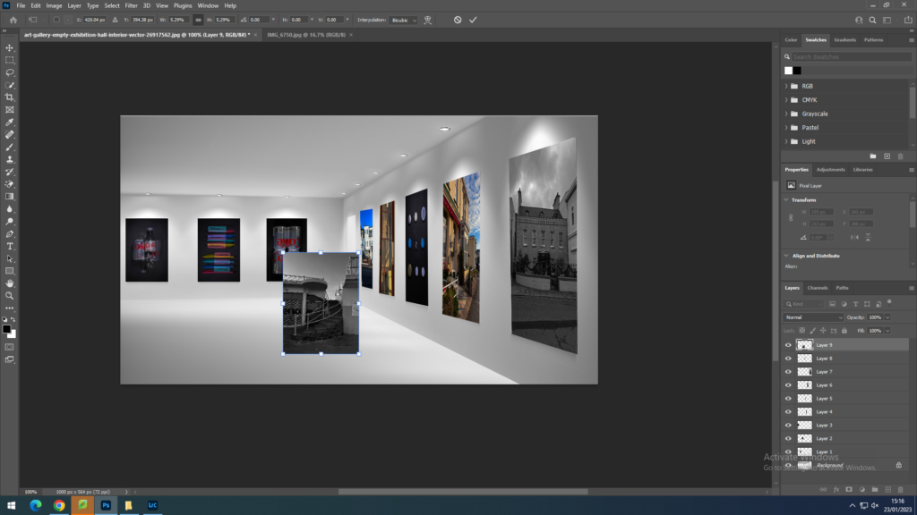
When creating my virtual gallery I used Adobe photoshop. I looked on the internet for photography galleries I could use as a template, however the template also had to fit the aesthetic of my images throughout my landscape project. I used images throughout my landscape project; Topographics, New Typologies, and Anthropocene. I inserted my images from my documents that I had previously edited, using the transform tool I changed the sizing so it fits onto the canvas. On the images that are on the side of the wall I used the ‘skew’ and ‘distort’ tool to size the image onto the side.
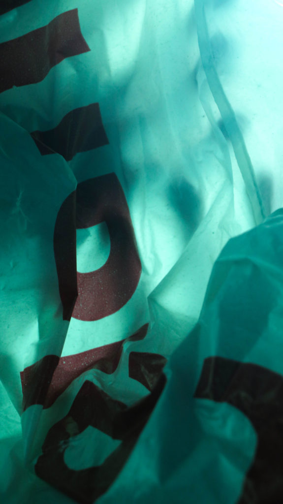
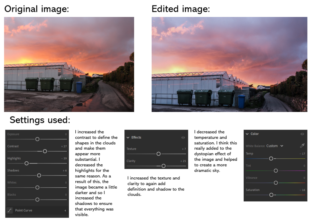
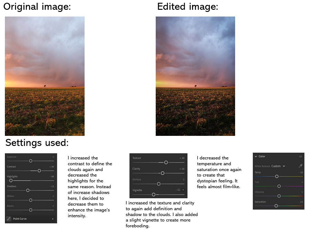
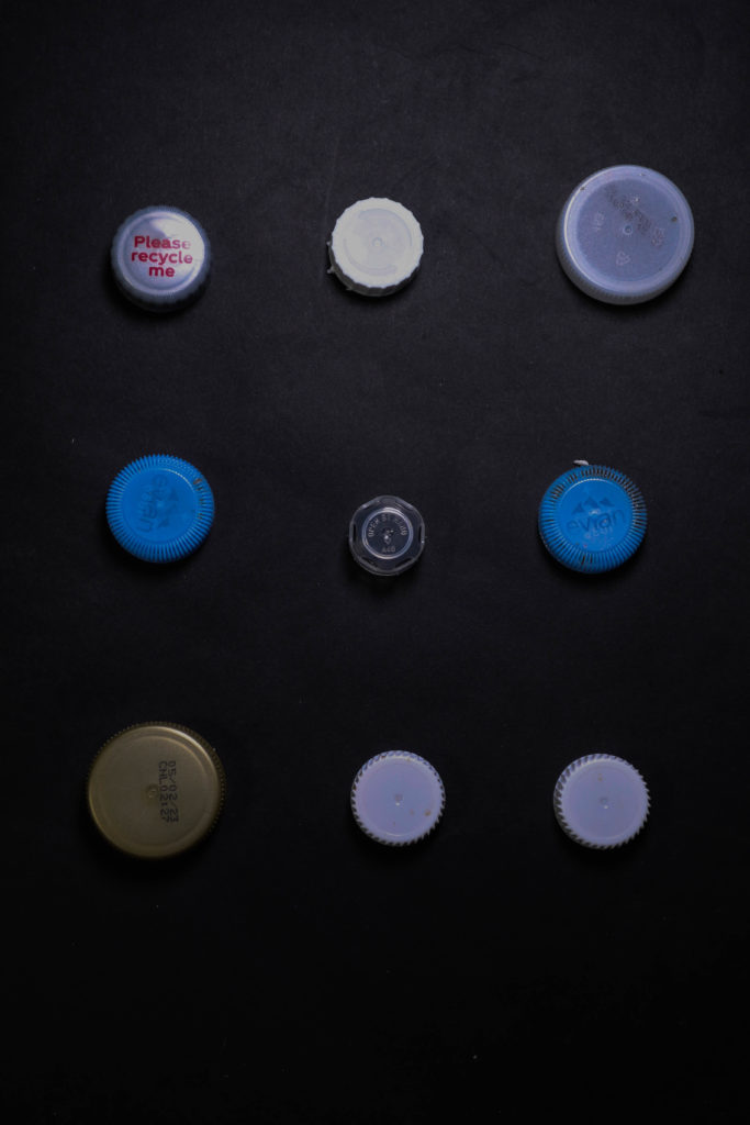
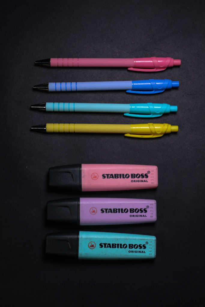
ANTHROPOCENE:
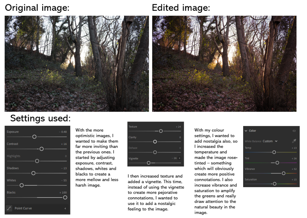
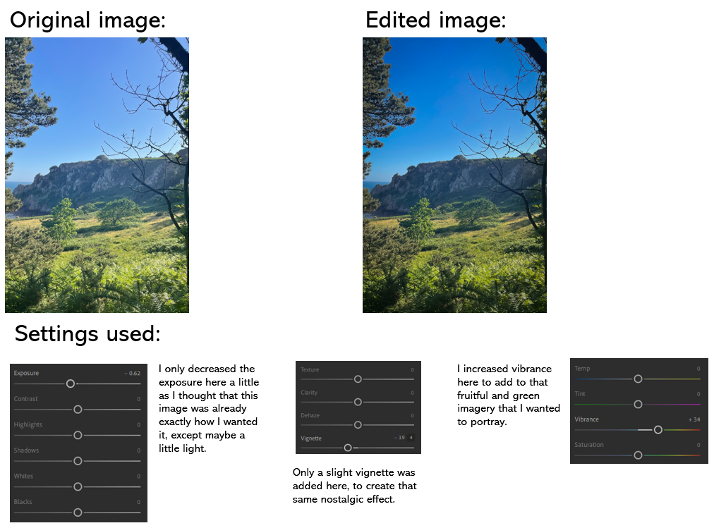
TOPOGRAPHICS:

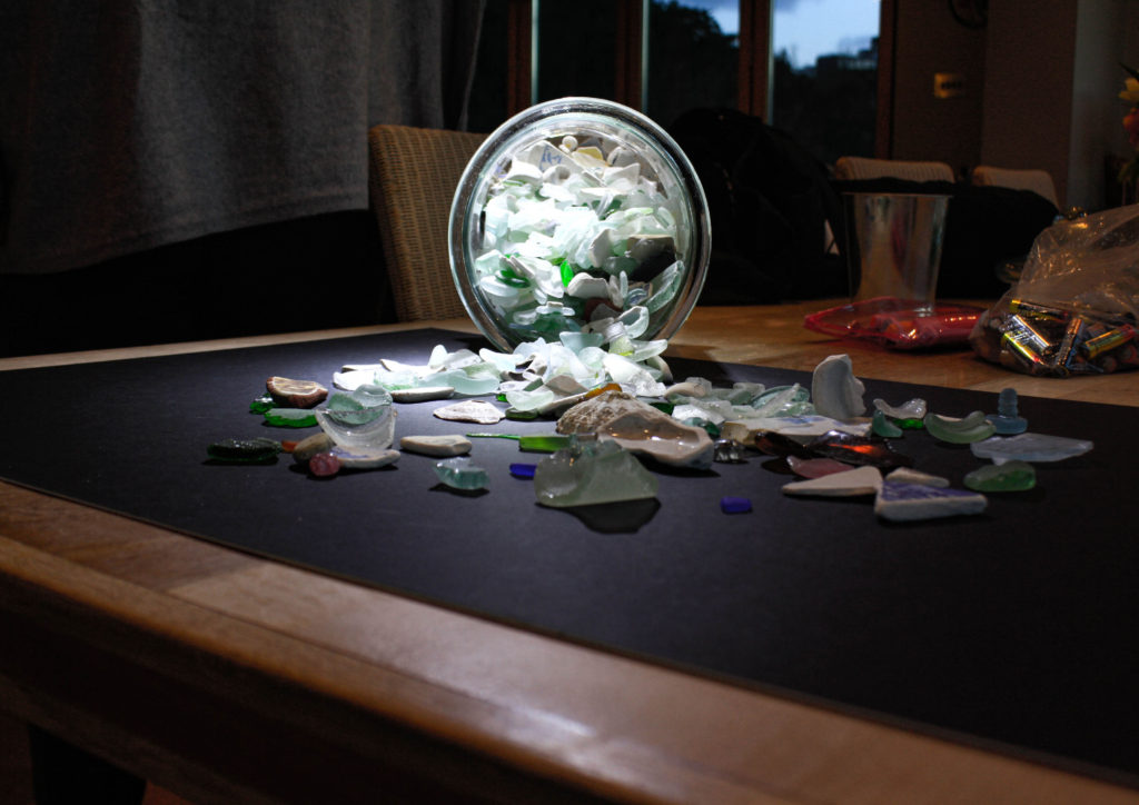
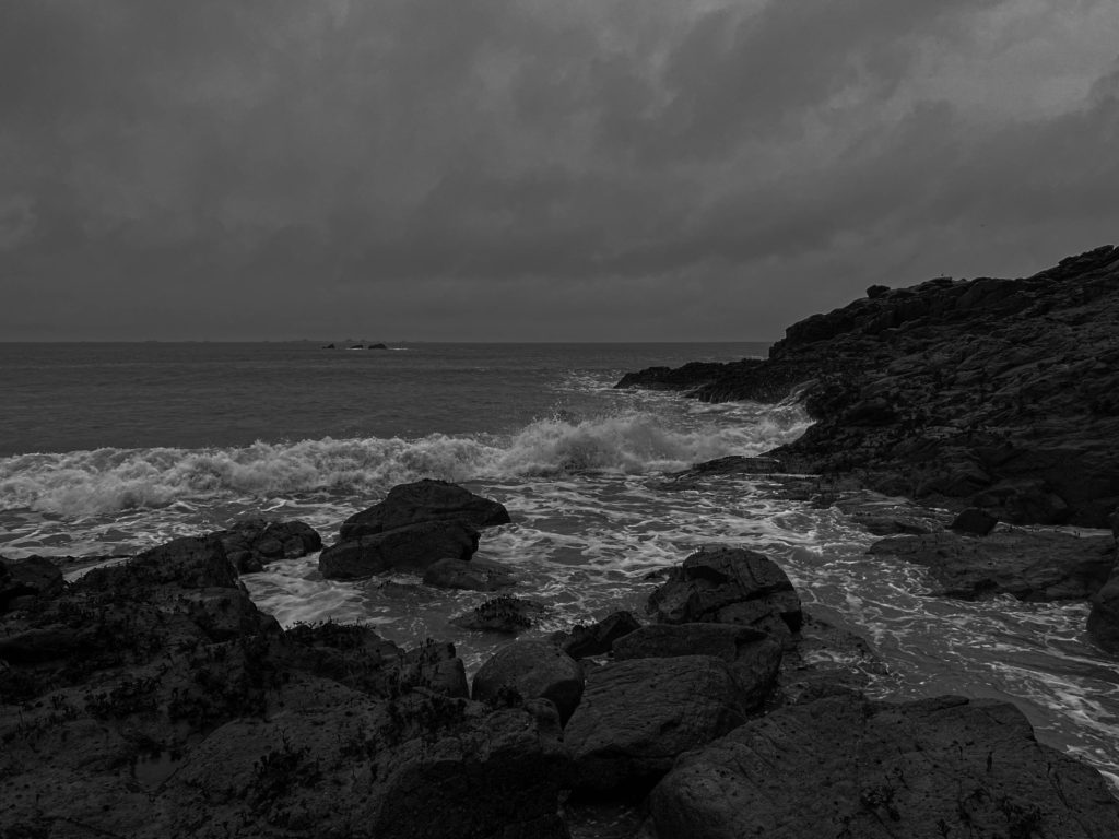
LANDSCAPE: WAVES

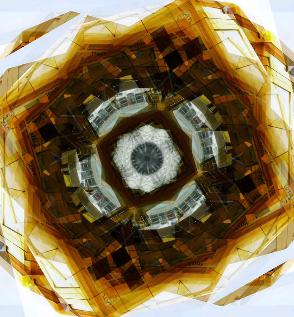
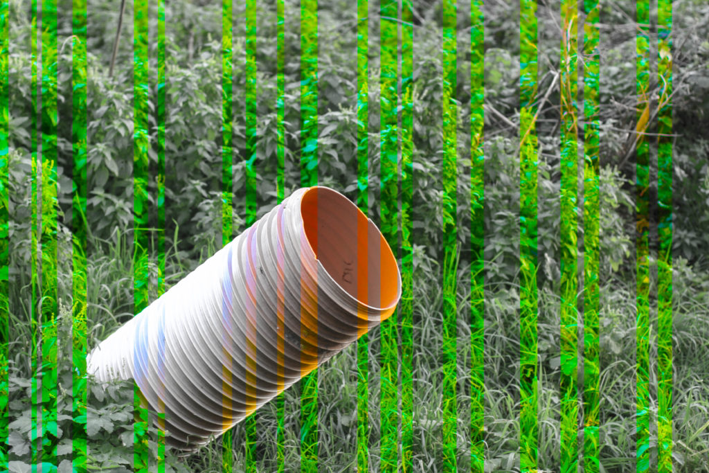
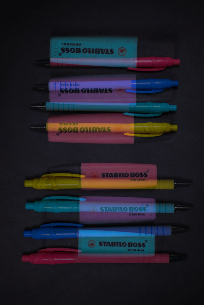
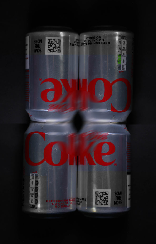
Mr Toft showed us how to do kaleidoscope images.
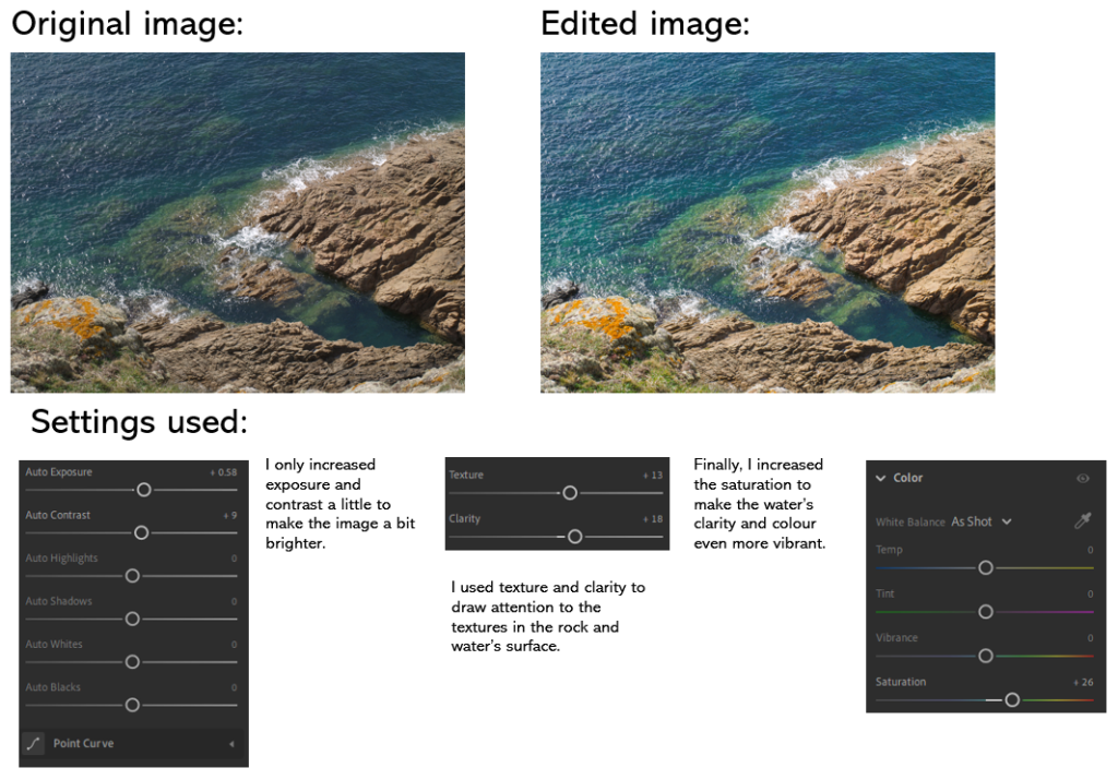
The original image:
This is my final image: