EVALUATION:

WHY THE TOPIC OF PLASTICS FOR ANTHROPOCENE?

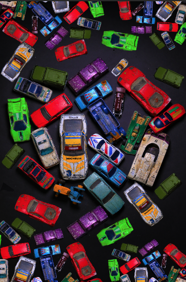
I chose to base my Anthropocene project on plastics. Mankind is becoming dependent on plastic; using it everyday yet all these plastic items are slowly destroying Earth. Mankind is become careless about the way they treat the world and the consequences that faces are due to all the polluting of non-reusables items. My project is supposed to highlight how much plastics we are consuming and showing how much plastic we use on a daily basis.

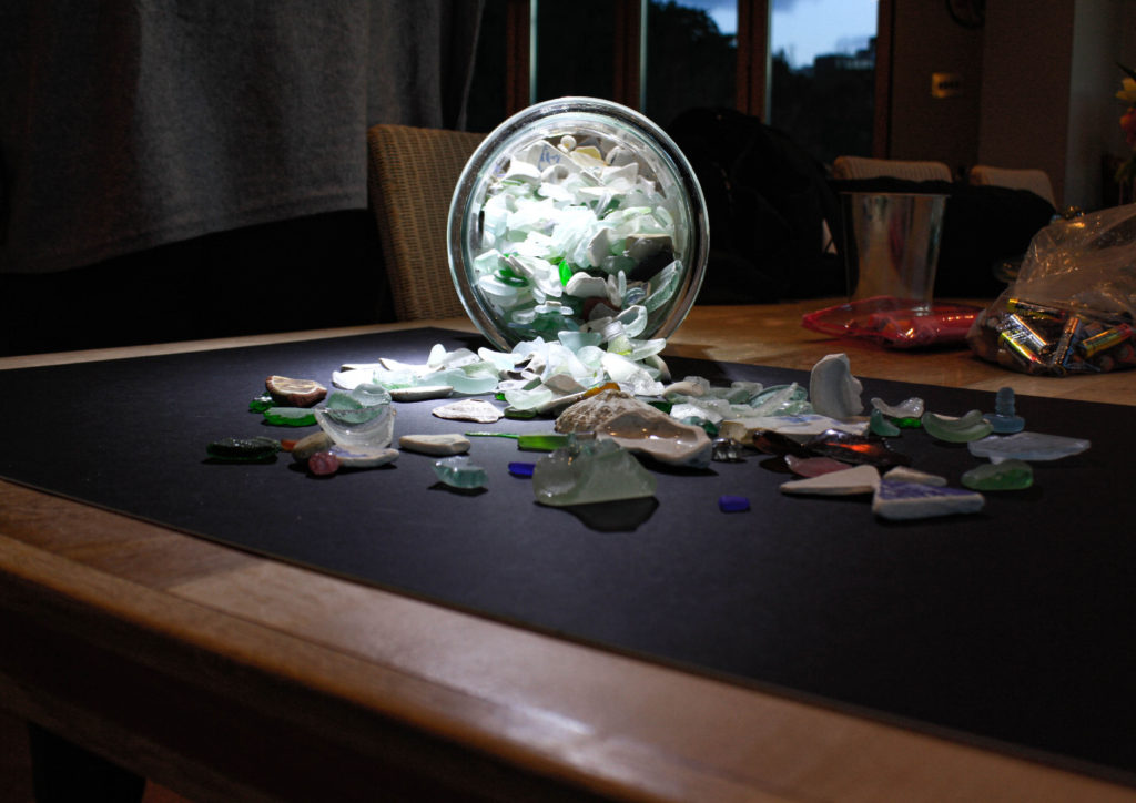
HOW DID I PLAN THIS PROJECT?

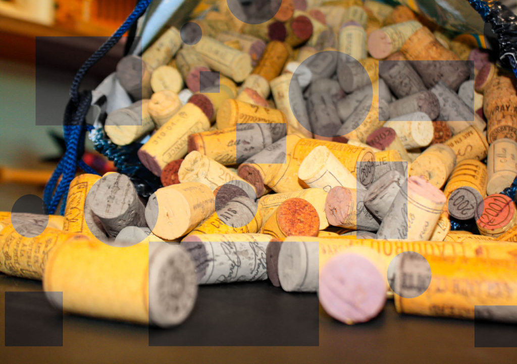
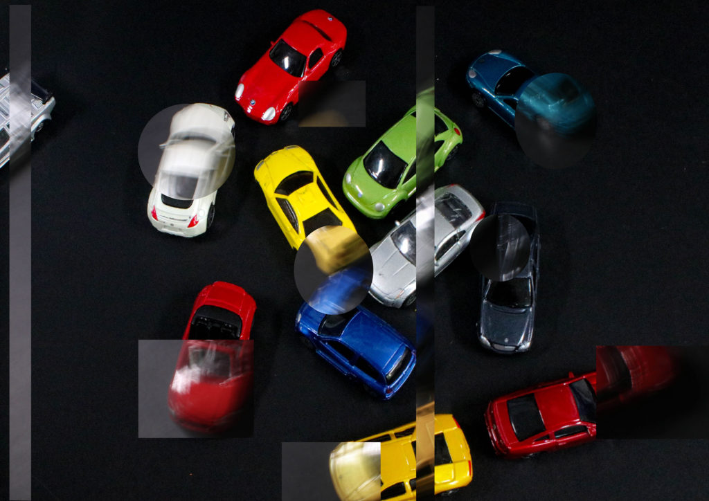
I wanted to show the variety of waste we use in a week that gets burnt or thrown into the sea, this is why I extended my project further from just plastic items to cans and other waste products. I began collecting things from around my house that we use on a daily basis and then collected after a week how many plastic bottles we went through.

PHOTOSHOOT AND EDITING:

I took the pictures in the Hautlieu Photography Studio. This is so they could look more professional. This is because i wanted to use studio lighting to make sure its evenly photographed. I wanted my images to show impact like Mandy Barkers images, I used inspiration from her using a black background to attract the eyes to the colours; I wanted my photos to make a statement. At the beginning I edited my images in Lightroom Classic to reduced exposure and increased the contrast, however later I decided to do some experimentation in Photoshop. I wanted to create abstract images like Mandy Barker.

WHAT WENT WRONG IN THIS PROJECT?

During this project it was difficult to collect objects from my house, mainly because people forgot and threw away the plastics. However the most challenging part was to plan the project out. Planning the project is the most crucial part of the project because if you miss or forget to do something your behind. Furthermore when I was in the studio I thought I had taken more images however when I came back I only had 35, this made things difficult because I didn’t have a wide range of images to work with in editing.

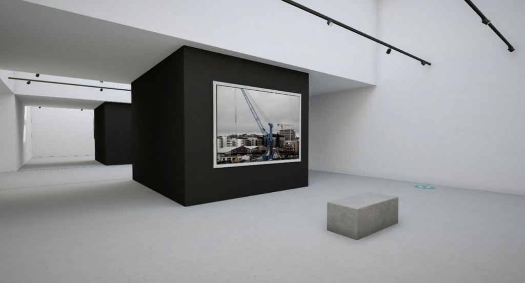
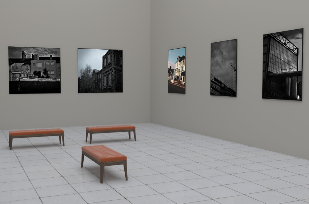
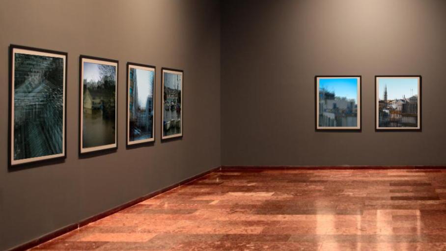
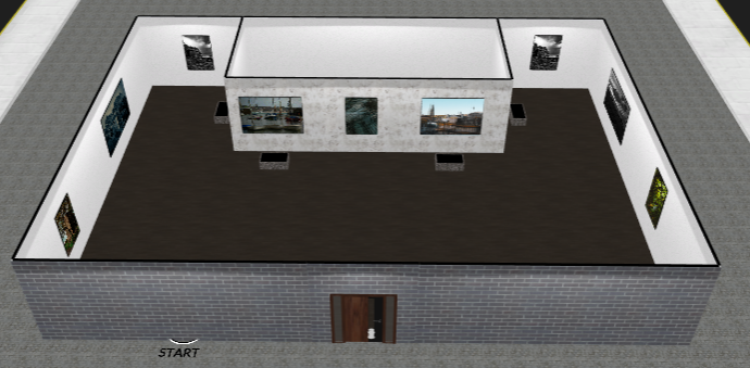
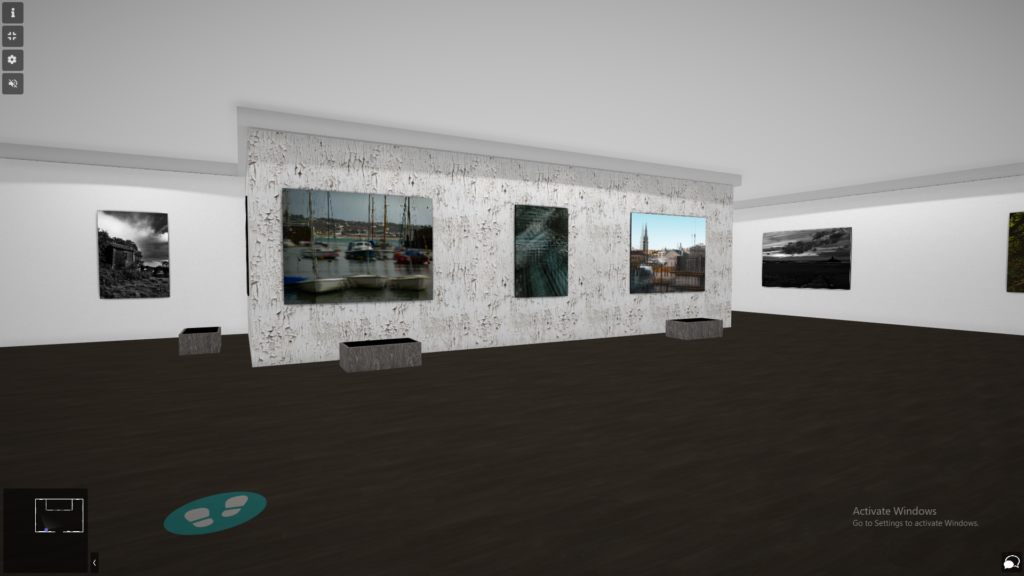
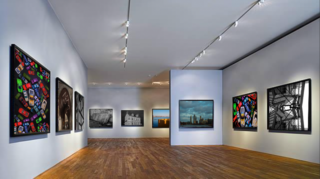
DIGITAL VERSION OF FINAL PIECE:

Digital Version Of Final Piece

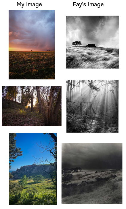
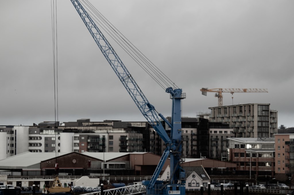
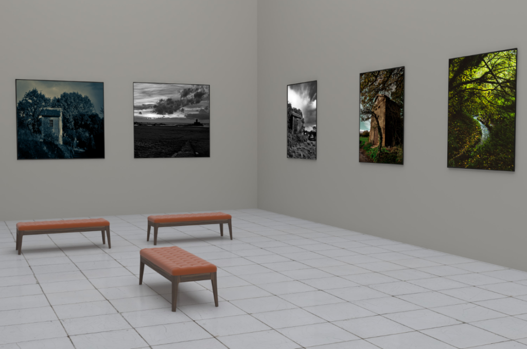
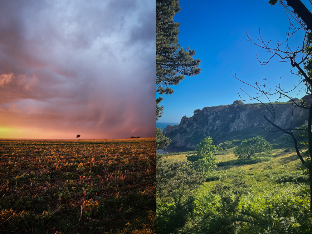
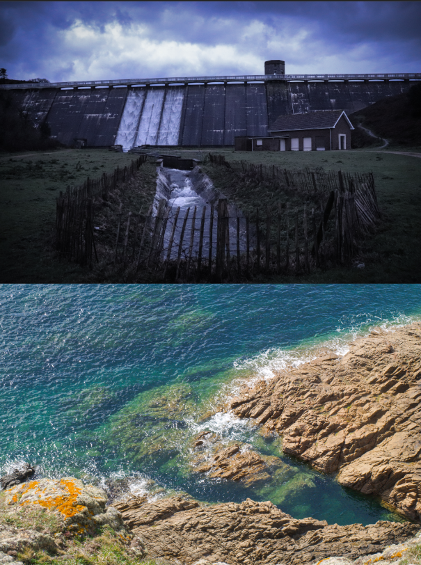
EVALUATION OF WHOLE LANDSCAPE PROJECT:

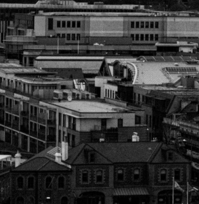
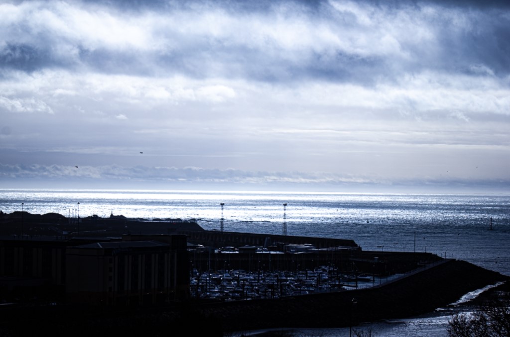
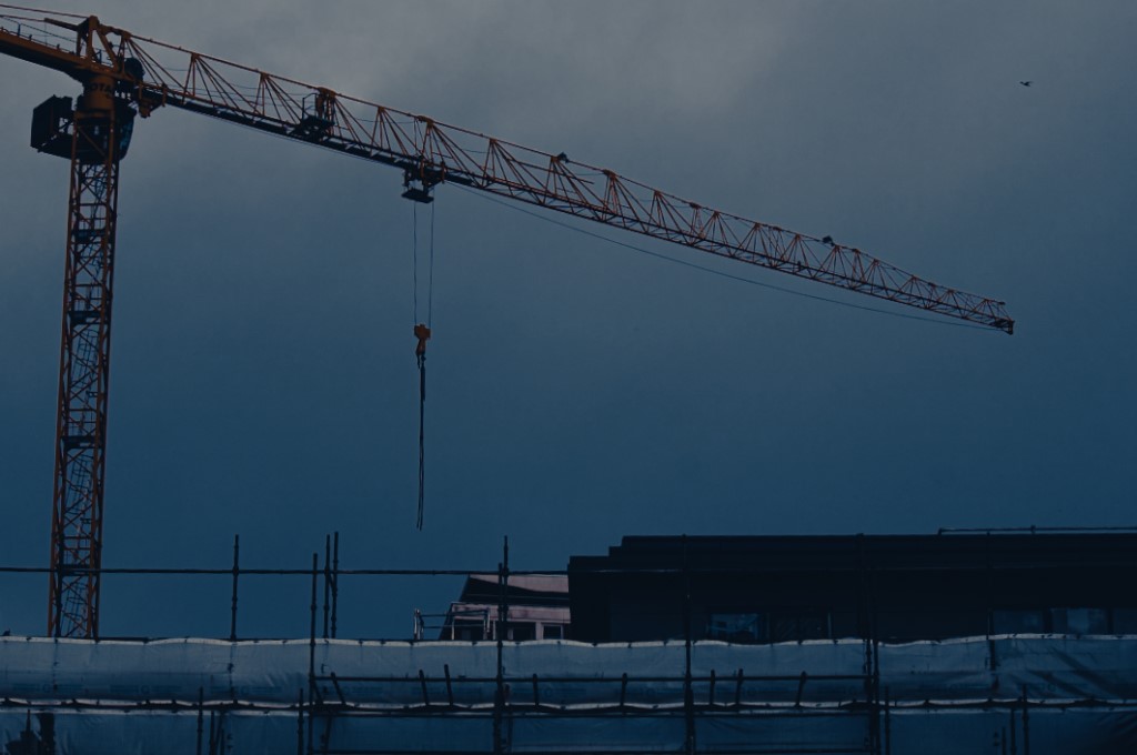
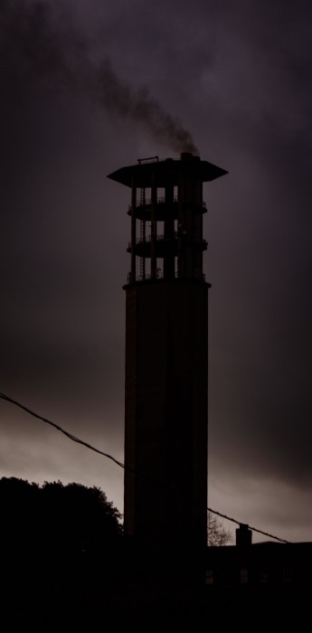
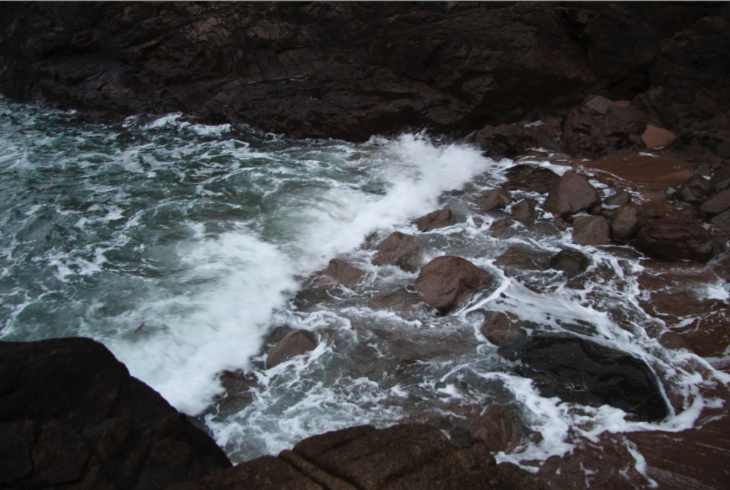
Reflecting on my Landscape project I believe it improved from my first part of my ‘HOME’ project. My blog posts have been becoming regular and creative to look at. My blog posts are minimal with information filled with many links to sites with further information or websites I’ve taken information from. Planning my photoshoots and working overtime has been the most challenging part for me in this project. The weather was rainy and not ideal to take most of my Landscape images, however when I took my ‘WAVE’ images the windy rainy weather created a more dramatic feel to the images. In my next project I will try to expand my blog posts with my writing and more analytical with artist reference and my images; more analysing. Furthermore I need to make time to take my photoshoots so I have a wider range of images to work with when it come to editing.

Evaluation

Final evaluation of project

Overall, I thoroughly enjoyed this project. I really enjoyed taking pictures of landscapes and the themes we did throughout.

I think that my favourite part of this project was the editing as I liked how there were so many possibility’s and moods you could present through your images.

My least favourite part of the project was the artist comparison as I feel like it was difficult for me to create similar images in Jersey when they mainly used city images.

If we were to do this project again, I would improve by taking photos in different places and perhaps try to take some close up images instead of taking them from far away.

Final images

Final image analysis

Urban images:

I really like this image and I think that the multiple layers paired with the busy town go really nicely together. If I could change anything about this image I would want to change the colouring. While I like the colour on the image, I don’t think it matches the style I was going for, and having certain bright areas would look a lot better in this image.

I think this image turned out very well. I like how there’s always something to look at in the image and that the focus point is in the centre. I am also fond of the colours used for this picture. If I were to change anything, I would probably add two more layers going inward towards the photo.

I think that this image is good as the focus point is in the centre and there’s always something to look at in it. If I were to change something it would probably be the vibrancy of the sky as I feel that it takes away the attention from the harbour which is the urban part of this image.

I am fond of this image, the blue shy contrasting with the busy town below creates a nice contrast. I I could change anything, I would crop the image a little bit so that there would be enough sky to have the contrast, but not too much you focus on it instead of the image.

I really like the whole aesthetic this image gives off and i think that the grain on it helps to create a more old timely look. If I were to change anything I would of probably expanded the image to get more in frame.

I think this image has an overall refreshing feel to it. I think the cool colours contrast nicely with the dark town. If I were to change anything I would probably decrease the highlights so that the sky isn’t as bright.

I really like how the tower is the main focus. I also like how highly contrasted the image is. I don’t think I would really want to change anything about this image. If I had to, I would probably add some more highlights.

Anthropocene images:

I like the industrial style this image presents as I think it shows a more modern side to Anthropocene. I also think the cool colouring of the image produce a melancholy mood, making the viewer reflect. If I were to change anything I would most likely edit out the bird in the corner of the photo as I feel it can be distracting from the main focus of the image.

I’m very happy with how this image turned out and really like how prominent the smoke is. I would improve this image by getting rid of the powerline as I feel it obstructs the tower.

This image turned out nicely however, I would of liked to include some more colour to it. Perhaps by making the lamp post have some light on it or finding a way to incorporate the sky light more.

This image shows very well how modernized the world is a will continue to be. The two cranes towering over the buildings below also make for great focus points. To improve this image I would lower the exposure, I like how low saturated the image is but i still feel like it’s too bright.

I think this image shows really well how nature can fight back. I really like the low exposure and black and white tones in this image. To improve, I would make the white in the windows and pipes on the side more noticeable.

This Image turned out okay. I like the view however I don’t think the vintage colourizing really works it it. To improve I would change the tones and perhaps have it in black and white.

Evaluation of the Landscape Project

During this project, I researched both of the main aspects of Landscape Photography; the natural and urban aspects of it with many subtopics. I learnt about Romanticism and the Sublime, Urban photography and lastly the Anthropocene. Each sub- topic introduced me to new photographers and the techniques they use- expanding my knowledge on landscape photography. Overall, I think I completed this project very effectively, exploring the different ways I could photograph my surroundings and capturing any different locations in a variety of styles. One of the most successful aspects of this project, was my experimentation when it came to editing, resulting with many effective and successful edits that linked in well with the artists I focused my research on. Something I could improve on, would have to be the amount of photos I took, resulting with more images to choose from and therefore making sure each image is good quality, making the final edits even better. Furthermore, I think I did well on researching the photographers, my analysis showing my understanding of their techniques and the type of landscape photography they do. If I could change/ add to certain parts of the project, I would research more urban landscape photographers, to deepen my understanding of the topic and therefore make my analysis and comparisons easier to write and more detailed.

Evaluation And Virtual Gallery

Virtual Gallery- Phoebe Sargeant – Landscape Best Images.

Virtual Gallery

I have created this Gallery in photoshop, i selected 9 of my best images and put them into photoshop i then used the skew selection tool to place them so they look like they and part of the photo.

Evaluation

In this project i believe i have done well in it, i have enjoyed taking and creating photos and developing my photography skills, there are still areas i need to improve on but i believe that will come over time and practice.

My favourite piece which i enjoyed making from this project is the cars inspired by Mandy Barker I liked developing my skills on photoshop and cutting out the cars to edit them to create the idea that there were more than the original photo.

This image has an empty alt attribute; its file name is image-1265.png

The photo which i find the most eye catching is the photo of the house i find it eye catching due to the darkness of the sky against the light shade of the house i make the photo in black and white to accentuate the look even more. Due to the photo being taken on a cloudy day the camera didn’t pick up on the glare on the windows from the sun as much.

This image has an empty alt attribute; its file name is image-1292-1024x686.png

The part of the project which i struggled with was taking photos of the sea i struggled with getting the settings right on the camera and as i did not have a tripod with me i found it hard trying to get the camera into focus without it looking blurry, the lighting in the photos wasn’t good either i went out too late, due to me going out in the evening the sky was staring to get dark and there wasn’t much sun light making the photos have a blue tint.

The image below is also one of my favourite photographs i took, i have the simplicity of it and the different shades shown within the image. I took this photo in the afternoon on a light cloudy day, which helped the camera to pick up on the light and make the image clear without making the photo over exposed. I believe that this represents urban landscape well due to the industrial metal framing with the contrast of the clouds which gives it the aspect of a landscape.

The two photos below are my interpretation of Edward Burtynsky he photographs rubbish on a much larger scale, however i photographed rubbish on a much smaller scale. I am pleased with these two outcomes of this topic due to i feel like they show off the damage we are create on the planet we live on and to our body’s, i decided to leave the cigaret buds in the first photo in colour to make them stand out and to show how they damage our planet by just being left and thrown on the ground and if they are damaging the planet how they are also damaging us as humans and our health.

Evaluation of Landscape Project

The landscape project was one I really enjoyed. I got to be creative with the way I put the images together or took the images. Like these ones:

But then I also got to do just simplistic images of the sky or objects like these ones:

In the end, I got to express my photography style in anyway I wanted in this project and that’s what I enjoyed about it.