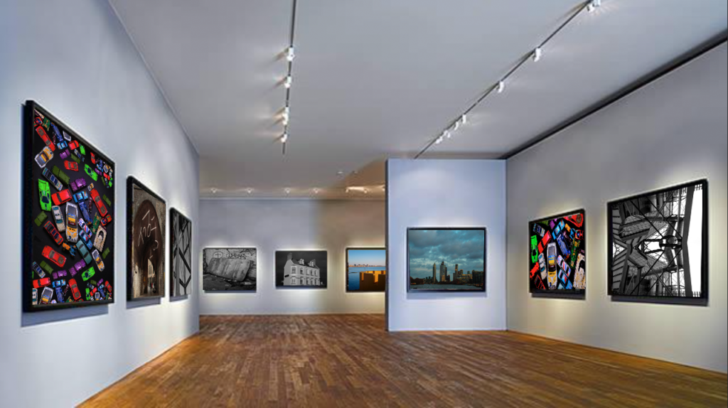
Virtual Gallery
I have created this Gallery in photoshop, i selected 9 of my best images and put them into photoshop i then used the skew selection tool to place them so they look like they and part of the photo.
Evaluation
In this project i believe i have done well in it, i have enjoyed taking and creating photos and developing my photography skills, there are still areas i need to improve on but i believe that will come over time and practice.
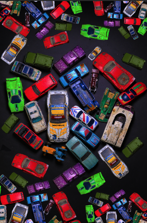
My favourite piece which i enjoyed making from this project is the cars inspired by Mandy Barker I liked developing my skills on photoshop and cutting out the cars to edit them to create the idea that there were more than the original photo.
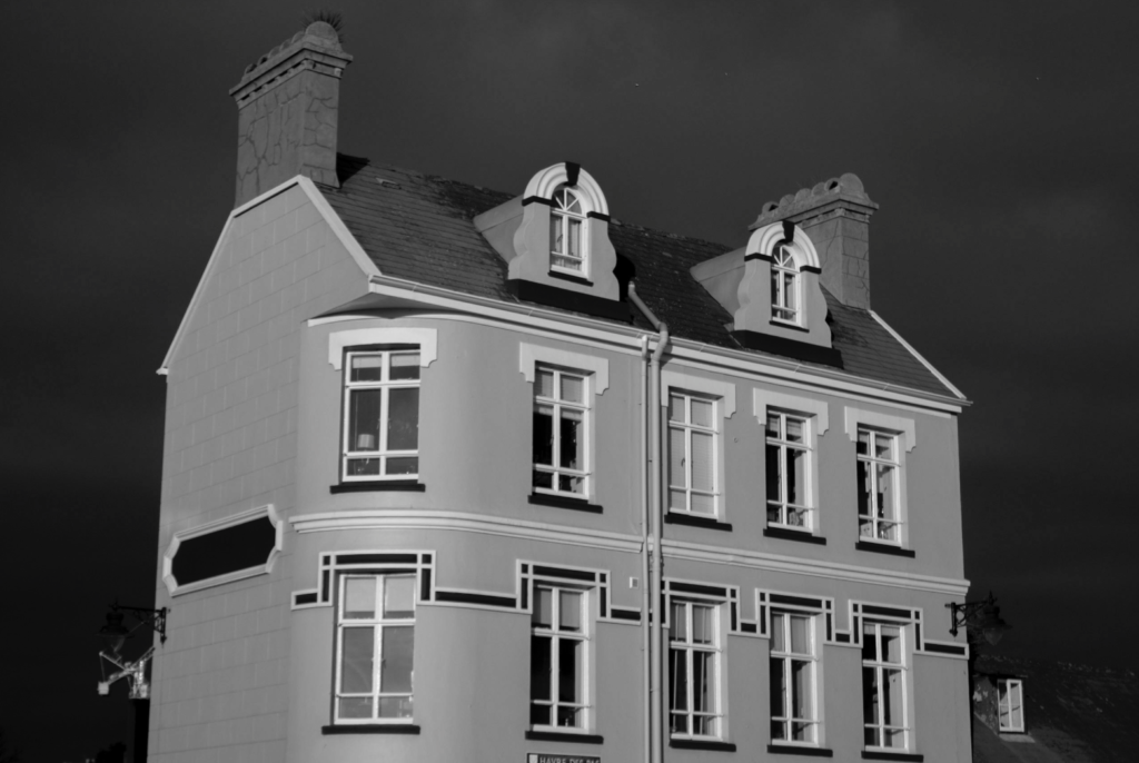
The photo which i find the most eye catching is the photo of the house i find it eye catching due to the darkness of the sky against the light shade of the house i make the photo in black and white to accentuate the look even more. Due to the photo being taken on a cloudy day the camera didn’t pick up on the glare on the windows from the sun as much.
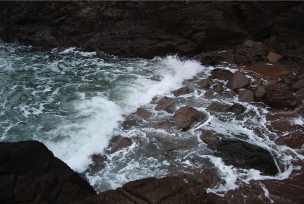
The part of the project which i struggled with was taking photos of the sea i struggled with getting the settings right on the camera and as i did not have a tripod with me i found it hard trying to get the camera into focus without it looking blurry, the lighting in the photos wasn’t good either i went out too late, due to me going out in the evening the sky was staring to get dark and there wasn’t much sun light making the photos have a blue tint.
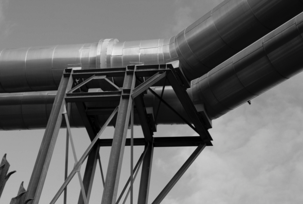
The image below is also one of my favourite photographs i took, i have the simplicity of it and the different shades shown within the image. I took this photo in the afternoon on a light cloudy day, which helped the camera to pick up on the light and make the image clear without making the photo over exposed. I believe that this represents urban landscape well due to the industrial metal framing with the contrast of the clouds which gives it the aspect of a landscape.
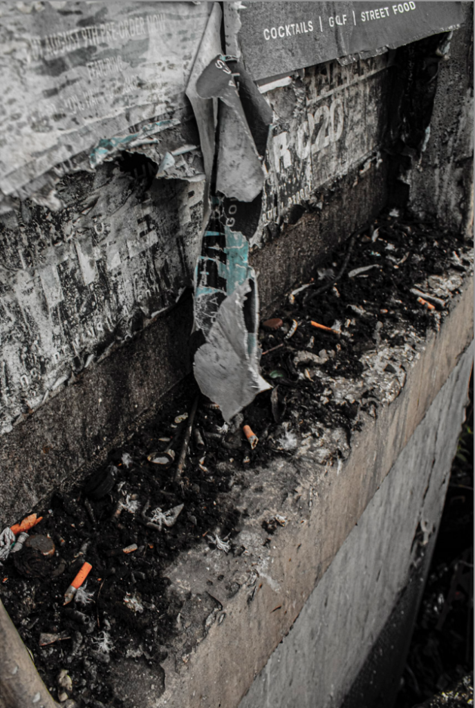
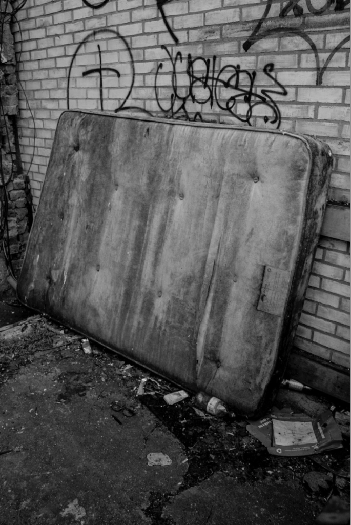
The two photos below are my interpretation of Edward Burtynsky he photographs rubbish on a much larger scale, however i photographed rubbish on a much smaller scale. I am pleased with these two outcomes of this topic due to i feel like they show off the damage we are create on the planet we live on and to our body’s, i decided to leave the cigaret buds in the first photo in colour to make them stand out and to show how they damage our planet by just being left and thrown on the ground and if they are damaging the planet how they are also damaging us as humans and our health.

A thorough and careful approach, with a wide range of image types. Much of your work would lend itself to a picture-story approach…and you should aim to blend documentary approaches with abstract imagery too. Nicely done!