Final Evaluation of Anthropocene

Why did I choose this idea?

When I first began thinking of ideas for this project, I felt that there was a slight lack of accessibility to any ideas that I could choose with complete passion behind them. This due to our general limited resources in Jersey, but also due to personal limitations. By this I mean not having much time outside of school to take images, limits put in place by the weather and any kind of fear felt when it comes to choosing a slightly more unorthodox idea. If I had had the courage, time and subjects to do so, I would have liked to have done a portrait project, as this is my favourite genre and I generally feel more proud after producing a portraiture based project. Unfortunately I felt rather limited on this front due to time restraints and so I looked to landscape, being my second favourite genre. Having just done a landscape project, I had a lot of images available to me as well as the fortunate position of living in St Ouen. I was very interested in the idea of enhancing imagery of Jersey’s natural areas as I personally enjoy these places often in my own time. I think I must have wanted to raise awareness of these places of beauty as it is pretty fair to say that not many people who are residents in Jersey really take the time to appreciate the amazing sights we have on our island, and to me this is quite unfortunate.

How did I plan?

My house is surrounded by the effects of agriculture, yet the area also has some of the most naturally beautiful scenery on the island. The locations of Greve de Lecq woodland, Val de la Mare Reservoir, L’Etacq and Les Mielles nature reserve are all within a very short distance of my house and so this made them easy choices of sites for me to photograph. This is clear in the fact that I was not able to actually get to La Collette (due to its location) in the end and so I did not get any images of the recycling centre. I also regrettably did not make it to Les Mielles just due to general timing restraints as I only had after school to take these images and it would not have been possible to get there before darkness. Luckily, the weather in the week that I had to take images actually offered all the weather that I wanted to capture. Earlier in the week there were stormy days but this was contrasted by the clear sunshine at the end of the week.

Anthropocene mood board

These images all represent and link to Anthropocene as they all show changes being made to the environment and places being polluted by things like plastic. Also land being altered by things like construction workings to make more places for people to live, work and also travel on a daily basis. A couple of the images also show how poorly people live and how bad of conditions they live in. How sea levels are rising because of global warming and how people are having to travel in boats because of the water levels.

Yves Marchand & Romain Meffre

A French photographer duo which work primarily with a large-format camera and they concentrate solely on photographing urban ruins. They both live and work in Paris and at first they worked individually but met online just before their Detroit project in 2005 which Steidl then published is 2010. They have also made a book called Gunkanjima and have done a project which is all about capturing American theatres that have decayed or been abandoned or even been completed transformed.

I find all of their photos intriguing as they all capture places that have been abandoned for a period of time and are decaying. It would be interesting to find out the stories behind all the images of the abandoned theatres and the images taken after the Detroit incident. Most of their images create an empty feeling as there is not a lot happening in them and most of them are plain but interesting.

Michigan Central Station, Waiting Hall, 2008. Yves Marchand & Romain Meffre

About the theatres

In the early 20th century, following the development of the entertainment industry, hundreds of theaters were built across North America. Major entertainment firms and movie studios commissioned specialized architects to build grandiose and extravagant auditoriums.

From the 60’s, TV, multiplexes and urban crisis made them obsolete. During the following decades, these theatres were either modernised, transformed into adult cinemas or they closed, one after the other; many of them were simply demolished.

Newark, NJ, Etats-Unis, Theatres 2006. Yves Marchand & Romain Meffre

This image is interesting as it shows an abandoned theatre which could have once held exciting shows and events. In this sort of image including the rows of seats I picture the theatre being full of people and I picture how the theatre would have been before it was abandoned and becoming almost lifeless. You can see the dust on the seats and the decayed look from the paint having come off parts of the walls. The image is being lit up by natural lighting which is coming through the windows and you can see the light casting on certain areas of the rows of seats. You can also see the organisation of the seats and how they are put into organised rows which is Aesthetically nice to look at.

The ruins of Detroit

Evidence Room, Highland Park Police Station, The ruins of Detroit 2006. Yves Marchand & Romain Meffre

Image analysis

I find this image super interesting because of all the old equipment thats is included and how some of the stuff in the image is decaying and falling apart. There are certain objects, like what looks like a gas mask sat on top of the tv which gives the image a story and meaning. From the image title we know that this is an old evidence room from a police station but was abandoned because of the Detroit incident. The image looks organised but also messy. You see the organised look because of the filing cabinets which are creating organised and straight lines and the Tv being a square shape. But then you see the things falling out of the filing cabinets and how they have a rusty and old look. You also see how the Tv is covered in dust and how there are things piled up and things lying around causing mess and clutter. The lighting in this image look natural as it is not to bright and not dark. There are shadows casting from some of the objects in the photo and there are some dark spots like underneath the desk.
Anthropocene

Anthropocene is a geological epoch dating from the commencement of significant human impact on the Earth’s geology and ecosystems. It is all about capturing the changes and possible changes that people are making to the environment and how people could be destroying the worlds ecosystems.

Edward Burtynsky

Edward Burtynsky, The Anthropocene project.

A Canadian photographer and artist who is know mostly for his large format photos of the industrial landscape. His works depict locations from around the world that represent the increasing development of industrialisation and its impacts on nature and the human existence. His photos capture the changes made to the environment and the things that are destroying it. His style of photography is characterised by the sublime nature of the scale of his photographs. Burtynksy worked with Jennifer Baichwal to create a documentary about Anthropocene in 2018. Burtynsky is considered one of the world’s most accomplished contemporary photographers.

This image shows how in some places there are people struggling with all the used plastic waste because of it all being piled up. They can’t get rid of the plastic as it is not being recycled and used again. It shows us that things like plastic should not be used as it creates dumps and fills up land spaces especially in places where they are not able to destroy or reuse the plastic. It also is dangerous for sea animals as it is being dumped into the ocean carelessly. This image gives a story and insight into how we are badly affecting the environment.

This image shows the process of people making a change to the natural land and how they are about to start some sort of construction. They are moving and altering the natural land to make room for something manmade which is benefiting for people only. This land change could be bad for the environment because of the use of certain equipment.

This image shows how manmade things like roads can alter the natural landscape. Even to make these roads it has impacted the ecosystem, by using equipment and fuels it is causing pollution. Also roads make more room for cars and cars cause more air pollution because of the gas they release.

All of these images include something that relates to manmade things or things that are making the environment and our society worse which links to the topic of Anthropocene and how we are poorly affecting ecosystems and our environment.

Anthropocene shoot

my images:

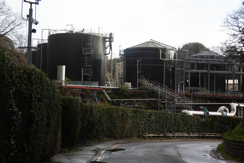
I like how theses image have came out, I think they portray the theme of Anthropocene nicely as it shows how industrial building etc are becoming more and more common all over Jersey and even damaging the island. I think that the carry a message through to the viewers making them aware of what is happening and get them thinking about how they could help or try and do something to help make a change.

inspired images:

My image: Artists image:

Overall, I am very happy with how my artist inspired images turned out. I think that the back backgrounds make the pencils and bottle caps stand out to the viewer and intrigues them into the image. In my first inspired image I like how the pencils draw you in because of the shape and pattern of them, they make you interested and look into the image for the more detail and depth of what the images is made out off etc. If I were to do the image again I would be more persist with the placement of the pencils make sure that they were the perfect length to meet and the corners where my image has a few gaps. I would also use less black pencils so that they could be seen easier. For my second inspired image I like how I have used a range of colours and different shaped/sized bottle caps, as it makes them very bold with the background being black. I think my second image is more the style of Barry Rosenthal’s work rather than inspired by his image as they are quite different, therefore next time I would use the same colour caps and place them in a more structured layout. For my final inspired image I think it works very well from far away as it looks very similar, however I have used coloured pencils as opposed to plastic straws like Rosenthal. I still like the image as it is very bust with the pencils being scattered rather than placed. If I were to recreate it again I would use straws instead as well as using more as he has more straws in his image than I do pencils. As a whole I like how my images show how regular items, that many don’t think of, can become something more than rubbish or wasted products.

For my final images I have chosen to use my three Barry Rosenthal inspired images as well as a few of my edits using the industrial images seen on the blog post above.

mock process

selection process:

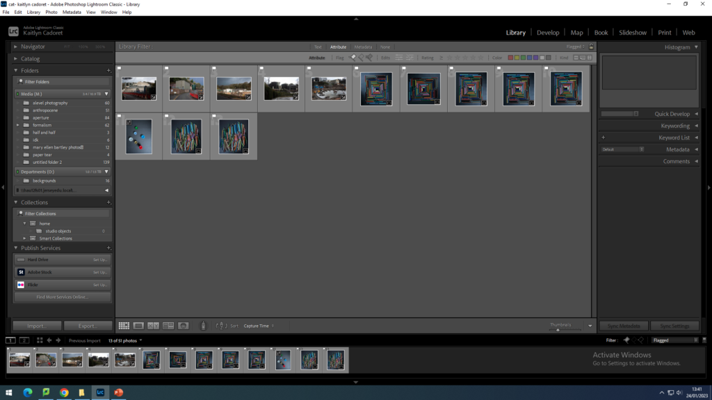
Firstly I opened up my images on Lightroom and went through them all selecting that images I wished to use using ‘x’ to reject the image and ‘p’ to pick the image. I then filtered my collection to only have my selected images viewable to create my final selection.
final selection

Artist inspired edits:

For my first edit I was inspired by Barry Rosenthal. I used bottle caps of different colours, shapes and sizes and placed them on black card photographing them. As you can see above I then selected the background and filled it in black to make it sharper.
I then began to use the quick selection tool and selected the individual bottle caps. layer via coping’ them and moving the duplicated caps around to fill the image.
For my second edit, also inspired by Rosenthal, I used old pencil colours and pen lids to create a square shaped pattern on black card. I then used Photoshop and the quick selection tool again to select the background and filling it in black to make the pencils stand out more prominently.
Lastly, I cropped the image to make sure that the pencils were in the centre of the image.
For my last image inspired by Rosenthal, I used the same old pencils and laid them all out on the black card randomly. In photoshop I then used the quick selection tool and selected the background. filling it in black to make the image sharper.

Industrial edits:

For my next two edits I used some industrial image that we taken at bellozane. I opened up my image on photoshop and duplicated the original image. I then filled the second image one with white and the other with black.
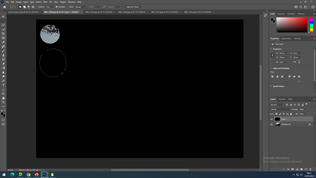
I then began to use the elliptical marquee tool to select circles all over the image, revealing the original image behind.

I repeated this on both images creating a stencil like pattern over the image.
For my fourth edit I also used one of my industrial images, and the elliptical marquee tool. I used the tool to select a circle in the middle of my image, before layer via copying it and using CTRL + T to select the circle. I then rotated the image slightly to the right and repeated this process multiple times until I got to the middle of the first circle.
For my fifth edit, I used another of my industrial images and the rectangular marquee tool as seen below. I used the tool to select rough squares of different sizes and layer via copied them. I then used CTRL + T to select the squares and moved them to a different part of the image. I repeated this multiple times until the main part of the image was covered.
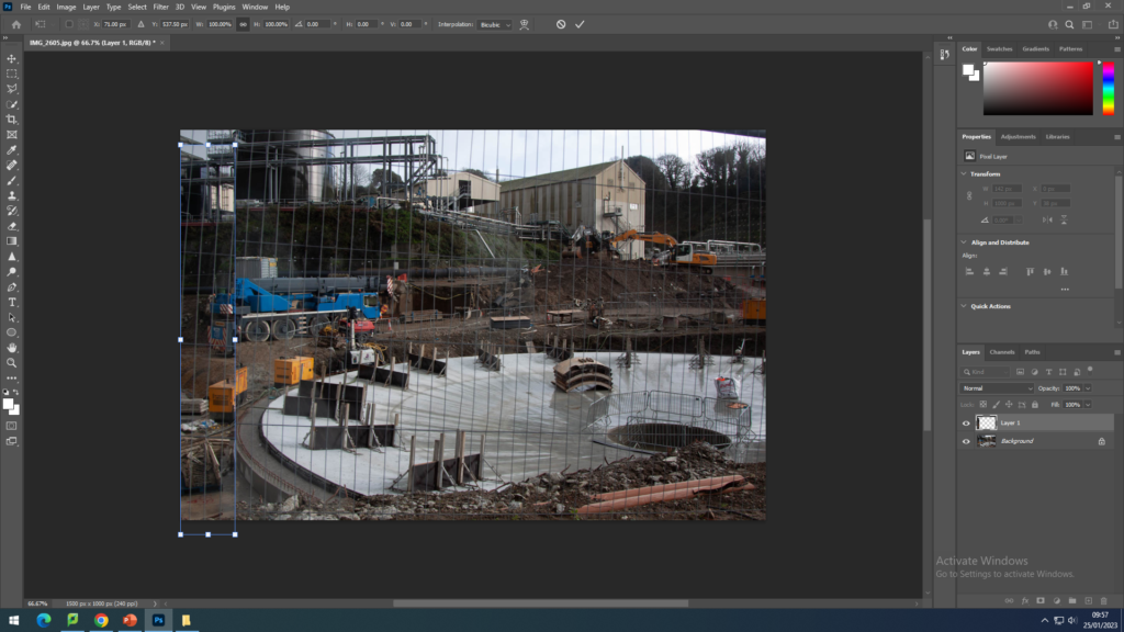
For my final edit, I used my last industrial image and the rectangular marquee tool like in the edit above. This image I selected rectangles in columns and also layer via copied them. I then also selected them with CTRL + T and alternately moved them either up or down slightly. I repeated this until the whole image was distorted.

EVALUATION

Why did I choose rural landscapes for Anthropocene?

I chose to do landscapes as its my favourite way to photograph, i prefer having a bigger picture of the scenery, rather than photographing specific objects up close. I also didn’t want to limit myself to a certain topic such as plastics. Whilst doing research on artists who base some of their work off Anthropocene I became inspired by Axel Braun who had photographed rural landscapes and also urban structures such as electric towers (within rural areas).

How did i plan?

Initially, I planned to do three photoshoots: Land erosion, Reservoirs and electric towers. I ended up completing two and also taking a variation of any other scenery whilst i was out photographing. I picked days when it wasn’t raining and more of a clear sky, also going out just before/ after the sun had set to create a darker more relaxing lighting. Since it had been raining consecutively for the previous few days there was a few land slides on edges of banks and also found flooding on a filed which had shown the bank eroding into it. Id say I definitely attempted to thoroughly go by my plan but as always ended up changing things last minute due to the weather and amount of time I had. For example I planned to go to Val De La Mar but the busses were too long and sun would’ve already set and i only had week days after school/ evenings to carry my photoshoots out.

Photoshoot – experimenting with editing

Whilst carrying out my photoshoots i was mainly on the north coast, ensuring there was no rain and a clear view to enhance my images and make them more clear, having a dim lighting helped give my images more character rather than broad daylight. However, it was very muddy and difficult to get to certain places but especially for one of my final images where im capturing land erosion i had to walk quite far and try get to the location which was quite steep and difficult. My shutter speed was on the wrong setting which therefore created my images to come out more blurry than i expected, this was frustrating as all the other images were fine and i couldn’t properly look back to check (land erosion images). After uploading all my images to the media drive i began editing them in Lightroom and photoshop, keeping in mind i didn’t need to edit them dramatically as Axel Braun’s landscapes were very simplistic. Although, with one image i took from underneath an electric tower i experimented with editing and i like the outcome which is why i have put it into my print folder and final images. Other than that i enhanced the exposure, contrast and texture on my landscapes.

What could’ve gone better/ went wrong?

Firstly, not completing all three of my photoshoots was frustrating as i specifically wanted to do reservoirs to compare with Axel Braun’s images, if I had more time I would’ve been able to do this. I also hoped my images would come out in better focus and more detail, the reasoning they didn’t would be due the camera settings most likely which i couldn’t really work out what the problem was; it was also quite windy effecting the cameras accuracy and how still i was holding the camera. Overall, i need to improve on trying to get images which resemble my artist references style as much as possible to make it obvious what I’m attempting to recreate.

Overall evaluation on Anthropocene:

I enjoyed doing this project but wish I had more time to complete my photoshoots to my best ability, I am pleased with my final outcomes however I do think they are limited and that i could do much better and more on task outcomes.

Anthropocene – Vilde Rolfsen

Vilde Rolfsen is a fine art photographer based in Oslo Norway. In her work ‘plastic bag landscapes’ Rolfsen scrunches plastic bags and photographs the inside to create abstract landscapes whilst addressing the effects of plastic on the land and oceans.

Vilde Rolfsen first started noticing the impact of plastic on the environment when living in London and the abundance of plastic bags and litter in the parks and city. The whimsical Plastic bag landscapes were a response to this. “I didn’t want to do something that was too in-your-face, because I think that puts people off.” – the compositions are inspired by her home country of Norway and its mountains, recreating the natural with the man made.

Rolfsen uses unatural pastel colours in her work attributing to the artificial feel whilst still be pleasing to look at. The shapes and texture created by the bags are natural looking almost like glaciers or mountains which contradicts the material they are mad with – Rolfsen modeled the bags after the Norwegian mountains. She uses vignette depth of field to focus the centre and have the edges unfocused and uses low iso to have sharp images.

Evaluation

Throughout this project my main aim for my images was to explore the environmental consequences of the construction industry and how it may effect the future generations if it is not changed somehow, during my research i was astonished with the actual impact construction waste and extreme over construction has on our planet and day to day life. According to new research by construction blog Bimhow, the construction sector contributes to 23% of air pollution, 50% of the climatic change, 40% of drinking water pollution, and 50% of landfill wastes, These statistic are huge and i believe they should be really brought to the table when talking about climate change and the way humans are impacting the world, This really fuelled by intentions when taking these photos since being a teenager in jersey the overexploitation of construction jersey is greatly impacting the islands future with property value sky rocketing, this means children and young adults on the island will find it extremely hard to ever have a future one day without having a large amount of money.

For my photoshoot I went to a construction site on Wellington road in St Saviour as I had permission to walk around with a member of the management system who agreed with the research I was doing and showed me many stages of the construction and different forms of wastage throughout, from air pollution to wastage of materials such as wood and plastic i cant begin to imagine the sheer amount of waste that occurs across the world let alone one site.

My images are all in black and white since I believe that its displays the message that it is almost as if humans will de evolve if something isn’t done to save our planet. Although the style of my photos are Anthropocene, I did not want to have any people in my images since i thought it may take away from the dramatic affect of the shoot and will leave an image in the viewers head that the fact there is no people around may be the case if the environment isn’t saved sooner.

Throughout the shoot I used high shutter speed to captures has much detail and to not allow a lot of light in as a i like to have a dark gloomy style to my images.

Overall i think my photoshoot was a great success and i believe i managed to capture some great shots for the ideas I wanted to share.