Action plan
For this photoshoot, I plan to take pictures of city styled buildings, preferably with lots of them all together. I then hope to edit these images in different ways.
Photos

Edits and how I did them:
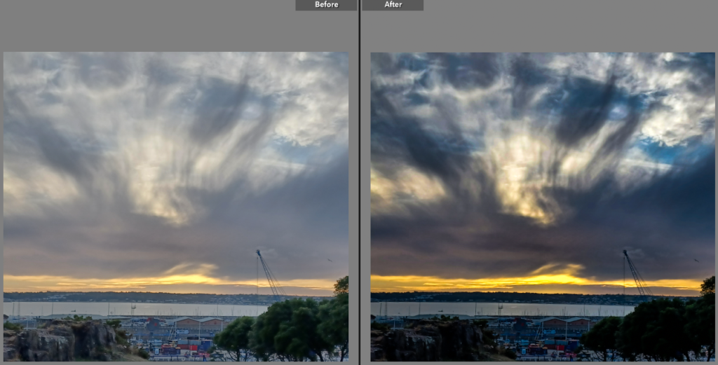
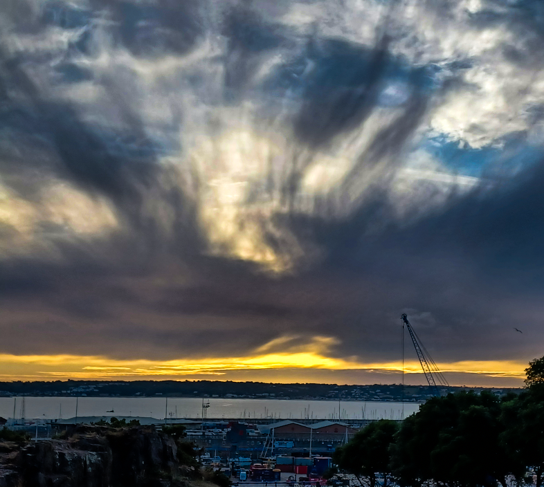
- lowered exposure
- increased vibrancy and saturation
- decreased shadows
- increased highlights
- increased clarity and dehaze
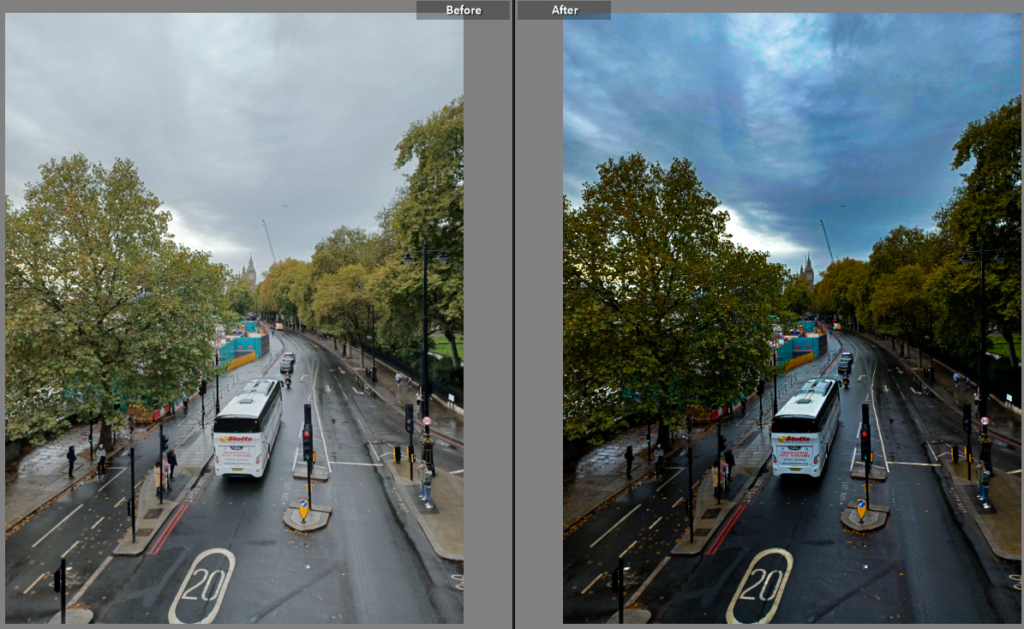
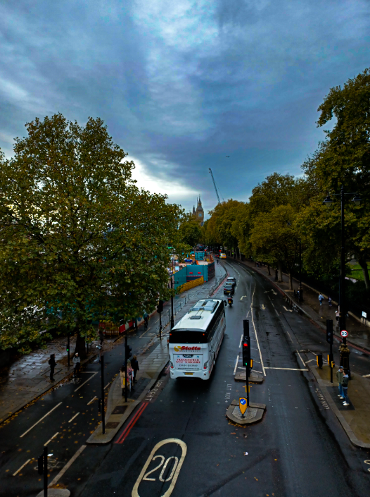
- decreased exposure
- increased contrast
- increased clarity
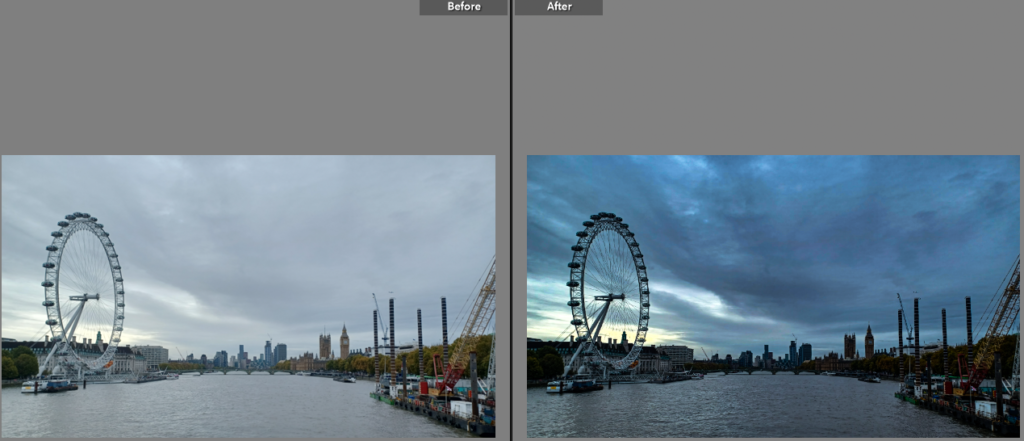
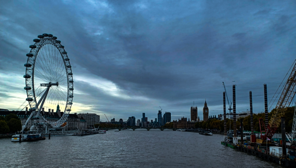
- lowered exposure
- increased clarity
- lowered temperature
- increased highlights
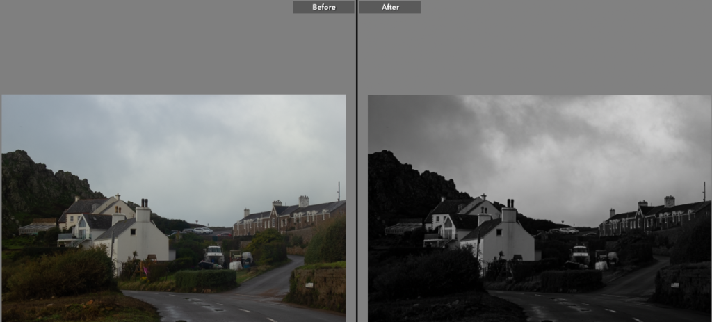
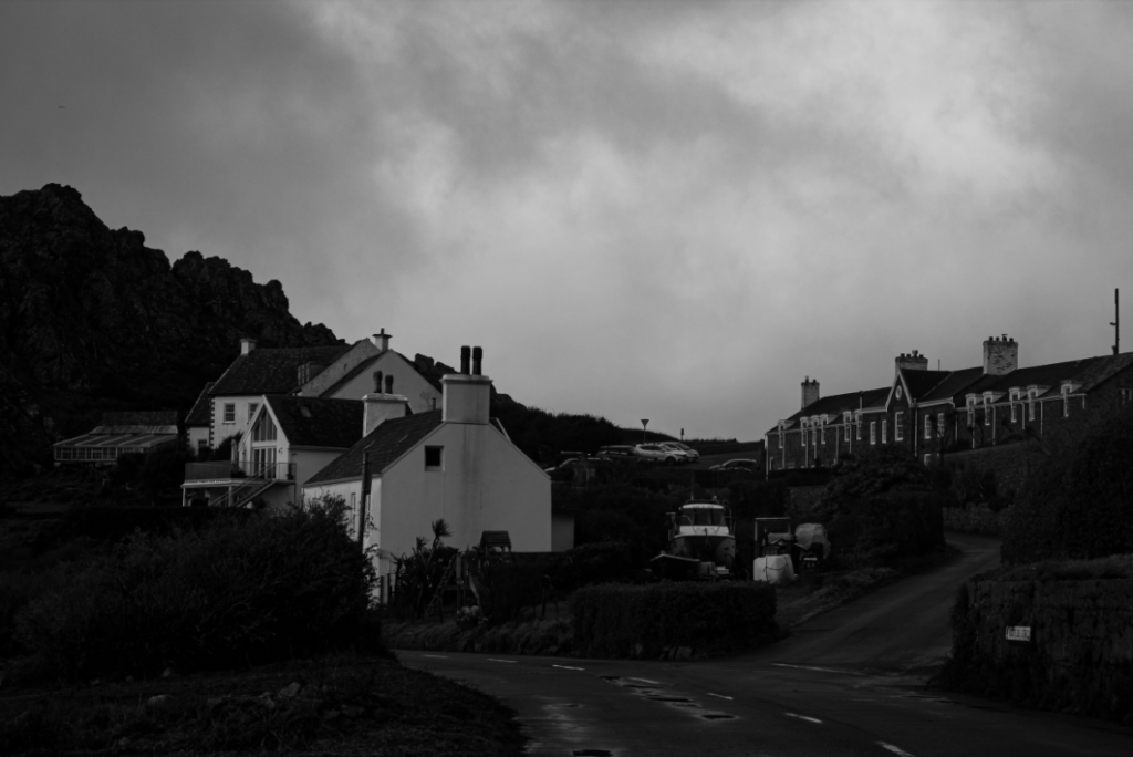
- Changed image to be in black and white
- increased contrast
- increased highlights
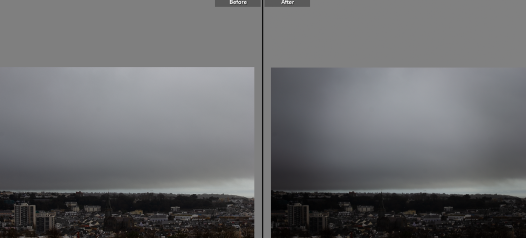
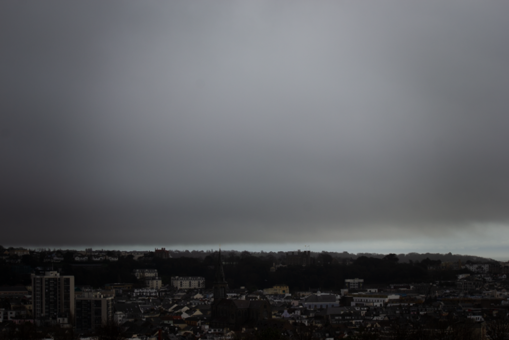
- added vignetting
- increased contrast
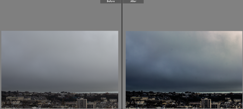
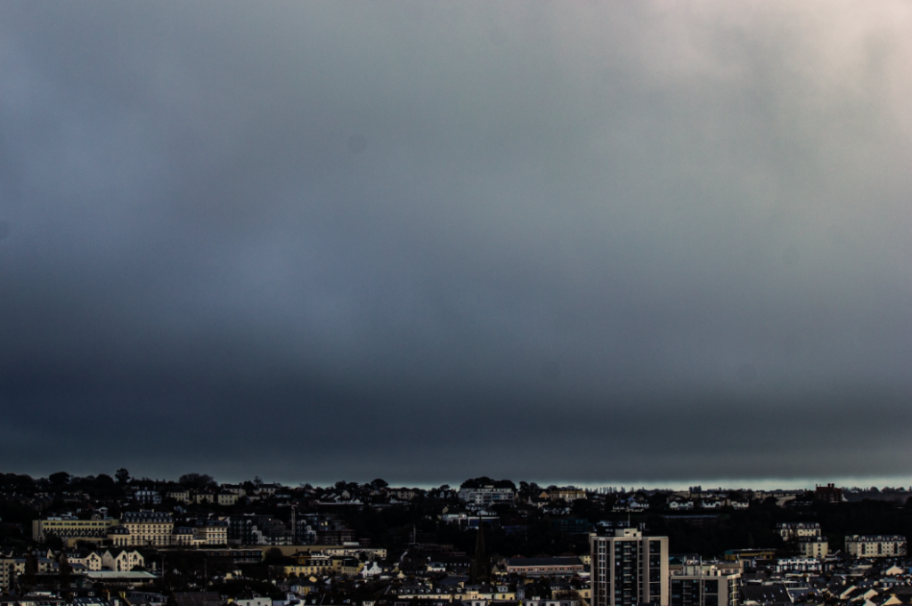
- increased clarity
- increased highlights
- increased contrast
- lowered temperature
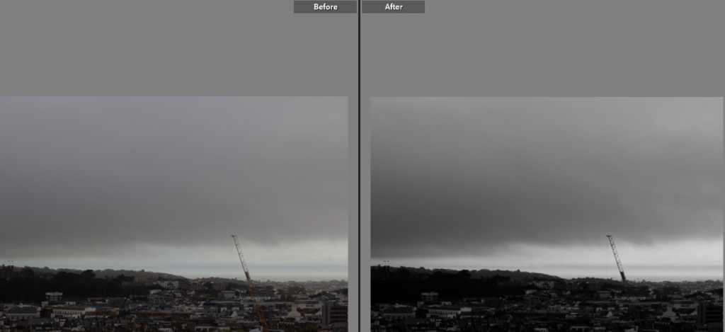
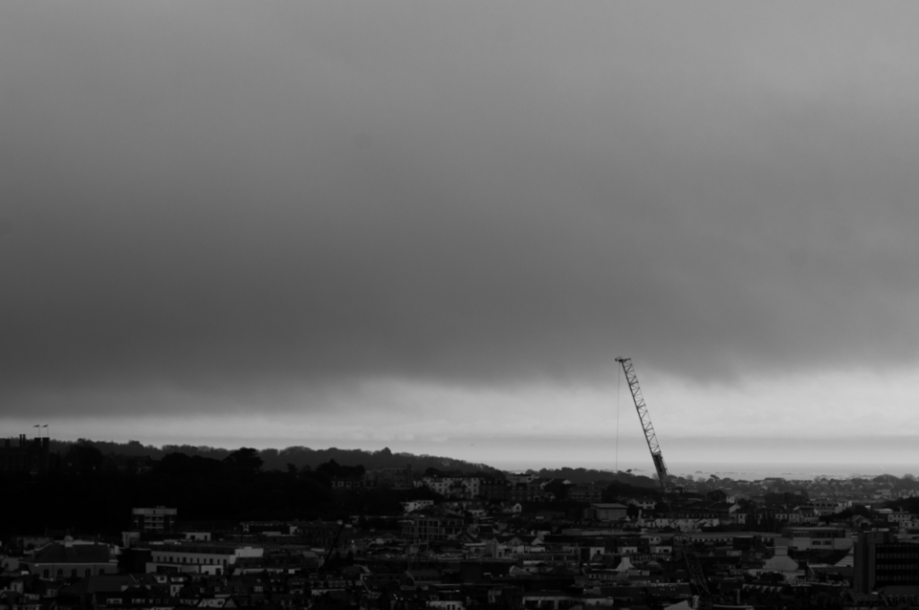
- changed image to black and white
- increased contrast
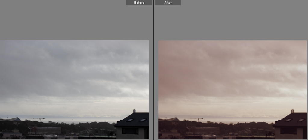
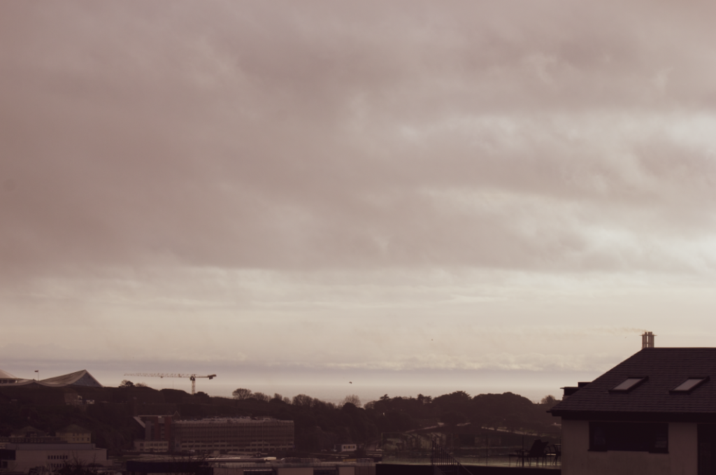
- changed temperature
- changed hue
- increased exposure
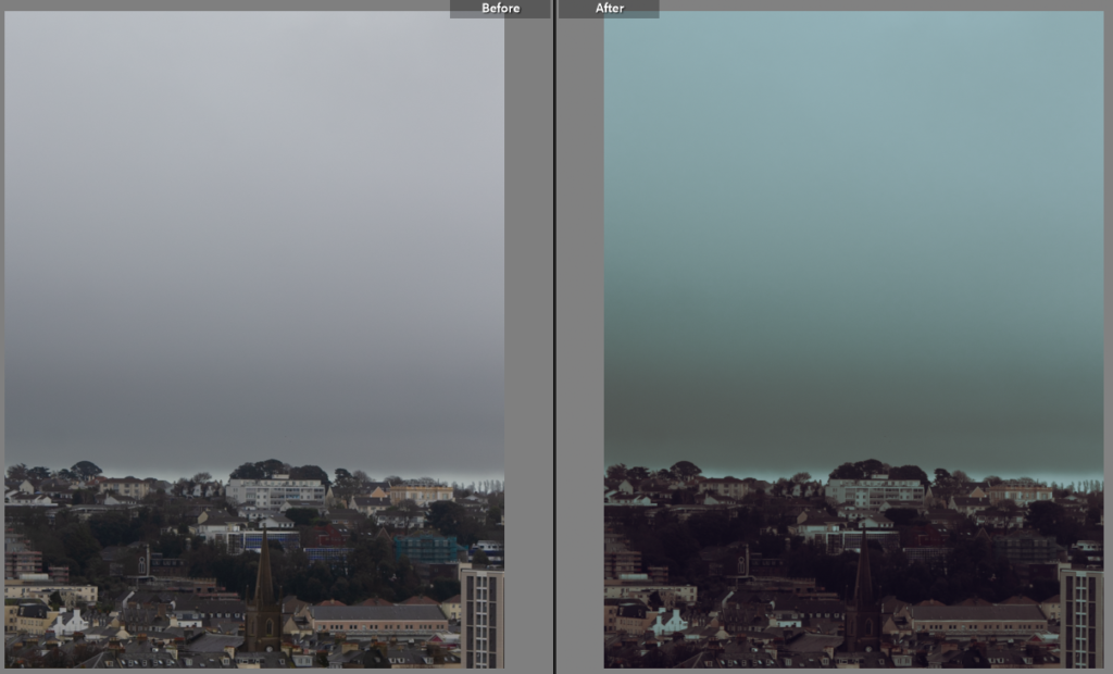
- lowered temperature
- lowered exposure
- increased contrast
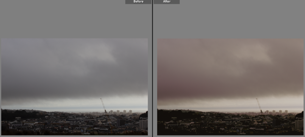
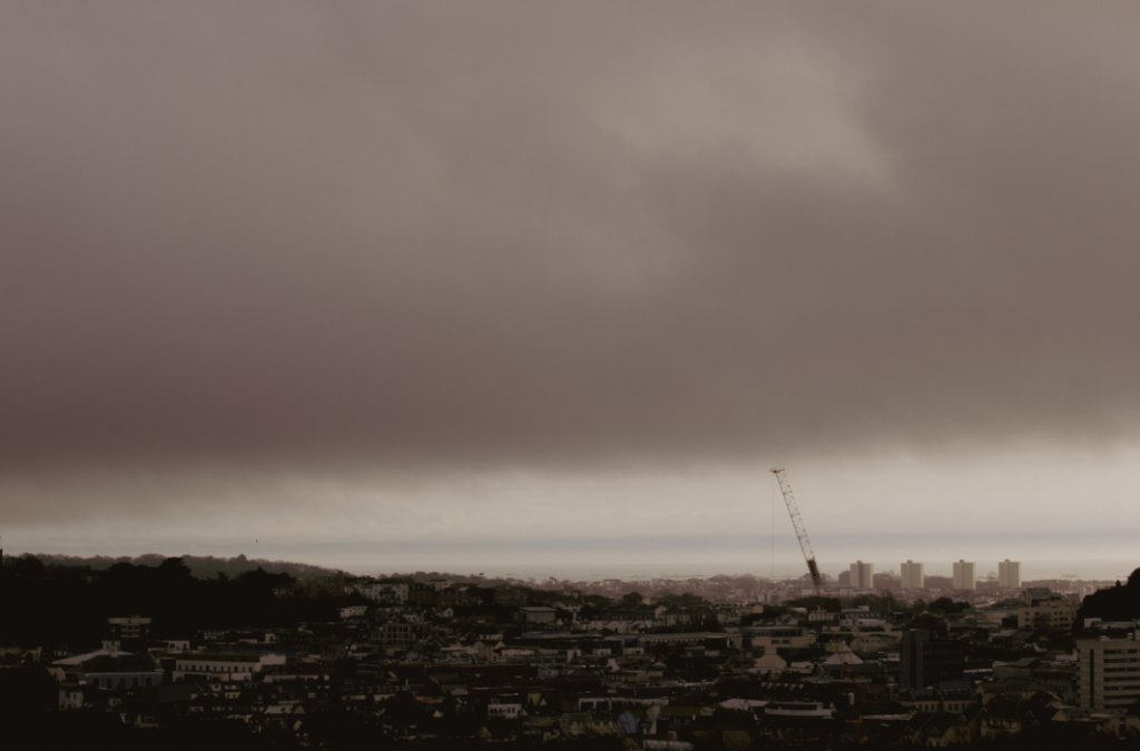
- changed tmperature
- lowered exposure
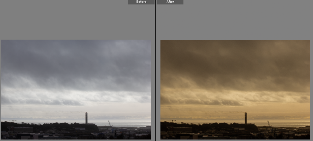
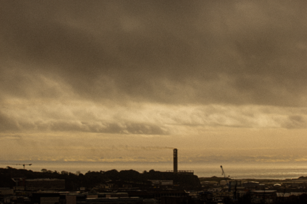
- changed hue
- changed temperature
- increased highlights
- increased contrast
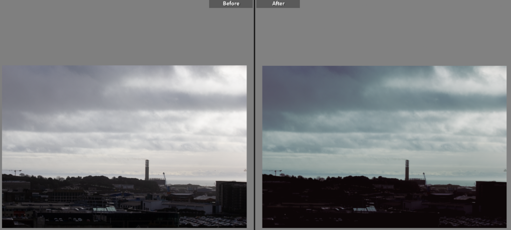
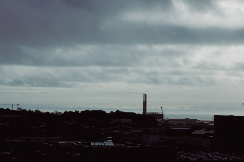
- lowered temperature
- increased highlights and white tones
- decreased exposure
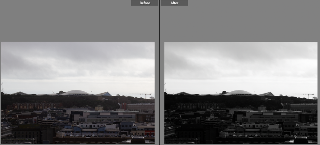
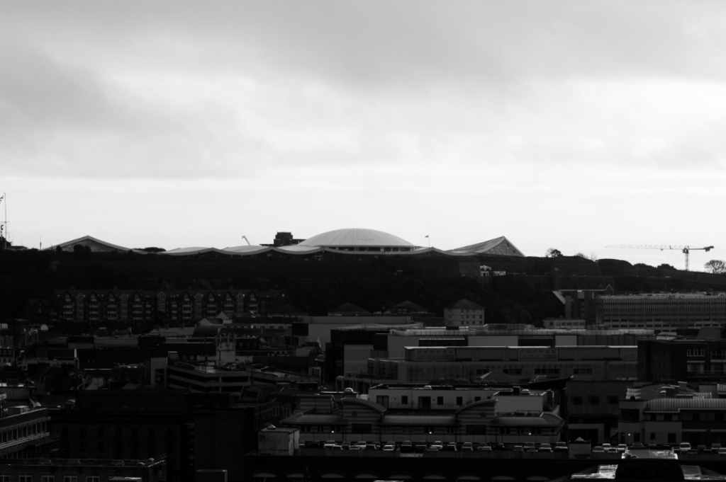
- changed image into black and white
- changed exposure
- increased contrast
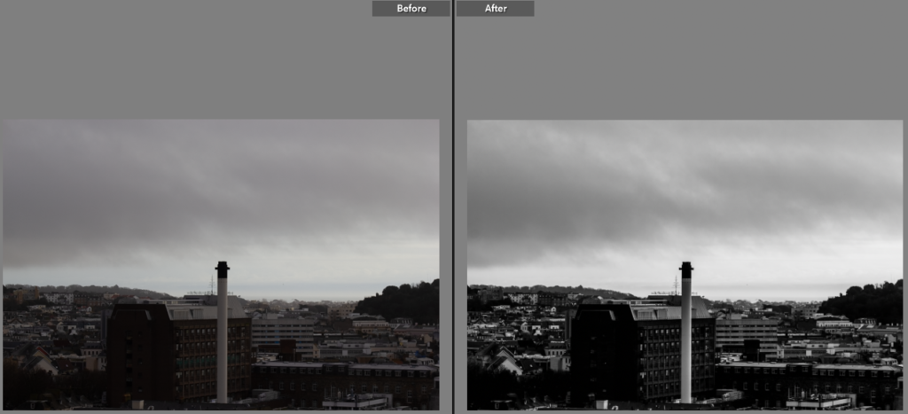
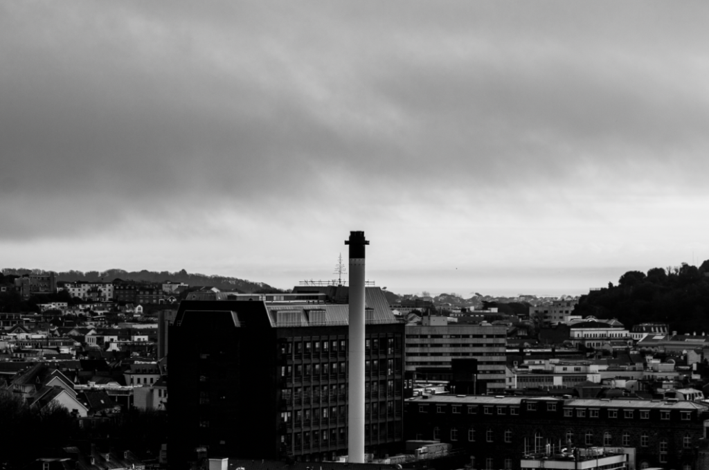
- increased contrast
- increased exosure
- changed image into black and white
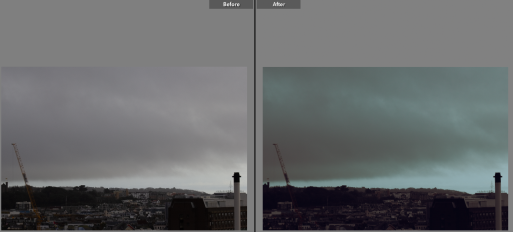
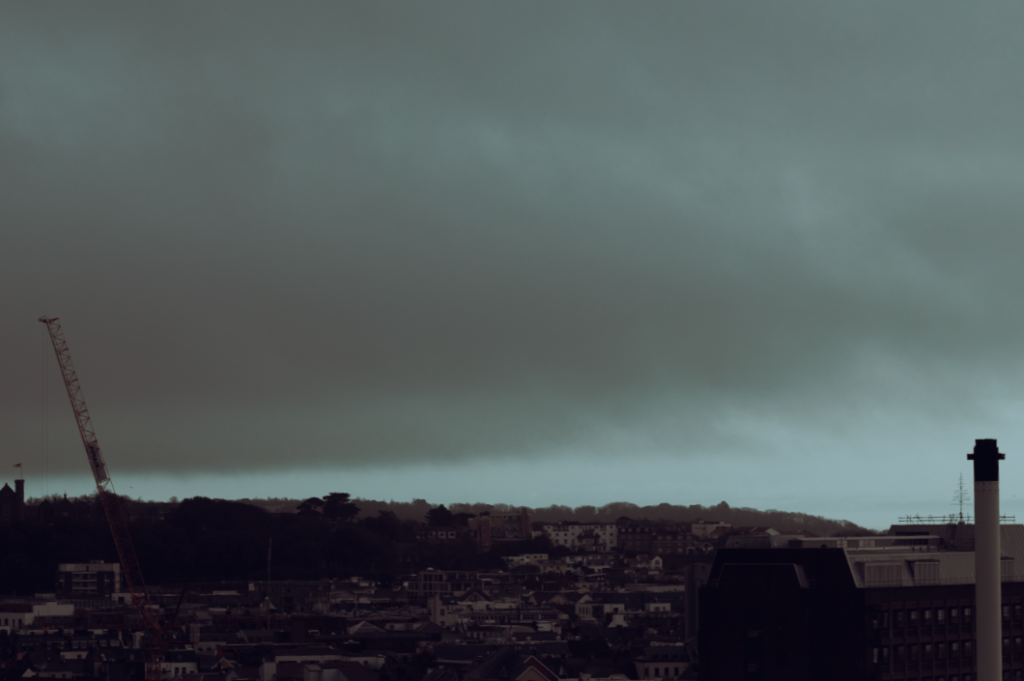
- lowered temperature
- increased contrast
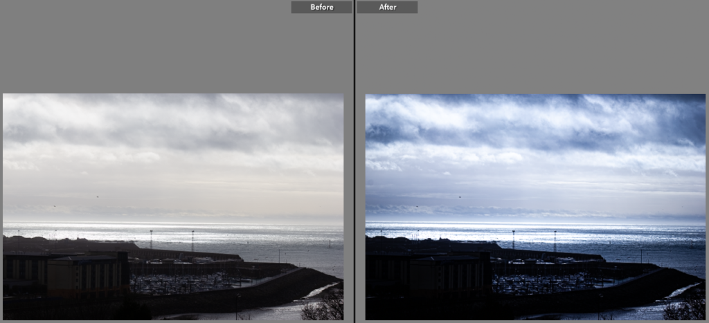
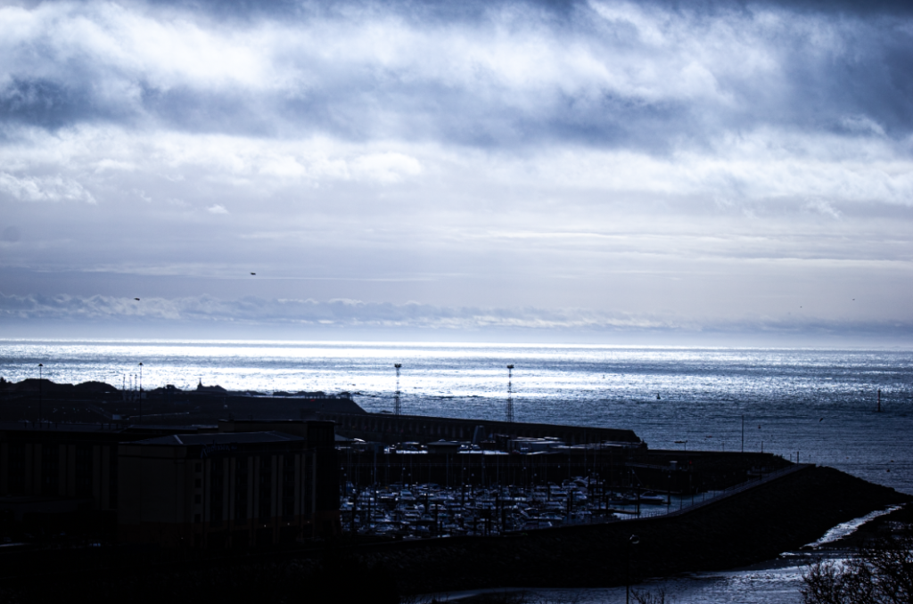
- changed temperature
- increased contrast
- increased highlights
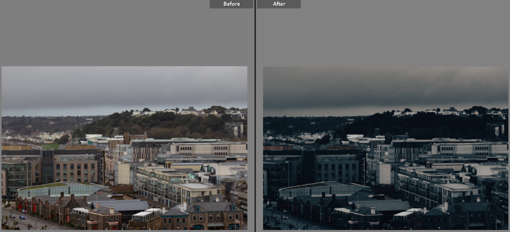
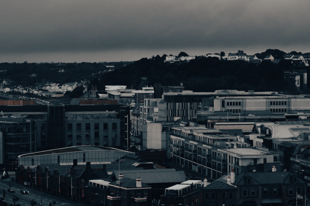
- changed saturation and vibrancy
- increased contrast
- increased white tones
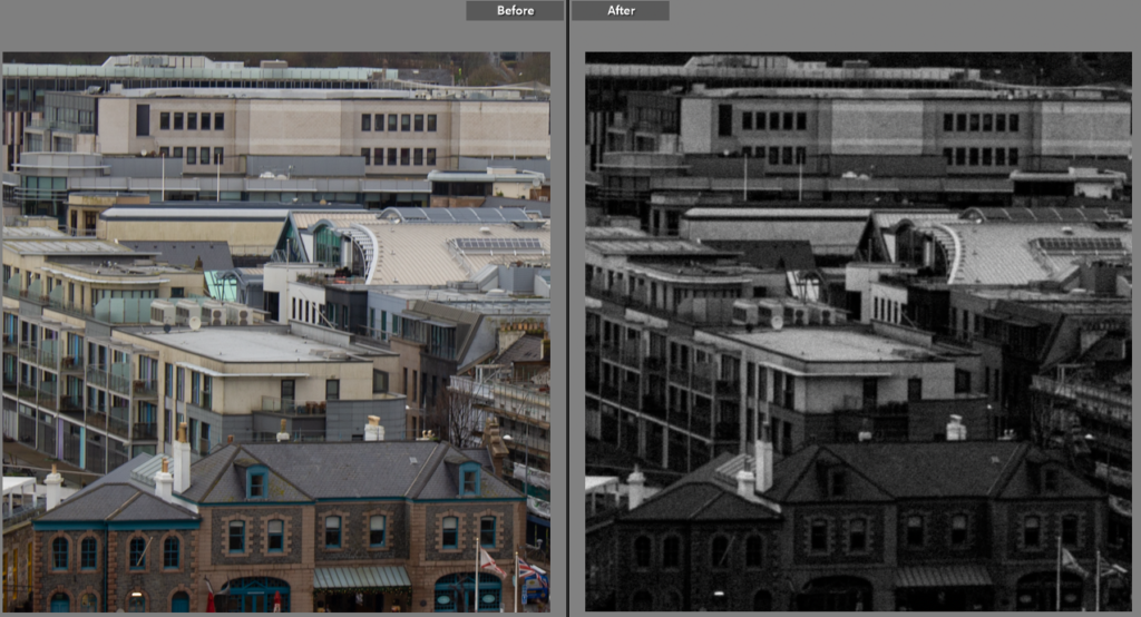
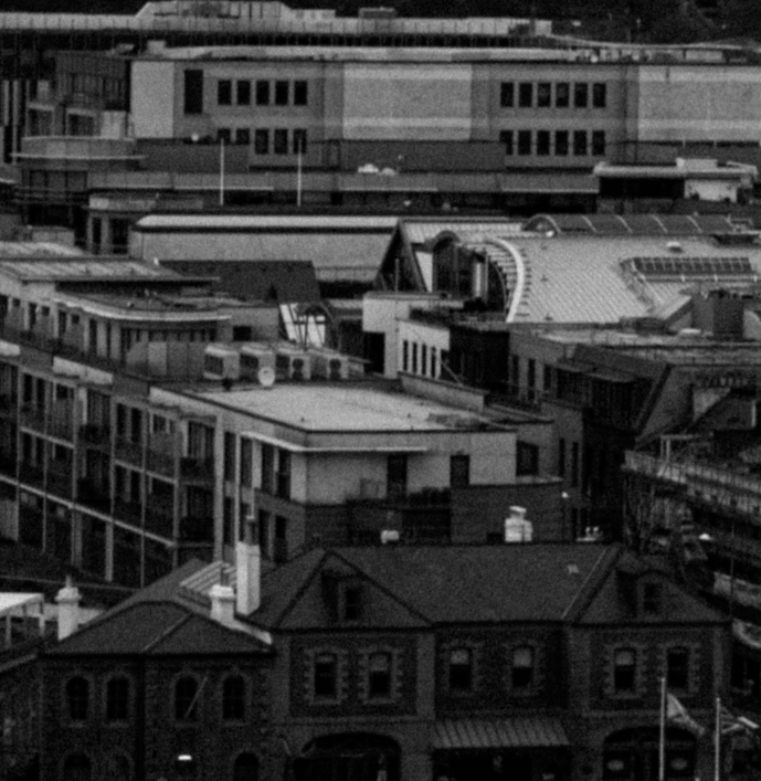
- changed image to black and white
- added grain
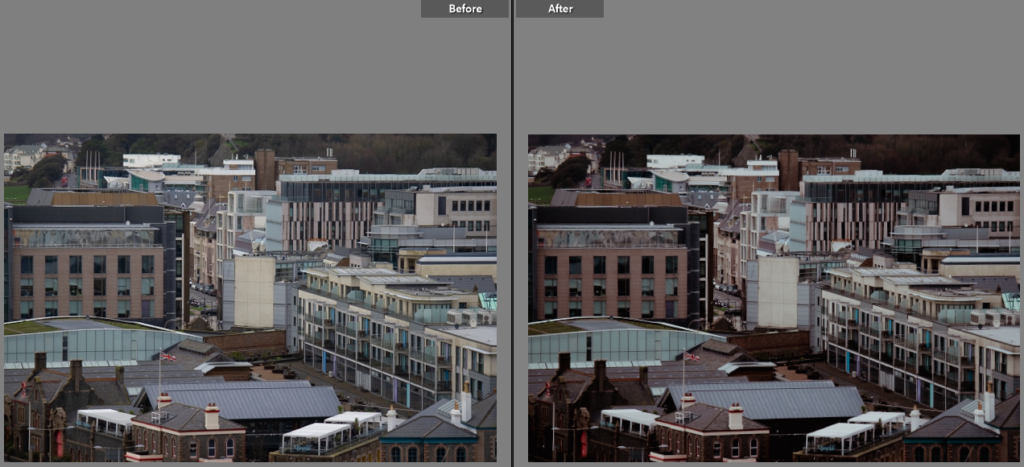
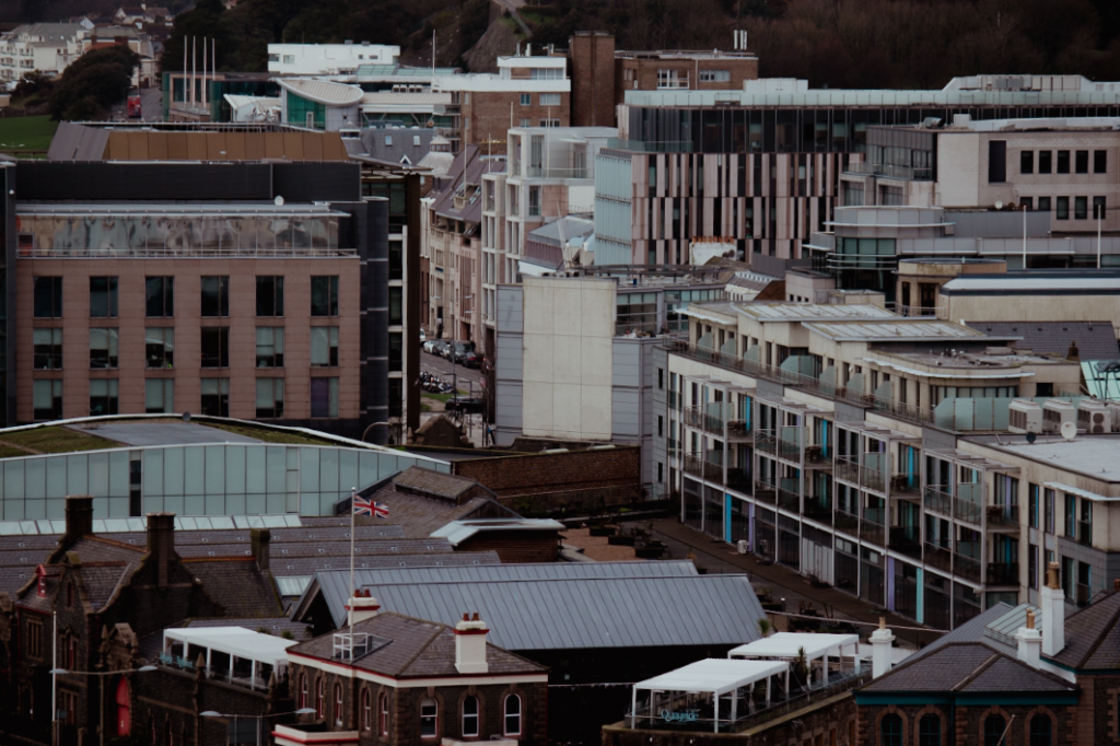
- changed exposure
- changed highlights
- changed tint
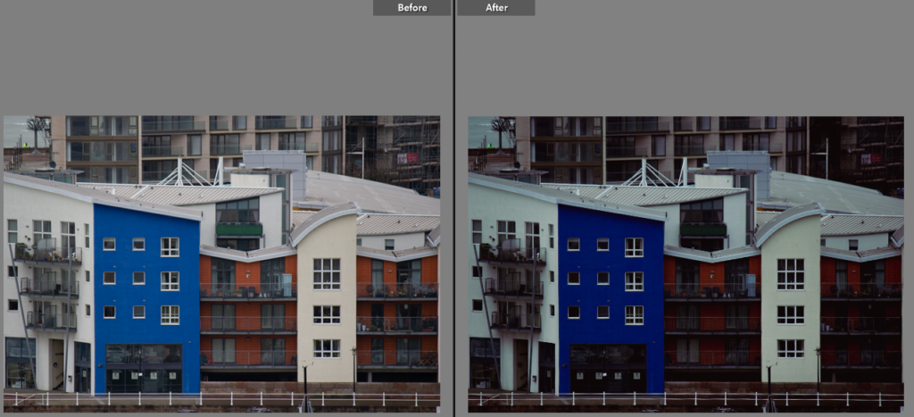
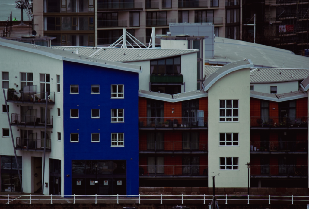
- changed exposure
- changed temperature
- increased saturation
Best images

I picked this as a best image as I really liked the urban feel this image gives off. The structure in the middle acts as a focus point for the eyes, and the clutter of buildings beneath it shows off how urban Jersey can be. I also really like the amount of contrast used here as I think it creates an old timely feel to it.

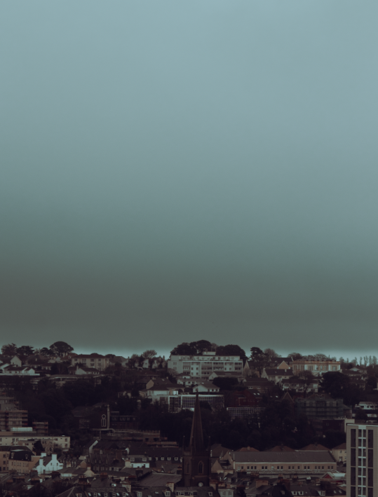
I chose this image as I felt that the large sky over the town create a contrasting view of cluttered and vacant spaces. I like the colouring of this image too as it reminds me of a storm hovering over a town. I also like how the church is the focus point of the image.

I selected this photograph as I liked the grainy effect I added to make the image seem older. I think that this gives off a different feel to what you would usually see in urban images and while the buildings still seem modern, I think the texture and colouring still work nicely with it.

Finally, I selected this image as I liked the contrasting sky with both the ocean and cluttered buildings/ boats. I also like the highlights as I think it extenuates the ocean in the background. The cool tones in this image also give off a refreshing feel for the viewer.
