Urban artist research

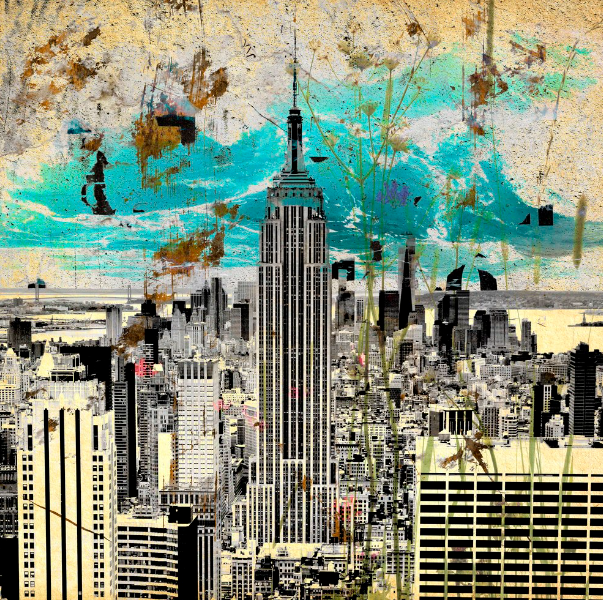
Steven Irwin

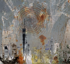
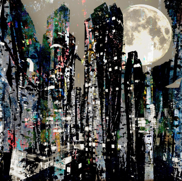
Freelance film maker and photographer, Irwin is based in Cardiff, South Wales. He began his career as a documentary film maker and photographer before moving towards more layered, abstracted images.

Steven’s work practice combines both digital and analogue methods, from scratching and staining negatives to digital manipulation. with his work has being purchased by private collectors around the world.
Why have you chosen this artist?

I picked this Irwin as one of my urban artists since i think he has a very unique and interesting style.

What interest you about their work?

I was intrigued by the colourful, modern, street art we can see when walking around big cities.

How does the work relate to the theme of Urban?

This relates to urban photography since the buildings are city like in a cluster of them.

What are you going to do as a response to their work?

In response, I would perhaps like to try either editing the image manually using water colours or editing my image on photoshop by adding in colours digitally.

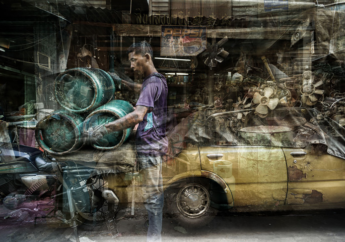
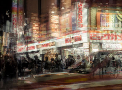
Riccardo Magherini

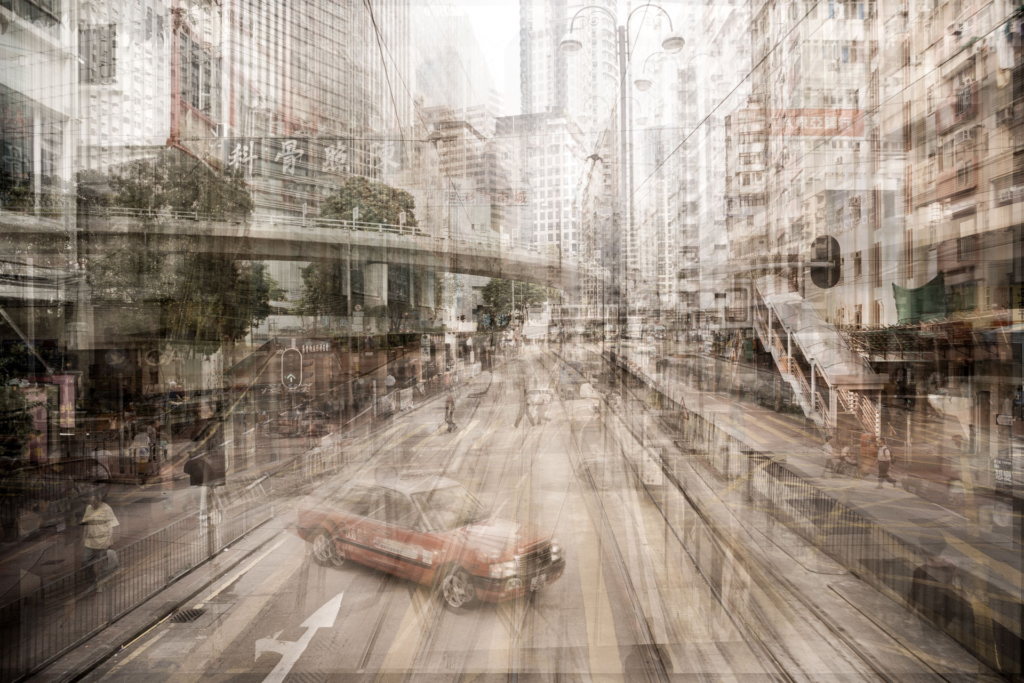
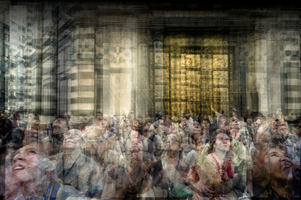
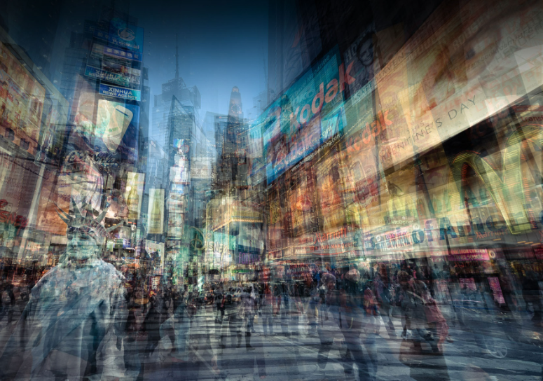
Riccardo Magherini is known for his frenetic and layered images of street scenes and urban landscapes. Represented by galleries across London, Paris and New York, Riccardo has achieved recognition internationally from awards such as the International Photography Awards and London International Creative Competition.

Riccardo’s photography explores the phenomenon of time, more specifically, the movement that time creates. By overlapping multiple impressions, Riccardo’s photographs have a painterly quality, and with the endless illusion of depth, he creates works that resemble abstract paintings.
Why have you chosen this artist?

I chose Magherini as my main urban artist due to his stunning blurred street photography.

What interest you about their work?

I was interested in the colourful lights and busy surroundings seen in his images.

How does the work relate to the theme of urban?

His photos are often taken in cities or very populated areas, giving his pictures the theme of urban.

What are you going to do as a response to their work?

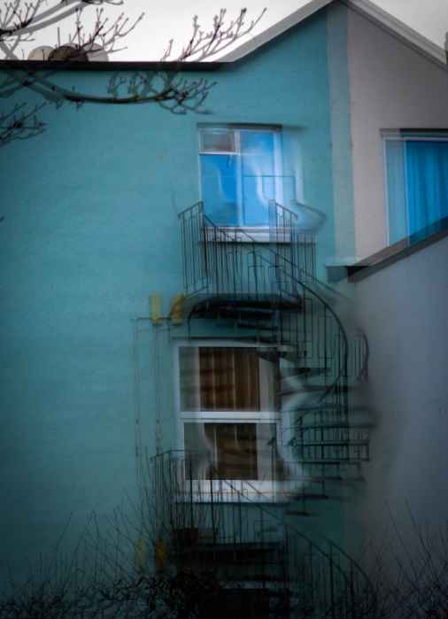
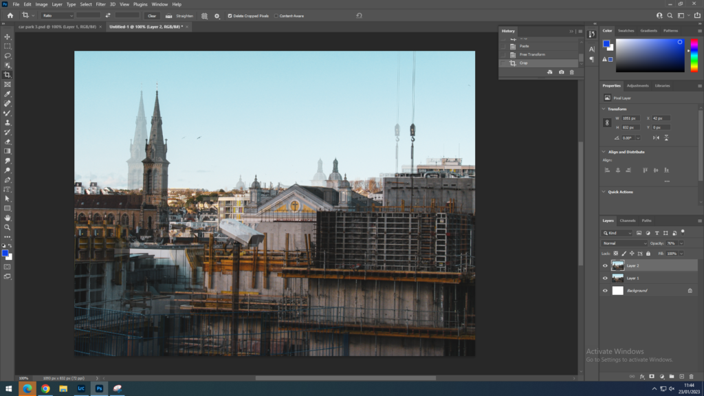
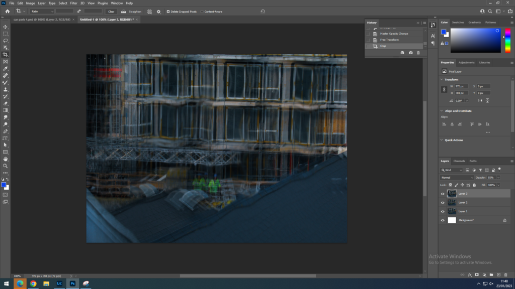
In response, I would like to have a go at his blurred effect that he creates in his images by placing the same image over the top and lowering the opacity.

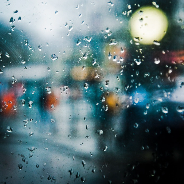
Pedro Correa

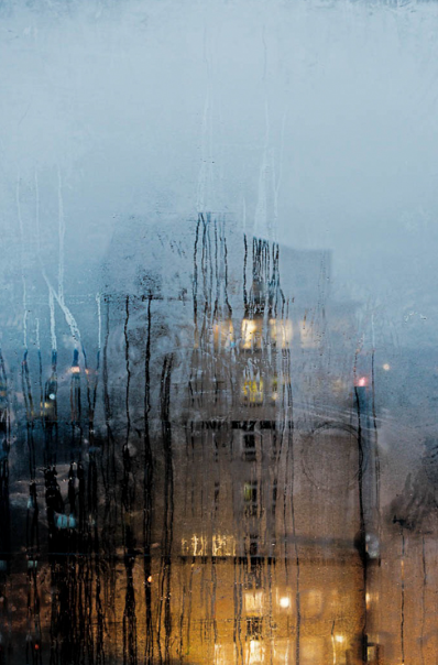
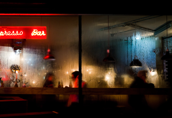
Pedro Correa is a fine art photographer. Having studied oil painting and comic art at the Brussel’s Royal Academy of Arts, he became fascinated by photography and its capacity to capture the moment. He decided to pursue the path of chasing these meaningful, fragile moments, seizing them through the art of photography while taking his impressionistic background with him. With a recent solo show in London, and a portfolio just launched on Rise Art, we decided to sit down with him and find out more about his work, and this elusive thing he terms the decisive moment.
Why have you chosen this artist?

I chose Correa as one of my urban artists since i found his minimal style to be captivating and attention drawing.

What interest you about their work?

I really like how he often sees beauty in things that would otherwise go unnoticed, such as rain or condensation. I also like how he uses the focus to direct the viewers eyes to see specific areas of his photos.

How does the work relate to the theme of urban?

His photos are often taken in cities or busy areas, even thought sometimes they aren’t the main focus of the image.

What are you going to do as a response to their work?

If i were to do a response to his work, I would try to use the wet weather to my advantage like he does in his photos. I would do this by focusing on the rain when there are lots of lights in the background.

Artist Comparison

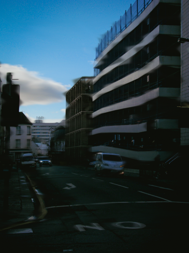
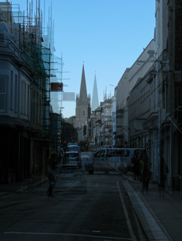
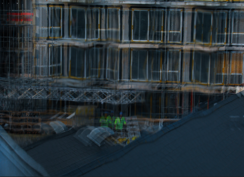
The artist I have chosen to do a comparison of is Riccardo Magherini. I think his style really stood out to me among all the rest as I find his manipulation of the images to present more of a time rush and urban feel to them.

Image 1:
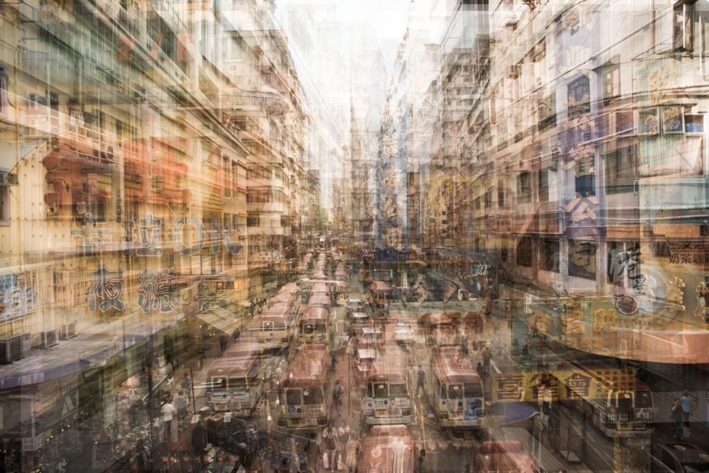
– Riccardo Magherini, urban.
My image

How I did it:
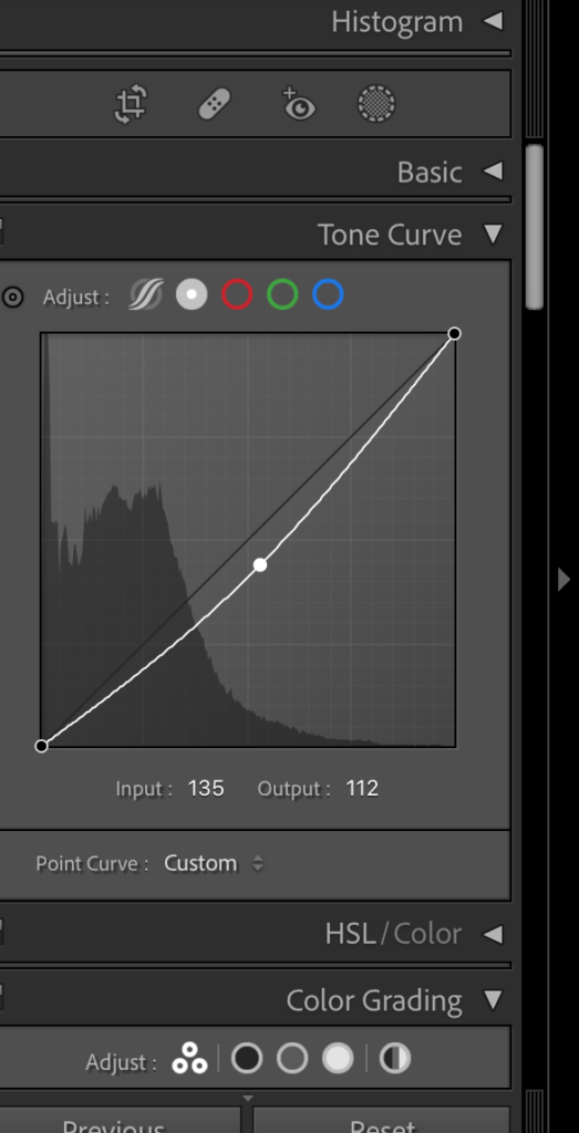
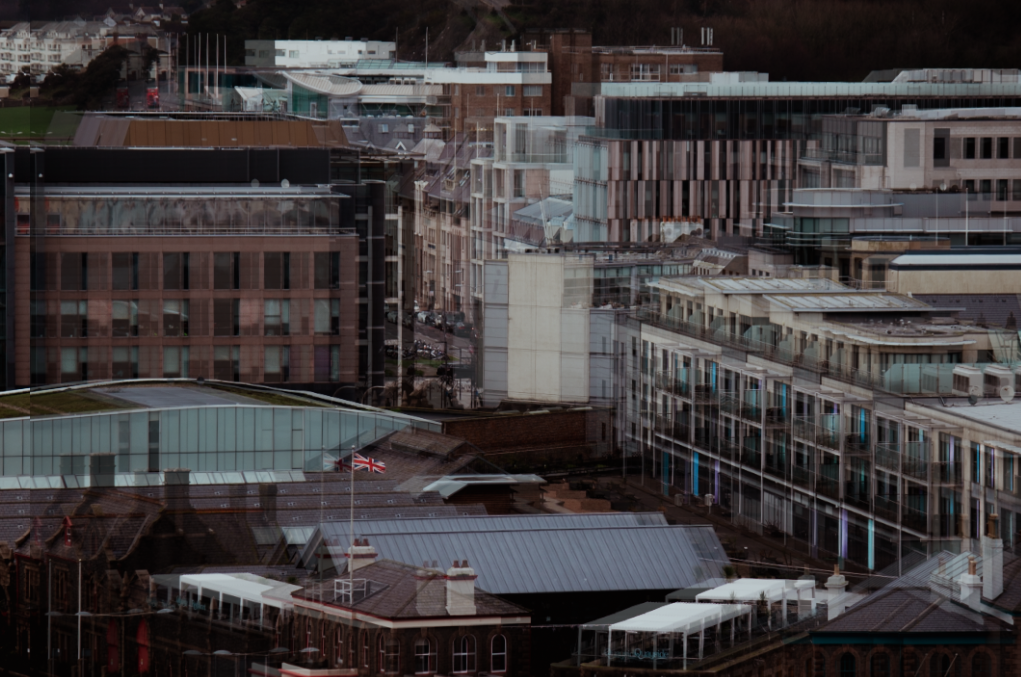
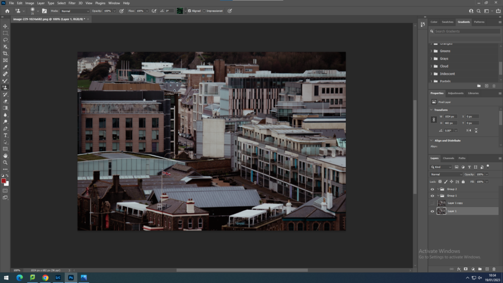
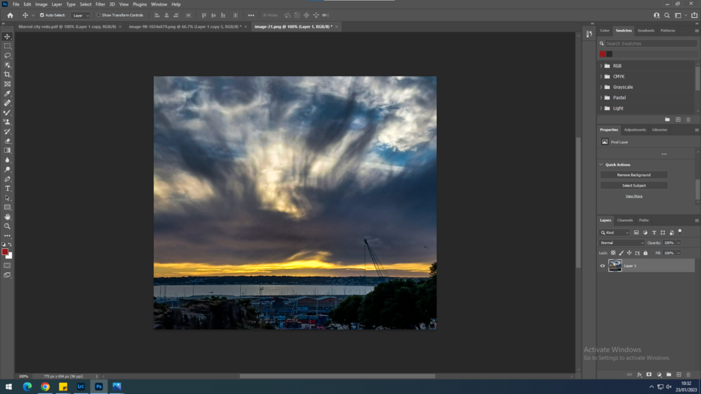
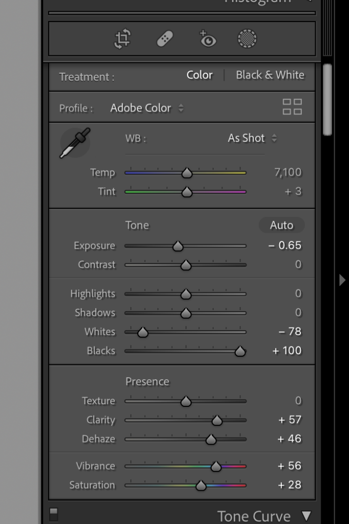
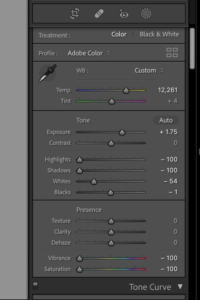
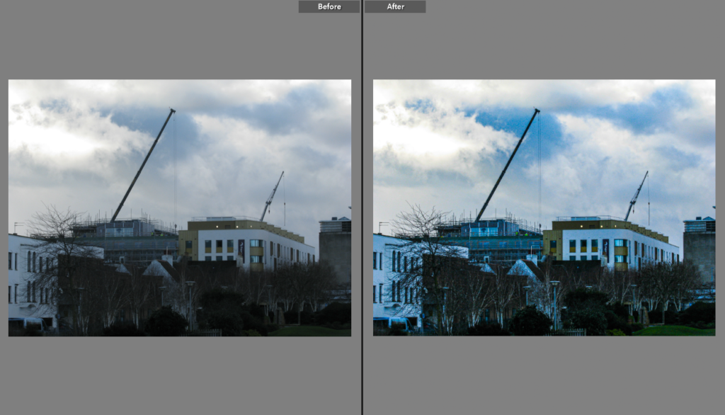
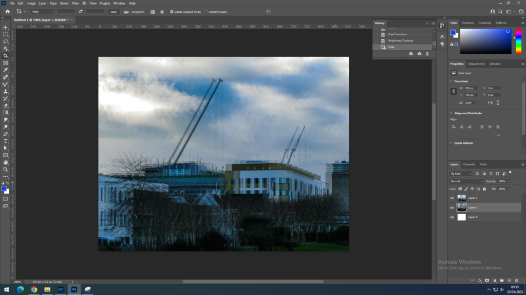
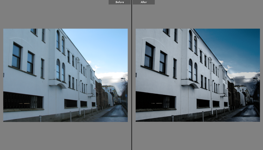
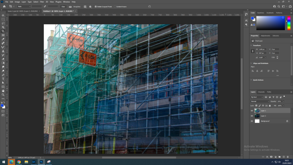
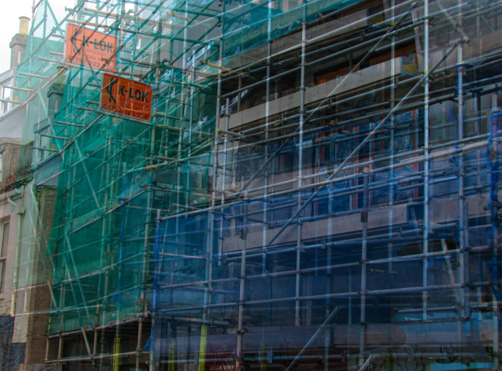
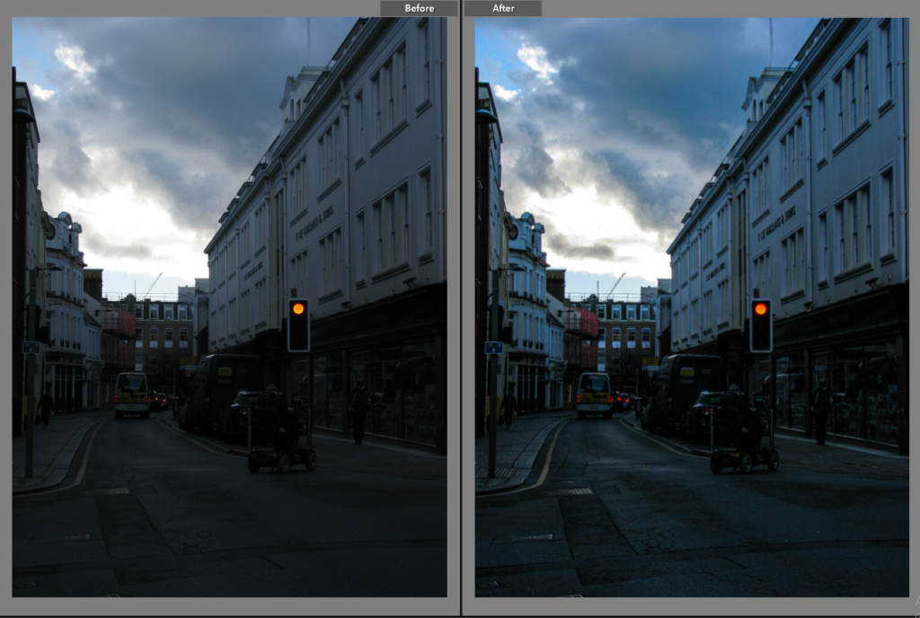
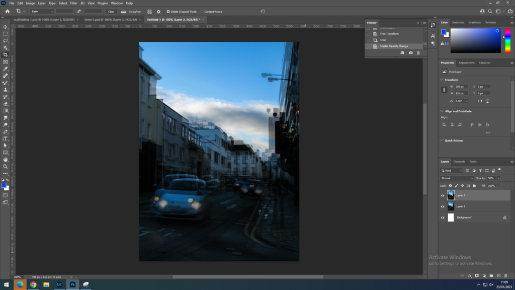
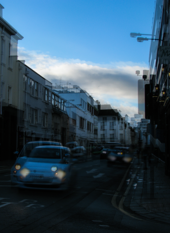
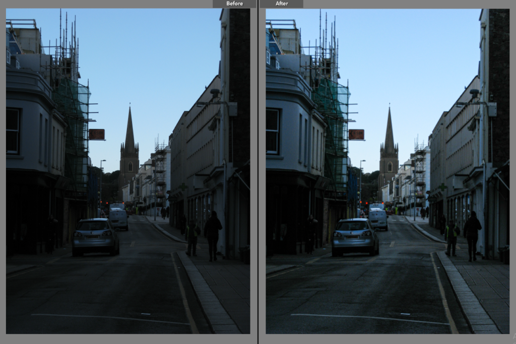
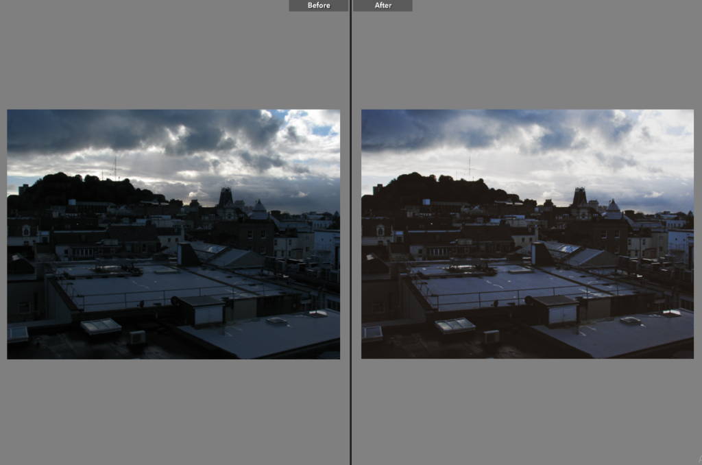
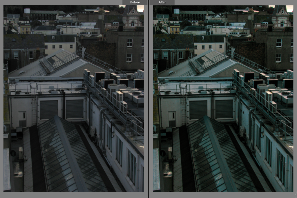
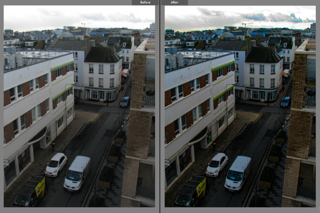
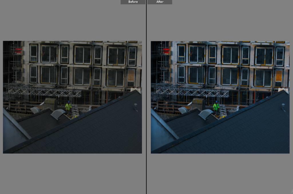
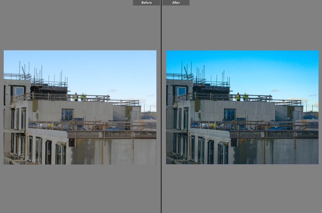
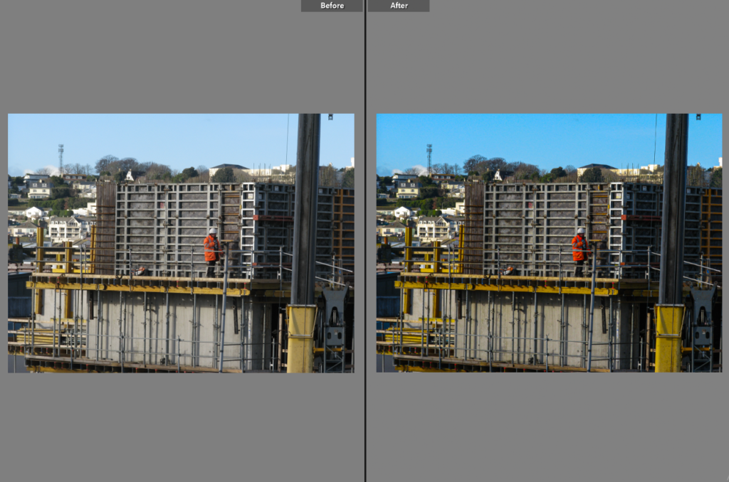
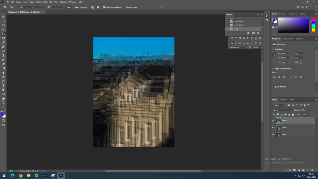
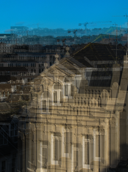
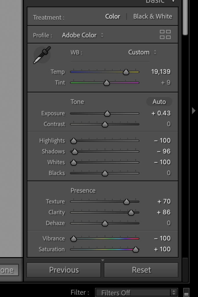
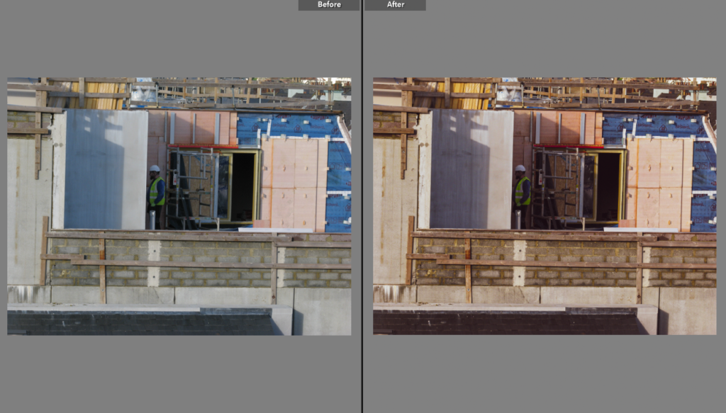
Firstly, I added my image to photoshop from the edited version from Lightroom.
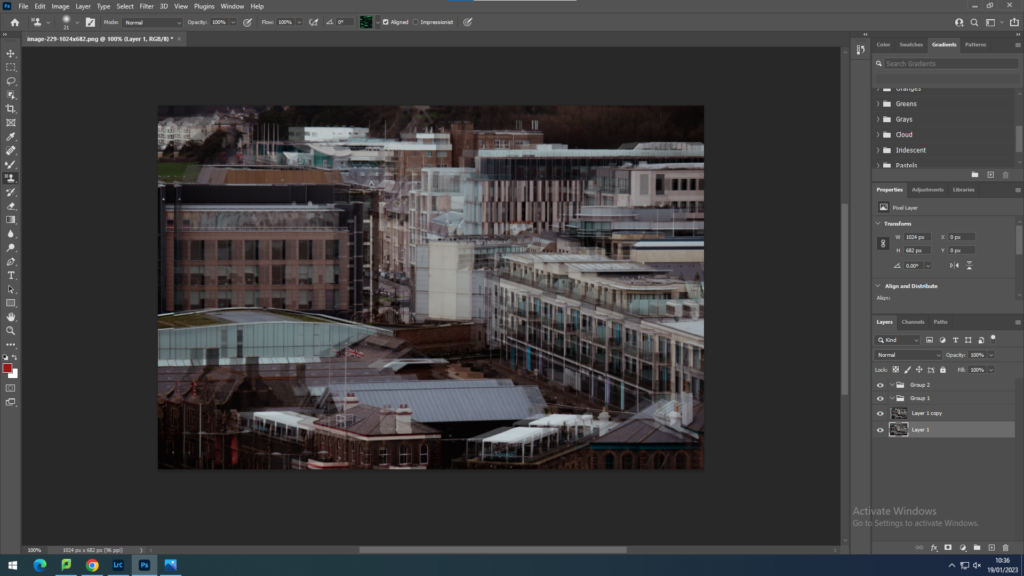
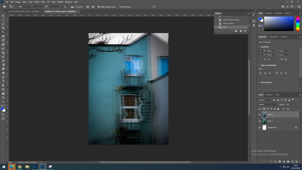
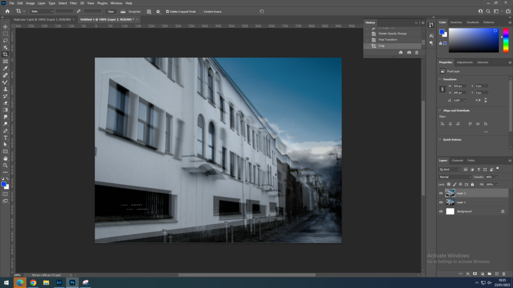
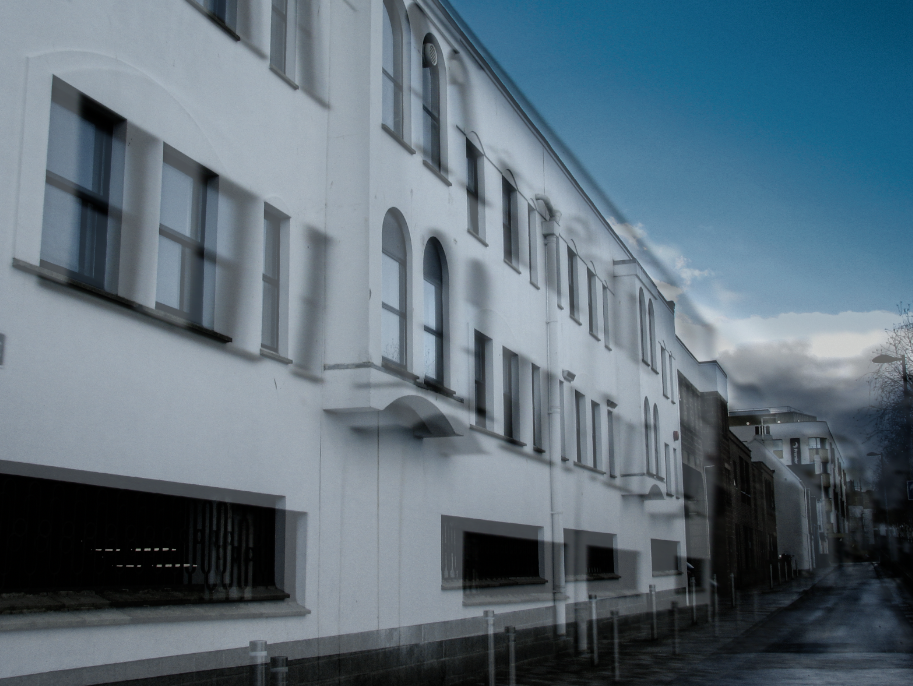
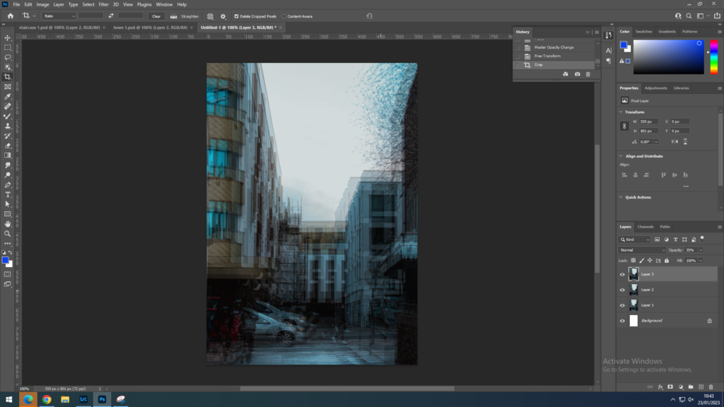
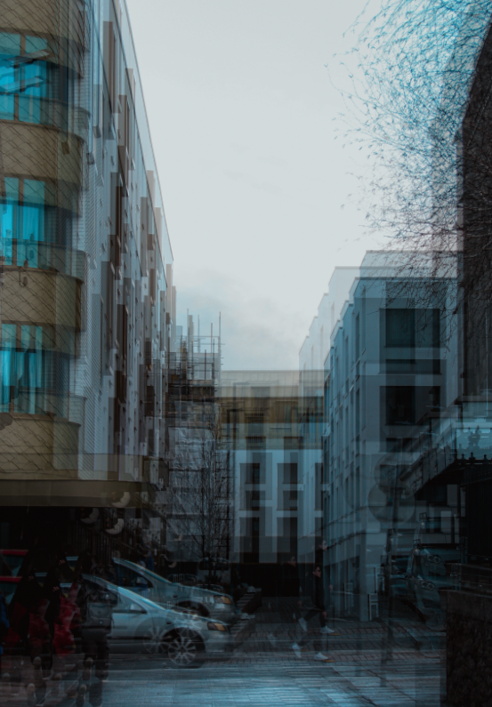
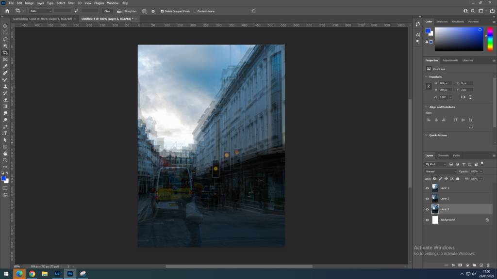
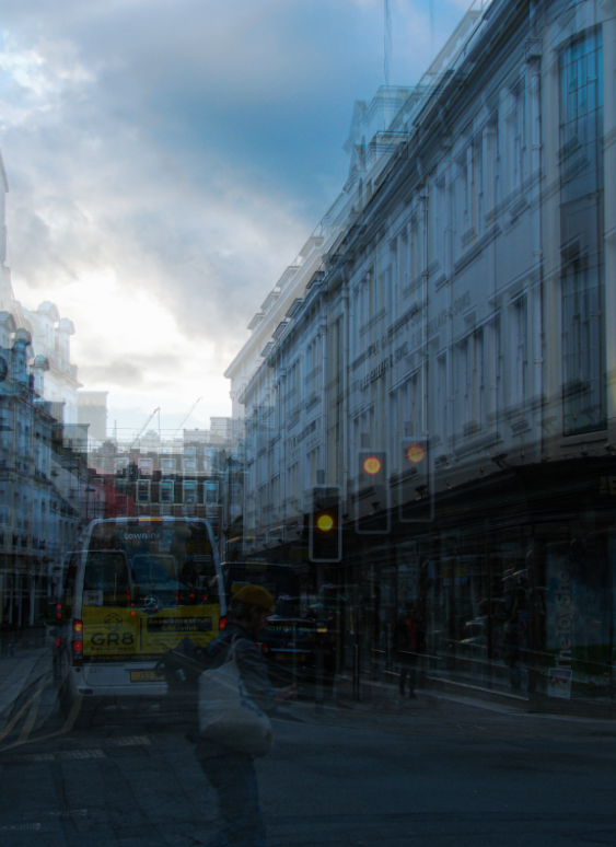
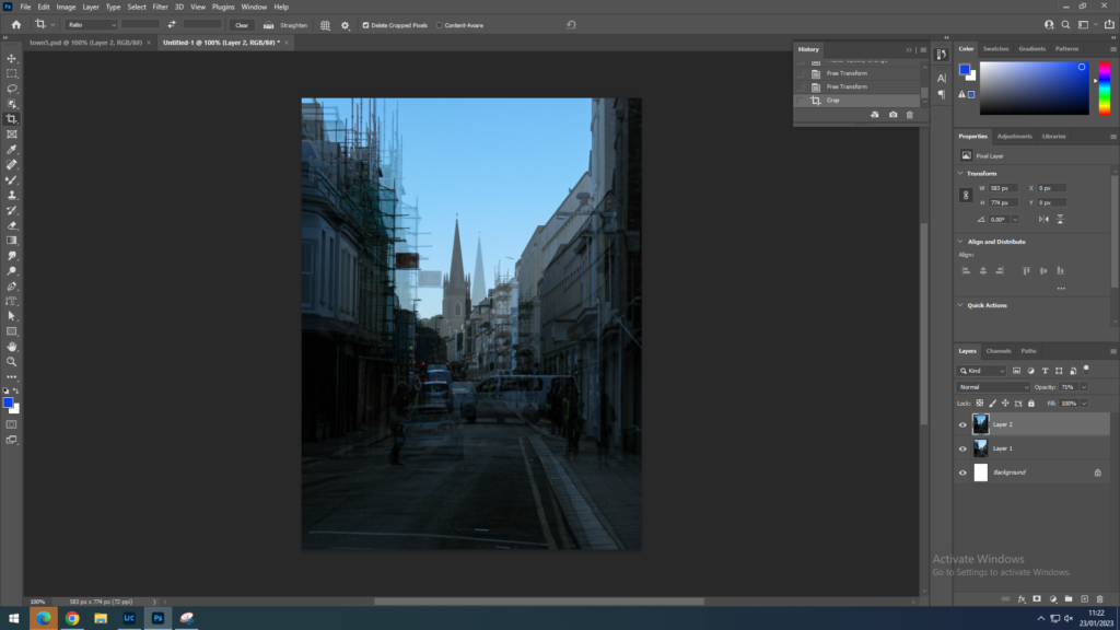
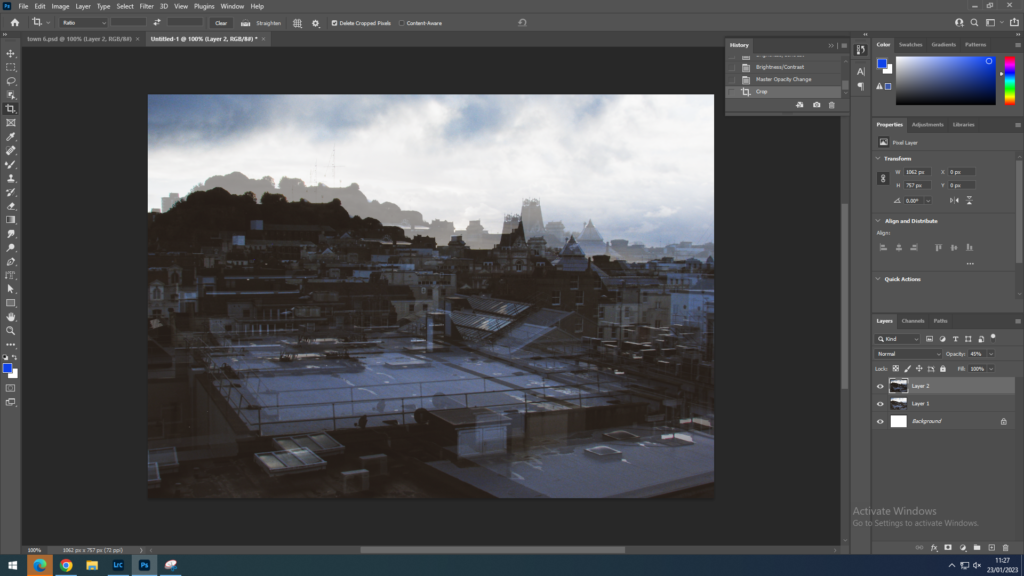
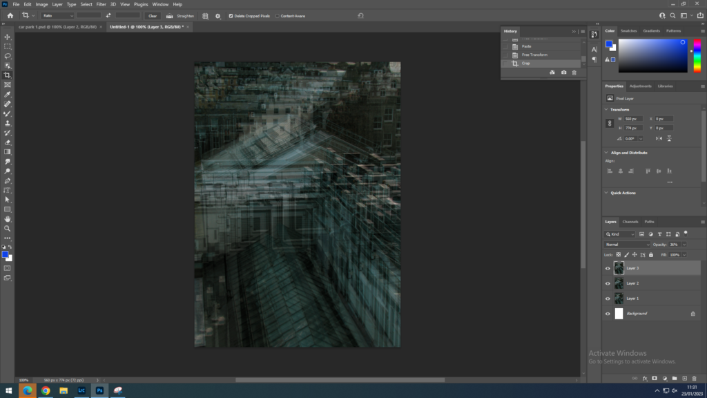
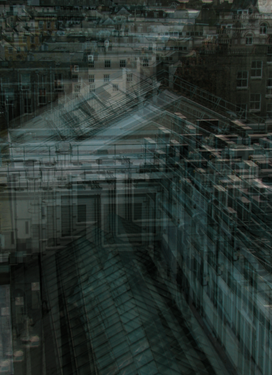
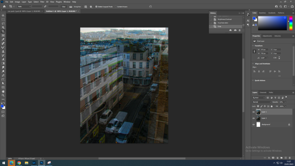
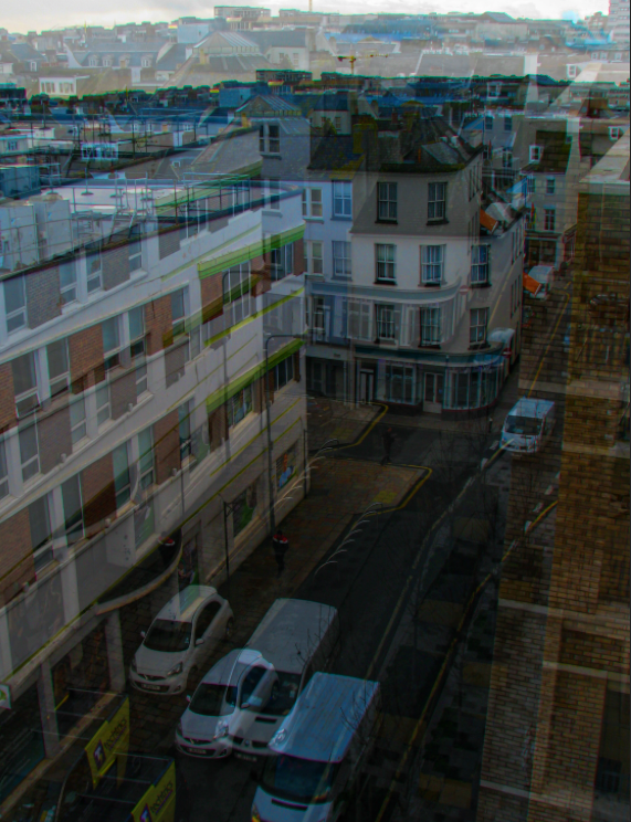
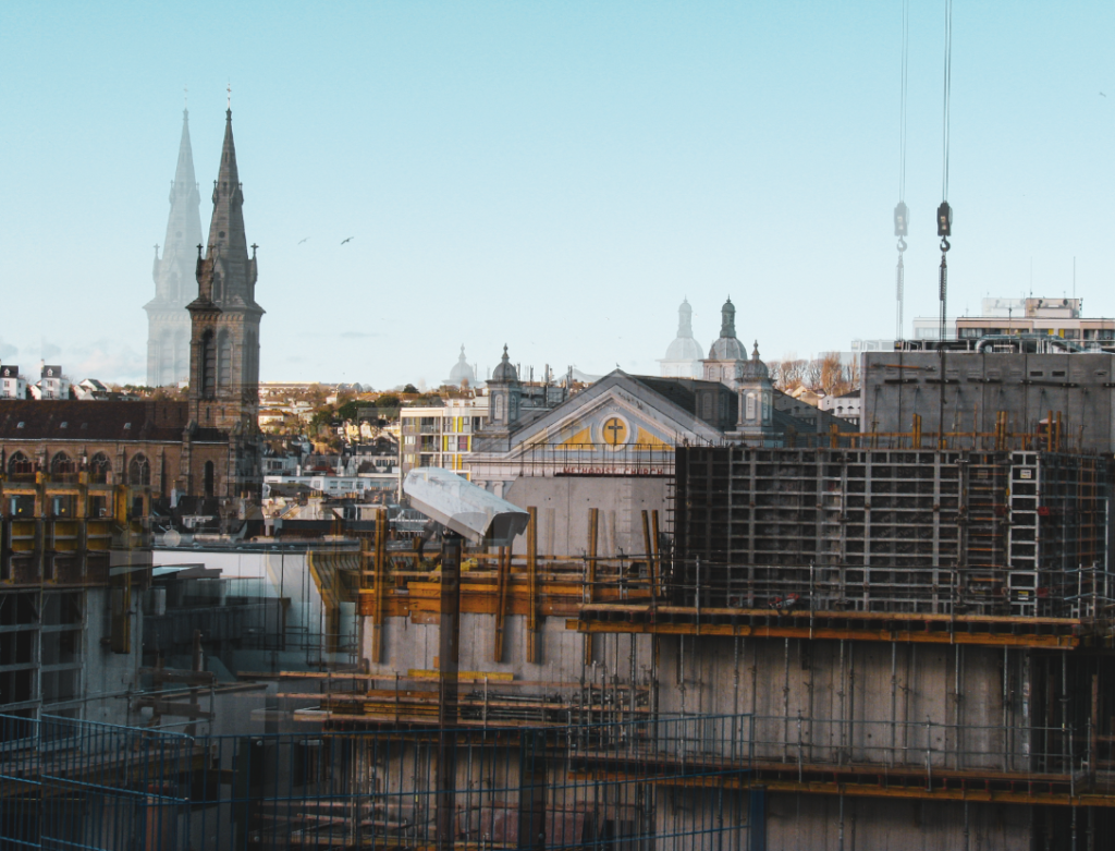
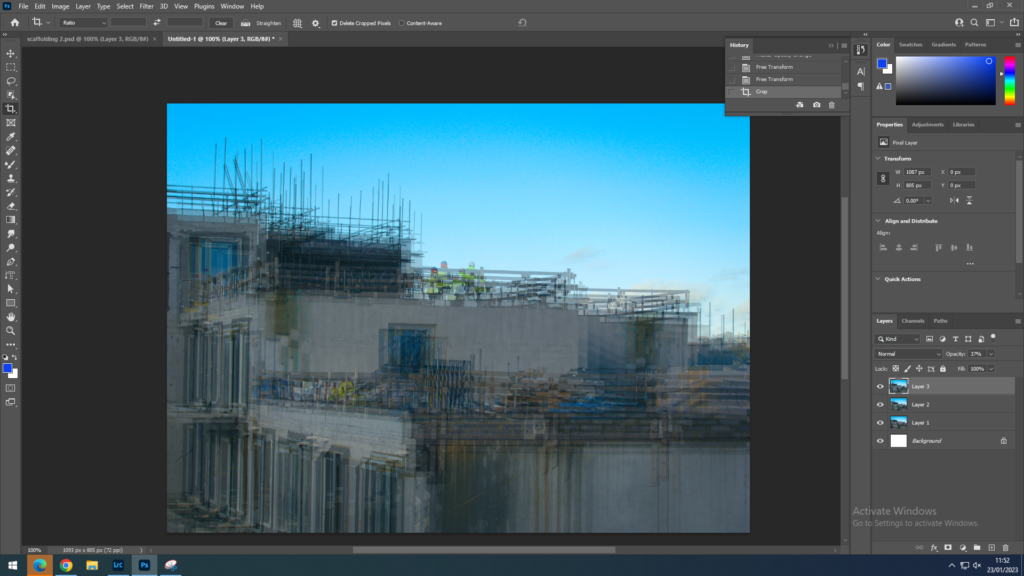
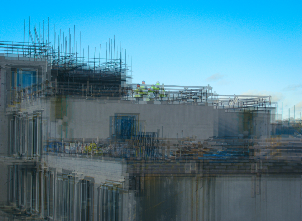
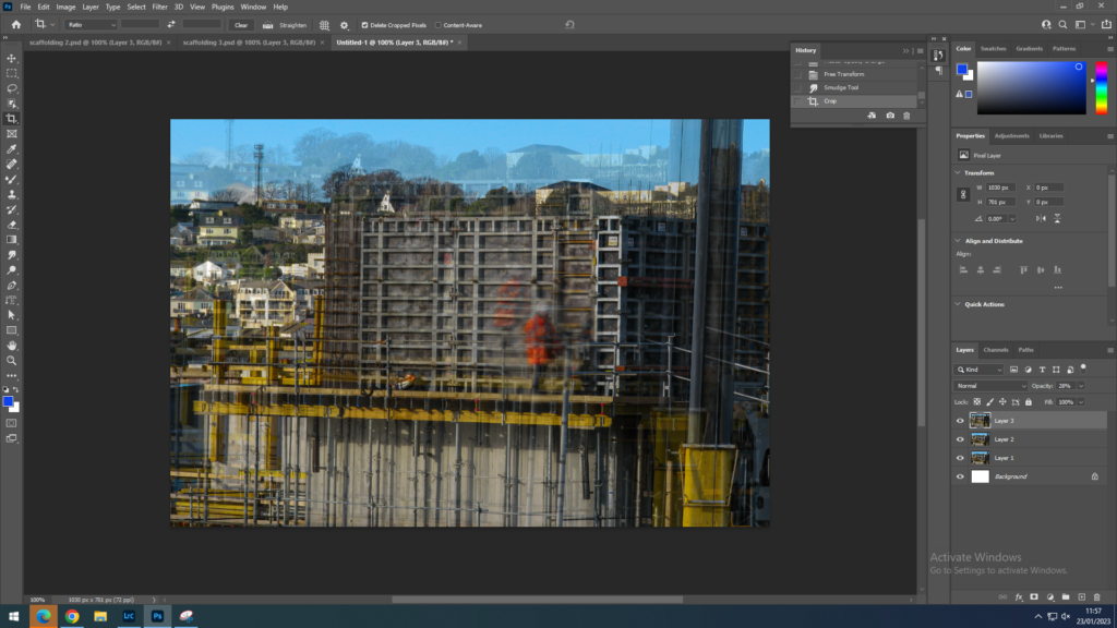
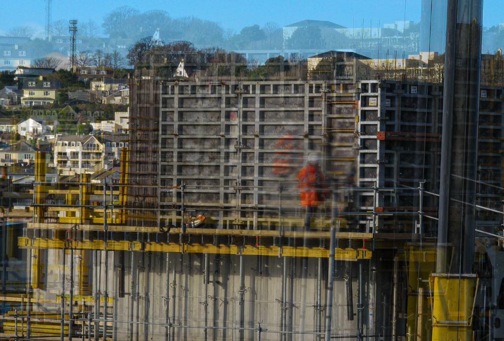
Next, I copied the layer on top of the image and changed the opacity, moving it slightly to give a blurred effect.
Lastly, I used the dodge tool to make some of the light areas brighter so imitate the lighting effect Riccardo has on his images. I also changed the exposure to brighten the image a little more.
Final result.

Image 2:

– Riccardo Magherini, urban.
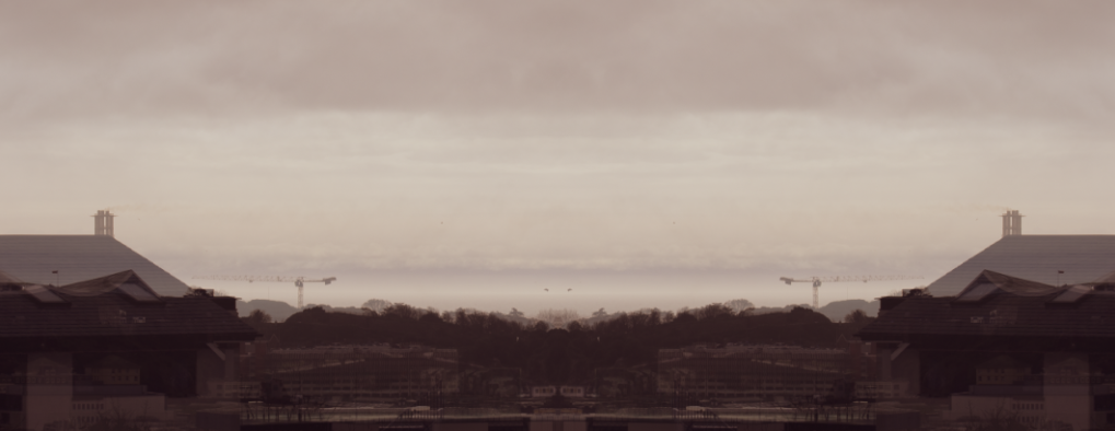
My mix

How I did it:
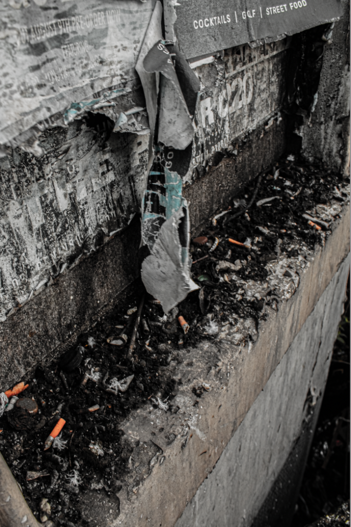
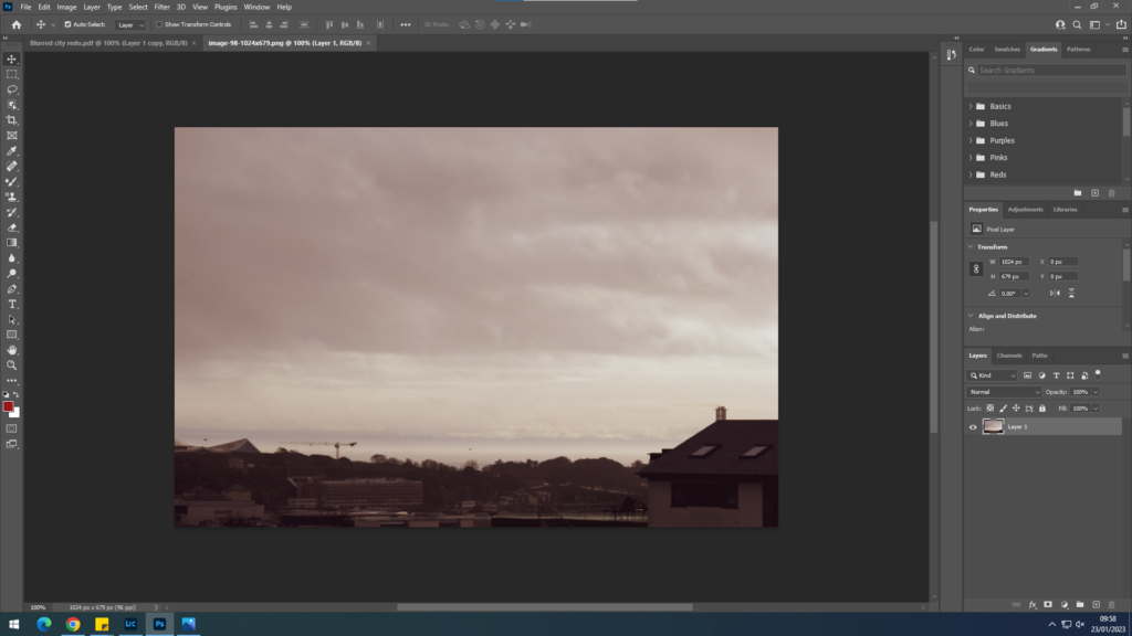
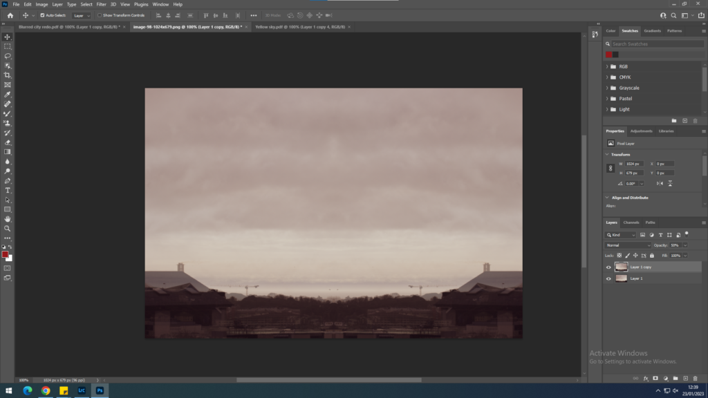
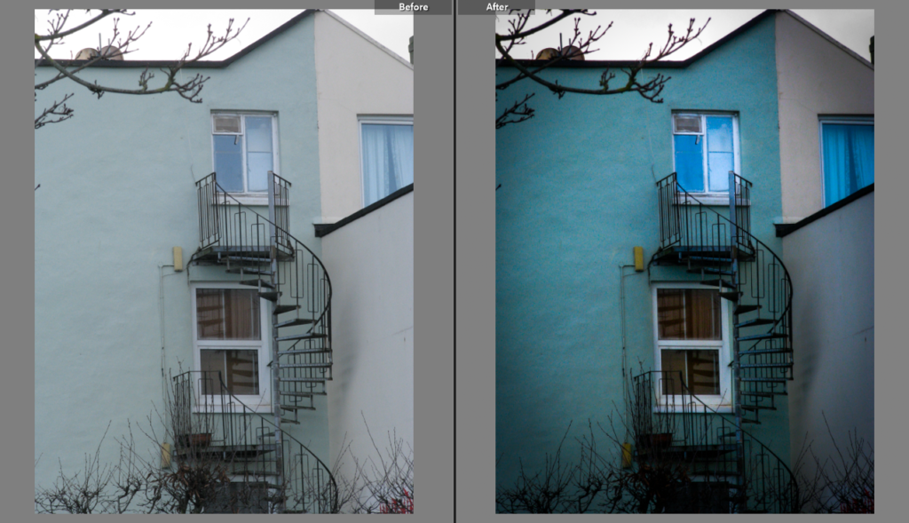
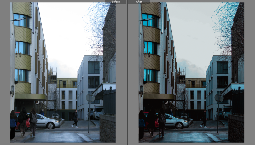
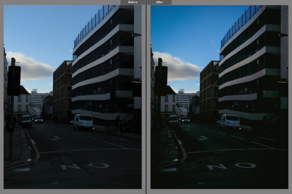
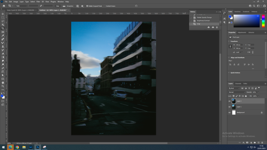
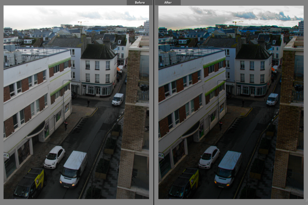
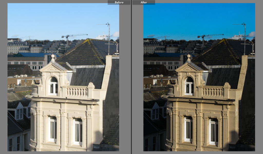
Firstly, I added my edited photo into photoshop. I chose this image since I liked the vintage colouring of the picture and how the dull colours are similar to that in Riccardo’s image.
Next, I created a duplicate layer and inverted it.
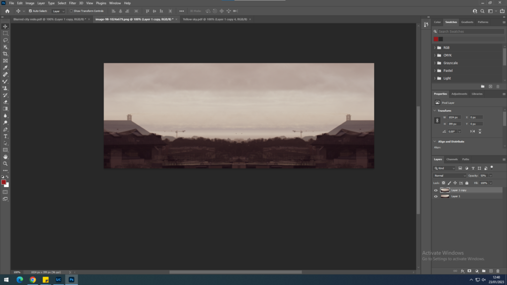
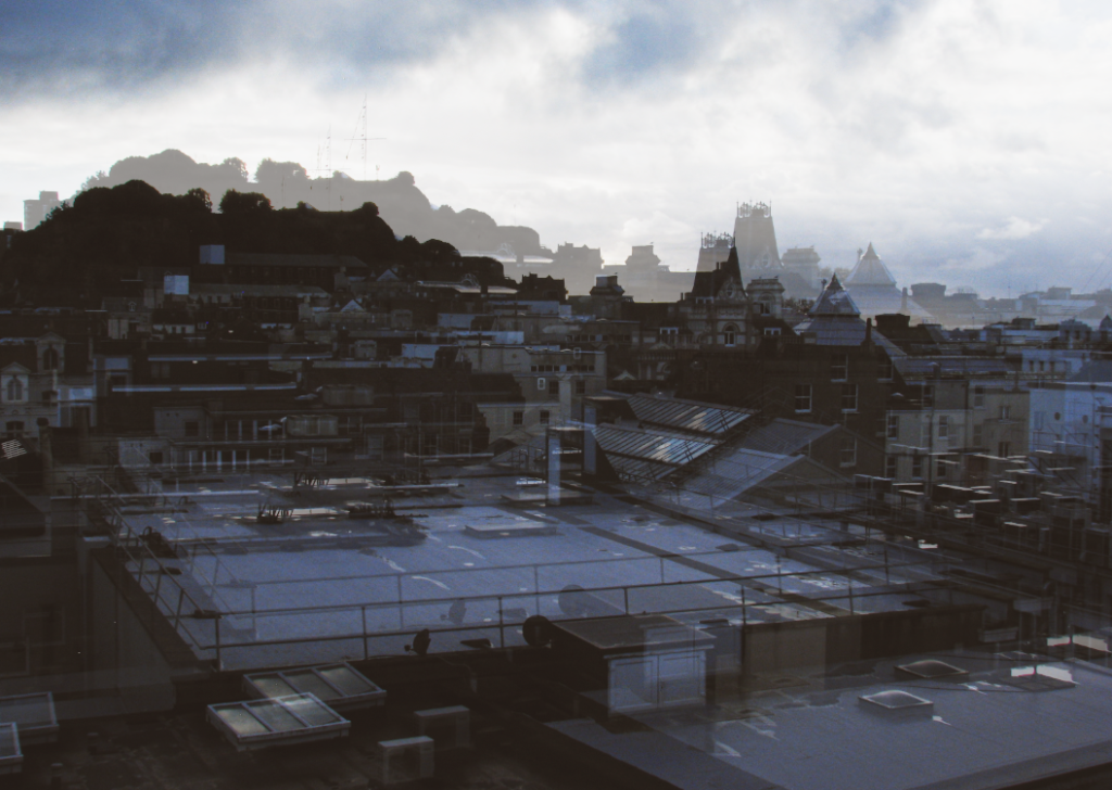
lastly, I cropped my image as there was too much excess sky.
the final outcome.

image 3:

– Riccardo Magherini, urban.
My image

How I did it:
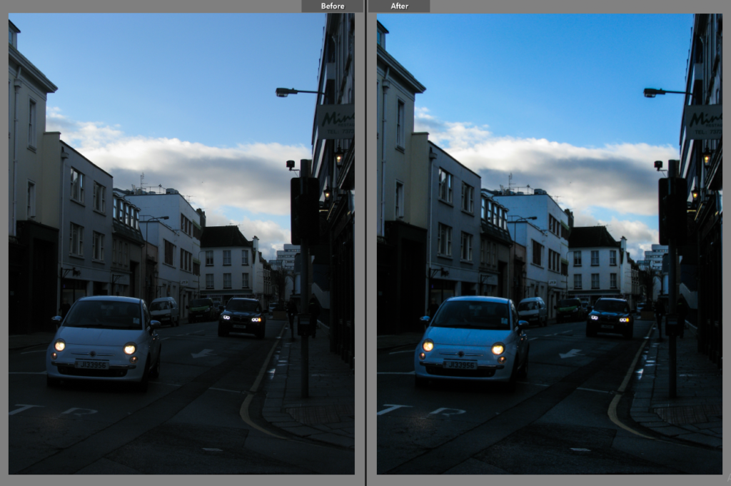
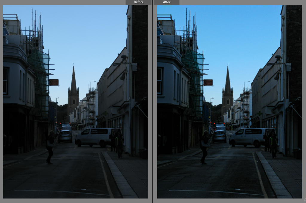
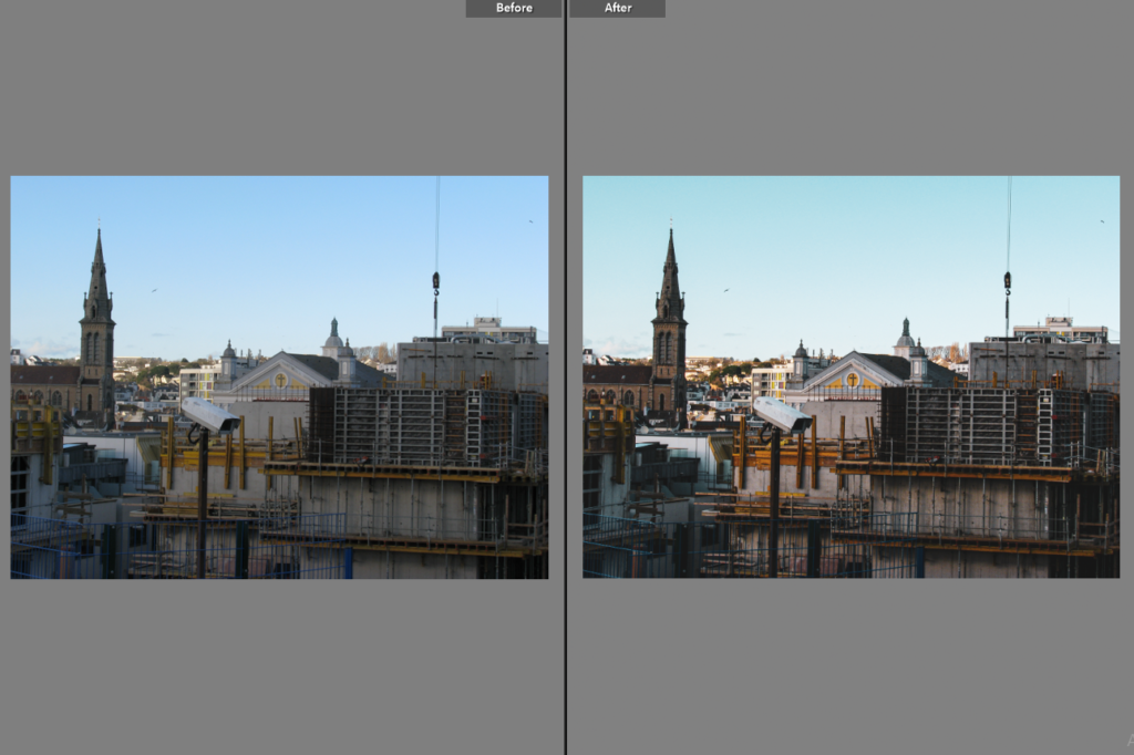
Firstly, I added my picture into photoshop.
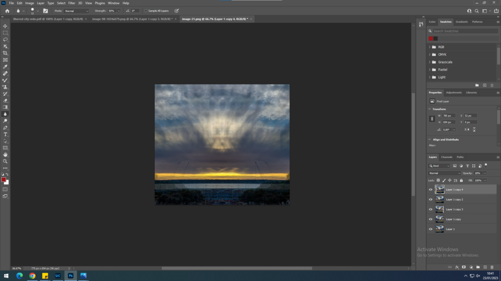
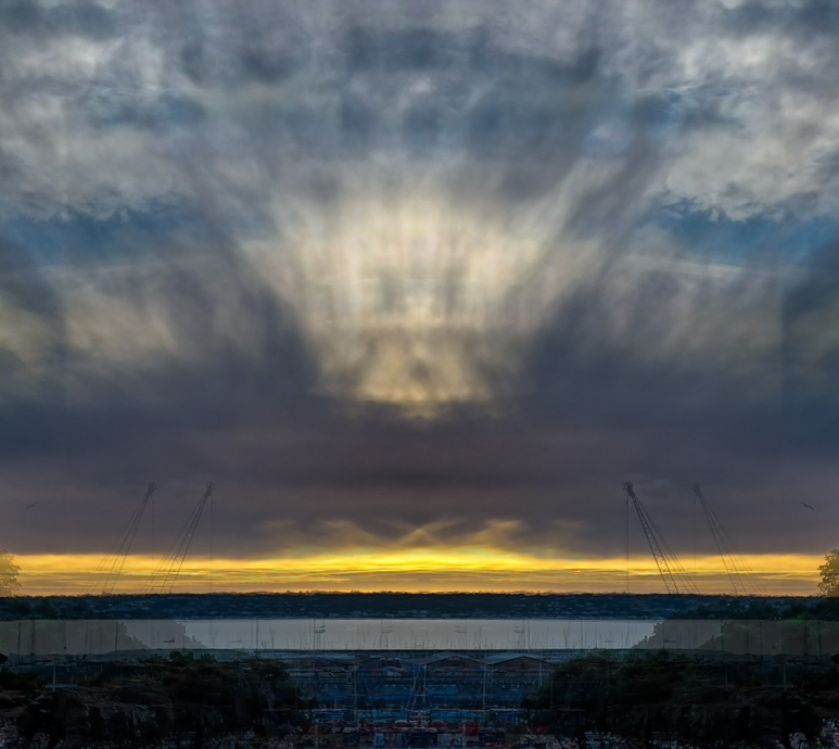
Then, I created layers, inverting two to give the image even more of a focus point in the centre.
This was the finial outcome, I chose this picture as I felt that the yellow in the sky matches the yellow on the door of Riccardo’s image.

Photo Edits

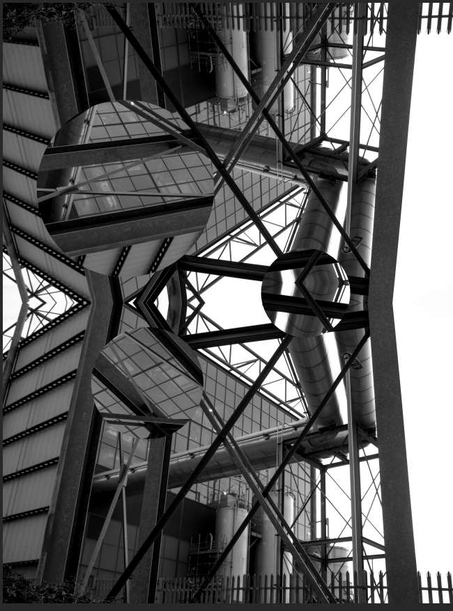
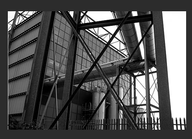
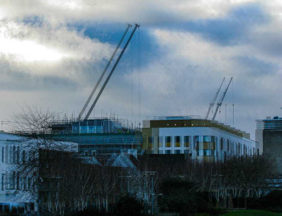
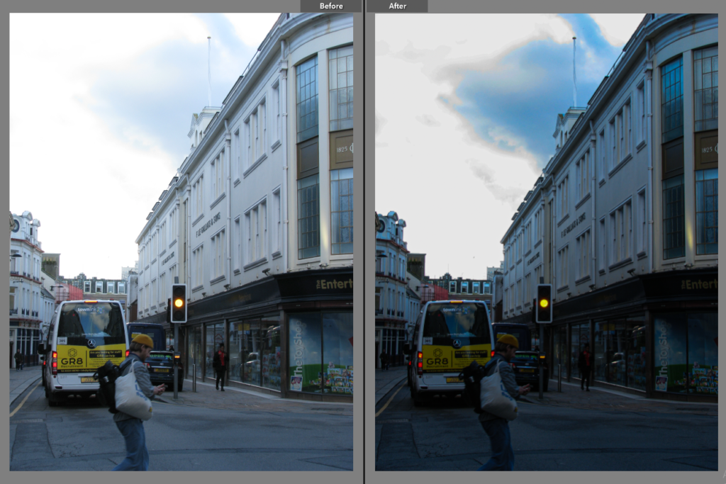
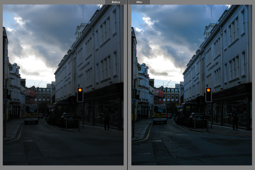
This photo was edited on Light Room then edited on photoshop, i doubled the photo and flipped it so it would line up and then cut circles up and turned them so they sit distraught on the photograph i am happy with the final outcome on this photo due to the alinement of the two photos and how it gives off a clean look

This was the original photograph I used to create the edit.

Anthropocene – Photoshoot 1 – Making

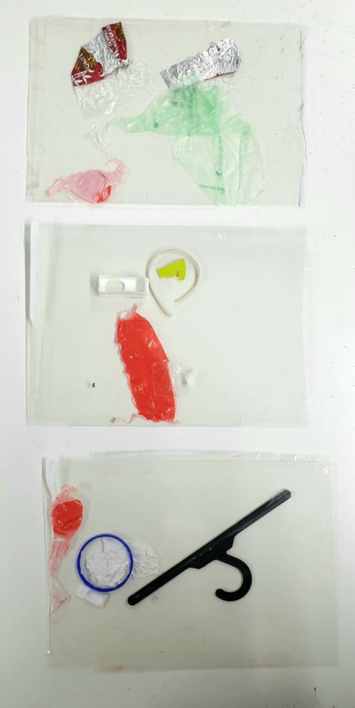
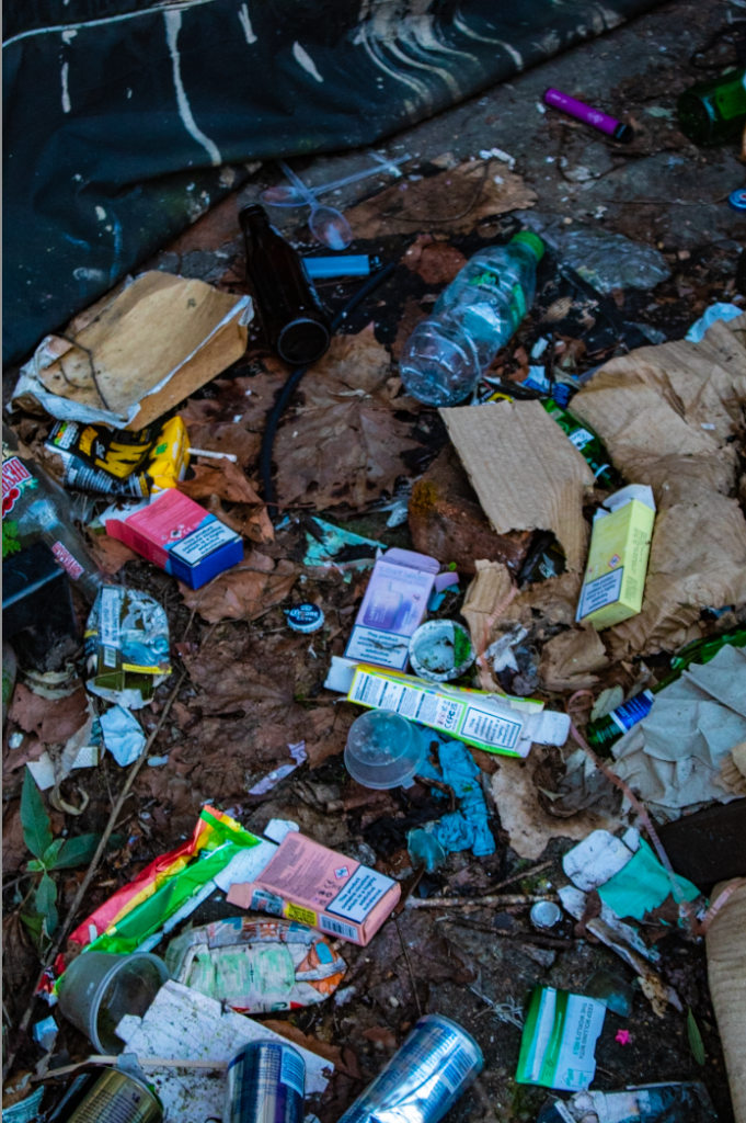
The idea for this photoshoot was how we are so used to seeing plastics in our daily life and the sheer amount of it. I wanted to take photos through plastic to express this and I was inspired by Stephen gills talking to ants series.

To recreate how Stephen Gill put the materials he wanted to capture inside his camera I created small pockets out of clear plastic by taping them together. I then put the plastic I had found outside and around the house inside to hold them in place and allow me to take photographs through them by holding them up to the lens.

Fay Godwin

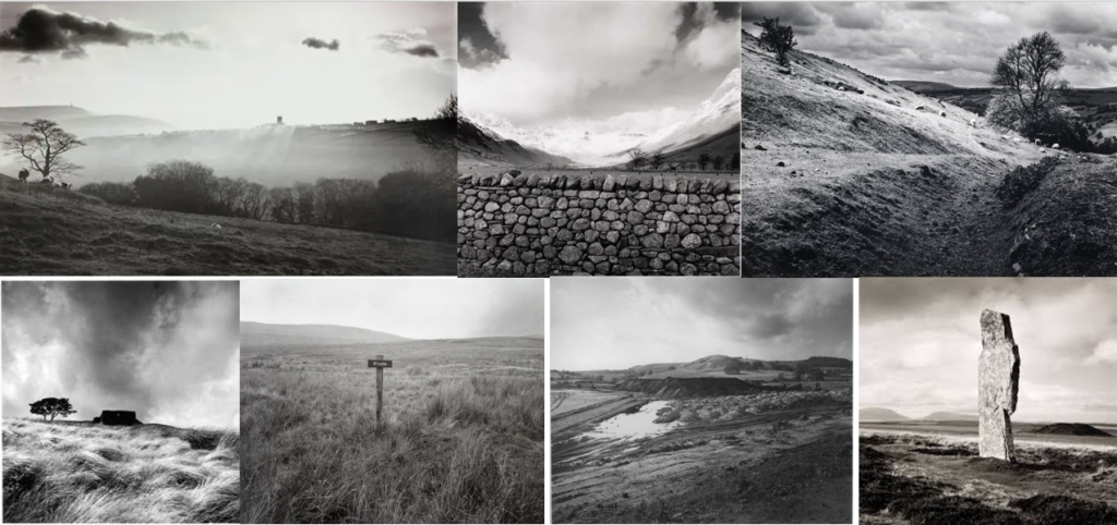
Fay Godwin was an artist that I have looked at previously for my romanticism project earlier in this landscape module, but this time I looked a little closer. After doing further research, I have discovered that her dislike of being named as a ‘Romantic Artist’ is not just due to personal disagreement but because of the intention behind her work being of the documentary nature.

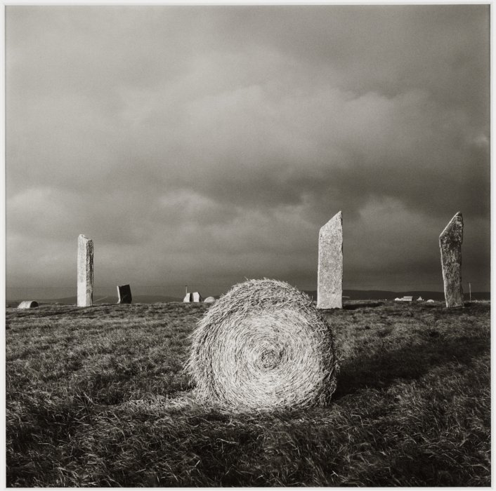
Fay Godwin, Stones of Stenness, Orkney, 1985.

As an amateur to the medium, Godwin found herself attaching to the landscape genre through her love of walking in the English countryside, often collaborating with writers ‘to produce in depth surveys of particular rural topics or regions.‘.

The activism aspect in her work stems from her personal enjoyment of walking, with her presidency of the Rambler’s Association from 1987-1990 being evidence of this. Most particularly, she focused her career on supporting the establishment of legislation that allowed walkers more roaming rights with less restrictions from private landowners. The introduction of the Countryside and Rights of Way Act in 2000 is a testament to the work she did as president of the association.

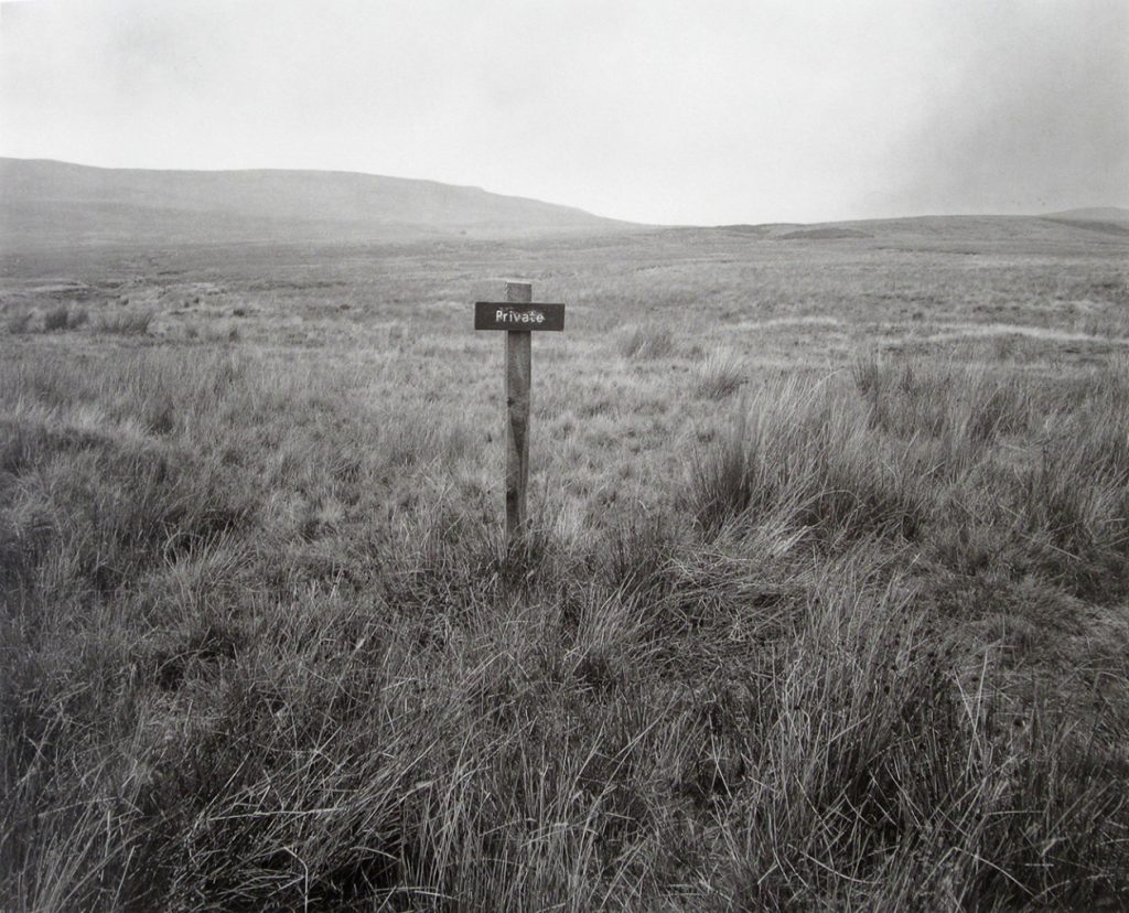
Through her images, Godwin demonstrates the juxtaposition and relationship between uncultivated land and the human marks on it. This is done through her framing of fencing and signage as symbols of land ownership and enclosure in the countryside.

Fay Godwin, The Duke of Westminster’s Estate, Forest of Bowland, 1990.

This essay explains Godwin’s personal connection to her cause, as well as her inspirations.

‘The old question about whether photography is an art is a silly question. I’ve been called a Romantic photographer and I hate it. It sounds slushy and my work is not slushy. I’m a documentary photographer, my work is about reality, but that shouldn’t mean it can’t be creative.’

– Godwin (quoted in Fowles 1985: xii)
I think that, in my idea for this Anthropocene inspired project, I want to echo her ideas slightly with my work. Being in Jersey, there is a lot of evidence and many examples of where land has been enclosed by wealthy landowners – there is not much of the island which actually remains public – and this is quite unfortunate for those who want to explore what Jersey’s wildlife has to offer. Despite the fact that there are many protected areas of beauty that are available to the public, much of Jersey’s land is used for agriculture and energy resources. This is already quite closely linked with my own idea for this project, as her showcase of the tension between man and nature in a single image is similar to what I wanted to produce with more than one image.

Anthropocene – Comparative Analysis

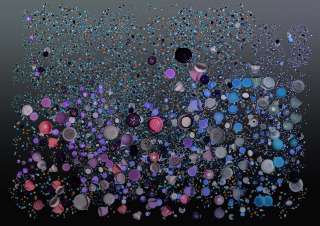
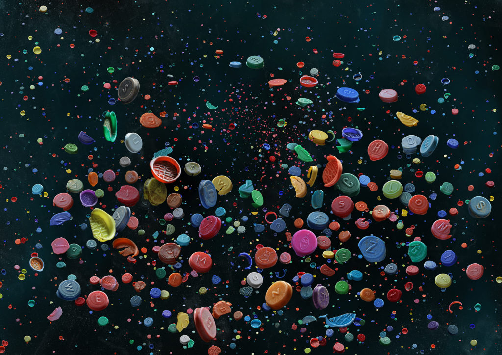
Compared to Barker’s work, my piece is very similar to hers – the light in the image comes from above, the positioning of the bottlecaps add weight and direction to the image, no real patterns or repetition is really visible, most of the shapes are organic and flow into the rest of the photograph, the images have depth because of smaller bottlecaps placed in the background, there’s a large range of tone and colours, but they overall tend toward darkness, most of the colours are also quite saturated and helps a viewer to understand that the pieces are about plastic in some way or another.

On the other hand, our images differ quite drastically too. Barker’s piece feels more as if the light in the image is natural, and that this manufactured photograph was something found in nature. The lines and shapes created by the placement of the bottlecaps also feels more natural, as it flows better with the image, much like the negative space, the random density of caps throughout adding to this effect. When it comes to the colour palette of Barker’s image, the colours are a lot more saturated and full as compared to mine – it looks dull in comparison.

I wanted to create a piece of work very similar to Barker’s, and I think while I did a pretty decent job at imitating her style, I don’t believe I captured the guise of realism that she does with her work when compiling all of her photographs together, as mine still just looks like it was done on photoshop.

PLAN FOR FINAL OUTCOME

IMAGES USED IN FINAL OUTCOME:
WHAT IS A TRIPTYCH?

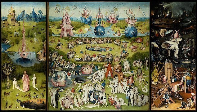
A picture or relief carving on three panels, typically hinged together vertically and used as an altarpiece.

The Garden of Earthly Delights, 1490-1510, by Hieronymus Bosch

ORIGIN OF TRIPTYCHS:

The first triptychs go back to the Middle Ages when Byzantine churches were decorated with biblical altar paintings. One of the most famous of all triptychs is the altarpiece in the Antwerp Cathedral by Peter Paul Rubens, completed in 1612

Llandaff Church is one such cathedral with a triptych altarpiece. Rubens’ two versions may be seen at the Cathedral of Our Lady in Antwerp, Belgium, and Notre Dame de Paris is another instance of triptych in construction. The construction of many church stained-glass windows echoes the shape.

ARE TRIPTUCHS RELIGIOUS?

The triptych became a popular art form in early Christianity. Beginning in the Middle Ages, altarpieces with elaborate painted or carved panels that were hinged together became popular in churches and cathedrals.

PLAN FOR HANDMADE FINAL OUTCOME:

Photoshop plan of final outcome

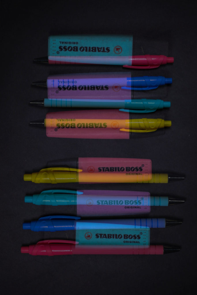
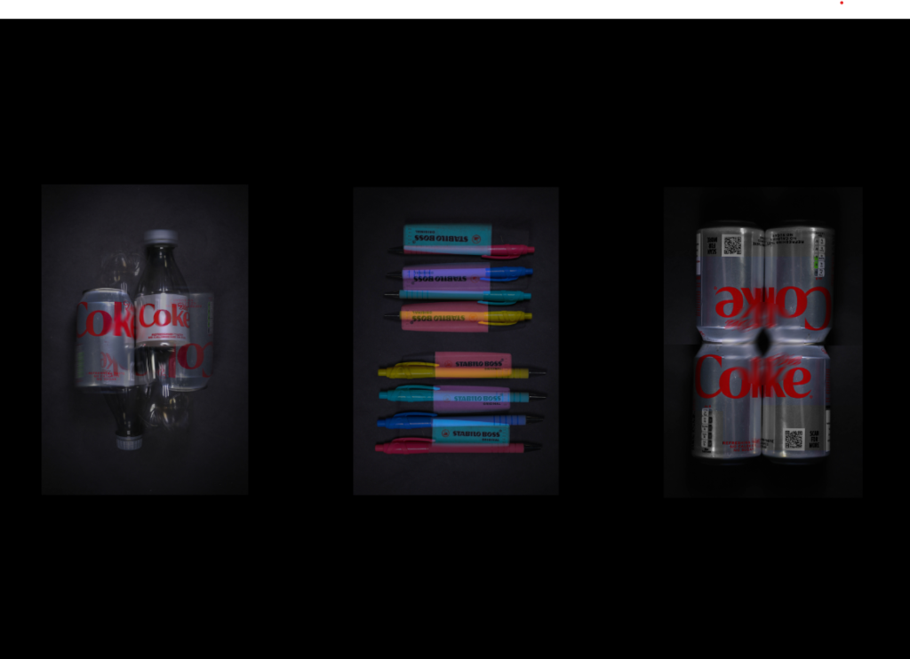
For my final outcome I will print out my images in A4, and mount them onto foam board. Then I will place them or card next to each other. My main idea is to form a triptych with my images. These are the images I made during my further editing this is due so that they are more eye catching rather than just simple basic images. I chose the highlighter-pen picture in the middle as it is the most colourful and my most successful image during my photoshoot, then I decided to pick both diet cokes on the side so that they have a similar concept.

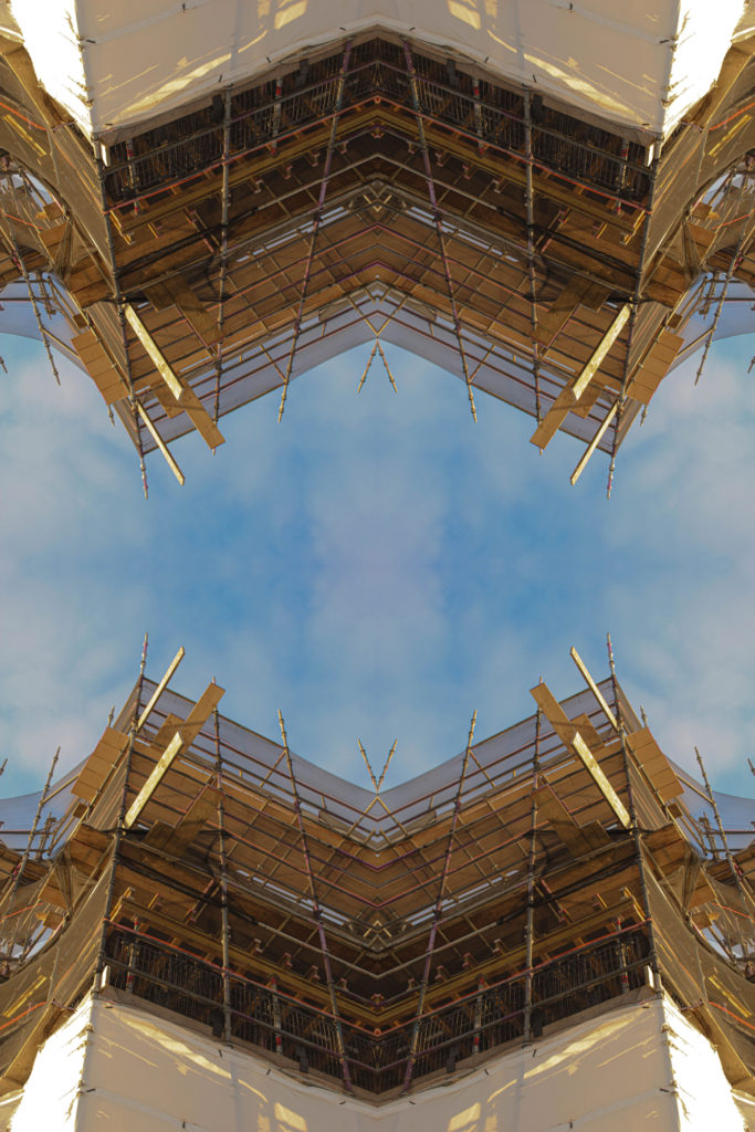
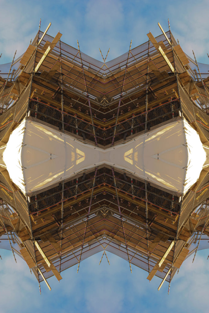
Kaleidoscopic image altering

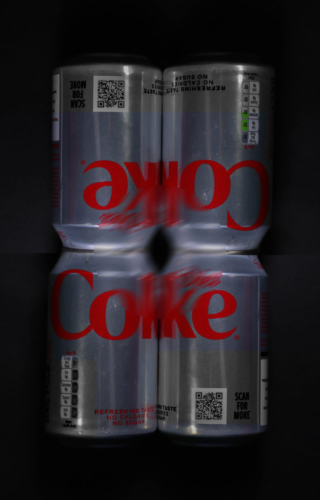
It is a simple method that uses duplication, mirroring, and rotation to create a geometric pattern. A kaleidoscope pattern has a hypnotising quality to it. The pattern draws you into the centre of the image. This can be done with a repetition and rotation of the image over and over again to create more of a circular effect or could be done with just 2 rotations. i have decided to do it 4 times.

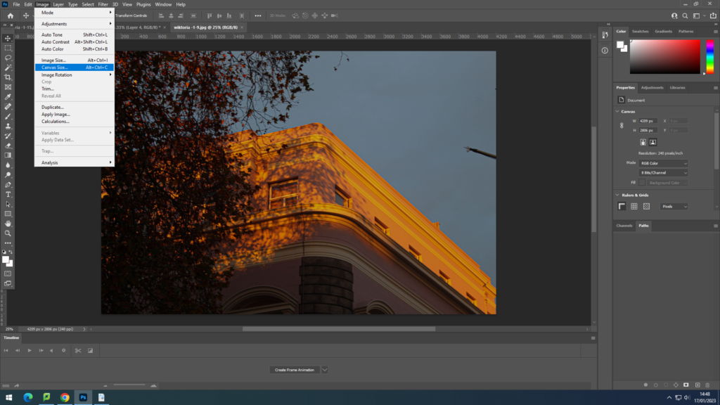
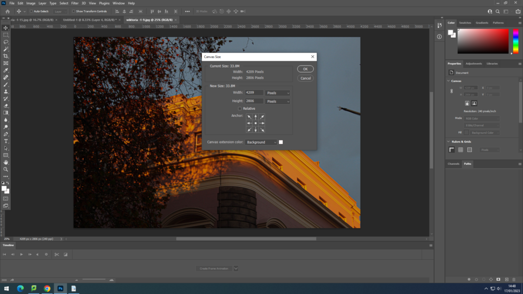
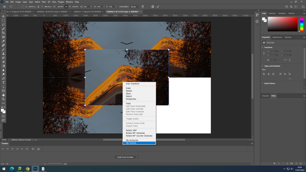
  1. Change the canvas size. to do that I have gone to image-canvas size- and made a note of the number of pixels.

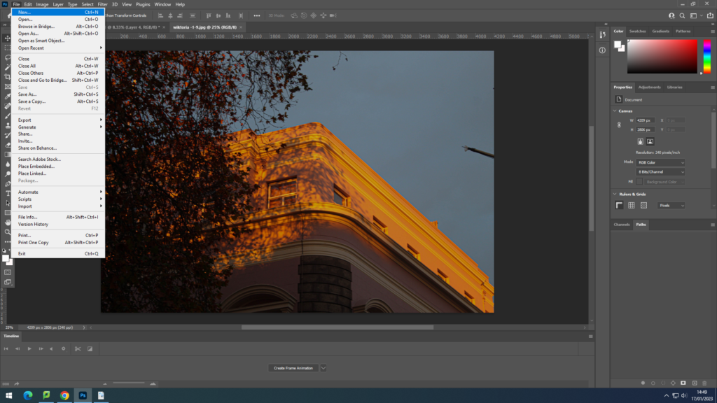
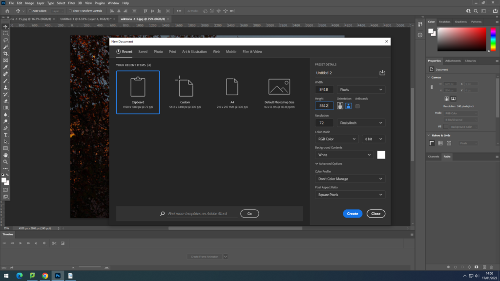
2. File-New and change the pixel number

The number that needs to be changes is the width and height. by doubling the number of pixels of the image. then putting in the doubled width into the width pixel column and height in height one.

3.After opening the background and the picture, Using Ctrl+A and Ctrl+C I copied and pasted the same image onto the background area.

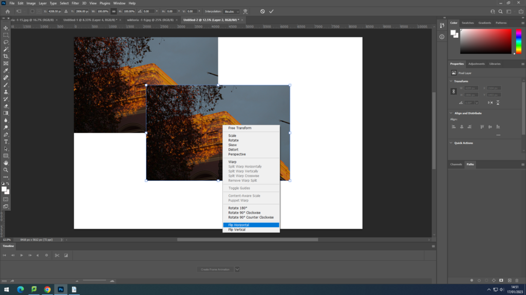
4.On that image using Ctrl+T I right clicked a chose : flip horizontal, this image because it was flipped horizontally I put it onto the right of the first image.

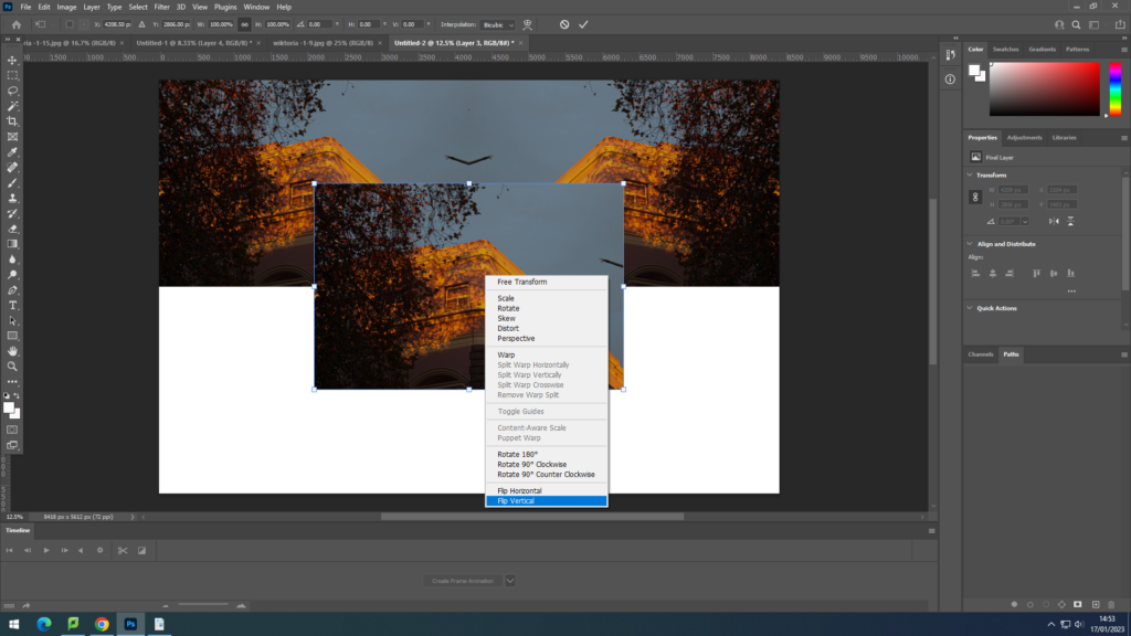
5. Using Ctrl+V I pasted the same image as before but this time selecting : flip vertically. This image I have put bellow the original one .

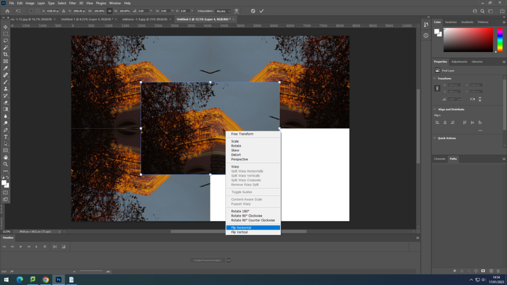
6. Having the same image pasted again, i have flipped it horizontally.

7.Then I have flipped it vertically, and have aligned it in the bottom right corner.

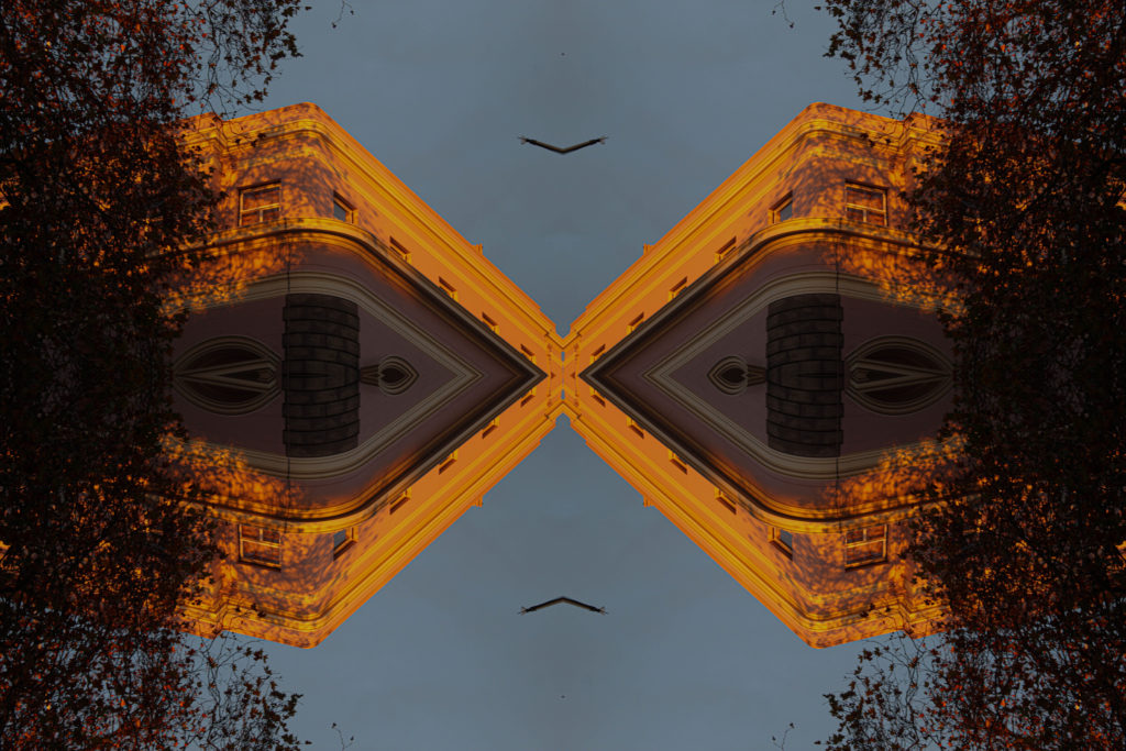
Final Image:

I have experimented with that technique on another image, as well as rearranging the images alignment, swapping them vertically.

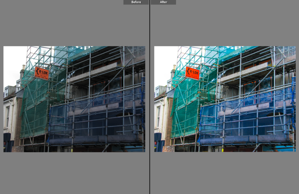
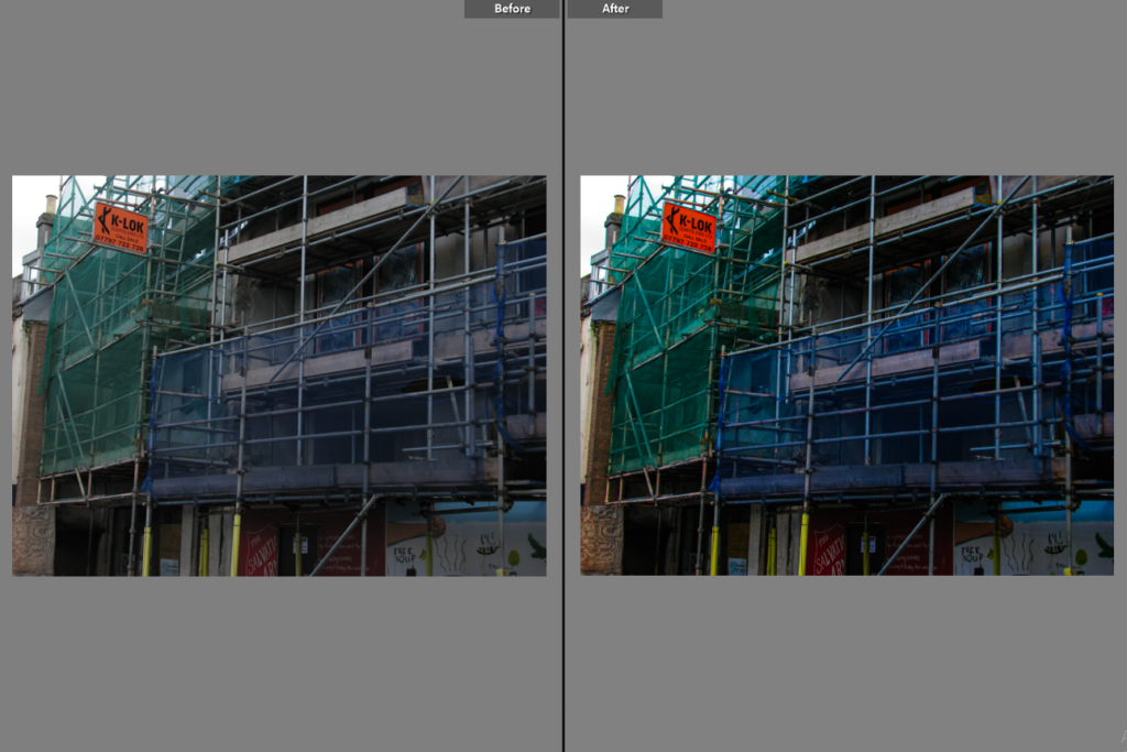
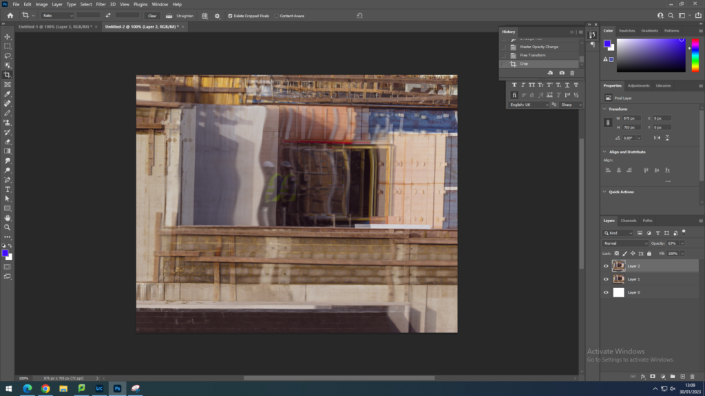
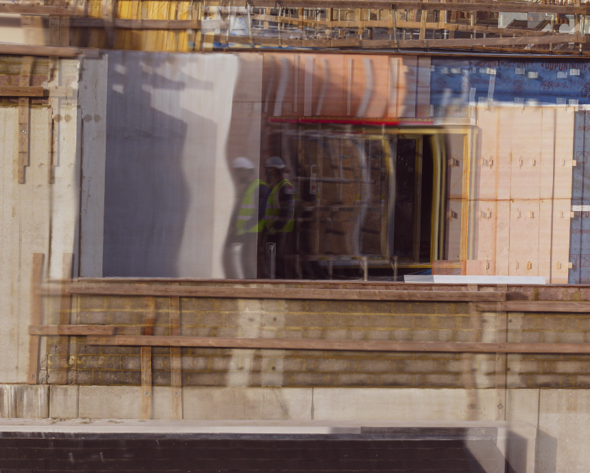
THE ANTHROPOCENE PHOTOSHOOT 7- EDITS

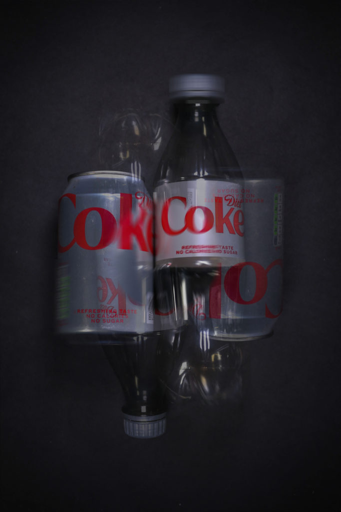
I edited these images in both photoshop and lightroom, using tools such as the smudge tool and adjustment brush to create these images, manipulating the images to look better and more like the artists in lightroom and later layering the images in photoshop. I lowered the opacity of the layers on top, creating these multiple exposure photos. For some images, I conjoined different yet similar images, and for some I layered the same photo on top of another (one version being edited, for example by using the smudge tool, differently to the other). I also moved the layers around ,creating the idea of movement in my photos.