PHOTOSHOOT ONE:

PHOTOSHOOT TWO:


PHOTOSHOOT ONE:


PHOTOSHOOT TWO:


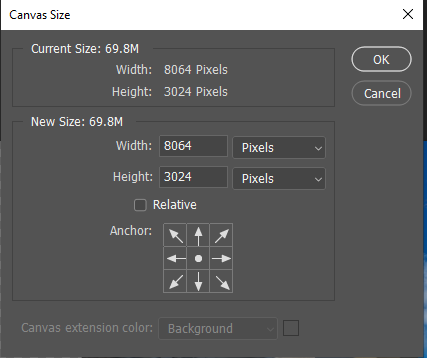
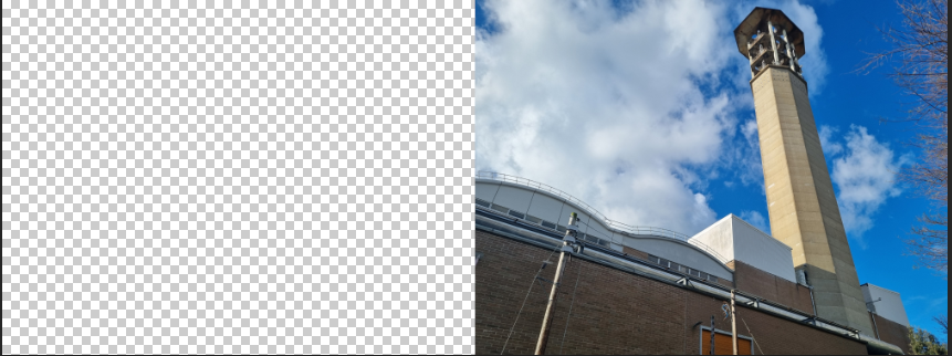
I doubled the width of the canvas.
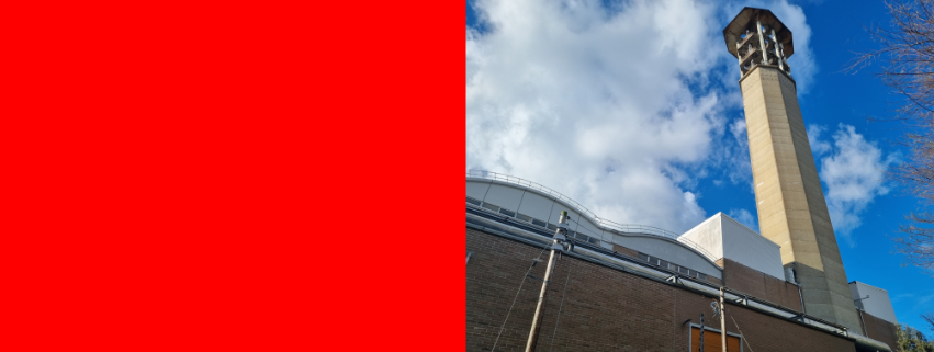
I filled the empty side in with red.
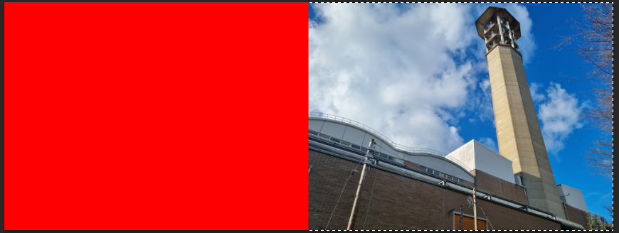
I selected the red side with the magic wand tool and pressed on inverse select.
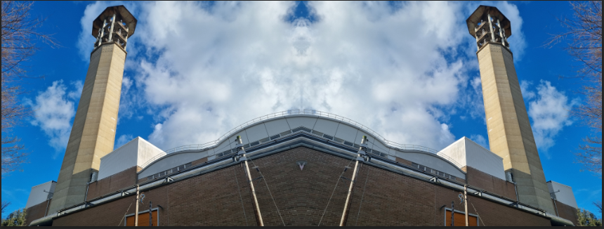
I duplicated the image and flipped it horizontally, I filled the empty with red so I could see if there where any gaps between images.
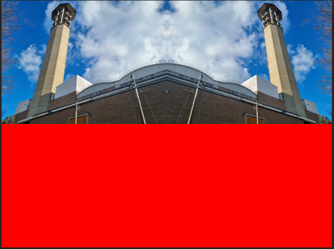
I repeated the 1st and 2nd step but with the height.
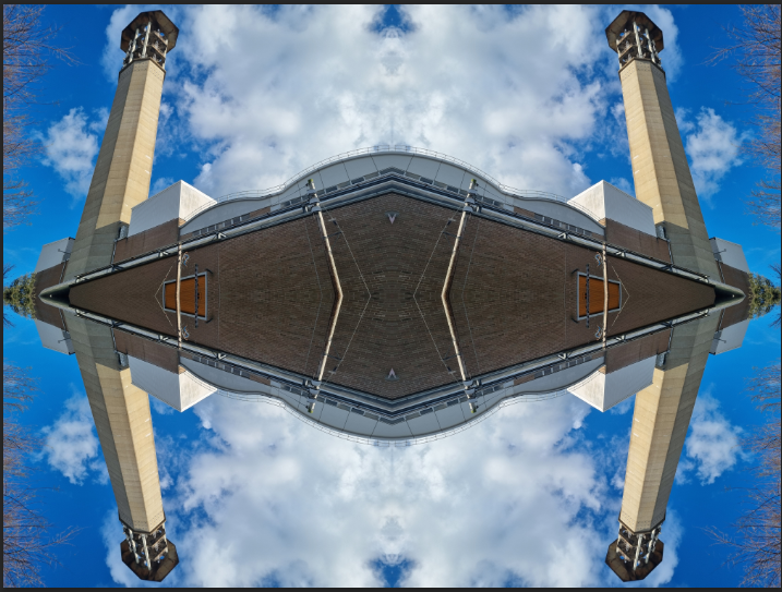
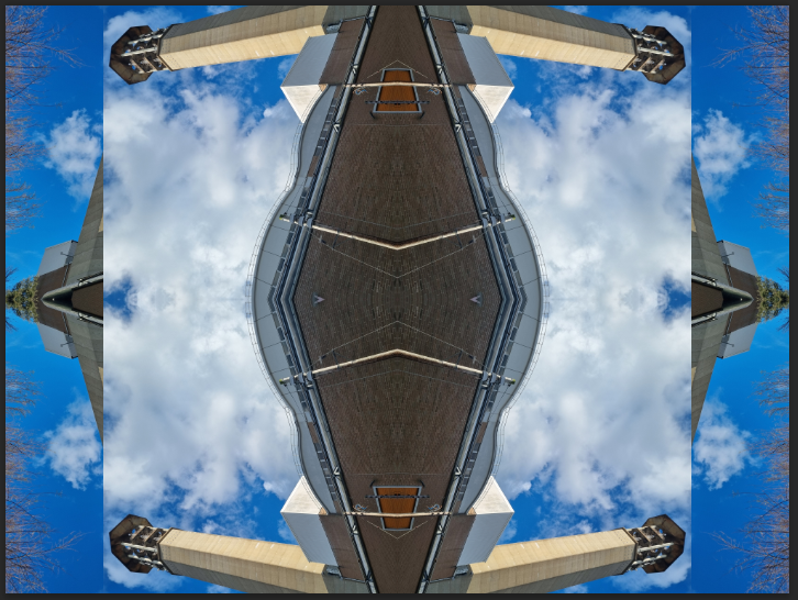
I duplicated the image and flipped it 90 degrees.
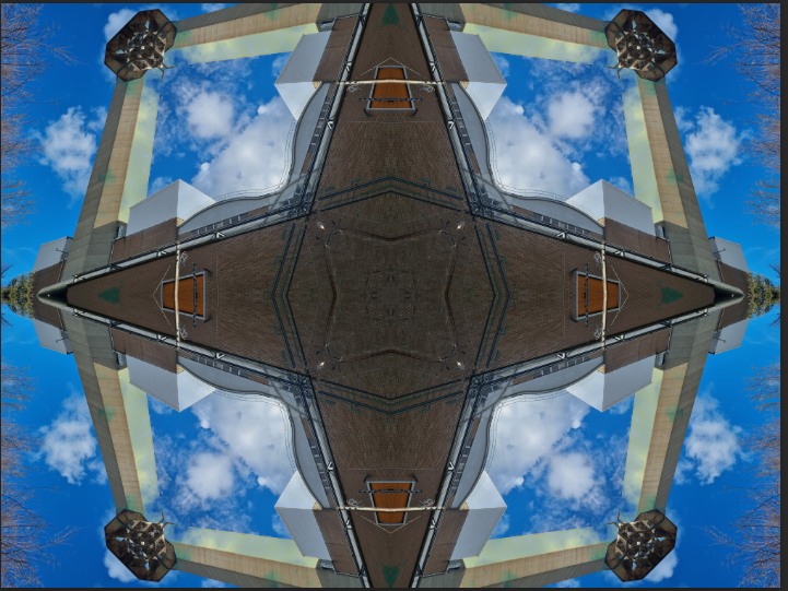
I changed the blending mode of the second image until if found one that looked good.
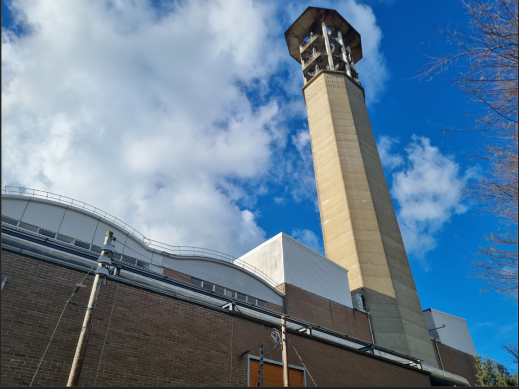
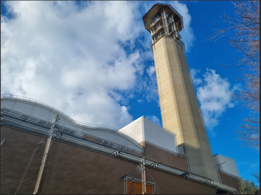
I duplicated the image and change the opacity and offsetting it a bit.
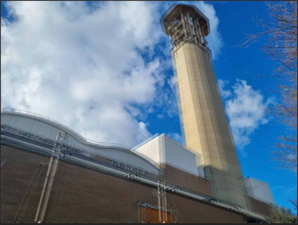
I repeated this a second time.

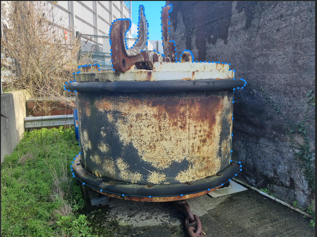
I used the pen tool and went around the image.
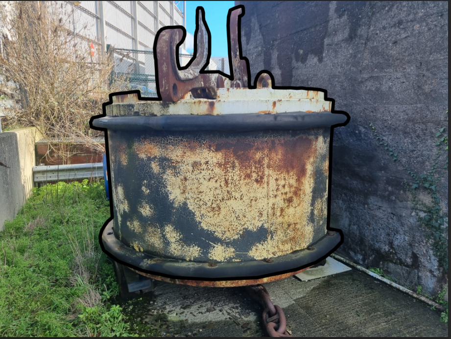
I then clicked stroke path with a black brush.
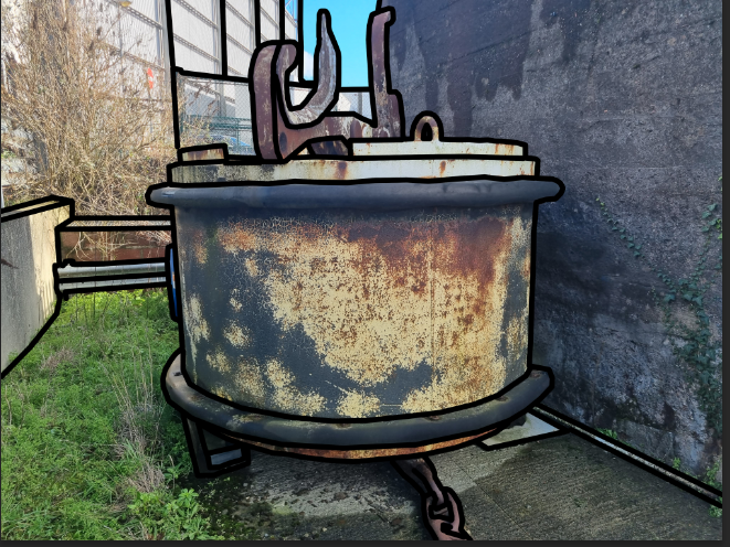
I repeated this process until I couldn’t outline anymore.
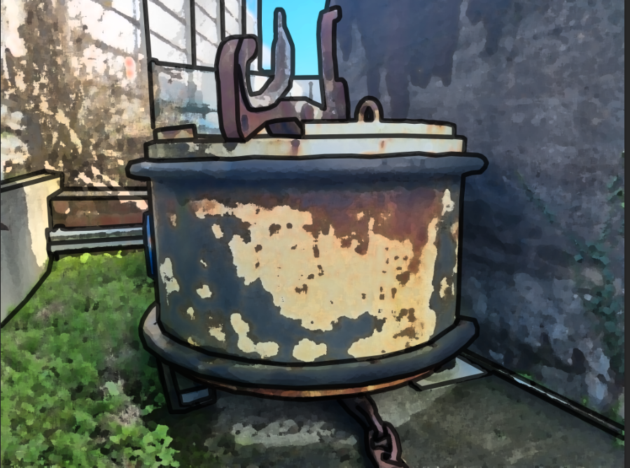
I applied a filter to reduce the realness of the image.
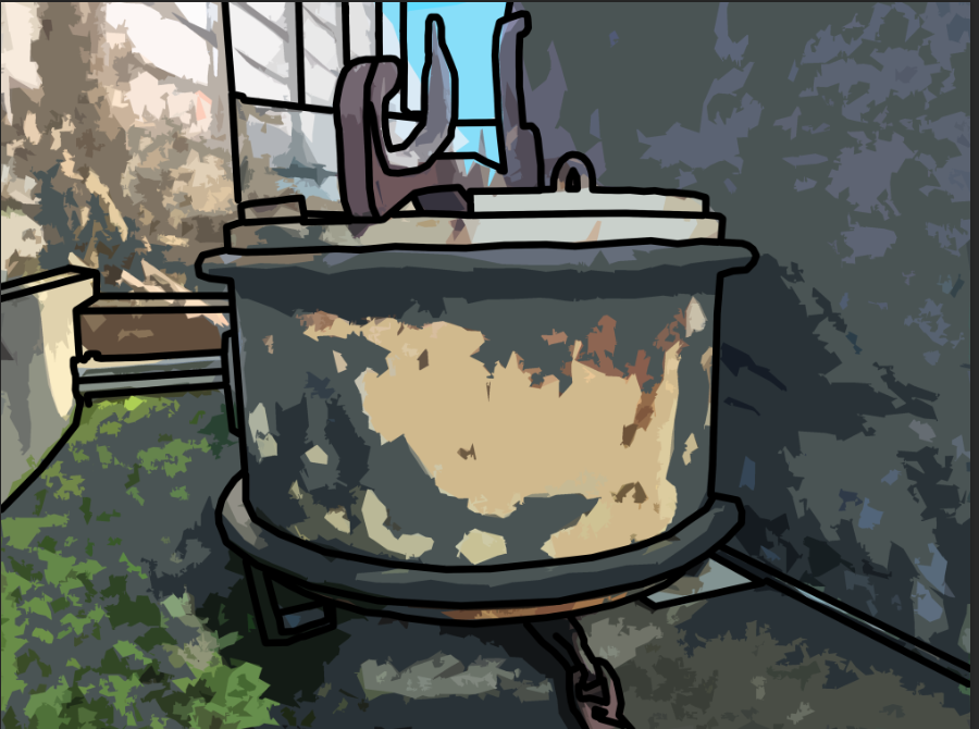
I then applied a second filter to give a cartoony look.
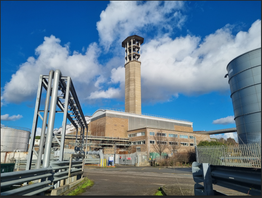

I applied a layer mask to the image.

I then made a new layer, filled it in with white and put it bellow the image.


I filled the layer mask in with black to make the image disappear.

Then i found a brush that I liked.
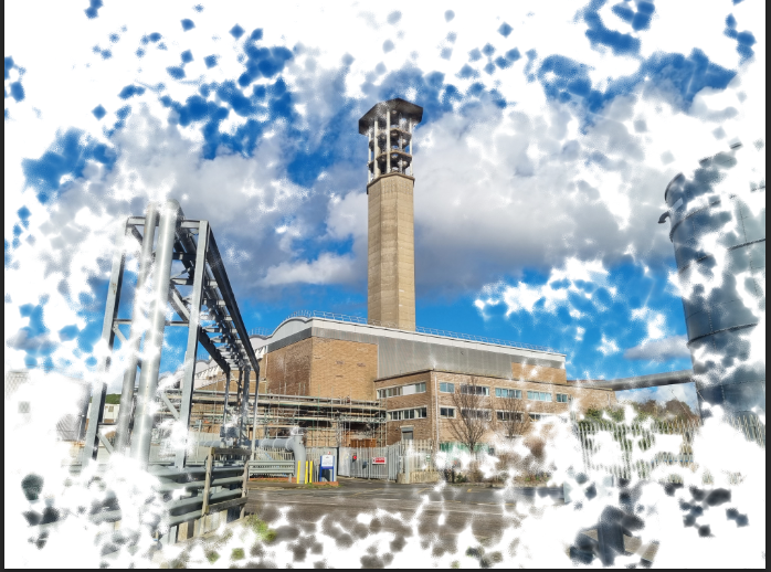

with the layer mask selected i painted, with white selected, around the image.
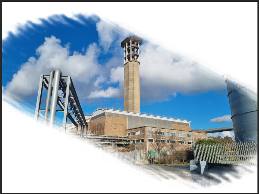
I used a different brush to give me this result.
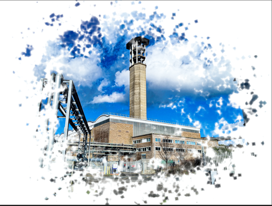
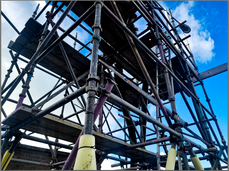
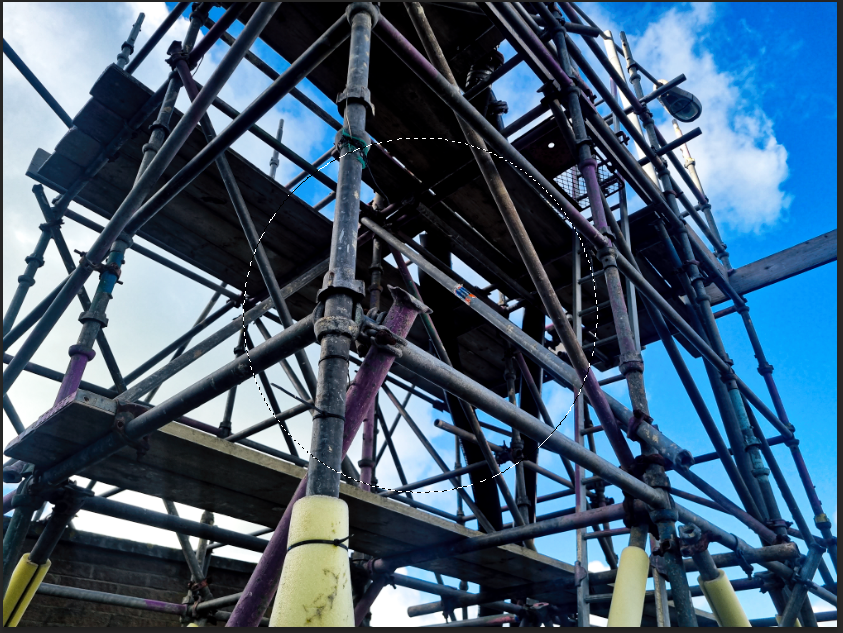
I used the ellipse marquee tool to make a selection of a circle
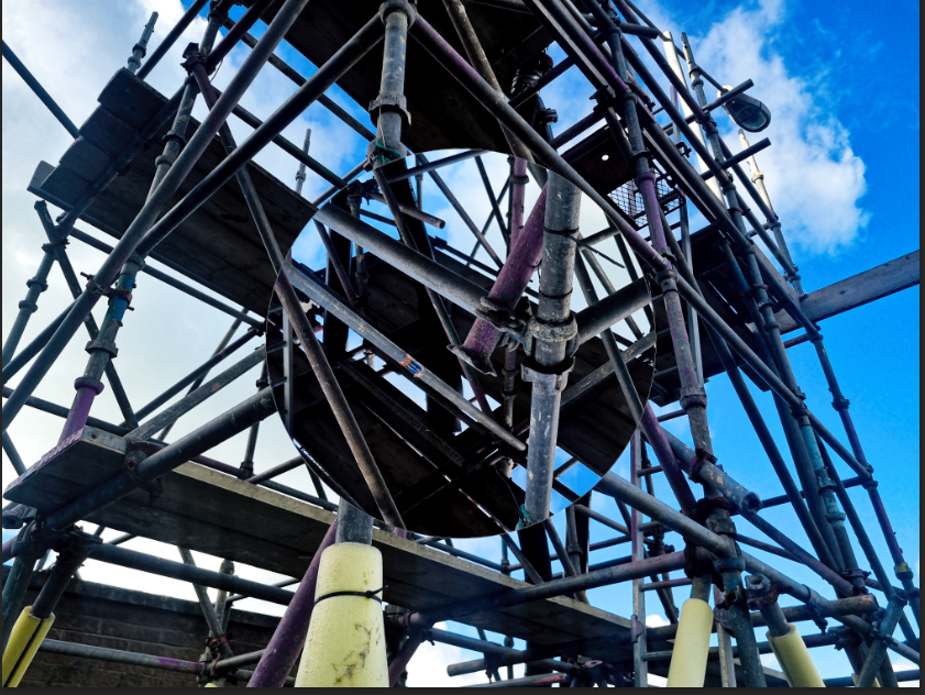
I then rotated the selected part 180 degrees

For this image i got a image of a bottle outlined it with the pen tool and clicked stroke path
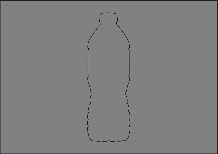
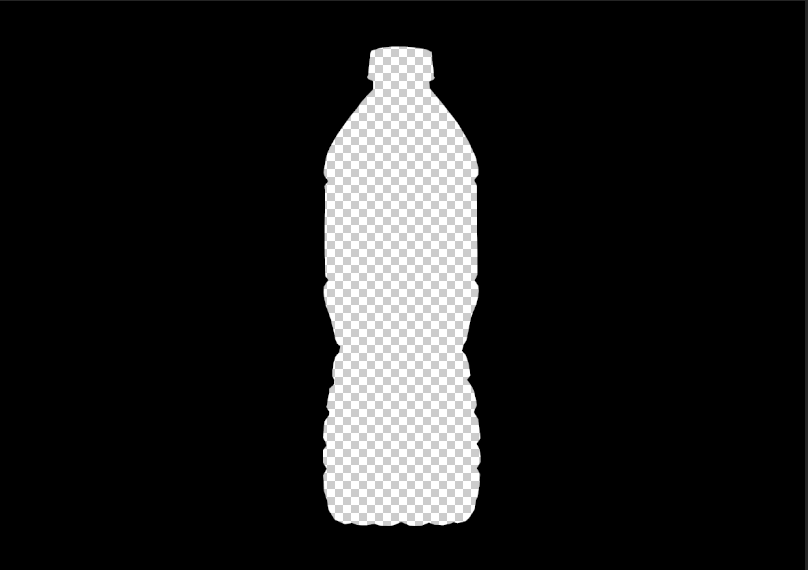
I then selected the outline and applied a layer mask and changed the background to black
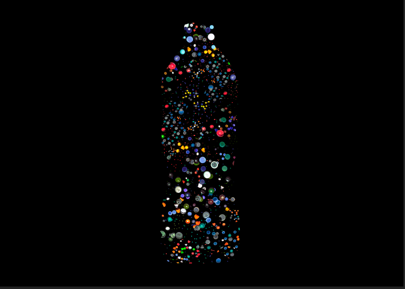
I then filled the outline with caps
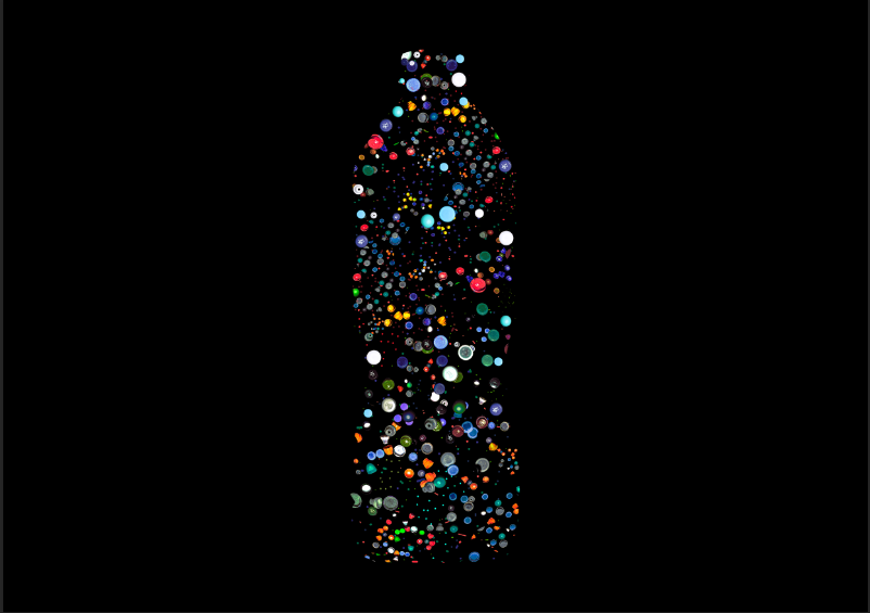
selecting-

I think these images and the clearest backgrounds and defined shapes.


I have chosen two images from each two photoshoots I’ve done. Land erosion and Electric towers. In this blog post i will be focusing on relating my images back to Axel Braun and Anthropocene.
Land Erosion- Photoshoot 1
(Three final images)

ANALYSIS:
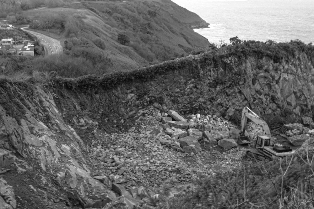
This image shows a clear representation of land erosion. You can see all the rocks from which they would’ve fallen from the cliff side, and how it has created a ‘ditch’. I like the contrast between plants, land and harsh rocks/ debris it makes the focus on the image stand out (the landslide). This relates to Anthropocene, as in a peaceful natural area by the cliff there has been damage to the area. In the picture you can see a man made digger which also gives the impression that humans also had a part in it. Axel Braun’s research deals with controversial infrastructure projects, tautology as an attempt to understand reality, and failed utopias in art and architecture. He mainly takes landscape pictures, I feel like this is something he would photograph however without it being in black and white. I had to have this image in black and white due to the blurriness, it slightly hides it and focuses less on the sharpness of the colour.

ANALYSIS:
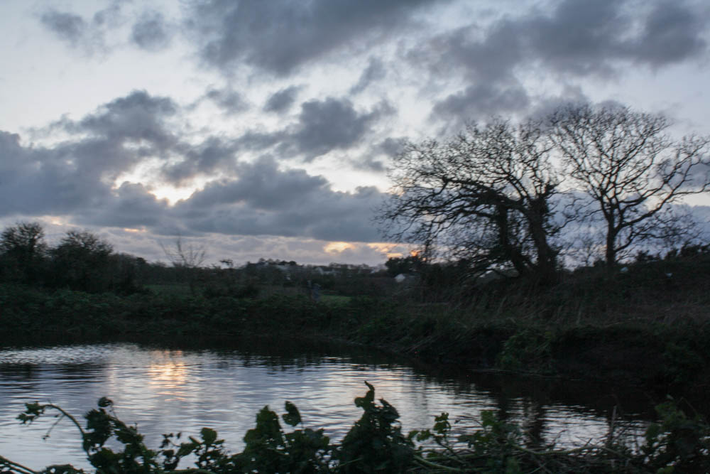
This image shows a pond surrounded in greenery. I like how the sky reflects onto the water giving off a peaceful feeling and also how you can see at the bottom of the image leaves covering it slightly. Whilst editing this picture I made the exposure a bit lighter so the greenery surrounding the pond is visible, I couldn’t make it too light otherwise it wouldn’t have the same effect it gives off now with the darkness creating a peaceful scene. The bank around the pond is slowly falling into it, which is where you see land erosion in this image. Axel Braun has several images where he includes rivers/ ponds through natural areas such as fields, woods and anywhere without man made structures. I like how its not that obvious but is still present in the image and almost gives off a feeling that you dont know how deep or large the pond is and really how it formed; knowing once there was just grass and leaves there.
ANALYSIS:
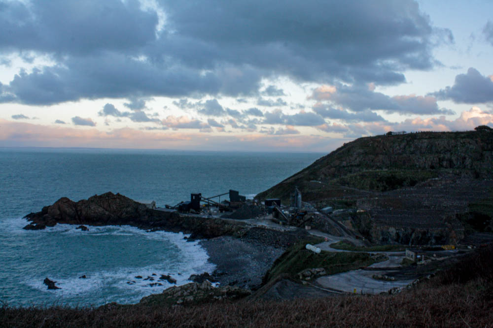
This image doesn’t particularly show land erosion but I am using it as it relates back to Anthropocene and Axel Braun. Just off the side of a cliff path several man made structures are put into place, roads have been made which stand out as they are randomly placed on the cliff. I like the detail of the waves crashing against the rocks underneath and how secluded this buildings are. its a simple landscape yet still represents Anthropocene (Axel Braun’s technique).
Electric Towers- Photoshoot 2
(Two final images)
ANALYSIS:
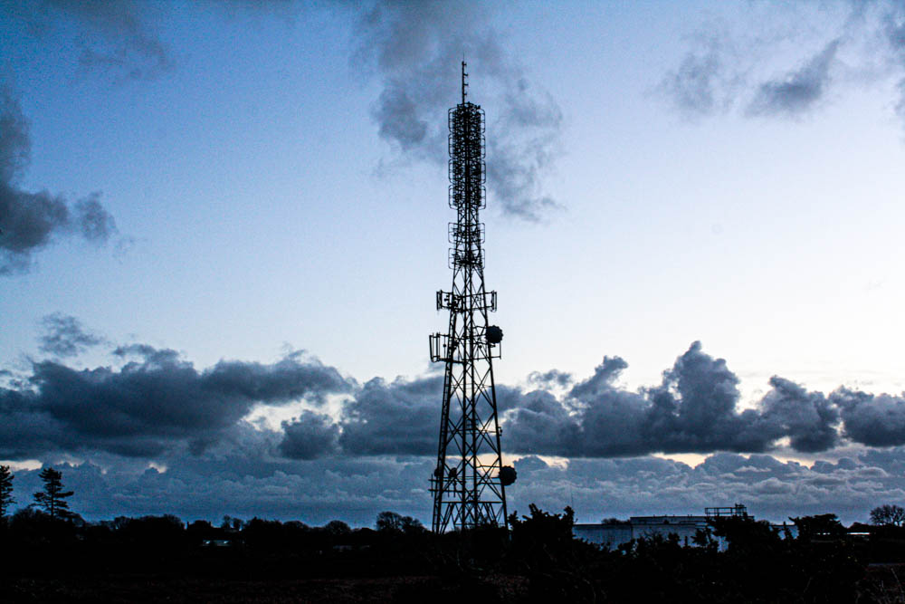
This image was primarily inspired by Axel Braun’s images of electric towers, the composition in the image is the main aspect. All the bushes/ trees are at the same level and then the electric tower stands out with its height. However electric towers aren’t usually taken much notice of but when you analyse them they are such simple yet interesting structures in the most quietest peaceful areas. I darkened the bushes below the tower so that the tower itself was mainly focused on. I like the positioning of the clouds too because it really helps show how tall and significant the tower is. Once again linking to Anthropocene as it stands out amongst the nature which surround’s it.
ANALYSIS:
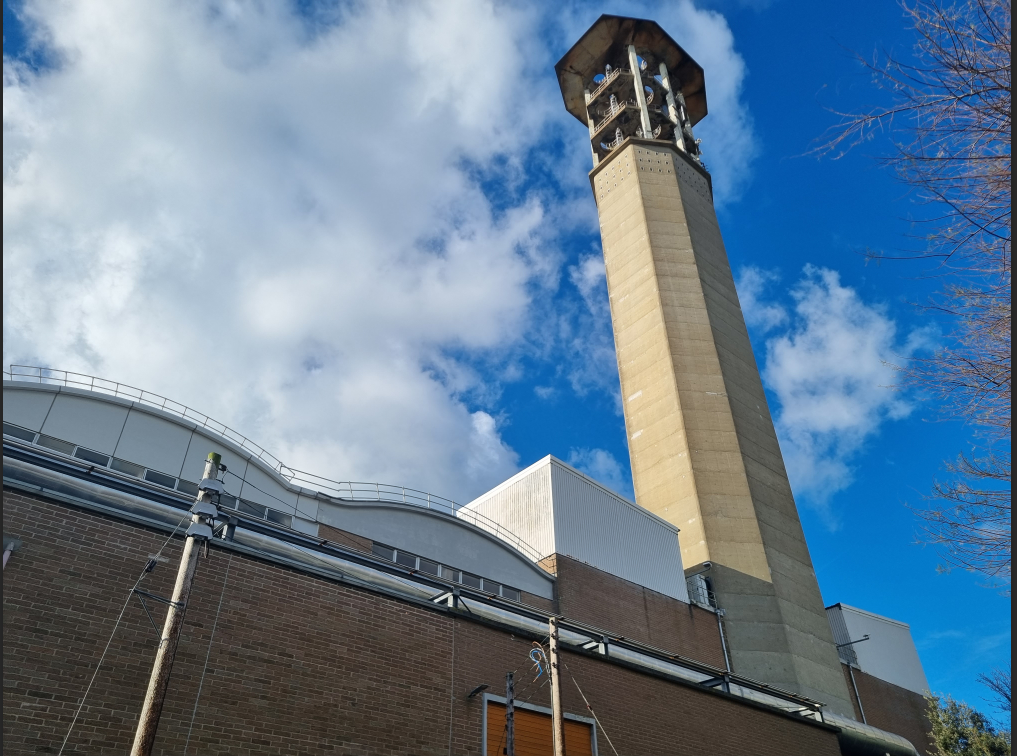
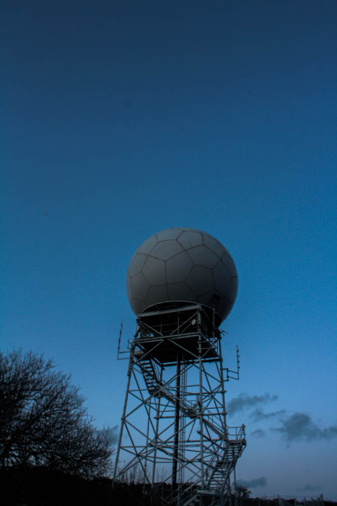
This is a weather radar tower, once again located in a very rural area.
experimentation


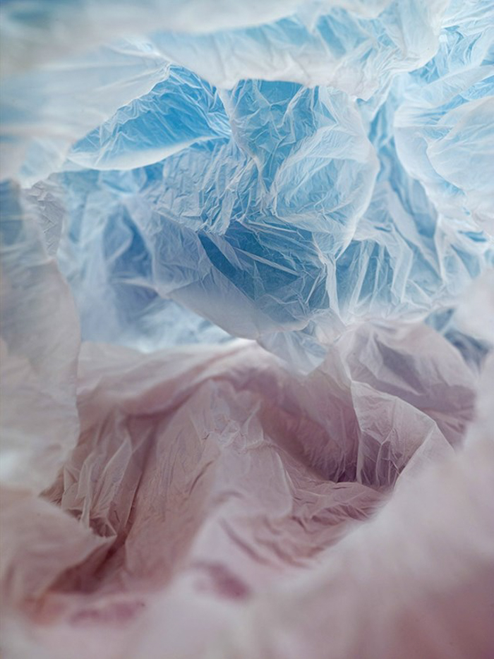
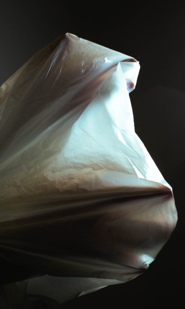
I used coloured filters over the lights to create bright colour with little to no editing- whilst I don’t think these images are effective on their own together they compliment each other.
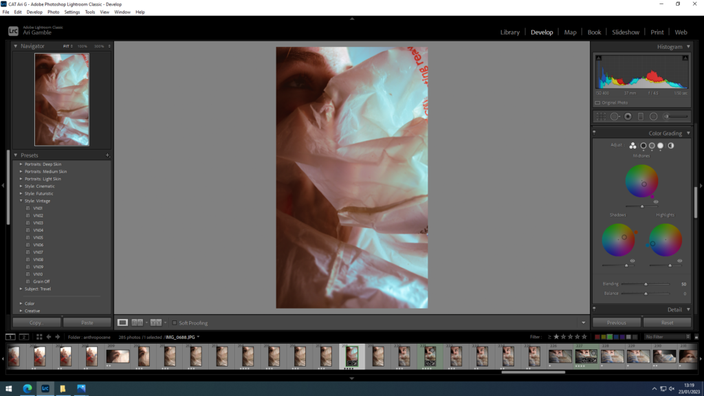
Editing
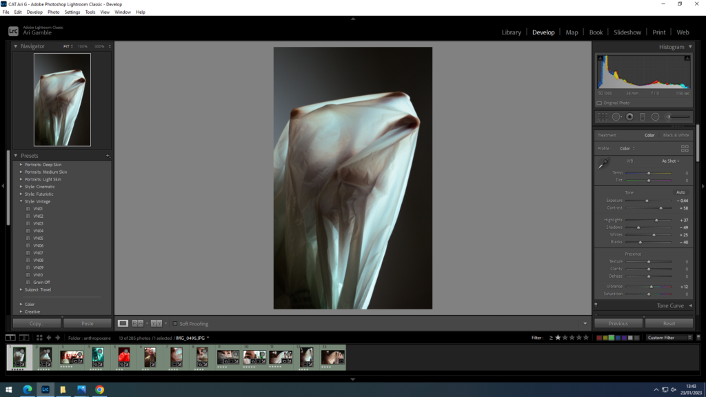
I adjusted the contrast and tones to create more dramatic lighting to highlight the transparency of the plastic. I also used colour grading to switch to blue highlights as it gave a cooler less yellow light.



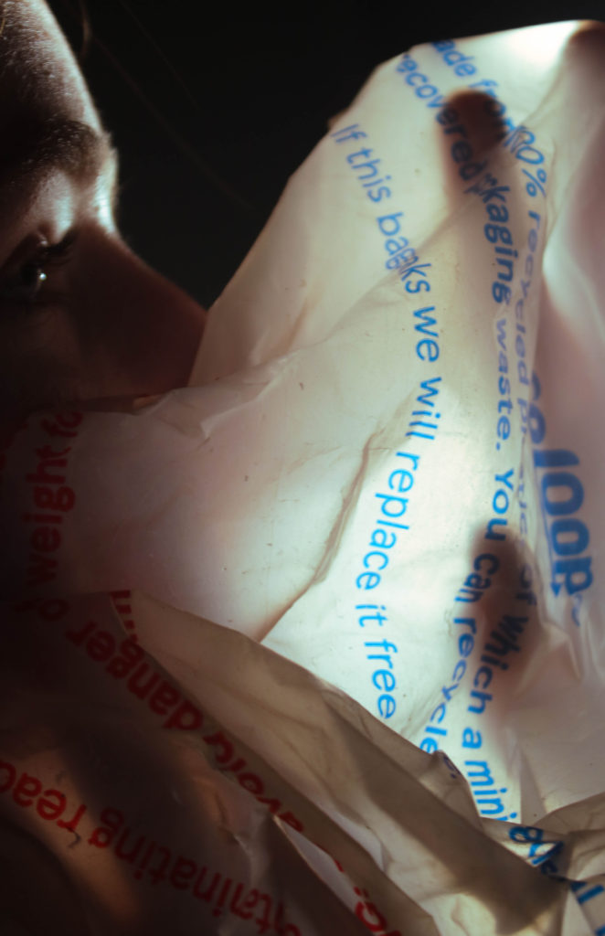
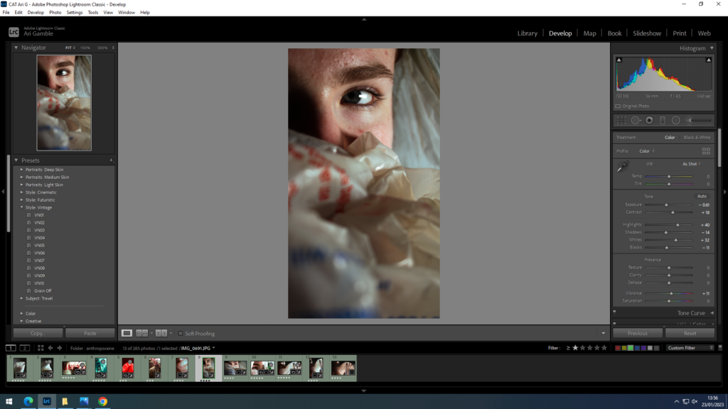
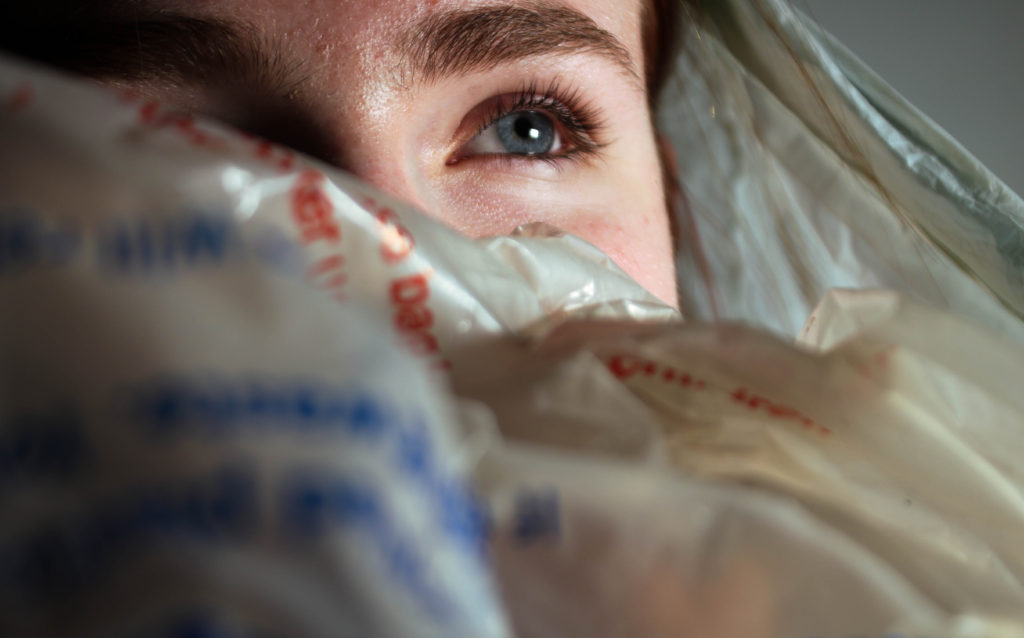
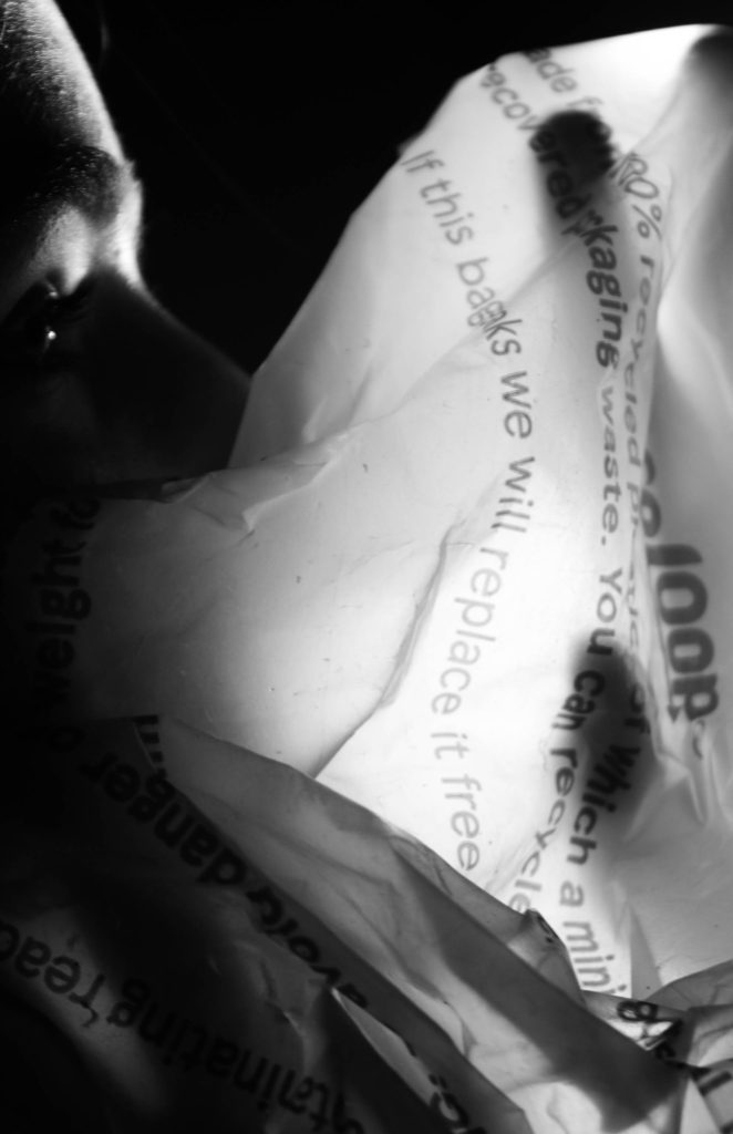
Again switched colour grading highlights to blue to keep cohesive- I think the portraiture dominates the images making them less effective for the focus being plastic.

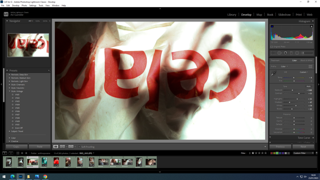

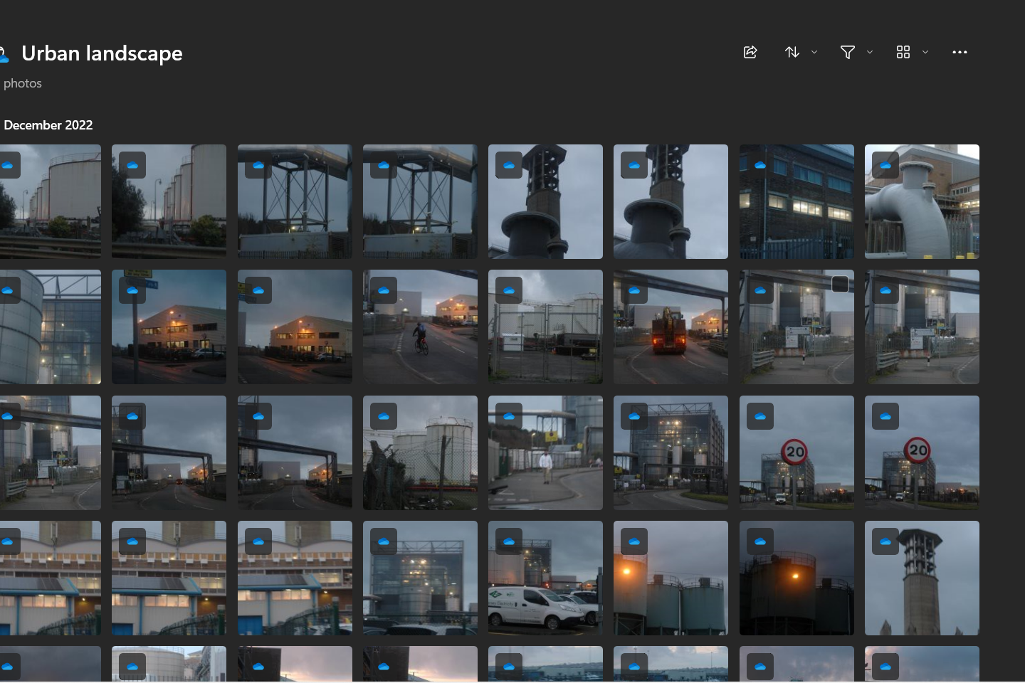
selecting- all ended up darker than i’d like
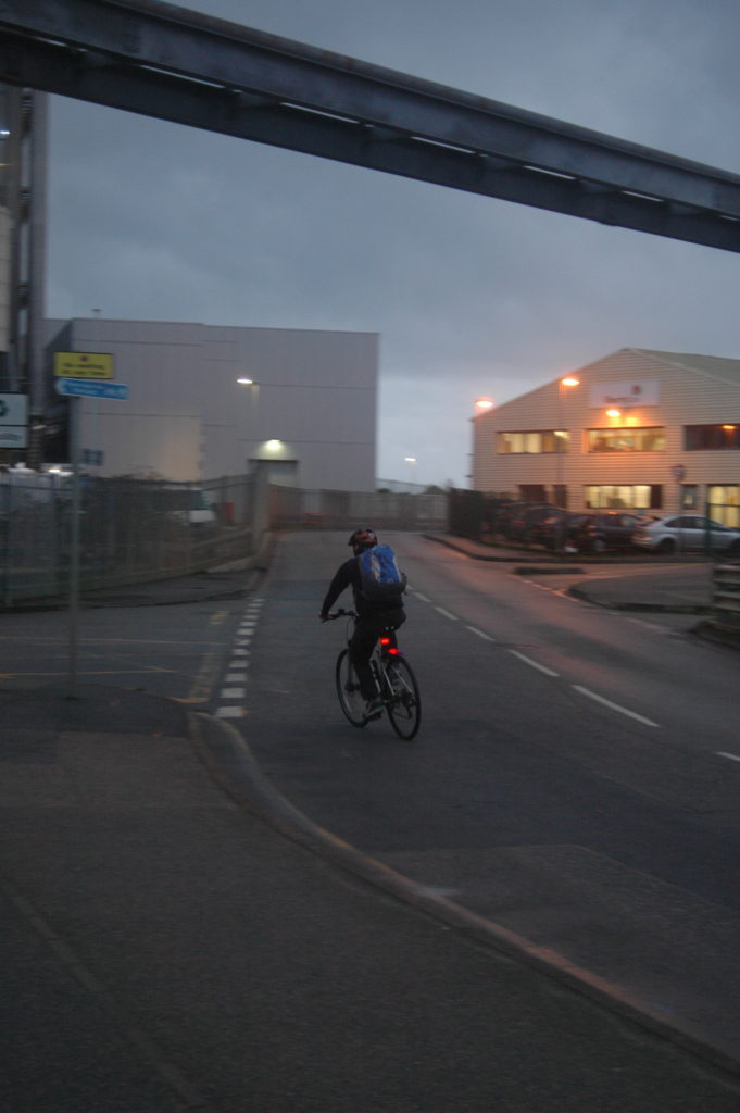
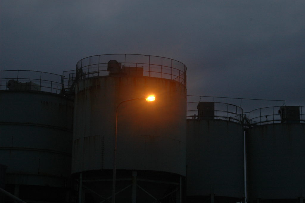
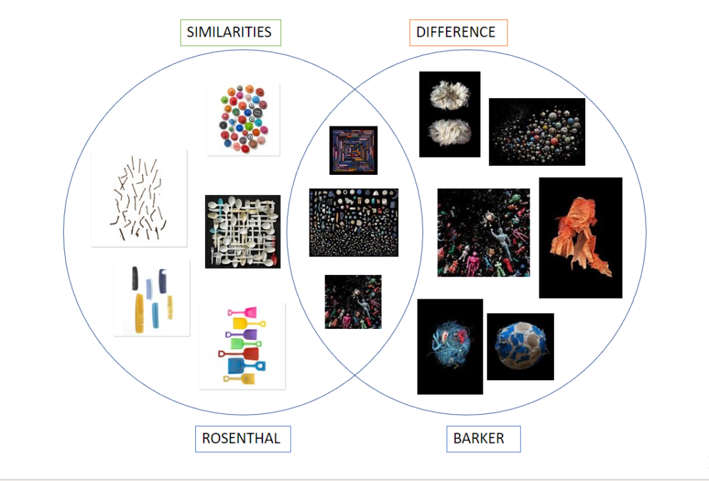
Rosenthal and Barker have similar styles in photography, yet their work is contrasting.
Both Rosenthal and Barker are showing how plastic is affecting life and the Earth. Rosenthal highlights how much plastic and non-renewable sources we use on a daily basis, perhaps without even realising or not knowing its plastic. However Barker shows how plastic is affecting Earth and the natural life such as the sea, this therefore affecting habitats for the water animals with them digesting the plastic.
Rosenthal usually uses a white background with minimal objects in the foreground. His objects are well placed in a sense that they cover the frame equally, or they look like they have been randomly scattered. His photos are basic yet his message is shown directly and still is recognised.
Barker photographs her image in a more aesthetically pleasing way. She started off taking pictures similar to Rosenthal while she was on the go, however it wasn’t getting the recognition that she had hoped for. She photographs her objects on black velvet which energises her photos and brightens the colours. Barker edits her photos more than Rosenthal so she can get her audience to engage more with the eye catching images.
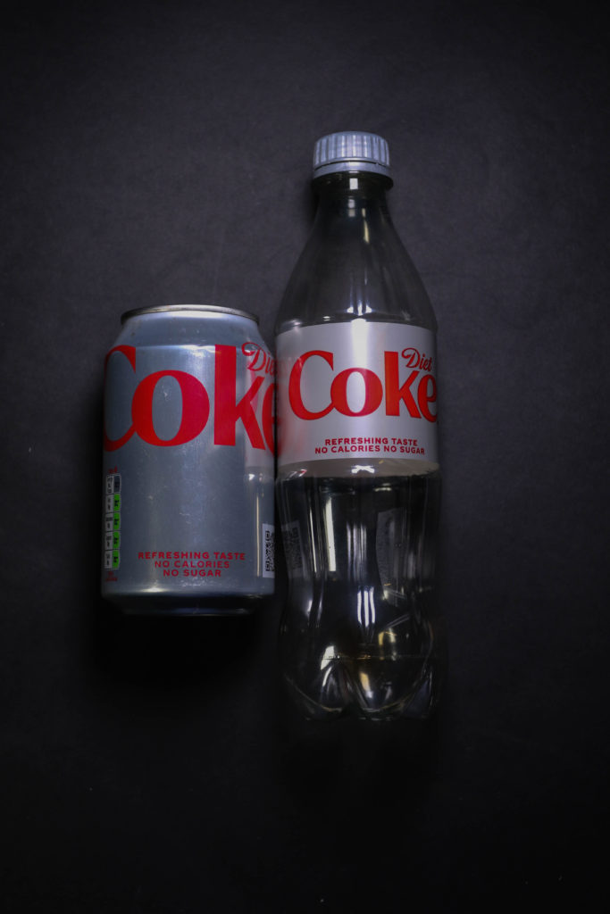
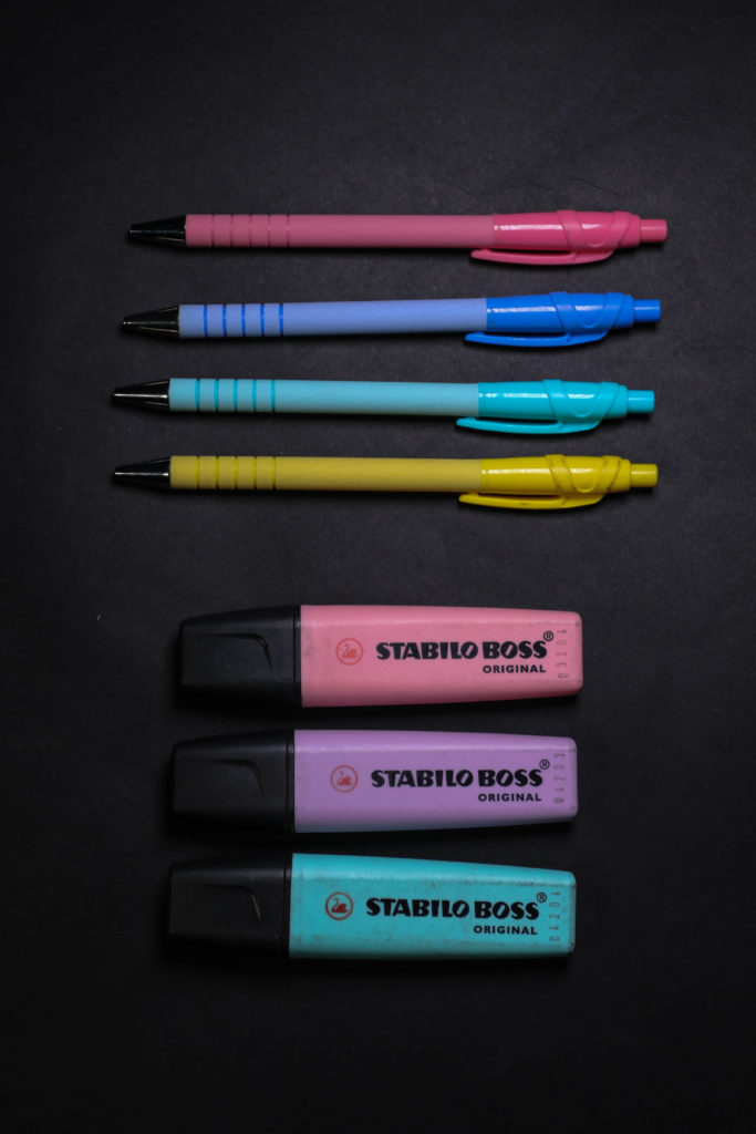
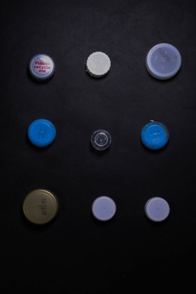
My images are placed on black cardboard I took inspiration from Barker as I wanted the colours to seem more vibrant and to contrast against the dark background. I did use a diet coke can, it may not be plastic but its many things that is one time use and people don’t recycle. I tried to replicate the plastic cap image from Rosenthal so I could link it back, however mine is slightly different with different sizes and colours. Perhaps if I collected them for a longer period of time they would look more similar.
Action plan
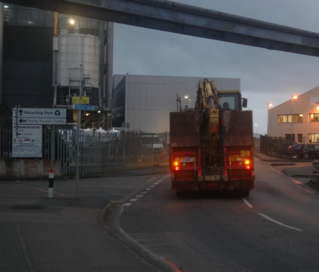
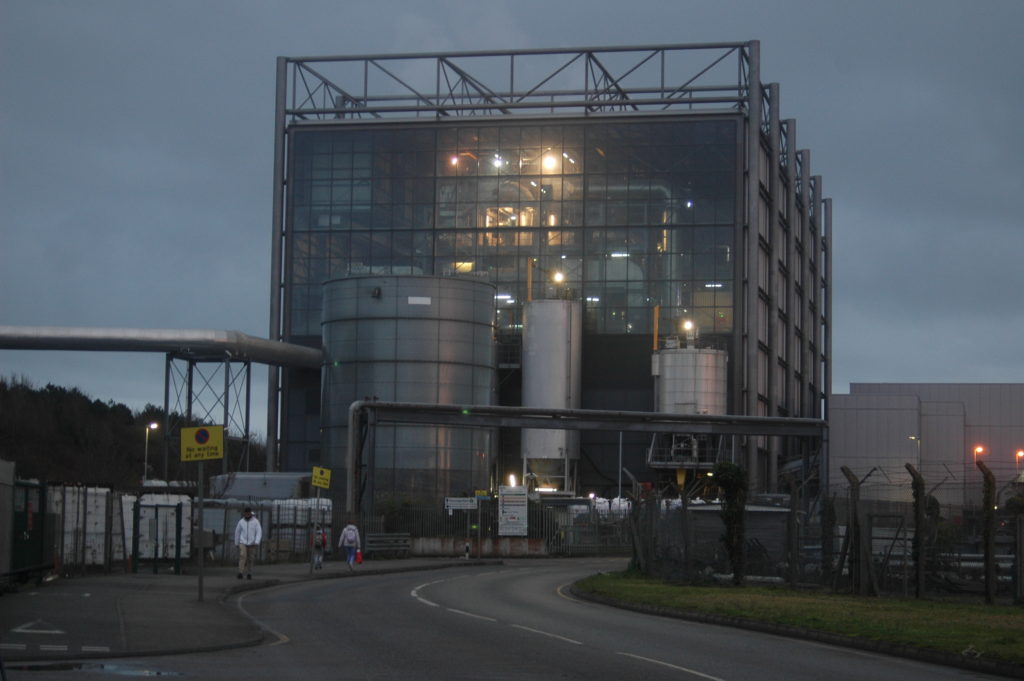
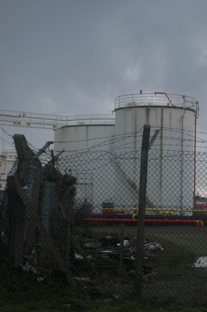
For this photoshoot, I plan to take pictures of industrial styled buildings or areas. I then hope to edit these images in different ways the will highlight potential damage to the environment.
Photos

Edits
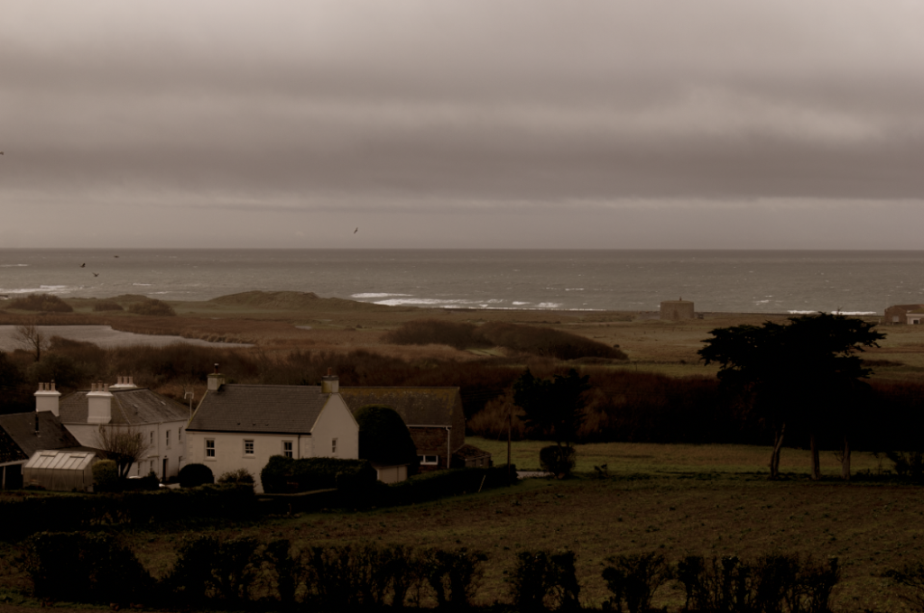
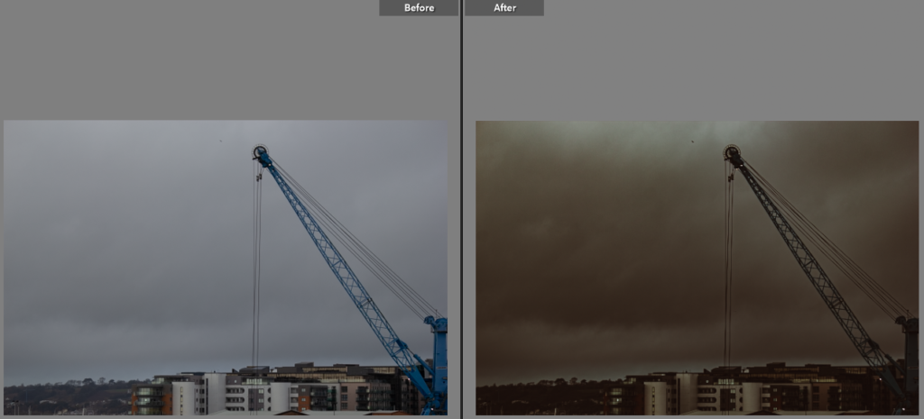
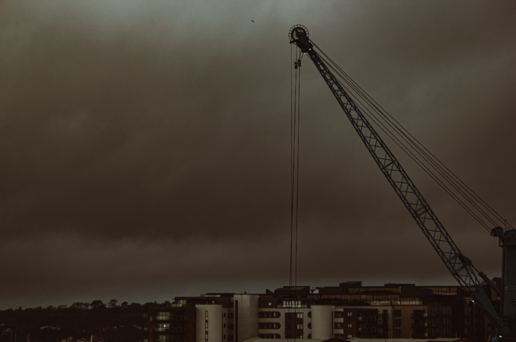
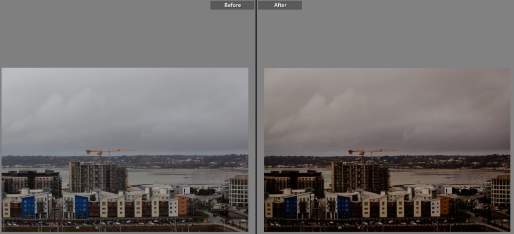

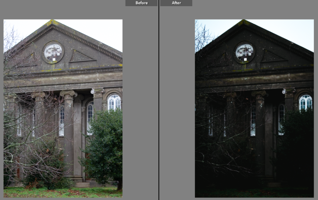
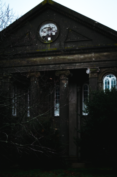
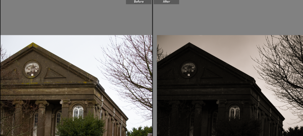
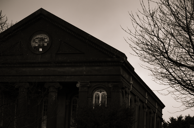
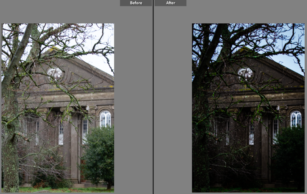
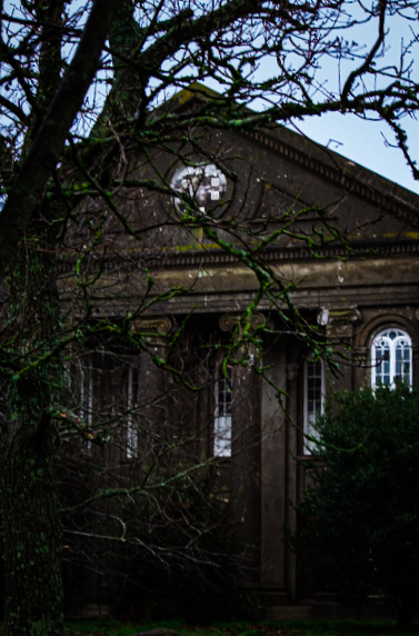
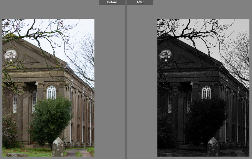
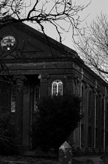
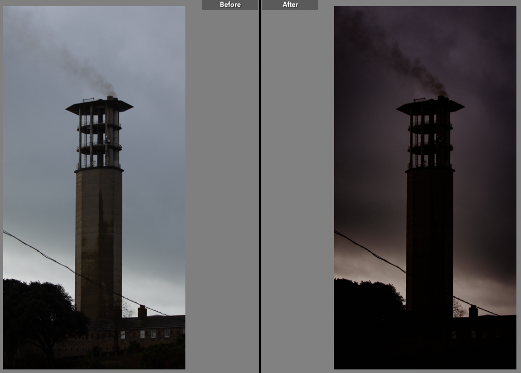
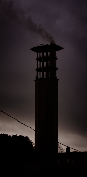
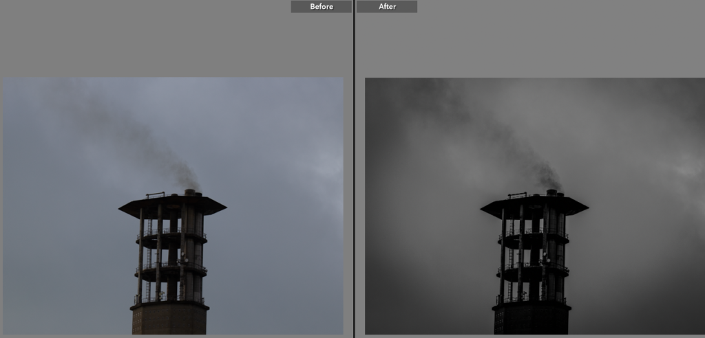
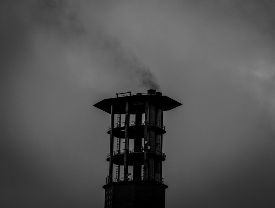
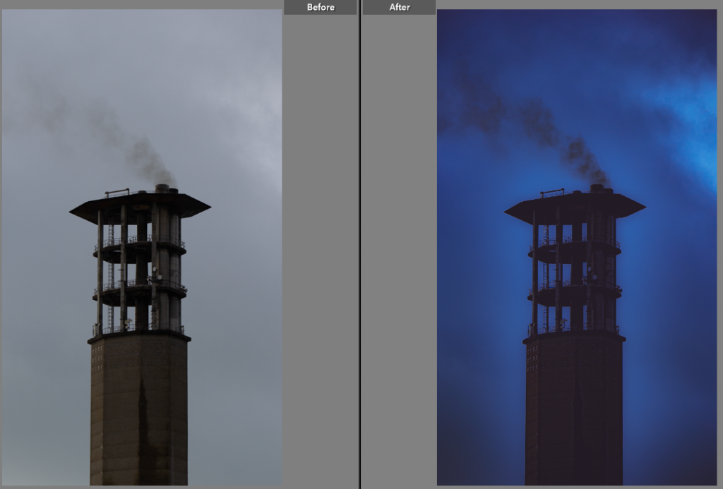
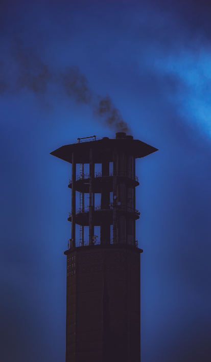
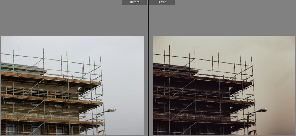
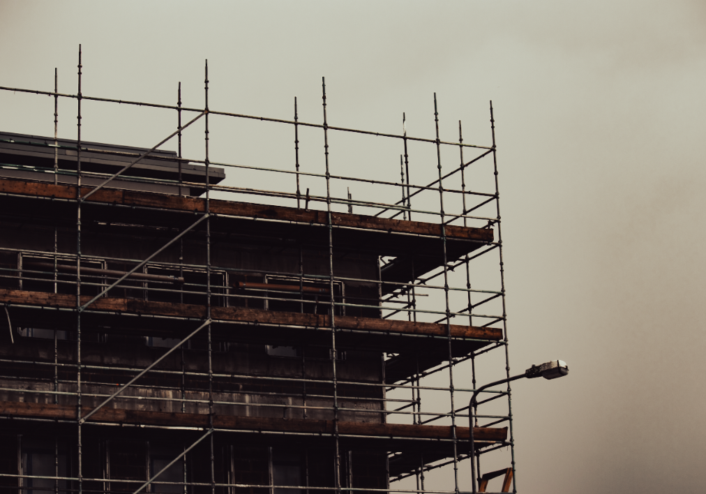

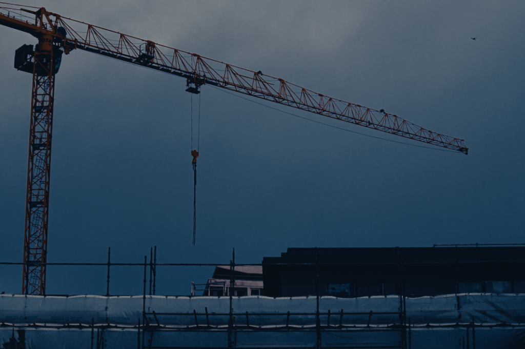

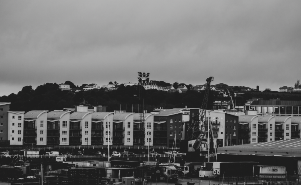

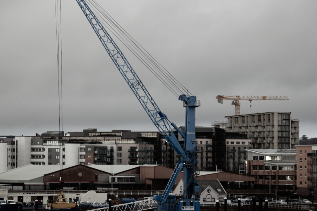

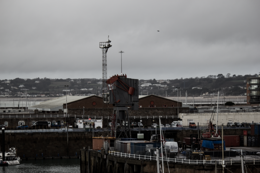

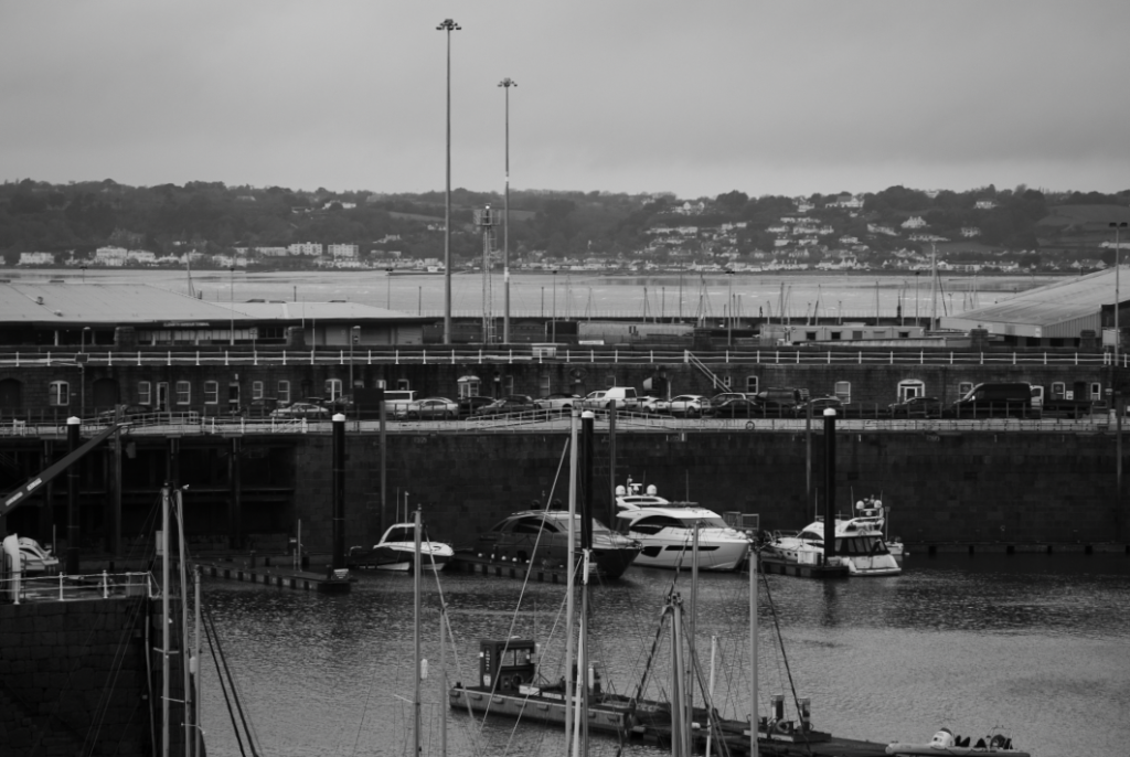
Best photos

I chose this as a best image because I liked how the house is all over grown and wrecked, showing the viewer nature fighting back against man made structures. I also think that having the image in black and white creates a cool atmosphere.

This is one of my favourite Anthropocene images as it displays the smoke being produced from the tower. I also like how the tower is silhouetted against the sky in the background.

I picked this image as I think the construction work relates to industrial areas. This fits the Anthropocene theme since it takes over land in order to build something potentially damaging for the environment.

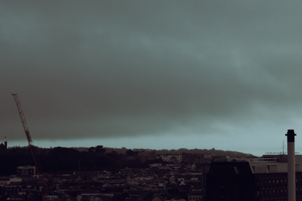
I picked this photo as I like the industrial style this image gives off. I think that the crane adds a focus point to the image as well. The cool colours also add a refreshing yet sad mood to the picture.
Edward Burtynsky
Edward Burtynsky was born February 22, 1955. He is a Canadian photographer and artist known for his large format photographs of industrial landscapes. His works depict locations from around the world that represent the increasing development of industrialization and its impacts on nature and the human existence. It is most often connected to the philosophical concept of the sublime, though they are equally disturbing in the way they reveal the context of rapid industrialization. He is an advocate for environmental conservationism and his work is deeply entwined in his advocacy, which often comments on the scars left by industrial capitalism while establishing an aesthetic for environmental devastation.
He often positions himself at high-vantage points over the landscape using elevated platforms. Burtynsky describes the act of taking a photograph in terms of “The Contemplated Moment”. He currently uses a high-resolution digital medium format camera and his photographic style is often characterized by the sublime nature of the scale of his photographs. His large-format view camera depicts humanity’s scarring on the landscapes he makes his subject, with “astonishing color and relentless detail”, always focusing on the consequences of global consumerism.
Burtynsky’s photography places the viewer in a state of non-intervention with the environments depicted. While the viewer witnesses the consequences of radicalized consumerism, the viewer is left to quietly contemplate its political articulation: neither a condemnation nor a celebration of the subject matter, simply an acknowledgement of its existence.
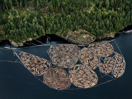
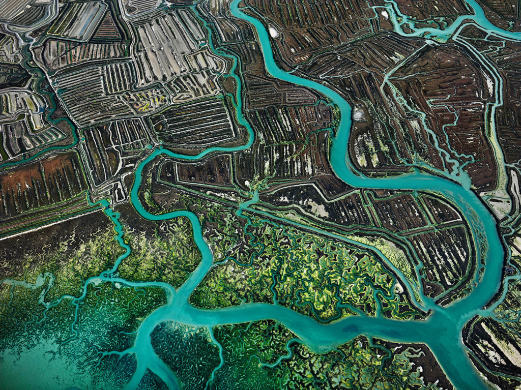
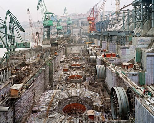
Why have you chosen this artist?
I chose this artist as looking at his work, you immediately see the damage done to the world. While i know this was his aim, it makes you reflect on any past behaviors that would of aided in creating these images.
What interest you about their work?
I am interested by the the mix of beauty and pity captured in his work. On one hand, the scenery on majority of his photos are stunning but the pity we feel towards the land contrasts greatly.
How does the work relate to the theme of Anthropocene?
His work relates to Anthropocene as he captures the industrial takeover of nature.
What are you going to do as a response to their work?
In response, I would like to take some similar photos by finding areas that combine man made structures and nature.
George Marazakis
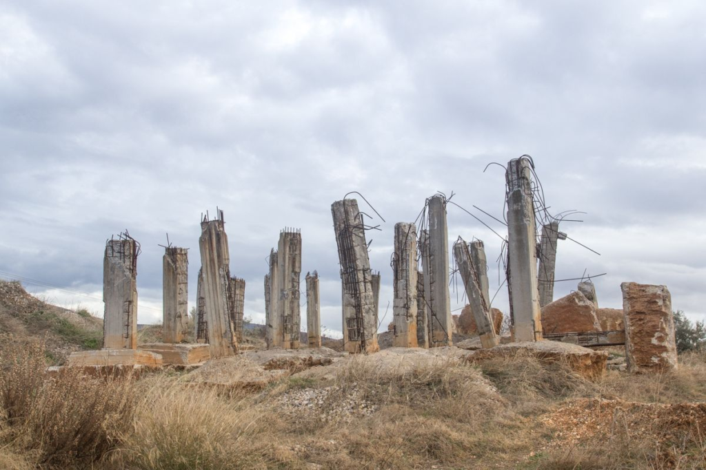
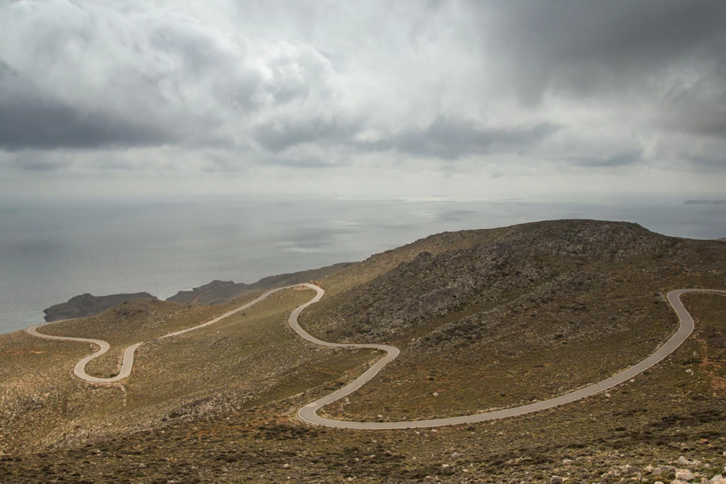
George Marazakis is Greek photographer who takes Anthropocene photographs, as a concept and title for a series that looks at a new time periods engendered by the greed of mankind. This includes the planet, plastic pollution, and power stations. Anthropocene is an era in which human activity is the dominant influence on both climate and environment.

Why have you chosen this artist?
I chose this artist as I feel he has an interesting take on the world around us. His images show us how we effect our earth, whether that’s through paving paths or constructing buildings.
What interest you about their work?
His work interests me as he shows us the negative side to how we live, however, he also shows us the beauty. This makes sure we get a clear perspective from seeing both the good and the bad.
How does the work relate to the theme of Anthropocene?
His work relates to Anthropocene since he shows the effects that humans have on the world.
What are you going to do as a response to their work?
If I were to respond to his work, I would most likely try to photograph roads and pathways around nature, as I feel that this would relate to some of his work.
Artist comparison
I have chosen to do some work in the style of George Marazaki’s. I chose him since I think he shows different areas of Anthropocene that may not normally be shown.
Image 1:
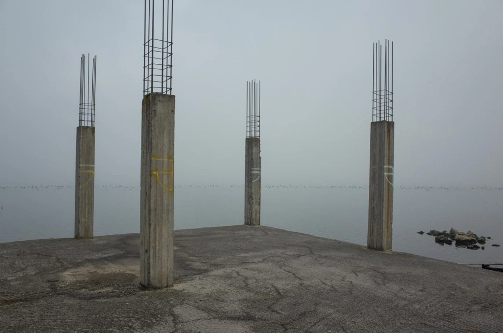

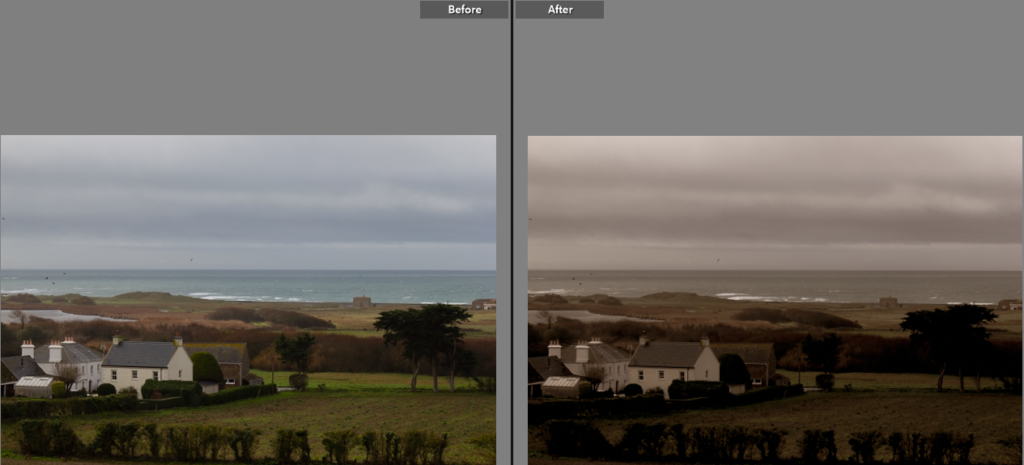
In my image, I tried to replicate the cool tones of Marazaki’s image by lowering the temperature and increasing the exposure.
Image 2:


I felt that the amount of nature in my image related to nature surrounding the industrial area in Marazaki’s image as the modern house is being surrounded by the wilderness.
Action plan
For this photoshoot, I plan to take pictures of city styled buildings, preferably with lots of them all together. I then hope to edit these images in different ways.
Photos

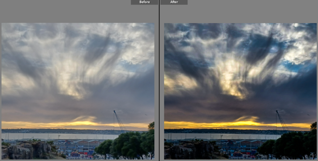
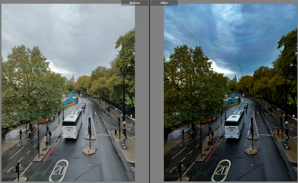
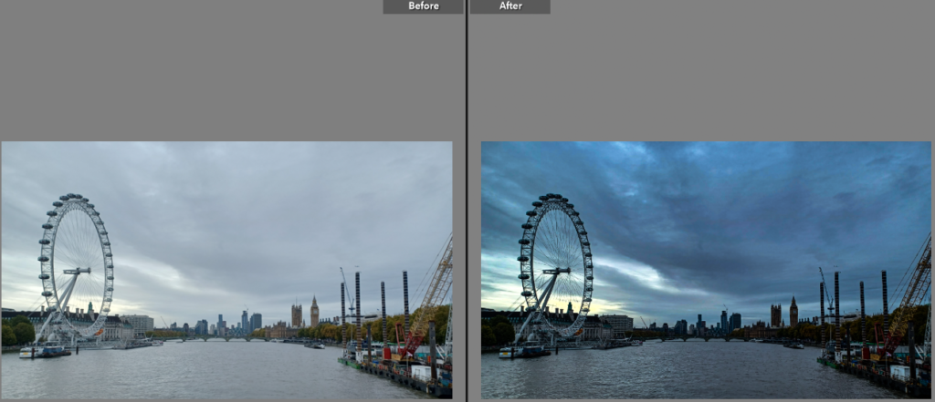
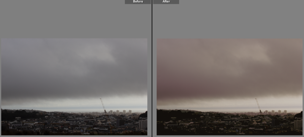
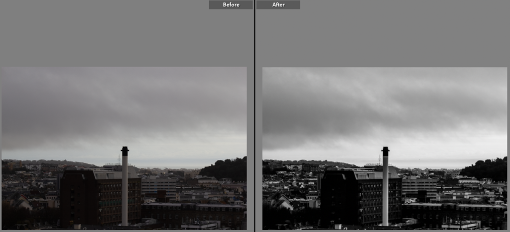
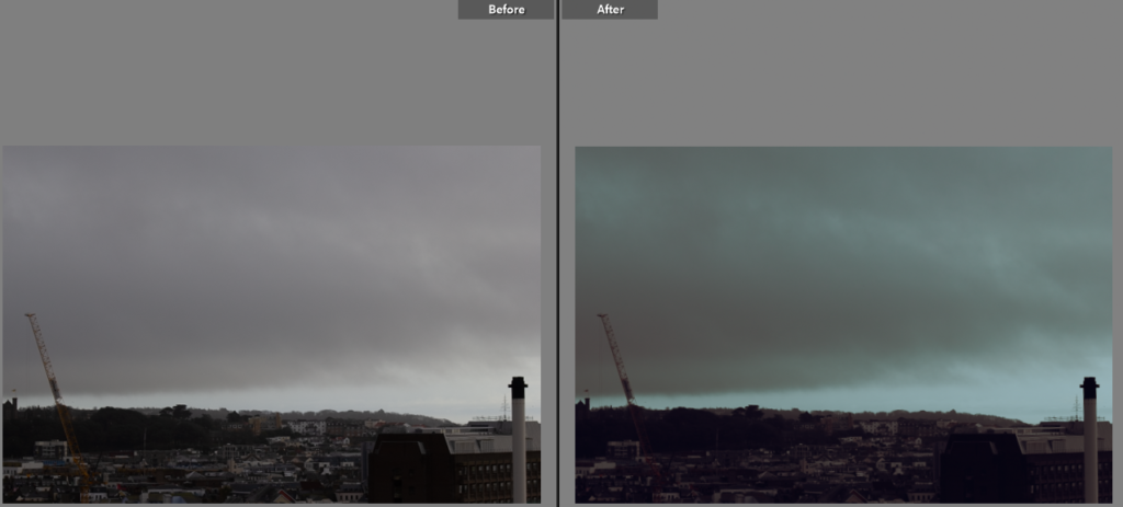
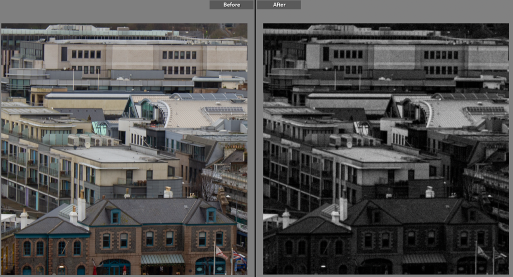
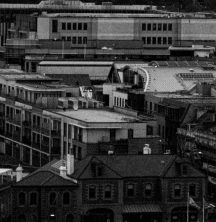
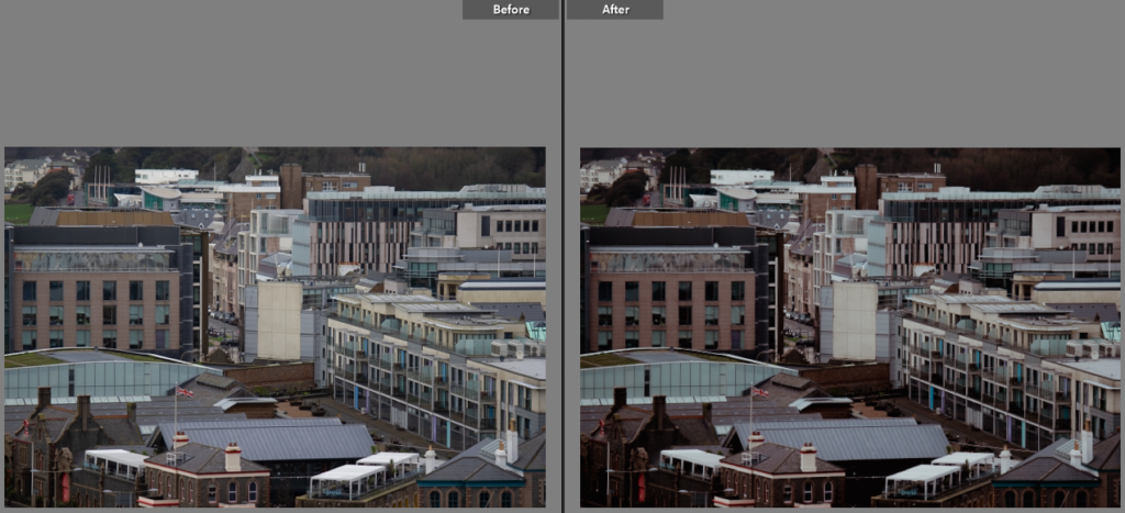
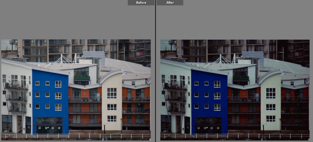
Edits and how I did them:
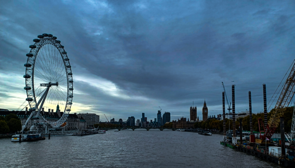
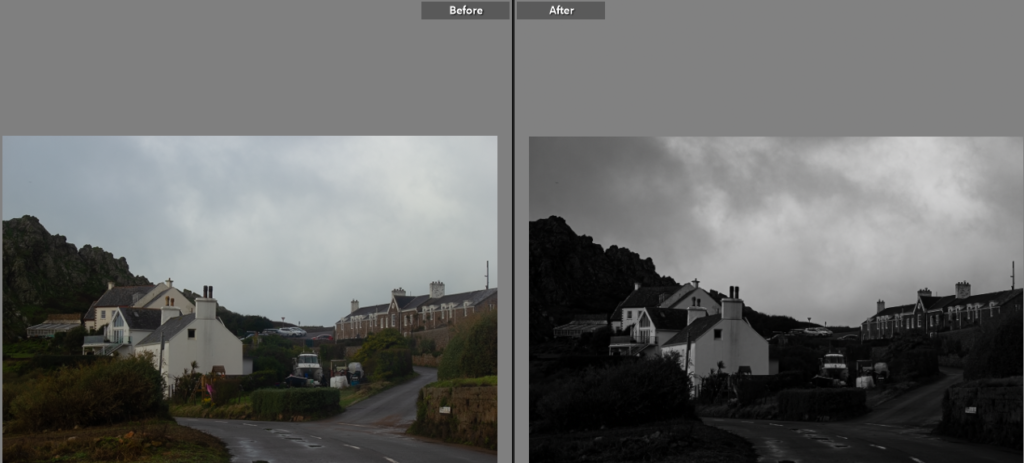
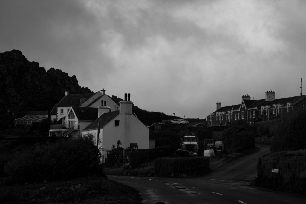
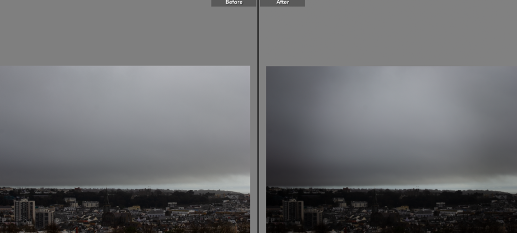
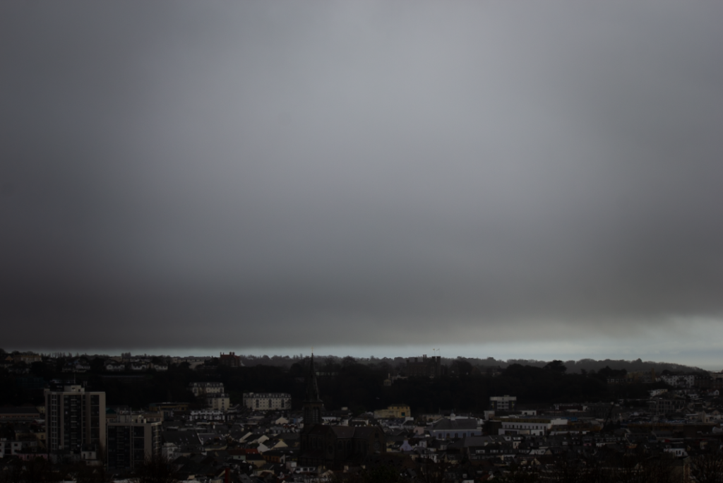
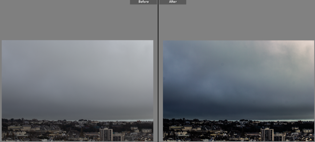
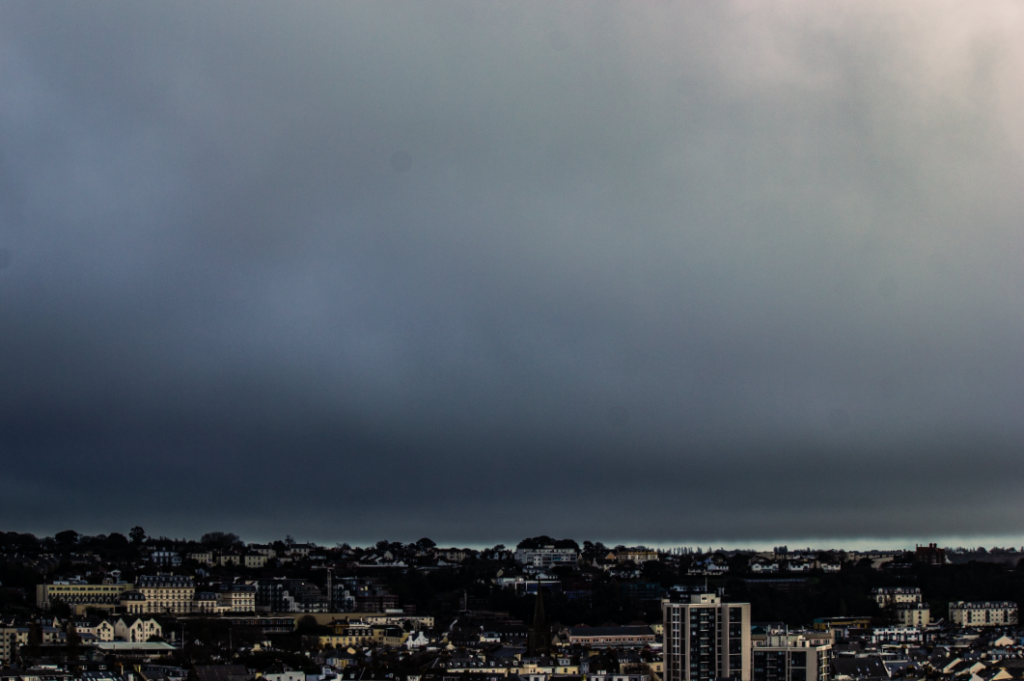
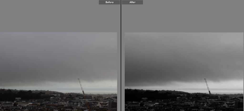
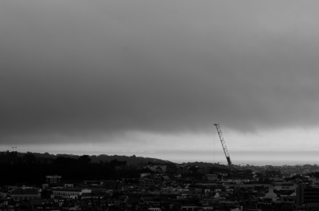
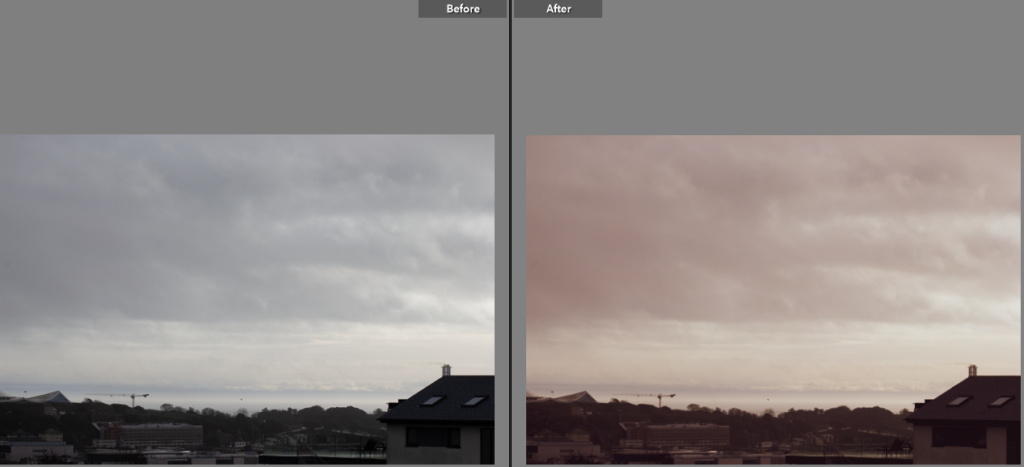
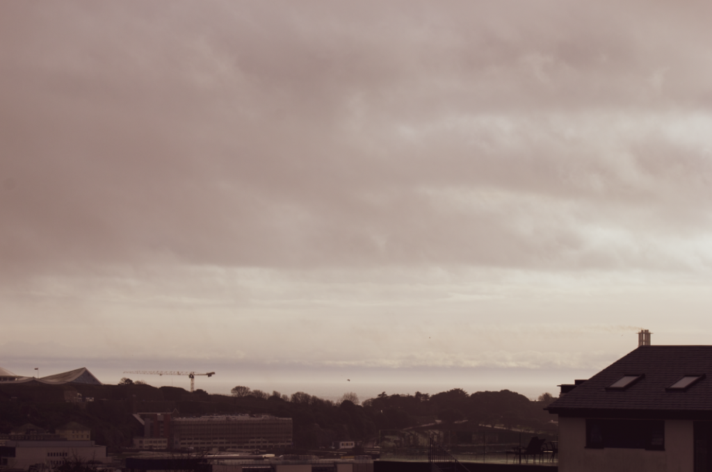
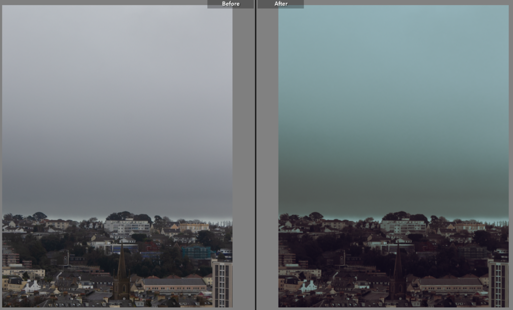
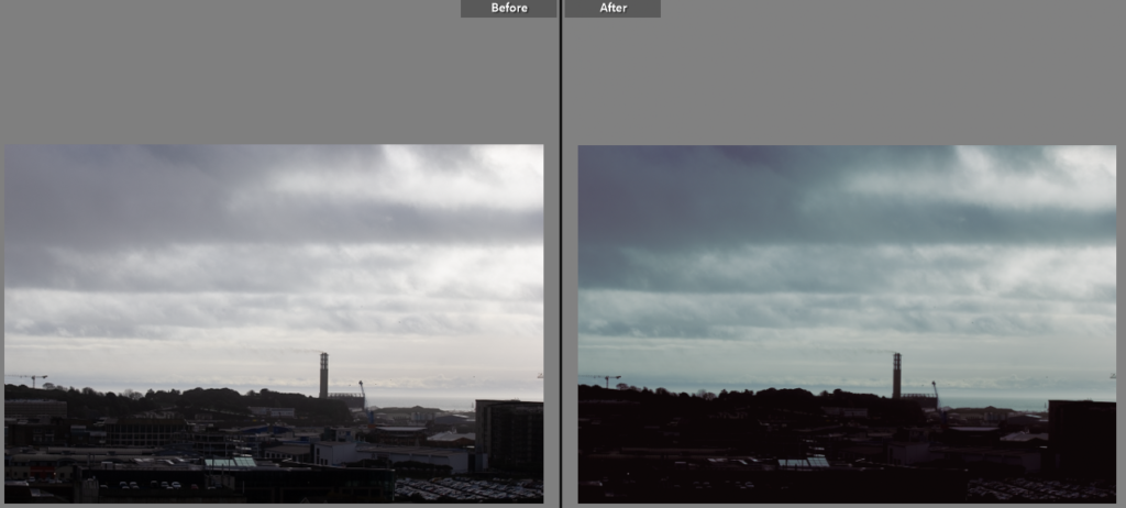
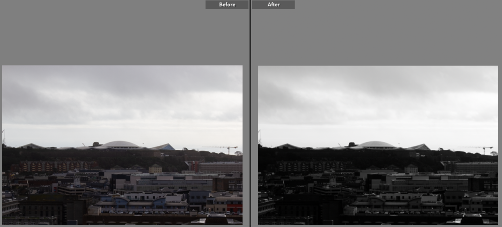
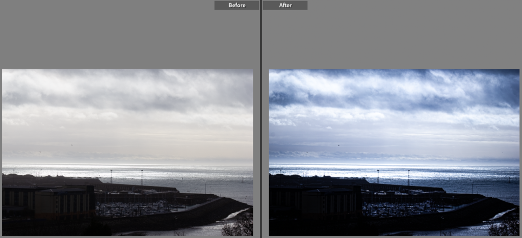
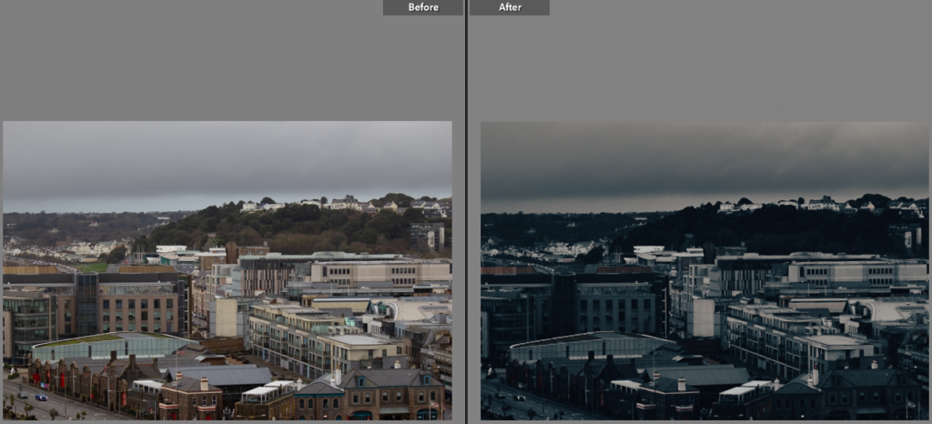
Best images

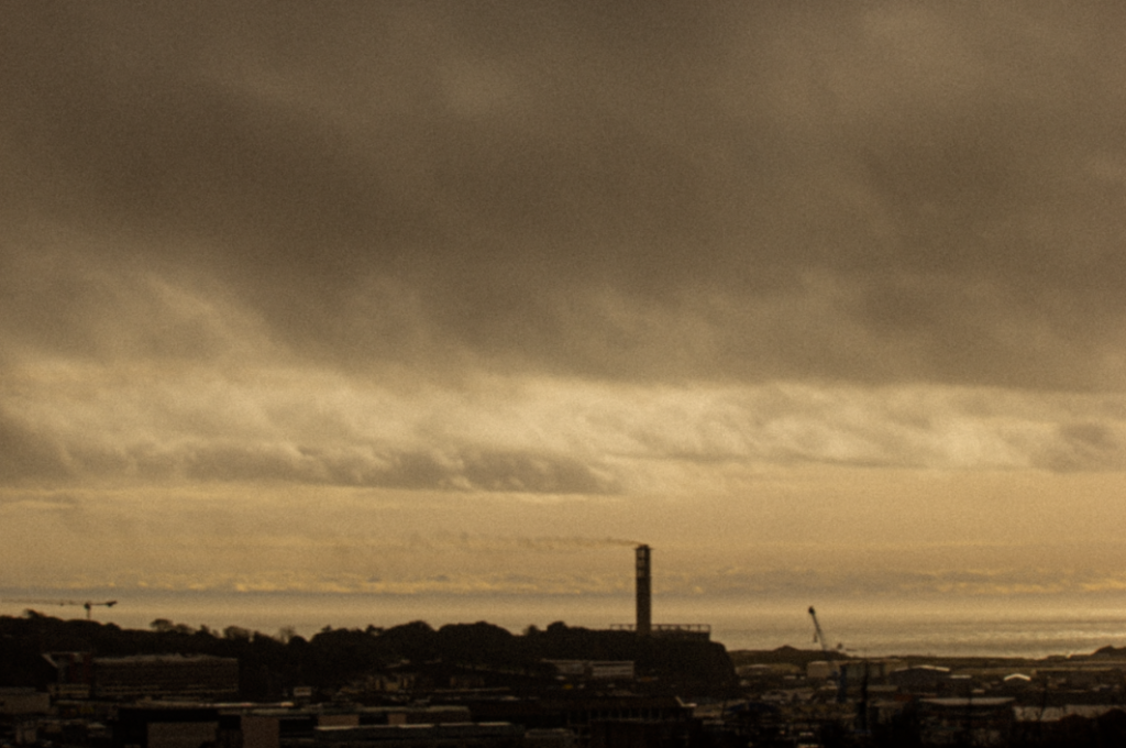
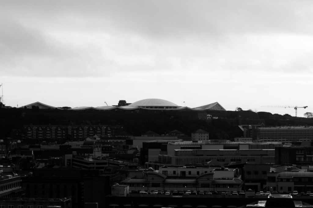
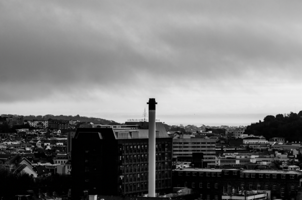
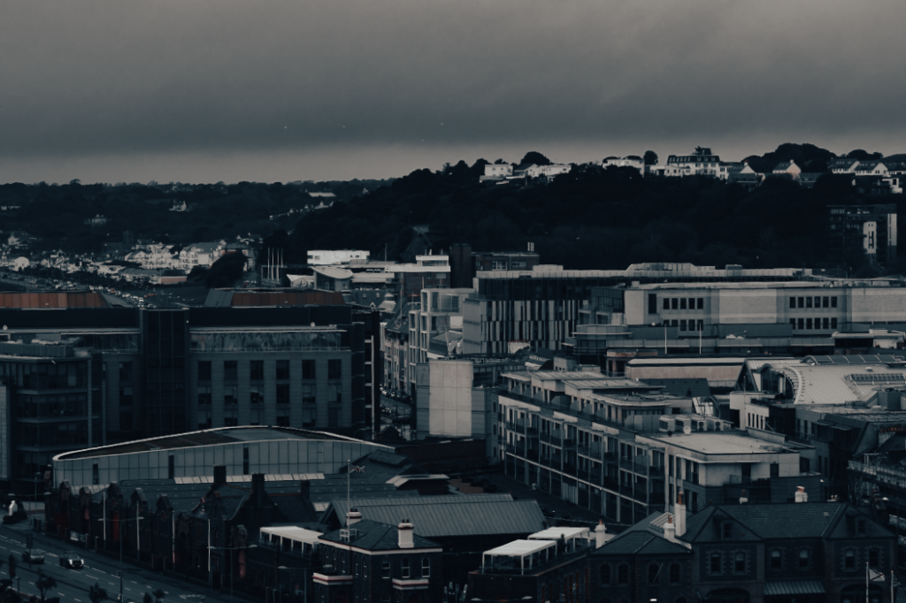
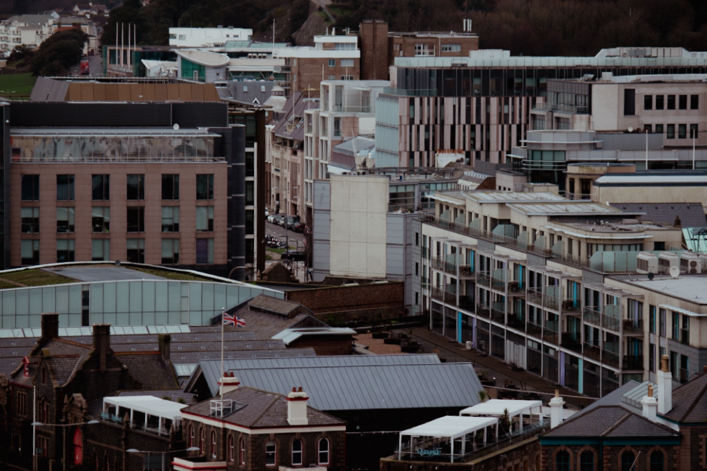
I picked this as a best image as I really liked the urban feel this image gives off. The structure in the middle acts as a focus point for the eyes, and the clutter of buildings beneath it shows off how urban Jersey can be. I also really like the amount of contrast used here as I think it creates an old timely feel to it.

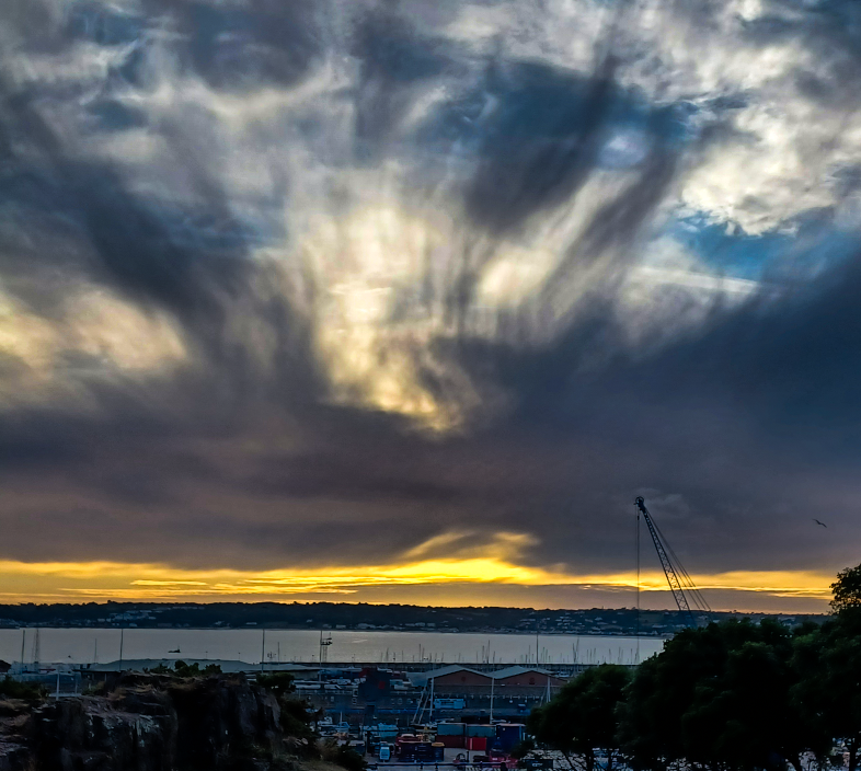
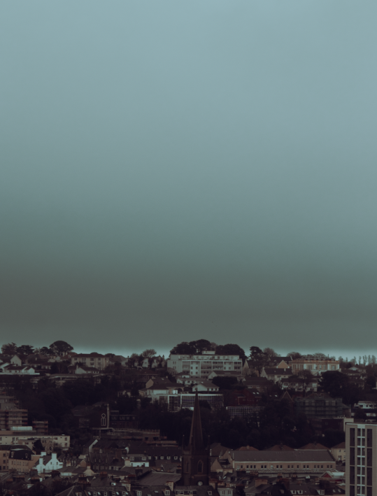
I chose this image as I felt that the large sky over the town create a contrasting view of cluttered and vacant spaces. I like the colouring of this image too as it reminds me of a storm hovering over a town. I also like how the church is the focus point of the image.

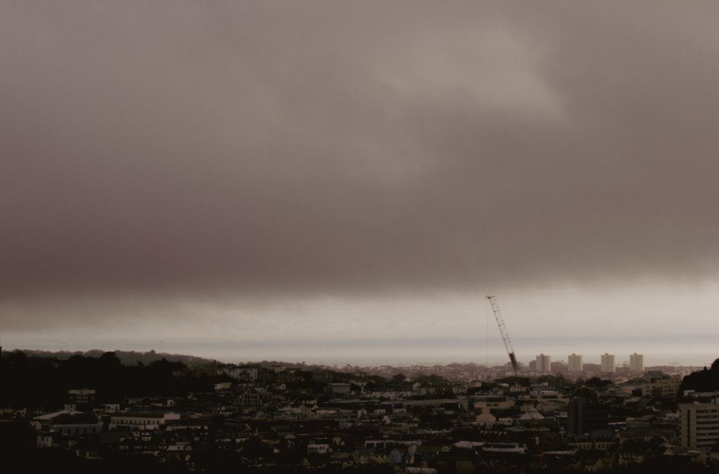
I selected this photograph as I liked the grainy effect I added to make the image seem older. I think that this gives off a different feel to what you would usually see in urban images and while the buildings still seem modern, I think the texture and colouring still work nicely with it.

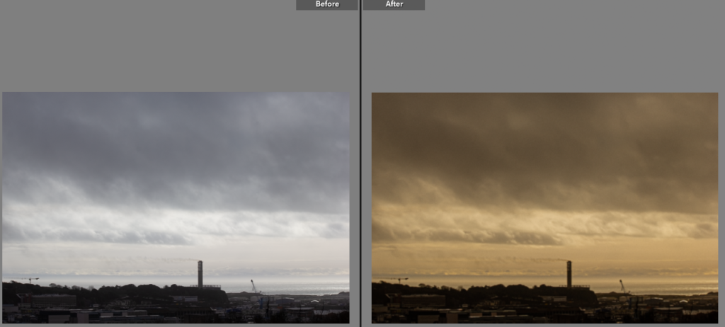
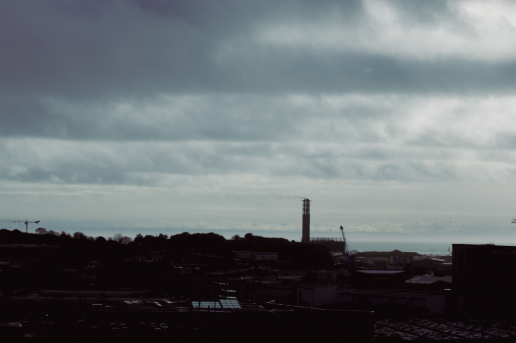
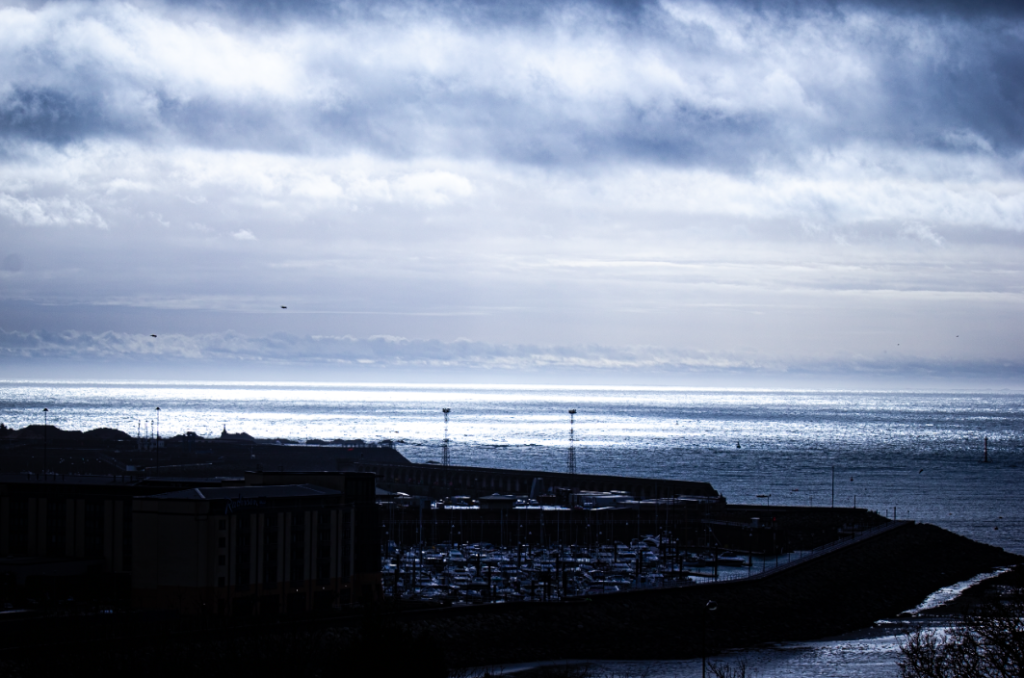
Finally, I selected this image as I liked the contrasting sky with both the ocean and cluttered buildings/ boats. I also like the highlights as I think it extenuates the ocean in the background. The cool tones in this image also give off a refreshing feel for the viewer.