EDIT ONE:
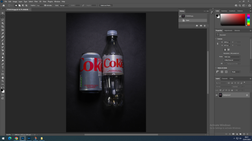
I imported this picture into photoshop of a plastic diet coke next to a can of diet coke, in Lightroom classic I did basic editing of lighting and colour changes.
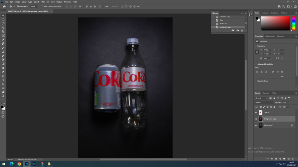
I created a background copy so I would have an extra layer if something went wrong. I used the ‘Elliptical Marquee Tool’ and drew a circle in the middle of the image. In that circle I blurred the image with the radical blur tool.
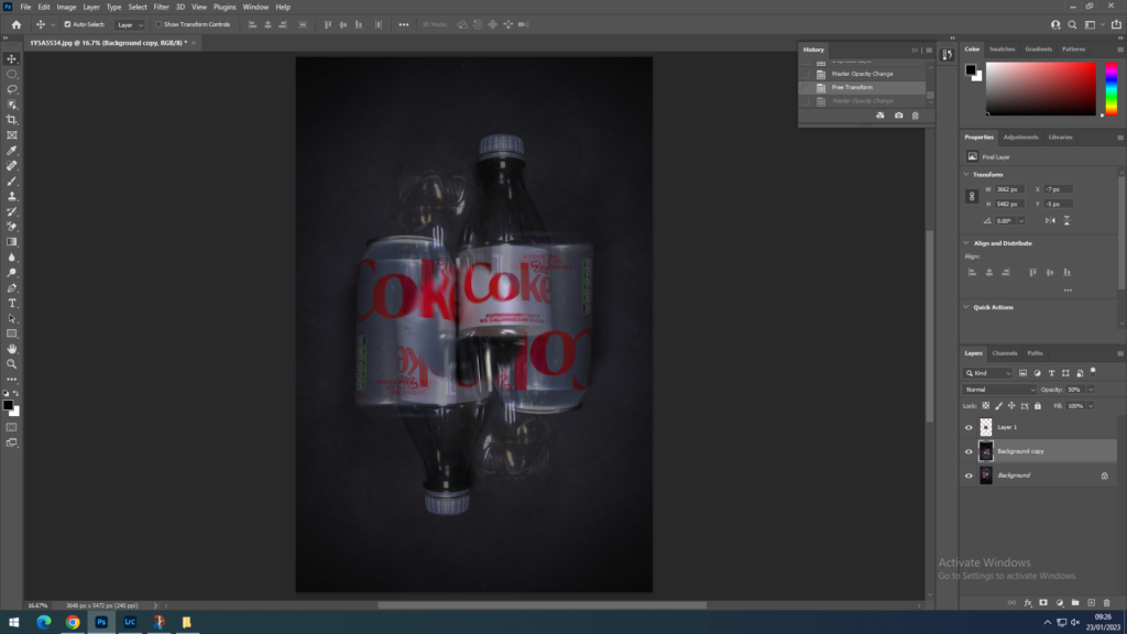
I now used the background layer and transformed it, I turned it the opposite way of the original image. While doing so I decreased the opacity to 35% which therefore created this shadow effect to the image. Furthermore it enhanced the blur in the middle within the circle.
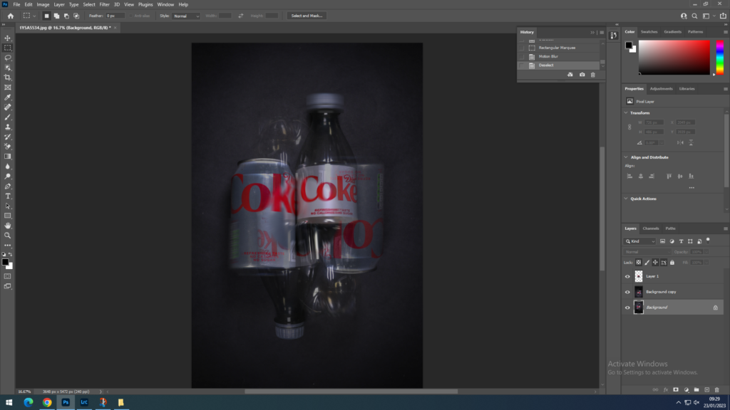
Using the background layer I began to use the ‘Rectangular Marquee Tool’ and selected the top of the plastic bottle, the bottom of the plastic bottle and the side of the can and blurred it. For this I used the ‘motion blur’ to create a more distorted look to the picture.
EDIT TWO:
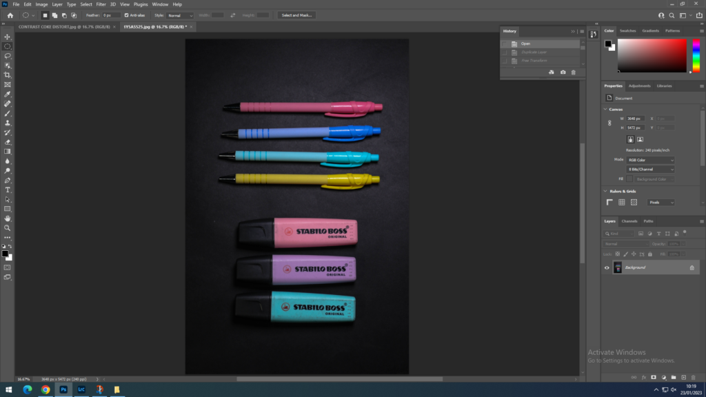
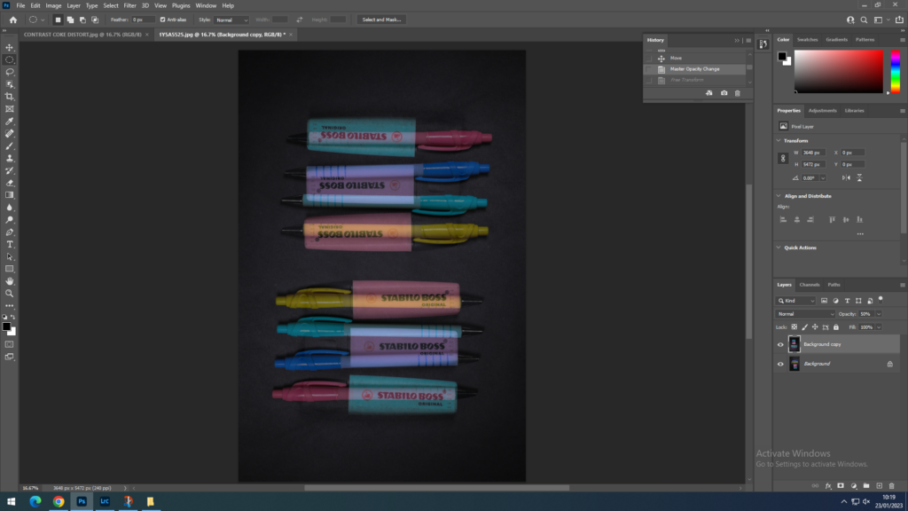
I imported this image from Lightroom. When I imported the image I created a background copy. When I created the background copy I flipped the image and reduced the opacity. I did very minimal further editing due to this image already being full with object and I didn’t want to create this image to be over chaotic.
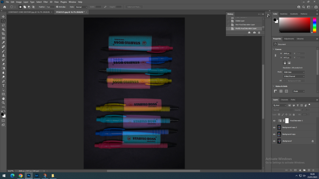
When putting another layer with low opacity over the original image the colours of the objects started to fade and become muted. Therefore I increased the hue and the saturation to redefine the colours and created them for visible to the eye, especially these colours since they are already bright and vivid.
EDIT THREE:
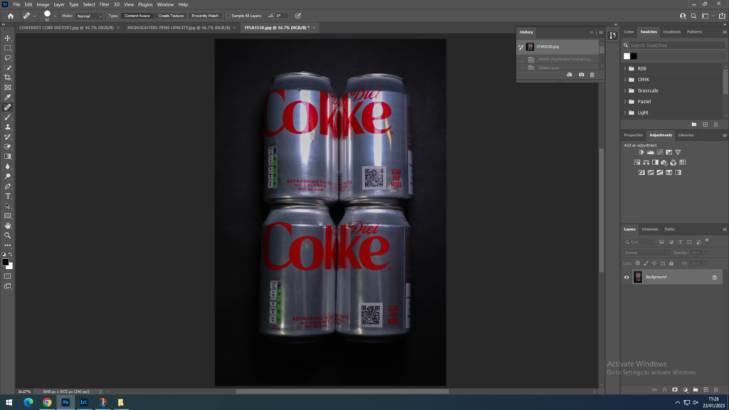
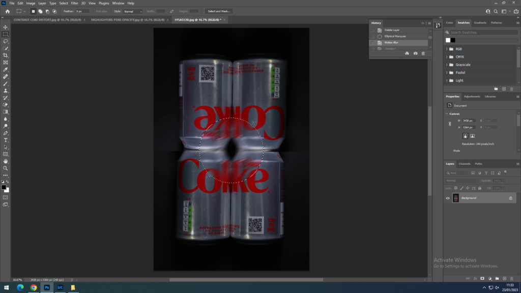
I had used the ‘Rectangular Marquee tool’ to select the bottom half of my image and then transformed it for the cans to face the opposite direction. Then I used the ‘Elliptical Marquee tool’ in the middle and blurred it with the ‘Motion blur’. This is so when the diet coke images are on either side of the highlighter image there is a connection between the two.
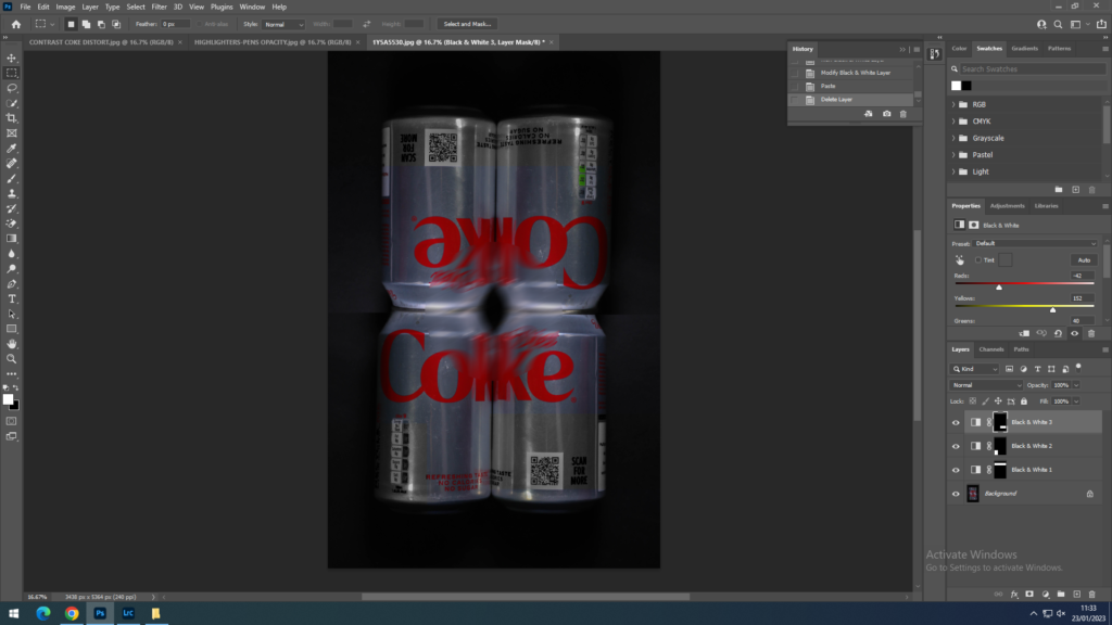
I started to used the ‘Rectangular Marquee tool’ to pick random parts outside the image and change them to black and white. This is so it could have more depth to the image.
