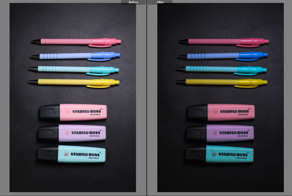
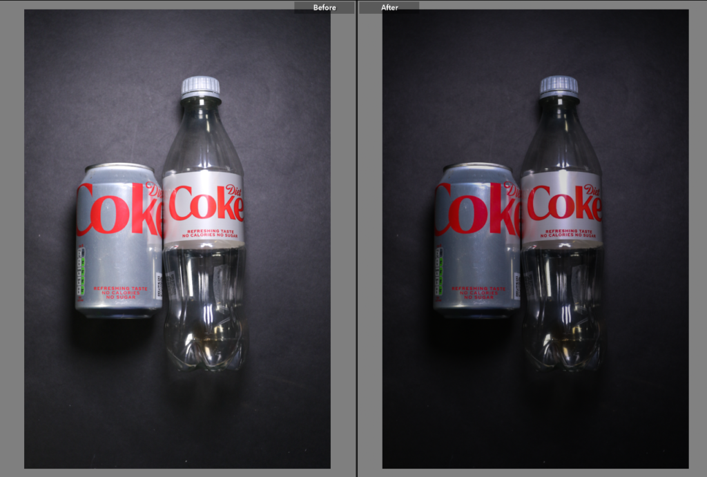
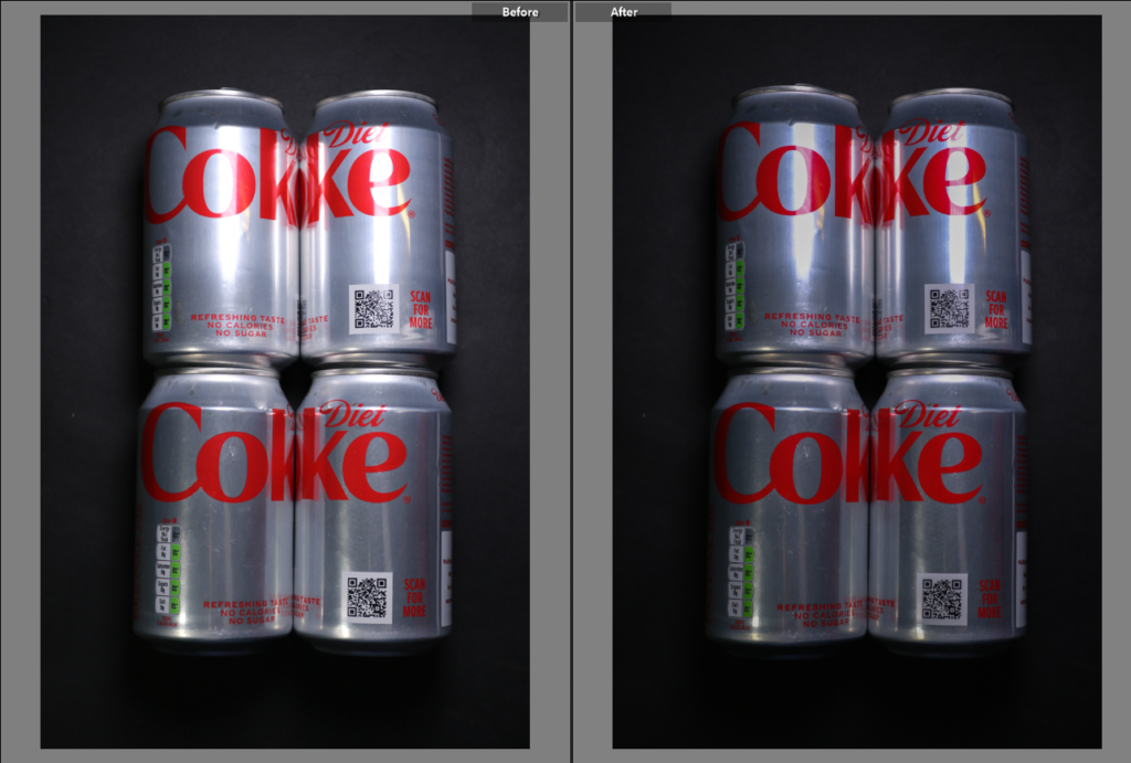
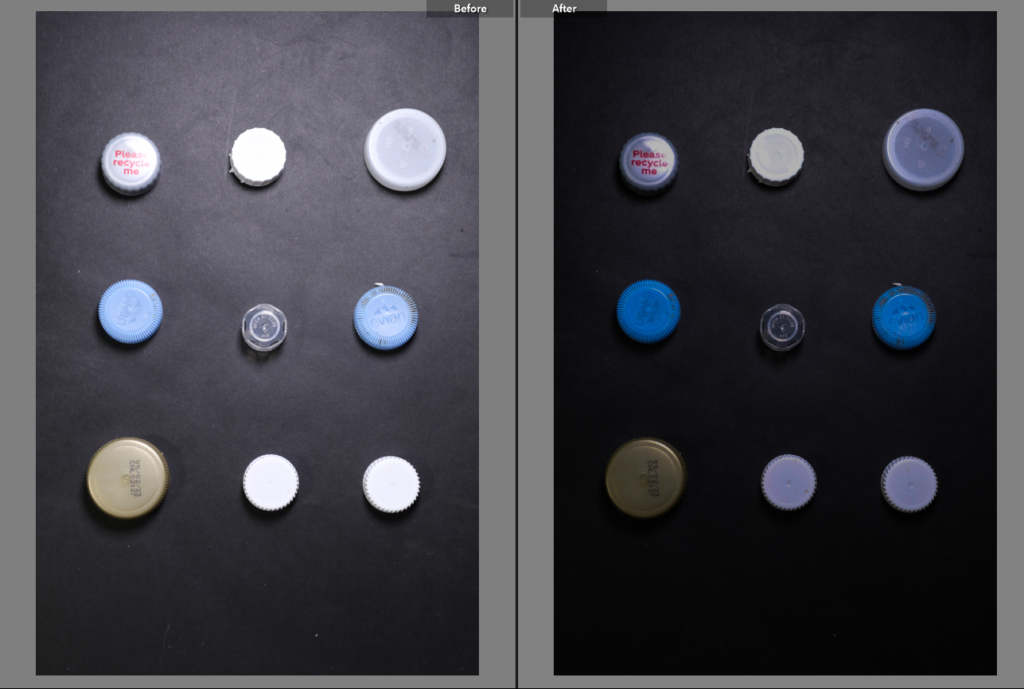
The following images I edited in Adobe Lightroom Classic. I edited to try and replicate Rosenthal’s work. To make the background more of a black colour than charcoal I reduced the exposure, however to keep the vibrant colours from the objects I increased the contrast. I slightly minimalised the highlight due to the lighting being so strong however you can see in the third edit there is still a glare from the lighting.
Edit three I may not use for my project, due to the harsh lighting lines however I can still try to minimalize it in photoshop. Currently for my Anthropocene project I will to a triptych. I will choose my best three images and print them out. Furthermore to have more of a visual effect the photo placed in the middle will be printed A3 and the other A4.


