Final Edits
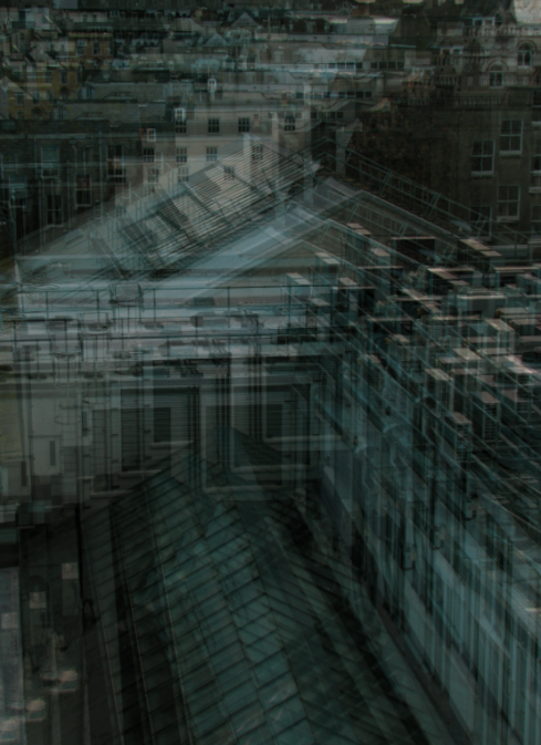

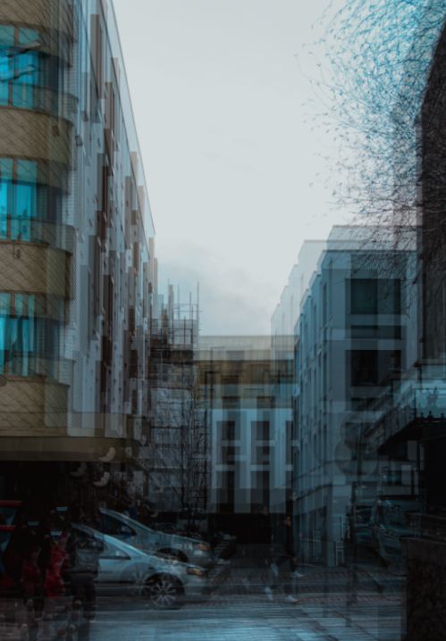
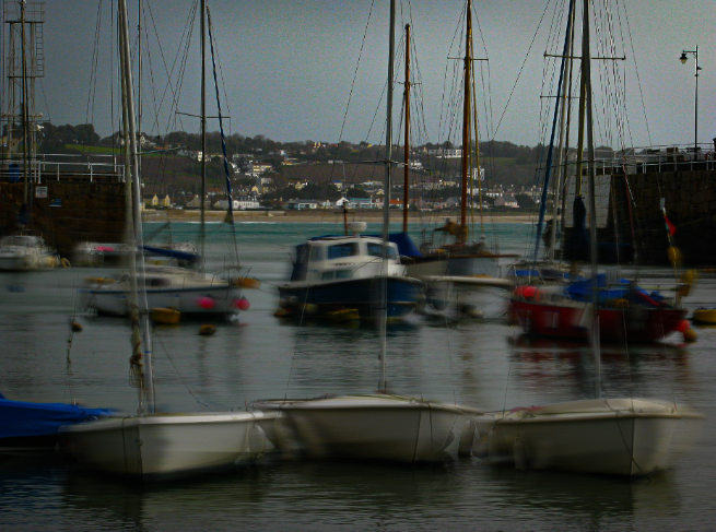
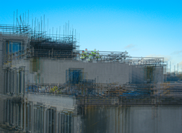
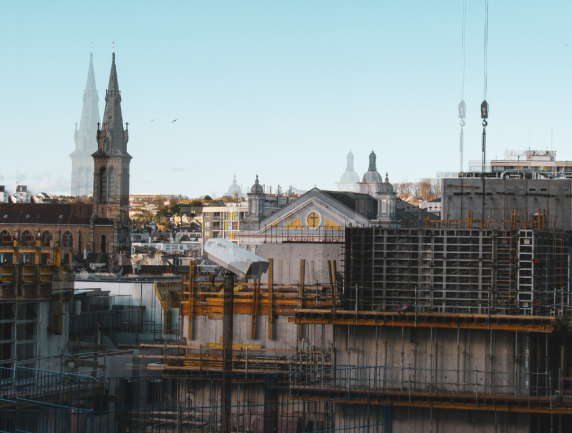
my best final edits from my Anthropocene landscape responses
Comparison


This photograph was inspired by Stephanie Jung, who takes multiple exposure photos of urban landscapes, editing them so that they appear as though they are moving. She illustrates reality as we normally see it whilst portraying many bizarre and unearthly dimensions within her pictures. Her photo includes a cityscape that shimmers and shifts, forever moving and not allowing the viewer to fully understand what is happening. Jung focused on the bluey-green tones apparent throughout the image, accentuating them during her editing phase and creating this ghost-like image. I loved the dizzyingly abstract effect she created, and I tried to recreate it by capturing a similar landscape from the same high angle she took it from, the bird’s eye view angle showing the city from a different way it is normally seen from. I was inspired by the multiple exposure technique, recreating it by layering the same image on top of itself twice and slightly moving it to create the shifted look. Furthermore, the overall cool tones in the photo looked very effective, and it became yet another aspect of her photo that I recreated, enhancing the cool blues and whites in my image to create a similar effect. On the other hand, her photo has a quite high exposure, making her photo quite bright. In contrast, my photo’s exposure is quite low, juxtaposing her image by being much darker and having a gloomier look. Moreover, her photo consists of a much clearer foreground and background, the buildings at the top of the image being much paler where as my photo was taken at a steeper angle and the foreground and background don’t have such a clear difference. Both of our photos present human architecture as a repeated concept, the shifted repeated photos layered on top of each other further supporting this idea.


This photo was once again influenced by Stephanie Jung, who captured a street view in Japan and edited it in her style to create this interesting photo. Her photo consists of the road creating a leading line, running from the corner of the image and helping our eyes decipher the image by guiding us through it. I thought this as very effective and decided to recreate the leading line, however I decided to take the picture so that the leading line would start in the middle of the photo, guiding the audiences eyes through the foreground all the way to the background of my image without getting distracted by the shifting surroundings. I, once again, recreated the shaking effect by layering the image on itself over and over, slightly changing the position of each after lowering the opacity. Jung’s photo focused on the sandy yellow tones present in the image, enhancing them to create this interesting filter. Although being influenced by this before, I decided to go for a more natural effect, simply enhancing the colours by increasing the saturation. This, however, did bring out the cool, blue tones of the image therefore there is a link of focusing on one colour in the two photos. Furthermore, both pictures include a sense of depth of field, the leading line being the main cause of this by adding depth to the image. The composition of Jung’s image struck me as very effective, the two buildings on either side of the street towering over it and almost embracing it. I attempted to recreate this by capturing a building on each side of the image, even a bit of a tree branches to add another pattern to the image, just like the artist did. The repeated shapes (branches in Jung’s photo and the windows in mine) adds a repetition of patterns throughout both photos, another effective technique that adds to the idea of multiple dimensions.

wowowow! so cool