Dafna Talmor response Photoshoot

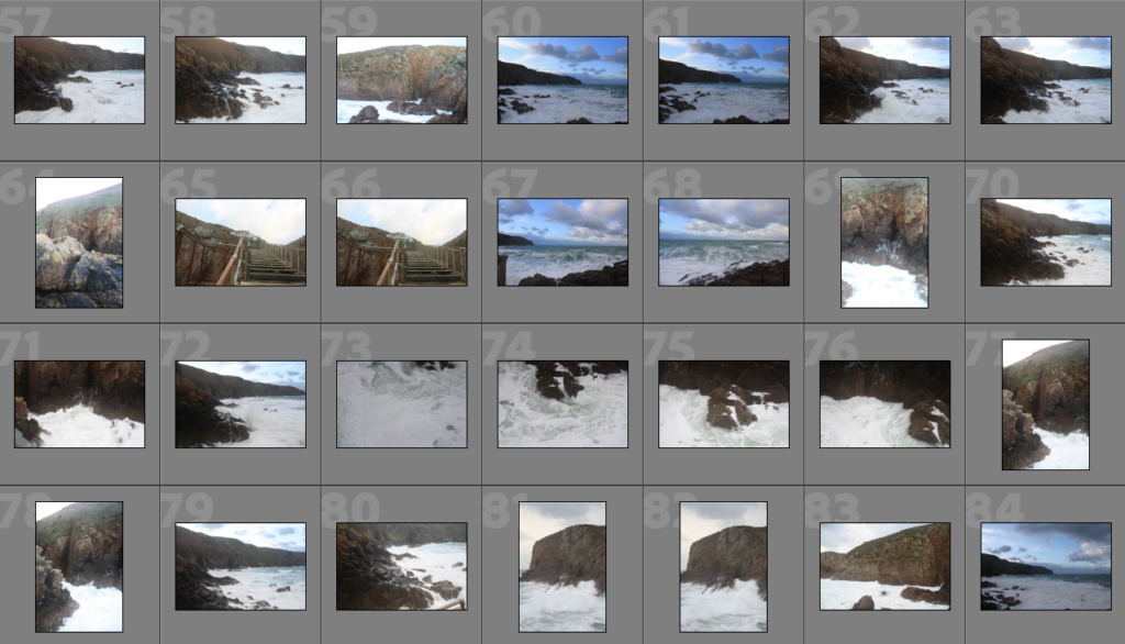
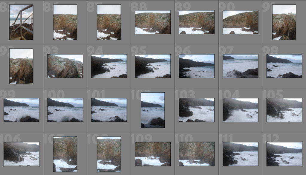
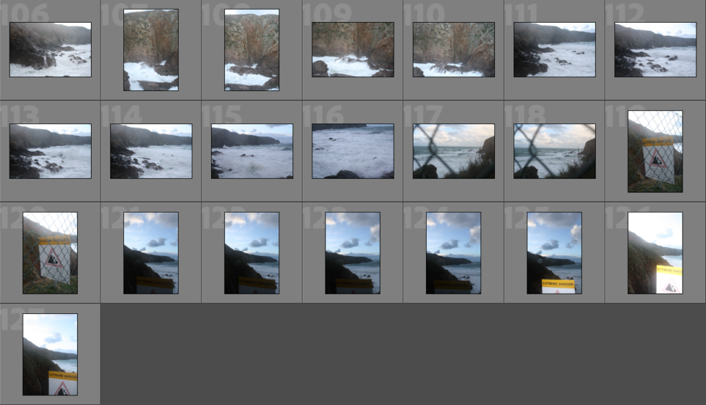
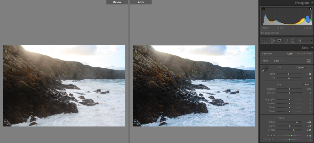
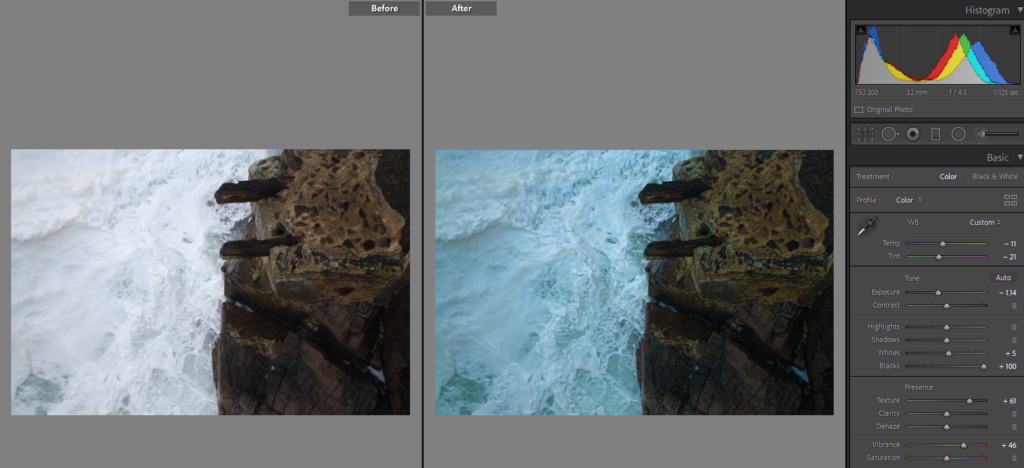
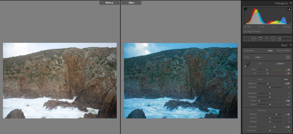
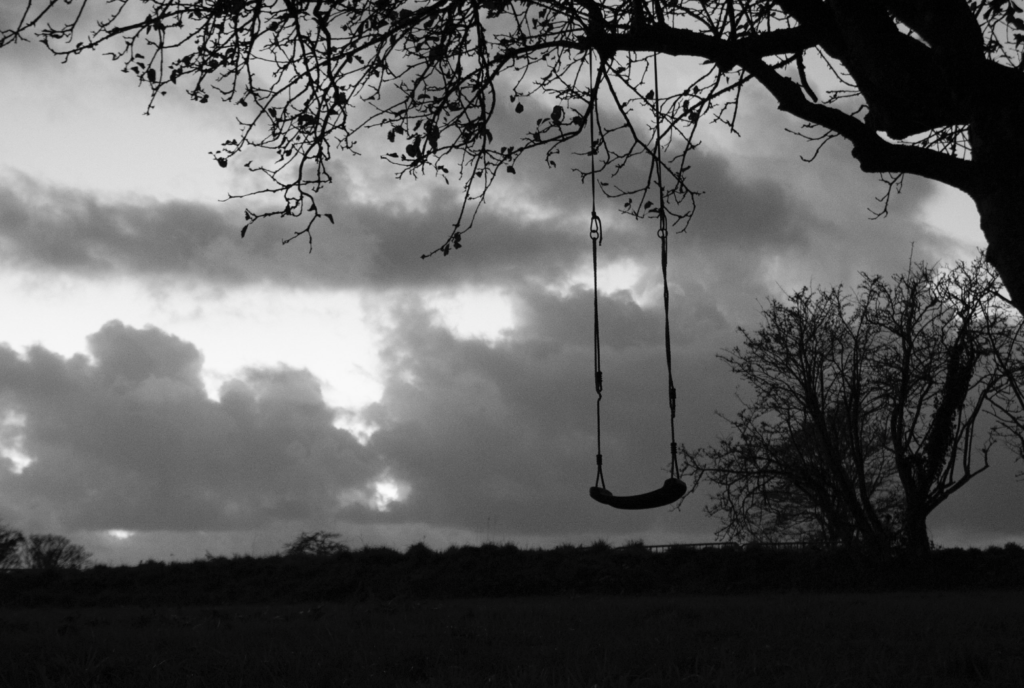
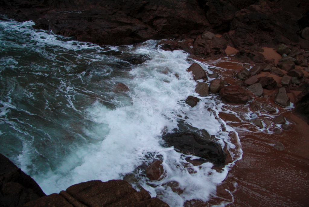
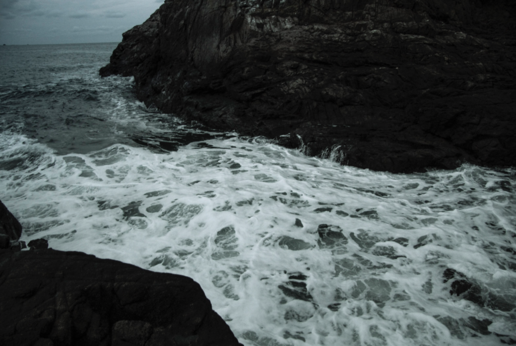
I wanted to go to the a place which included water but wasn’t a reservoir to base a photo shoot on that responded to Dafna Talmor’s work. The landscape work she produces is usually based around the coast, focusing on the cliffs by the seaside and the ocean.

The day I decided to go on this photo shoot, I went when the tide was quite high, this is why I wasn’t able to go to the beach that was covered by the water. However I was quite pleased with the weather, it was very difficult to get the shots I wanted as it was very windy and the waves were extremely violent, this was a positive in terms of the photographs I’ve got, as this caused them to be fascinating as they came out quite dramatized and terrifying as the rough sea crashed onto the rocks.
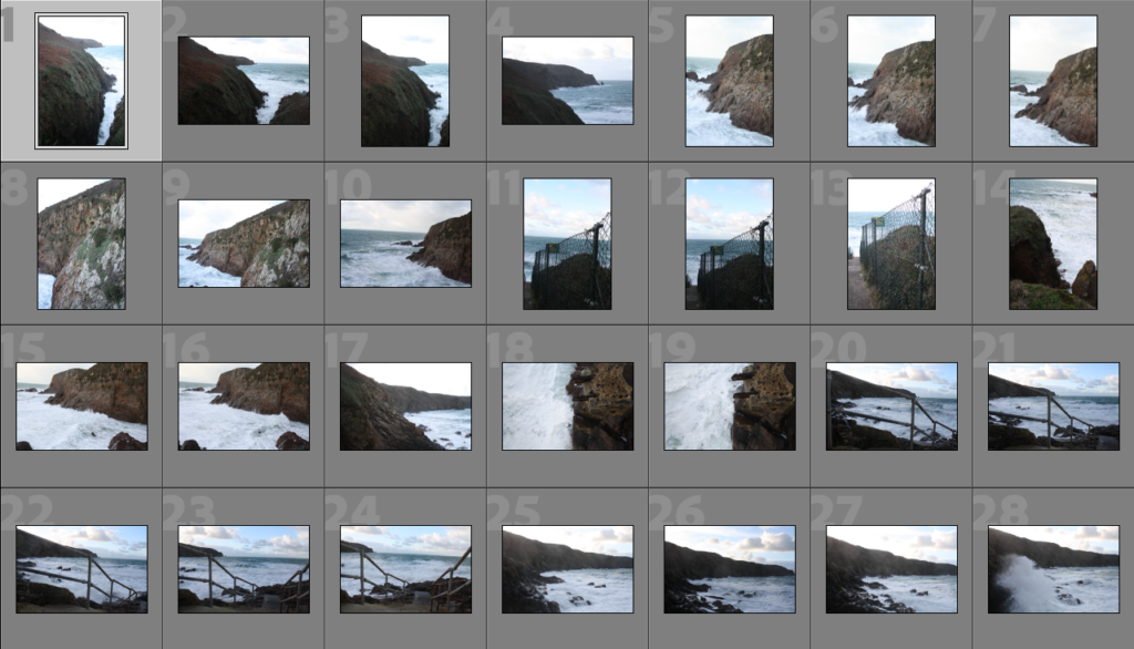
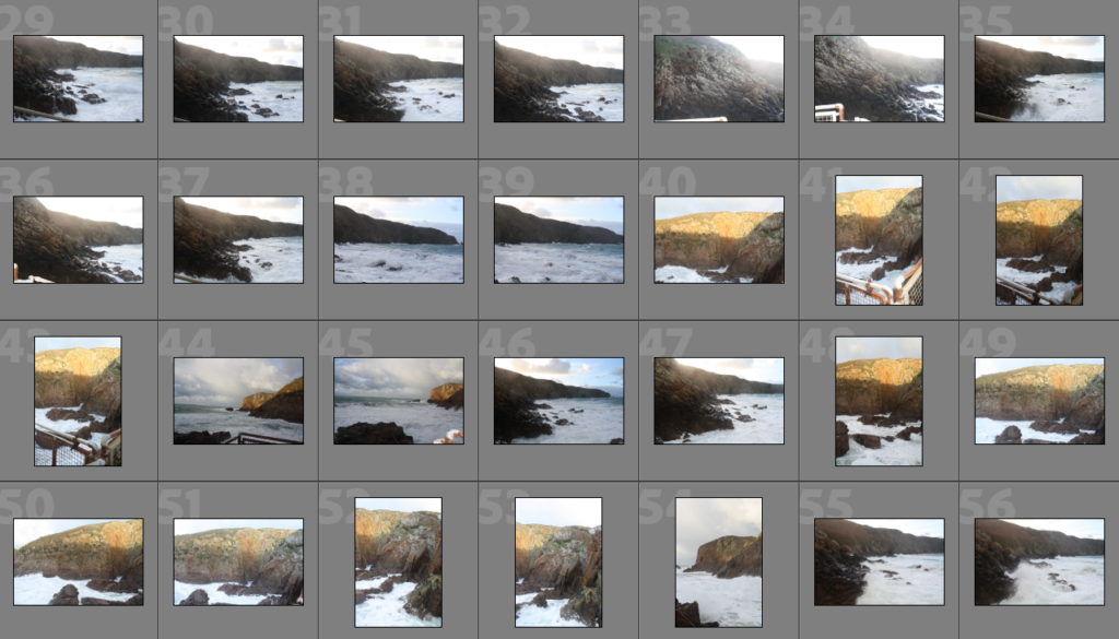
Sub-Selection

The reason why I chose these images was because to me these were the best quality. However I also payed attention to the shadows as well as highlights and trying to find a balance between blacks & whites. I was aware that I can edit the pictures slightly when it comes to over exposed images but I preferred to choose these which didn’t require much adjusting to the exposure.
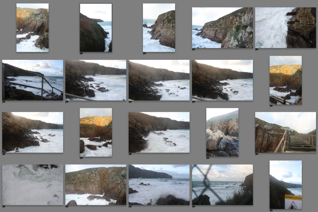
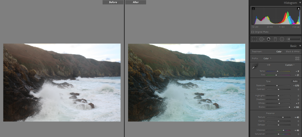
Editing

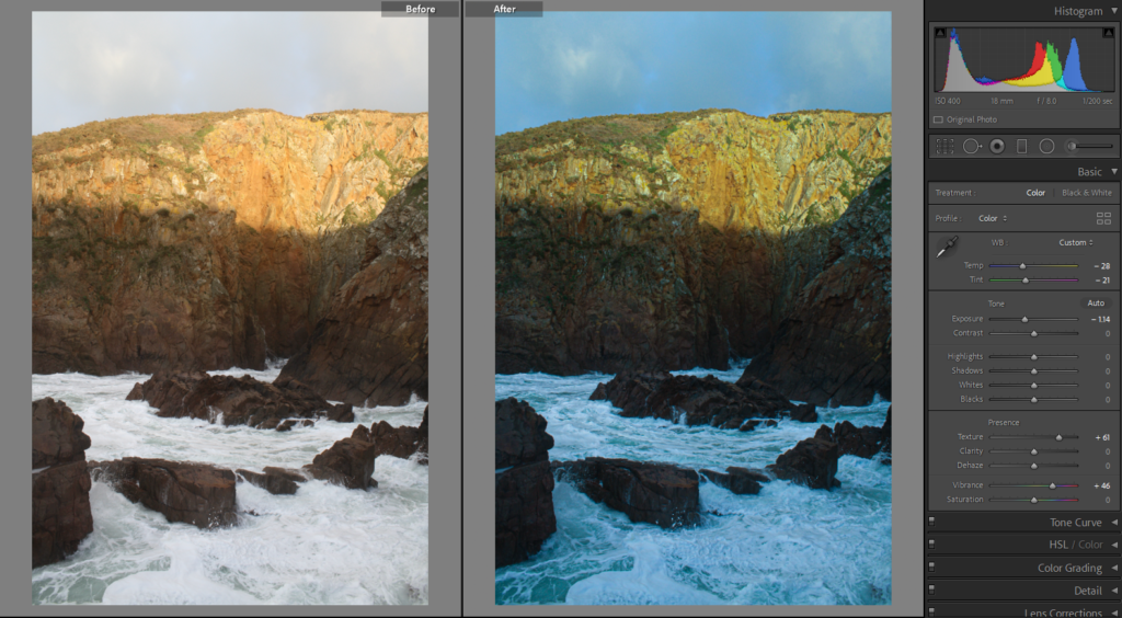
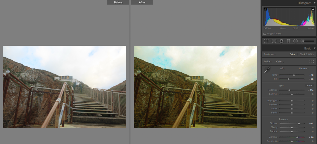
For most of the images, they were edited to show more vibrancy in them as well as making them look a bit older to give the effect that they were taken from a film camera. For most of them the main difference is that they appear more blue as I decreased the temperature of the image making it look cooler, which hopefully gives the images more of a eerie feeling as much as the sea does. I wanted to edit them in the way the surroundings made me feel when I was taking these images.
Having done previous research on her, I was aware she usually shoots in film, then works with negatives to produce her images. However because I did not have the materials for that, like the camera or a dark room to get the picture developed, I have decided to replicate her ideas digitally.

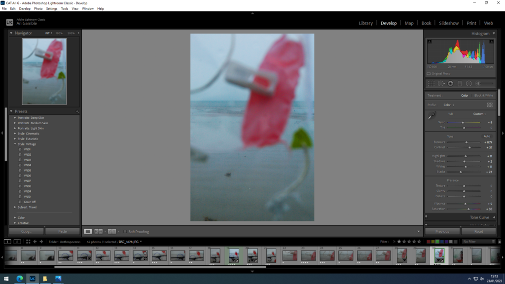
1.The chosen image, which was transferred from Lightroom to Photoshop, was already edited so that no further image adjustments needed to be done in Photoshop.

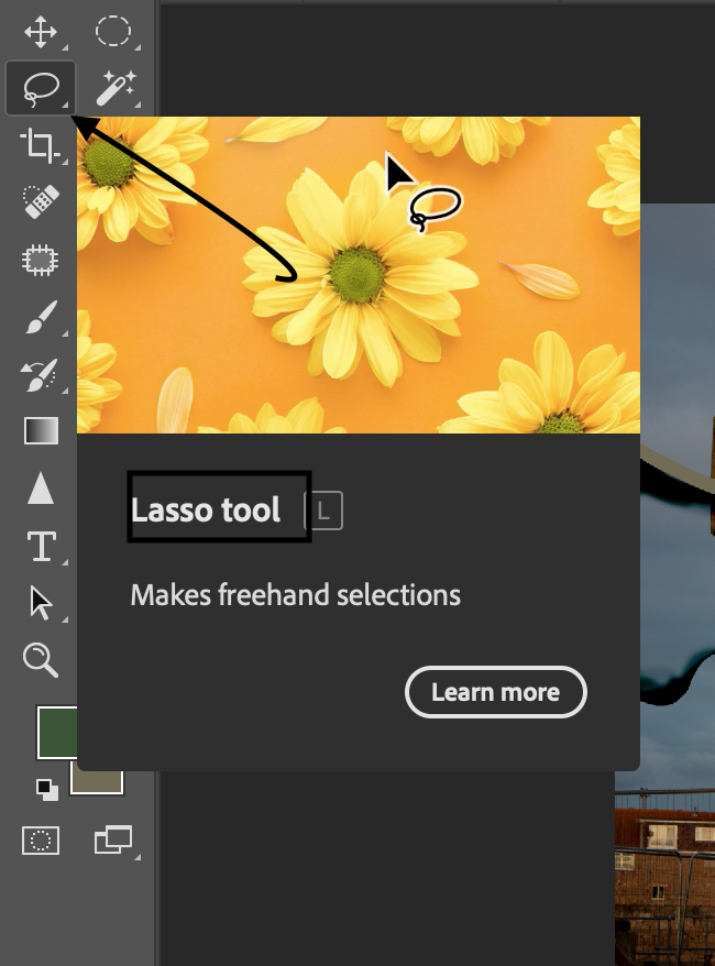
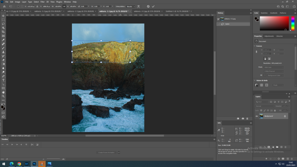
2.Then using the Lasso Tool, found on the left tool bar of the screen, 3rd one down, I have drawn out an area that I wanted to cut out .

3. using the keys ctrl+T I was able to work on just that cut out area.
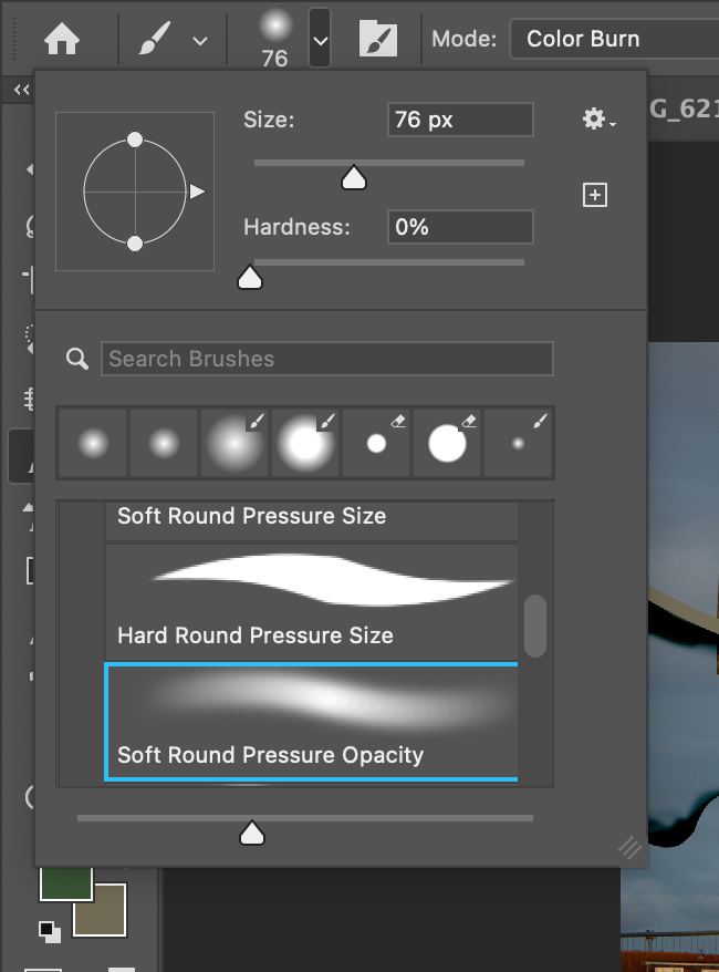
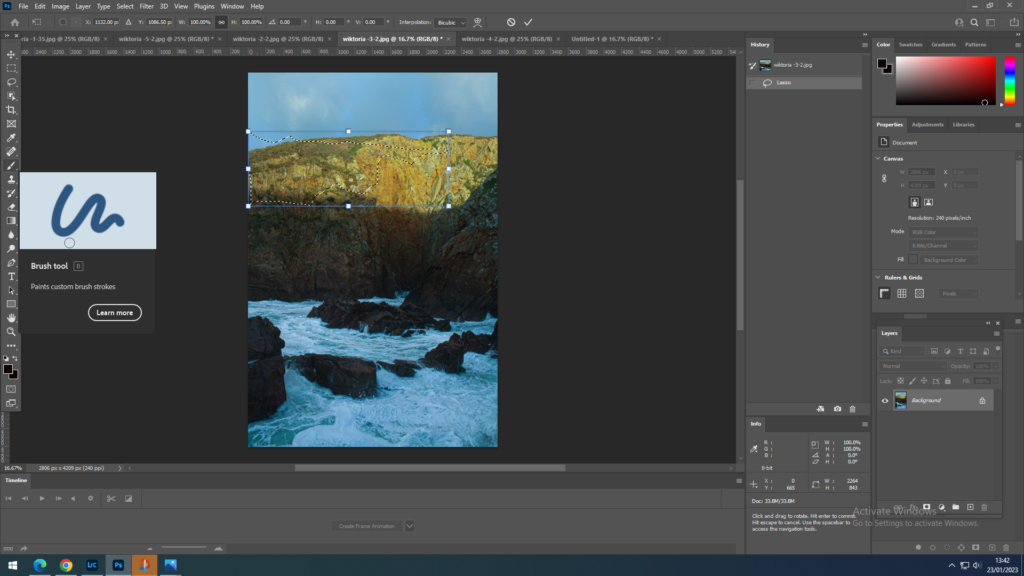
4. Using the brush tool, found on the left tool bar, I have looked at a reference photograph and then decided which colours I would need to create a burning effect, digitally. I have noticed that in her photographs the main colours the image consists of is a very dark orange as well as black, that’s why I selected the lowest softness of the brush I could find, and I have painted onto the edges of the area first with orange and then with black.
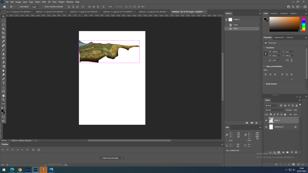
5. I have placed the area that I just worked on onto a white background layer as well as pasting the whole image. A mistake that I have done during this process is that I should have pasted each area I worked on onto the background, so that I would have separate layers for each pasted piece, however because I haven’t done that I ended up working on a single layer which made things difficult when trying to isolate the parts from each other.
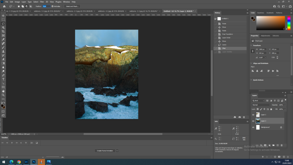
6. Repeat the process done with the first selected area a couple more times.

7. This bit was more difficult as everything was on the same layer, however I have colored in some areas in black, again using the paintbrush tool. As I wanted some of the white background layer to show through, representing cracks in the print, I had to make sure I didn’t colour them.

8. Some of the areas coloured in black I have blended in to the same segment selected. This was also with the brush tool however with a different texture that I could choose from the settings of the brush.
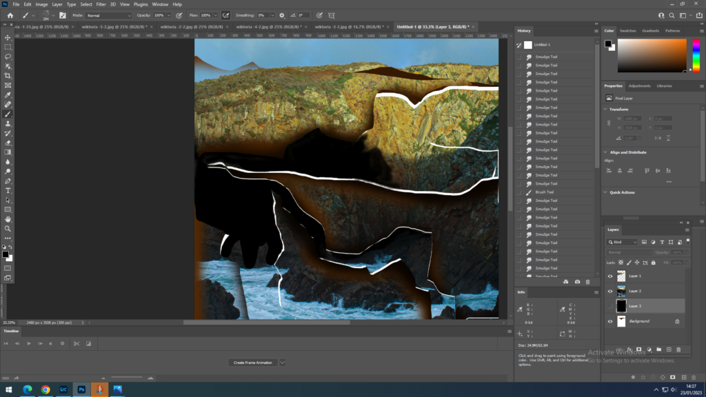
The final results:
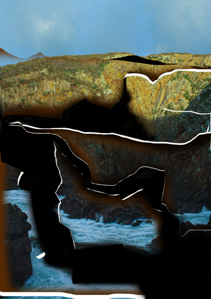
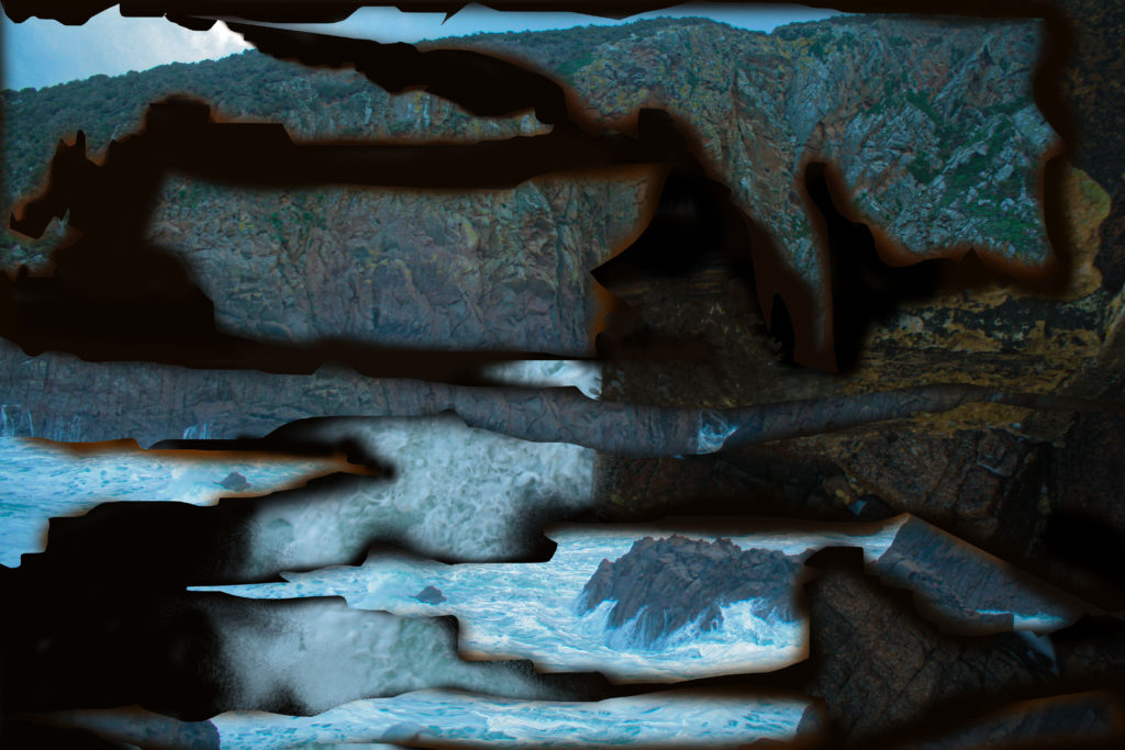
The last image was more of a experiment of her methods as well as a mix of my own experimentation. I have learnt from my mistakes and have pasted all the different segments onto another image, that is how I was able to alter 2 different landscapes. From 2 different images I have created one through the joining methods that I learnt when experimenting with getting the effect of Dafna’s work.

Anthropocene plan

To tackle this task I plan to visit area that would have a natural landscape , however they are also polluted or likely to be polluted.

I chose to focus on reservoirs as the water is heavily polluted, however this contrast with the environment around the water. that’s why I will chose a reservoir on jersey to photograph. However I would like to focus on landscapes with water as these interest me the most. regarding Anthropocene, I plan to show it through altered landscape, by montaging and experimenting with altering the image manually as well as digitally.

Mood board

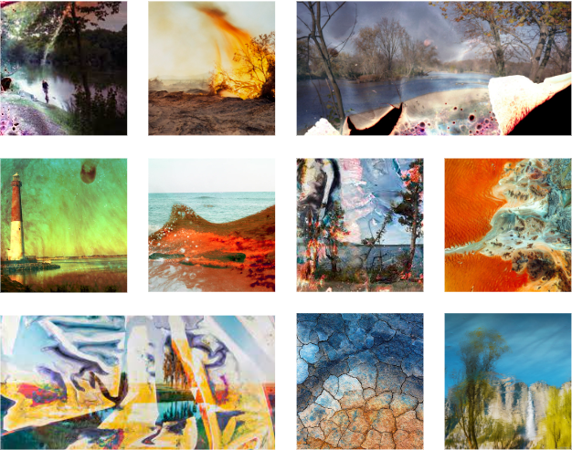
what interests me the most are colourful altered or constructed landscapes, that have been manually altered. I can use that to my advantage to represent Anthropocene through the manufactured and “ruined” photograph of a natural landscape. The images that I have used for my mood board are abstract and unique as well as full of colour, that’s what I will inspire to achieve with my final images.

What-reservoir banks, gates, trees, houses etc. a mix of both the natural and rural landscape, since my main focus is going to be the reservoir the pictures would include most of these items, mainly consist of water, sky and a tiny amount of land with trees.

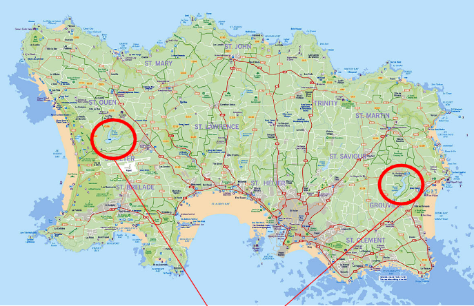
Where- Reservoirs in jersey, which is more likely to be Val de la Mare reservoir, which is in St. Peter/ St. Ouen area. However to have a wider choice of images, I might visit some of the coastal areas, like plemont.

When- During daytime or before sunset, around this time of the year this would usually be between the hours of 12.00pm-17.00pm.

How- I will try to photograph the pictures to include elements of water as well as land. i will try to show all the angles of the scenery and try to use different settings on the camera .

Why- The final images should respond to the topic of Anthropocene. the images should represent a landscape that is polluted, this could be by altering the pictures or picking out a polluted, degraded scenery that has been ruined by humans.

New Topographics

What is New Topographics?

New Topographics was a term created by William Jenkins in 1975 to describe a group of American photographers whose pictures had a similar banal aesthetic in that they were formal, and mostly black and white prints of the urban landscape.

Most of the photographers associated with New Topographics, including; Robert Adams, Lewis Baltz, Nicholas Nixon and Bernd and Hiller Becher. They were all inspired by the man made building and the urban landscape, things like garages and suburban housing also car parks.

What was New Topographics a reaction to?

New Topographics was a reaction to Ansel Adams’ images. Photographers like the ones above wanted to photo the manmade world instead of the natural environment. Ansel Adams would go through a lot more effort to take his images which makes it difficult for people to photograph things like that, whereas with New Topographics it is easier for everyone to take photos as you could simply walk around and find manmade structures that are interesting to photograph.

Stephen Shore

Stephen shore (born in 1947), is an American photographer who is best known for his images of banal scenes and objects. He was interested in photography from an early age and his first camera was a kodak junior, then 3 years later he got a 35mm camera and made his first colour photographs.

Why is Stephen Shore's 'American Surfaces' Important? – ARTnews.com
Stephen Shore: Uncommon Places | The Independent Photographer
Images by Stephen Shore.

Stephen shore image analysis.

From the Archives: Stephen Shore Raises 'Serious Question for Modern  Photography' at MoMA, in 1977 – ARTnews.com

This image by Stephen Shore shows a lot of rectangular and square shaped things, with the signs and traffic lights. There is also the contrast of the mountains in the background and all of the manmade things in the foreground of the image. The image is full of colour and has a light tone to it, also an old effect because of the old camera that is being used. This image also includes the staple colours of the American flag on the gas station sign which is the closest thing in the image and could be the main focus for people in this image. This image is also connected to the New Topographics movement which went against Ansel Adams and his photography of the natural landscape.

Robert Adams

Robert Adams (born in 1937) is a photographer who is best known for documenting both the natural and the manmade areas of the American west. While Adams was teaching English at Colorado college, he began taking pictures of nature and architecture with a 35mm reflex camera, also learned photographic techniques from the professional photographer Myron Wood.

Photography, Life, and Beauty — Art21
Robert Adams: Finding Beauty in the Mundane
A black and white image depicting a suburban neighborhood seen from an elevated area, with a flat horizon line and cloudy sky
Images by Robert Adams.

Robert Adams image analysis

A black and white photograph of a lone person digging with mountains in the background.
Robert Adams, Basement for a tract house, 1969

This image shows the beginning of construction. You see the main focus of the man working on the construction and what looks like him digging up the land to start building. Because of how close this is to the foreground of the image it is what you first look at and not the natural land and mountains in the background, which have not yet been altered by people and manmade things. The mountains in the background almost look like they have been photoshopped in as they are really faded. The image is in black and white which gives an old style and also the minimal building equipment shows that back they didn’t have any help from electrical equipment and had to do almost all of the work by hand. In the image there is a lot of flat land apart from the mountains in the back ground and the hill that has been created from the hole being dug. This creates a sense of emptiness because there is nothing but flat land.

Anthropocene – Photoshoot 1 – Editing + Experimentation

For this photoshoot I wanted to create harsher lines against the background so I achieved this by adjusting the contrast, shadows and saturation.-

First attempt

my first attempt came out too dark as I raised the contrast too high.

I lowered the temperature towards blue to create a cooler more bleak looking landscape. I also experimented with the contrast and saturation to make the plastics stand out from the background mimicking the contrast seen in Stephen Gills work.
Anthropocene Final Images

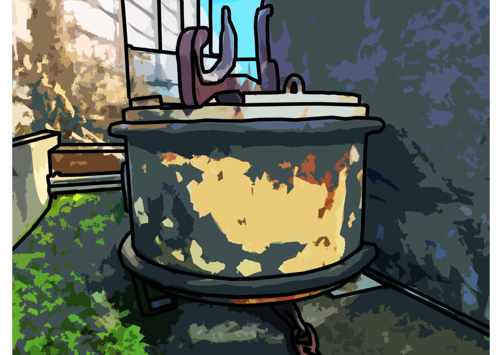
This image wasn’t inspired by any artist i just wanted to give the photo a ‘cartoony’ feel, to make it i first outlined the image then applied 2 filters from the filter gallery. The original photo without the edits was inspired by Edward Burtynsky.

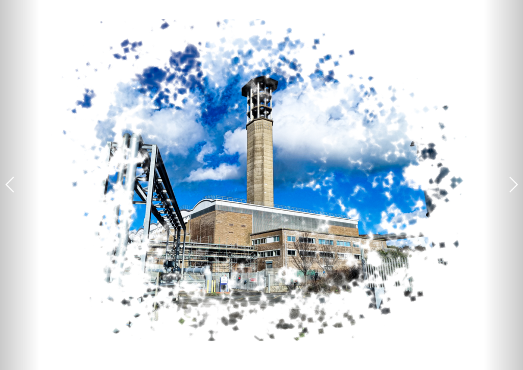
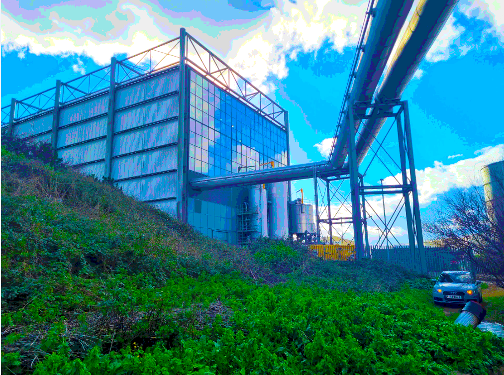
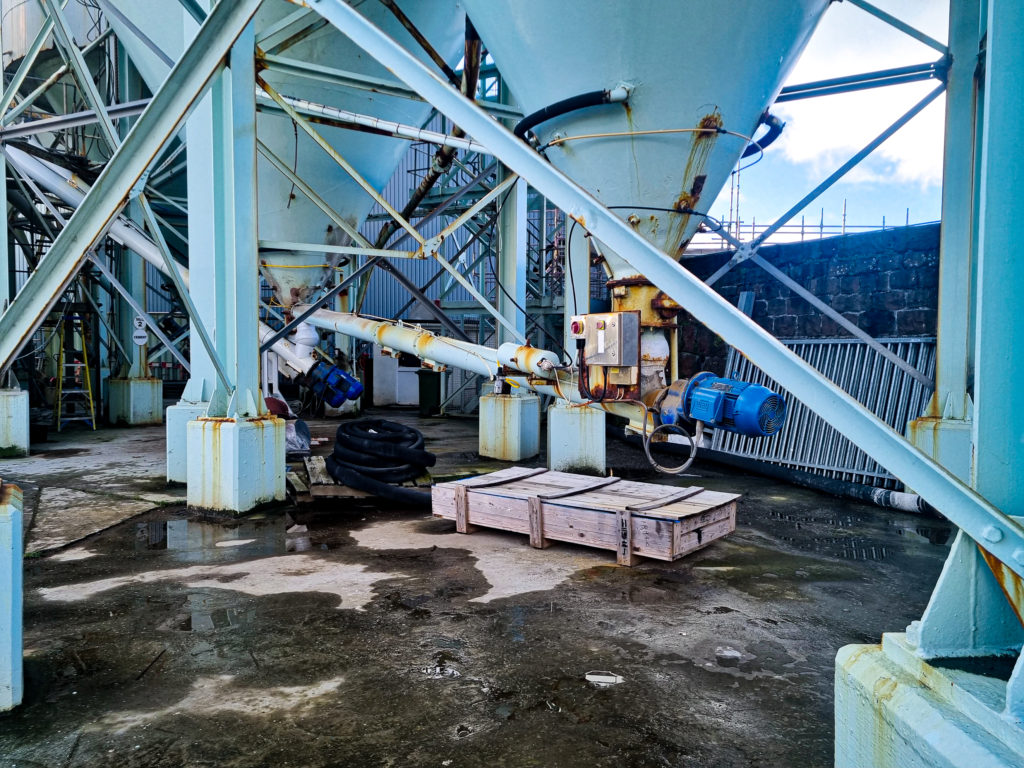
This photo was inspired by Edward Burtynsky and is of a urban landscape that also shows an industrial theme.

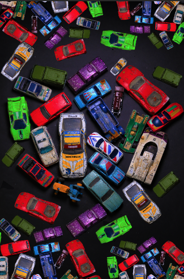
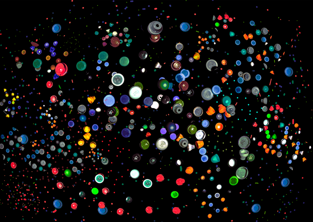
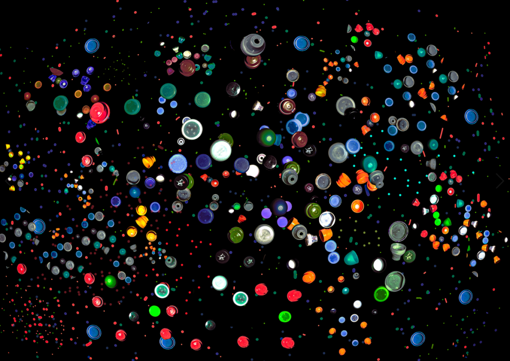
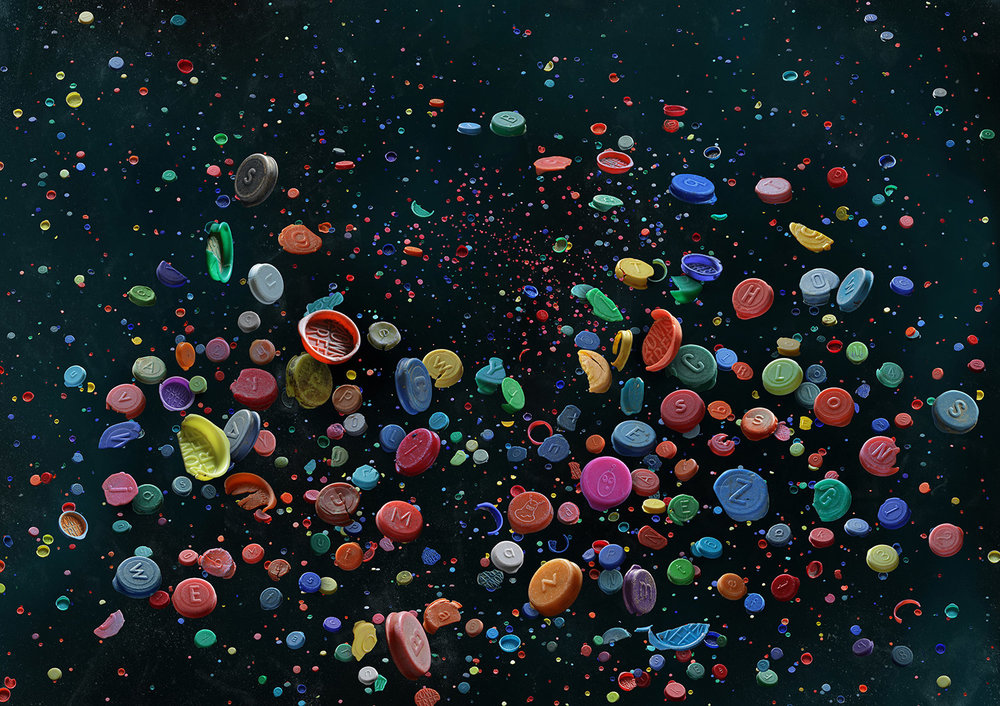
This image was inspired by Mandy Barker and the way she scatters many pollution related items around a black background, to make this image i only used 6 bottle caps and took pictures of them in different positions, the really small bottle caps are actually just dots from the brush tool.

For this image i wanted to use a layer mask to give the illusion of the image being painted on.

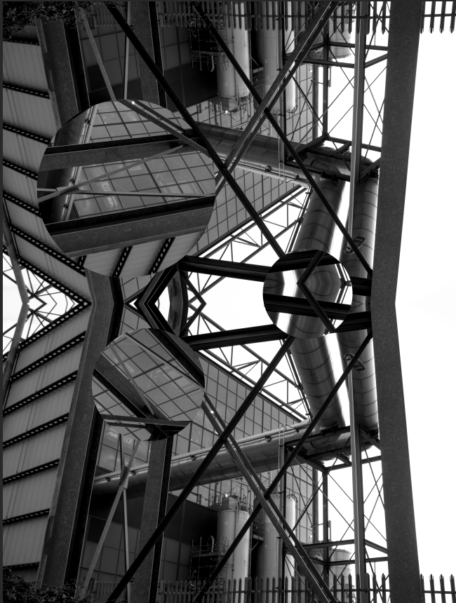
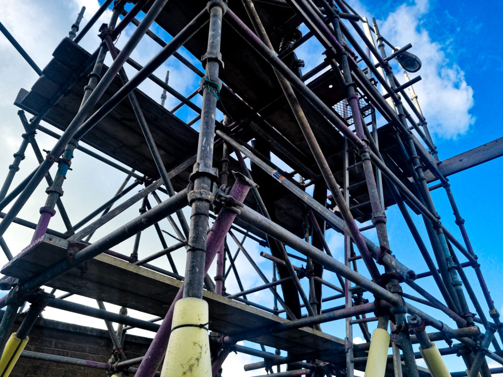
This image was also inspired by Edward Burtynsky, but has a more abstract approach.

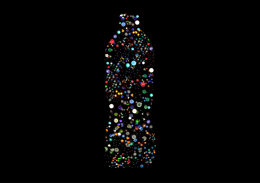
This image was inspired by Mandy Barker and the way she lays out plastics on a black background, i came up with the concept of putting the caps in the shape of a bottle because i thought it would relate to Anthropocene.

Image Comparison

Seeing my image side by side with Mandy Barkers I can see that I didn’t put a blue mist around the image and the bottle caps aren’t as much in focus.

Evaluation

The Anthropocene project helped me explore different parts of photography that I never thought about touching, the project improved my editing skills because it let me edit different photos that to what I’m used to. I found that my strengths lie in this project is in the experimentation and manipulating an image, however i found going out to take the photos was difficult as it was a random chance if i was gonna get decent weather. I took the bottle cap images as an almost fall-back plan if I couldn’t go out to take photos. I thought I could improve by taking photos in different locations.

Furthermore I thought I could also improve by taking photos with a higher resolution and photos that are in focus but to accomplish that I would need to acquire a camera and a tripod so I would be able to take steady and still landscape photos.

I enjoyed this project as it let me expand on my photoshop abilities, whilst experimenting with my edits i found areas in editing that I was not so confident in so this project helped me improve in the areas I was lacking.

photoshoot edits

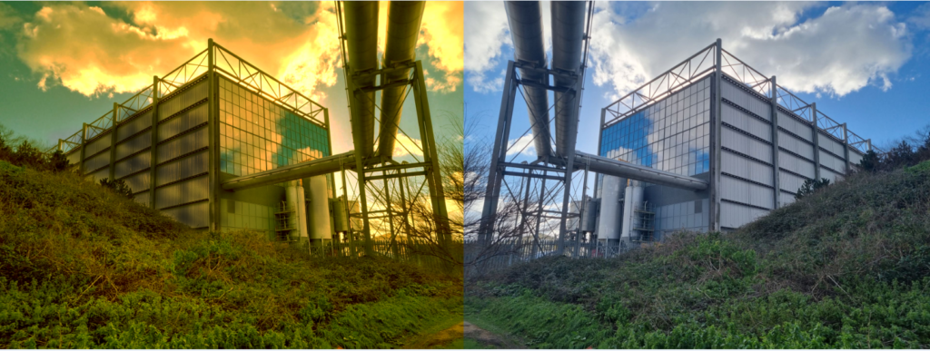
The edited photos are on the left and on the right is the original photo. with the one under this text I tried to make it look warn down and sort of toxic I did this because It looks cool and because these industrial places are making the air toxic. when I print this photo it will just be the edited one not the original next to its just so you can see what I have done to the photo.

With this edit I didn’t really do to much to the phot I added a lenses flare I also added a bit of weathering to the image. Also when I print this photo it will just be the edited one not the original next to its just so you can see what I have done to the photo.
this image is black and white however the reds been turned up so there’s is a light hint of red I liked this photo because its a sort of barren landscape however if you look to the left there’s one small little tree maybe showing there is a bit of natural life in the photo. I didn’t add the original photo next to this one because I think it makes it look rubbish.

With this photo all I did is click on selective colours then gradient map and then invert and it looks very good for something so simple to do. why I took a screenshot of this photo in photoshop is because I wanted to show what I did to the photo in editing.

photo editing experiments

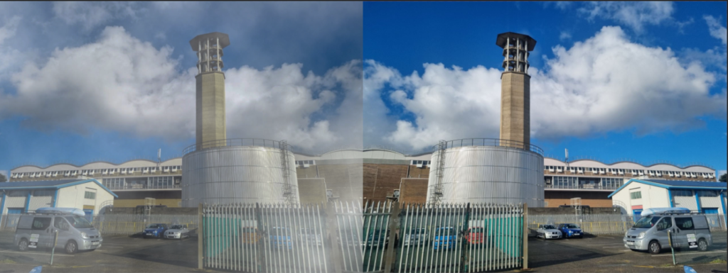
With this edit I tried to add fog to the photo because there’s a chimney I wanted to add smoke coming out the chimney. However I couldn’t find any good photos of smoke and the one that I did find was to small and pixilated so I decide to add fog to the photo. And I believe it looks way better with the foggy effect. How I got the foggy effect, I clicked filter, render, clouds the I just decided how big I wanted it and where it looked best. however the fog doesn’t look realistic enough so thats why I decided to just use it for experimental. Also this photo is the edited one next the original photo.

with this edit I like it, it has a really nice effect however I don’t like its final photos material its a bit grainy and not a hole lot is going on.
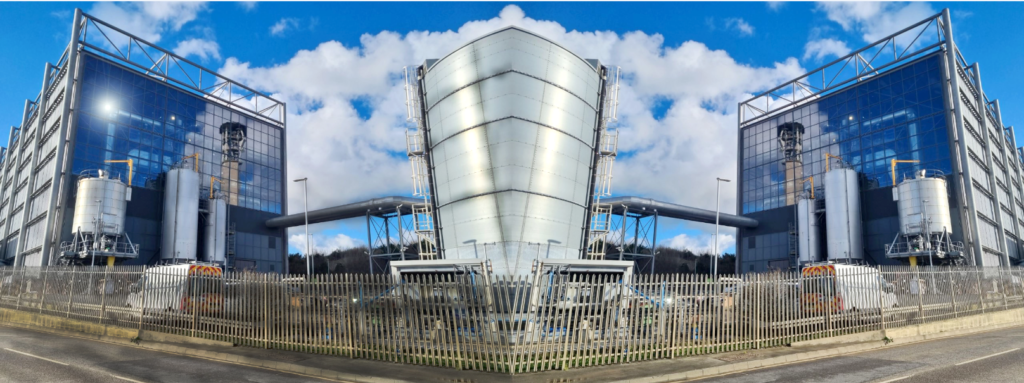
with this photo I was just messing around with the lasso tool and making the photo look like its been stuck together the reason that I didn’t put it in the final images is because I dont really like the look of it and probably wont try it again.
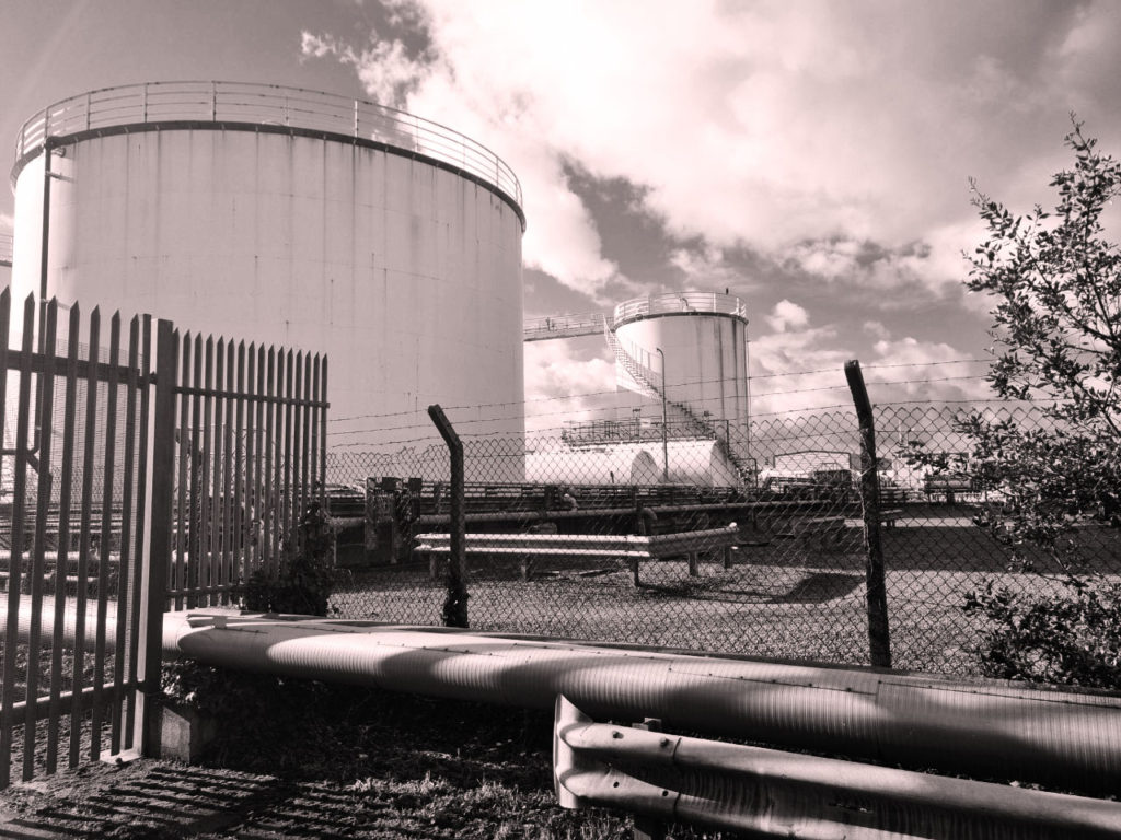
with this I just made it black and white and then weathered it a bit with the burn tool I think it turned out ok but as I said before its black and white and its a bit over done but I did it because it looks good.

Anthropocene – Photoshoot 2

images and selection-

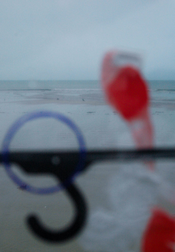
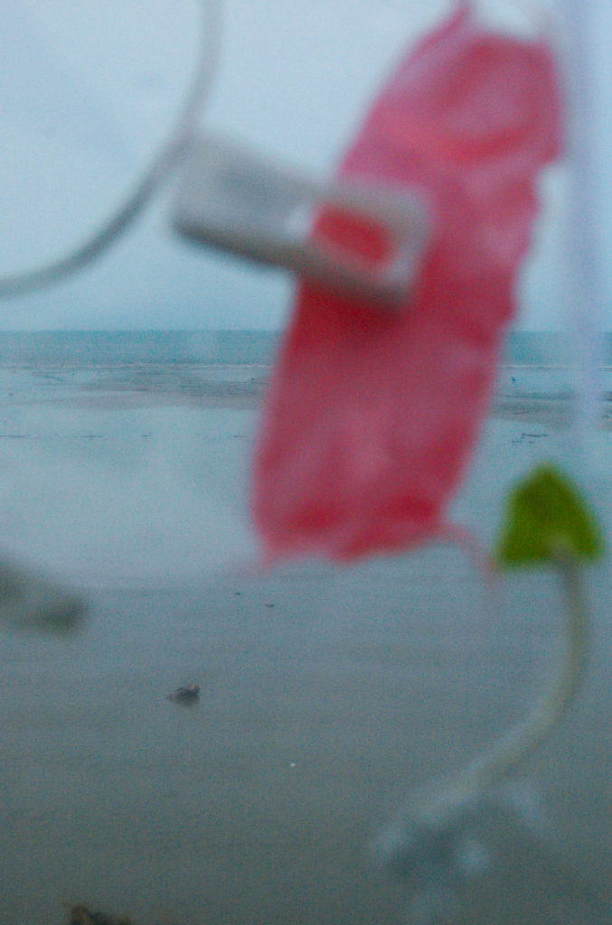
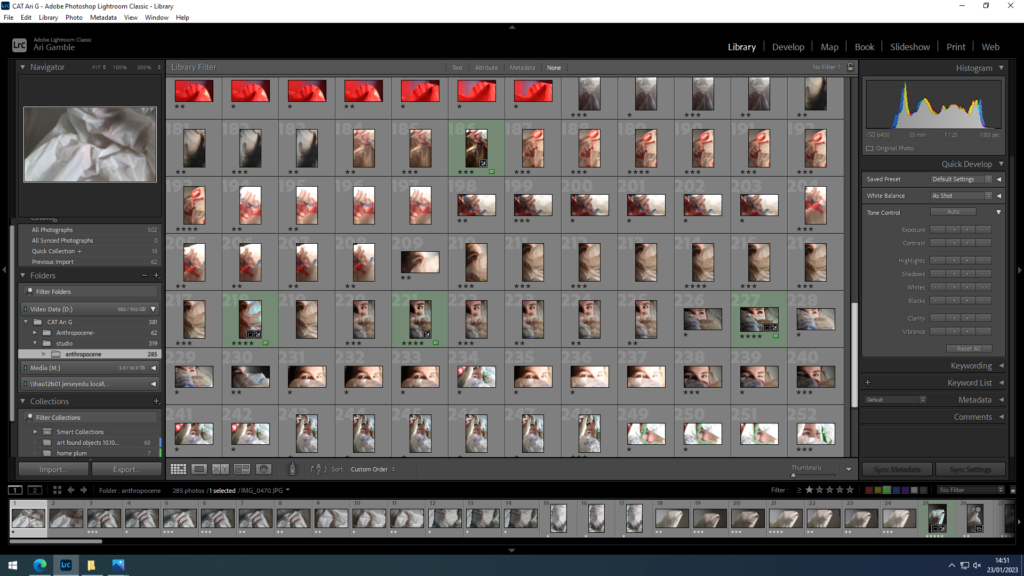
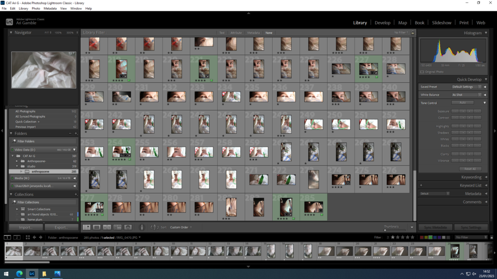
I decided a lot of the images taken with coloured filters over the lights were unsuccessful in showing what I wanted as they were too exposed and skipped out on the effect of the transparency that I was going for.

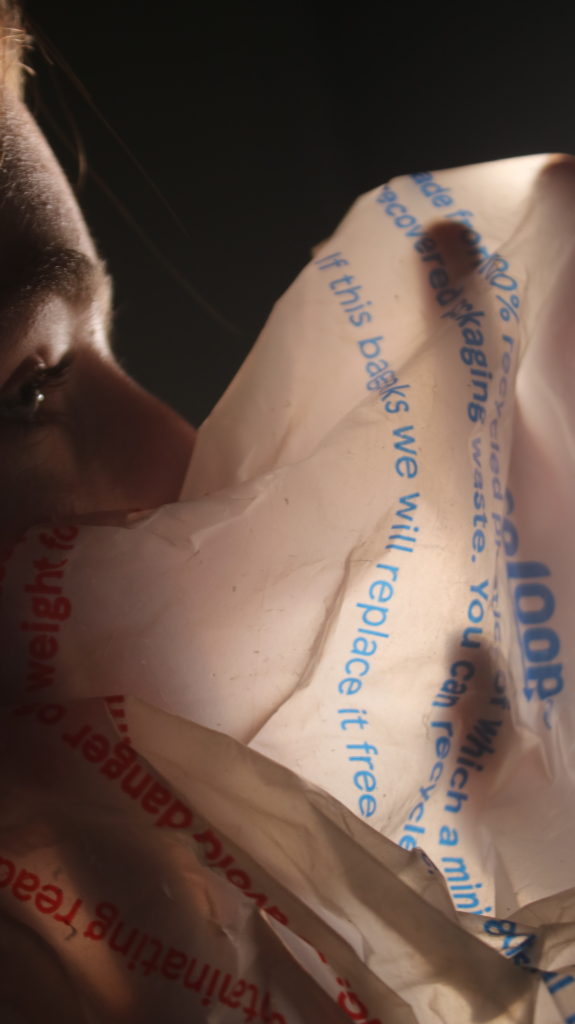
This image combines both the portraiture that I was going for and the more abstract shapes from the plastic bag.

focus is one just the hands and the shapes created.

Dafna Talmor

Dafna Talmor

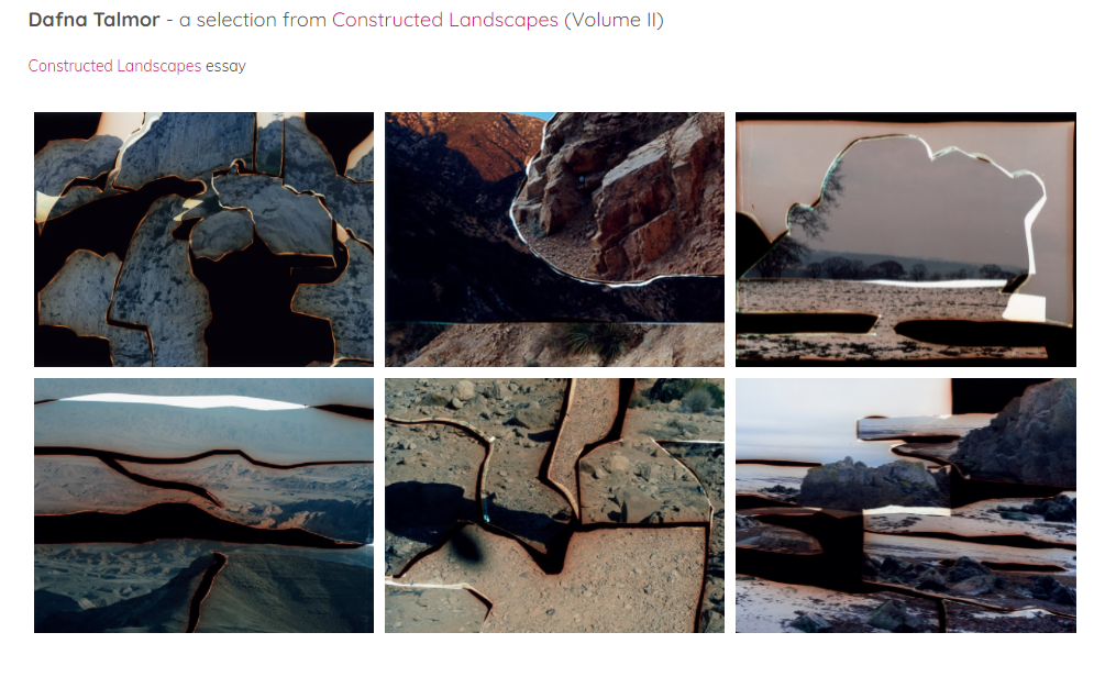
Talmor is a London based photographer who practices encompasses photography, spatial interventions, curation and collaborations.

She creates her work by using two different negatives and cutting them up with a scalpel to merge the photos together when developing them. Talmor combines colour negatives of landscapes that she has been collecting for years and transforms them into visually striking compositions that are devoid of man made structures.

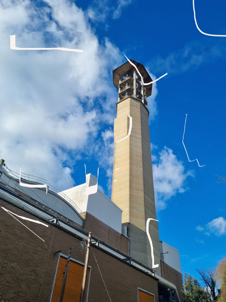
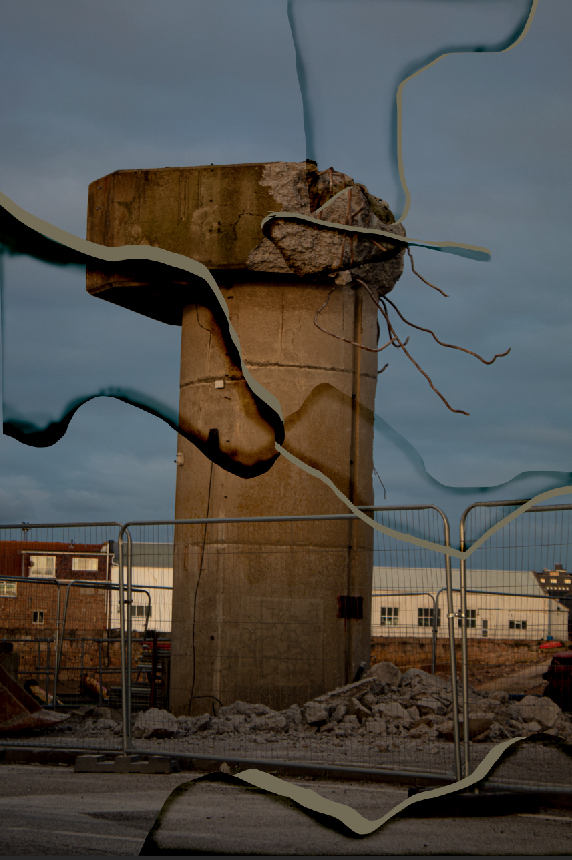
I attempted to create a image inspired by Talmor on photoshop, i believe with more practice and time i would. be able to make the image look a lot better and cleaner to create this i used the Lasso tool on photoshop to select the part of the image i wanted to use.

I then used the paintbrush to create the darker parts which Talmor would have used bleach to create it, i turned the hardness of the brush down, made the brush size smaller and turned the opacity down and proceeded to go over the outline on the parts i cut out.

This is the final outcome.

Best Anthropocene landscape outcomes

Final Edits

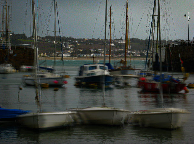
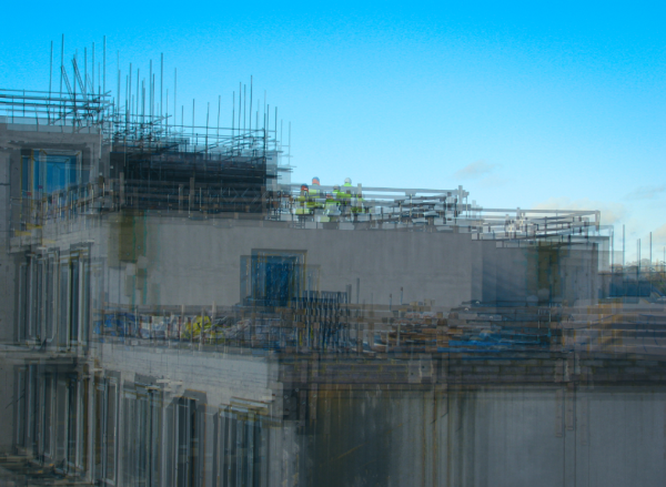
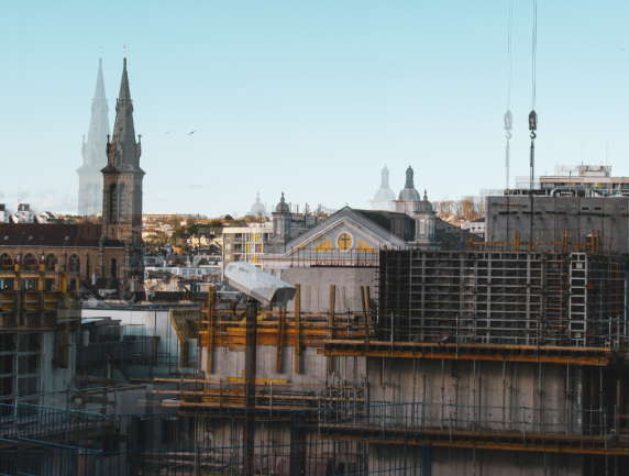
my best final edits from my Anthropocene landscape responses

Comparison

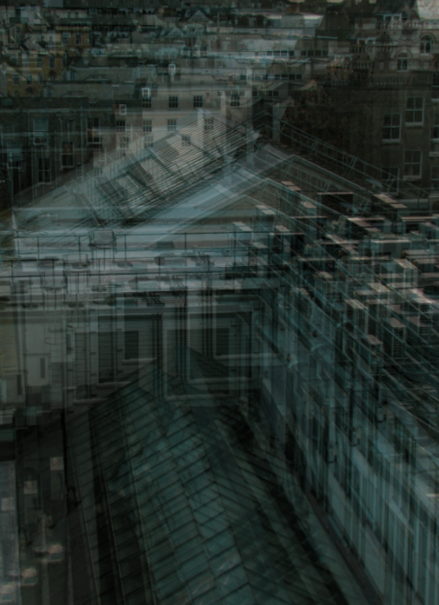
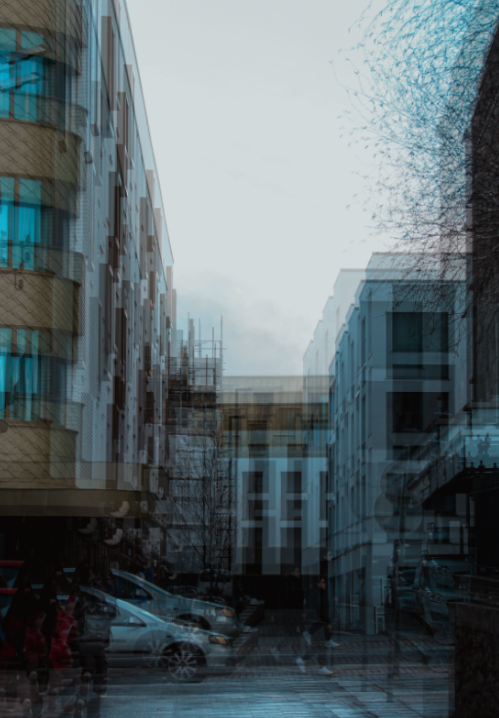
This photograph was inspired by Stephanie Jung, who takes multiple exposure photos of urban landscapes, editing them so that they appear as though they are moving. She illustrates reality as we normally see it whilst portraying many bizarre and unearthly dimensions within her pictures. Her photo includes a cityscape that shimmers and shifts, forever moving and not allowing the viewer to fully understand what is happening. Jung focused on the bluey-green tones apparent throughout the image, accentuating them during her editing phase and creating this ghost-like image. I loved the dizzyingly abstract effect she created, and I tried to recreate it by capturing a similar landscape from the same high angle she took it from, the bird’s eye view angle showing the city from a different way it is normally seen from. I was inspired by the multiple exposure technique, recreating it by layering the same image on top of itself twice and slightly moving it to create the shifted look. Furthermore, the overall cool tones in the photo looked very effective, and it became yet another aspect of her photo that I recreated, enhancing the cool blues and whites in my image to create a similar effect. On the other hand, her photo has a quite high exposure, making her photo quite bright. In contrast, my photo’s exposure is quite low, juxtaposing her image by being much darker and having a gloomier look. Moreover, her photo consists of a much clearer foreground and background, the buildings at the top of the image being much paler where as my photo was taken at a steeper angle and the foreground and background don’t have such a clear difference. Both of our photos present human architecture as a repeated concept, the shifted repeated photos layered on top of each other further supporting this idea.
This photo was once again influenced by Stephanie Jung, who captured a street view in Japan and edited it in her style to create this interesting photo. Her photo consists of the road creating a leading line, running from the corner of the image and helping our eyes decipher the image by guiding us through it. I thought this as very effective and decided to recreate the leading line, however I decided to take the picture so that the leading line would start in the middle of the photo, guiding the audiences eyes through the foreground all the way to the background of my image without getting distracted by the shifting surroundings. I, once again, recreated the shaking effect by layering the image on itself over and over, slightly changing the position of each after lowering the opacity. Jung’s photo focused on the sandy yellow tones present in the image, enhancing them to create this interesting filter. Although being influenced by this before, I decided to go for a more natural effect, simply enhancing the colours by increasing the saturation. This, however, did bring out the cool, blue tones of the image therefore there is a link of focusing on one colour in the two photos. Furthermore, both pictures include a sense of depth of field, the leading line being the main cause of this by adding depth to the image. The composition of Jung’s image struck me as very effective, the two buildings on either side of the street towering over it and almost embracing it. I attempted to recreate this by capturing a building on each side of the image, even a bit of a tree branches to add another pattern to the image, just like the artist did. The repeated shapes (branches in Jung’s photo and the windows in mine) adds a repetition of patterns throughout both photos, another effective technique that adds to the idea of multiple dimensions.