PHOTOMONTAGE:
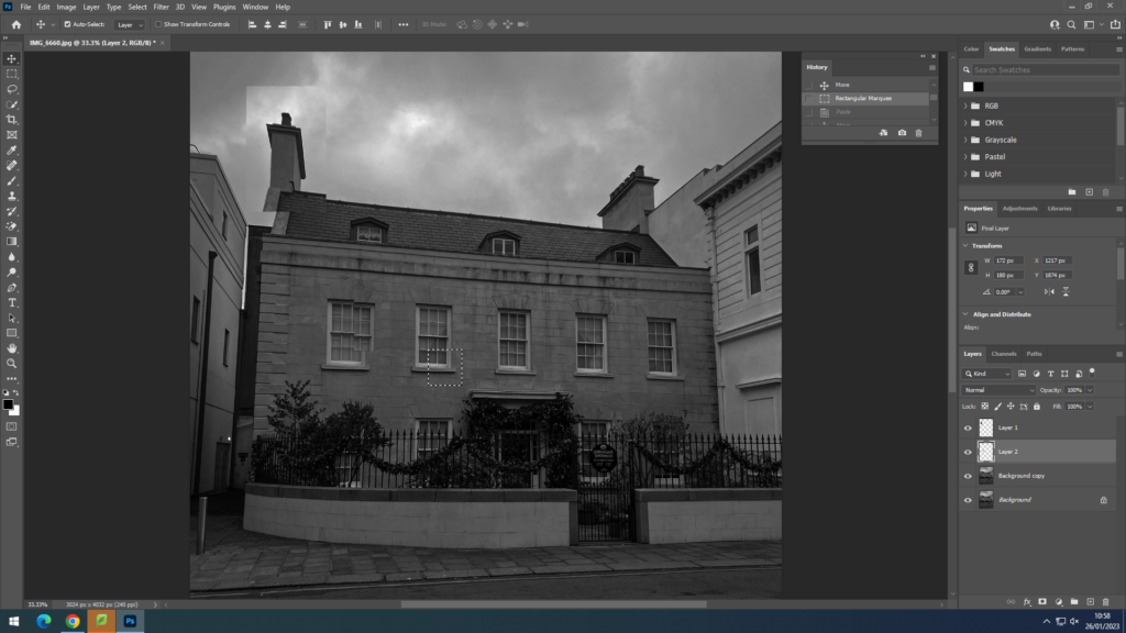
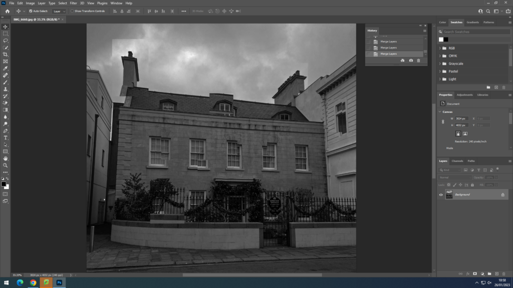
Using this image and editing it in photoshop, I used inspiration from David Hockney’s images by selecting parts of the image and then moving it slightly around to create more of a distorted image. In this image I did minimal selecting as I didn’t want to take away the simplicity and effect of the blank and white of the house.
PANORAMIC:
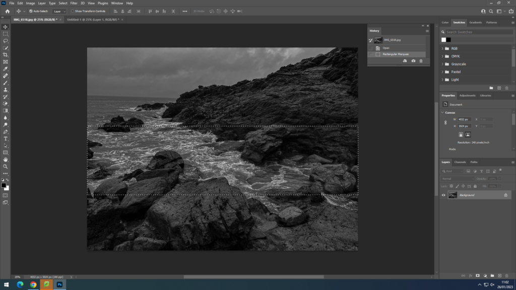
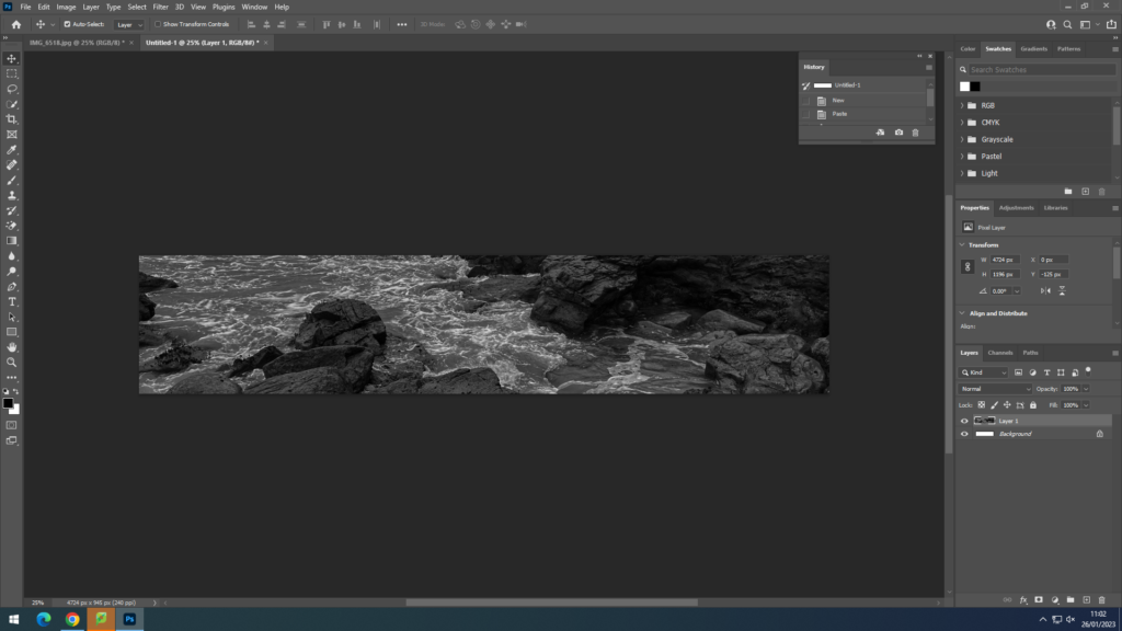
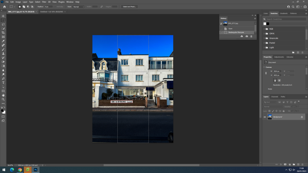
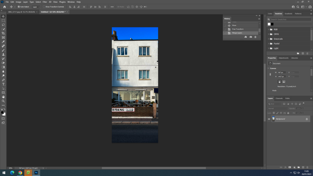
I tried doing a landscape and portrait panoramic to highlight the key parts of the image. In the landscape photo of the waves the white foam crashing into the rocks had an impact of the grainy editing. For the portrait image I highlighted the the building to emphasize the shape and how the windows create a frame in frame image.
TEXT:
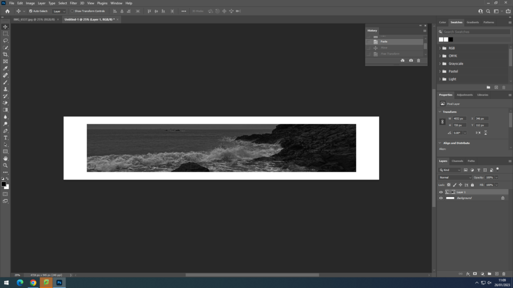
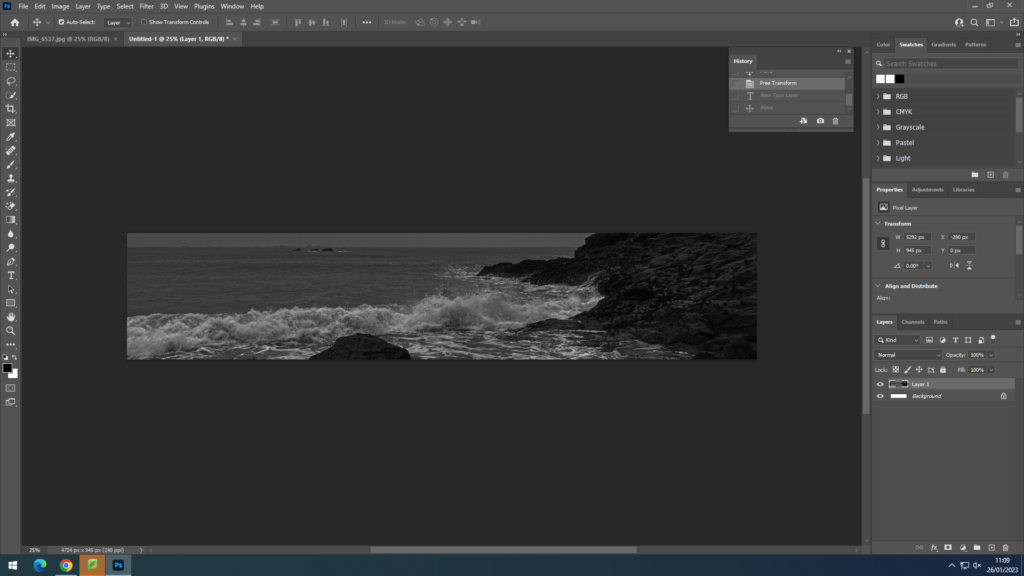
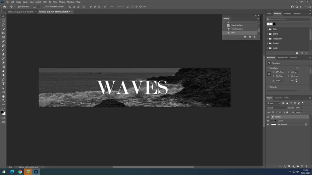
In this image I decided to do a panoramic edit of the waves crashing with a neutral text font.
