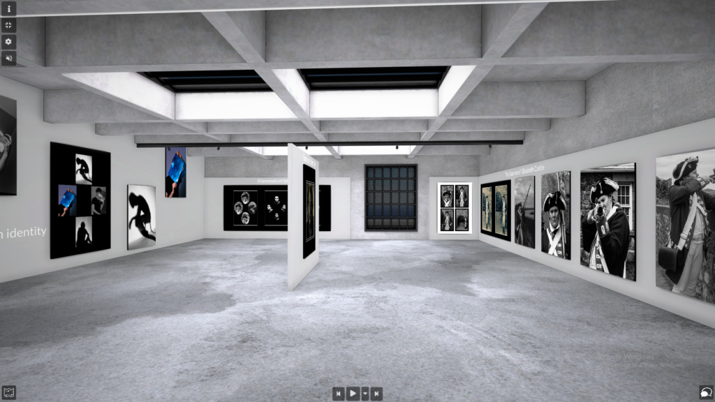
The Exhibition shows a series of portraits taken using inspiration from a range of photographers including Henry Mullins, Julia Margaret Cameron and more. The images vary in style but all revolve around the theme of identity; primarily that of hidden or disguised identity.
Typology
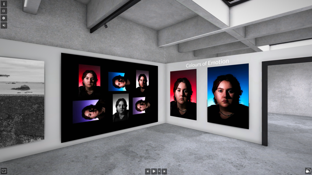
All of these images were taken of one single model each taken the same way with the only change being the colour of the gel used on the lighting. The cameras positioned remained unchanged and the lighting position unmoved. I felt that a simple technique like this can be used to demonstrate the differences of people’s feelings. The model shows a neutral expression but their emotion can be described through the colour of the light behind them. For example the red can show anger and heat; whereas the blue can show tranquillity and calm.
Environmental Portraits
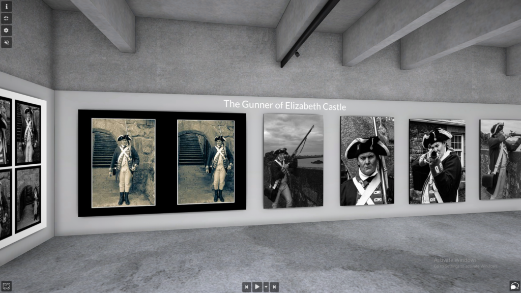
This series of environmental portraits were taken of the Master Gunner at Elizabeth Castle. When editing, I turned all of the images into monochrome photos to create the effect of the images being old. I felt that due to the character being that from a historical period, I wanted to compliment that within the images. They also show a disguised identity, one commonly used in theatre. The model merely conducts this role for Jersey Heritage and has a completely different life outside of the costume. As a performer myself, I wanted to use these images as a way of showing the freedom from normal everyday life that theatre and performance can provide; in this case a transportation to the past away from modern day issues. I personally feel that I could have expressed this thought process better if I combined these images with some of the same model in her everyday life and not in costume.
Diamond Cameos
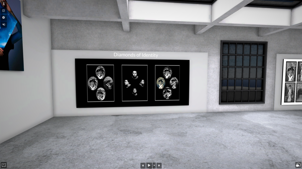
This triptych presentation of monochrome diamond cameos was inspired by the works of Henry Mullins, a photographer that lived and worked in Jersey during the 19th Century. Again, these images are monochrome due to the historical context of both the period in which this presentation style was used and some of the images have their own historical background. The two outer cameos both use photos of the Master Gunner at Elizabeth Castle; however, the central arrangement uses photos taken within the photography studio as an initial experiment after researching Mullins’ work. I chose the four images as they show a great use of chiaroscuro lighting that makes me believe that the model has something to hide. With three of the photos showing the model with a neutral expression the fourth stands out simply because there is a small smile. This took my interest and made think that through the arrangement, at the bottom of everyone there is a little bit of happiness or emotion that doesn’t always arise to the surface. By positioning this one contradicting image at below the others I believe that I have strongly communicated this.
I decided to combine the three diamond cameos for two reasons. The first being that they simply are all diamond cameos and so should be arranged together. However, the second reason is that I believe the contrast between dramatic chiaroscuro lighting created in an internal area (the studio) contrasts to the more naturally lit environmental portraits taken out at Elizabeth Castle in full view of the general public. The idea that something so simple was created in one room hidden from the outside world alongside an entirely costumed and extravagant photoshoot taking place where anyone could be watching again shows how some people fear being in the public eye whereas other thrive from it. Another aspect of human life that defines us.
Self-Portraits
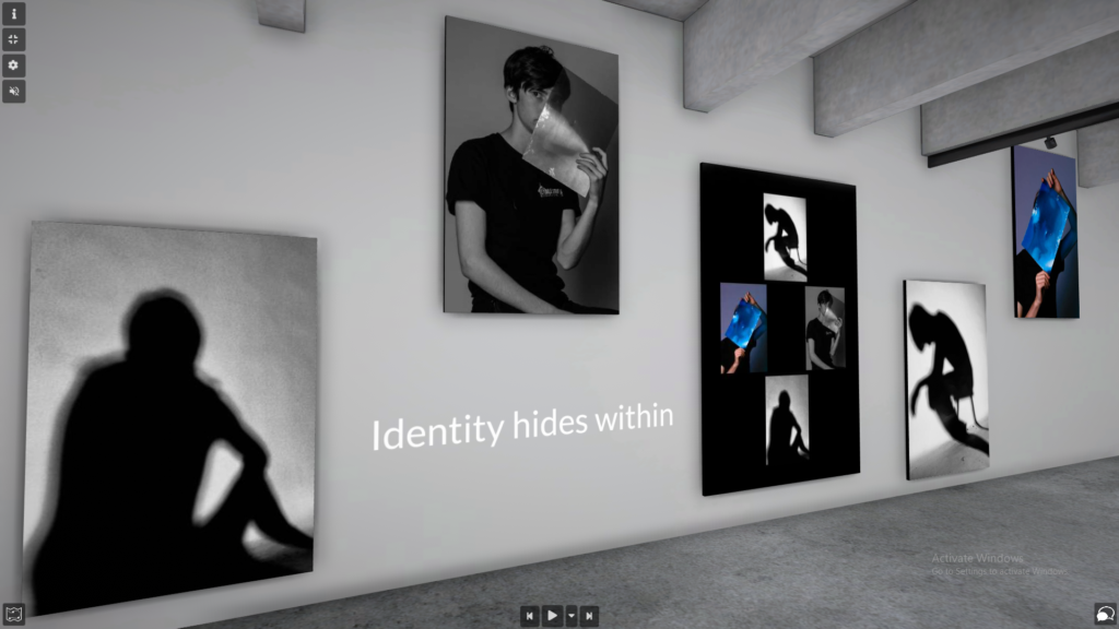
The theme of hiding and having a hidden identity is thoroughly expressed in these images. By creating shadow and obscured selfies, I could easily portray any range of emotions or actions and maintain an element of secrecy from the camera. The shadow selfies both seem to look like the model is depressed or upset over something. However, how many emotions can be expressed in a shadow. A shadow is dark, most commonly black, and to accentuate the shape has a much lighter background. These two images show an overall dull and dingy atmosphere which makes a viewer believe that the model is expressing these negative emotions. This is what I wanted to show; the idea that people assume that what they see is correct but perhaps the model tired, relaxing on their phone, reading, or even asleep. Essentially the viewer just does not know but assumes that the image shows a dark message because of the way the colouration and brightness of it.
The obscured selfies were an experiment using a piece of coloured gel that was held in front of my face. After the first few photos, I soon realised that the light reflected off of the gel rather than obviously projecting through it, therefore completely masking areas of my face and disallowing the camera to read my facial expressions and my internal emotions. The combination of a single coloured image alongside three monochrome photographs shows that there is light in the darkest points whilst also showing that even with good light and full colour, it is impossible to clearly read a person. Even with a perfect view, the viewer would still be unable to understand what I was feeling as the model in this image. I feel that this obvious imagery of hidden identity clearly shows this theme in the final piece.
Double Exposures
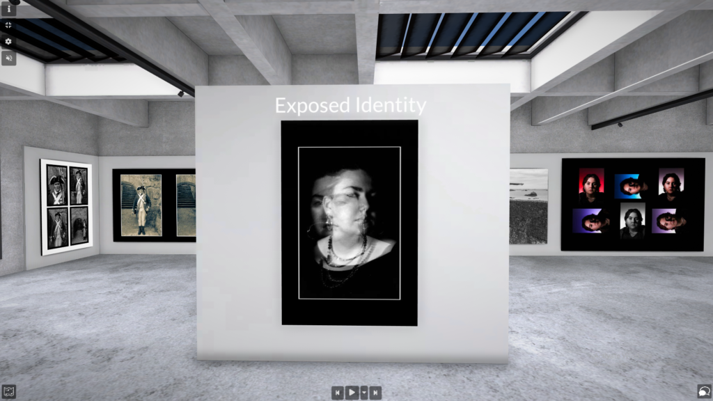
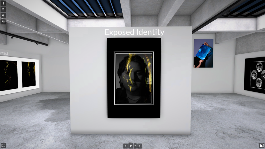
On both sides of this wall there is a window mount presenting two images that have been doubly exposed. Both images were created digitally in photoshop. The first being completely in monochrome was inspired by an image created by Claude Cahun, a French photographic artist that emigrated to Jersey before the Second World War and resided here until her death in 1954. Both of the photographs layered into this double exposure show the model once again using a neutral expression. Despite this, I believe the viewer to be able to see two different sides to the model. I feel that the translucent image shows similar expressions to that of Leonardo Da Vinci’s ‘Mona-Lisa’. Having the slight smile to it compared to the bass image having nothing almost expresses that the model projects the view of being grumpy or upset to the viewer but we are allowed to see the internal feelings by this simple smile projected on the surface.
This double exposure uses one of the images from my typology piece underneath one of the final images of my mirrored portraits. This unnatural chiaroscuro lit image over a very naturalistic headshot creates this unusual mix that I still struggle to find a sense of identity; and I suppose that is why it is so appealing, it is a mystery. I feel that mixing these two very different images creates a sense of ambiguity in it’s hidden story. I feel that it might imitate how someone looks back on their actions or assesses the way they look. The unusual overcasting photograph removes any naturalism within the piece and almost makes it quite mystical. But like I said, this outcome is very open to interpretation and I struggle to assess how well it conveys my intention of showing a hidden identity.
Mirror Portraits
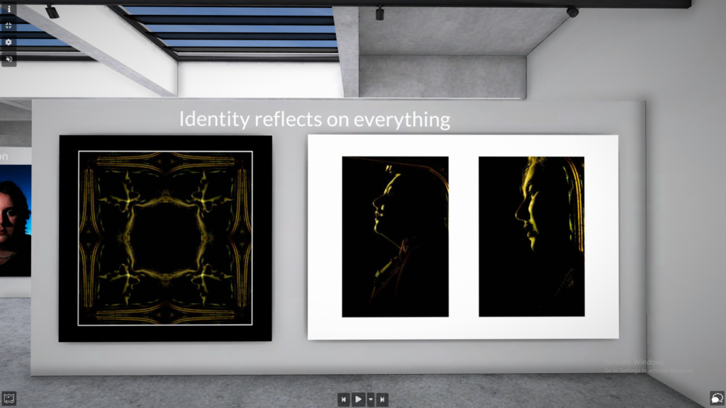
Taken using a mirror, these images show a harshly backlit model’s reflection in an ornate mirror. The diptych created on the right shows initial images that were taken during this experiment and the image on the left is a mosaic created using photoshop software. As I just mentioned, this was an experiment and I did not plan to have these images appear as they do. But I chose to print and mount these as they create a dark and brooding feeling when viewed. I feel that they express pain and struggle within a mirror. The use of a mirror also conceives the idea that it is hidden in a mirrored world or universe; when we would we see a chilled and natural figure normally. The discolouration of the face alienates the model from the natural world as well by removing any sense of nature and again shows the idea of pain and anguish.
The mosaic uses the image on the right of the diptych and expresses the same feelings as that. However, by turning it into a mosaic, the pattern creates the effect that the feelings expressed by the singular image are now projected everywhere and there is no escape from this alternate side of yourself. This print presents a new side to the theme of this exhibition and reveals what was hidden and now brings it into the light.
Overall Evaluation
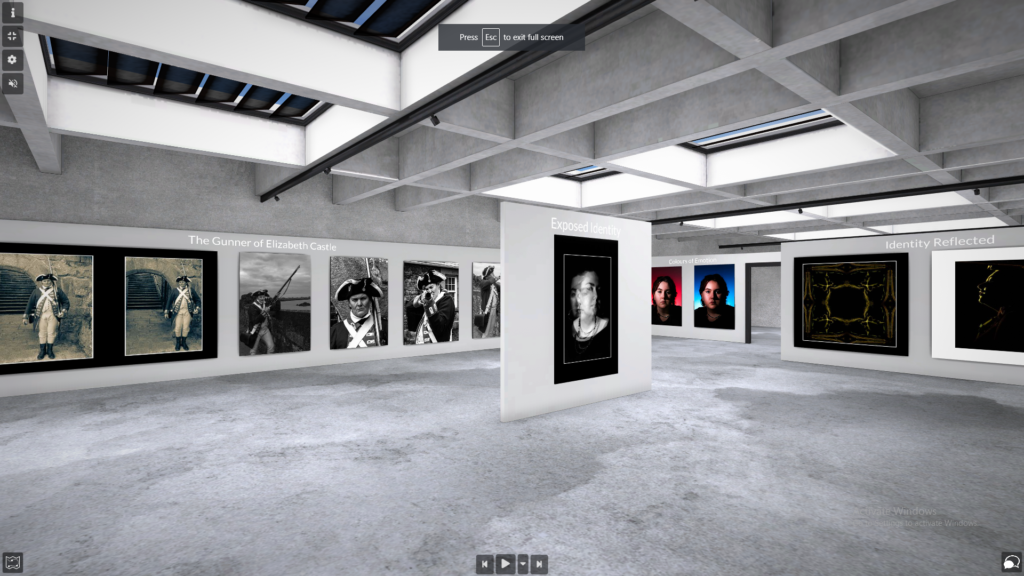
I feel that my portrait project as whole was a success and I was able to clearly convey the idea of hidden identity in a very stylistic way. I still believe that some images could have been better presented but when all of my final prints are collected together the general outcome is very successful. My favourite images were created in the studio when I had access to different lighting and could easily experiment with the themes of identity but I feel that I would have enjoyed more vocational photoshoots. I produced more final outcomes from the studio shoots but I enjoyed photographing the environmental portraits. If I was to conduct this project again I think I would do less editing after shoots and only perfect the finer details of exposure and contrast within the images. I would definitely like to continue with creating diamond cameos and exploring the outcomes that I could create by simply using the rules that Henry Mullins used in the 19th Century.
Link to the Virtual Gallery – tour and same details as provided on this blogpost are there as well: https://www.artsteps.com/view/6470632829728b7ee5adeb21?currentUser
