Robert Adams

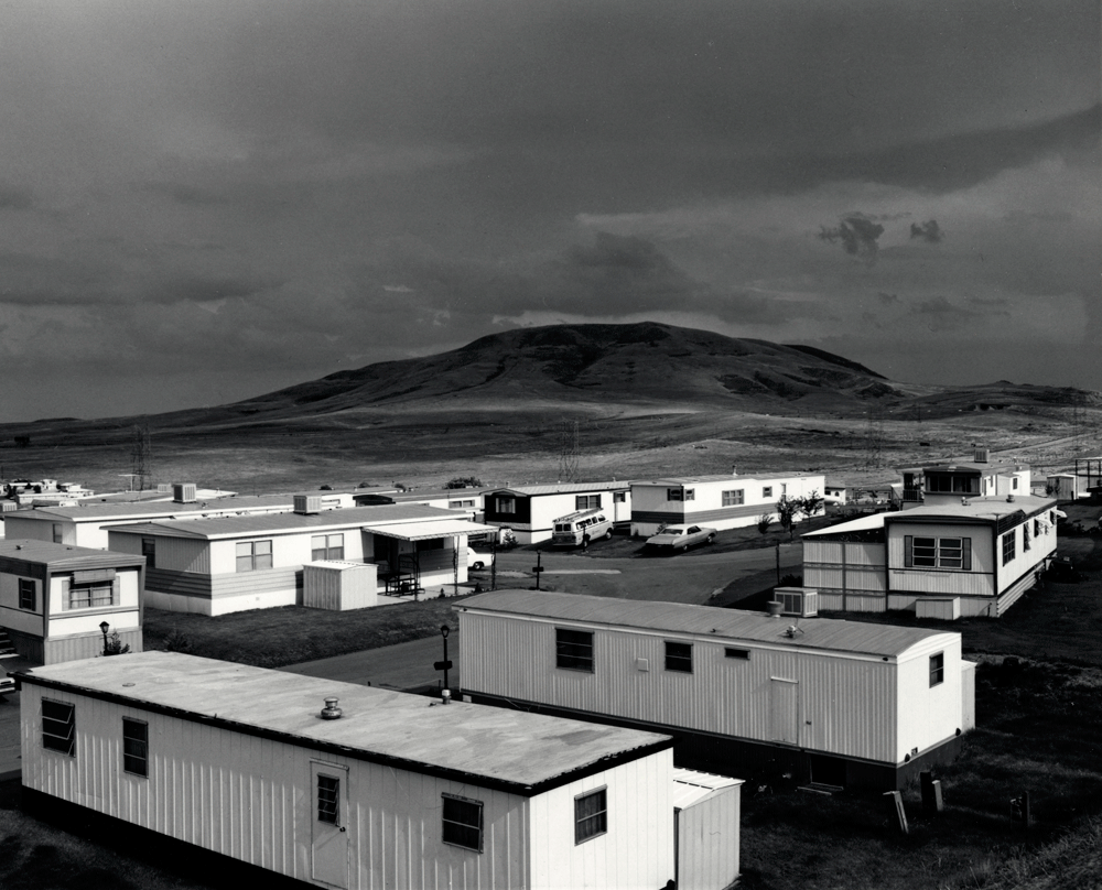
Robert Adams was a photographer who documented the extent of the damage to the American West. His refined black-and-white photographs document scenes of the American West revealed the impact of human activity on nature. His images often lack human subjects however manage to capture the physical traces of human life. An underlying tension in Adams’s work is the contradiction between landscapes visibly adapted or scarred by human presence, through buildings and industrialisation, and the beauty of the natural land captured in the camera. The complex photographs express sombre indignation by exposing the darkness of the nineteenth-century and shows how humans view the West as an unlimited natural resource for human consumption despite the destruction being caused. However, his work also conveys hope that things can change.

His goal

“is to face facts but to find a basis for hope. To try for alchemy.”
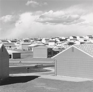
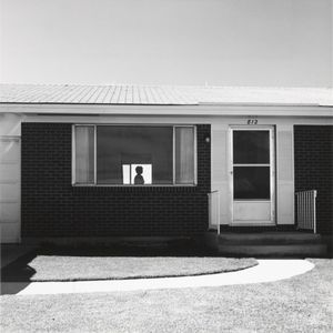
Robert Adams. Colorado Springs, Colorado, 1968. 

The image Colorado springs displays a melancholy and sombre scene of the silhouette of a woman stood in a suburban house. It was taken in a time of great change as many peoples life’s were abandoned and they moved to the new suburbs created to ensure there was enough housing after all the soldiers came back from war and started families. However, this meant many people had to move to these new suburbs leaving everything they knew before behind for this desolate and lonely land. Robert Adams photographed around these suburban towns and encapsulated the atmosphere and emotions of the residents through his images, such as the one above, to capture the damage and transformations happening to natural landscapes. His images are strategically taken to portray this meaning using the repetition of rectangular shapes surrounding the figure zoom in the viewers attention onto the woman to leave her as the main subject as she represents the loneliness and isolation many people were facing in this situation. The black and white filter further develops the melancholy feeling to the image as all colour is stripped portraying the way peoples life’s have been changed and the dark tones portray the sadness. The image is quiet with minimal eye catching elements to represent the feeling of seclusion and lack of joy present in these new suburban towns making the viewer wonder if the woman is perhaps reminiscing her life before being moved to the desolate suburbs. The natural lighting continues the sense of ‘realness’ showing the scene as he found it to accurately display the events. From what I can tell Adam’s used a fast shutter speed as I believe the image isn’t set up so the woman would have most likely been moving which means he must of had a quick shutter speed to ensure she wasn’t blurred from the motion. I believe the image was also taken with natural lighting as he is outside and not in a studio further displaying the ‘real’ insight into the situation as the scene has not been set up in a studio it is how he found it. Overall, I think Robert Adams created this image to show an accurate representation of how the residents of the town were feeling at the time and showing their loneliness and isolation and almost giving them a voice, through his images, in a time where they had been sent away leaving them silenced.

New Topographics

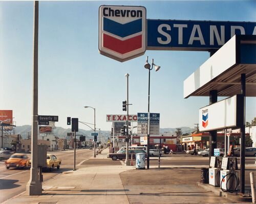
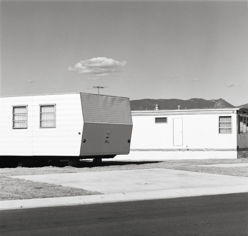
New topographics was a term created by William Jenkins in 1975 to describe a group of American photographers; for example Robert Adams and Lewis Baltz, whose photography had a similar banal style. The photos were (mostly) monochrome and formal of the urban landscape. Many of the photographers associated with new topographics were inspired by the man-made buildings and adaptions. Carparks, suburban housing and warehouses were all portrayed with a beautiful stark austerity.

Robert Adams

Robert Adams | Photography and Biography

Robert Adams is an American photographer born May 8th 1937 in New Jersey. He focused his work on the changing American West landscape. His work became popular, due to his books for example, The New West and his exhibitions.

Analysis

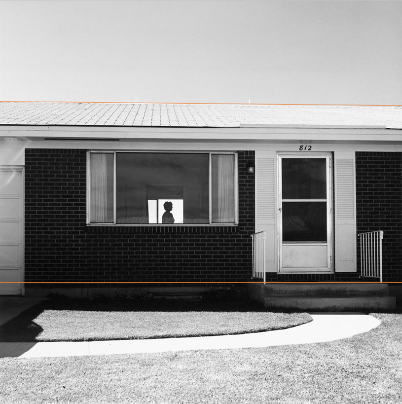
This is a digital monochrome photograph from an exhibition titled The New West by Robert Adams in the 1970s. The mise en scene presents a rectangular house with an window revealing a silhouette of a woman. The repetition of rectangles suggests peacefulness and security. The focal point of the image is the silhouette of the woman this is because silhouettes attract and remove distractions of details such as smiles and imperfections.

The aperture is around f/16 due to the dark exposure and wide depth of field. The shutter speed is very fast and the lighting is natural sun lighting. The photograph follows the rule of thirds as shown with the orange lines.

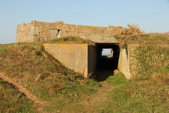
To conclude, personally I really like this image and I think the silhouette is so powerful in contrast to the rectangular shapes. I would love to recreate something similar to this. For example, at Plemont there are old ruins of a building which I could use:

Robert Adams states:

“I think if you placed me almost anywhere and gave me a camera you could return the next day to find me photographing. It helps me, more than anything I know, to find home.”

New Topography Photoshoot Ideas

El Tico

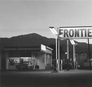
Front
Back

It will be easy to access as I work here every weekend. This is a very peculiar shaped building perfect for new topography, especially around the front.


Town
There are many cool buildings in town such as these ones and would be perfect for new topography.

Harve Des Pas and La Collette

I think here would be very interesting to take photos as there are some interesting structures.

Typology

What is Typology?

Typology is typically a body of work that holds consistency throughout the work, usually in the environment, subjects and presentation.

Bernd and Hilla Becher

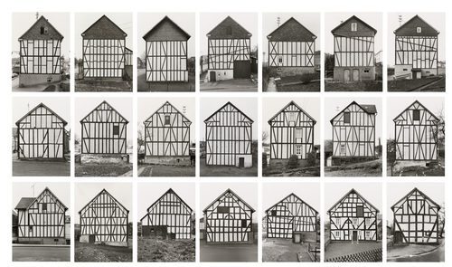
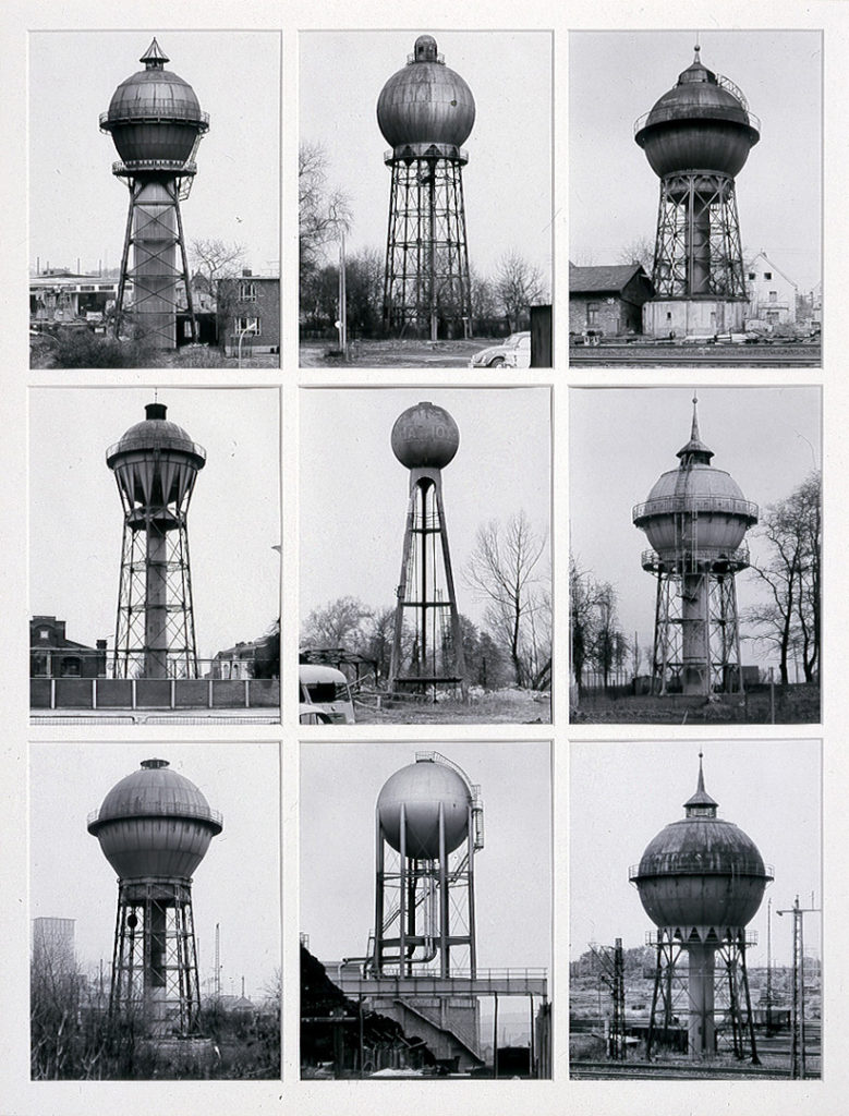
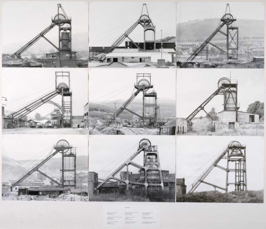
The term ‘Typology’ was first used to describe a style of photography when Bernd and Hilla Becher began documenting dilapidated German industrial architecture in 1959. The couple described their subjects as ‘buildings where anonymity is accepted to be the style’.

Stoic and detached, each photograph was taken from the same angle, at approximately the same distance from the buildings. Their aim was to capture a record of a landscape they saw changing and disappearing before their eyes so once again, Typologies not only recorded a moment in time, they prompted the viewer to consider the subject’s place in the world.

Black-and-white photographs of variant examples of a single type of industrial structure. The rigorous frontality of the individual images gives them the simplicity of diagrams, while their density of detail offers encyclopaedic richness.

research who influenced the Bechers’… from three German photographers in the 1920s, Karl Blosfeldt (plant studies), August Sander (portraits of citizens of Cologne) and Albert Renger-Patz (he photographed industrial landscapes)

The Bechers’ were inspired by Karl Blossfeldts plant studies, they were inspired by the way he presented his work.

Kevin Bauman

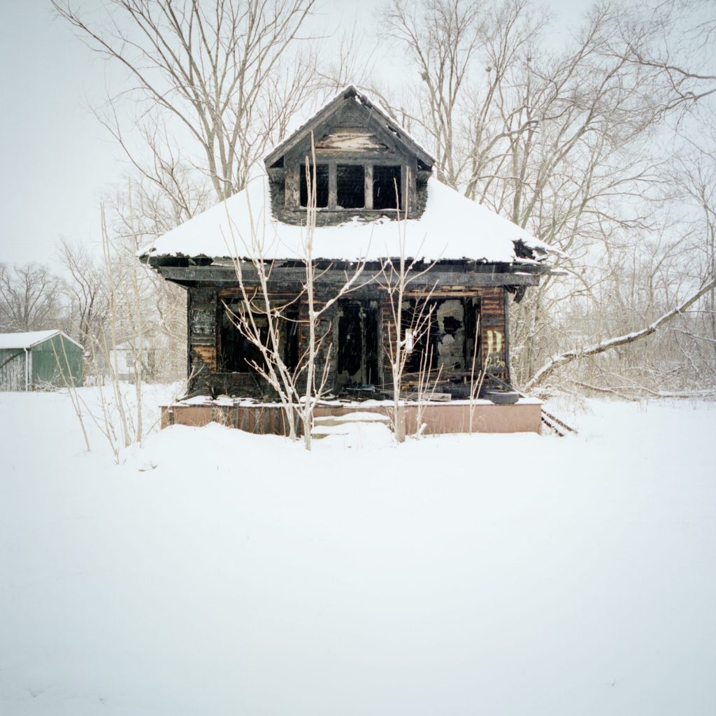
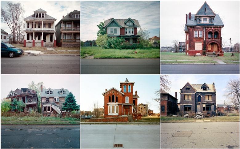
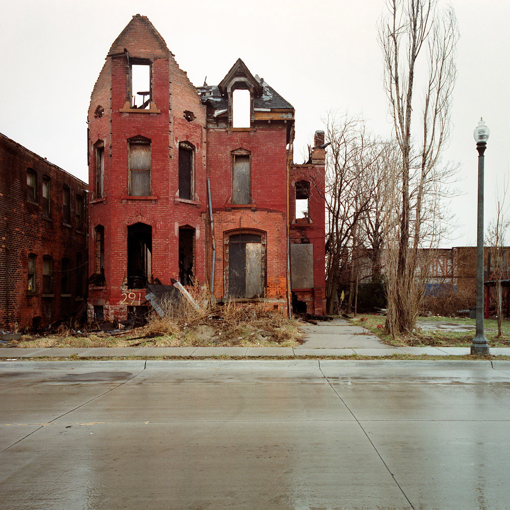
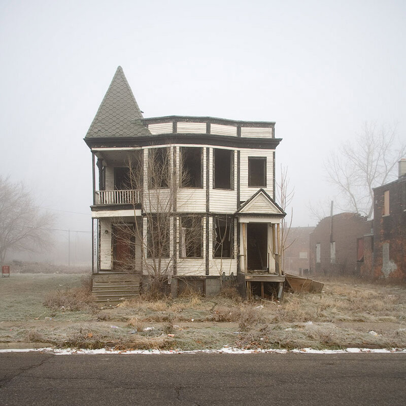
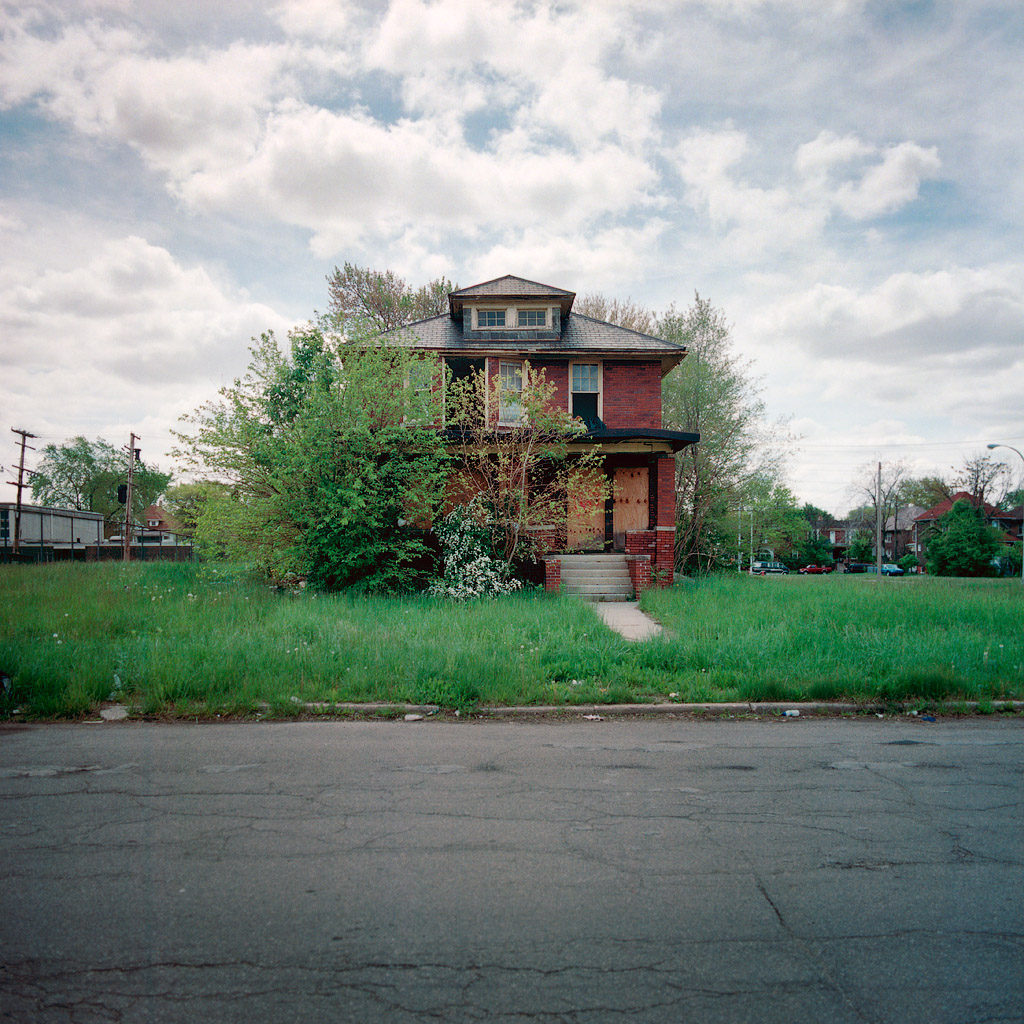
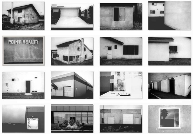
100 Abandoned Houses:

The abandoned houses project began innocently enough roughly ten years ago. He actually began photographing abandonment in Detroit in the mid 90’s as a creative outlet, and as a way of satisfying my curiosity with the state of his home town. Bauman had always found it to be amazing, depressing, and perplexing that a once great city could find itself in such great distress, all the while surrounded by such affluence.

100 Abandoned houses is my favourite project of Kevin Bauman. Each abandoned house contrasts one another yet they fit perfectly when put together next to eachother. Every house is different in its own way, however, as the pictures are taken roughly from the same distance, they belong.

NEW TOPOGRAPHICS

New topographics was described as ‘a ground breaking exhibition of contemporary landscape photography’.

William Jenkins selected eight young American photographers:

Robert Adams, Lewis Baltz, Joe Deal, Frank Gohlke, Nicholas Nixon, John Schott, Stephen Shore, and Henry Wessel, Jr. He also invited the German couple, Bernd and Hilla Becher.

The exhibition was recreated in various locations: such as Bristol, Tucson, Rochester, New York, Los Angeles County Museum of Art, the Nederland’s and Spain.

This image has an empty alt attribute; its file name is baltz-00-featured-800x554.jpg

Although the eight photographers included in the original exhibition make up the core of the New Topographics school, photographers such as Laurie Brown have been tied to the school.

The purpose

New topographics was a reaction to the ongoing expansion and growth of suburban areas due to the soldiers returning from war and therefore there was a need for more space for them and their growing families. This meant people were moved to these new suburbs that were located in the middle of know where which were very isolating and lonely as many people left their friends and families. The movement showed a more realistic demonstration of American landscapes by showing the industrialised and suburbanised landscapes rather than just the ethereal nature landscapes.

Urban Photography

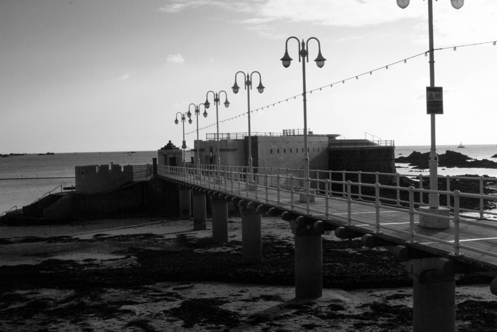
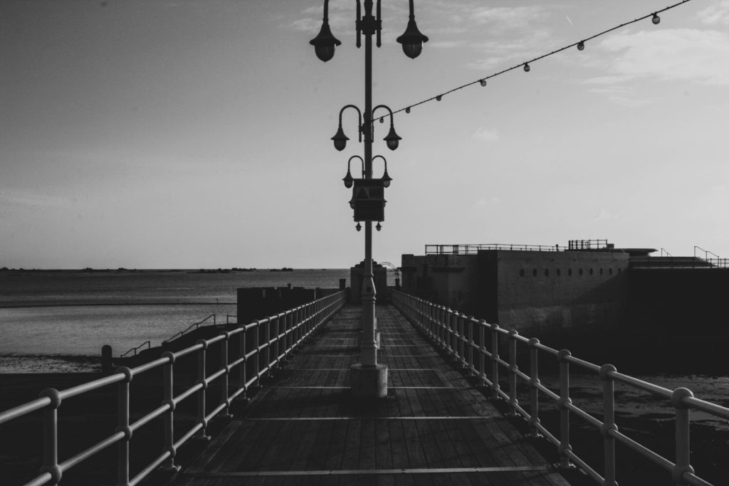
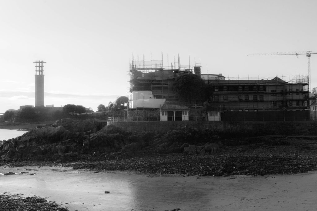
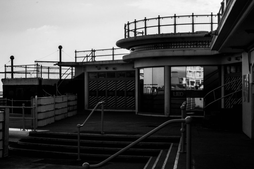
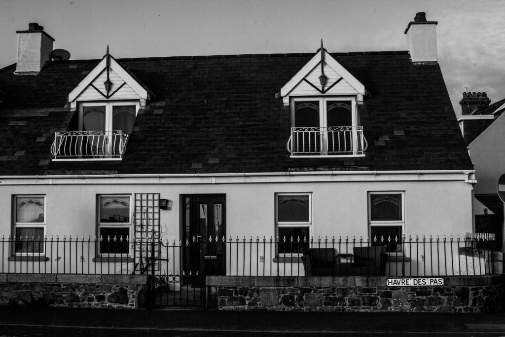
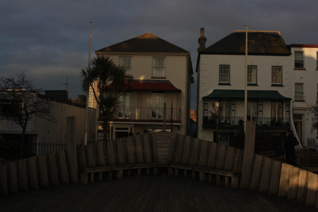
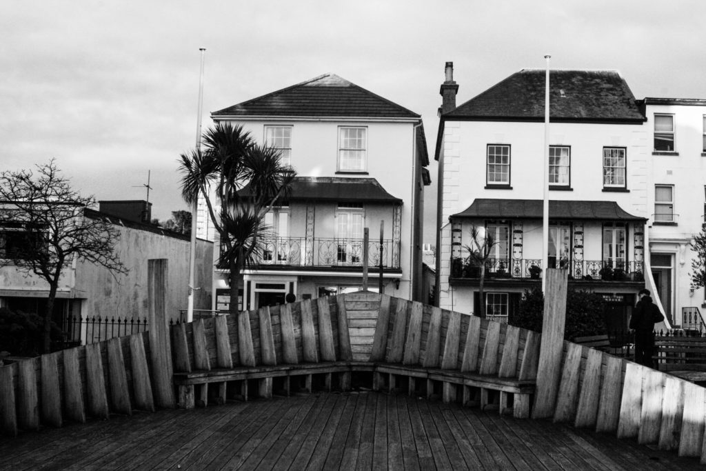
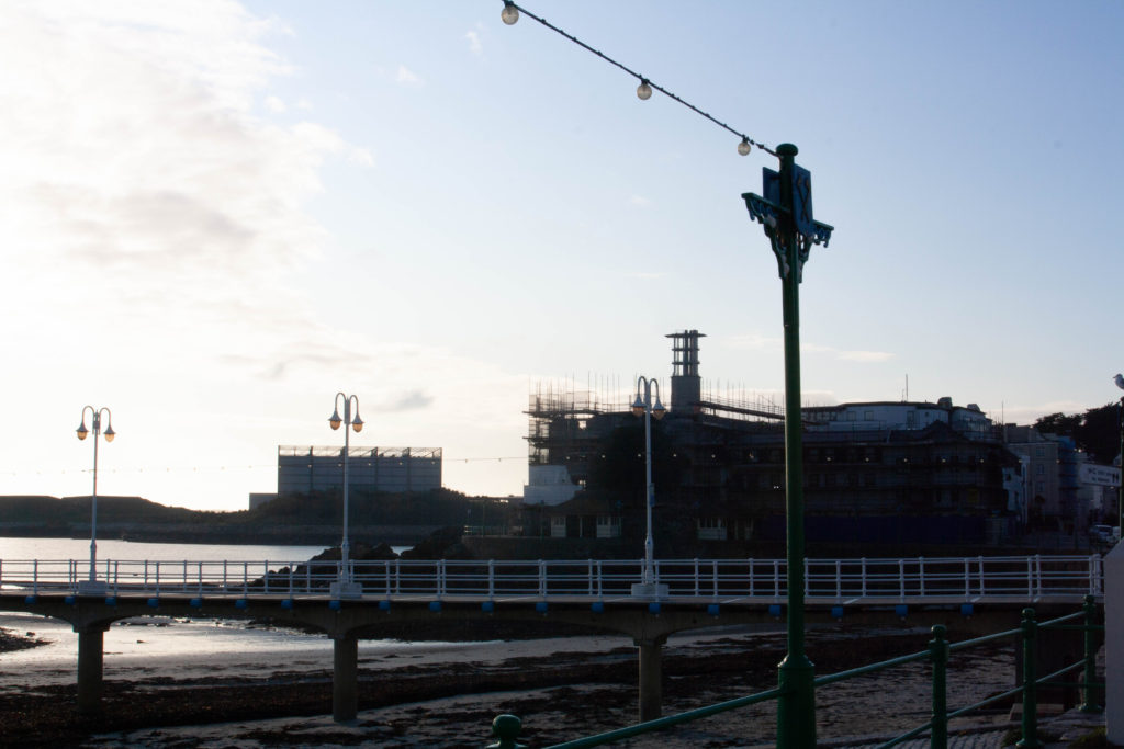
The other week me and another class went out to havre de par along the coast to take some urban images. These are some images I took, edited to black and white to create that nice aesthetic.

We went all along the coast from the pool at havre de par, up until the dump near DVS. It was an interesting experience going out taking urban images, there was a lot places to take images of, each area with their own meaning behind them. Like a simple house, Lot of people would of lived in that house, with a lot of memories that we don’t know but are still there.

I like to use this image as a good contrast for showing an aesthetic. See in the first image that isn’t edited, it uses a dim exposure which is hard to see from afar, but really it doesn’t create a feel compared to the black and white image next to it. I edited the exposure to be higher to show more light and detail in the image, the black and white creates an old fashioned feel along with the look of the house and other objects in front of the house, gives me an Italy feel.

Although edited images look good and create a nice effect, they don’t show what you was really trying to capture, the black and white images are filters showing the fake version to look good, kind of like everything in life. I like this image because it shows what I wanted to capture in the first place, which is an urban landscape, with something being built in the centre of the image, and power stations in the background. The image also includes a lot of shapes like the light poles for lines and railing etc.

Comparing outcomes with Ansel Adams

Was Ansel Adams's Landscape Photography Influenced By His Male Gaze? | Artsy
Mount Williamson, Sierra Nevada, from Manzanar, California 1944, – Ansel Adams
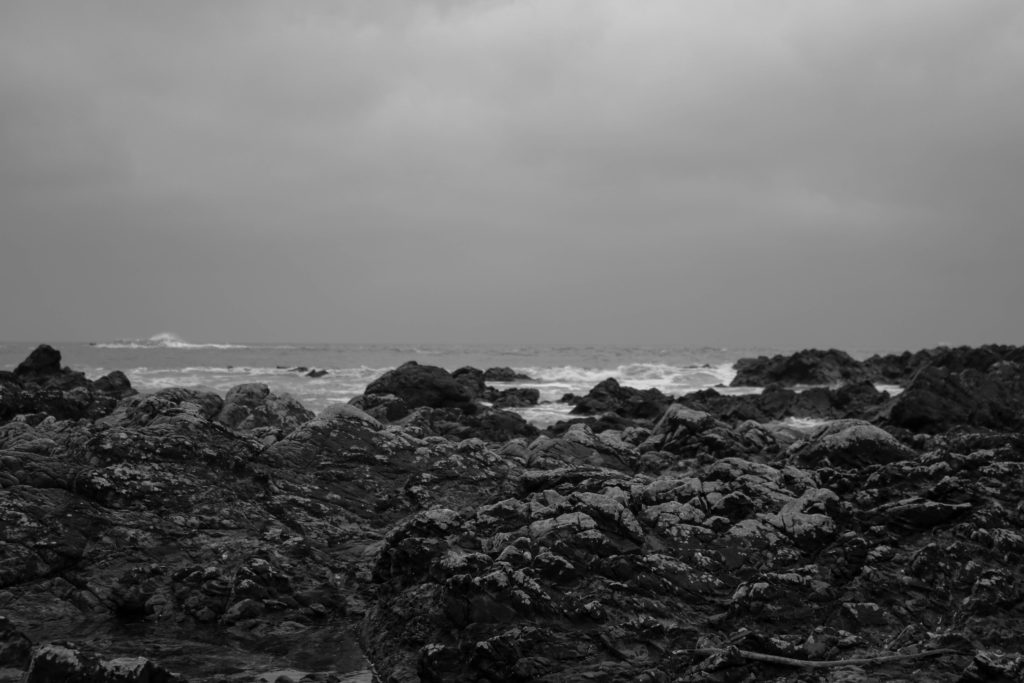
Both these images have a rocky focus in the foreground and a more misty and mysterious background. They are also both edited into monochrome adding a more dramatic and intense tone to the image. The images have natural lighting, brightest at the top of each image as this is where the sun is behind the clouds creating a focus point in Ansel Adams image however, in my image it doesn’t have this effect as it was a duller day. In Ansel Adams image there are clear and ethereal sun beams spilling through the clouds that could be seen as a representation of hope as it contrasts the dull and dreary colours and tones of the rest of the image. Due to the difference in weather conditions I wasn’t able to capture the symbolic feeling of ‘hope’ however was able to create the rocks and sea showing the rough journey ahead prior to the beams of hope. The rocks also add an element of texture and contrast from the smoother backgrounds of the sky. Although the mountains in Ansel Adams image are much more dramatic, they are similar to the waves in my image adding additional texture and height to what would otherwise be quite a flat 2D image. Overall, my Ansel Adams inspired image is not a perfect replica of his style however does have many similar qualities and potential representations allowing them to be compared.
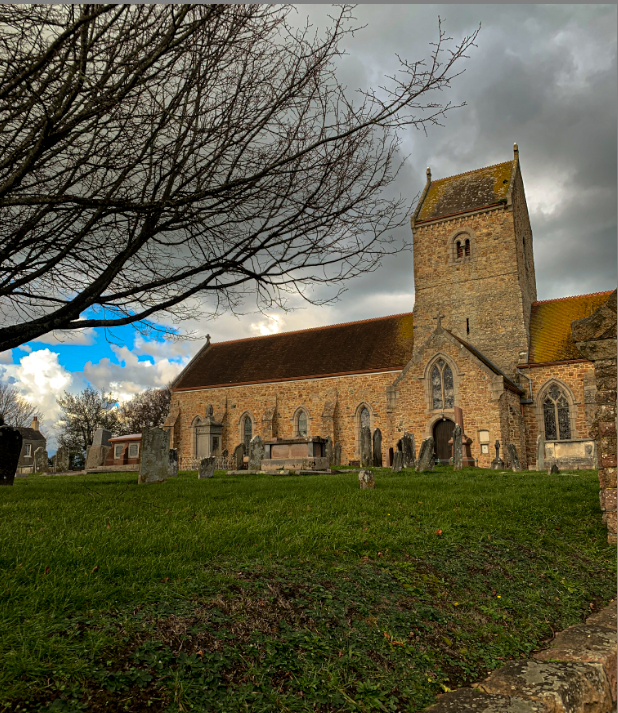
Typology Photoshoot Plan

What? – I have a range of ideas that I could photograph:

  • Victorian front doors
  • Historical landmarks/ towers
  • Old/ Victorian houses
  • Road signs
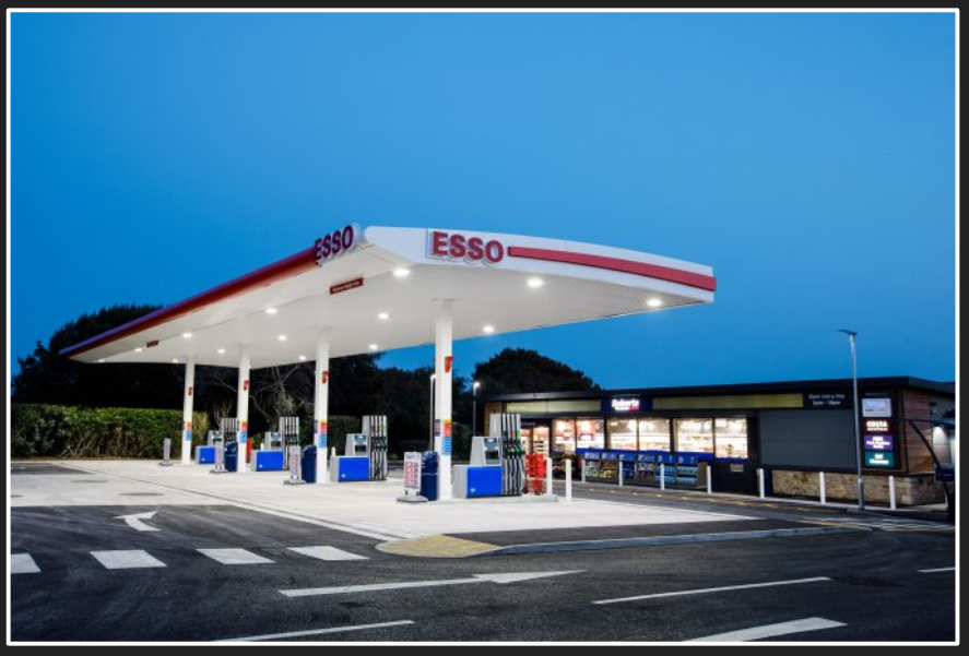
  • Petrol stations
  • Graffiti

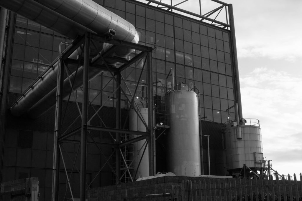
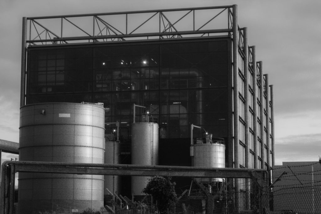
When? – for all of them I would photograph in the day, and make sure it is a plain sky/ light so my subject is the main focal point (using Bernd and Hilla Becher’s technique). If I were to photograph petrol stations I would do the shoot at night because I want to photograph the lights and create a dramatic set of images.
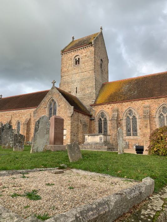
Where? – for doors and houses I might choose town as there are a lot of old buildings and houses. If I take the landmarks I will travel around the Island and capture the different towers.

How? – I’ll use my DLSR camera, and probably use the Tv/A setting so I can adjust the light and if necessary do some different exposure bracketing. For a night shoot I would use a tripod so my images are sharp as I would need to use a long shutter to fully capture the light. For this I would use shutter priority.

Constructed Seascape comparison

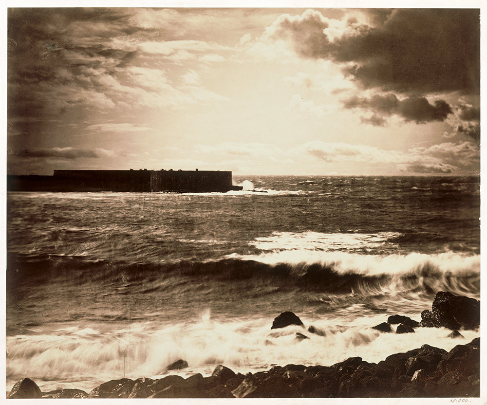
Gustave Le Gray – He was the central figure in French photography of the 1850’s. He was admired for his use of paper photography, which he first experimented in 1848. An experimenter and technical innovator, he evolved the use of the paper negative in France and developed a waxed-paper negative with the ability to produce sharper-focus prints. He became one of the first five photographers, along with Édouard-Denis Baldus and Hippolyte Bayard, to work for the missions héliographiques and is credited with teaching photography in the 1850s to many important French photographers.

“It is my deepest wish that photography, instead of falling within the domain of industry, of commerce, will be included among the arts. That is its sole, true place, and it is in that direction that I shall always endeavor to guide it.”

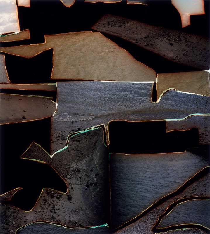
Dafna Talmor – She is an artist and lecturer based in London whose practice encompasses photography, spatial interventions, curation and collaborations. Her work can be found in the permanent collections of the Victoria and Albert Museum, Deutsche Bank, Hiscox collections and private collections internationally, and in many publications.

Taken with no original plan or idea to what they would be used for she would take images and the negatives accumulated for years in boxes, without any use or artistic function. Eventually, she realised that by merging images of different places of personal meaning she was able to create idealised and utopian landscapes therefore giving a function to these seemingly useless negatives.

This allowed her to transform photographs initially taken without an intended purpose through of slicing and splicing. The resulting photographs are a conflation, ‘real’ yet virtual and imaginary. Her aim was to transform a specific place, loaded with personal meaning and memories for her into a space that has been emptied of subjectivity and becomes universal.

“I am interested in creating a space that defies specificity, refers to the transient, and metaphorically blurs space, memory and time.”

Both could be described as landscape pictures. What kinds of landscapes do they describe?

They both describe a seascape however they are displayed and formatted in very different ways. Gustave’s image depicts a rougher more dramatic environment and Dafna’s is an abstract approach to a seascape image.

What similarities do you notice about these two pictures?

they are both seascapes, both daytime images

What differences do you notice?

The one on the right is a collage of images showing describing the seascape in an abstract format whereas the image on the left is not a collage and is presented in black and white with the yellow tones presenting the image as older or vintage. The image on the left shows a rougher sea whereas on the right the sea looks a lot more still, portraying different feelings to the viewer as Gustave’s image is more gloomy and has an essence of drama whereas Dafna’s image shows a calm sea however creates interest with the construction of her image.

What words/phrases best describe each of these landscapes?

image 1 – Rough, old, choppy

image 2 – still, collage, abstract

In which of these landscapes would you prefer to live? 

I would prefer to live in the abstract landscape as the image portrays a calmer more tranquil setting and the presentation of the other image is more of a dark and dramatic scene.