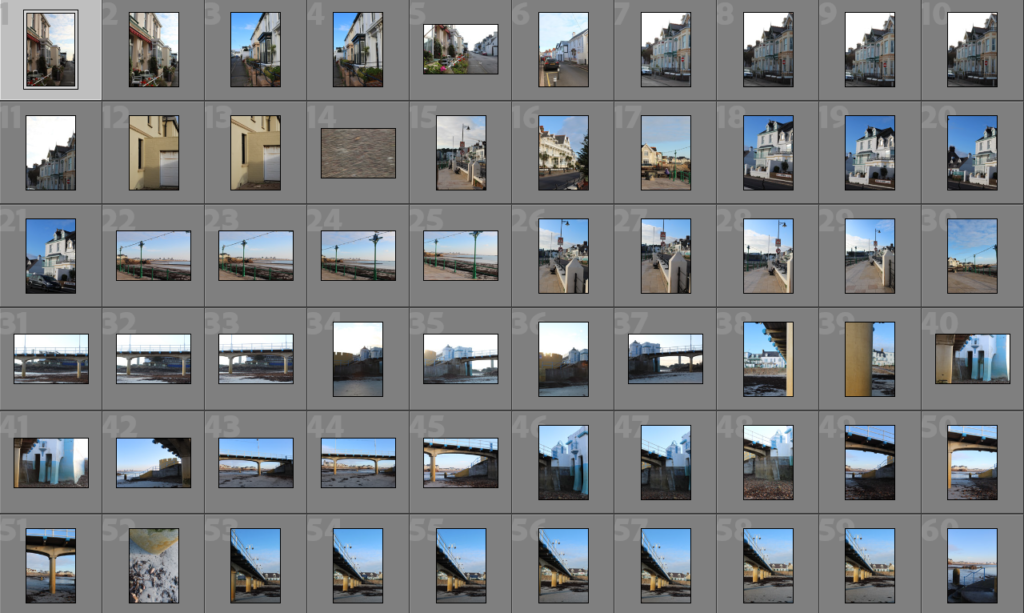
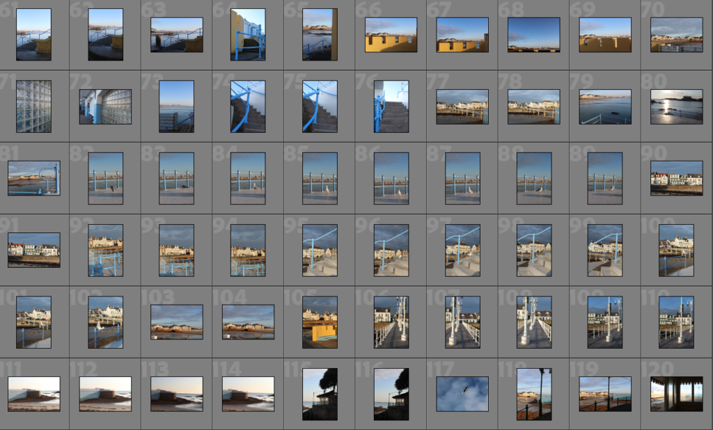
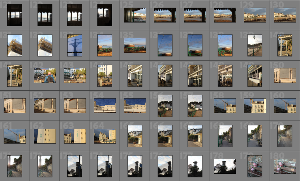
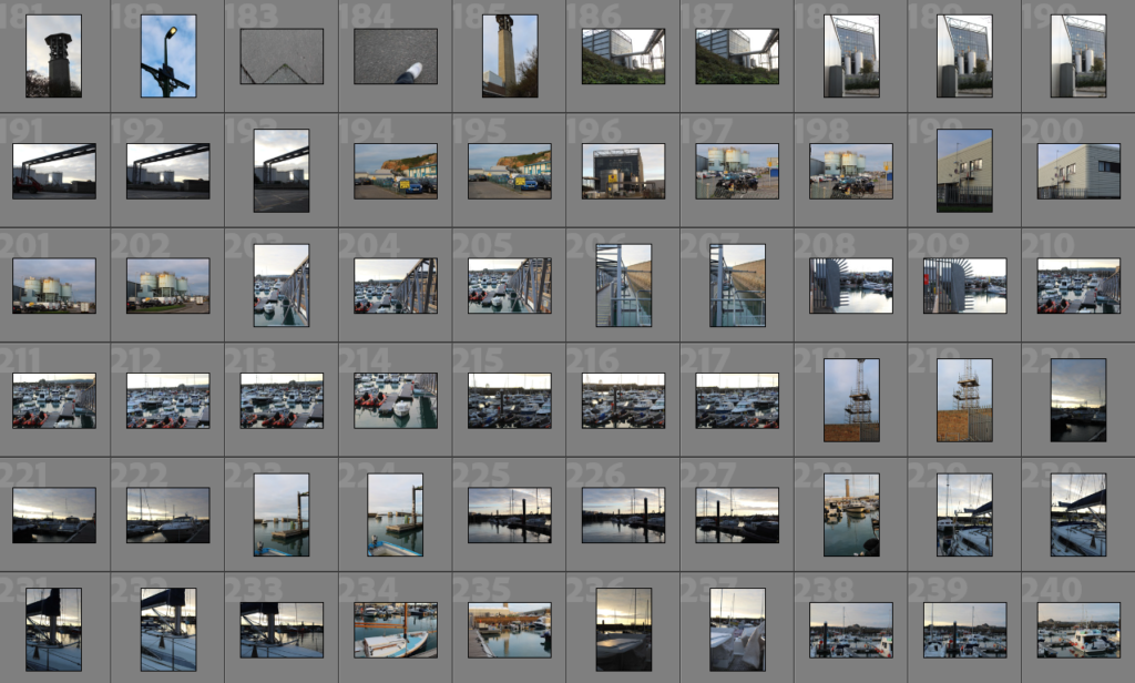
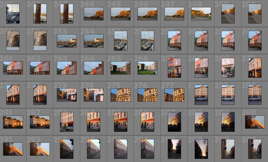

sub-selection
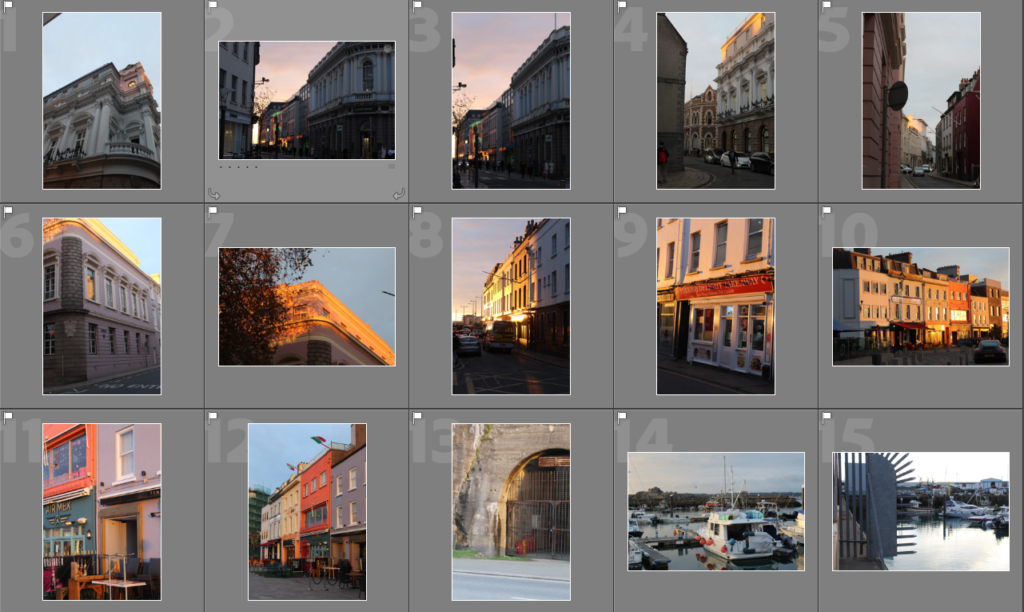
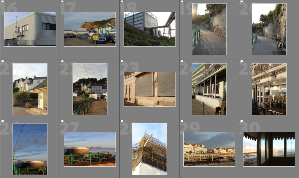
editing
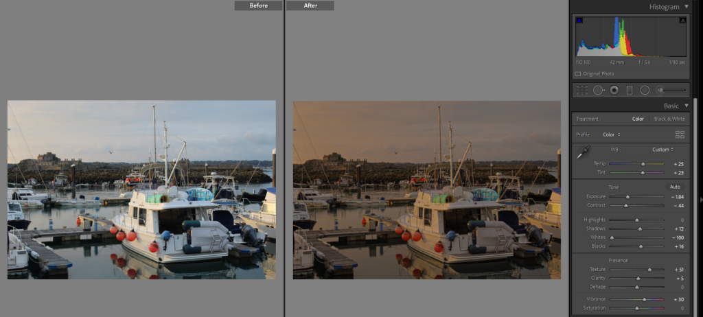
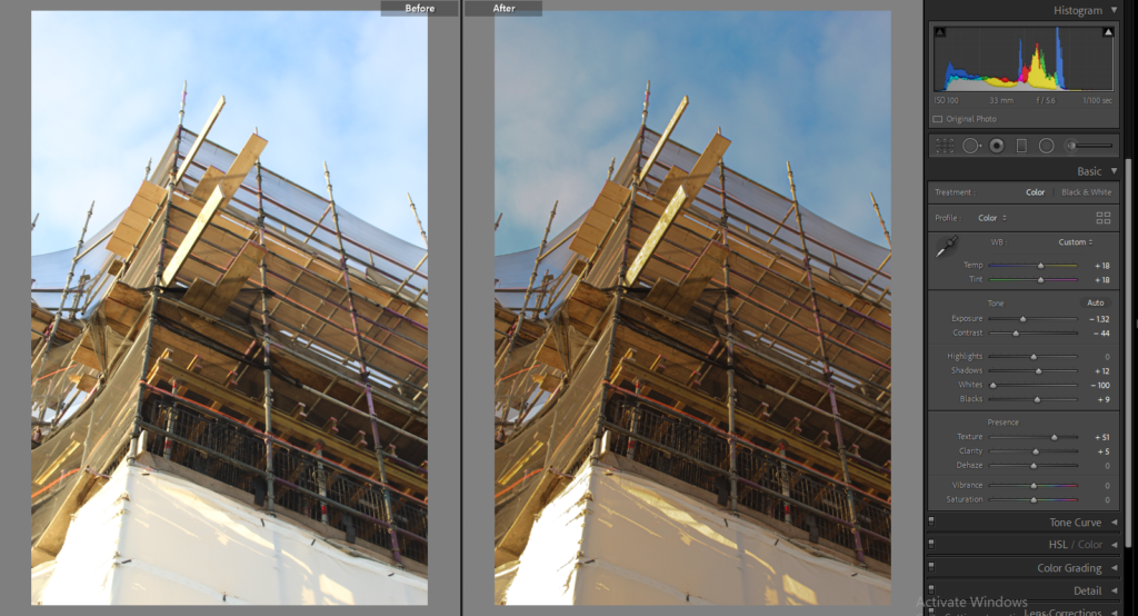
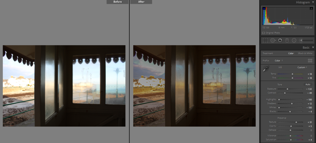
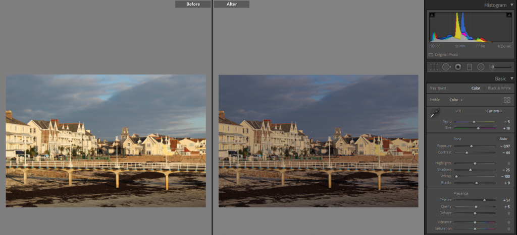
FINAL IMAGES

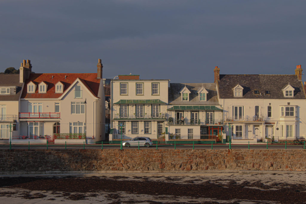
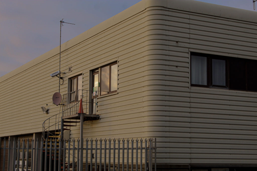

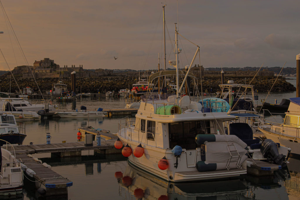


Stephen Shore is an American photographer known for his images of banal scenes and objects, and for his pioneering use of colour in art photography. Stephan Shore was one of 10 artists involved in the New Topography exhibition. these artist worked more individually rather then in a group, where all had different types of images.
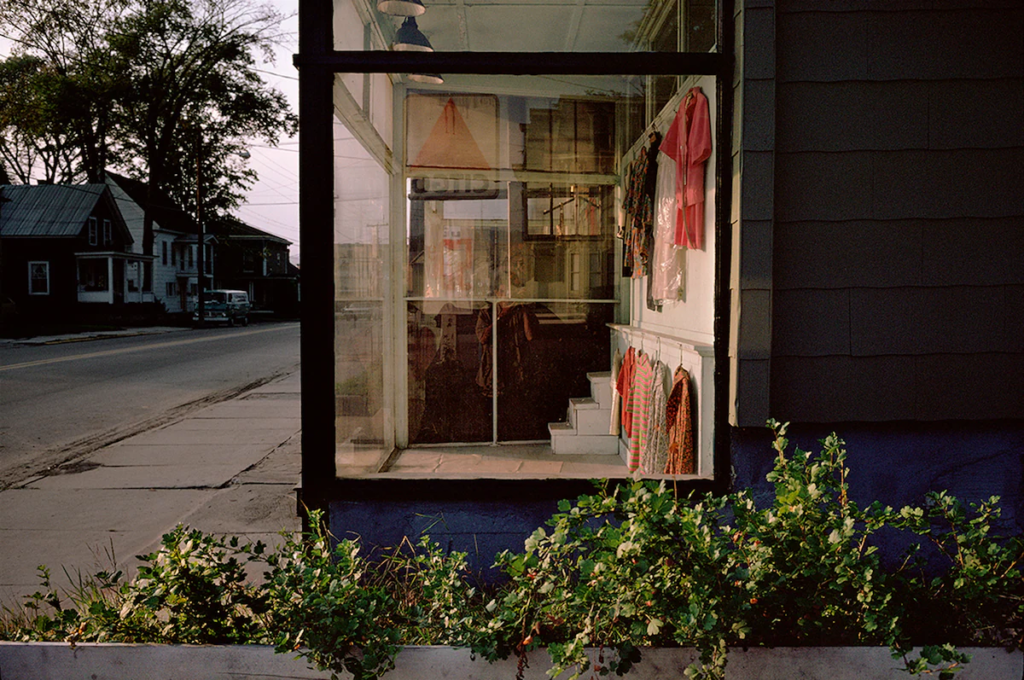
Out of these 10 artist I have decided to analyse and educate myself further on his artwork as what pulled me in was his use of colour which has a big impact on the photograph and what a photograph stands for, he uses colour to his advantage when it comes to showing a meaning or story of a photograph.
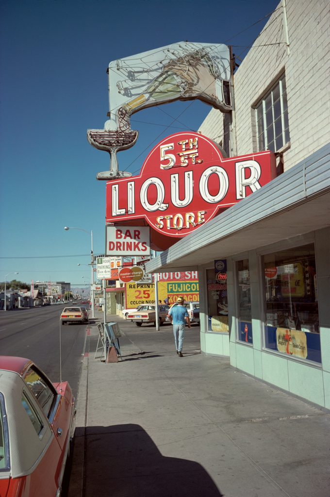
Looking at his images, they often are based in street settings, looking unplanned like he is wondering around the cities inviting us on his journey and memories from these towns. His pictures are usually based in good looking weather where there is bright blue clear sky, and the sun is sharp shining from above or the side. He picks places with shop signs and includes cars in most of his work. His street photography is like a record of time, time that is constantly changing, if today a photographer wanted to recreate his pictures in the same places as Stephen did, they would look completely different. every aspect of his photo is in some way is”temporary” like cars, the signs, lamps etc. Today the shop signs would be replaced to other ones or maybe taken down, the cars would be entirely different and new technology would be included, new buildings might be built or bus stops and all these changes would create a different landscape in a different time. what Stephen shore and others on new topography wanted,was to record that change, to acknowledge the time now in a world of constant change. This might be a reason why Stephen decides to include a lot of cars in his photographs, especially moving ones, he indicates this change, time constantly moving, people getting from one place to another, and he makes a photograph that is a record of a single moment, a moment which already passed and cant be taken back, cant be repeated and replaced.
on this website https://bensmithphoto.com/asmallvoice/tag/Stephen+Shore
However the answers from Stephen shore that I wanted to focus on are:
the questions in pink are mainly about the photographs and how he produces them, what inspires him, keeps him going and general about his work. whereas the one in green is more about his opinions and thoughts that are not only to do with photography but can be linked to other matters for different people.
what stephen has said about experimentation is that as times change and so does his teachings and it is responsive to change, the time and place, it comes natural to change and experiment with other mediums. This links to the creative process which is…
the interviewer asked an interesting question which was “photography is good at showing but bad at explaining.” to which Stephen responded with a statement ” a picture is worth a thousand words”he then said one of his favourite pictures is a picture taken by Garry Winogrand.
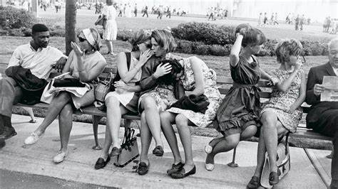
he said when looking at this image , analyzing each person, hhow they are sitting, what they are doing, their relation to each other, this could take a thousand words, the longer you describe it the less simultaneity which means the words could never do what the picture is doing. by this he means a photograph would evoke o lot in a person or their feeling and their perception of the photograph but it would be difficult to write about this or find the words for it. he then talk about how in childrens books if a child was reading a story of a forest, when the image is in the book this restricts childrens imagination, the picture of a forest in the book would be different to the one a child would imagine, this means that this is what the words are capable of doing and the power they have likewise to and image/photograph. both could be used a a story writing but each challenges the viewer in a different way. a photograph will have a story to it that is up to anyone imagination, but a story will encourage imagination and create these images in ones mind.
what i liked when Stephen was talking about Structure vs. composition or Inclusion vs. exclusion is his reference of painting and photography, where he said that with painting you start of with a blank canvas and build on top of it creating in image but with photography, taking pictures its the opposite, you start off with a matter, like landscape and you then build it from there, deciding from what angle to capture it, what to capture, depending on weather, different times of year etc.
he talks about a period in the 80s, when the work wasn’t coming out how he wanted it to, he said that there were times where he would ask himself of the idea of a muse, and question himself as a photographer, but as soon as one day he picked at the camera it came natural and easy, that once he got in the head space to go out and make the photographs the pictures almost came to him. This links to finding ambition and then motivation to keep going , once he was fixed on doing something it was harder to stop and how the importance of keeping this momentum is a key for sustaining drive.
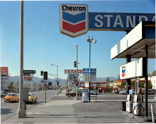
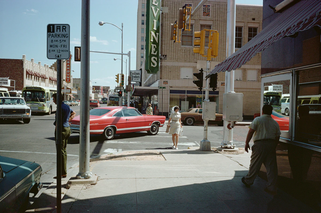
The above image is one of Stephens most popular photographs, to me it is so interesting, and the more i look at it the more detail i notice that can be talked about. this image is quite fun to analyse because of the different values certain parts have. the first thing i noticed is that Stephen Shore, like Robert Adams or other photographers within the subject of new topography, he included a tiny area of a natural background that the urban one interacts with. although this area is not the biggest in the photograph, it catches my eye as the mountains in the background oppose the urban landscape. in the urban landscape there are many repetitions of straight lines or even patterns that these lines create, the pattern is repetitive and could be said is the perfect demonstration of the man-made items, where people keep the made objects simple but functional, however this looses the natural beauty. the outline of the mountains is a perfect example of the differences between man vs nature, where the line of the mountain is unpredictable, rough and untidy, whereas everything else in the first plan is the opposite of that, the lines of objects are straight, direct and certain.

This comparison gives a great value to the photograph, and the reason why Stephen decided to be in an area which will make the mountain look secondary and be as a background to the urban landscape, said a lot about humans evolution and population. To me its like Stephen is showing how the nature and natural world is going to be forgotten or at least its on it’s way of being forgotten, with lamp posts and shop signs getting in the way of seeing this mountain, like people are the cause of this natural world destruction, but also because the mountain is distant might also link to this disappearance of nature and it being secondary, unimportant and a distant dream like there is a segregation between people and nature, where the urbanised, populated areas are specifically for humans and if one wants to make this connection with the natural world it will eventually seem harder for them to do so. This photograph was taken in 1975 and since then a lot has changed, this idea of humans being segregated from nature, back them might of only been a beginning of it. However now, people are consumed with today’s social world, hardly any see the sense of freedom nature gives, as we are born, we are pressured onto a certain lifestyle, like school and job, as well with technology not many can see how far from nature we are today. With this photograph if it was taken from where the mountain was it’s meaning would be flipped, where it may seem nature is overtaking civilisation, however because it is not and because of the times and meaning of the subject of new topographics, it is unlikely that it would stand for that meaning.
Stephen was one of a couple photographers producing coloured prints at the time, this also means he was able to give more detail that would correspond to the meaning behind the image. the bright blue sky takes up the majority of the image and a lot of detail is in the bottom 1/3 of the whole image. in that space there are cars, shop signs, traffic lights, street lights and a couple buildings. what I noticed there is a lot of repetitive colours, these being blue, red and white. this might link to the American flag, and what it stands for, these colours might be repetitive because the picture is taken in the USA. I noticed these colours firstly when looking at the top part of the image, the petrol station sign.

This is the closest item to the camera and catches ones attention because of its size as well as having a plain blue sky as it’s background. the colours correspond to the one on an American flag, however what I’ve noticed is the arrow like shapes, used to market the petrol station, however it is because it is in the middle of the top 1/3 of the whole image, it look like it is pointing to the mountains or the road which is behind the station.
In this photograph there are many hints of travel, transport, and movement. There is an elongated road stretched towards the mountains, cars traveling that direction, petrol stations for these vehicles, even little hints of the light being green, allowing the cars to travel further. The location Stephen picked definitely has a purpose and to me this is him encouraging people to explore nature, to travel to it, towards it as there is ,or there shouldn’t be anything stopping someone from doing so. In my opinion he is trying to state that in a constant changing world, with new technology, buildings, more rules and laws, we shouldn’t ignore the natural world, we should explore it. He is not taking a picture of just the natural world like Ansel Adams would, where his images would be idealised in a way, Ansel would make his way to these locations to take an image , whereas Stephen, especially with this photograph does the opposite, he makes people wonder and encourage them to travel for themselves to these locations, he shows a process to it. Because he wants to show reality, reality of people, day to day time, he is showing that it is more possible, even the photograph including just a small part of the mountain may make people wonder how it looks close up, how it looks from a different angle. Stephen gives people this sense of exploration through his photographs, makes them wonder and think, with this photograph for instance is about travel to the natural world and how distant it is, and is becoming, but through many others he challenges the viewer to really spot the hidden meaning behind it.
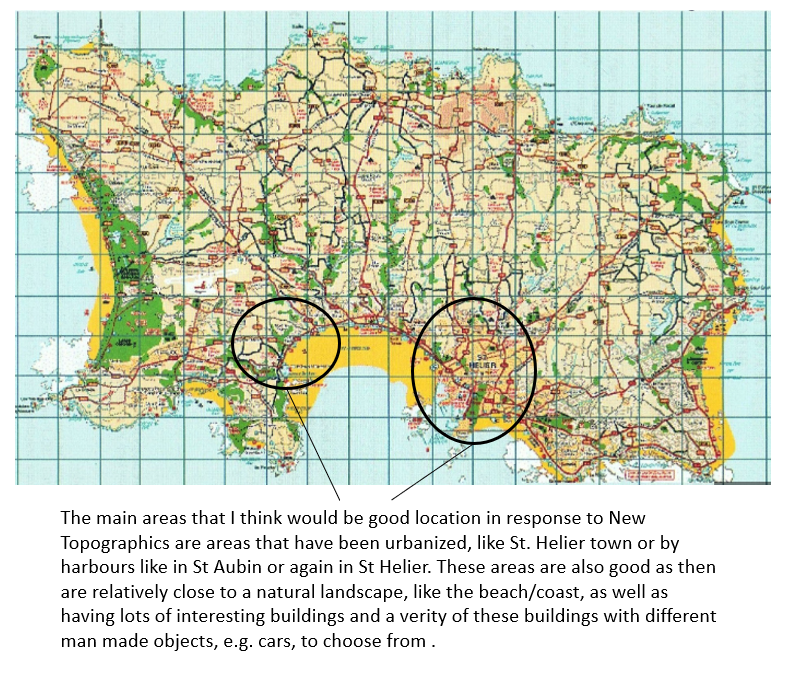
Areas of interest: St. Helier (Town), Harbours(St Aubin/ St Helier), Havre de pas, St Aubins Bay
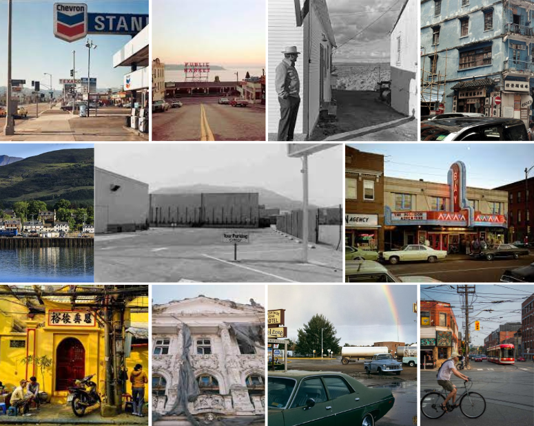
Mood board– pictures that allow me to follow their pattern, I will inspire to take images that are influenced by these, this comes to the angles of the camera, the object being photographed, colours, weather and editing. This is because those pictures to me are very fascinating.

Who – since the areas i plan to photograph are very civilized and populated, i am aware that there may be times where random people may get in the frame, or i may capture strangers in my photographs, since my main focus is to photograph landscapes i will try to avoid capturing people, but if i do then again it is not a problem as they are a part of that landscape.
What– the main focus is to respond with this photo shoot to new topographic, which is through photographing buildings, however buildings that correspond to the area, and it’s history, but populated areas will have other values that i cant escape from like lampposts, a couple trees/flowers or bushes that might be a part of the houses, cars that are on the roads and other vehicles.
Where– in more civilized areas where there is greater amount of man-made objects, like towns and cities, in jersey the biggest town since it’s a small island, is town in St. Helier. but i may also find a great amount of buildings or vehicles in harbors,car parks etc.
When- cities look very interesting during the night due to lots of different types of lights, i might explore night photography in these areas with many different lighting but i would like to also capture some building in a sharp light like maybe during a sunset or sunrise, or throughout the day when the sun is out. i would not like to take photographs in a dull weather because if the background is very smooth and one solid colour this may blend in with the objects I’m photographing, depending what colour they are, but also makes the photograph look quite uninteresting as there is less going on.
How- as it’s a landscape photo shoot i plan on finding a balance between the sky and buildings. i also may experiment with certain angle especially when photographing a bigger building or object but being up close
Why– this photo shoot is a response to new topography, i am influenced by many of the new topography artist, but mainly Stephen Shore as i find his work the most interesting. i want to produce photographs influenced by his but also represent the meaning of new topography which was to capture the changing world. some artist even included the urban landscape mixed with the natural so i will try to find locations suitable for that.

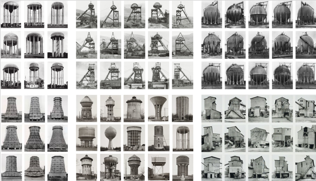
When taking my images I’ll make sure that the sky is plain and that I separate the subject from the sky so my images reflect the work of Bernd and Hilla Becher.
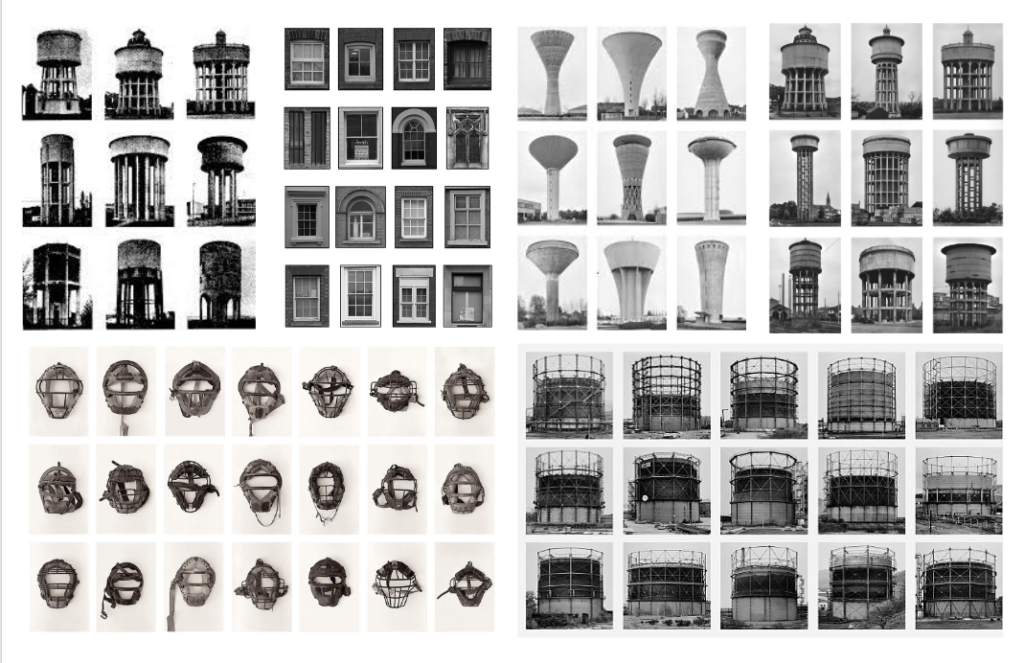
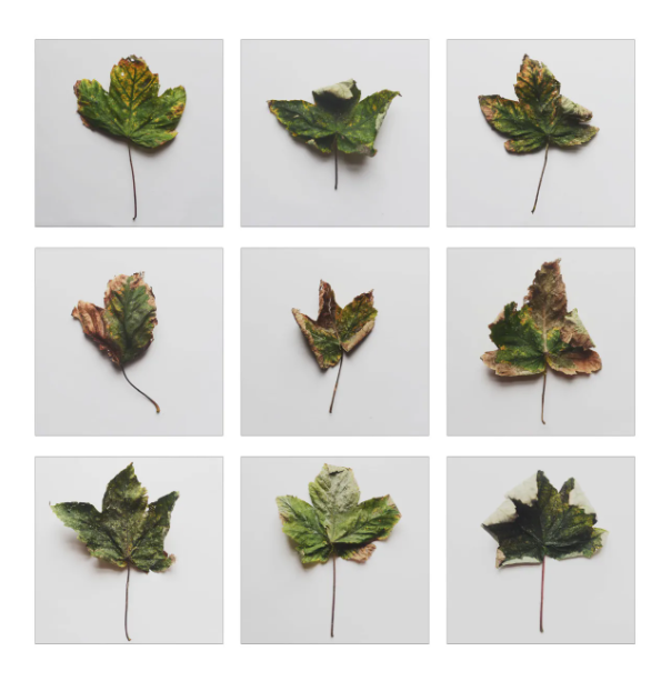
A typology is a system that is used for putting things in to groups based on how similar they are. In photography this can be seen by grouping images of the same or similar objects together that share the same level of high consistency. For example putting images of buildings with the same environment.

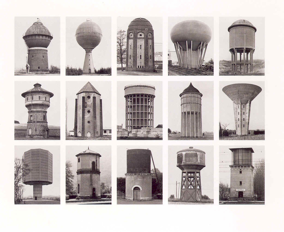
Bernd and Hilla Becher were a German couple who took images of the disappearing industrial architecture in Europe and North America. Their photography was very different to other photographer as they started off by documenting the history of German architecture before the structures were removed. Their images would consist of water towers, factories, coal bunkers and other industrial structures. When taking their images they always wanted they sky to be separated from the structure or subject in the image. They also wanted the sky to be plain, so would take their images on an overcast day to make sure the background was clear with no clouds. To make sure the background was clear they would go to the same structure at different times of day and would have to wait for the weather to change. Once they had got all their images they would group their similar images together, in a grid formation, creating many typologies; which can be seen below. The idea of presenting their images in a grid formation was inspired by Karl Blossfeldt as he presented his images of plants in that way.
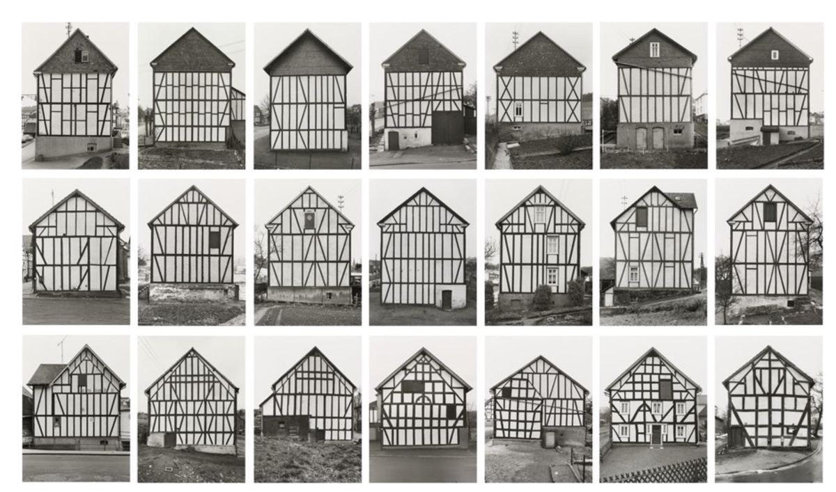
Bauman is a Montana based photographer who specialises in architectural photography such as his well know project 100 Abandoned Houses. His photography has been used by many interior design clients.
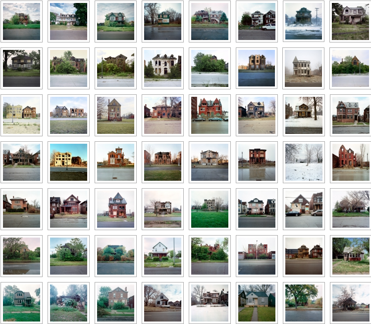
Bauman’s project ‘100 Abandoned Houses’ photography is unique and displays a range of houses in different environments. Kevin Bauman said taking the images were “a way of satisfying my curiosity with the state of my home town. I had always found it to be amazing, depressing, and perplexing that a once great city could find itself in such great distress, all the while surrounded by such affluence.” I like how he has taken something that we see in everyday life and made it fascinating in a way that each individual image leaves the viewer wondering what story the house has.
Karl Blossfeldt was a German photographer who was most well know for his images he took of plants however, he started out as a sculptor. He created typologies out of his natural that he took his images on a camera he made out of wood. Blossfeldt took his images of the plants as he wanted to reveal the essential form of each plant.
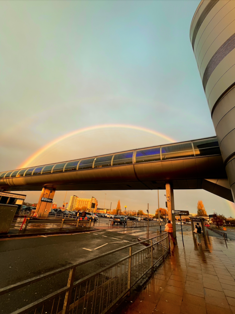
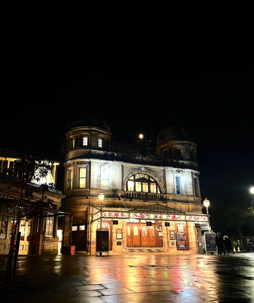
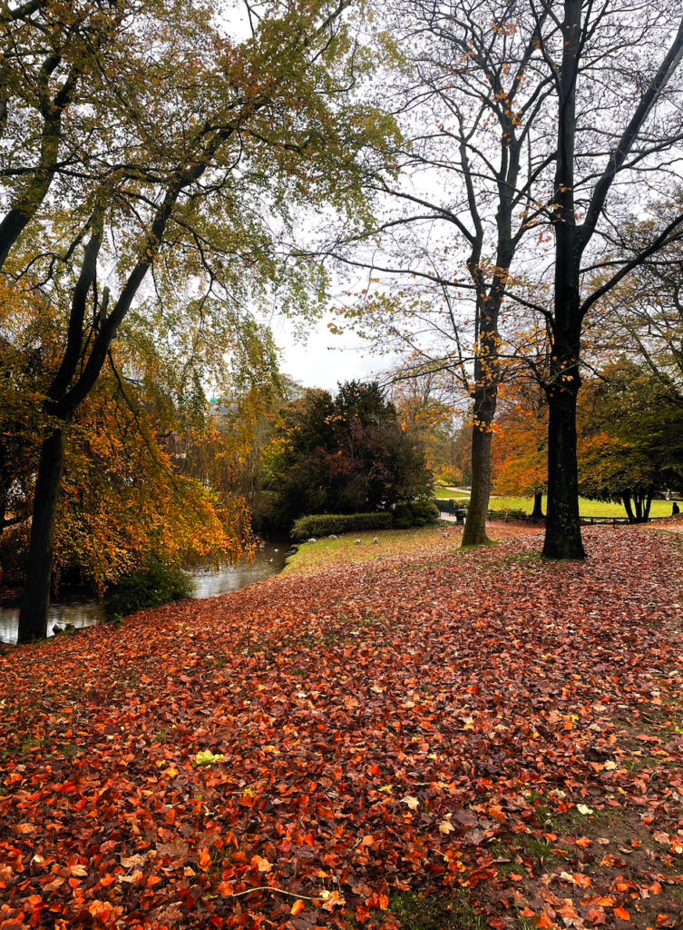
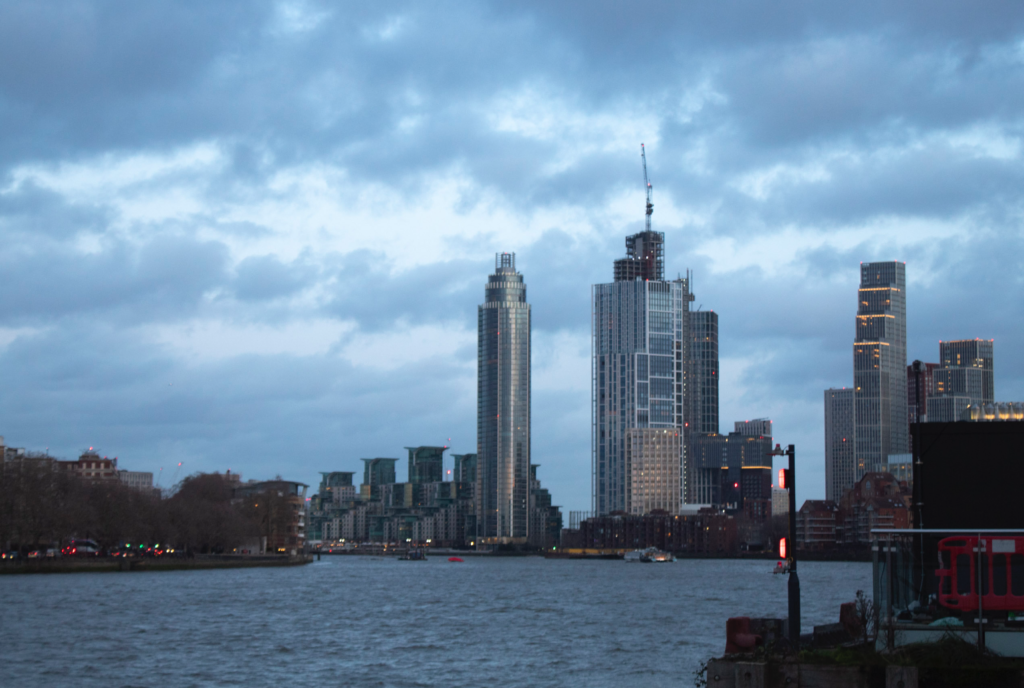
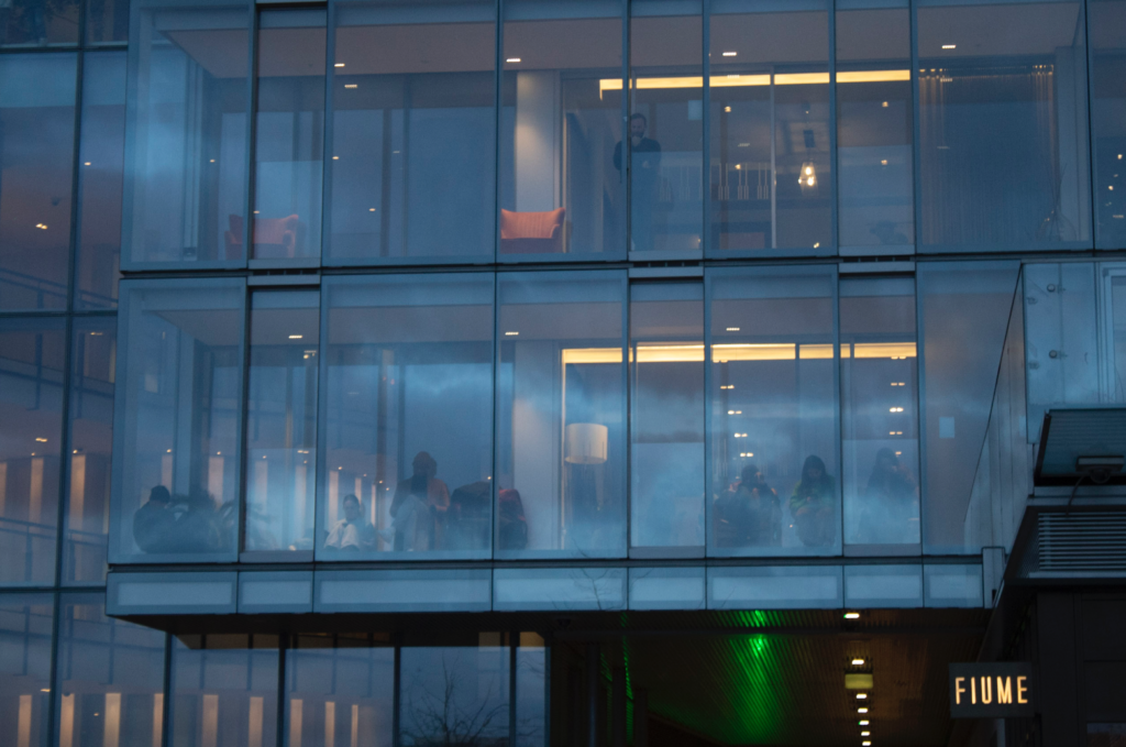
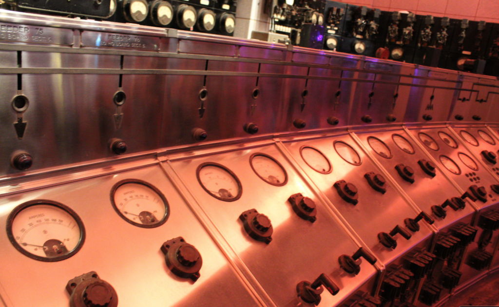
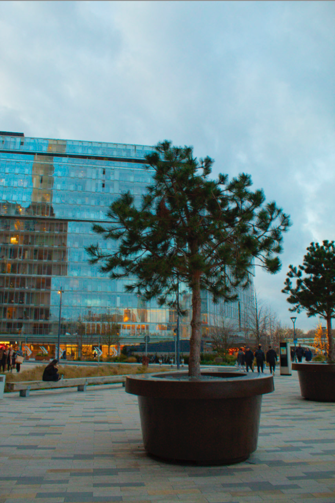
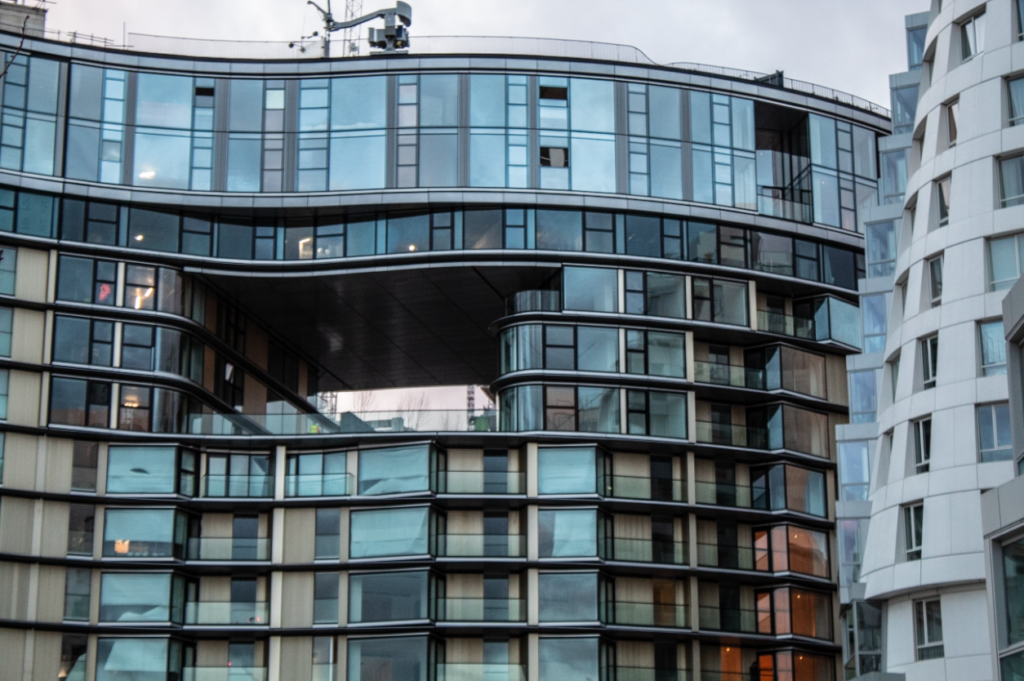
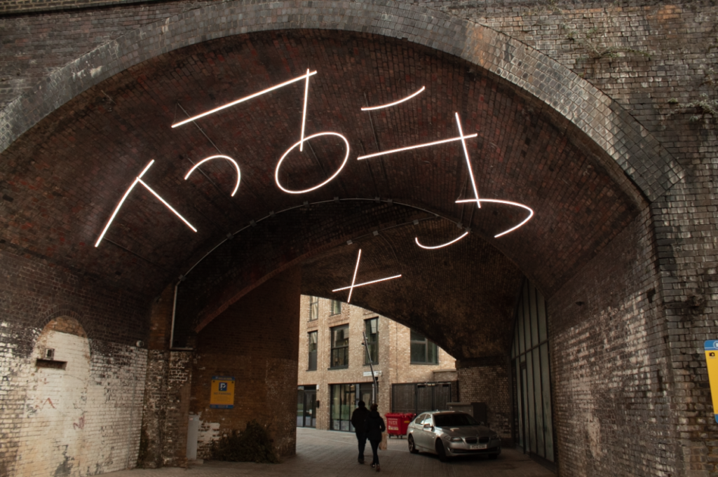

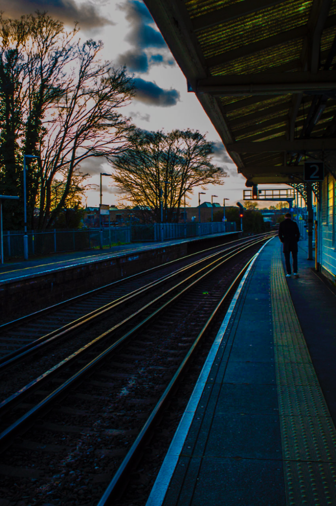
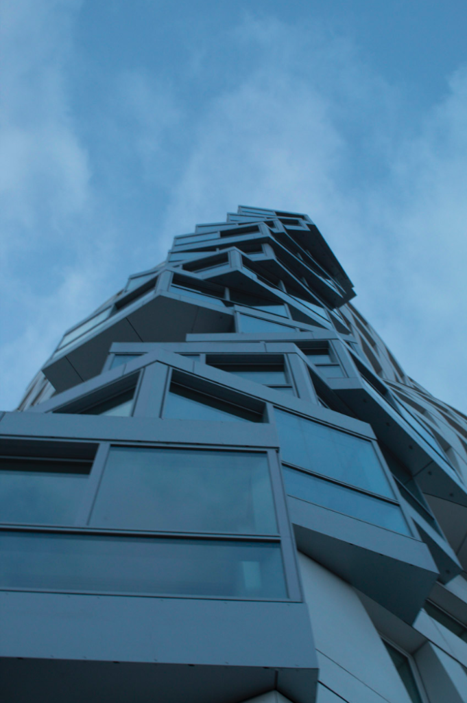
Night photography is used to express the world in a different light. images taken after dark of landscapes, cityscapes, or the night sky have greater depth, emotional quality, and sense of emptiness or abandonment that daytime photographs of the same location might lack.
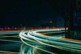
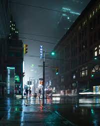
Below is my attempt at some night time photography:
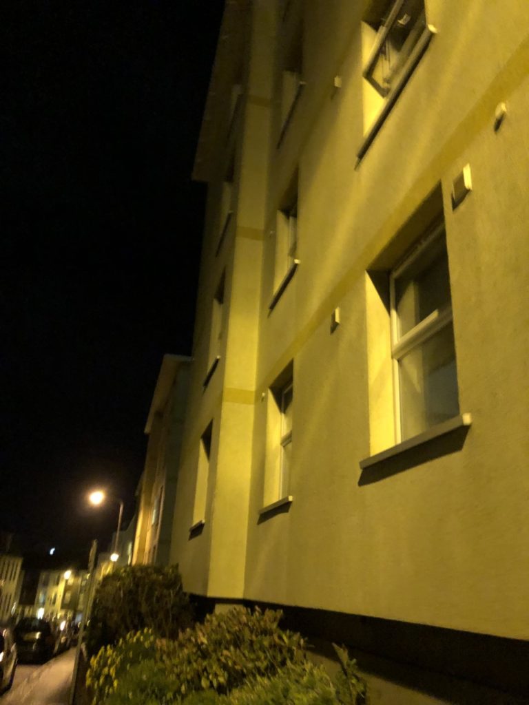
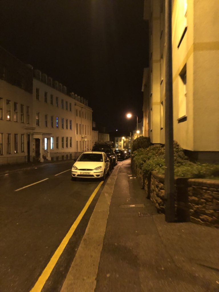
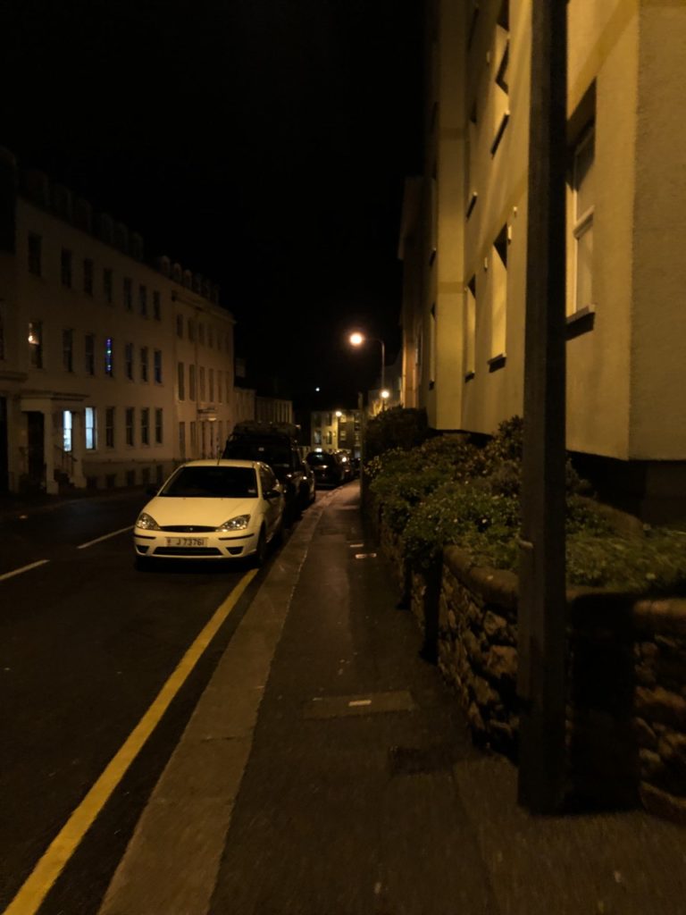
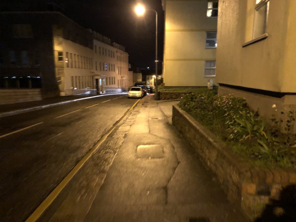
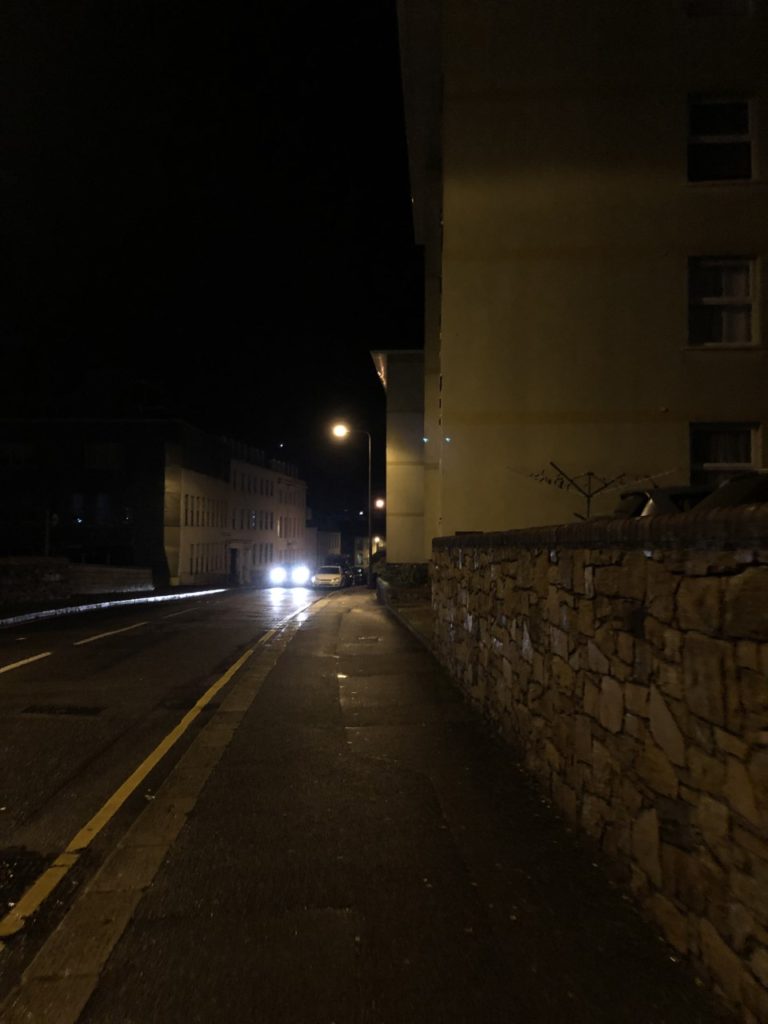
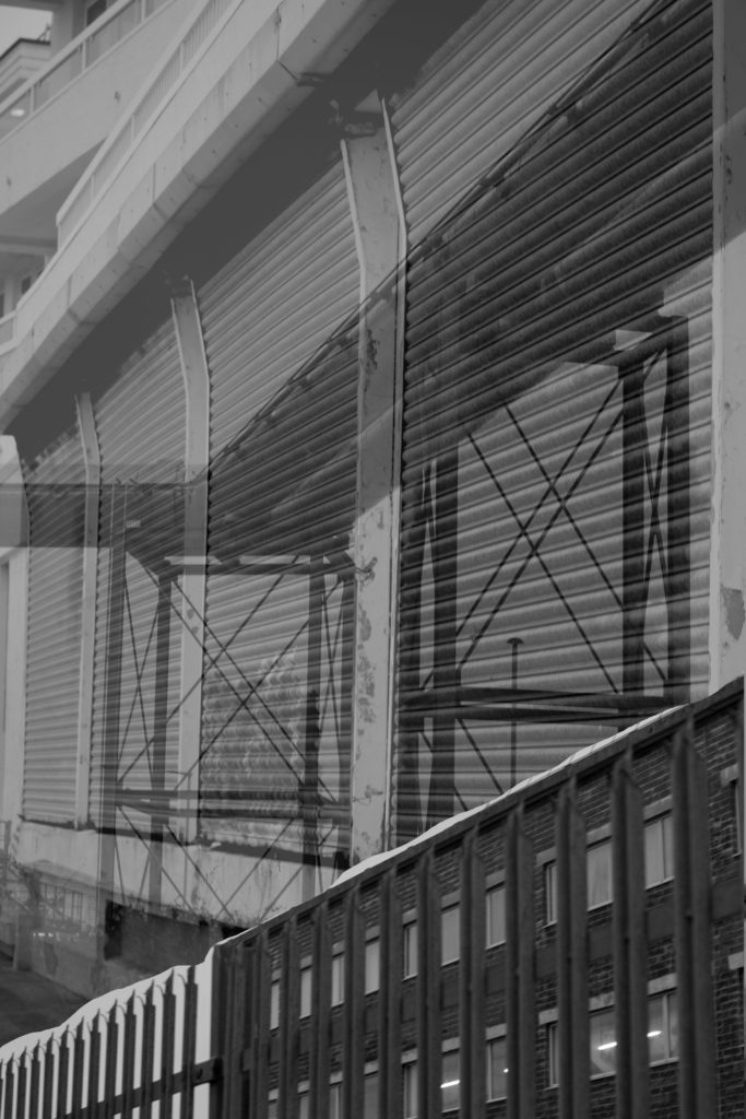
Using a selection of different images from my landscape shoots, I compiled some montages from my favourite outcomes:
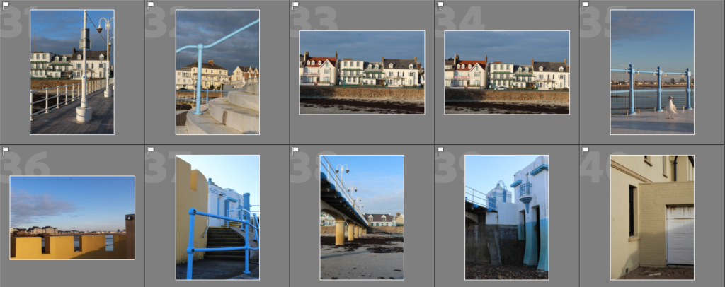
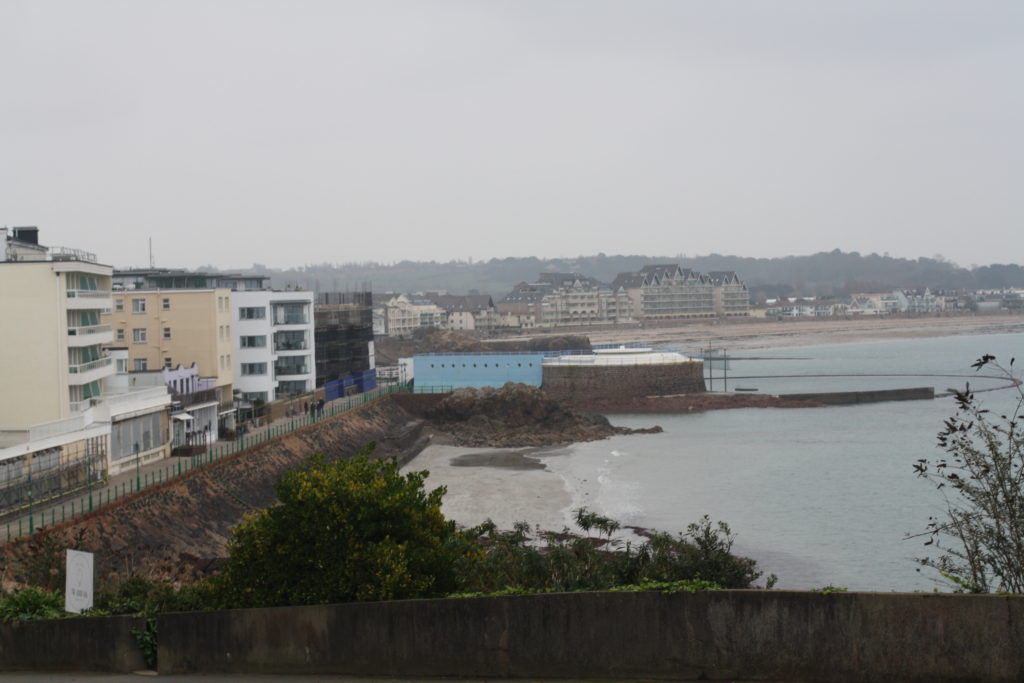
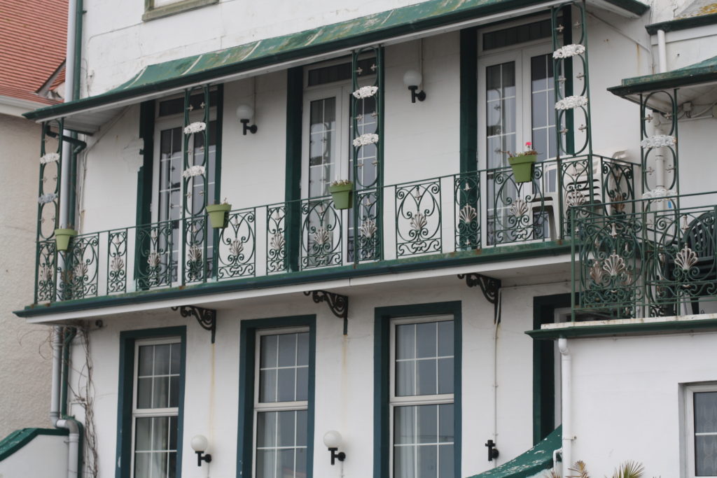
We went on a walk from harve des pas to la Collette and I took lots of images inspired by the new topographics movement on the way, here are some of the images before editing:
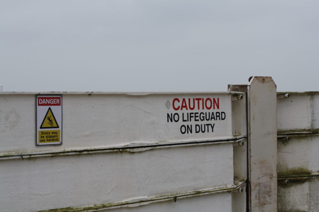
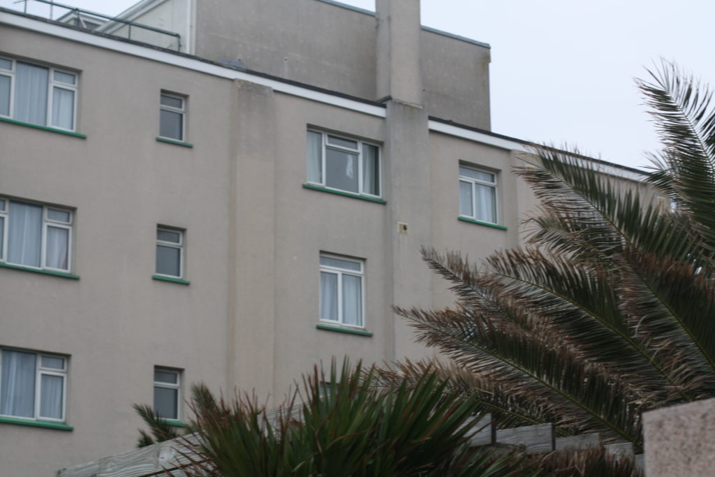
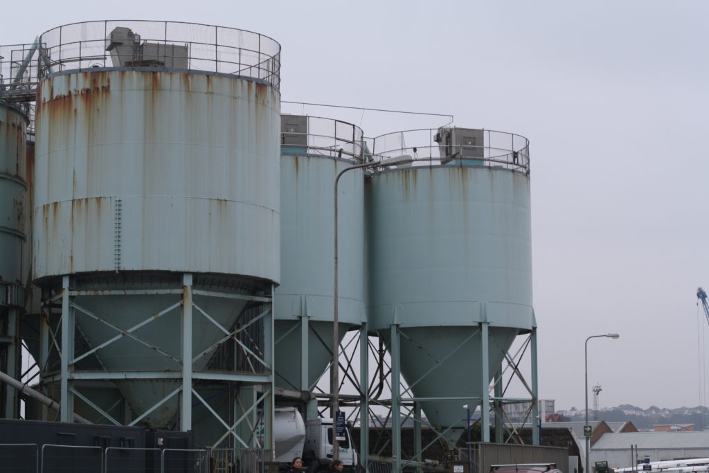
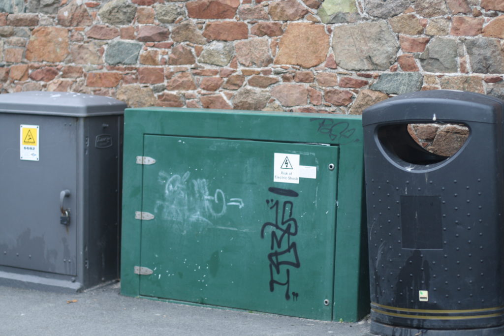
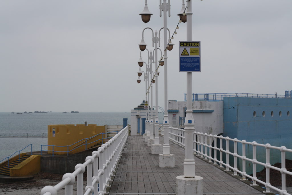
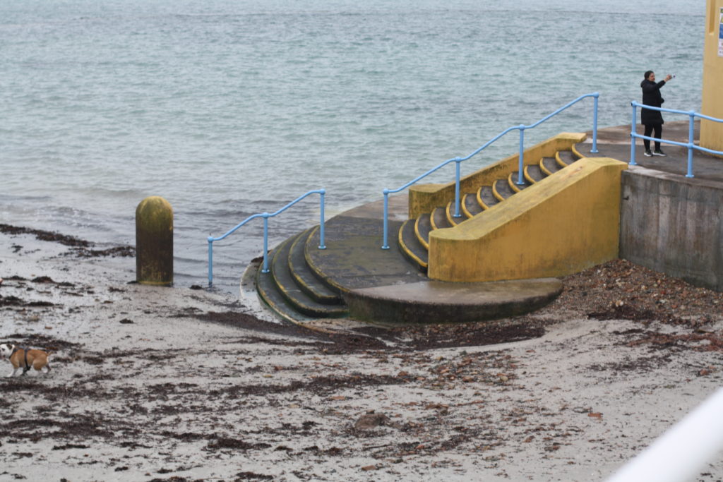
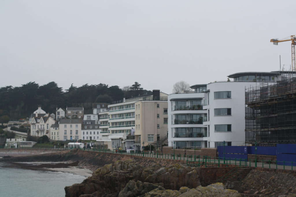
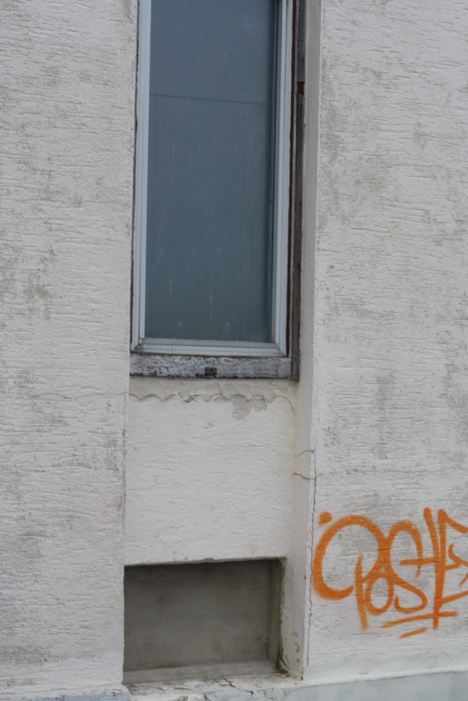
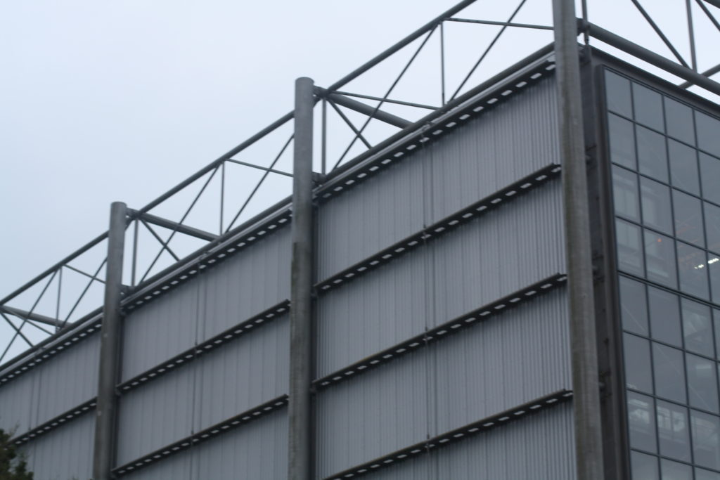
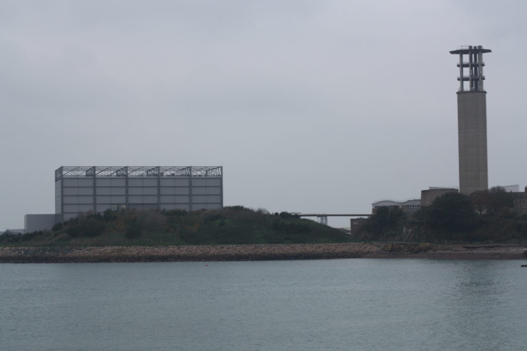
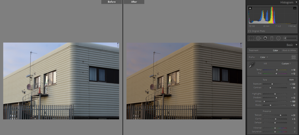
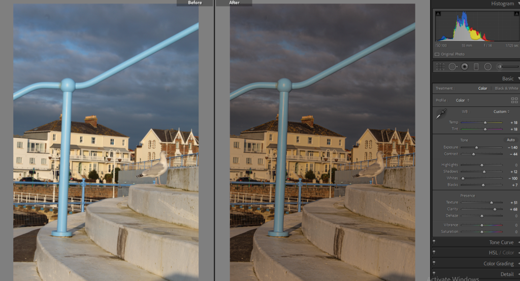
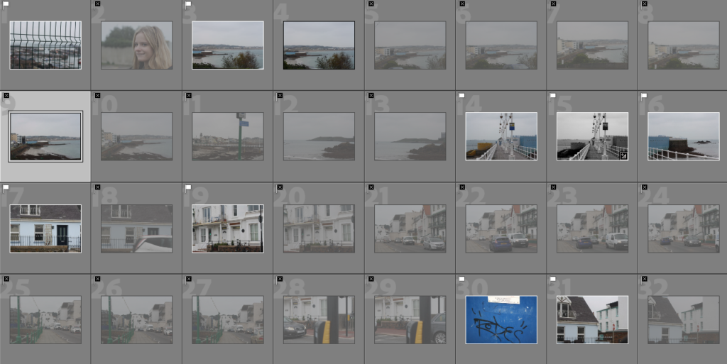
On lightroom i looked through the images and selected the best outcomes:
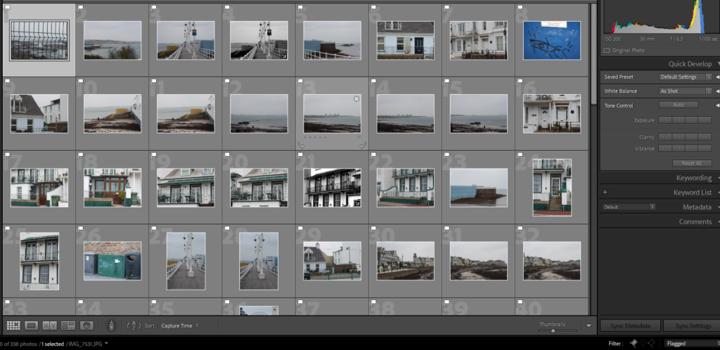
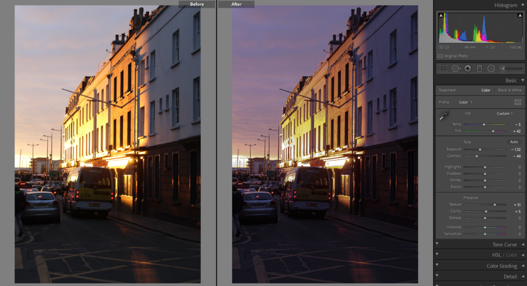
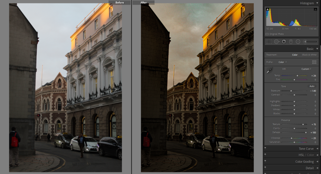
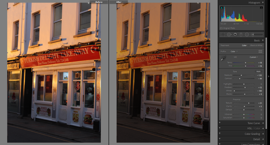
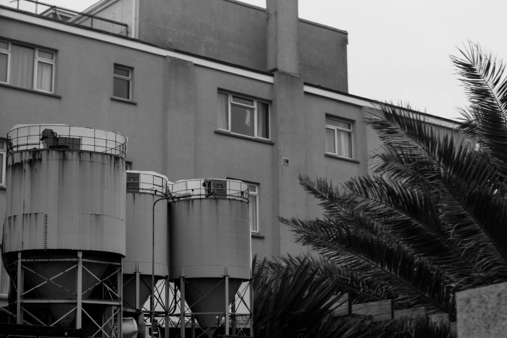
These are the edited outcomes:
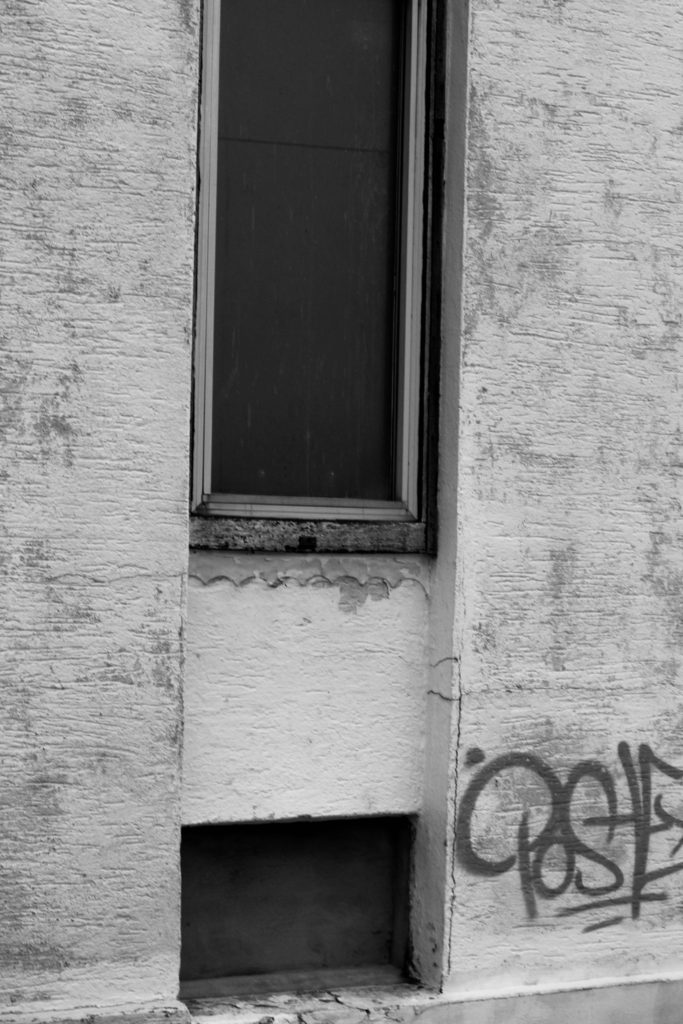
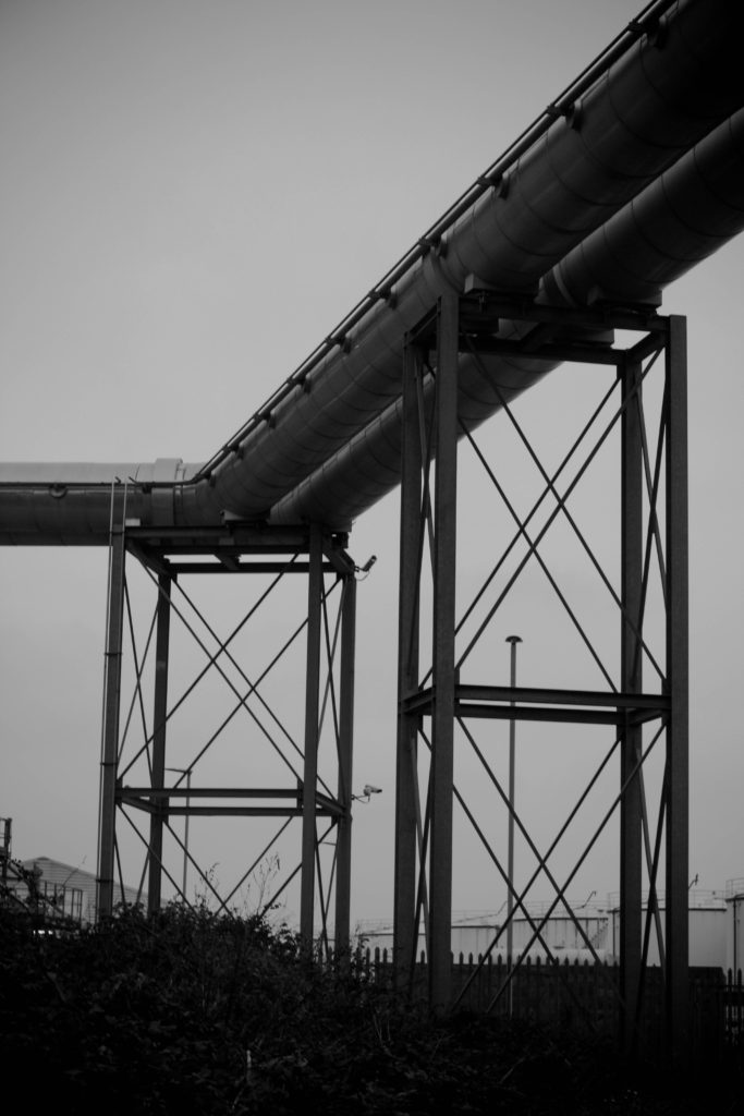
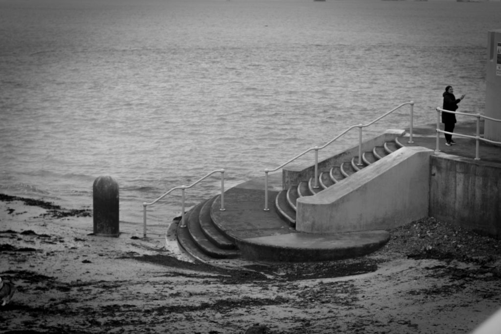
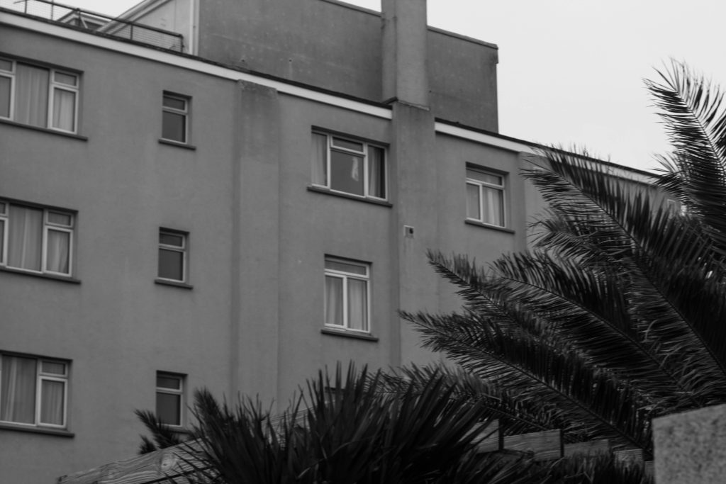
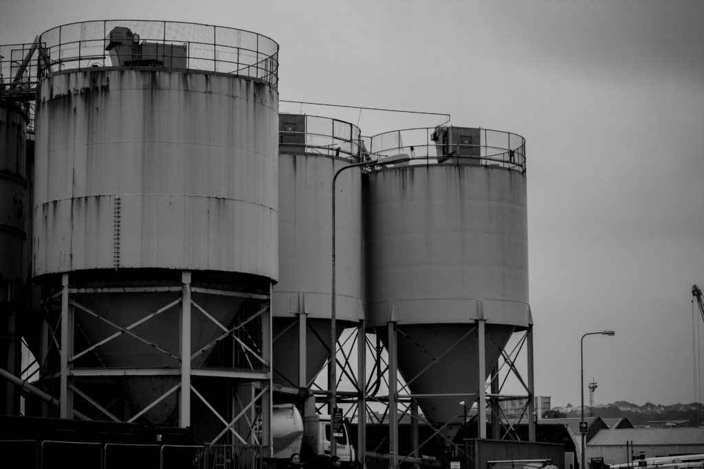
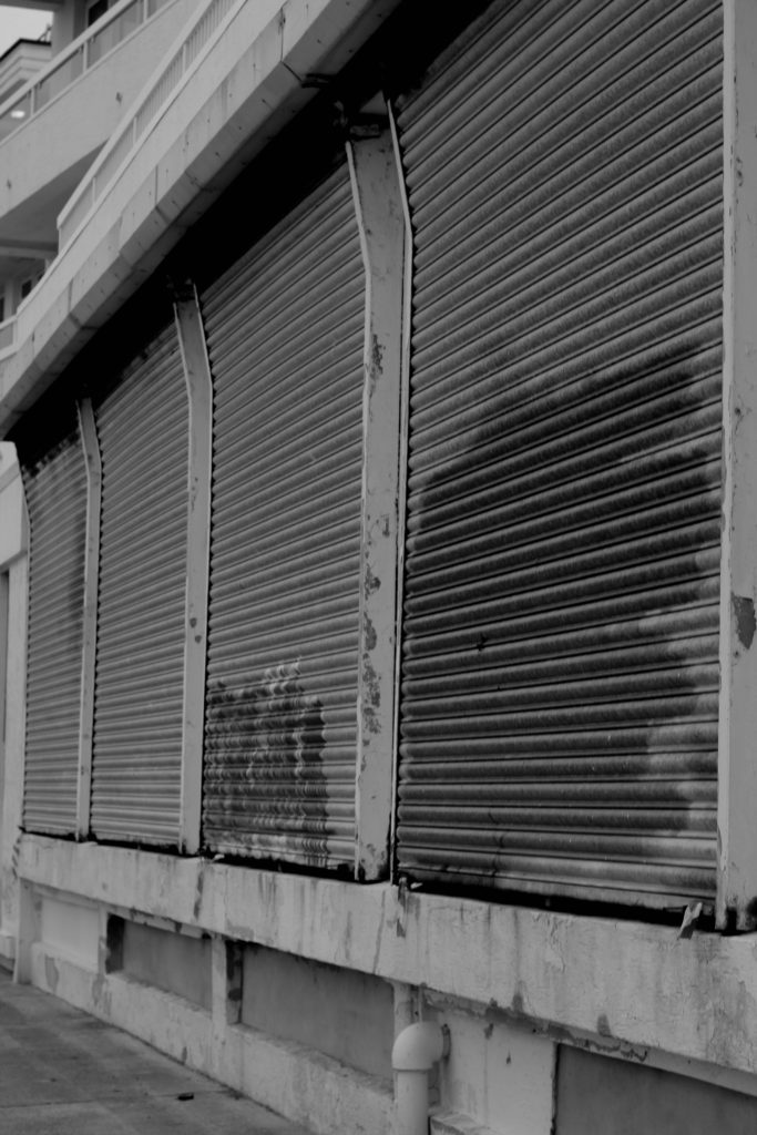
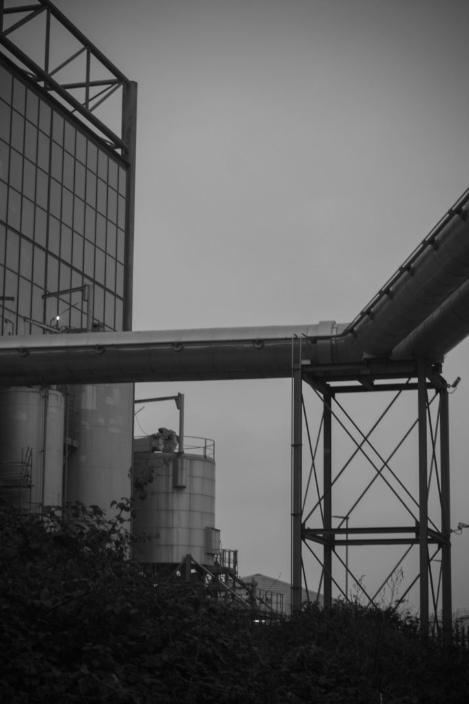
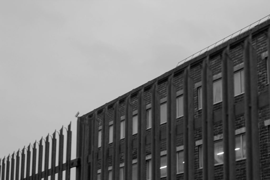
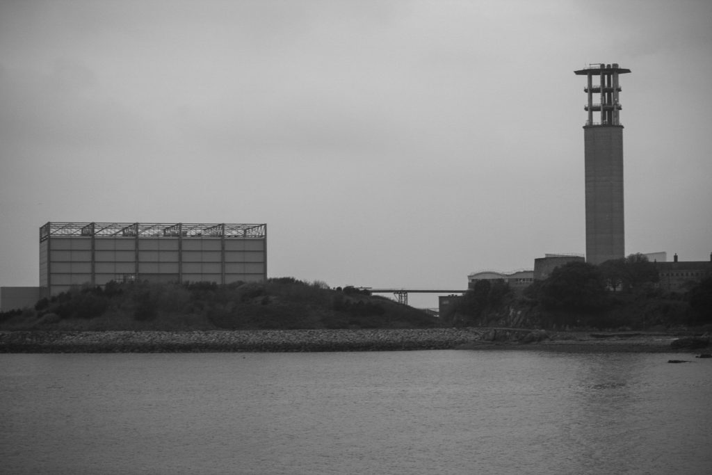
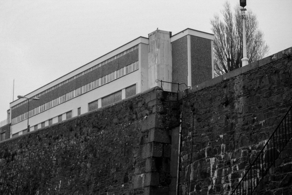
All of these images were edited and adapted on Lightroom to follow the style of the New Topographics movement.
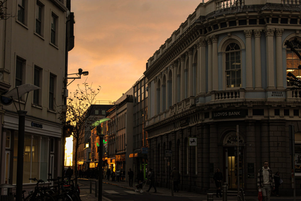
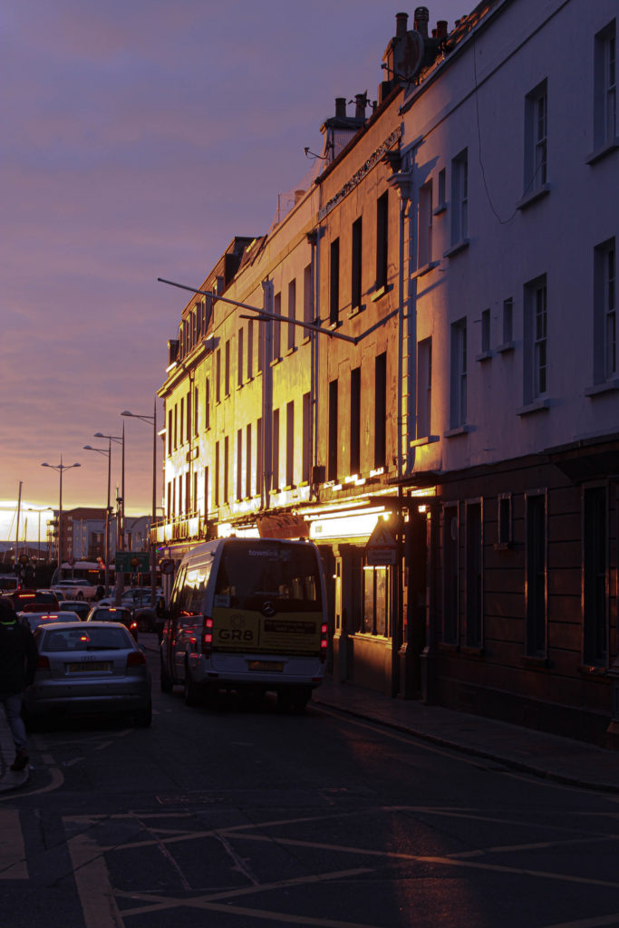
Final images
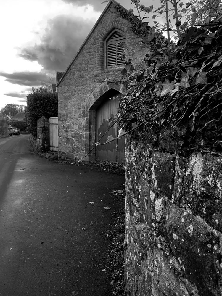
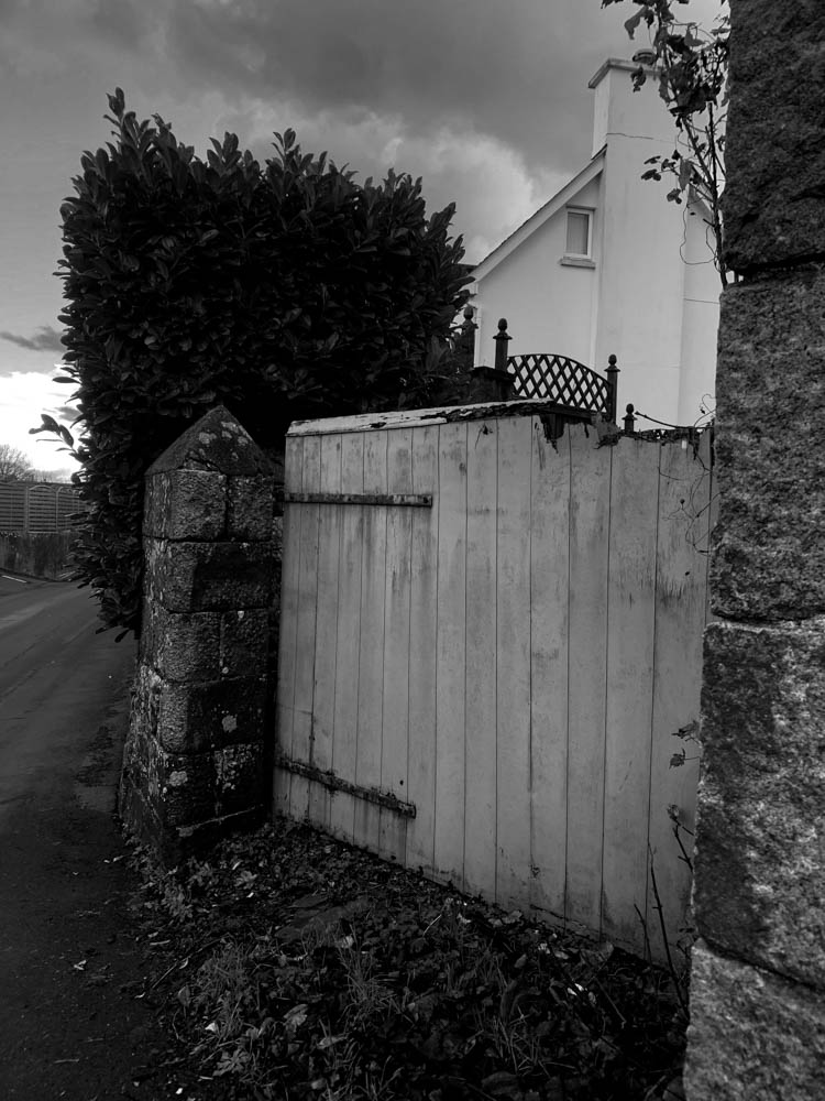
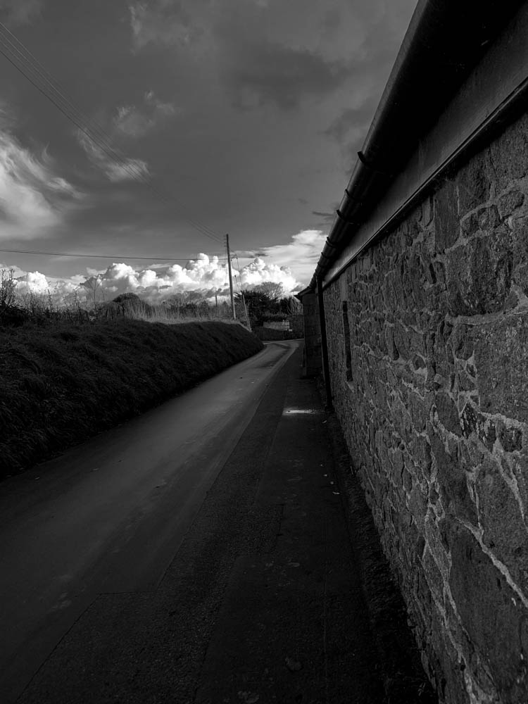
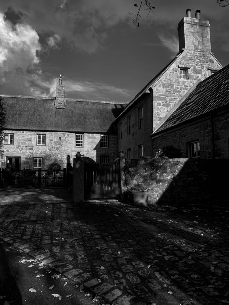
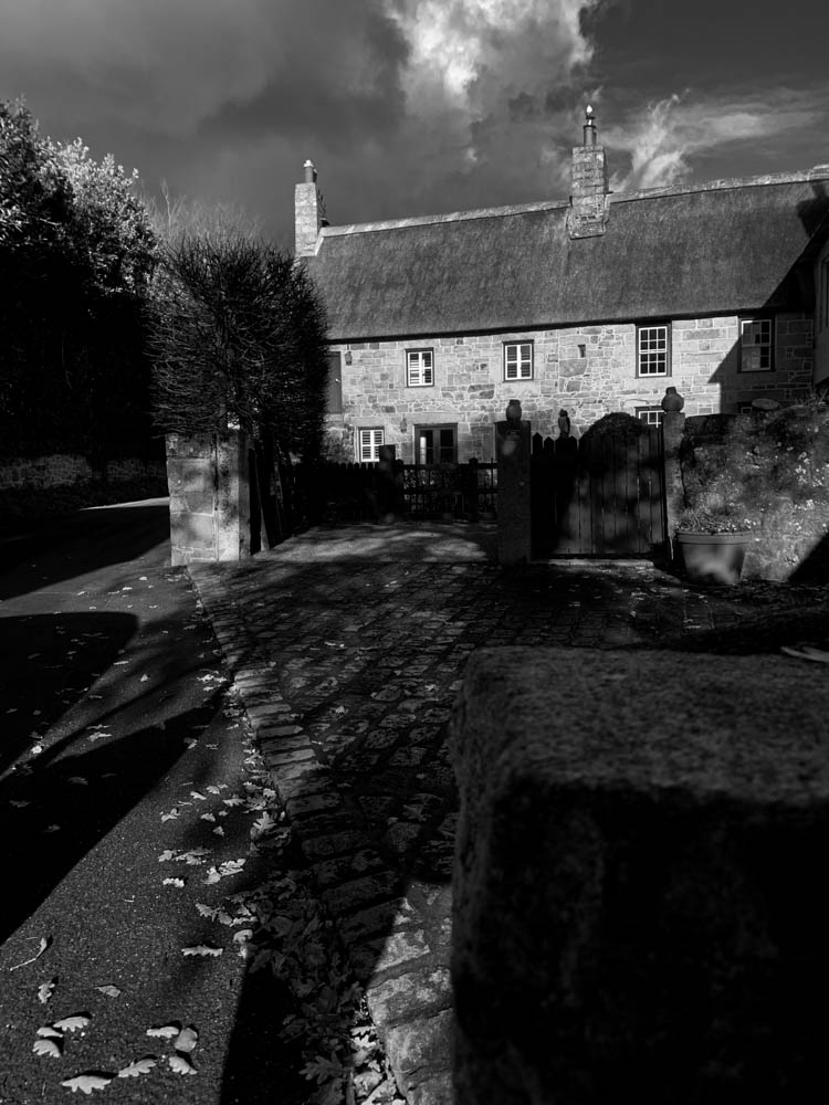
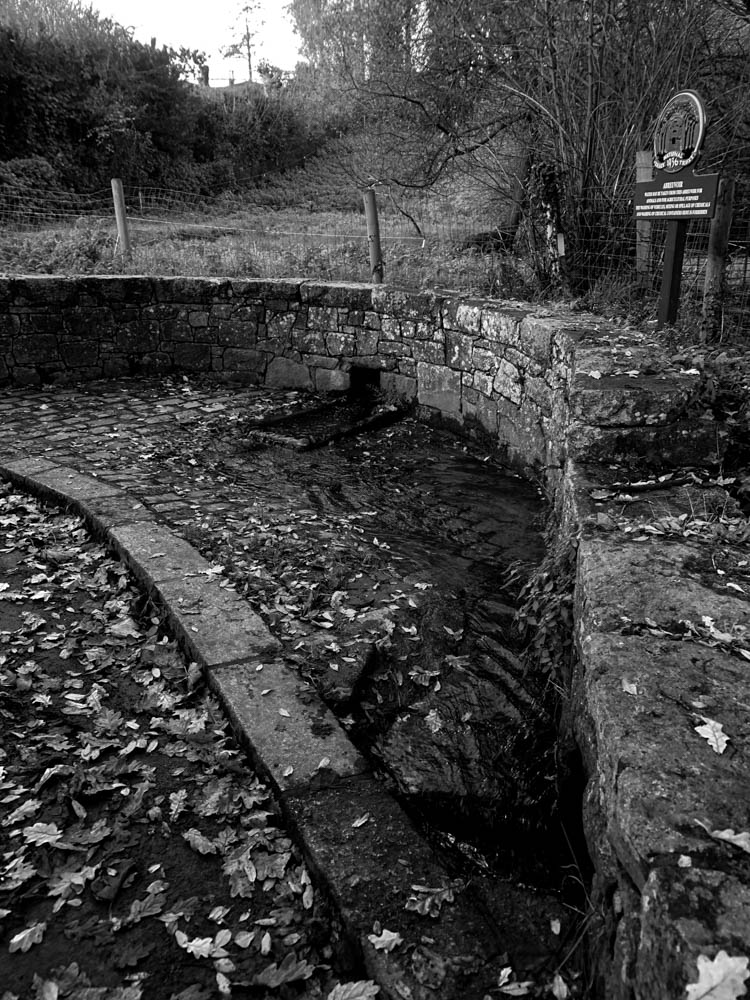
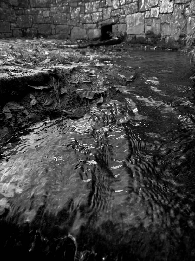
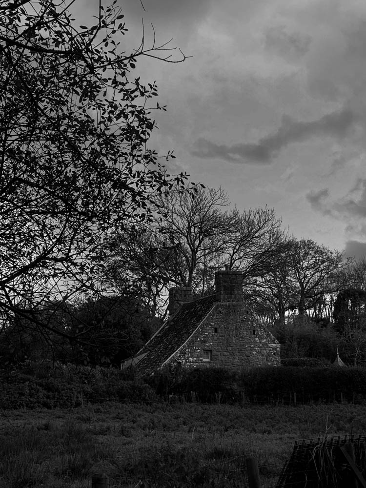
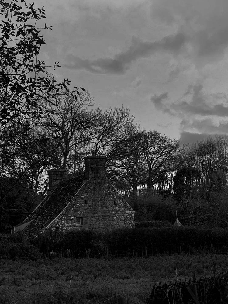
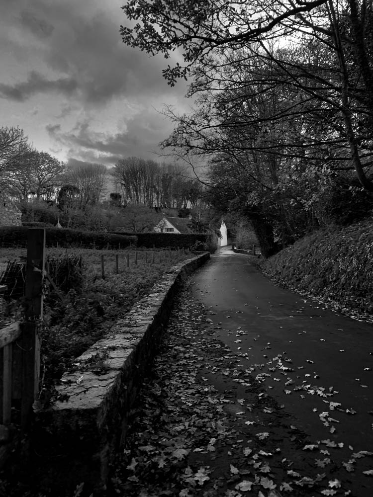
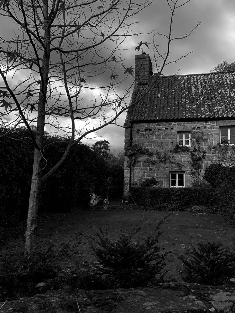

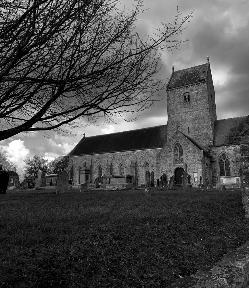
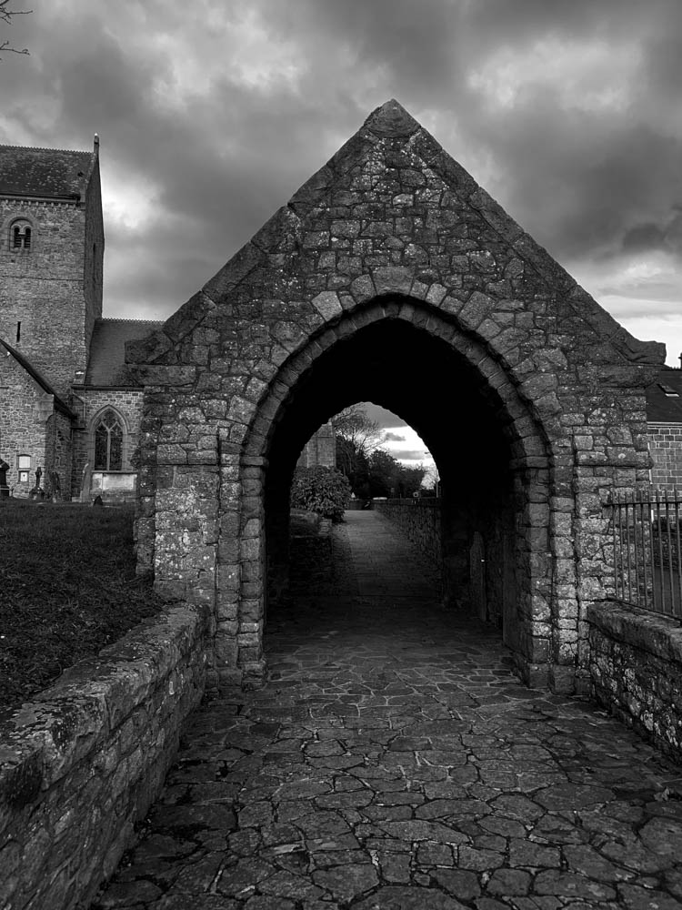
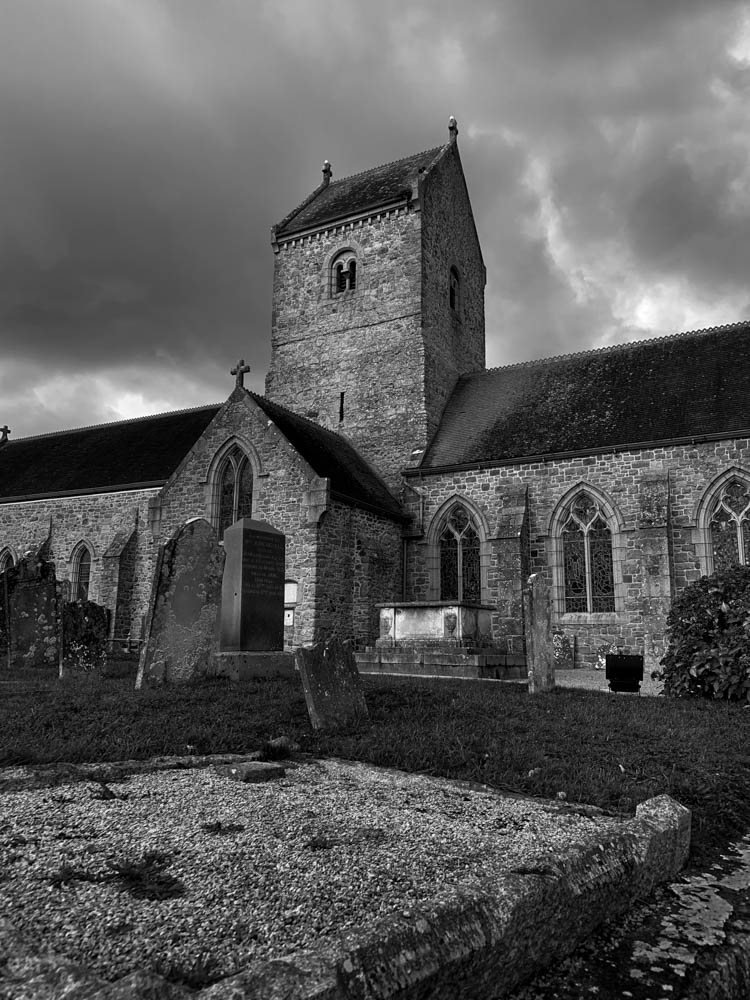
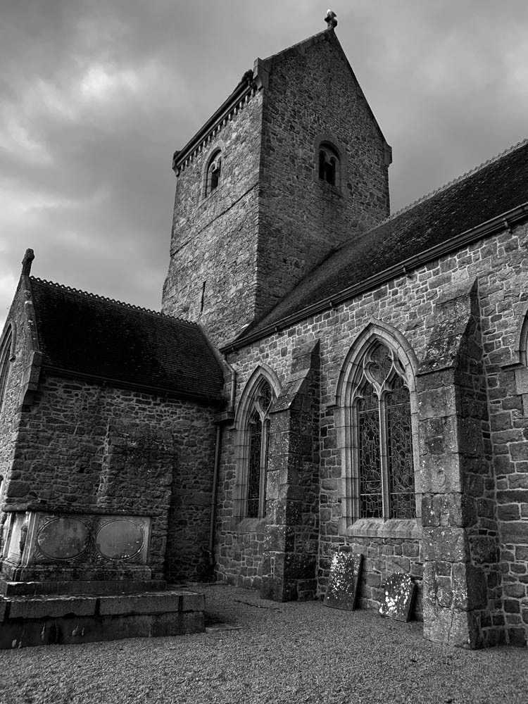
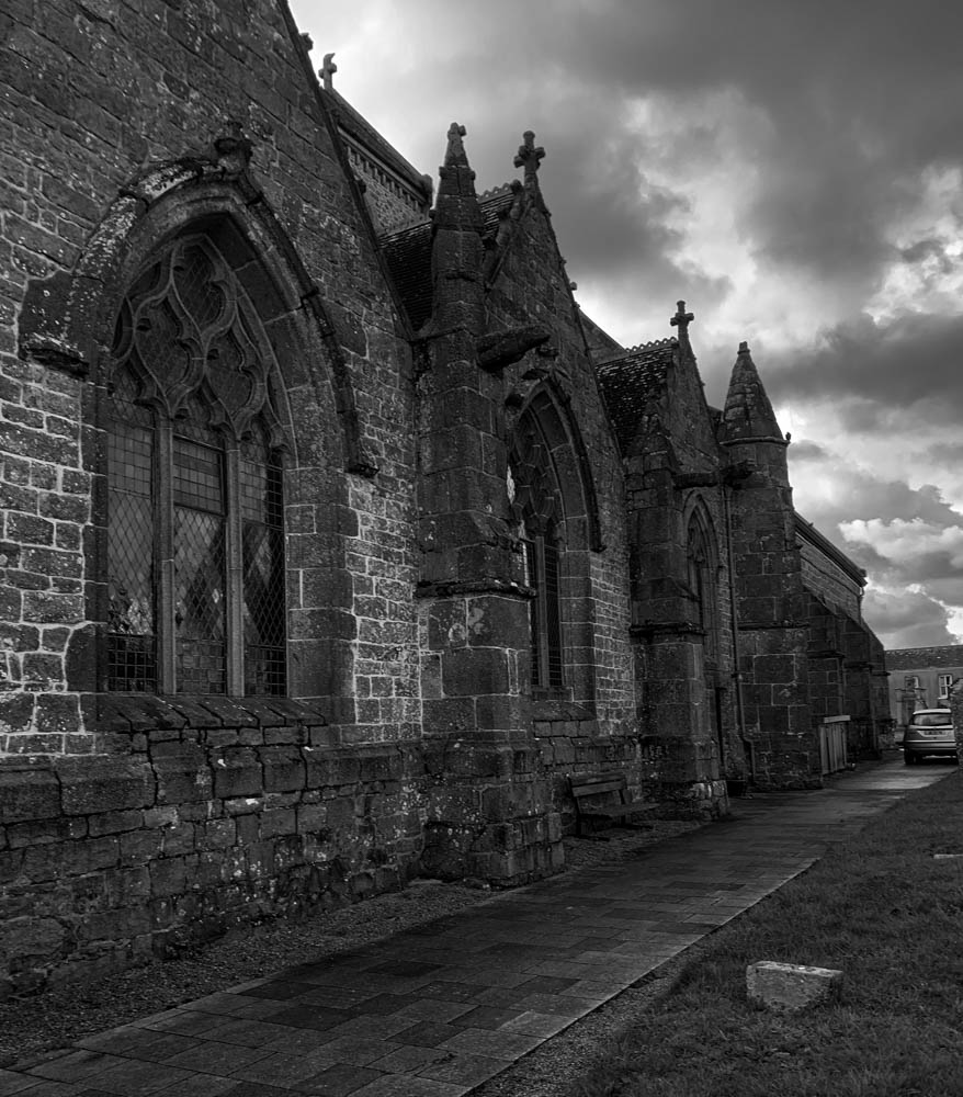
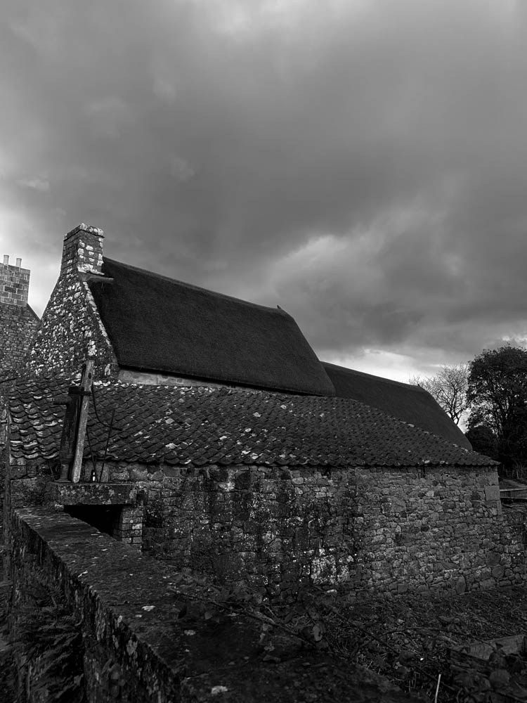
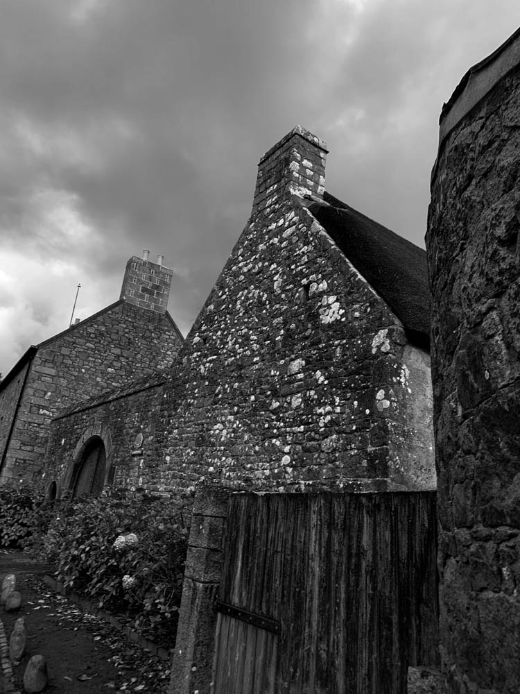
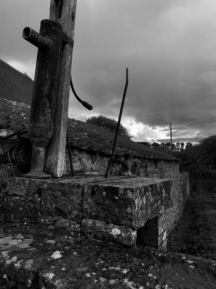
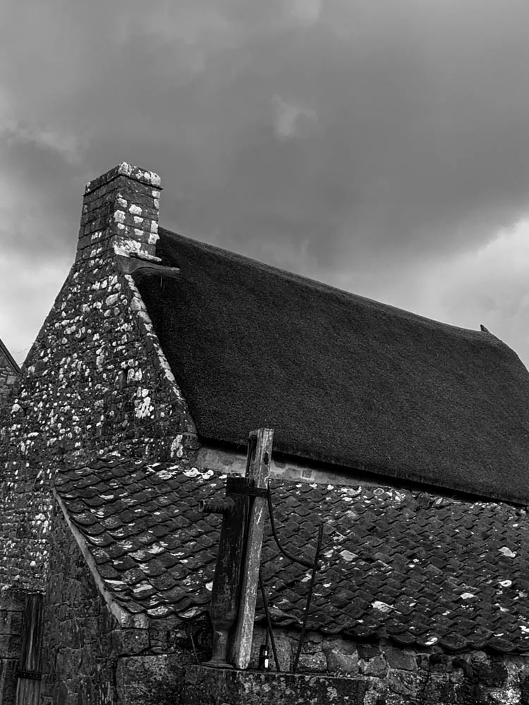
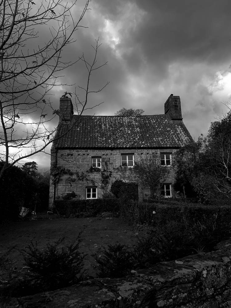
The two images below are my best images as I feel that the monochrome look gives them an ominous and solemn look.
