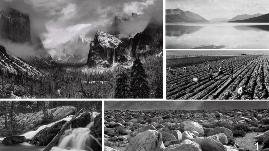
My first response to romanticism landscape was inspired by Ansel Adams and his work. I have previously done an analysis of his work which gave me an idea as well as inspiration to explore his way of making images.

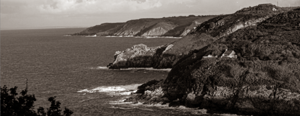
Comparing my image inspired by him to his own work, I think what is a big resemblance is the exposure of the image and the amount of darkness to brightness. his photograph has a much larger area of the clouds, this also means that area is lighter in relation to the rest of the components in the photograph. regarding my photograph I have very small amount of clouds shown, this is because in order to show as much land as well as different plans like the trees nearest to me, from the area that I was standing in I had to compromise on what to and how to point the camera to capture what I wanted. because Ansel Adams photographs much bigger areas he is able to shoot the desired photograph from further away and be able to get a lot in the frame as well as a big area of clouds, as I was limited to much smaller areas in jersey photographing a larger area of the sky could mean I may loose detail I wanted in the frame. a similarity between his and my image is that he also has layers in his image where he has a first plan, second , maybe even more , background etc. the object nearest to the camera, like the 2 trees in the bottom right corner are much darker, being a pure black likewise like my own photograph, where the trees nearest to me are also a pure black , however what is different is that they are much bigger and therefore the larger surface area is black.

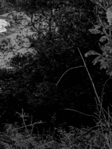
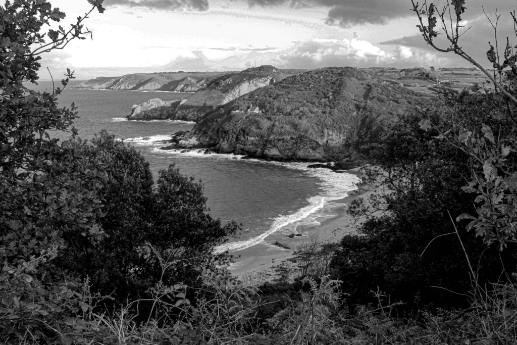
The trees near to me in the photograph frame the image whereas his is more open as in his photograph there aren’t any objects close to the camera on the sides of the photo. this could be good and bad, depending on the viewer as framing an image may result in capturing less of the desired landscape, it will also make the landscape look less open , which when photographing an area which is already beautiful may take away its value as then there’s less of that landscape area visible. But this framing may also mean the photograph gives more of a personal value as then it feels more like the viewer is in it , it may seem more realistic. I picked this image out of a couple of my final images to analyse, where I also have an image of the same view without the trees in the first plan, however although that image is also a good photograph , it doesn’t have that personal value to me and the frame that the trees created to me make it much more interesting as there are more detail in the photograph and they also balance the bright and dark areas as the rest of the landscape and clouds are quite bright whereas this frame contrasts with this as it is very dark and to me creates more of a sublime photograph.
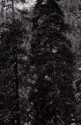
With the above image I wanted to represent a different tone to black and white photography which meant adding a different filter on the image and working from that with exposure brightness etc. This image does a good job at representing a vintage photography style, however I felt like the fist analysis image had more in comparison to Ansel Adams works. although the style of the above image interest me and although it was firstly inspired by Ansel and it doesn’t have to look exactly like his work, I found the other images more interesting to analyse fully.
Another similarity between mine and his photograph is that he has a small area, in contrast with the rest of the photograph , of pure white which is the lightest colour he can achieve. This white can be visible on top of the mountains he photographed. The snow and a bit in some clouds are his lightest points whereas my photograph also has a small area of pure white but it can be seen in the water, when waves crash onto the shore and similarly in the sky and clouds. To me the amount of brightness in the photo is very similar to Ansel Adams photograph . however his white usually pairs up with a darker shade that the rocks on the mountain have making it look much more dramatic and make the white stand out more whereas mine blends in with the shade of the sand.


As a whole I have enjoyed exploring his style and although his landscape locations are much more fascinating and interesting then the ones I am capable of capturing right now, the style of his work like the enhancement of the shadows and dramatics of his images was very fun and different then what I’m used to edit. however what I should of payed more attention to was the colours that contrast each other, as with his work because of these opposite colours that are right next to each other, his photographs look so pronounced. 2 colours of completely different shaded being next to each other, quickly changing from one another, meaning they are not smooth or blended in, will make the image look sharp as a whole and this is why Ansel’s photographs look this conspicuous.
My photographs:

Ansel Adams’ Photographs: