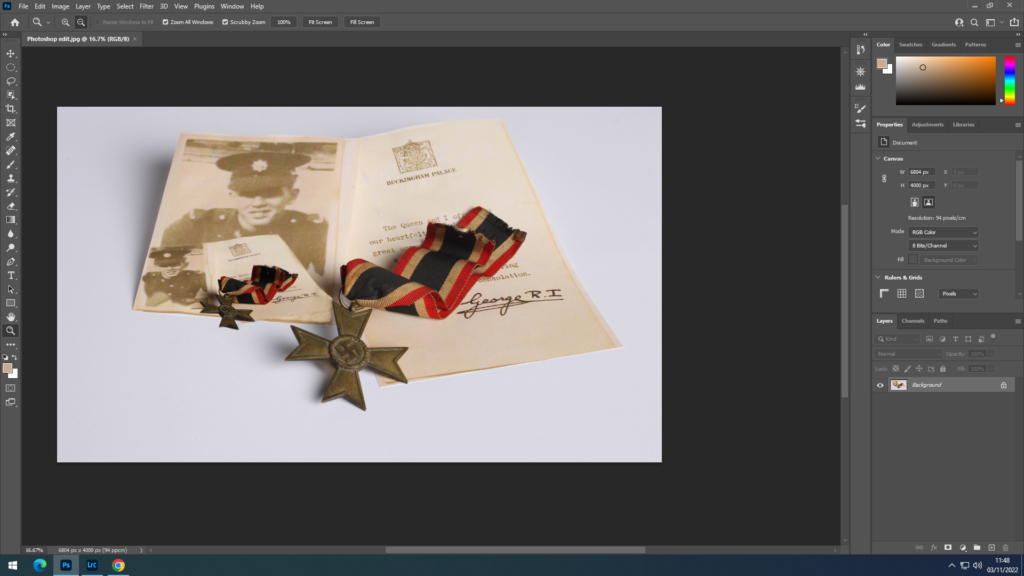
photo Montage final images

Physical Photo Montage Experiments
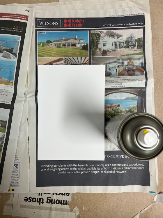
Once I had my final pictures printed out i went throught a process of photo mounting.
I have used spray mount to spray it on the back of my photograph to make it sticky, this is useful as the spray gets to all the corners of the image.
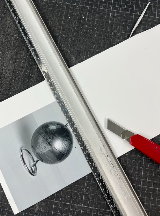
After sticking the photo on a white foam board. Then using a craft knife and by aliening the ruler with the edge of the photograph I cut firmly the edge.
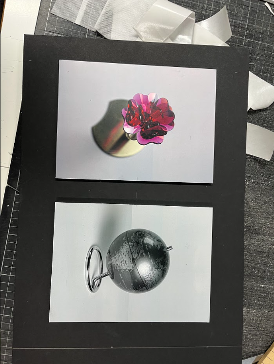
After an image is stuck on a foam board I could stick it using double sided tape onto other backgrounds like another foam board or a black board. This is previously measured so everything is in a proportional shape .
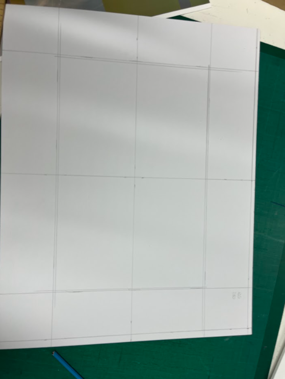
There is another way of photo mounting which is a window mount, this involves creating a “window” in a black board.
This process involves a lot of measuring done in steps
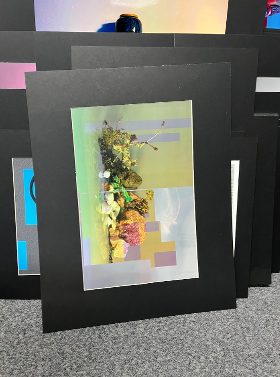
Once a window was cut out I put 2 pieces of tape on the image and facing it up put the frame on top of it so that I could see how well it fit, then flipped it so I could see back of the frame and the image and with more tape I taped the edges of the image to the back of the board.
The last thing to do was to put velcro on the edges of the photo mount ready for display.

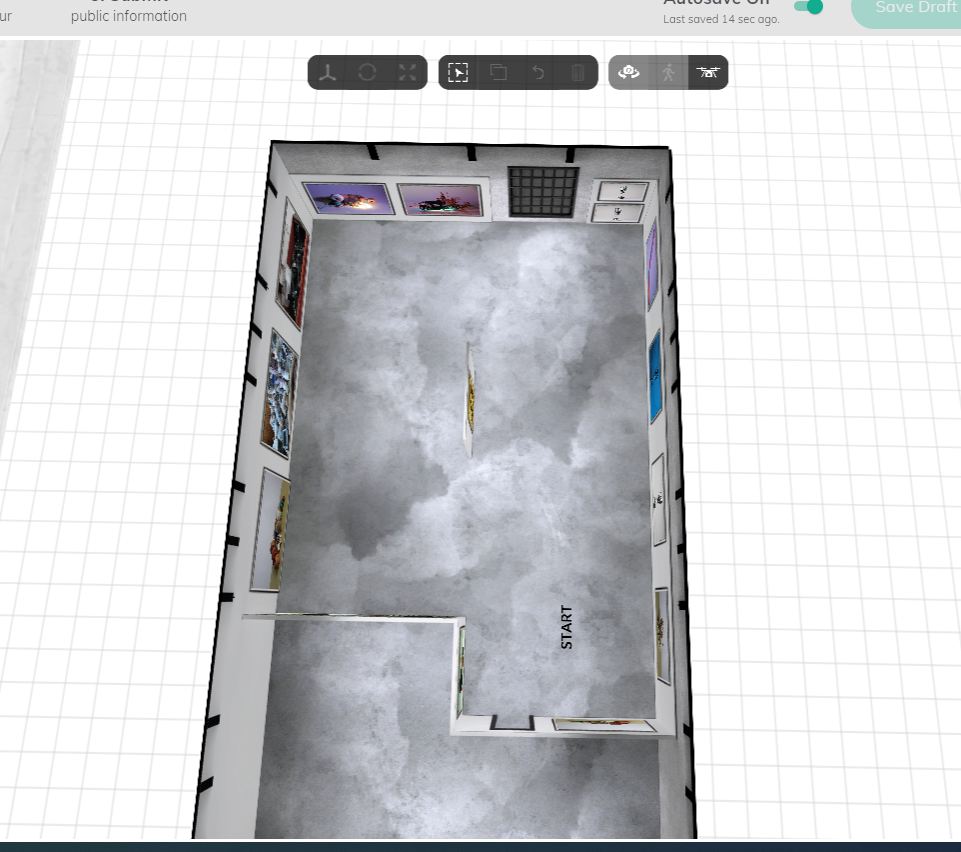
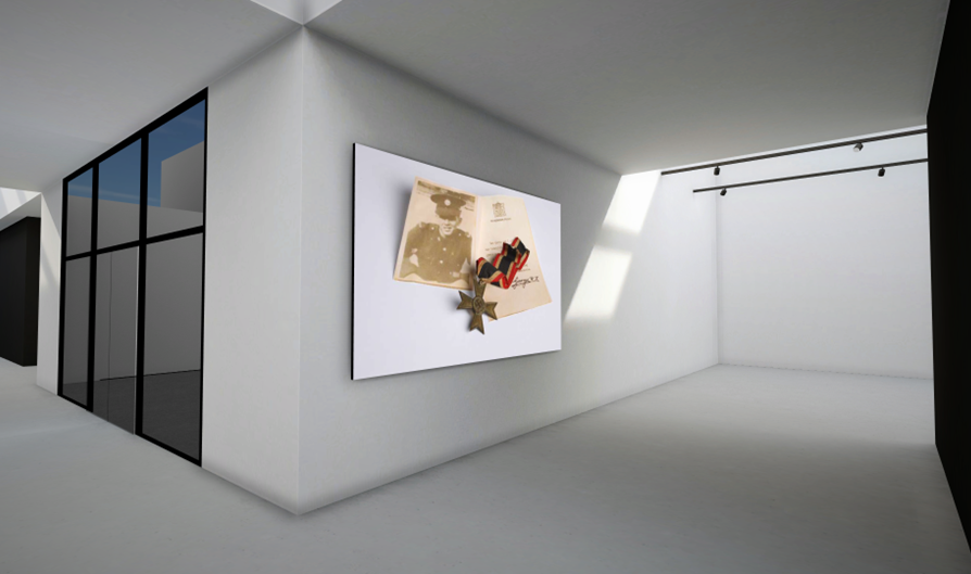
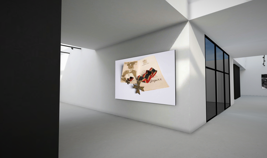
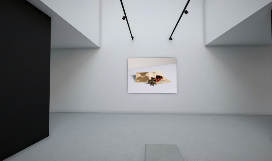
I used artsteps to make a virtual gallery which shows some of my favourite photos I have taken.
I like this image because of the colours and how the green and pink go well together. Also how the pink illuminates the beach objects above. One thing wrong with the image is that there is a lot of spotting in the top left of the photo which makes it look less smooth.
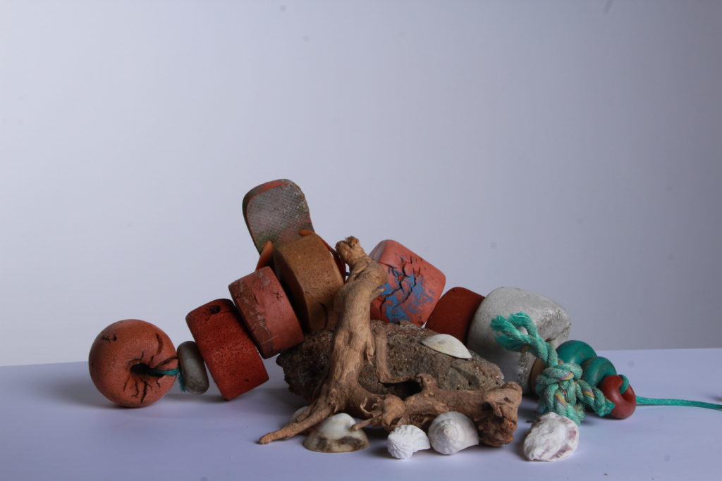
I like how this image looks very smooth because of the white background. Also how there is a main focus of the image with the beach object in the middle. The white background makes the objects look a lot brighter and more vibrant.
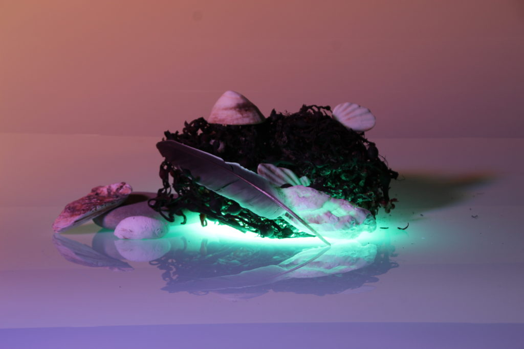
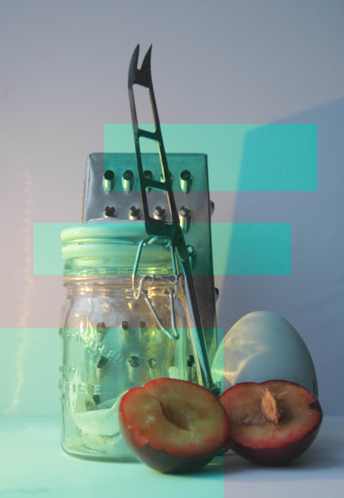
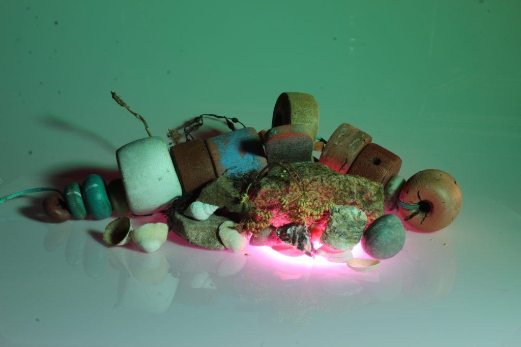
I like the colour contrast in this image with the green and the purple/pink. I also like the objects used in the image, like the bunch of seaweed and how the green light lights the seaweed and the other objects around it a little bit, and how there is a reflection of the objects because of what they are sitting on.
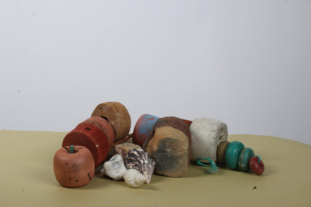
I like this image because of how simple it is. The bottom is more like a sand colour which could make it look like it is actually on the beach. One thing I don’t like about this image is how the background and the bottom of the photo use different coloured paper which does make it look less smooth as there is a line splitting the image in the middle with the two different colours.
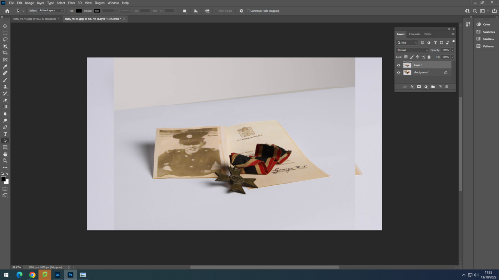
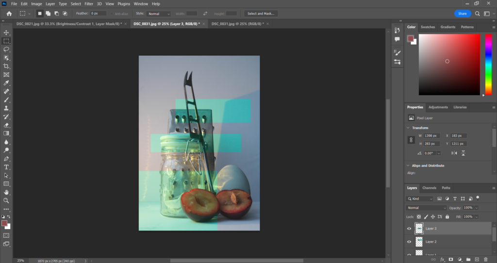
Use ctrl A to outline first image then copy and paste to second image
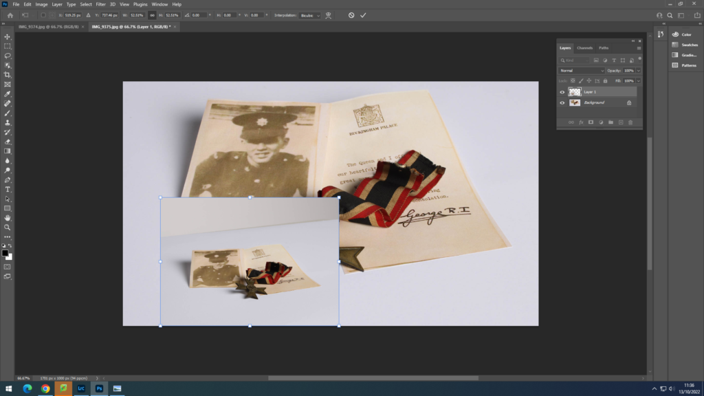
Use ctrl t to select second image

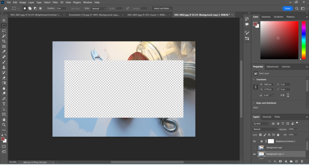
Select layer, use rectangular marquee tool then delete the selected section
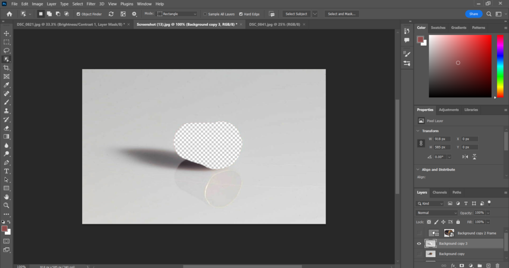
Cut out the second image and place on top of the original using the brush tool to erase parts of image to fit
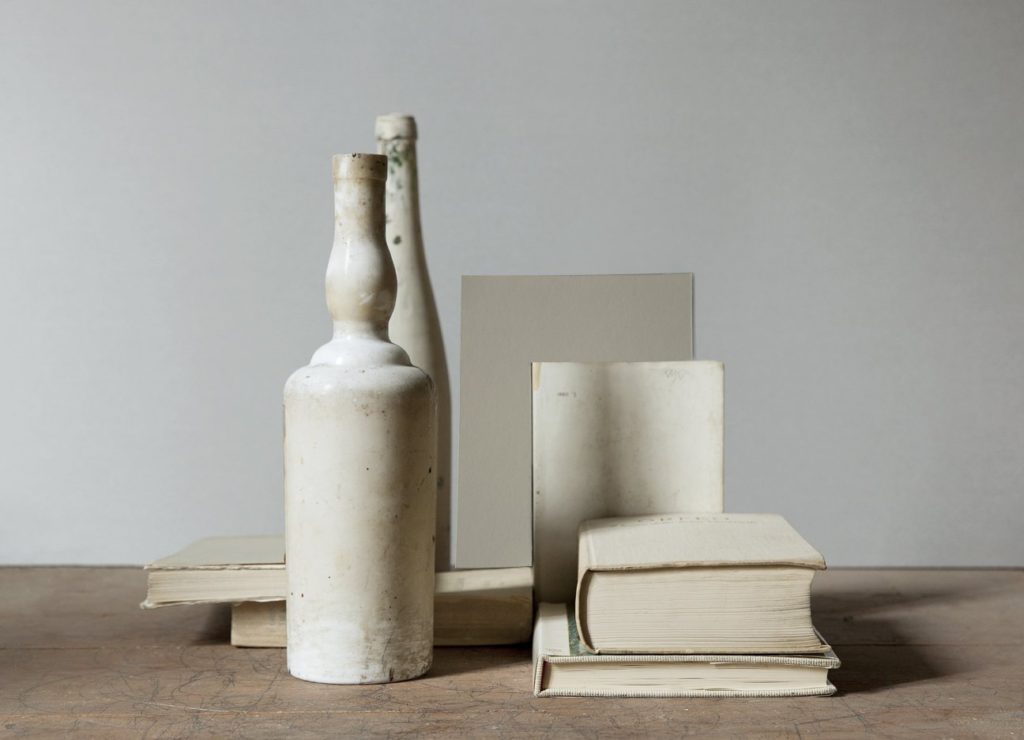
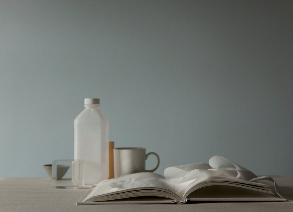
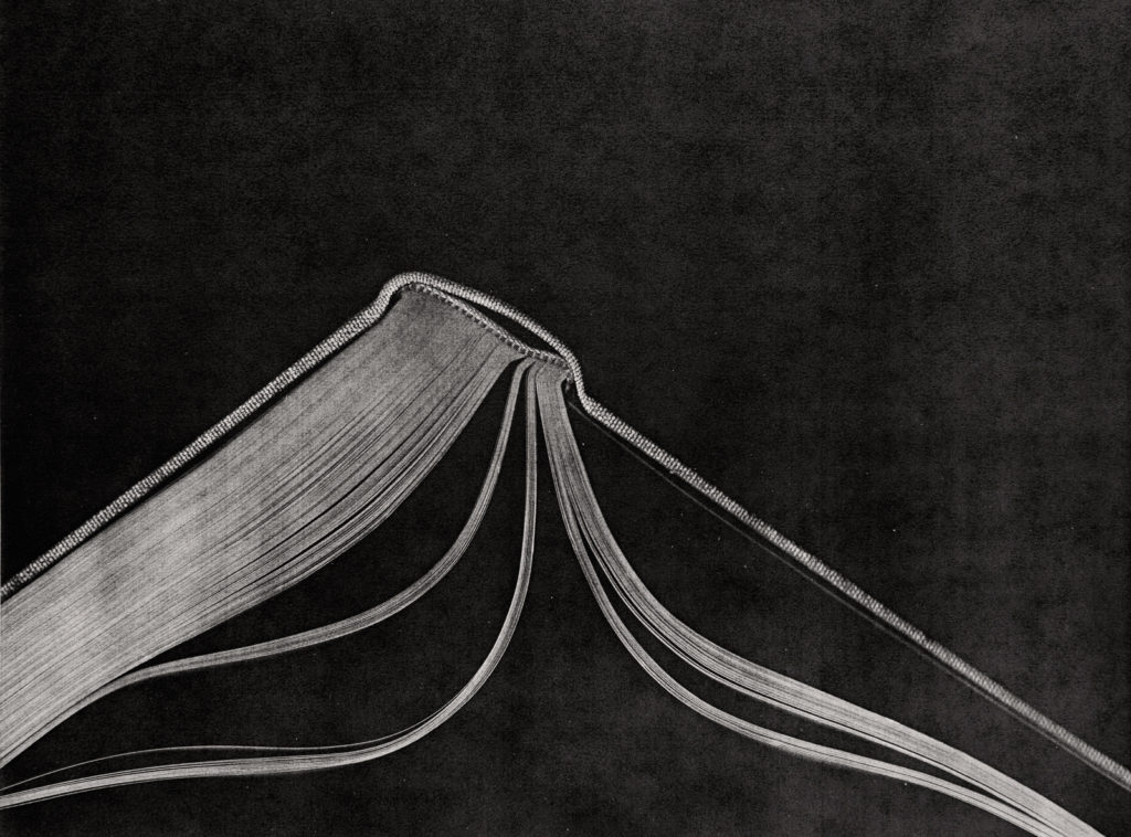
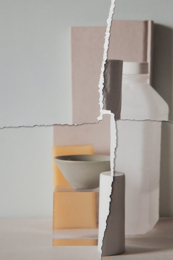
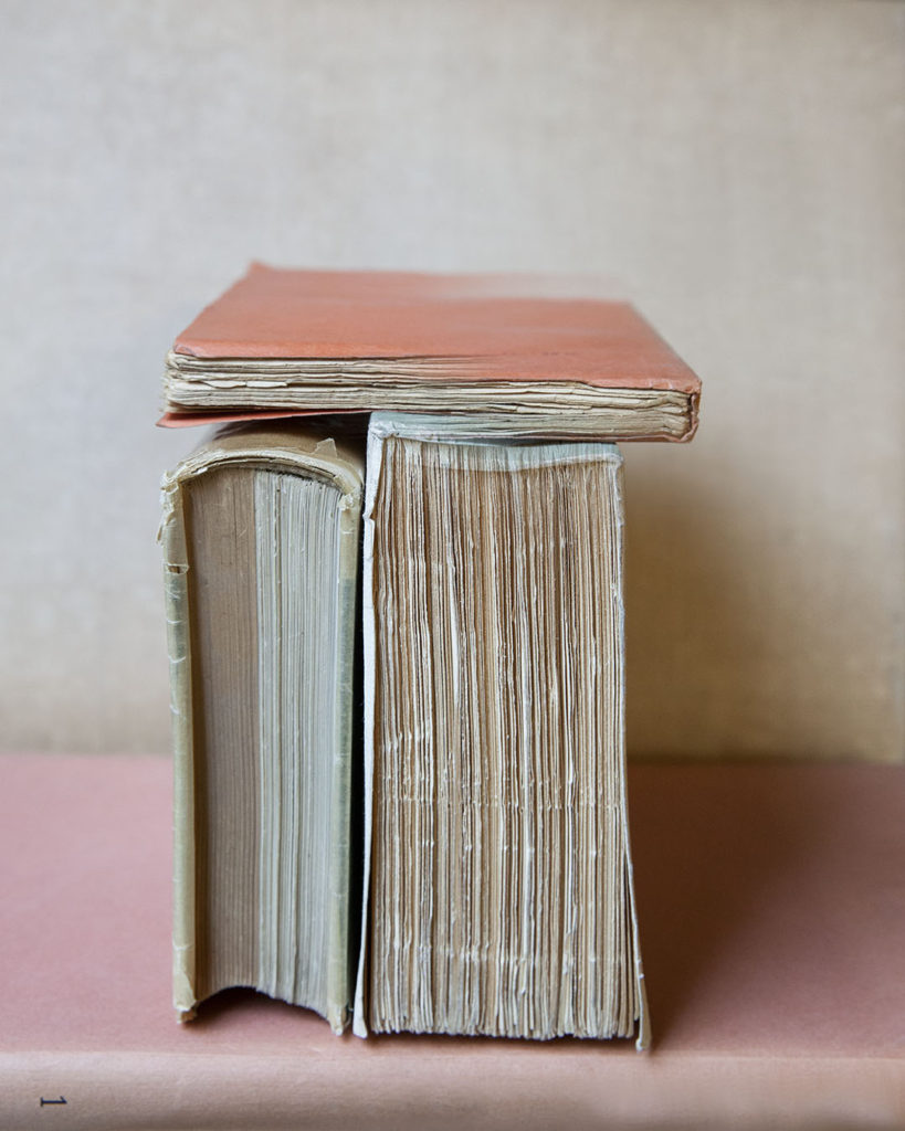
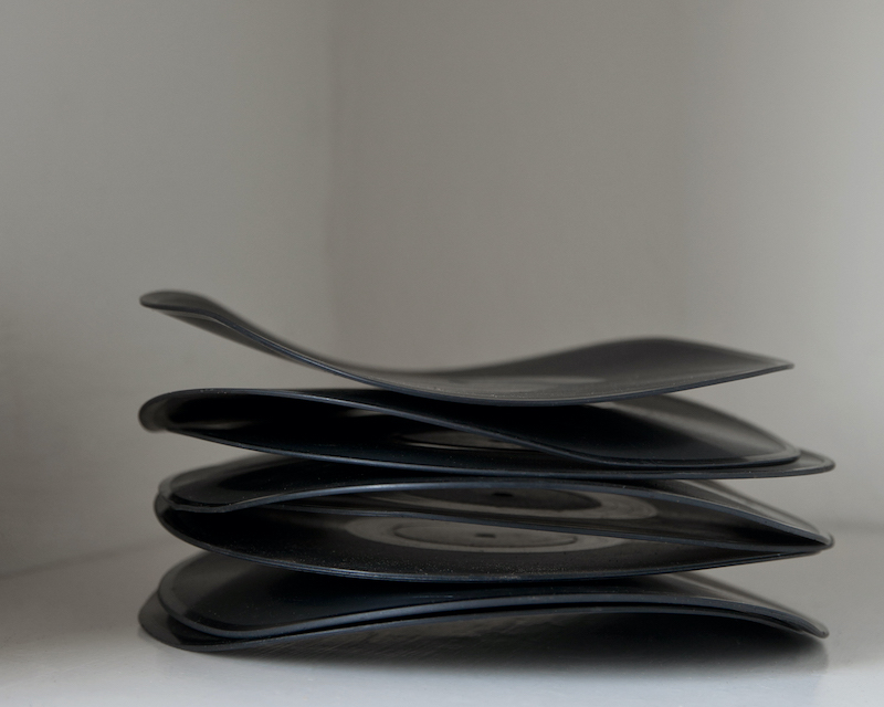
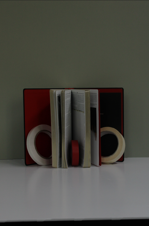
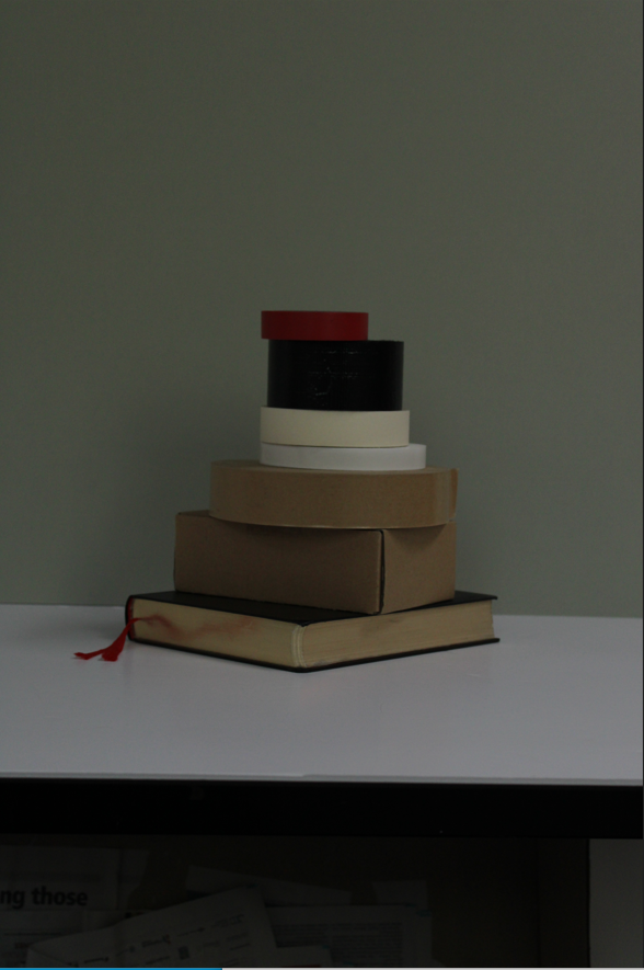
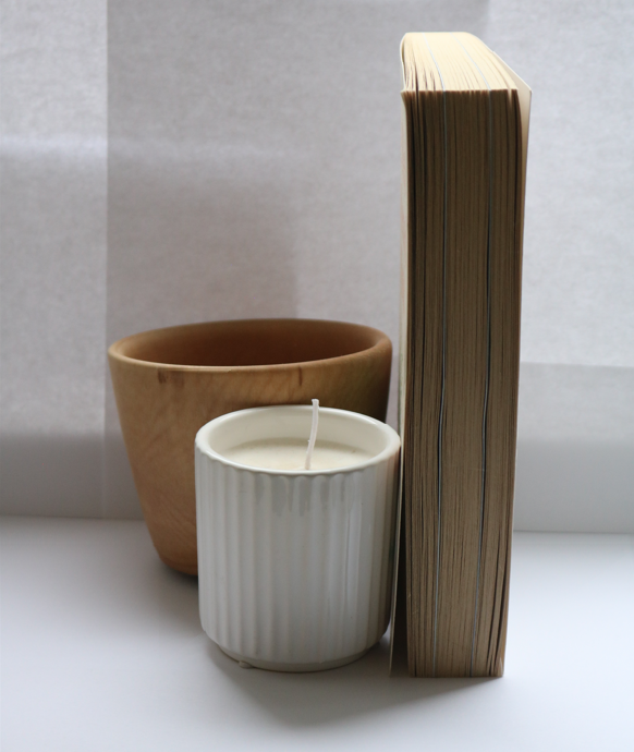
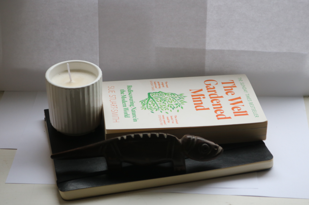
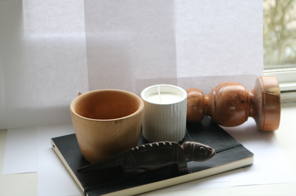
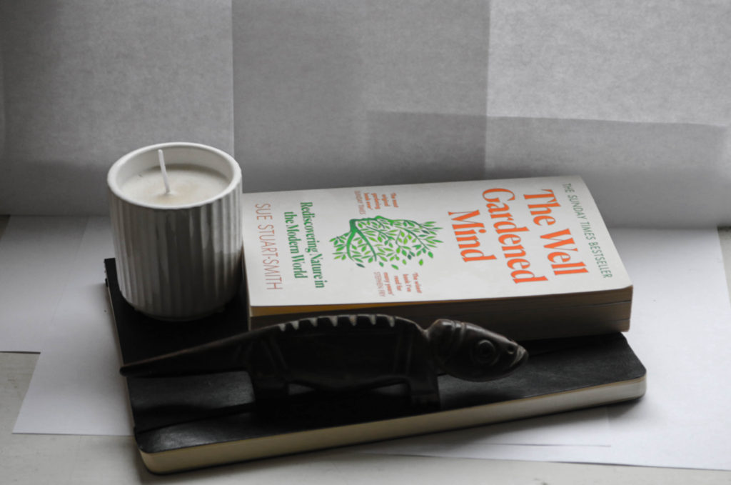
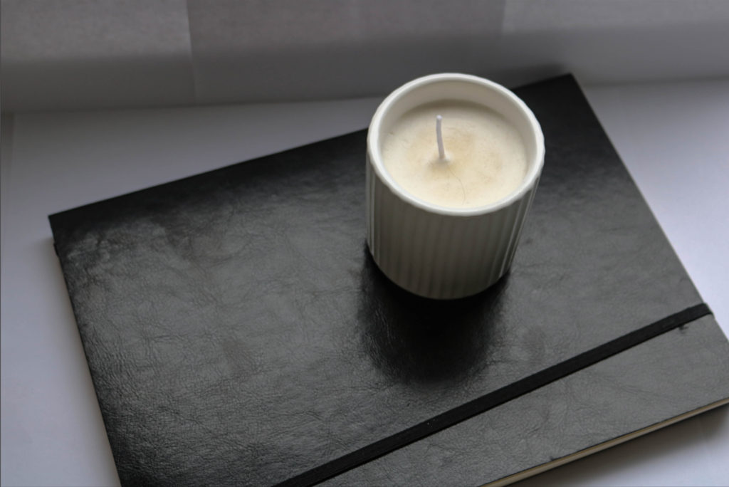
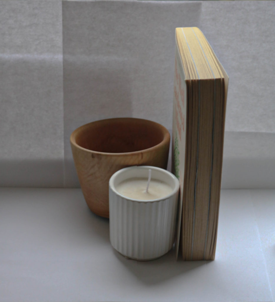
inspired by Mary-ellen Bartley I created some images of my own:
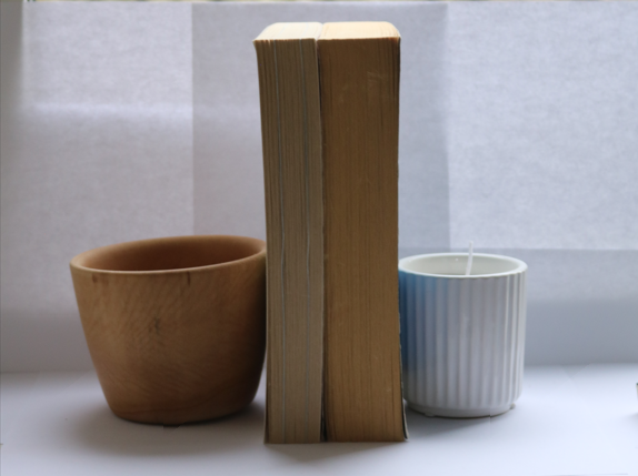
I then edited some of the images on lightroom to make them look more like Mary-Ellen Bartley’s outcomes:
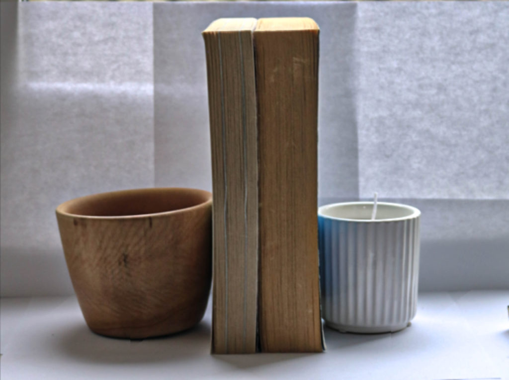

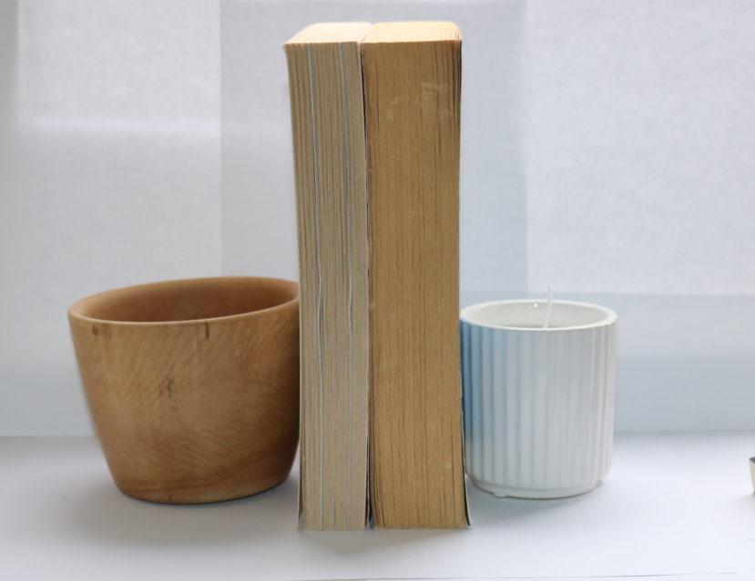
Mary Ellen Bartley is known for her photographs looking at the tactile and formal qualities of the printed book, she photographs stacked paperback books that are minimal minimal and can be used as sculptures.
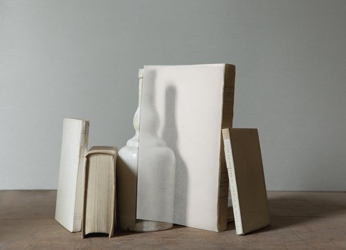

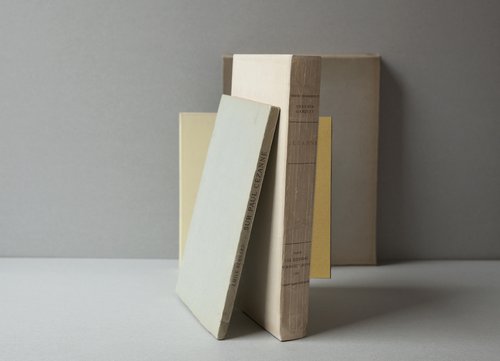
inspired by her unique aesthetic I decided to try and recreate our own version inspired her style: