




Comparative Analysis:

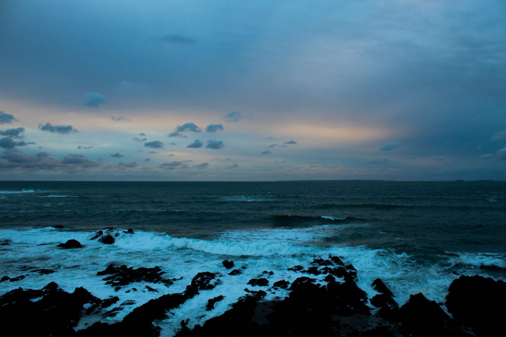
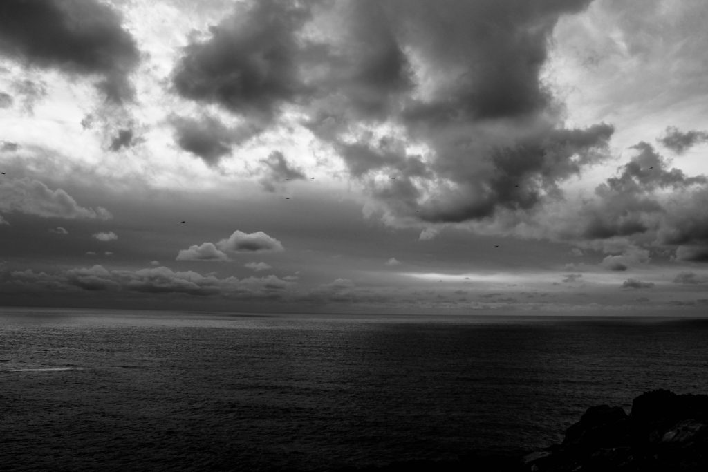
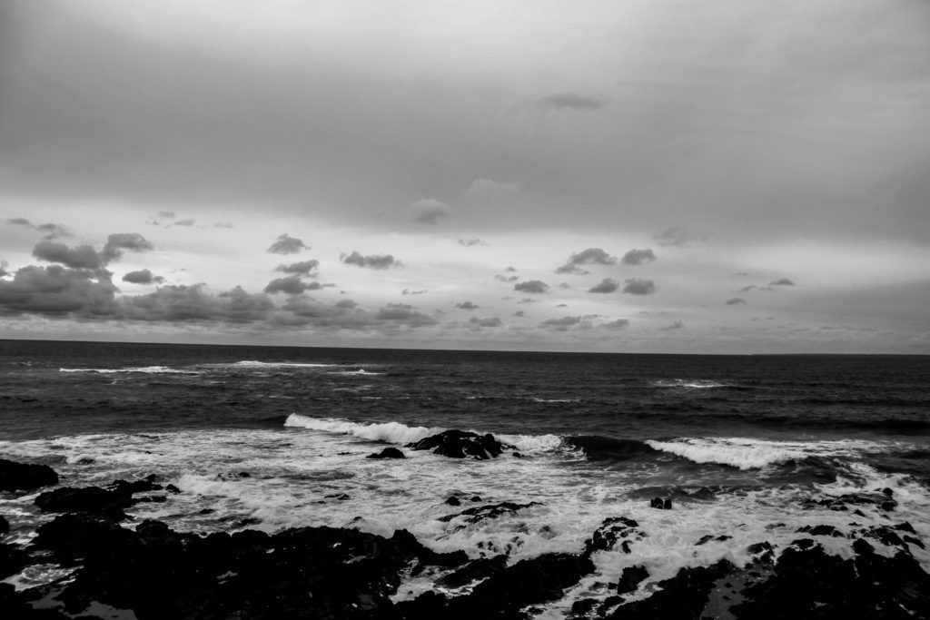
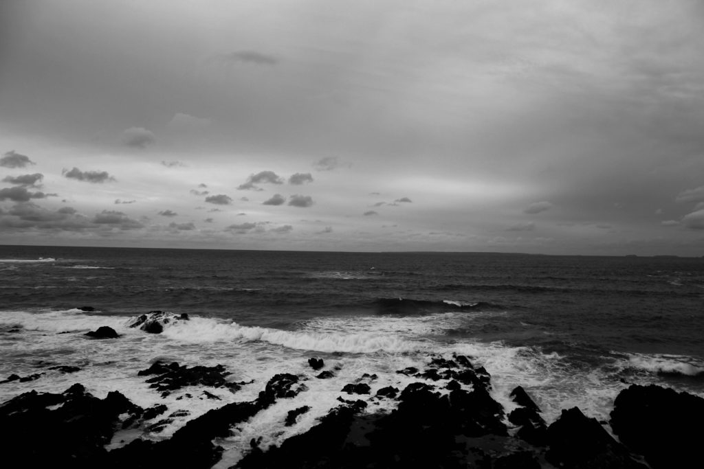
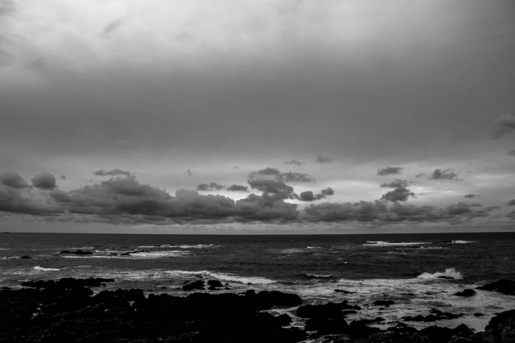
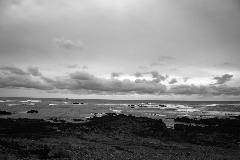
When comparing my image to Ansel Adams I can identify that both of the images are digital, their mise-en-scene presents a coastline on an overcast day. The lighting used is natural for both and they’ve both been taken from a straight-on angle however, my images has been taken from higher up than Adams image. Both images are monochrome and vary in tone. You can see the contrast in tones in both images such as in the clouds and the sky compered to the sea. It is clear that the rule of thirds has been used in my image and Ansel Adams image however Adams has used leading lines, which leads you to the land in the background, whereas I haven’t.

Evaluation:
I think that some of my images related to the theme of romanticism however, I didn’t have a wide angle lens so couldn’t exaggerate the perspective of the landscape. Overall I think I could have done better but I’m not too disappointed with the way my final images came out.
