Landscape Outcome

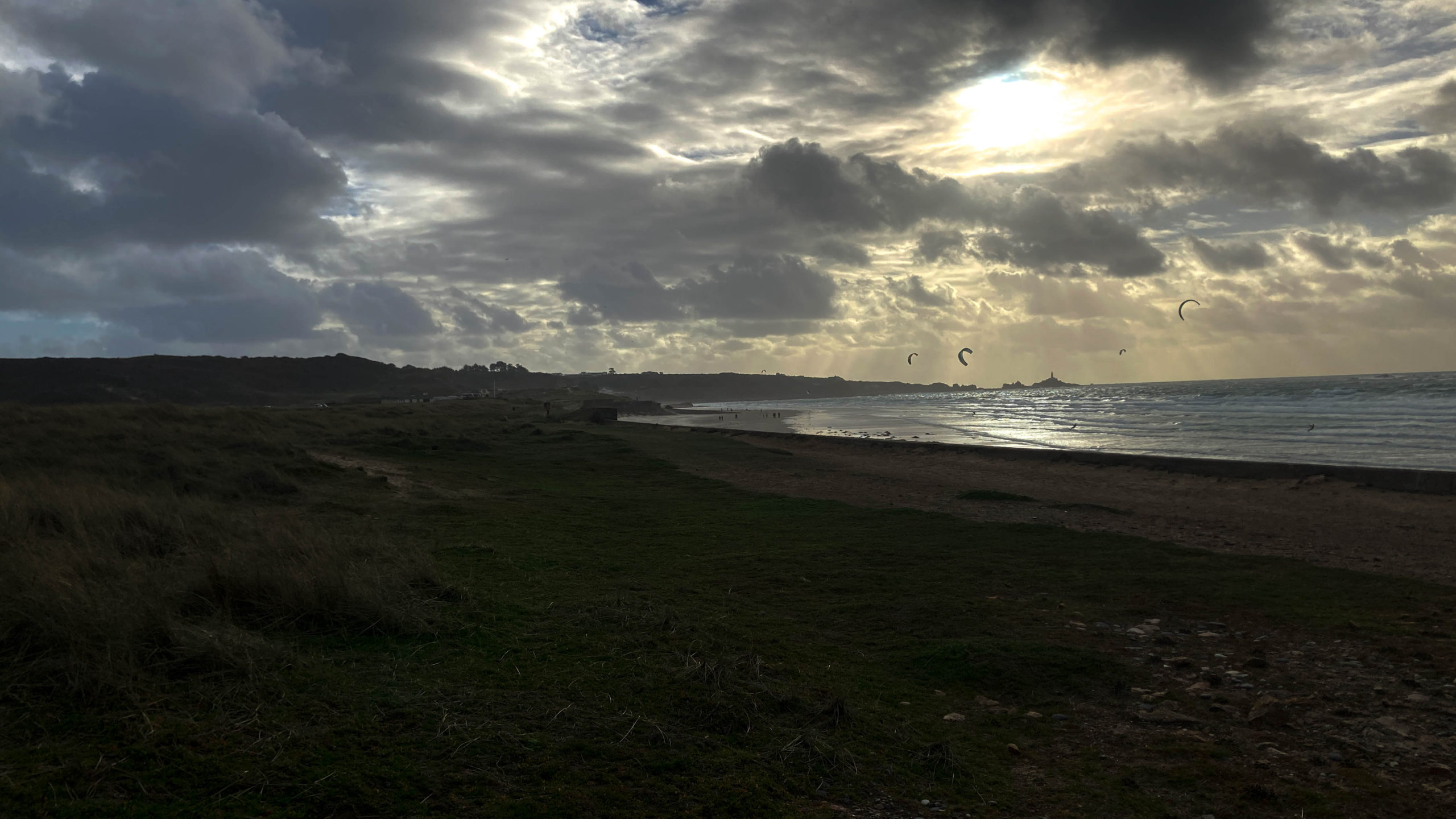
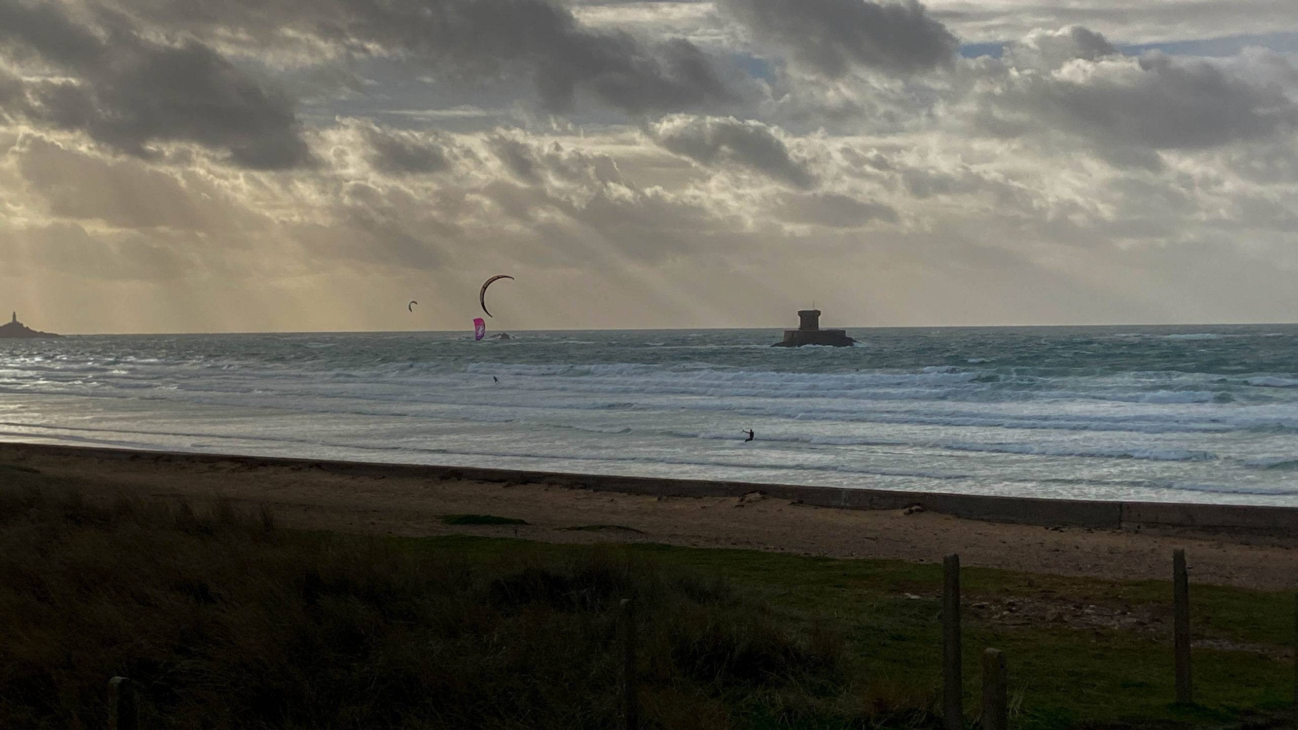
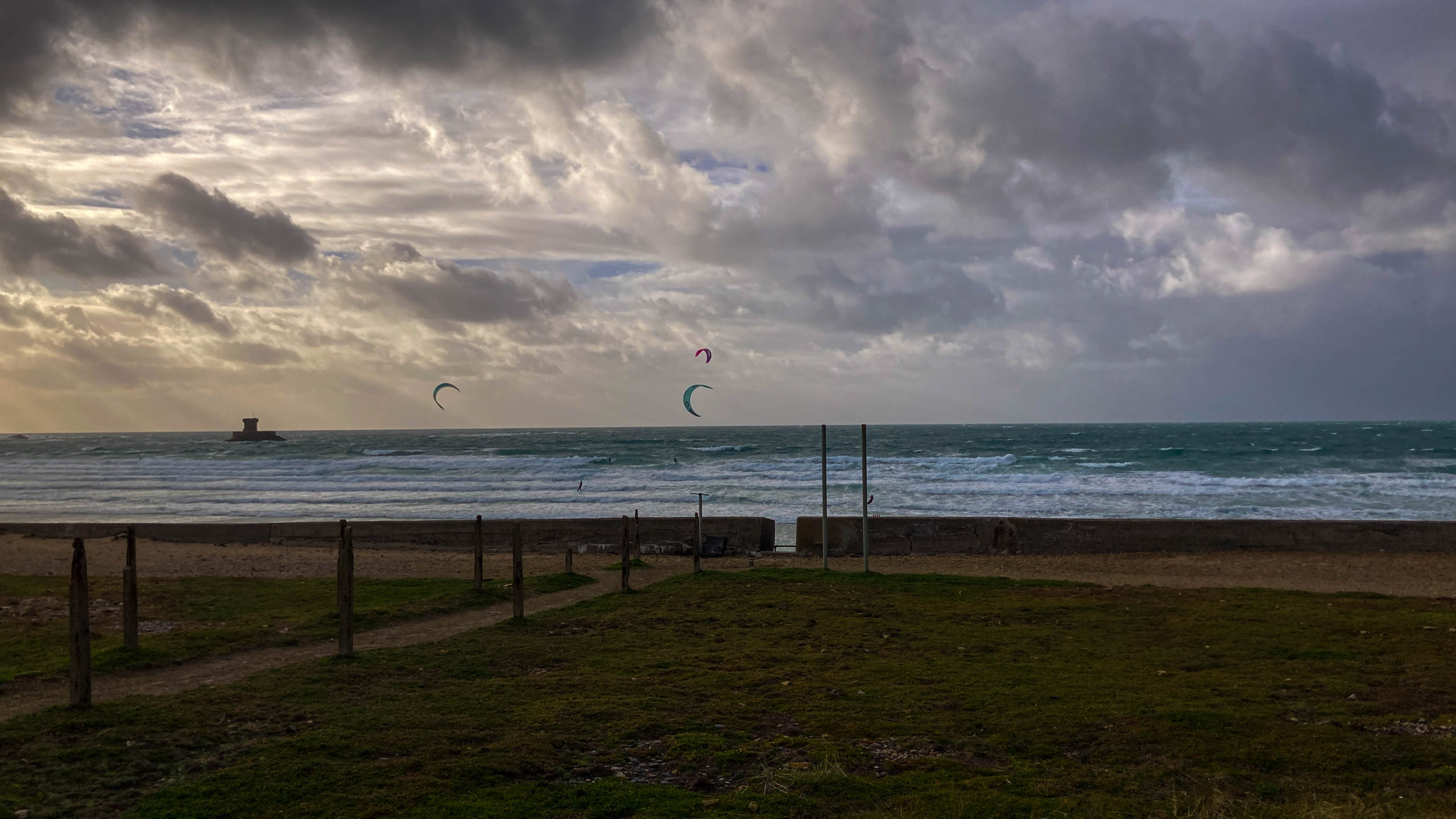
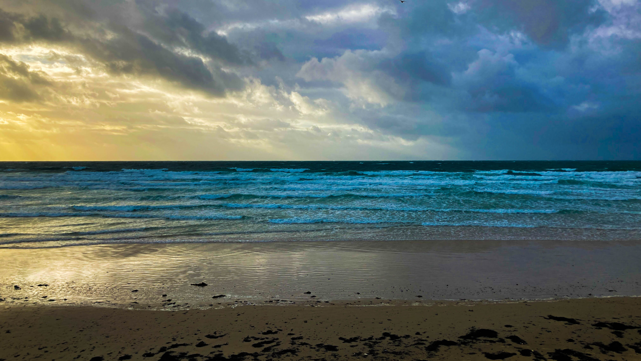
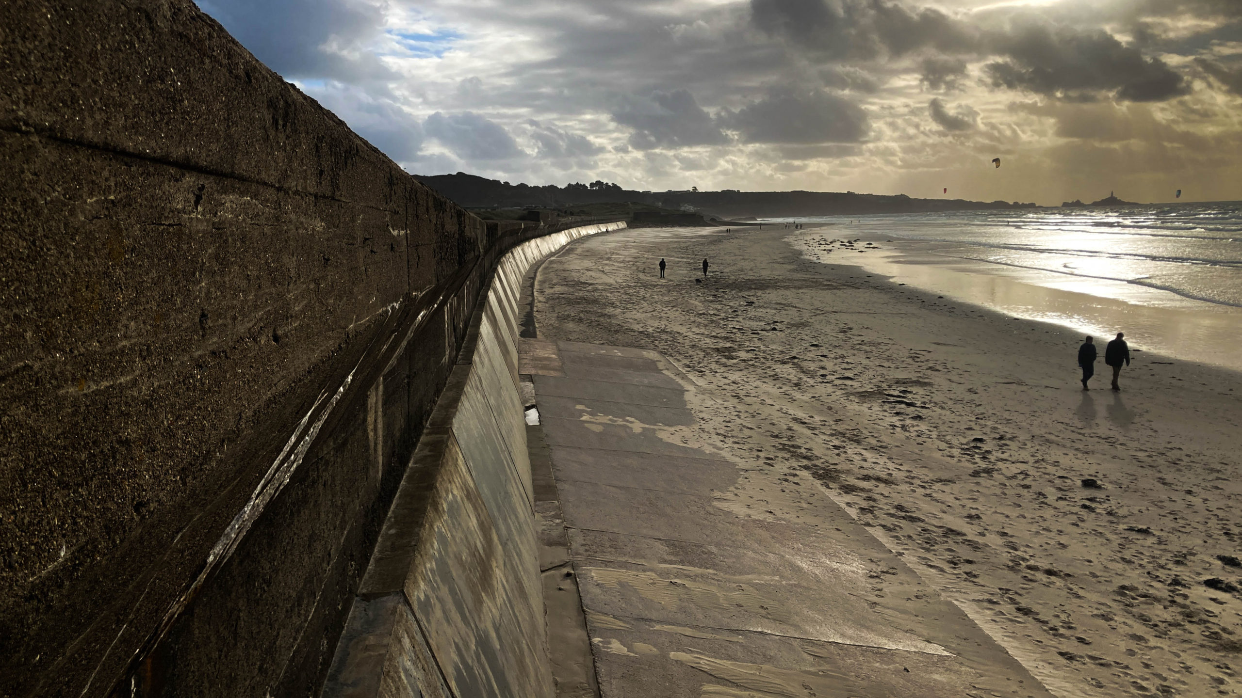
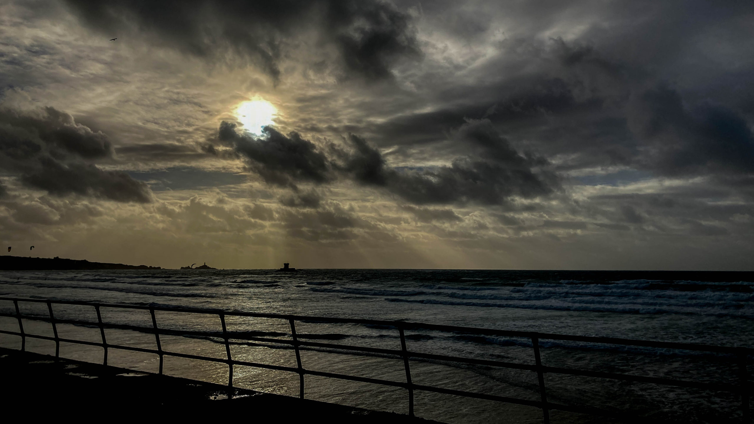
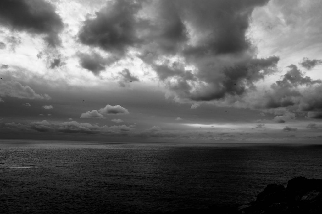
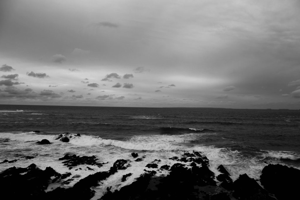
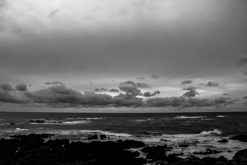
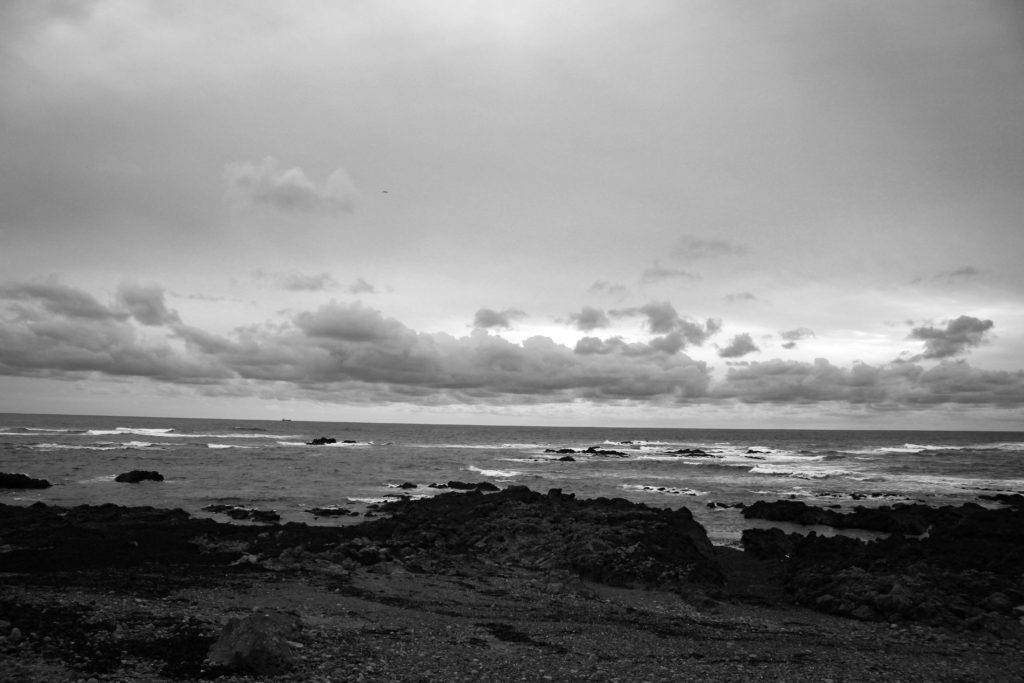
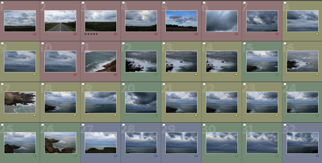
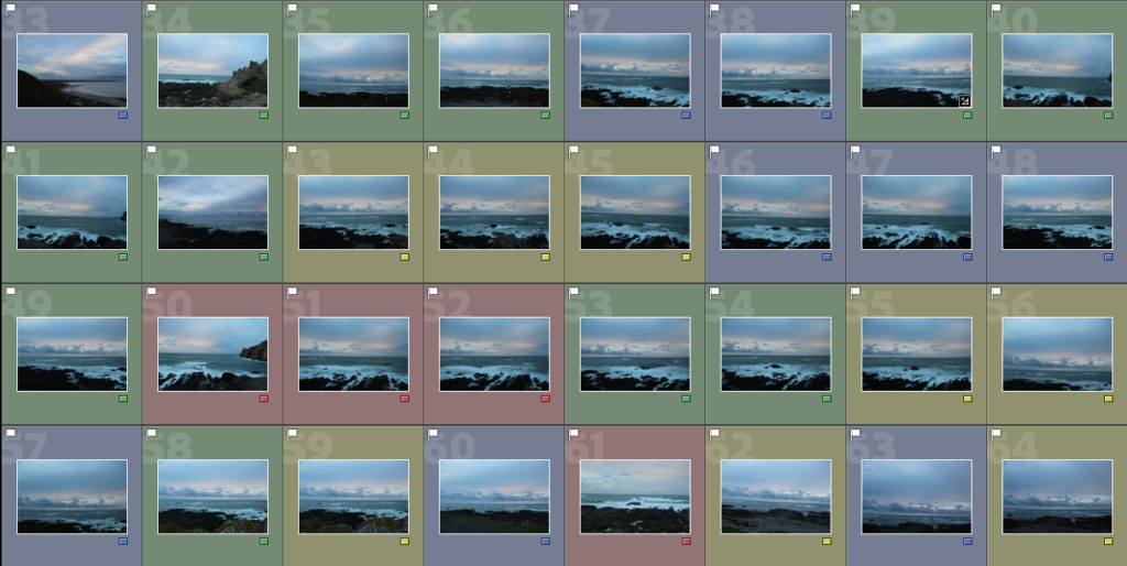
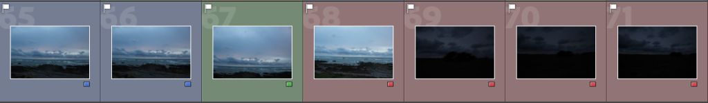
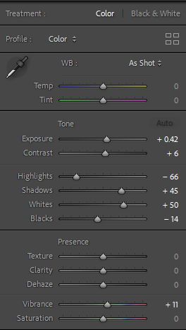
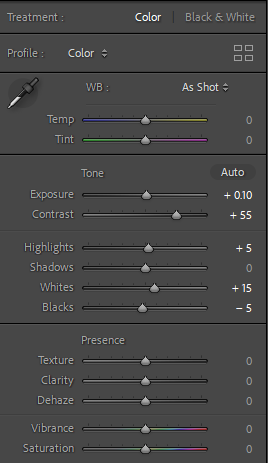
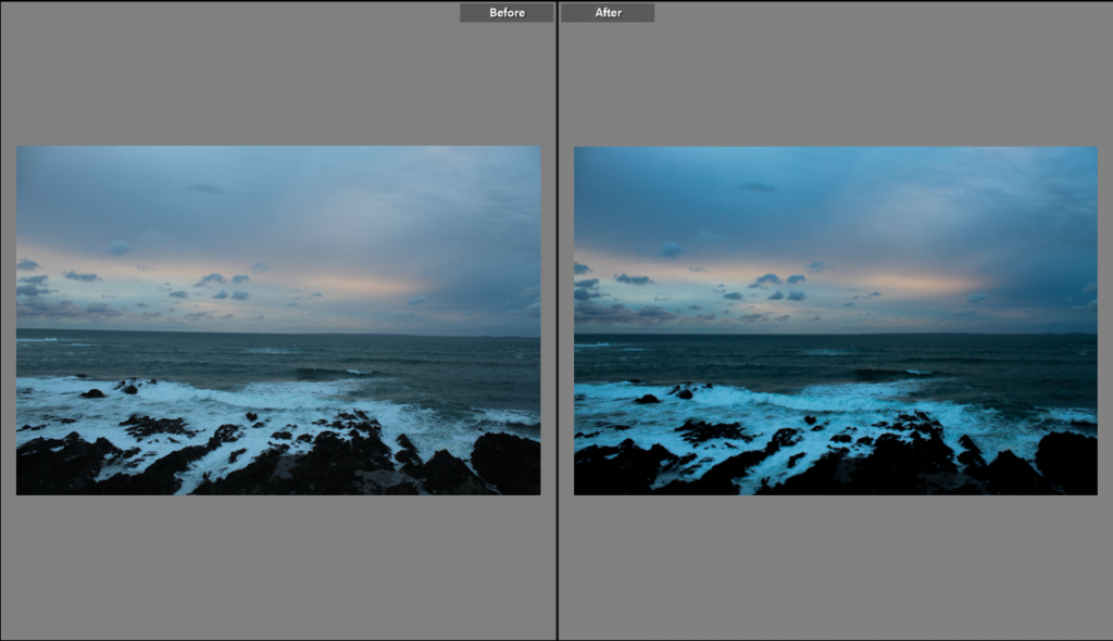
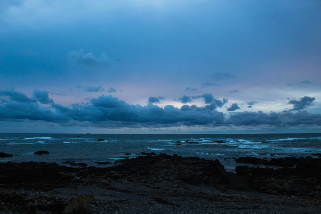
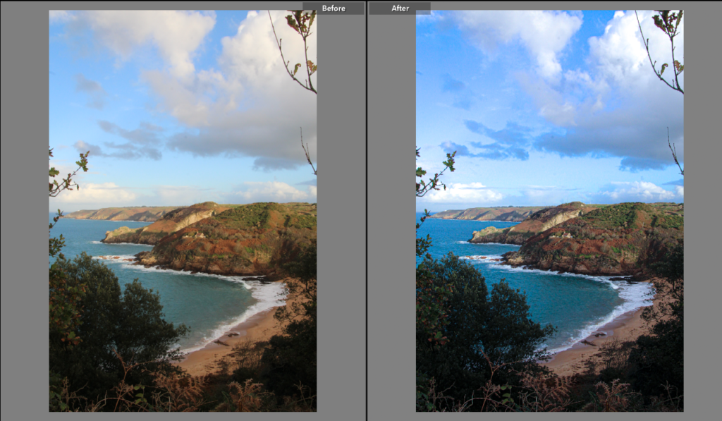
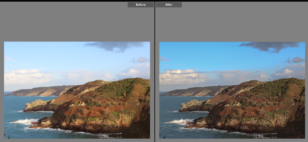
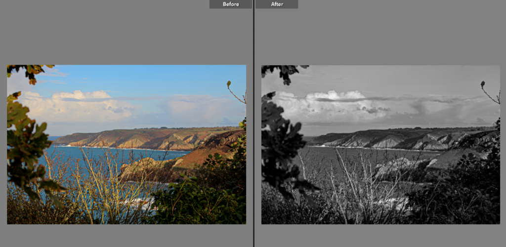
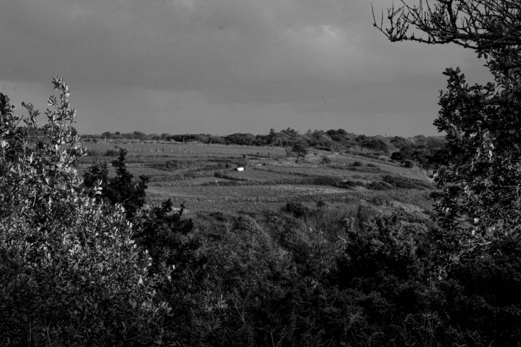
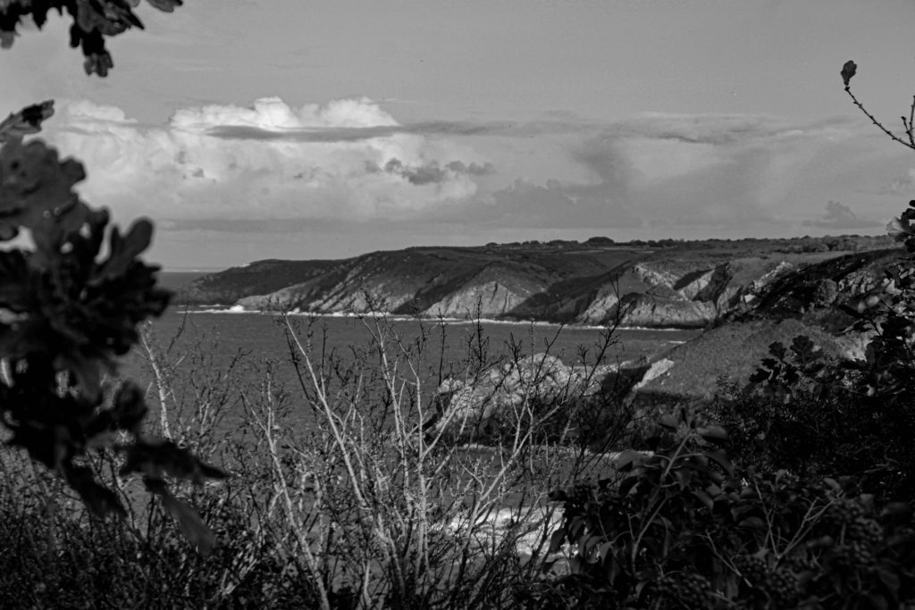
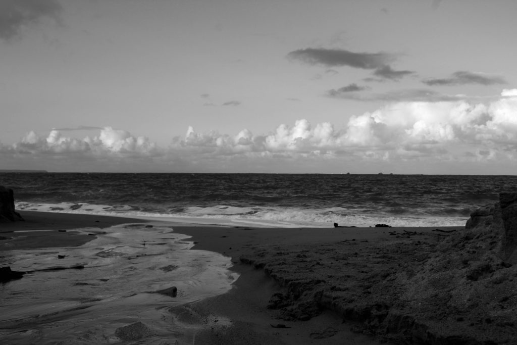
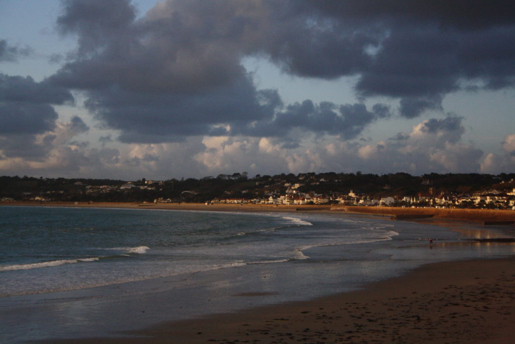
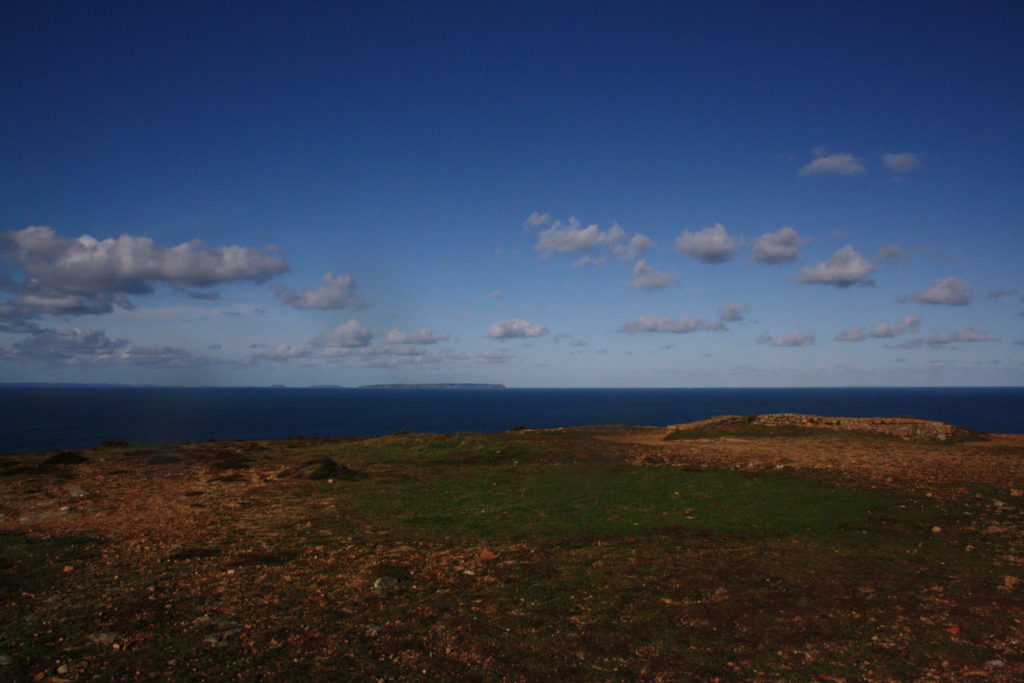
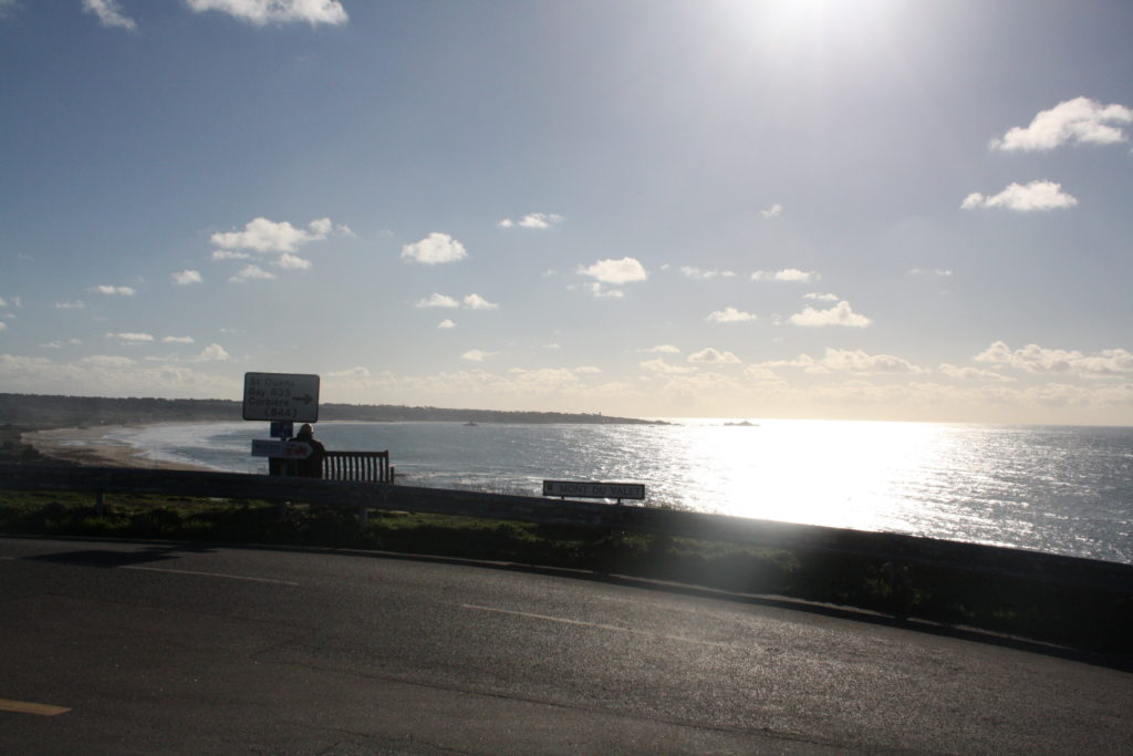
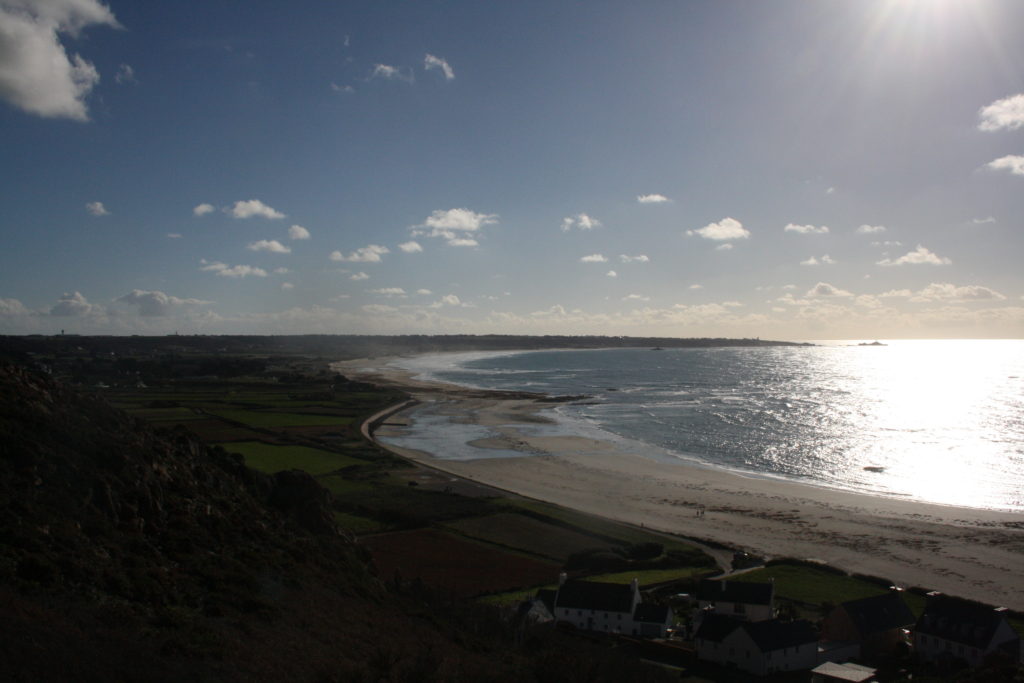
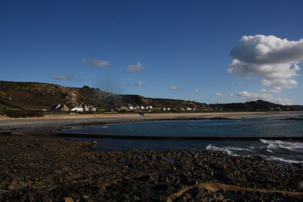
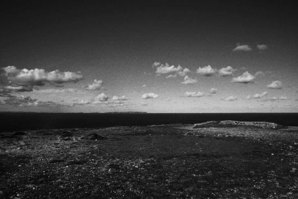
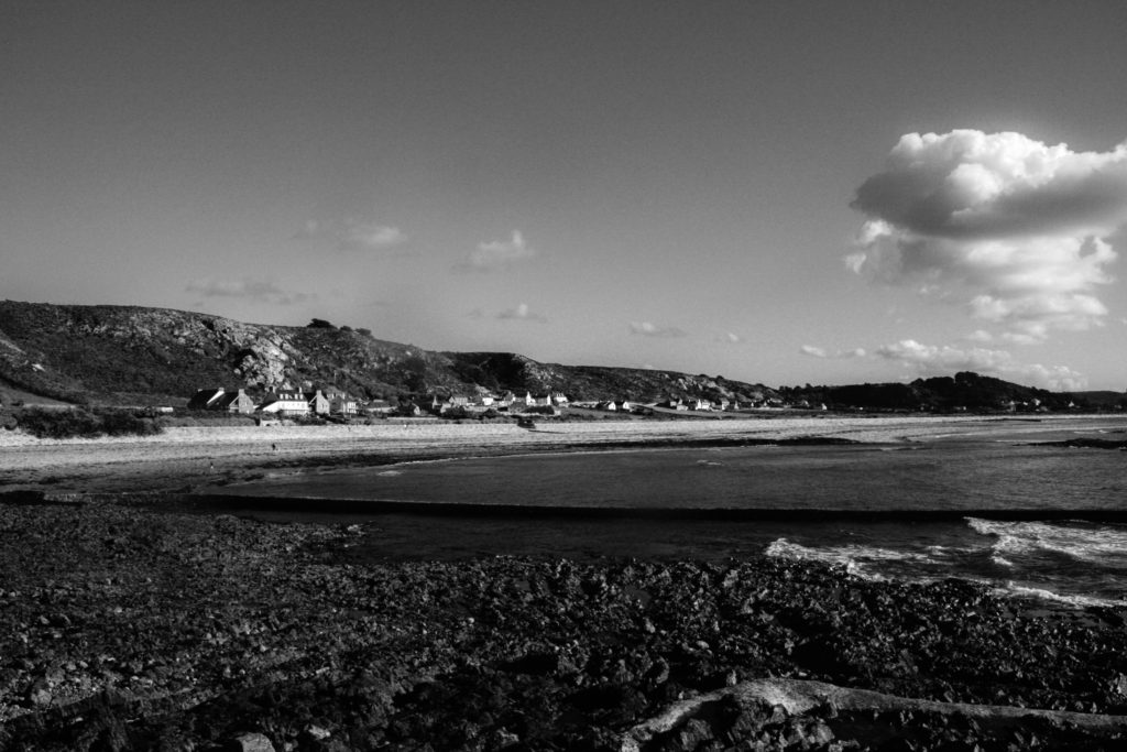
These are all the unedited images iv chosen from a variety of images I took. The sights here include, Greve, St. Ounes, Frige, somewhere near the East-West, and near town. My intention for the images was to capture mainly a peaceful look at first, but to also have other small aspects to the image which might be going on which is not visible at first.

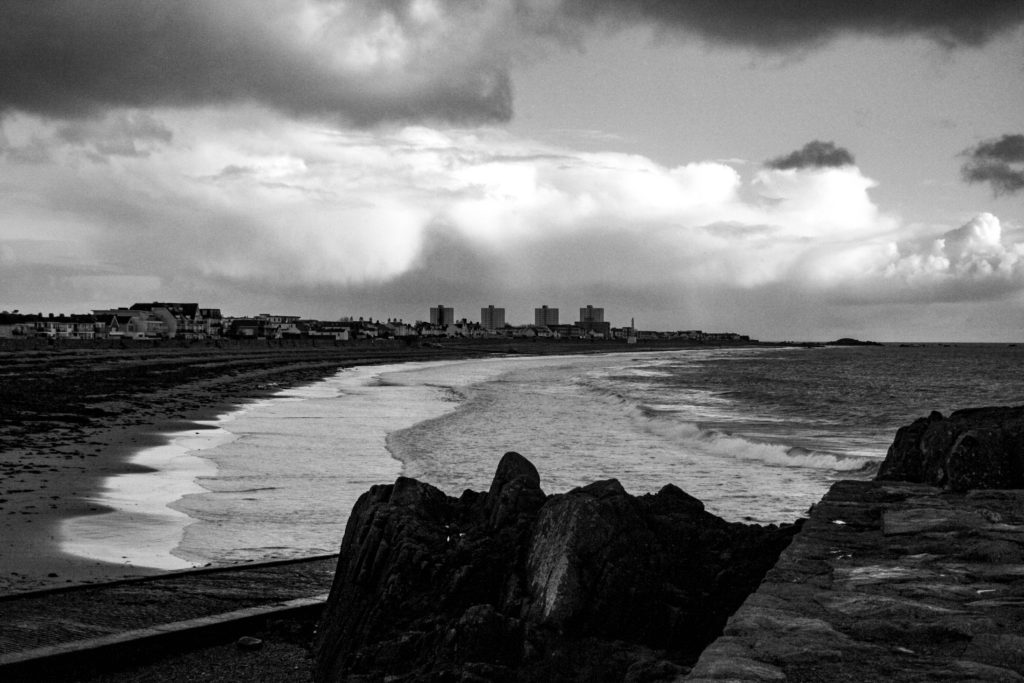
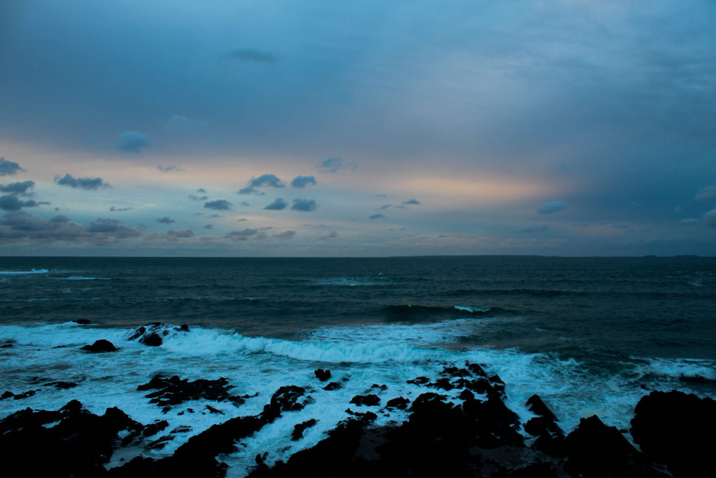
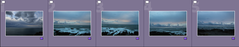
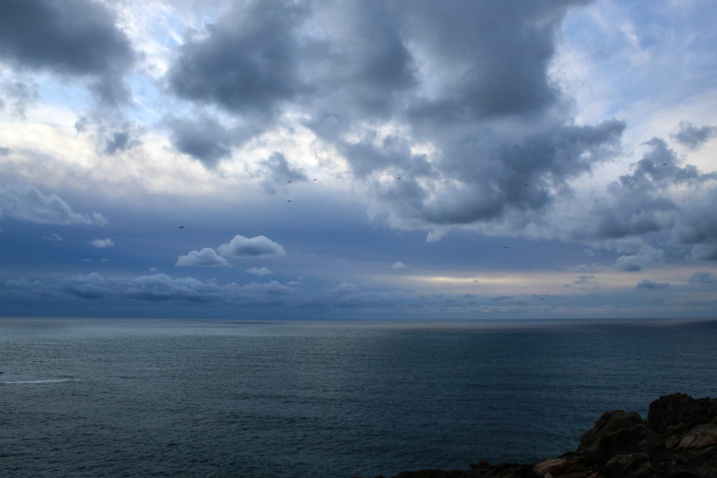
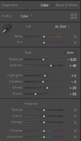
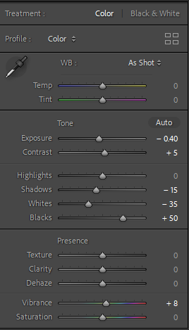
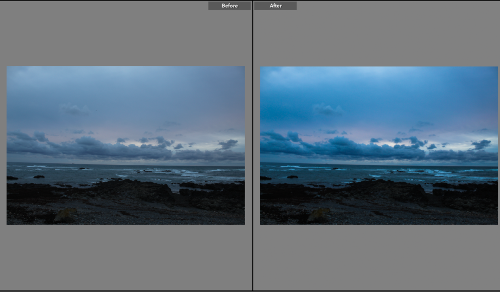
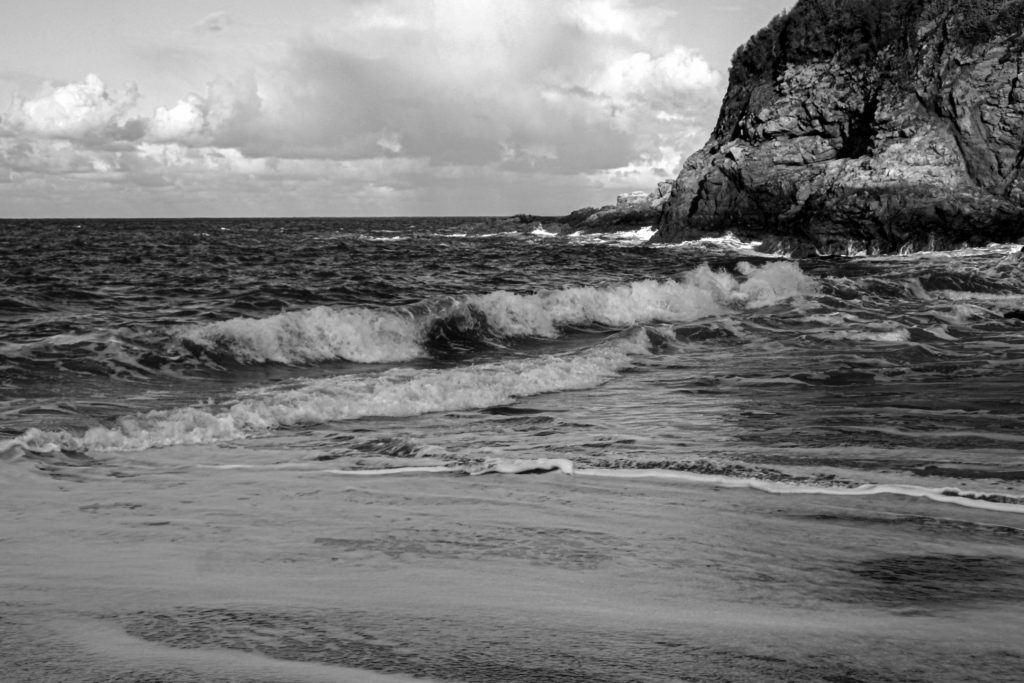
I decided to edit my personal best images, increasing/decreasing contrast, whites etc. Reason being that it allows me to use the whole colour scale (in black and white), all the way from a deep black to a pure white. This is the technique Ansel Adams used, so why not try it myself.

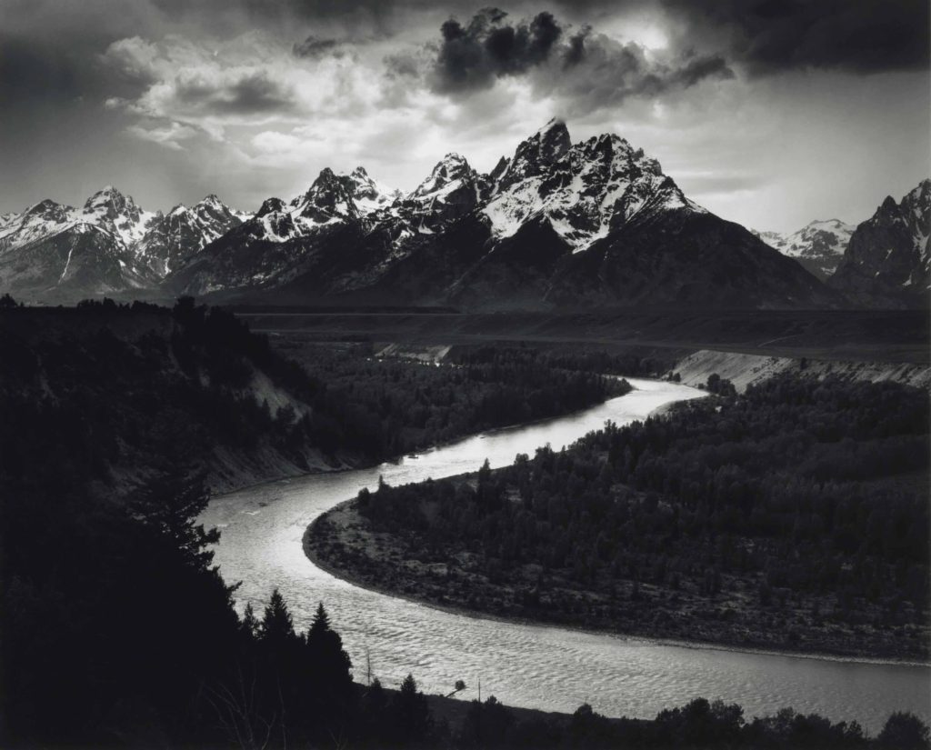
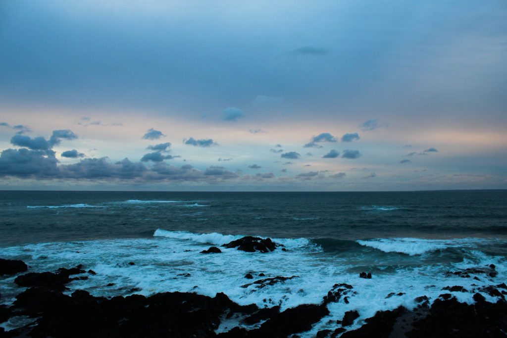
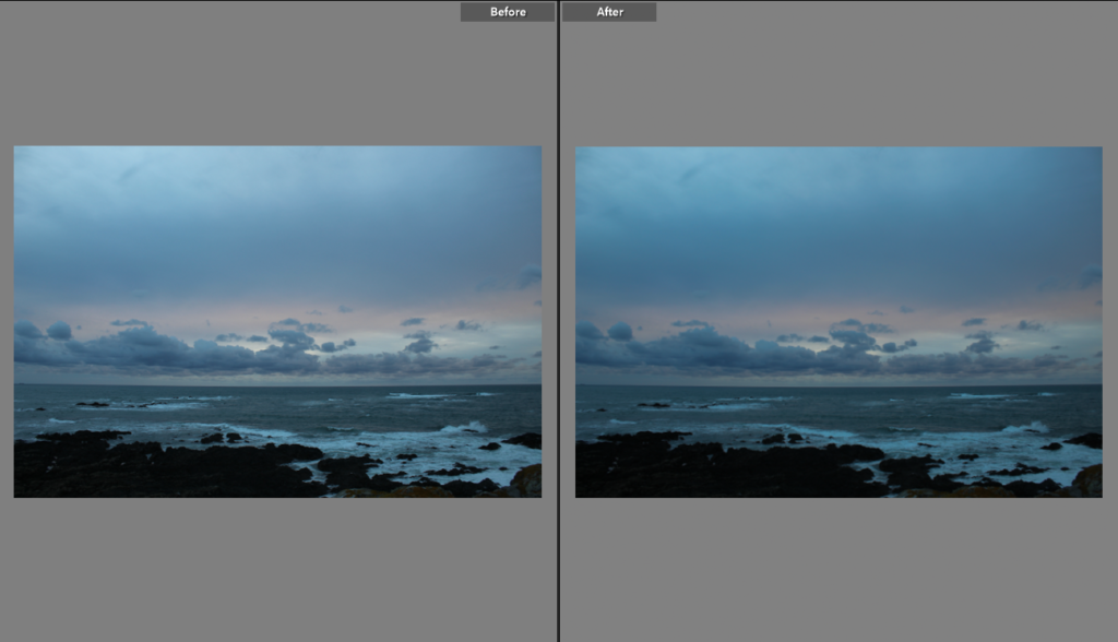
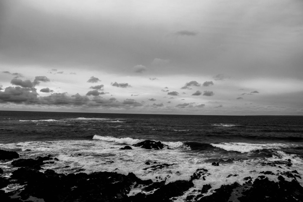
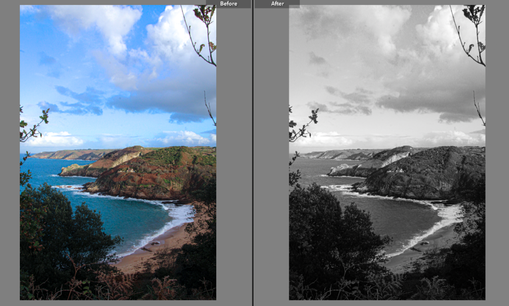
Here is an example. The image on the left is mine and the image on the right is Ansel Adams. Firstly in Ansel’s image he does use the whole tonal scale: so have I. Secondly he has used much more of a contrast between the black and the whites he uses: I also have but to an extent, obviously not as well as the one and only Ansel Adams. And to be honest for my first time even using a good camera, and going out to take semi-proper images, I done quit well. These two images work well together as well, if you focus on the river and where it leads you, you can see that on my image if you follow the shore line you can see the similarity of the layout. I think my image as well as Ansel Adams image that it is very balanced. It doesn’t focus on just one area of the landscape, it includes the scenery around me like the rocks, slipway, and even the shore. I like how it includes a lot but in a way where it isn’t overwhelming, there is a rough texture on the rocks close up to me and around the back of the sea, compared to the soft smooth sky and the clouds, it evens out. I also like how casual it seems, like you look at it and it seems pretty chill.

Landscape Best Photos

I picked out these photos that I thought were best out of my photoshoot. I like them because I feel they best suited my standards. I also like their correlation to Ansel Adams’ work as the photos appear quite sharp and detailed, much like his work. They also feature very good contrast and overall feel very dramatic. I like the shading the clouds have in combination to the sun, it creates a warm and happy feeling.

Romanticism Outcomes

Comparative Analysis:

When comparing my image to Ansel Adams I can identify that both of the images are digital, their mise-en-scene presents a coastline on an overcast day. The lighting used is natural for both and they’ve both been taken from a straight-on angle however, my images has been taken from higher up than Adams image. Both images are monochrome and vary in tone. You can see the contrast in tones in both images such as in the clouds and the sky compered to the sea. It is clear that the rule of thirds has been used in my image and Ansel Adams image however Adams has used leading lines, which leads you to the land in the background, whereas I haven’t.

Evaluation:

I think that some of my images related to the theme of romanticism however, I didn’t have a wide angle lens so couldn’t exaggerate the perspective of the landscape. Overall I think I could have done better but I’m not too disappointed with the way my final images came out.

landscape photoshoot

raw images before and after editing using Lightroom.

Images after turning them black and white from the edited versions done previously. Some images were turned to black and white before so I changed them to show how they would look in colour.

Final images after final adjustments:

This photoshoot was inspired by Ansel Adams and his photography. this is why I have turned all my final images to black and white and edited them in a dramatic way , decreasing exposure, whites and blacks to make the image darker. I wanted to make a high quality photograph and show this in the detail in the clouds or waves. What I focused on and tried to balance was decreasing the brightness enough to show the texture in the clouds but not to make the rest of the image too dark. changing from coloured edited versions of the images to black and white I had to adjust them as the coloured images had settings designated for them.

typology shoot

For this shoot I decided to take pictures of the different towers in Jersey. The towers were built between 1808-1814 and between 1834-1837. Bellow you can my final images that I have placed together to give more of the effect. I have added them in colour as well as black and white as most of Bernd and Hilla Becher’s image are in black and white. Overall I like how my images turned out as I think it looks similar to my inspirations images. However, If I were to retake these image I may choose a different topic to photograph as not all of the towers are the same as some have been built around or painted, and some are not accessible anymore as they are on private land etc. This meant that couldn’t get as close to some as I could to others meaning the towers are at different distances in the images which is a key part of the Becher’s images. Also they didn’t quite match my inspirations as all of my images were taken at different time of the day. In my images in colour you can see that a few of them have the sunset in the background and others have blue sky, some brighter than others. However in black and white I don’t think it is as noticeable. I am pleased with my images but think that they could be improved next time.

inspiration images
my images
my images

still life final images

I personally life this image as the editing I use is quite unique and gives the illusion of an x ray which I think gives quite a creepy tone to the image.

I was personally not a fan of this image as it do not like the purple colour as it does not go well with the dark shadows .

PHOTOSHOOT TWO

This is a photoshoot I took in the summer of 2022, however I believe it links with my landscape project. The harsh waves at St. Ouens beach creates the image more fascinating, interesting and more appealing to the eye. When I come to editing these photos I will change a few to black and white to see the results, however I would like to experiment with the hues and saturations to see if I could make my images for vivid and dramatic in colour.

SELECTING MY BEST IMAGES

In Lightroom Classic I was selecting my images with the ones that have the most powerful waves, yet fit with the composition. The images marked red, the waves where distracting from the landscape of the sunset or blocking the natural light creating an awkward image.

ISO and White Balance

Digication ePortfolio :: Tetiana Nagorna :: ISO/White Balance settings

High ISO settings are useful for capturing fast action in poorly or unevenly-lit situations. (Taken with ISO 800 sensitivity, 1/800 second at f/6.3.) The white balance setting is used to make the colours in a digital photograph look natural under a variety of lighting conditions. shown in the top

What is WHITE BALANCE in photography – How to set WB

taking photos with high IOS can make your photos look grainy and not look as good as it could be. Also taking photos with low IOS can make your photos look can make your photos look darker.