


This photo was inspired by the photographer Fey Godwin, who took many pictures of different forest landscapes, capturing different lighting in her photos. Her photo includes a clearing with sun rays shining through the trees, the light illuminating a patch of grass in the middle of the photo. I found this composition very effective and decided to try something similar when taking my own photos. I ended up with this image, a small stream flowing through a dense forest. I made sure to capture the sun glowing through the trees from the top corner, reaching the water below. I think the composition of both photos are quite similar, as well as the tonal range present throughout the images. Despite Godwin’s photo being in black and white, the same dark tones in the tree are seen in my coloured image. The sun casts a similar effect, brightening the middle area of the image, and creating an area of focus due to the lighter tones, similar to the artist’s photograph. On the other hand, one of the ways I edited the image was by increasing the contrast of the image, this contrasting with the artist photos as her image appears more hazed, the grass not standing out as much. Moreover, her image consists of a clearer foreground and background, the trees further back appearing lighter and adding depth to the image. In contrast, my photograph captures the curved line of water surrounded in lush woodland, creating a curved leading line running through the image, guiding our eyes through to the back of the image and causing there to be depth in the image. The stream disappearing round a corner also creates a sense of mystery and adventure, adding to the mood of the photo. Godwin’s image creates the impression that she wanted to capture the true beauty and wildness of the forest, using the trees in the background to capture the depth of the forest. I tried to recreate this effect and capture the wild yet beautiful side of the forest.


The inspiration for this paragraph was Ansel Adams, a landscape photographer who sometimes includes abandoned architecture in his photographs, comparing them with the rural landscape around them. He creates this idea of the sublime- how man made buildings break down over time but the nature around them is everlasting. His photo includes a broken down structure with a young tree growing in front of it, a contrast being created between the old, destroyed building and the new life of the tree. I found this concept very effective and perfectly capturing the essence of the sublime, so I decided to photograph an abandoned structure in the middle of a wild, rural landscape- the woodland slowly growing onto the architecture itself. Adams’ also photographed the scene in black and white, something I wanted to recreate in Lightroom. However, instead of black and white, I edited the photo so that it was in blue and yellow shades, since I believed it looked more effective and unique this way. Adams also focused on applying a wide tonal range in his work, which was something I considered when photographing and later editing my image. I wanted my image to have lots of contrasting tones, especially in the trees. Furthermore, I applied the rule of thirds in this photo, composing the photo so that the building appear in one of the thirds so that the other two thirds could be simply wildlife- capturing the idea of there being a lot of healthy, green nature around the decaying building.
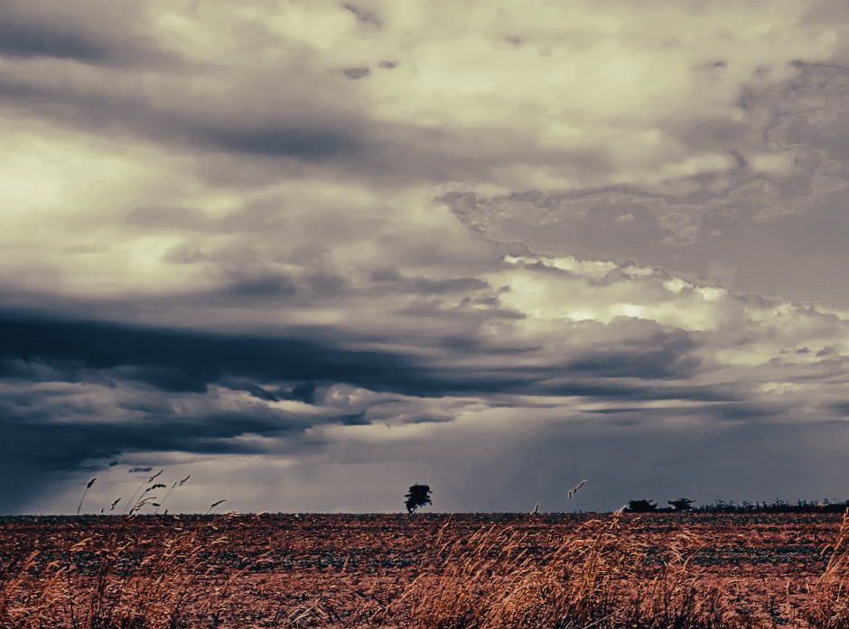
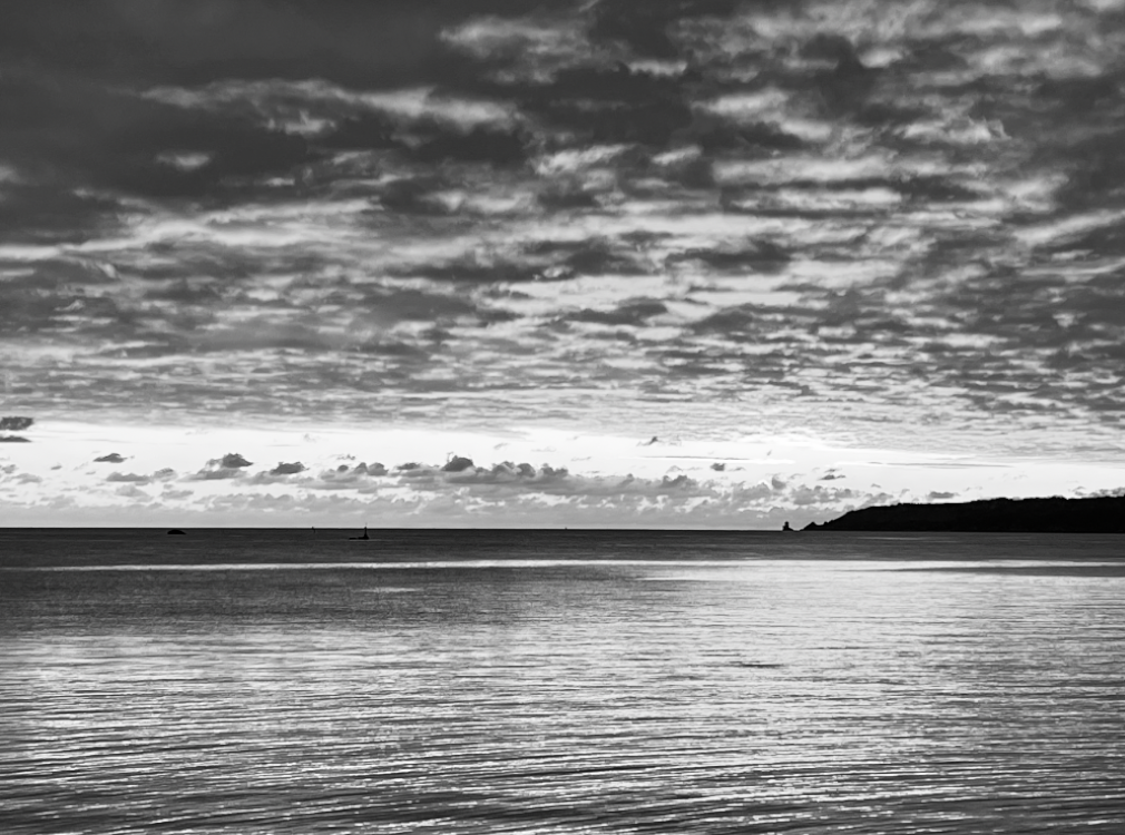
I like this image because of the dramatic clouds and singular tree in the centre. I believe that the low exposure adds depth to the photo and creates a contrast between the two sides. I also like the flat horizon line as well as how you are able to create meanings behind the image such as ‘the calm before the storm’.
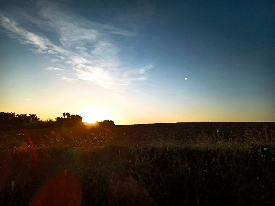
If I were to change anything about the image, I would try to make the field at the bottom of the picture less textured and maybe smooth it out a bit as I feel like the current texture makes it look grainy.


With this image I tried to somewhat style after Ansel Adams. I did this by changing my image to black and white, in order to try to match his style. I also focused in on a flower, however, I thought that a silhouette style would of better suited this photo.
In Ansel’s image he focuses on the flower and has, what seems to be, a mountain in the background. The black and white in the image also helps to bring out the tones, highlights and shadows within it. I also like the angel he chose to use as it allows us to see the whole of the flower and top of the mountain.
I really like the sky in my image as I think it highlights all the tones and vibrancy of the picture. I also like how the silhouette makes the rest of the image stand out. If I were to try this again, I would most likely try to use Ansel’s work as an inspiration more since I followed his idea but still created a very different image to his in the end.

In this image, I lowered the exposure and the shadows, while increasing he saturation, highlights and contrast to make the image more vibrant and lively.


For this picture , I changed the colour to be in black and white by lowering the saturation. This gave the clouds a more dramatic look. I also increased the contrast and lowered the exposure to make the lighter parts of the image stand out.

In this edit, the vibrancy was increased while decreasing the white and black tones of the picture, giving off a more dramatic mood to the image.


Here I aimed to give the photo a lighter and more up beat mood. I did this by increasing the saturation and contrast as well as the white tones and highlights. To make the greenery stand out more I also darkened the shadows and black tones.


In this edit, I liked the original picture but wanted it to stand out more. To do this I improved the clarity and vibrancy of the image while only slightly raising the contrast.


To make this image lighter than the original, I increased the saturation and decreased the white and black tones while also adding some grain to image.


I increased the vibrancy and saturation while decreasing the black tones in the picture to make the sky look brighter and give off a more eye catching effect.


Here, I decreased the saturation to make the image black and white to make the tones more noticeable. While I did like the orange in the original image I preferer the more dramatic appearance of the black and white.

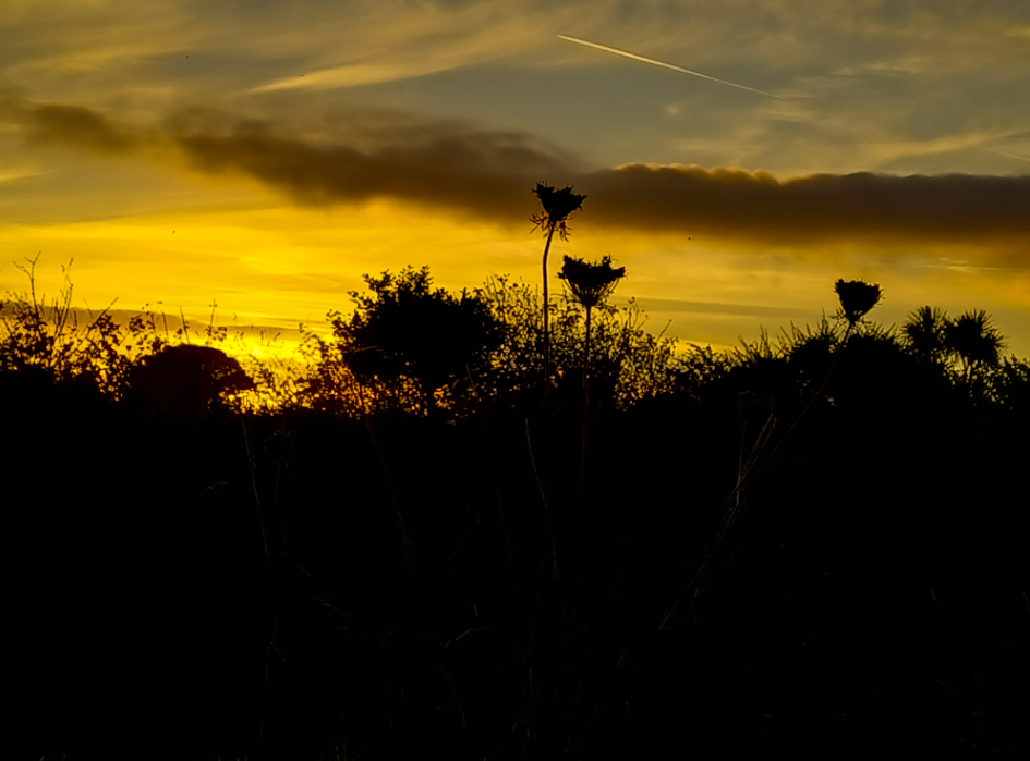
For this photo, I increased the contrast, highlights, white tones, clarity, vibrancy and saturation to make the sky more vibrant and blended, while decreasing exposure, shadows, black tones, texture and dehaze to make the greenery into a silhouette.


In this image, I increased the contrast, highlights, clarity and white tones of the image to make the lighter tones more prominent, all while lowering the exposure, shadows and black tones to give the photo more depth.

This image was turned to black and white and had the exposure lowered. The texture was also decreased making it seem more smooth and blended.

For this edit, I added a purple tint to the picture to make the clouds stand out more against the blue sky. I also decreased the exposure while raising the texture making the grass appear more prominent.


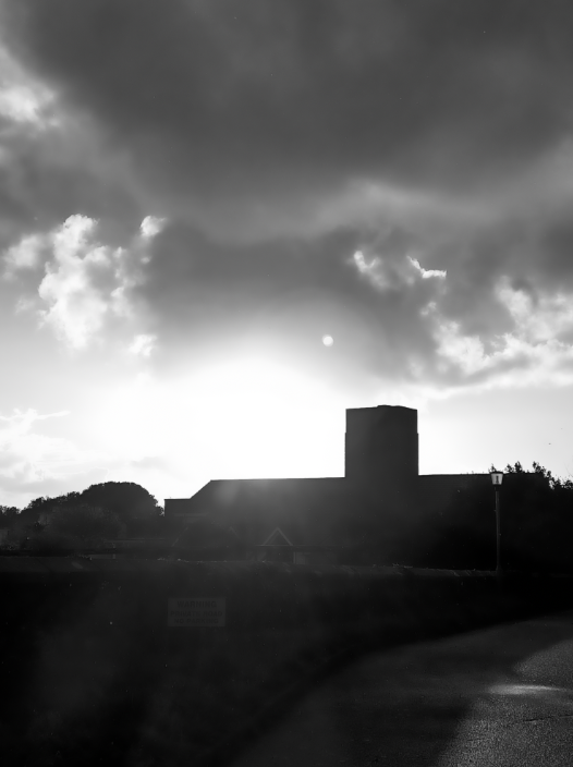
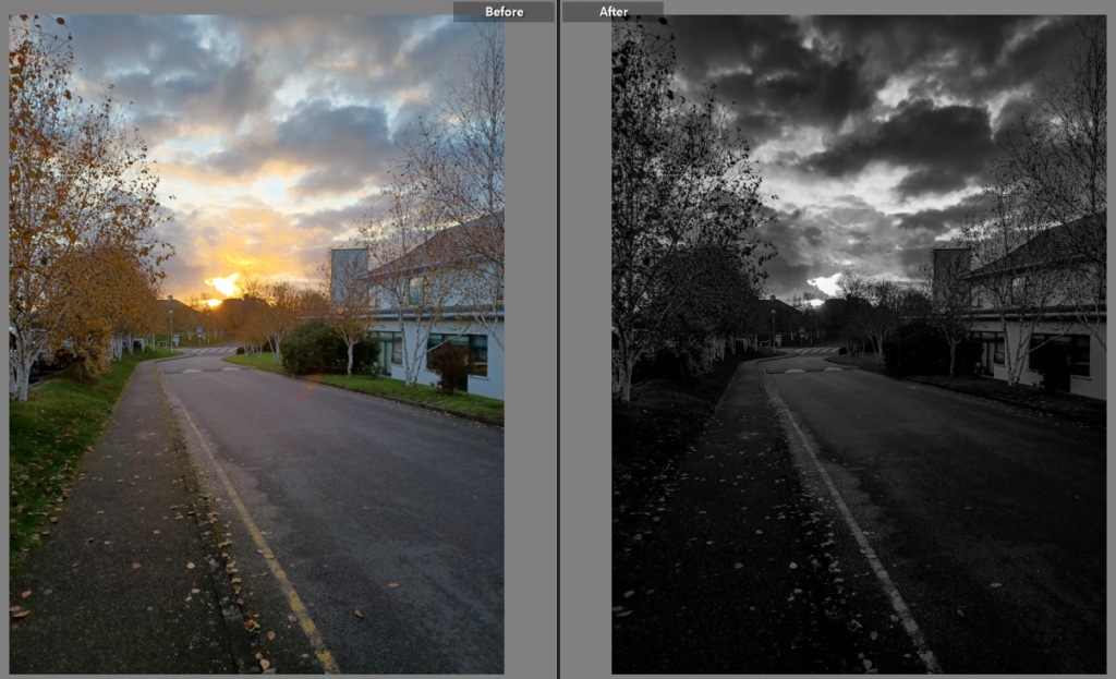
With this image, I wanted to make the sun stand out more, to do this I lowered the exposure and increased the contrast and clarity. This made the building more shadowed and gave the photo more warmth.


To this image I changed it to be black and white to make the shades of the photo stand out. I also cropped the photograph to make it more focused and central. Additionally, I rose the contrast and clarity to make the clouds stand out.

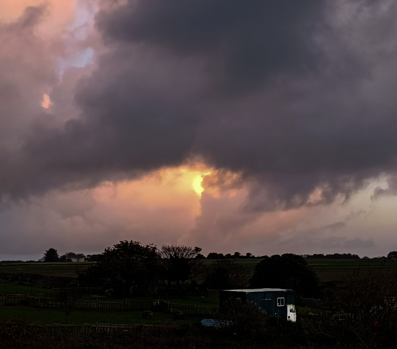
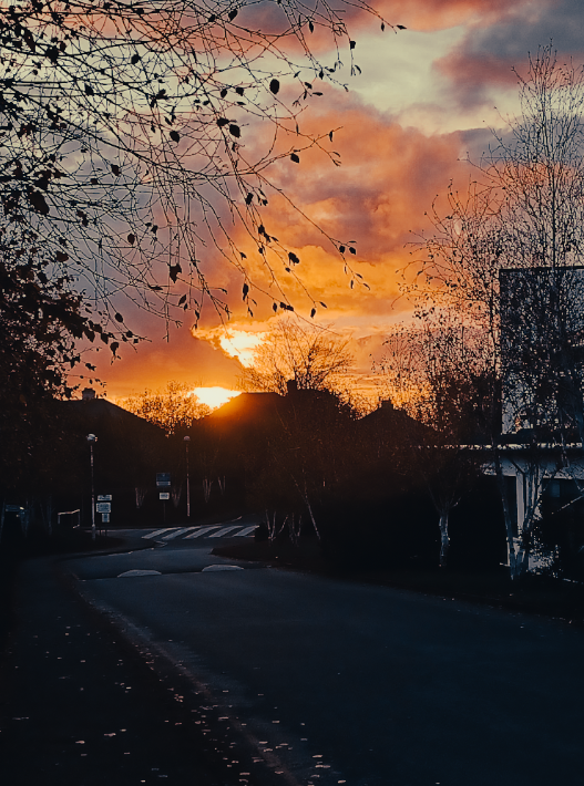
With this image, I lowered the exposure and increase the contrast and vibrancy to make the sun the main focus of the picture. I also made the caravan more exposed to make it stand out against the dark background.


In this picture I decreased the exposure and increased the contrast and clarity to make the light from the sun stand out more.
In this edit, I turned the picture into black and white to make the picture more dramatic while also decreasing the exposure and white tones in it and increased the clarity to make the clouds the main view point of the image.
Here, I lowered the exposure while increasing the contrast to the colour of the orange pop out more. I also increased the vibrancy and saturation of the image to make it a deeper colour than the original.


In this picture I wanted to make the clouds stand out more. To do this I decreased the exposure and white tones of the image and increased the highlights and saturation.


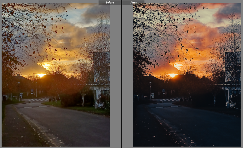
In this photo, I wanted to try and gain a more autumn vibe than the original, to accomplish this I changed the tint of the image to a more orange one and lowered the exposure while increasing the contrast. This made the shade of the photo to be much darker while also increasing the darkness of the shadows.
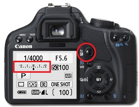
What is Exposure Bracketing?
Exposure bracketing is a technique where, instead of taking a single photo, you take three (or more) that are all exposed slightly differently; normally one is correctly exposed, one slightly underexposed, and one slightly overexposed.
When should you use Exposure Bracketing?
Anytime you feel the scene is a challenging one (too much highlights or shadows) as far as lighting is concerned, e.g. sunsets are usually better taken slightly under-exposed so use exposure bracketing there


Bracketing is a technique where a photographer takes shots of the same image using different camera settings. This gives the photographer multiple variations of the same image to choose from or combine to ensure that they get the perfect shot.
The purpose of this is to cover more of the dynamic range. Bracketed photos are used later to create an HDR (high dynamic range) photo. Some other bracketing techniques include white balance bracketing or focus bracketing.


We experimented with the exposure bracketing inside the school, testing the different settings on the camera. Trying light and dark images by playing with the exposure, but changing the numbers on the ‘M’ setting. Changing the numbers lower e.g -2 the darker the image will be, if the image was +2 it would make the image over exposed.

This controls the exposure compensation, as well as the bracketed shots
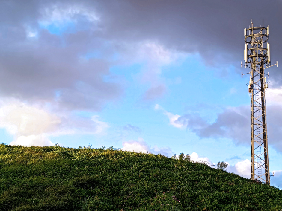
Rural landscape describes the diverse portion of the nation’s land area not densely populated or intensively developed, and not set aside for preservation in a natural state.

Jersey Rural Areas

Areas in Jersey such as lanes, fields, woods and coastal areas.


Possible Triptych prints relating to Ansel Adams


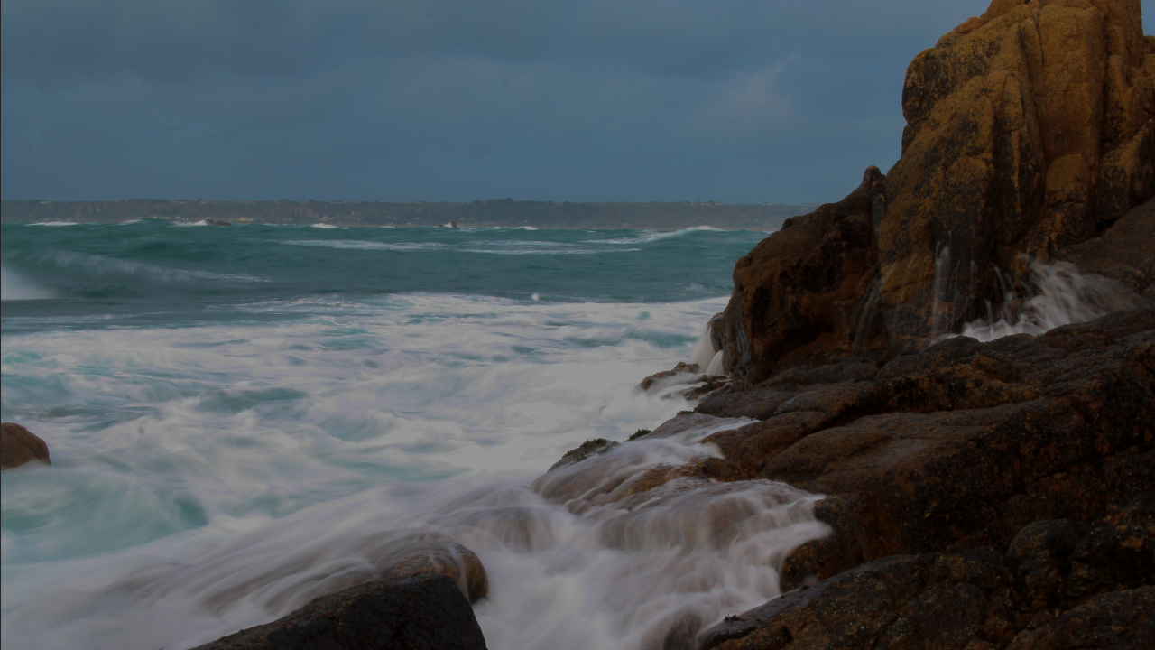
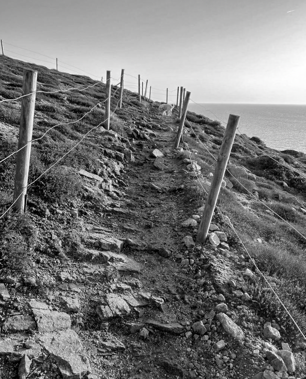
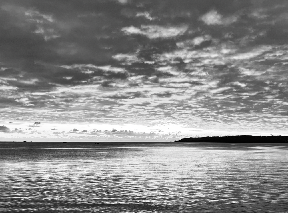
Image Analysis

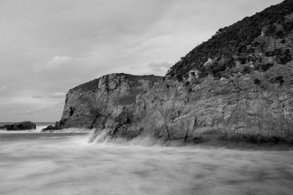
Technical
Lighting: Natural/daylight/soft
Aperture: 18-55 mm f/4-5.6 IS STM lens

Visual
Colour: Monochrome
Tone: Light tones in the sea (IX) /dark tones in the vegetation on the cliffs (III)
Texture: Textured background/ Smooth foreground
Composition
Leading eye: drawn to the wispy effect/contrasted coastal area
Contrast: Cliff area highly contrasted
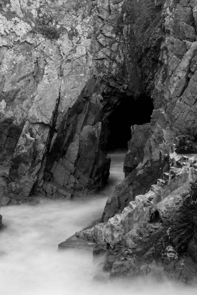
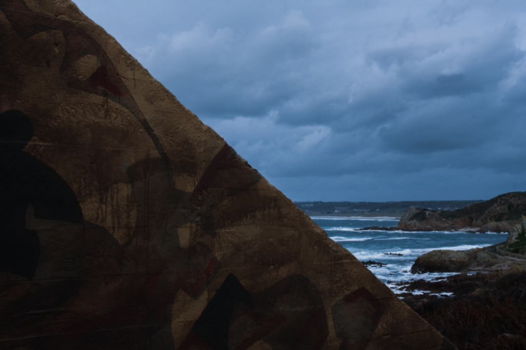
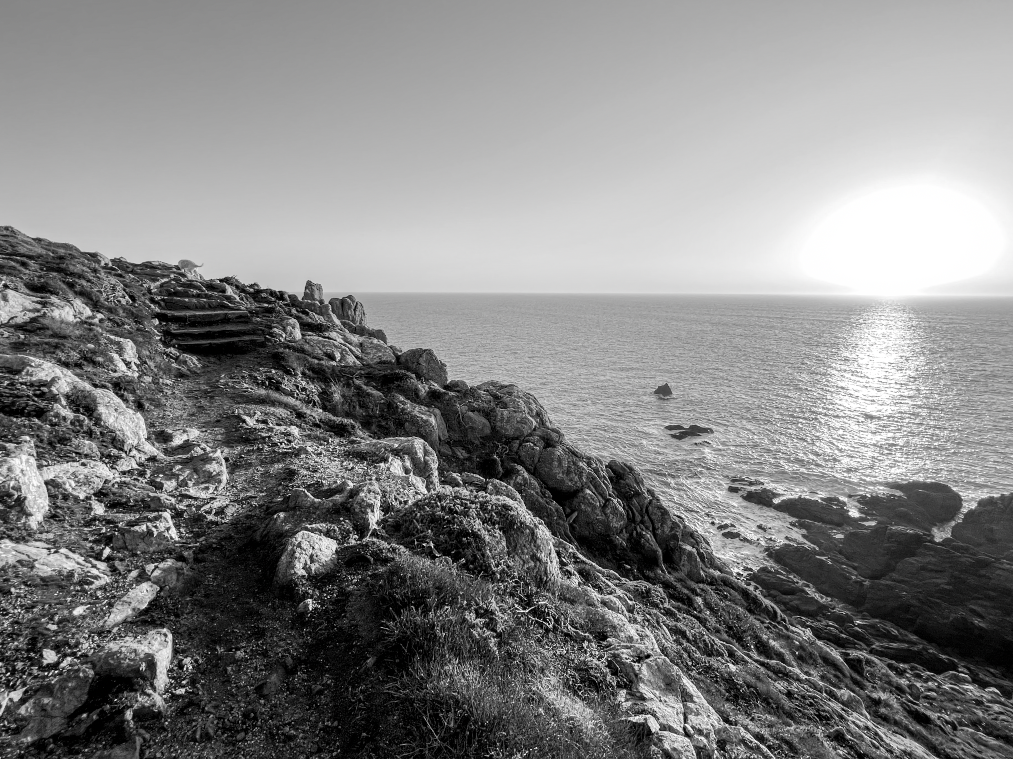
Technical
Lighting: Natural/daylight/soft
Aperture: 18-55 mm f/4-5.6 IS STM lens

Visual
Colour: Monochrome
Tone: Light tones in the sea (IX)/dark tones in the cave (0)
Texture: Textured background/ smooth foreground
Composition
Leading eye: drawn to the wispy effect/the dark tones of the cave
Contrast: Rock highly contrasted

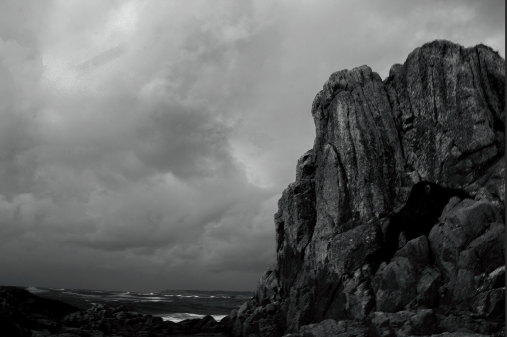
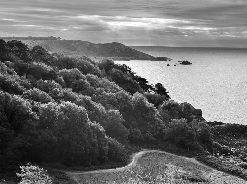
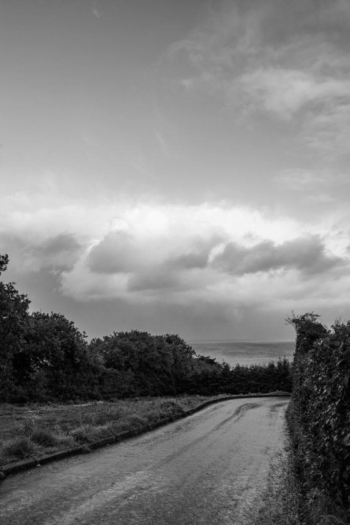
Technical
Lighting: Natural/daylight/soft
Aperture: 18-55 mm f/4-5.6 IS STM lens

Visual
Colour: Monochrome
Tone: Light tones in the sea (VIII)/dark tones in the cliff area (IV)
Texture: Textured background/ Smooth foreground
Composition
Leading eye: drawn to the wispy effect/contrasted coastal area
Comparative analysis with an image by Ansel Adams

Similarities: Composition, layout, arrangement, use of the zone system, background, natural lighting
Differences: Range of tones, foreground, Kodak Brownie/Canon EOS 800D