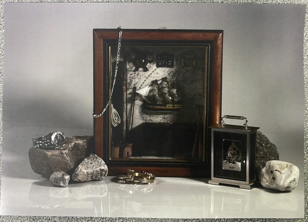
I started out with this image from my still life shoots. I planned to use it as a base for the rest of the image, as it was the most dull variation of the several similar images that I had edited, as it would cause a heavy contrast in the colour palette.
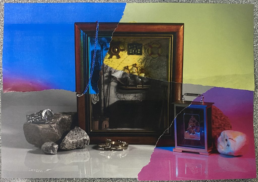
After ripping off some of the corners from the other similar photographs I’d printed in large pieces, I stuck them to the base image after also ripping off the same corners from it. I made sure to try and stick them to the image so that the continuity and mise-en-scene stayed the same; the only difference being the colour.
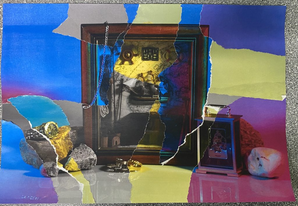
I then gradually implemented smaller pieces ripped from the other photos, until I was left with this composition. I trimmed the edges to make the piece look neater, and left it there.
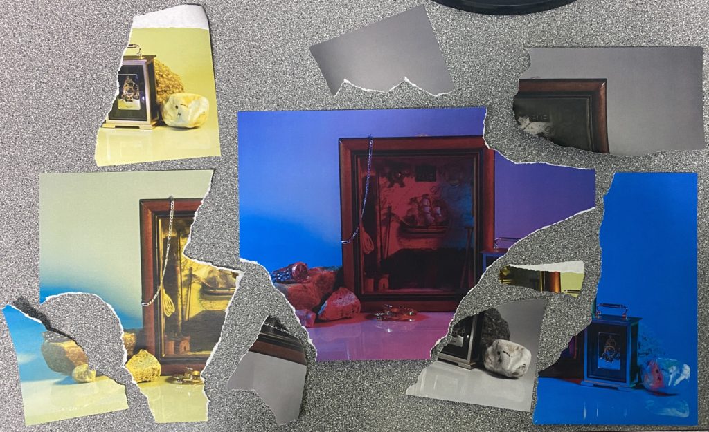
With the pieces that remained from each image so far, I decided to make a second iteration of the original, except I started with the largest piece that was available.
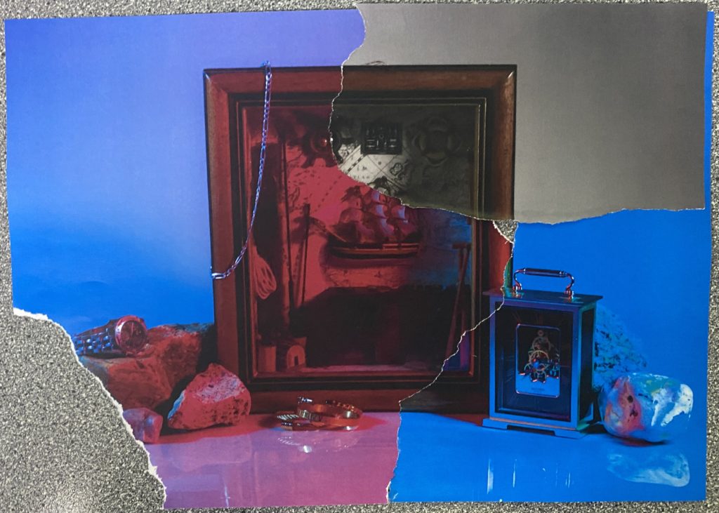
After sticking the first few pieces together, I noticed a small hole just a bit to the right of the centre, which I decided would be nicer to patch from behind to add some slight depth to the work.
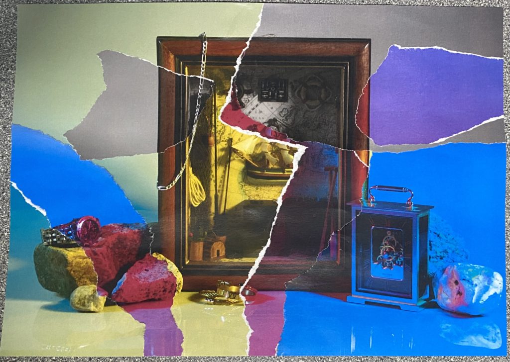
After I’d put all the pieces that I could together, I was left with this; a more vibrant composition that focused a lot less on the darker aspects of the image.
Evaluation
I’d created two similar pieces that varied only in colour, and contrasted vastly because of it. In my opinion, my preference is the first piece (left), as each piece is well placed and functions better as an overall composition, whereas the second piece (right) wasn’t planned and feels a bit too oversaturated with the loud yellow hues, also featuring less smaller pieces, so most of the colours congregate in one area.


