What is a montage:
Photomontage is the process of using two or more images and creating a final image out of them by either cutting, gluing, overlapping, editing or rearranging them.
Some of my own:
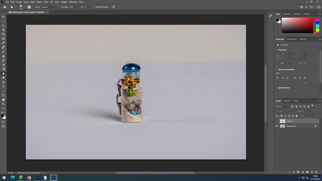
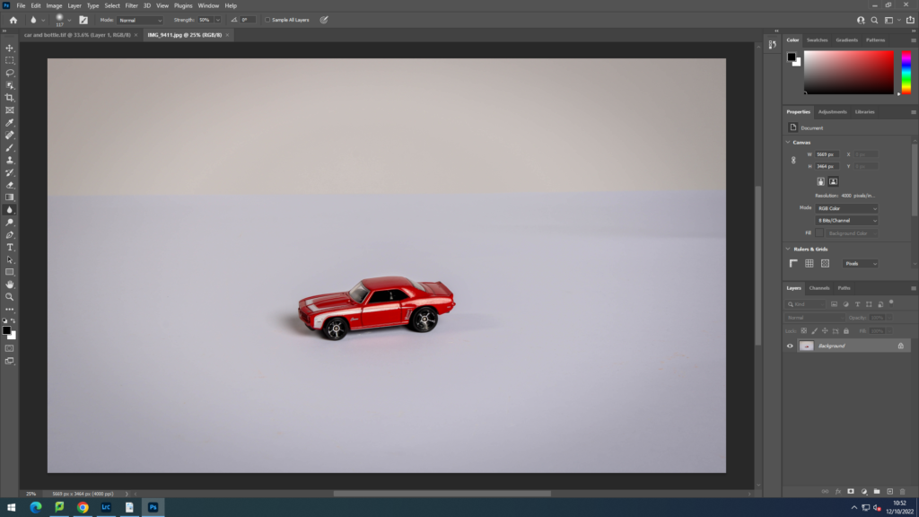
Firstly I opened up two of my images that I liked and that I thought went well together, in this montage I used a toy car and a little bottle with sand and shells in.
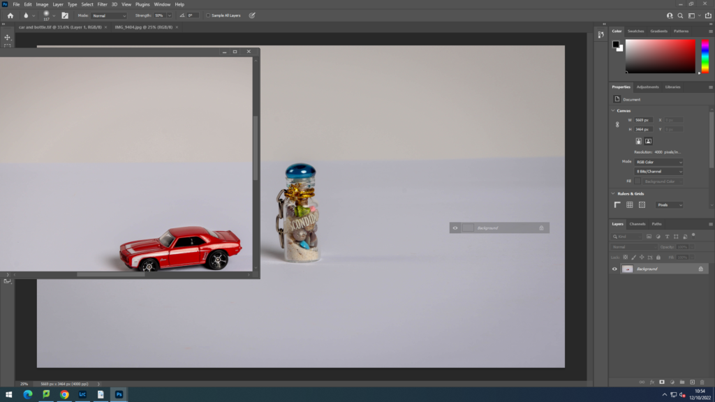
I then dragged one image on top of the other and then resized it and placed it where I wished it to go.
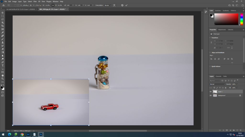
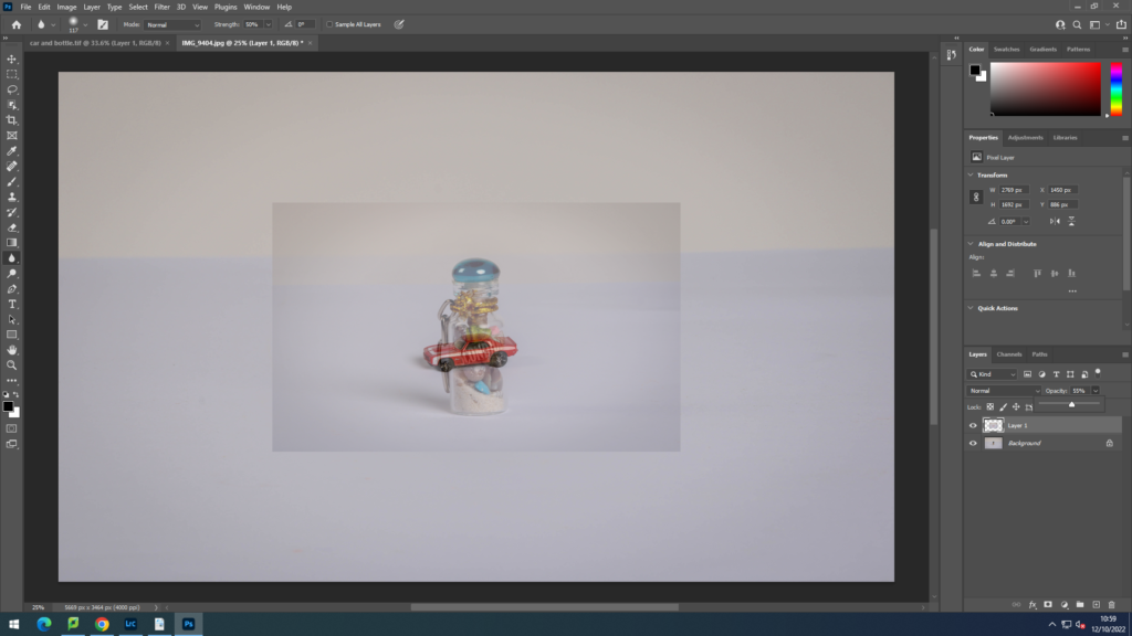
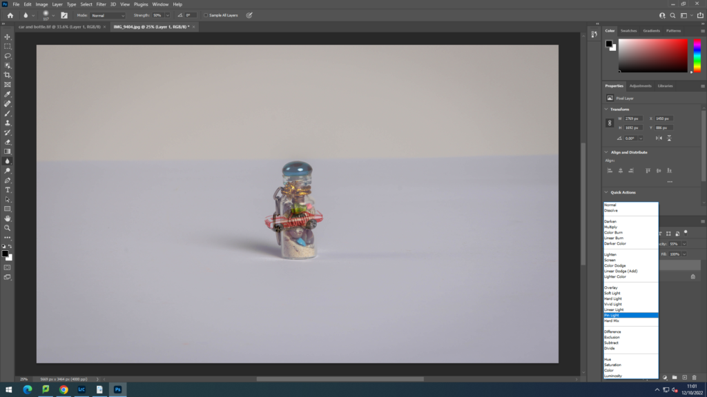
I then changed the opacity level to 64% so that the image was more of a blur. To blend the background I then changed the layer from normal to pin light to leave the car by itself.
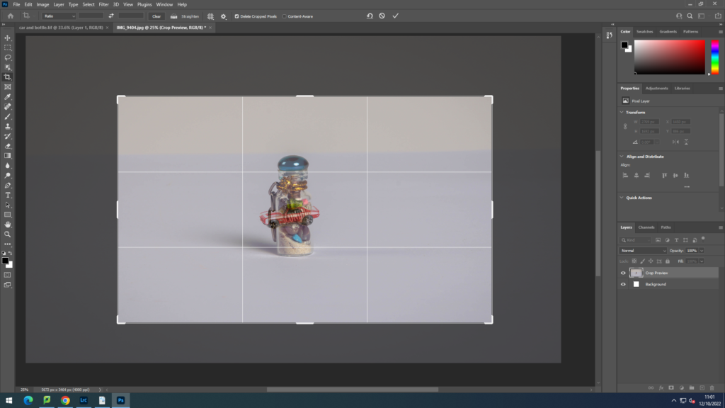
Finally I cropped the image to the size that I wanted it to be so that there was not too much empty background.
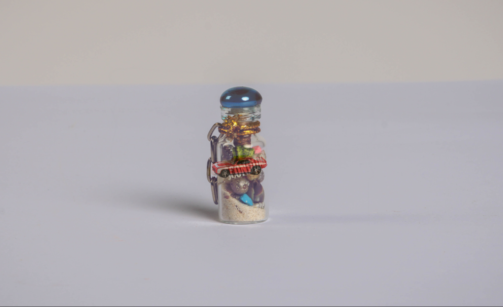
Overall I like this image as it looks as if the toy car has been captured in the glass bottle. I also think that the plain background make the objects pop and stand out drawing the viewer into the image.
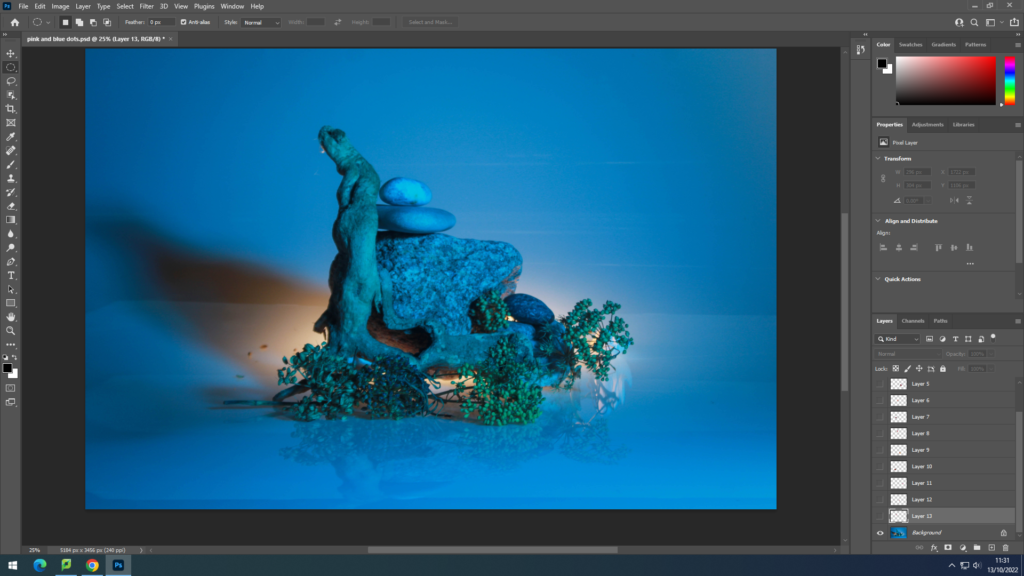
For my second montage I opened up two images that we the same in different colours, one in blue and one in pink.
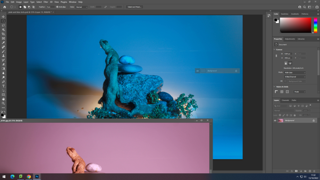
I then dragged one image on top of the other and began cutting out circles with the elliptical marquee tool. I then clicked layer via copy and once I was happy with the amount of circles cut out I deleted the original pink image to leave the blue image and pink circles.
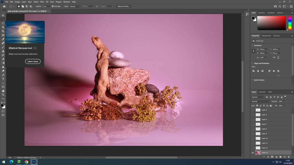
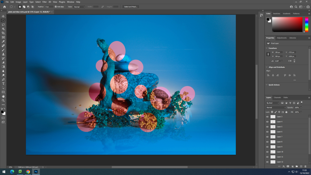
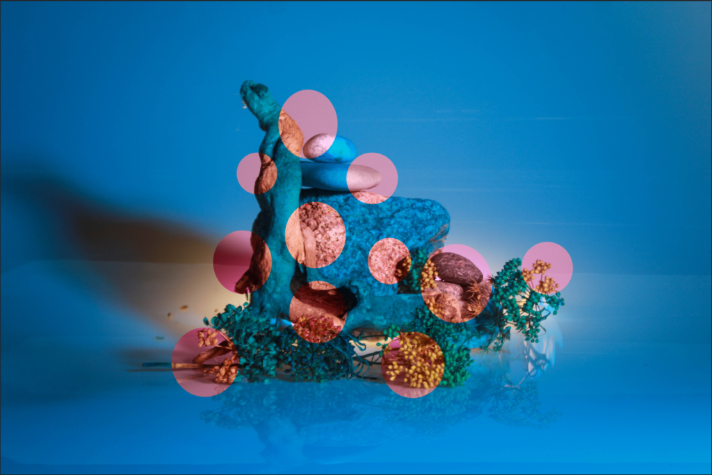
I am happy with how this montage turned out as it shower the viewer two versions of the image at once with the pink peering through breaking up the solid blue.
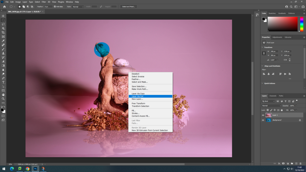
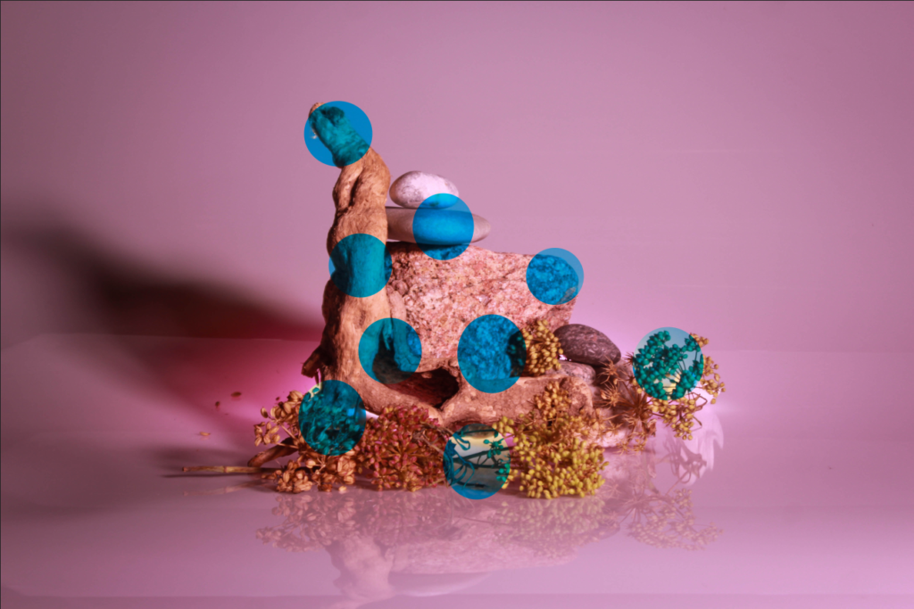
For this montage I used the same method as above however when I selected the circle I deleted it so reveal the image underneath. I think this edit is very effective and engages the viewer with the shapes and colours.
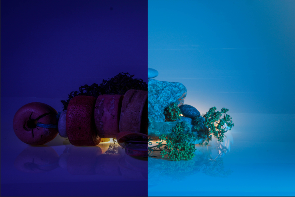
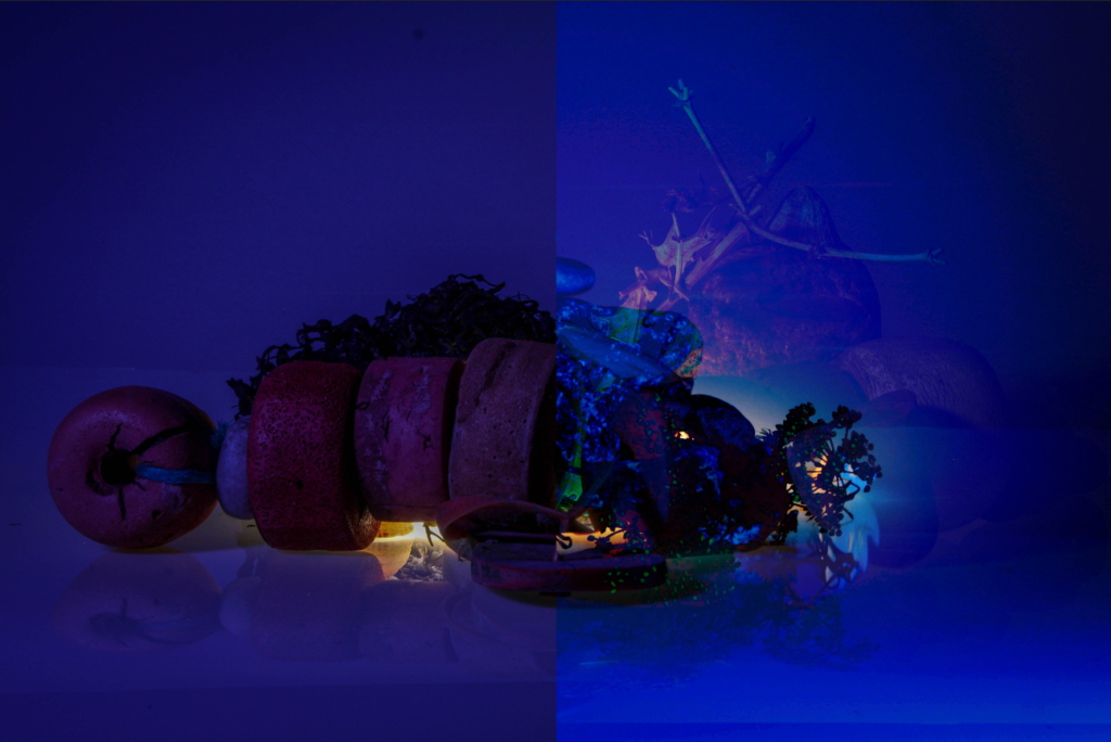
For this montage I opened two images on top of each other. I then selected half of the top image with the rectangular marquee tool, and deleted it by right clicking and then clicking layer via cut to reveal half of the image underneath. I like how this edit turned out as the blue and purple contrast well with each other drawing in the viewers eye. I have also tried to change the layer of the blue image to pin light to give it an engaging effect with the purple image in the shadows behind, as seen below.
